Designers

VormVijf, Proforma and Total Design: For 30 years, Aad van Dommelen worked as Creative Director for some of the most important agencies in the Graphic Design paradise of the Netherlands.
During this time, he undertook numerous well-known corporate design and branding projects, including KLM, the Dutch Ministries of Foreign Affairs and Defense, Koninklijke BAM and the Protestant Church. Another milestone was the re-design of Total Design itself together with Leon Stolk when it transformed into Total Identity in 2000. In the course of this, Aad began to (seriously) start to work on type design for the first time and developed the agency’s much-noticed corporate typeface, Oneliner.
Three years later, he worked on the corporate design of Hyundai Card. This left such an impression on the South Korean design scene that many other projects and briefs followed from there, often also for exclusive typefaces. Aad’s corporate fonts are now omnipresent in South Korea. They have graced and adorned the likes of the internet company Daum, LG Electronics, Heungkuk Insurance (together with Christoph Dunst), SK Telecom (together with André Mol), Total Impact and JTBC Television. He also created custom fonts for MRO Industries, Stern Groep, Vigilius Mountain Resort, Friesland Campina, Gaffel and Lotte Duty Free (awarded the “Red Dot Award, Best of the Best”).
Romaine is Aad’s second retail font that he has published. In 2012, he brought FF Aad into the world via the FontFont library. Incidentally, at the time he wasn’t so keen on the idea of naming the font after himself. His modest manner initially stood in the way of the proposal. But Fontwerk founder Ivo Gabrowitsch – who was Marketing Director for FontFont back then – finally convinced him with the argument that there was only one other font that could ever appear before the FF Aad in the font menu or other alphabetically sorted overviews: Letraset’s Aachen.
Aad’s design skills, like that of many other Fontwerk designers, were influenced by the Royal Academy of Fine Arts in The Hague. There he studied Graphic and Typographic design with Gerrit Noordzij, among others.
A riddle that we have not yet been able to solve is where the Dutchman finds sufficient space for his passion of collecting old Macintosh computers and pop-up books. But he will undoubtedly have mastered that too with his extraordinary calm and meticulous nature.
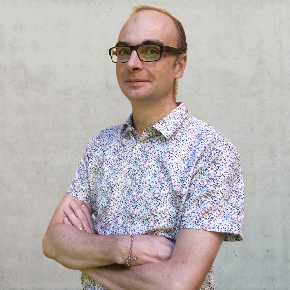
Even though he has spent three decades in his “new” home in Berlin, Alessio Leonardi has retained that extra special Florentine gene that exudes a wit rarely experienced in this country. A coffee with the young-at-heart professional always promises to lead to a stimulating discussion covering everything from professional to personal topics.
A glance at his CV proves that the Communication Designer and Type Designer knows what he is talking about. After studying at ISIA in Urbino, he was drawn to Erik Spiekermann at MetaDesign Berlin before running his own design offices (Leonardi.Wollein, Lion&Bee) and finally, after being employed as a Visiting Professor for Corporate and Information Design at Burg Giebichenstein and for Typography at HBKsaar, in 2010 he was appointed as Professor of Visual Communication at HAWK Hildesheim. Throughout his career, he has been (co-)responsible for numerous large corporate design projects, including WDR, Springer Verlag, Schering, Linotype or CECIL.
Alessio Leonardi designed his first analog typeface families in 1989. In 1992, he created his first digital famlies for FontShop International and Linotype. With Alexander Branczyk, Heike Nehl, Sybille Schlaich and Thomas Nagel, he founded one of the first digital type publishers called Face2Face. He then went on to set up Fontology with Fabrizio Schiavi. Some of his typefaces were designed exclusively for the legendary techno magazine Frontpage.
In the new millennium, he started his own label BuyMyFonts. This is also where the Corporate typeface for Berlin, the BMF Change, which is now published by Fontwerk in revised form for the rest of the world. Other work highlights include the complex type system for Schering AG (now Bayer), the Bröhan typeface for Bröhan Art Advisors Inc. and BDFoundation for the Bröhan Design Foundation, as well as FF Letterine, FF Matto, FF Handwriter and FF Graffio for FontFont and BMF Elettriche, which, in his own words, is “the largest type family in the world … until now”.
Besides speaking at (always a highlight!) and moderating conferences (e.g. TYPO Berlin), Alessio Leonardi also writes for design magazines and has published numerous books including: “From the Cow to the Typewriter: the (true) History of Writing”, “A Line of Type. 120 years typographic history” (with Jan Middendorp for the Mergenthaler Edition), “Mr. Typo and the lost letters” (also with Jan Middendorp) and “How passion ruins our lives.” and the typo graphic novel “Mr.Typo and the treasure of design”. This concludes his bio for now, before we have to publish it as a book …
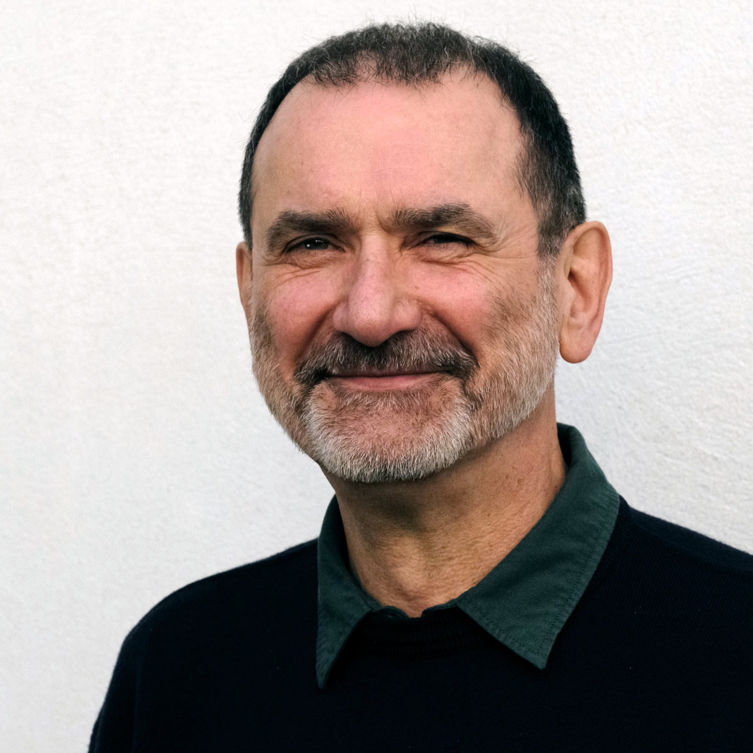
As Type Director, Andreas Frohloff was our first employee and now works for us on a freelance basis. His mentoring approach and expert eagle eye have been instrumental in informing our own approach as to how we want to publish fonts.
During the 16 years that he headed up the TypeDepartment at FontFont, his guiding hand was highly appreciated by numerous designers. Many FontFont superstars, including FF DIN, FF Meta, FF Mark and FF Spinoza, all benefited from his precision and meticulousness.
Andreas is perhaps best known for his workshops and type design teaching. There was hardly a TYPO Berlin visitor from 2001 to 2018 who didn’t benefit from his highly interactive and engaging calligraphy workshops and from his hilarious puns and wordplay.
Together with Axel Bertram he published two font families Rabenau and FF Videtur and revised the characterful Berlin street signs after German reunification. His latest major project is Neue DIN, which he created together with Hendrik Weber and Olli Meier and whose design he influenced decisively.
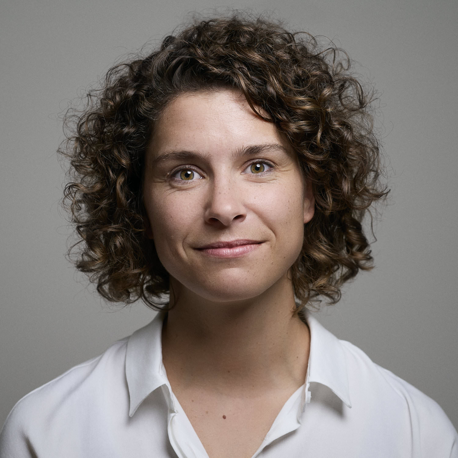
Surrounded by the crystal-clear, ice-age lakes at the gates of Berlin, Anja Meiners finds inspiration for distinct and contemporary typefaces.
She lives in the tranquil surroundings of Brandenburg with four generations of her a not quite so tranquil family but the business of the city is always within reach.
Together with Ralph du Carrois, Anja founded bBox Type where they developed exclusive custom fonts for international brands such as ZDF, Cewe and Autodesk. They are also responsible for the popular Fira Sans for Mozilla in cooperation with Erik Spiekermann and team and the multiscript extension FiraGO for the geodata provider ‘here’. In 2022, Anja left bBox to pursue new challenges.
As well as a flair for typefaces, the communication designer has a talent for organizing events, such as the monthly Typostammtisch Berlin, for which she also loves to write for. Another big and important topic for Anja is the process of how kids learn to read and write.
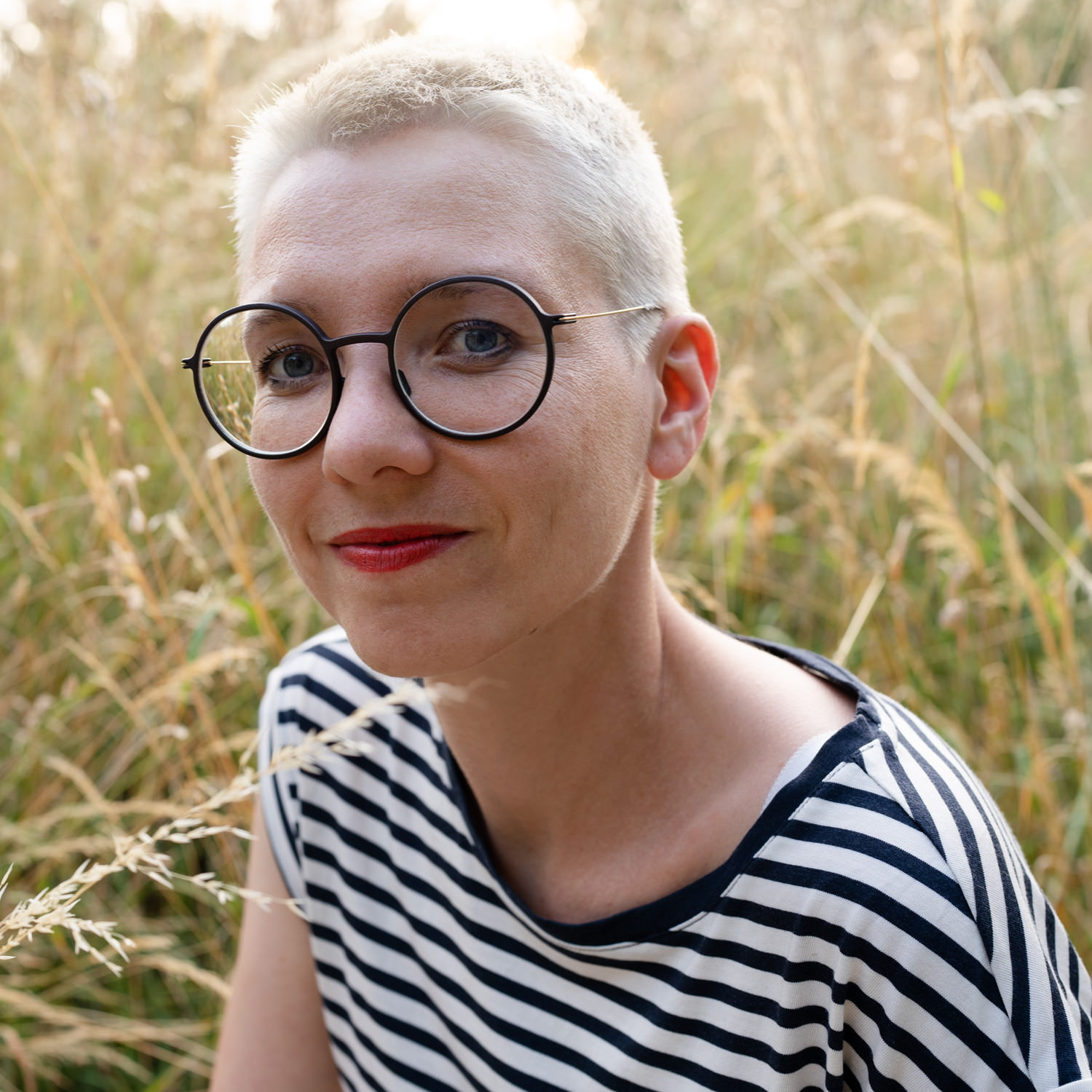
Christine Gertsch is interested in bringing brands to life through interaction. She teaches this, and much more, in her role as a Lecturer and Head of the CAS Type & Brand faculty at the Zurich University of the Arts (ZHdK) in courses on type design, its digital application and creative coding.
Her progressive and systematic approach is also recognized and praised by her clients which include Reka, Jelmoli, Halsfeger, Sympany and Unicef. As Co-Founder and Organizer of the Typostammtisch Zurich, Christine regularly also brings together typography enthusiasts from across the city.
The self-employed Visual Designer and Type Designer draws on her experience from living and working in five different countries. In addition to her adopted home of Zurich and her hometown of Basel, she has worked in Canada, Denmark, Germany and the Netherlands. During her time on the Type and Media Master’s degree at KABK (Royal Academy of Art), The Hague, her interest in the combination of technical features and design gained particular momentum.
This interest is one of two central themes of her typeface, Push. After various custom font projects and her own font experiments, Christine is now publishing a retail family for the first time. As a hobby cyclist and rower, sporting aspects were also part of the inspiration behind the font’s design concept.
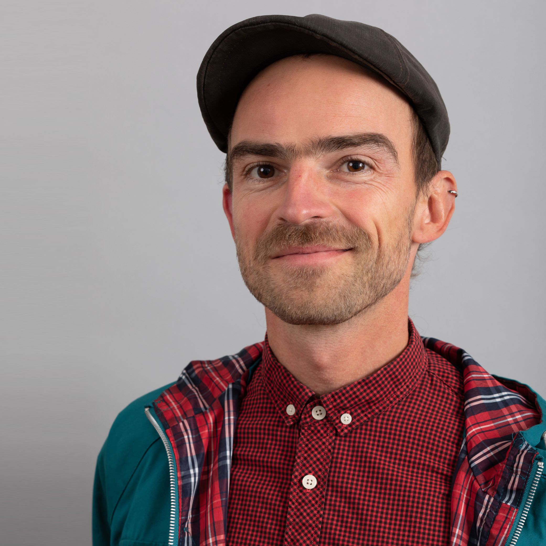
A Berliner by choice, Christoph Koeberlin, is one of the most sought-after font engineers in Europe. Foundries such as FontFont, Swiss Typefaces, TypeBy, Miles Newlyn, TypeMates and Grilli Type and brands such as Ebay, TikTok, ZDF, Volkswagen, the German government, Deutsche Bank, DFB, Porsche, MAN, Twitter, Decathlon, Pinterest, Figma, Telekom and Lufthansa put their trust in him. What’s more, the Fontwerk engineering team would be unimaginable without his instrumental help in the early days. The list would be even more star-studded if it weren’t for numerous non-disclosure agreements.
Yet it is not just his technical know-how that Christoph is renowned for. His creative work is proof of his keen instinct for what makes a stand-out and highly sought-after corporate typeface. In addition to FF Mark, which he designed in partnership with Hannes von Döhren and the FontFont Type Department back in 2013, Christoph is also the designer behind Fabrikat (released by HVD Fonts 2016) and Pangea (published by Fontwerk 2020). All three of these typefaces became bestsellers within a very short space of time. He was also significantly involved in major custom font projects for Mercedes-Benz, Liebherr, Hyundai, Lonely Planet and SFMOMA. This makes him one of the best typeface designers of our time. Yet Christoph remains modest and down-to-earth in an almost Keanu Reeves-esque manner with philanthropic ideas and actions such as the permanent donation of part of his Pangea royalties to help conserve the rainforest. With his latest work, Tausend, together with Gabriel Richter he is writing the next chapter. It too has what it takes to be the next big thing.
At this point, any other CV would already be impressive and full to the brim, yet Christoph has another trick up his sleeve, his passion project sportsfonts.com. Under this umbrella, he designs retail and exclusive fonts for sports clubs and brands such as FSV Mainz 05, FC St. Pauli, Werder Bremen, Schalke 04 and (his) 1. FC Kaiserslautern. Their fans are just as enthusiastic about it as the specialist audience, as documented by awards such as the ADC 2025 Grand Prix Design Award (!), the iF Design Award and German Brand Award.
Christoph Koeberlin is a multi-talented, exceptional designer who can fill many positions – always at a world-class level.
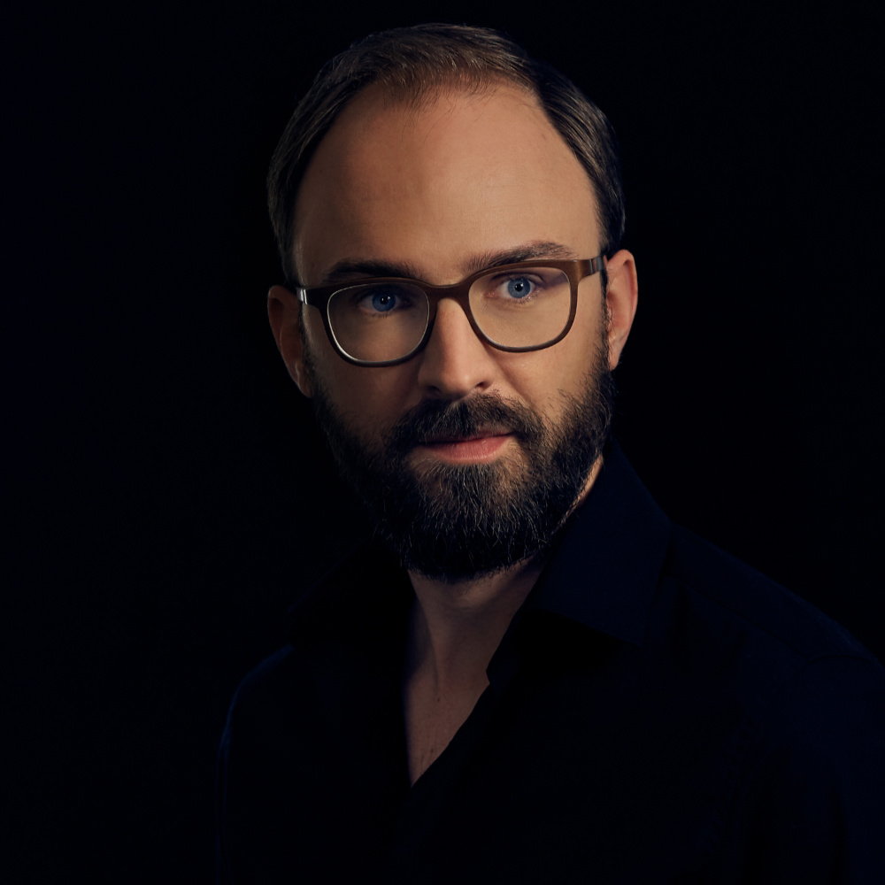
With their bold and daring designs, the Olympic Games in Mexico in 1968 and in Munich in 1972 were high points in the world of visual branding according to Daniel Perraudin. This opinion certainly enjoys majority support amongst his peers and we also strongly agree. As founder and partner of Capitale Berlin/Vienna—a studio for branding, wayfinding systems and editorial design—Daniel is a proven specialist for complex (typo)graphic projects.
His expertise is also rooted in his broad professional experience, Daniel studied Information Design at Stuttgart Media University and FH Joanneum Graz and then worked at KMS Team in corporate design and typography for clients such as BMW, Canyon, MAN, Porsche and Sky. He later obtained a TypeMedia Master’s degree in Type Design at the Royal Academy of Fine Arts in The Hague. He has been passing on his knowledge to students in Graz for several years. Daniel’s first typeface Parka was successfully published by the legendary Font Bureau in 2010.
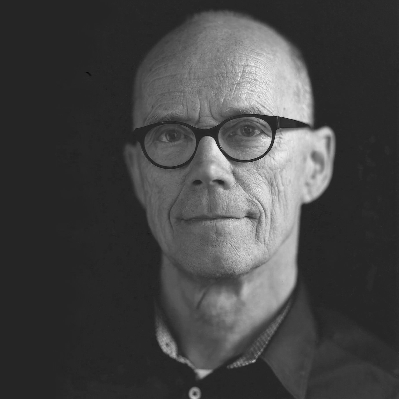
What else can one write about the man whose Wikipedia entry has been translated into 15 different languages?
The man, whose shelves are decorated with multiple awards for his life’s work from the most renowned associations and a beautifully framed honorary doctorate certificate. The man, whose reference books and biography became international bestsellers. The man, who has designed more successful typefaces than most foundries have to offer. The man, who is an entertaining guest in audio, film and TV productions (e.g. the legendary BBC video. He is at home in three time zones and owns more bicycles in each place than a large sporty family. He is the man who was heavily involved building two of the most relevant creative agencies, a legendary letterpress workshop, and the most important independent font distributor and the largest library of contemporary typefaces.
So, there is not much left to write about this man. Apart from the fact that Fontwerk would probably not exist without the latter two achievements, our roots lie in the ideals and friendships of the first 25 years of FontShop. The fact that Erik sees his future as a type designer for our label after his enormously successful time at ITC and FontFont is highly appreciated and a hugely motivating obligation for us.
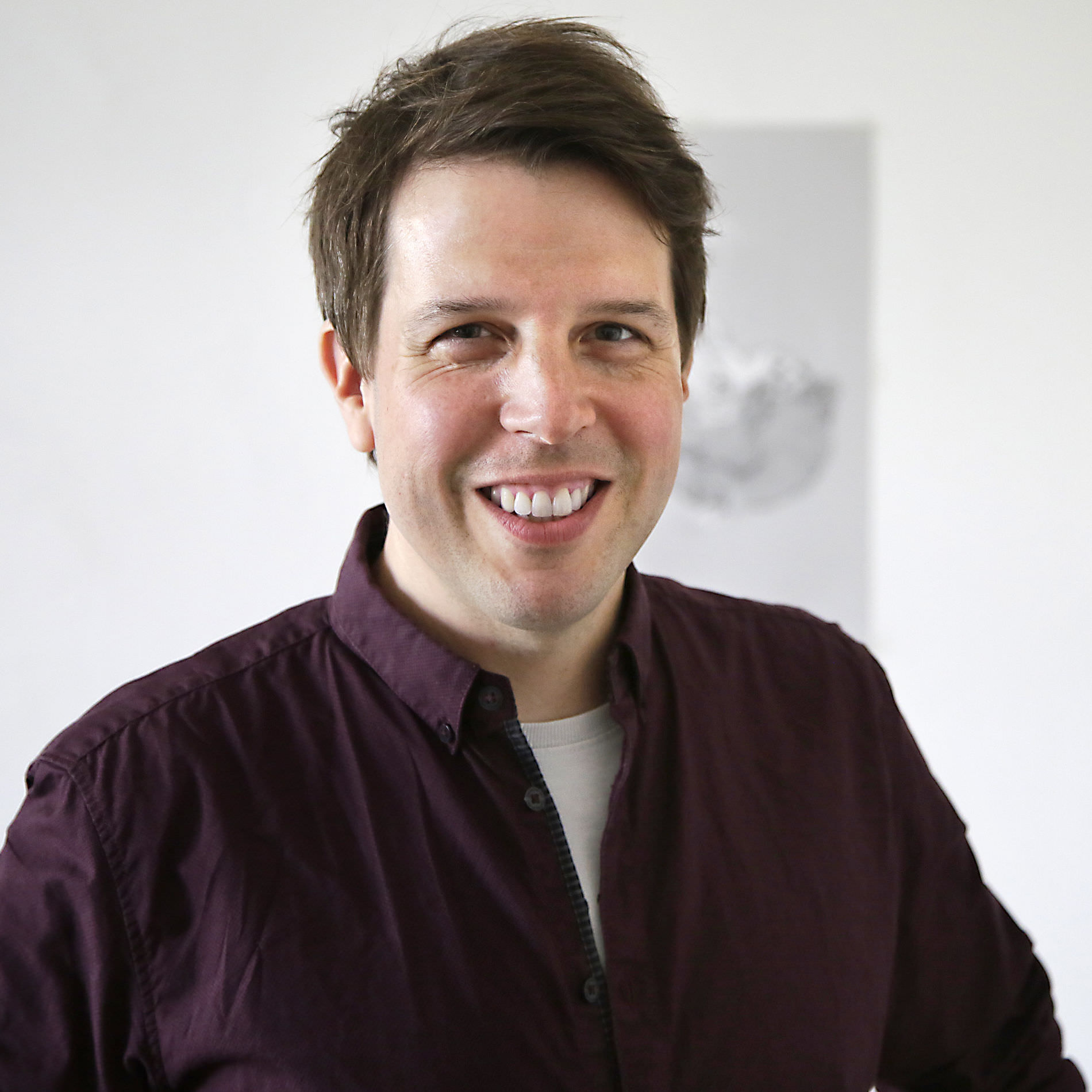
The Greek philosopher Thales pronounced: “The principle of all things is water; everything is made of water, and everything returns to water.”
Cologne-based designer Felix Braden also appreciates and recognizes the beauty and importance of the wettest element. His own foundry Floodfonts and almost all of his fonts have a reference to water. His veritable typographic aquarium includes fonts with names such as: Pulpo, Kontiki, Capri, Tuna, FF Scuba, Bikini or Moby. His latest typeface Turbine, which is published by Fontwerk, also fittingly means the rotating turbomachine of a hydropower plant.
In terms of design, Felix’s typefaces have also been very well received. His typeface FF Scuba was recognized in the Communication Arts Typography Annual in 2013 and his typeface Kontiki was nominated for the German Design Award in 2019.
Felix Braden works full-time as an Art Director at MWK Cologne and was responsible, among other things, for the corporate design of Malteser International and the logo design of the Romano Germanic Museum. Previously, he co-founded Glashaus Design and worked with Jens Gehlhaar at Gaga Design. Felix studied Communication Design at Trier University with Prof. Andreas Hogan.
In his free time, rather than pushing pens he sometimes likes to push balls, because he is a passionate boules player. When the weather is not so good, he emulates his role model Rian Hughes and draws illustrations. If he wants a little more excitement, he loves to go to indie and alternative rock concerts.
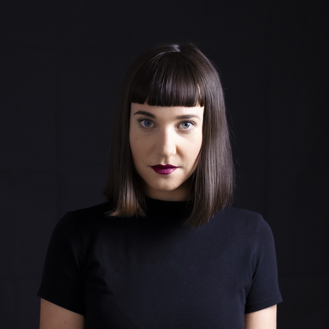
It is in the middle of two mountain ranges that Franziska Weitgruber designs her typefaces. The letterforms that she designs are just as striking as the South Tyrolean Alps where she lives.
Fascinated by the interaction of analog and digital technologies, she explores the limits of these tools and materials in her work. She works intensively with manual printing techniques and high-quality coatings, such as gold leaf, enamel paint, risography and screen printing.
Franziska received her Bachelor’s Degree in Graphic Design with a focus on type from the New Design University St. Pölten (typography, calligraphy, hand lettering, typeface design). Later she also worked there as a lecturer. The TypeMedia Master at the Royal Academy of Fine Arts in The Hague manifested her way to type design. Franziska is currently working as a freelance type designer and graphic designer. She is also a regular guest mentor at Type Clinic Slovenia.
In addition to Nikolai, she also initially published early versions of her fonts Gig and Roba on the Future Fonts platform. Aside from the world of letters, she loves bicycles and the Rietveld Schröder House in Utrecht.
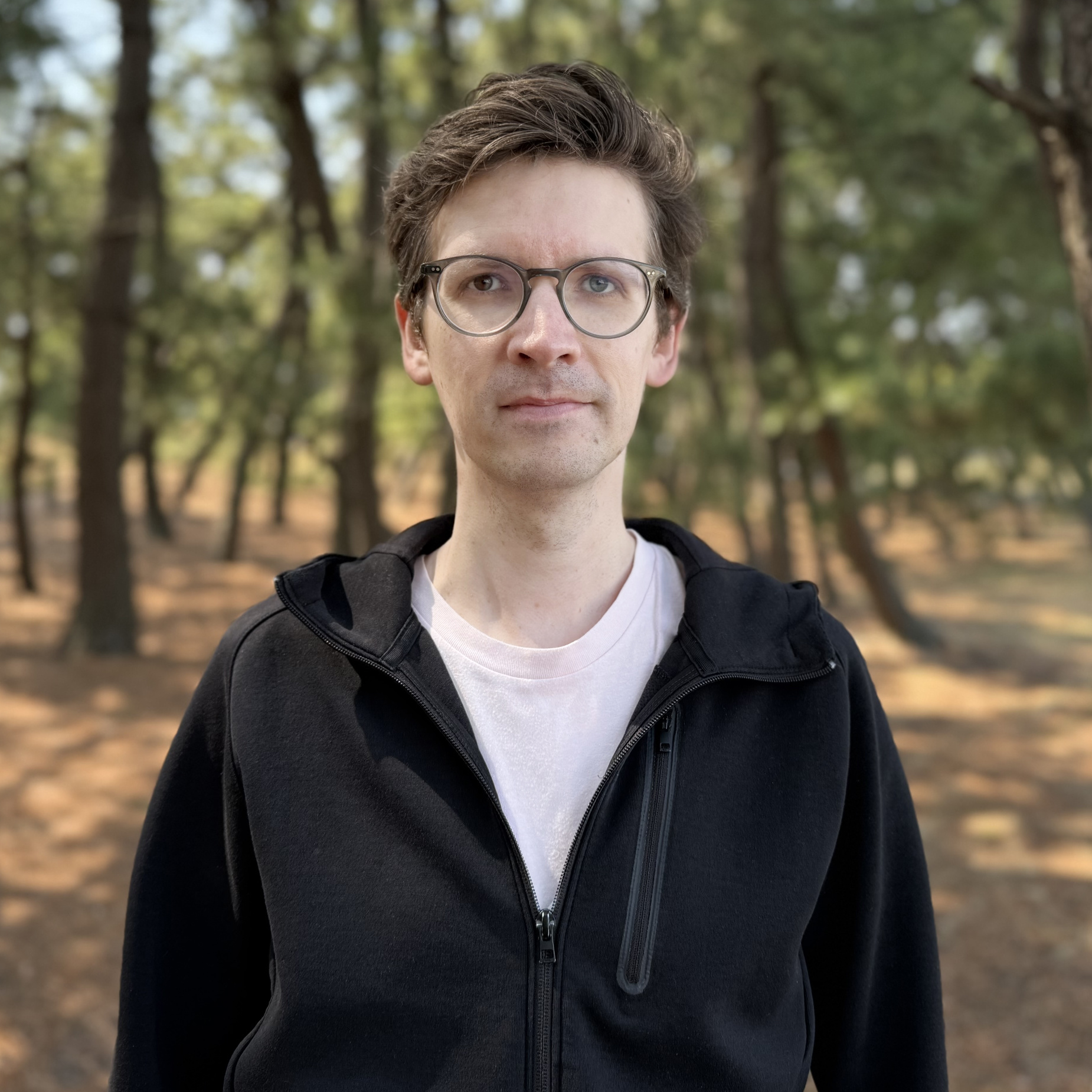
“We’ll take on any case.” Given his broad creative spectrum, the motto of Germany’s very popular youth book and radio play series, Die Drei ??? (The Three Investigators), could well be Gabriel Richter’s own motto. Proof of his typographic versatility can be found in a variety of projects: from his debut work FF Infra (distributed by Monotype) to his retail fonts (e.g. Massimo Grafia (with Andreas Uebele), Neue Television (with Klaus Richter) and Takeoff) published by his own label ‘nice to type’ to a multitude of custom jobs. Gabriel Richter also drew the exclusive Rocky Beach Grotesque for the publisher of Die Drei ??? and the groundbreaking typeface for the multi-award-winning orientation system for the creative agency, serviceplan (both on behalf of the büro uebele). All of Gabriel’s type designs are united by a special, non-conformist, eye-catching twist that interests even those not normally excited by type.
Gabriel’s initial spark for type design came during his studies at the Düsseldorf University of Applied Sciences at a workshop led by Jakob Runge and Max Kostopoulos. An internship at FontShop International, which lasted several months, helped forge his typographic path and enabled him to establish contacts that led to a close collaboration with Christoph Koeberlin. Gabriel supported Christoph in the expansion of Pangea and they have recently worked together on Tausend (both released by Fontwerk). A further internship at the legendary Stuttgart-based agency, büro uebele gave him the opportunity to combine graphic and type design and perhaps explains the dynamic graphic energy that his typefaces exude.
Gabriel not only heeds the advice of his former FontShop mentor Andreas Frohloff, “If you think the comma is long enough, then make it longer,” in his stylistically diverse designs. He now also passes it on to the students at Düsseldorf University of Applied Sciences, where he has taught type design since 2016. Inspired by his former lecturer, Daniel Fels, Gabriel conveys the connection between clear structures, an understanding of form and openness to all styles. This is also where his design career began as part of his communication design studies.
Having now settled down in Japan, the Black metal music fan no longer rules out any genre. He also pursues this stylistic openness in his choice and design of fonts, and thereby helps expand the creative spectrum of our own label.
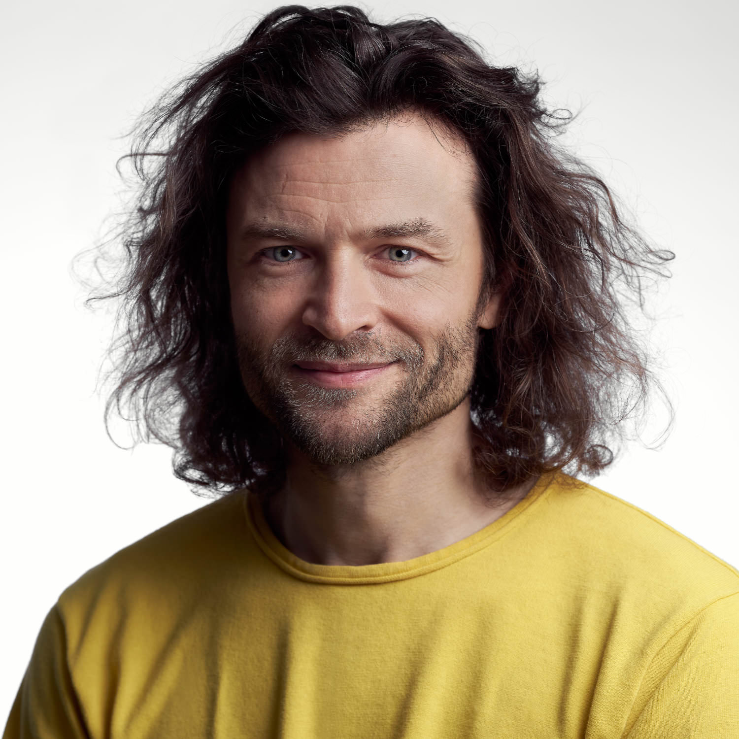
Simple is the best. Hendrik Weber has been guided by this seemingly uncomplicated yet in reality rather challenging design principle for the past 20 years when designing in public spaces.
As the Type Director of KMS Team – one of Germany’s leading agencies – Hendrik sees his work as inextricably linked with neighbouring disciplines. He strives for a constant exchange with designers from the fields of motion, 2D/3D, interactive and print and his exclusive typefaces for top brands such as Porsche, Bentley, BMW Motorbike, Santander and Canyon bikes, as well as his retail fonts for TypeBy and Monotype (Lirico, Edward, Unitext) are proof of his determination to create visible quality even in demanding environments. One of his dreams came true while working as Type Director for the DACH region at Monotype, where he led the team that worked on the revision of the most popular typeface in the western world (Helvetica) which resulted in the creation of Helvetica Now.
The foundations for his impressive CV were laid during his studies at the Leipzig Academy of Fine Arts. His patron Fred Smeijers, Professor of the then newly founded specialist class for type design, recognized his talent and has regularly relied on Weber’s services since he graduated.
The final phase of his studies was dominated by research on cursive typography and culminated in a book on the subject. “Italic – What gives Typography its Emphasis” is regarded as the first detailed treatise on the subject. It has since been translated into English and the second edition is available from the Swiss publisher Niggli. Since graduating, Hendrik Weber has passed on his knowledge and experience to students at the Weißensee Academy of Art Berlin, the Academy of Fine Arts Nuremberg, the Munich University of Applied Sciences and the Augsburg University of Applied Sciences.
Together with Andreas Frohloff and Olli Meier he took on Fontwerk’s challenge to rethink the German design icon, DIN. With clever design ideas, precision craftsmanship and following his design principle of simplicity, they came up with a solution that allows for a completely new feel – Neue DIN. Following in the footsteps of its predecessors, Neue DIN has a strict overall impression but it has been completely revitalized and reimagined to incorporate extreme widths, a variable-first approach and an extra special touch of elegance.
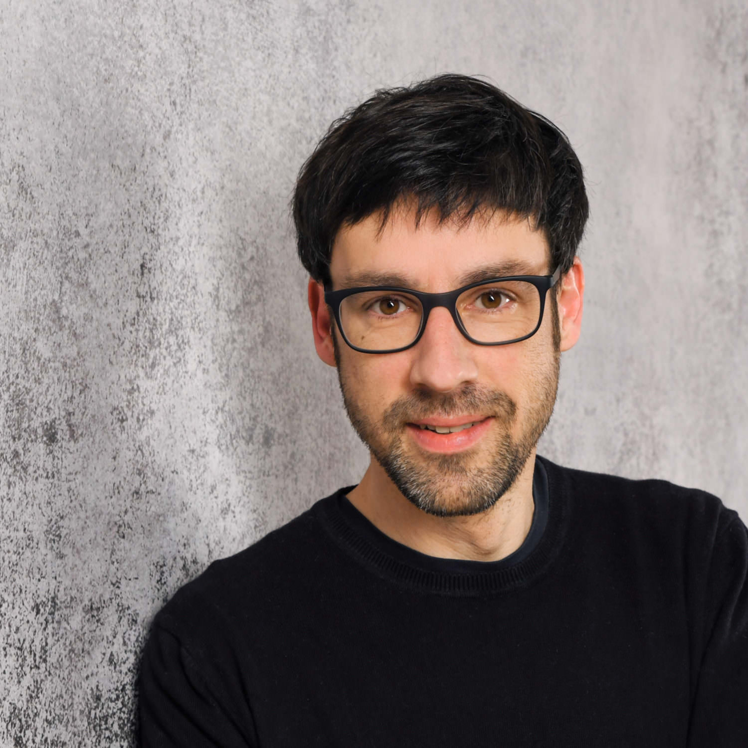
The typefaces of the typography legend Lucas de Groot are still making a mark after thirty years. But it’s not just his designs that leave a lasting impression, through his teaching at the Potsdam University of Applied Sciences, he has also shaped and influenced many other Designers. One such Designer was Jan Fromm, whose special talent de Groot recognized and who he invited to work alongside him during his studies.
Jan supported LucasFonts with extensive custom font projects and the expansion of the type library. He was also heavily involved in the concept and design of the website. Today, the multidisciplinary designer works freelance on his own fonts, logos, graphic and web projects. He considers type to be a fundamental component of visual communication, as it can convey not only information but also emotions.
His work is characterized by functionality and clarity and a considered reduction to all but that which is essential. His keen eye for detail is evident throughout. Jan is convinced that the harmonious interplay of those details decides on the overall quality.
One of his most interesting jobs is working for 29Letters, the foundry of Pascal Zoghbi. Jan drew and harmonized many of the Latin members and versions of Pascal’s Zarid Superfamily. Jan’s own families Camingo, Komet, Capito and Rooney are also worth mentioning, as they demonstrate his wide ranging stylistic and technical ability. Rooney Sans has been used for over ten years by the largest marketplace for digital fonts, MyFonts.
With the complex type system Nice, the coffee-loving cineaste is publishing a typeface outside his own label for the first time. We are delighted to be joining him on this journey, taking care of the production and distribution of the distribution of the 56-part typeface. Having completed this extensive project, we can attest to Jan’s exceptionally high quality standards—both in terms of design and technology.

Retail typefaces by Joe Stitzlein are in fact somewhat of a rarity. After ITC Tactile, which won a TDC award in 1999, Hamster follows a quarter of a century later.
Hamster is a typeface that is simply fun to use and is peppered with all kinds of design and technical subtleties. Usually, Joe can be found creating waves and stirring up dust in the custom font sector. In fact, he has designed fonts for SGI (awarded a D&AD Pencil), Sempra Energy, Cloudera, Glasgow Rangers, Telge and a popular social network, many of which included huge language extensions.
First and foremost, Joe is a designer of brand systems and identities, of which his or other designers’ fonts play an integral part. He has left his mark on many household and well-known brands such as FedEx, Herman Miller, Michelle Obama’s Let’s Move programme, H2FLY, Helion, P&G and Pixar, and has designed logos for Netflix, Lilly and dwell.
With Steve Jobs, he defined Apple’s imagery and packaging standards, as Executive Creative Director at Google he helped them become a global design studio, and for Nike he was Senior Global Creative Director for Nike+ and Nike Running, creating a campaign that resulted in the world’s most successful shoes (Nike Free).
In 2016, he joined forces with Leslie Stitzlein to form Stitzlein Studio, a brand identity, type design and digital environments practice in the San Francisco Bay Area. Drawing on his vast expertise to help brands stand out.
We couldn’t be happier that his immense experience is now making its way into the Fontwerk library with Hamster.
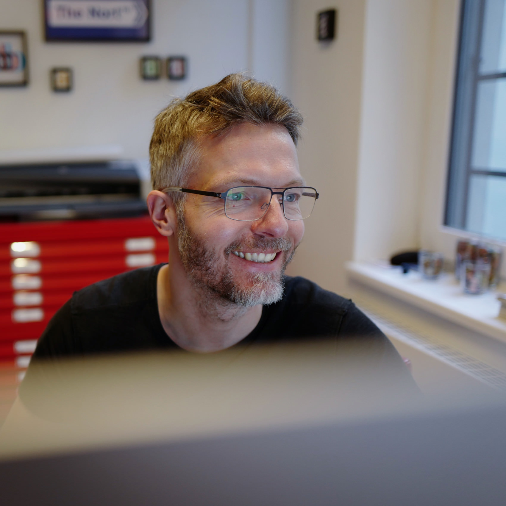
Jörg Hemker is a seasoned expert when it comes to knowing exactly what European companies need in terms of typefaces and branding.
Over the years, he has gained vast experience and has designed comprehensive font systems and logotypes for brands such as Bosch, Blaupunkt, Harry, dm, Metabo and Jette Joop. He also developed communications and branding solutions for Deutsche Telekom, ARD, rbb, Rheinische Post, Fresenius SE, Mainova, Mercedes-Benz, Allianz, Commerzbank, State Government of North Rhine-Westphalia, Würth, Alperia, REWE, Jil Sander … the list goes on, but we’ll stop here due to lack of space ;)
A commonality across all of Jörg’s typefaces is that they don’t ride the latest wave or comply with the newest trend, they are quite simply timeless. Five of his typefaces, FF Zwo (2002), FF Zwo Correspondence (2002), FF Sero (2011), FF Nort (2017) and FF Nort Headline (2020) all appeared in the renowned FontFont library.
He has won pretty much every communication and font design award and accolade out there: DDC, reddot, iF, German Design Award, Communication Arts, ADC New York, amongst many others. Jörg’s motto: Never compete, never compare (Karl Lagerfeld). We are over the moon that he has found a new home with Fontwerk.
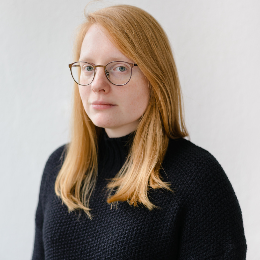
“Hope is for losers.” Katja Schimmel interpreted the advice of her teacher Peter Verheul very clearly: she does not hope, she just gets on and does it.
She designs typefaces, develops tools and scripts, creates animations, practices lettering and calligraphy, and last but by no means least, Katja produces and masters fonts. She developed her font engineering skills intensively during her time with the specialists from Alphabet Type and more recently through working with Grilli Type.
One of her rather unusual talents is creating 3D installations. She once built a wooden construction at a festival, which was stimulated by a pulse sensor and reacted with light to the rhythm of the heartbeat of the visitors. In this and many other ways, she continually keeps herself open to new creative worlds in a multidisciplinary manner.
Katja has a Bachelor from the Weimar Bauhaus University as well as a TypeMedia Master in Type Design from the Royal Academy of Art in The Hague. Before working with Loris Olivier and Noheul Lee on McQueen, she published her KABK graduation on the Future Fonts platform (Tweak Text and Tweak Display).
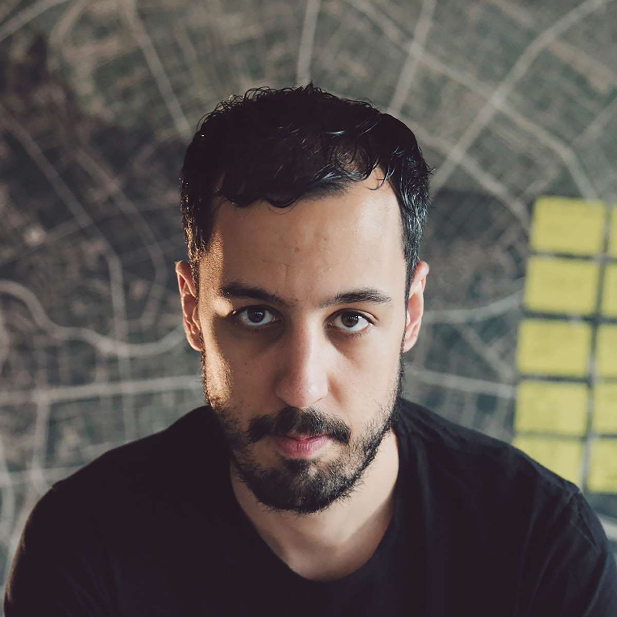
For Loris Olivier, typography is a small splash of color in the palette with which we paint our future.
This defining principle has unleashed an enviable talent for trends and experimental type design in the Swiss Designer. He proves this at Future Fonts, among others, where he is active as lo-ol typefoundry with his wife Noheul Lee. So far, he has published three families under this label: Gloubi (2018), Civilitate (2018) and Brienz (2019). The philosophizing designer still has enough designs for ten libraries up his sleeves.
Before he obtained his TypeMedia Masters in Type Design at the Royal Academy of Art in The Hague, he studied Art Direction at the ÉCAL in Lausanne. His passion for letter shapes was ignited in 2009 during a calligraphy course with Claude Dieterich in San Francisco.
Loris likes to leave his comfort zone of UI/UX, brand, graphic and type design by working on a project with a friend using CNC controls to cut wood.
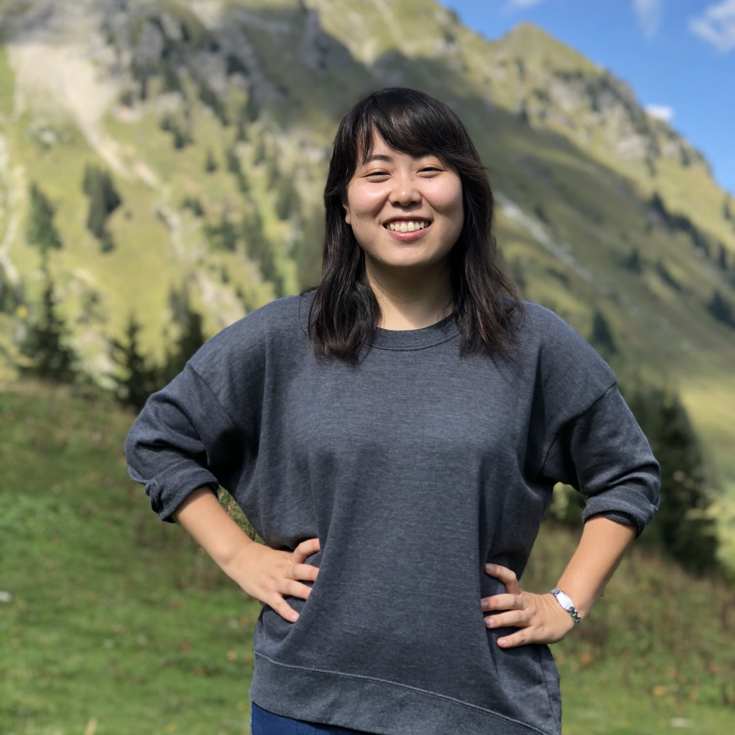
When Noheul Lee looks at the cover of Joy Division’s “Unknown Pleasures” album, she thinks less about their mysterious and enigmatic music, but rather about the design of the cover by Peter Saville that can be described with the same adjectives.
As a fan of his work, she shares the fate of many designers who are less touched and inspired by the content of a product but by its shape.
The Korean book, editorial and type designer runs the Swiss lo-ol Typefoundry together with her husband, Loris Olivier. It was type design that also brought the two together: both studied TypeMedia at the Royal Academy of Art, in The Hague. Noheul previously obtained a Master’s Degree in Visual Communication Design from the renowned Kookmin University and a Bachelor’s Degree from Sangmyung University in Seoul.
Noheul – pronounced “Noelle” – specializes in multi-scripts font design and is particularly committed to her mother tongue, Korean. Her work has received recognition and acclaim; she won the 6th Bang Il Young Cultural Foundation Fund Competition for her Hangul design of her previous version of Arvana, which is available on Future Fonts. She also received Gold in the Morisawa Type Design Competition for the Latin design of her TypeMedia final font project, Areon.
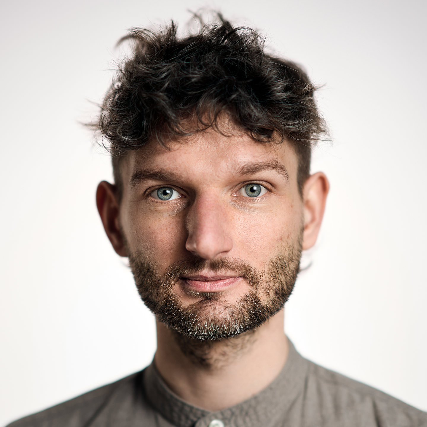
Olli Meier joined the Fontwerk family in 2022. As our Font Engineer, he is responsible for ensuring the high technical quality of our fonts.
He began his career as a Communications Designer for agencies such as MetaDesign and Stan Hema. He also taught the basics of typography at the University of Applied Sciences Dresden before he was drawn to Monotype’s production team. There he found his calling in font technology, most recently as a Senior Software Engineer, and was responsible for internal font tools, among many other things.
His projects for the market leader included: Helvetica Now, Neue Frutiger World (working on Quality Engineering). He worked with Bernd Volmer on the corporate design of TYPOLabs, which used a variable font as a logo for the first time and was awarded a Red Dot. He also created his own family Vary and the interactive font specimen website FontSpecimen.com, which was an Awwwards-nominee. As a committed member of the Unicode consortium, Olli is involved in the development of one of the most important tools in our industry and has worked closely with Dave Opstad, Apple’s TrueType and Unicode Pioneer. Working in cooperation with Glyphs, he also ensures the quality of the app and supports the development of new features.
In addition to font technology work, he also designed Neue DIN together with Hendrik Weber and Andreas Frohloff.
His reputation as a DIY king also proves that he can also do things by hand. He lives on a farm in Barnim and is passionate about growing vegetables, working with wood and jumping on his randonneur bike to cycle to the North Cape.
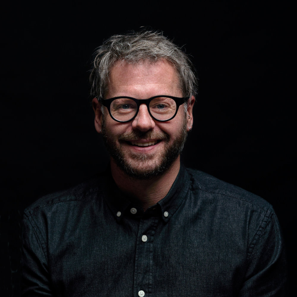
The graphic design studio founded by Ralph and Jennifer du Carrois soon developed into a type design studio after an extensive corporate type project for Suzuki.
Ralph made a name for himself with international clients such as de Gruyter, zdf, Cisco, Bosch, TERN, Autodesk and Monotype by extending and designing fonts. One of his most extensive projects was Fira Sans for Mozilla, which he developed together with Erik Spiekermann, Anja Meiners and team as well as the extended FiraGo design for the geo provider ‘here’.
With his foundry bBox Type, Ralph serves customers and clients of various sizes from different business areas. bBox has realized projects for zdf, cewe, here, de Gruyter, Mozilla, Neue Nationalgalerie Berlin, Autodesk, Erik Spiekermann, Cisco, Bosch, the City of Rome and many more.
Born in Allgäu, Germany, the graduate Product Designer still devotes his spare time to both his actual field of study and to art. When he left the hustle and bustle of Berlin, new spaces and perspectives opened up for him and his family in Potsdam. Today he lives and works there in a wooden house, which he designed himself.
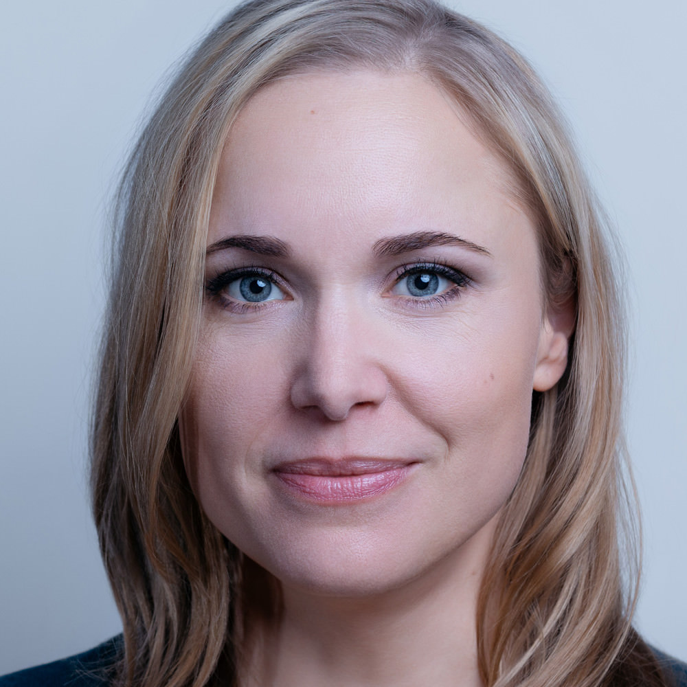
Berlin Letters is the name of the typography and lettering festival that Berlin-based Designer Ulrike Rausch set up with three other partners, and it could easily be the name of her own label.
But in fact, this is called LiebeFonts and has long been a byword for lovers of handmade fonts with outstanding quality – something that has often been missing in this particular sector. Since 2009, she has combined her creative talent with an extra special enthusiasm for code and sophisticated OpenType features. She was not only one of the pioneers for the script and lettering trend of recent years, she is also a highly valued consultant for clients such as Apple or Adobe, as well as for event organizers, at whose events she is a welcome speaker.
Together with lettering designer Chris Campe, Ulrike recently wrote a book Making Fonts!, in which she passes on her knowledge of type design and font production. Supermarker is the first font that she has published outside of her own label, and we couldn’t be happier that she chose Fontwerk.
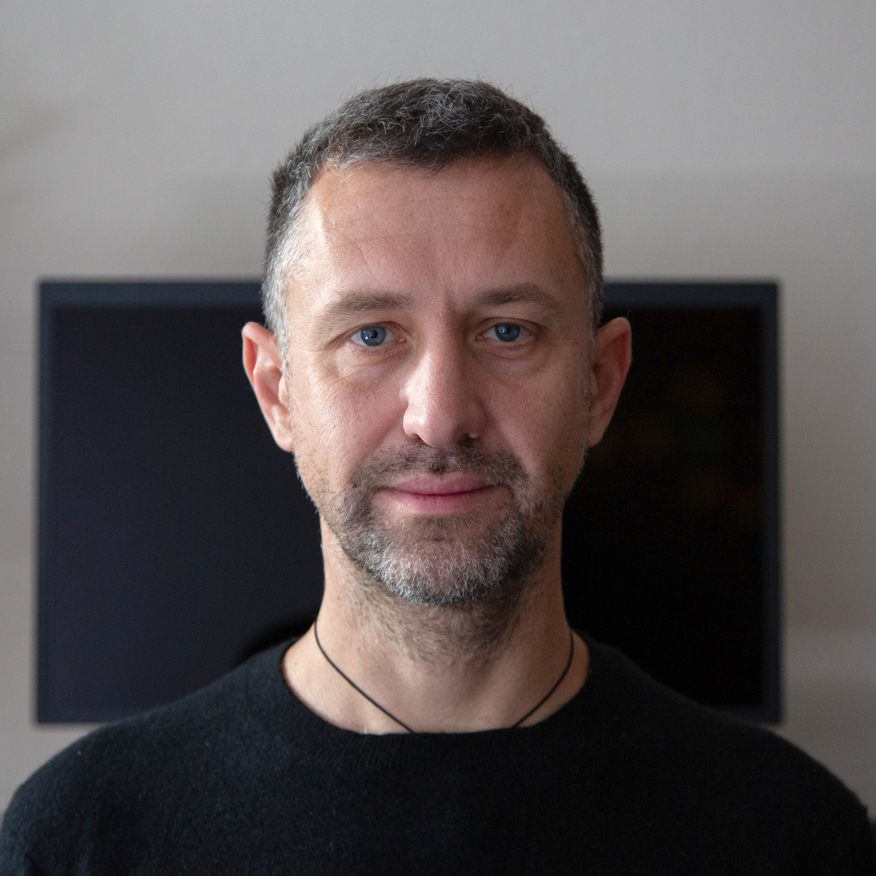
A neon sign in Dresden was the beginning of it all. Above a former delicatessen, a cursive script stood out in typical 1970s style alongside bold block letters. It was an unusual, contradictory pairing that fascinated the young Jan Gerner, who had just returned to his hometown after nine years in Ethiopia. The contrast between these two voices became the driving force behind his career and the core of his typographic approach.
Today, he is known internationally under the name Yanone: as a type designer, developer of typographic tools, DJ, and critical thinker—all part of his identity as a multidisciplinary artist. His works, which are always emotional and personal at their heart, are characterized by a keen sense of cultural translation, visual dramaturgy and technological change.
His best-known typeface, the free Yanone Kaffeesatz, has become one of the most popular fonts worldwide over the years. His large-format mixed media installation “Sun Gate” was a stimulating highlight at various festivals from Egypt to South Africa. Nine radially arranged light axes pulsate in slow, random rhythms controlled by computer—a hypnotic, spatial experience between technology and ritual.
After studying visual communication at the Bauhaus University in Weimar, he went on to complete a Master’s Degree in Type and Media at the Royal Academy of Art in The Hague. There, he created Antithesis, a typeface that continues the original impulse: three radically different styles combined into a functional system of maximum contrast. This also resulted in the smallest superfamily in the world, consisting of only one font style per style. The work has received several awards, including a Certificate of Excellence from the International Society of Typographic Designers (ISTD) and a Yellow Pencil from D&AD. An accompanying dance film set new standards in the field of art and type design.
Yanone has worked for Google, FontShop, Linotype, Bold Monday, GlyphsApp and Typotheque, among others. His skills extend far beyond type design: with font engineering tools such as Space Bar and Speed Punk, he has created tools that are now used in the training and practice of type designers worldwide.
After several years in Amman, Yanone now lives and works in Berlin again. The journey here—which began in front of a shop window in Dresden—was long and full of contrasts: geographical, creative, biographical. And yet it has consistently led him to where he is today: at the intersection of culture, technology and expression.
We are very proud indeed of our designers, as they represent all that we love about fonts and typography. Fancy joining us? Great! Here’s how: