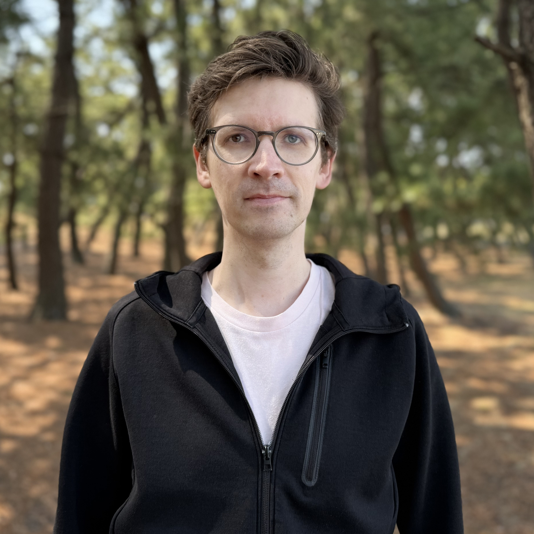
“We’ll take on any case.” Given his broad creative spectrum, the motto of Germany’s very popular youth book and radio play series, Die Drei ??? (The Three Investigators), could well be Gabriel Richter’s own motto. Proof of his typographic versatility can be found in a variety of projects: from his debut work FF Infra (distributed by Monotype) to his retail fonts (e.g. Massimo Grafia (with Andreas Uebele), Neue Television (with Klaus Richter) and Takeoff) published by his own label ‘nice to type’ to a multitude of custom jobs. Gabriel Richter also drew the exclusive Rocky Beach Grotesque for the publisher of Die Drei ??? and the groundbreaking typeface for the multi-award-winning orientation system for the creative agency, serviceplan (both on behalf of the büro uebele). All of Gabriel’s type designs are united by a special, non-conformist, eye-catching twist that interests even those not normally excited by type.
Gabriel’s initial spark for type design came during his studies at the Düsseldorf University of Applied Sciences at a workshop led by Jakob Runge and Max Kostopoulos. An internship at FontShop International, which lasted several months, helped forge his typographic path and enabled him to establish contacts that led to a close collaboration with Christoph Koeberlin. Gabriel supported Christoph in the expansion of Pangea and they have recently worked together on Tausend (both released by Fontwerk). A further internship at the legendary Stuttgart-based agency, büro uebele gave him the opportunity to combine graphic and type design and perhaps explains the dynamic graphic energy that his typefaces exude.
Gabriel not only heeds the advice of his former FontShop mentor Andreas Frohloff, “If you think the comma is long enough, then make it longer,” in his stylistically diverse designs. He now also passes it on to the students at Düsseldorf University of Applied Sciences, where he has taught type design since 2016. Inspired by his former lecturer, Daniel Fels, Gabriel conveys the connection between clear structures, an understanding of form and openness to all styles. This is also where his design career began as part of his communication design studies.
Having now settled down in Japan, the Black metal music fan no longer rules out any genre. He also pursues this stylistic openness in his choice and design of fonts, and thereby helps expand the creative spectrum of our own label.