Push
Push
Seven widths in eight weights? Challenge accepted!


Designer(s)

Christine Gertsch
Christine Gertsch
Christine Gertsch is interested in bringing brands to life through interaction. She teaches this, and much more, in her role as a Lecturer and Head of the CAS Type & Brand faculty at the Zurich University of the Arts (ZHdK) in courses on type design, its digital application and creative coding.
Her progressive and systematic approach is also recognized and praised by her clients which include Reka, Jelmoli, Halsfeger, Sympany and Unicef. As Co-Founder and Organizer of the Typostammtisch Zurich, Christine regularly also brings together typography enthusiasts from across the city.
The self-employed Visual Designer and Type Designer draws on her experience from living and working in five different countries. In addition to her adopted home of Zurich and her hometown of Basel, she has worked in Canada, Denmark, Germany and the Netherlands. During her time on the Type and Media Master’s degree at KABK (Royal Academy of Art), The Hague, her interest in the combination of technical features and design gained particular momentum.
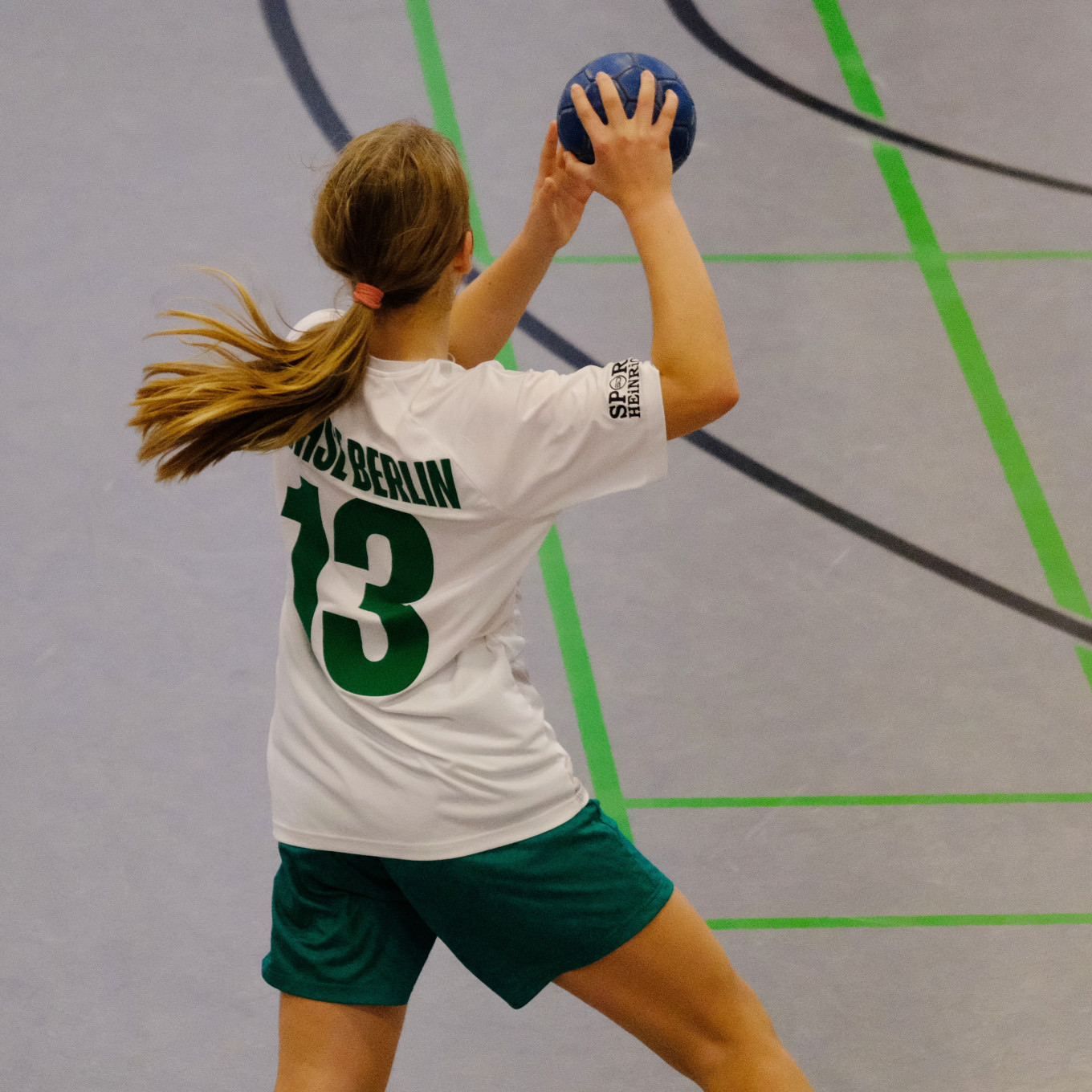
This interest is one of two central themes of her typeface, Push. After various custom font projects and her own font experiments, Christine is now publishing a retail family for the first time. As a hobby cyclist and rower, sporting aspects were also part of the inspiration behind the font’s design concept.
Fonts on Fontwerk
Team & Details
Design Contributions
Andreas Frohloff
Anja Meiners
Mastering, Production
Olli Meier
Marketing
Rocket & Wink Motion Design, Artwork
Christine Gertsch Naming, Artwork
Ivo Gabrowitsch Naming, Copywriting, Specimen
Ferdinand Ulrich Copywriting, German Translation
Lucy Beckley English Translation, Proofreading
Design Period
2021–2024
Release History
Version 1.0: March 19, 2024
Awards
Hiiibrand Design Awards 2024 Silver Award
Technology, Licenses & Trademarks
Formats
Static .otf, .woff2
Variable .ttf, .woff2
Additional formats on request
Licenses
Trial Free test license
Base Includes Desktop, Web and Social Media use
Extended Larger volume, App or Audio-Visual
Additional licenses on request
Modifications, Extensions
Available on request
Variable Fonts
Included in the Family package
2 axes: weight, width
Web file size .woff2: 235 KB
Trademarks
Push™ is a trademark of Fontwerk GmbH
A
Glyphs
Uppercase
A
B
C
D
E
F
G
H
I
J
K
L
M
N
O
P
Q
R
S
T
U
V
W
X
Y
Z
Lowercase
a
b
c
d
e
f
g
h
i
j
k
l
m
n
o
p
q
r
s
t
u
v
w
x
y
z
Latin Accents
Á
Ă
Ǎ
Â
Ä
Ạ
À
Ā
Ą
Å
Ã
Æ
Ć
Č
Ç
Ĉ
Ċ
Ð
Ď
Đ
Ḍ
É
Ĕ
Ě
Ê
Ë
Ė
Ẹ
È
Ē
Ę
Ẽ
Ğ
Ǧ
Ĝ
Ģ
Ġ
Ħ
Ĥ
Ḥ
Í
Ĭ
Ǐ
Î
Ï
İ
Ị
Ì
Ī
Į
Ĩ
Ĵ
Ķ
Ĺ
Ľ
Ļ
Ŀ
Ł
Ń
Ň
Ņ
Ṅ
Ṇ
Ŋ
Ñ
Ó
Ŏ
Ǒ
Ô
Ö
Ọ
Ò
Ő
Ō
Ø
Õ
Œ
Þ
Ŕ
Ř
Ŗ
Ś
Š
Ş
Ŝ
Ș
Ṣ
ẞ
Ə
Ŧ
Ť
Ţ
Ț
Ú
Ŭ
Ǔ
Û
Ü
Ụ
Ù
Ű
Ū
Ų
Ů
Ũ
Ẃ
Ŵ
Ẅ
Ẁ
Ý
Ŷ
Ÿ
Ỳ
Ȳ
Ỹ
Ź
Ž
Ż
Ẓ
á
ă
ǎ
â
ä
ạ
à
ā
ą
å
ã
æ
ć
č
ç
ĉ
ċ
ð
ď
đ
ḍ
é
ĕ
ě
ê
ë
ė
ẹ
è
ē
ę
ẽ
ğ
ǧ
ĝ
ģ
ġ
ħ
ĥ
ḥ
í
ĭ
ǐ
î
ï
̇
ị
ì
ī
į
ĩ
ĵ
ķ
ĺ
ľ
ļ
ŀ
ł
ń
ň
ņ
ṅ
ṇ
ŋ
ñ
ó
ŏ
ǒ
ô
ö
ọ
ò
ő
ō
ø
õ
œ
þ
ŕ
ř
ŗ
ś
š
ş
ŝ
ș
ṣ
ß
ə
ŧ
ť
ţ
ț
ú
ŭ
ǔ
û
ü
ụ
ù
ű
ū
ų
ů
ũ
ẃ
ŵ
ẅ
ẁ
ý
ŷ
ÿ
ỳ
ȳ
ỹ
ź
ž
ż
ẓ
Numerals & Currency Symbols
0
1
2
3
4
5
6
7
8
9
¤
€
$
¢
£
¥
₿
ƒ
₺
0
1
2
3
4
5
6
7
8
9
0
1
2
3
4
5
6
7
8
9
Punctuation
.
,
:
;
…
!
¡
?
¿
&
@
·
•
*
#
/
|
\
(
)
{
}
[
]
-
–
—
‒
‐
‑
_
‚
„
“
”
‘
’
«
»
‹
›
"
'
⟨
⟩
Mathematical Signs & Symbols
∙
⋅
+
−
×
÷
=
≠
>
<
≥
≤
±
≈
~
¬
^
∞
∫
Ω
∆
∏
∑
√
µ
∂
%
‰
Arrows & Shapes
◊
Greek
π
Languages
| A | Abua Acheron Achinese Acholi Achuar-Shiwiar Afar Afrikaans Aguaruna Ahtna Alekano Aleut Amahuaca Amarakaeri Amis Anaang Andaandi,Dongolawi Anuta Arabela Aragonese Arbëreshë Albanian Asháninka Ashéninka Perené Atayal Awa-Cuaiquer |
| B | Balinese Balkan Romani Bari Basque Batak Dairi Batak Karo Batak Mandailing Batak Simalungun Batak Toba Bemba (Zambia) Bena (Tanzania) Bikol Bini Bislama Bora Borana-Arsi-Guji Oromo Bosnian Breton Buginese |
| C | Candoshi-Shapra Caquinte Caribbean Hindustani Cashibo-Cacataibo Cashinahua Catalan Cebuano Central Aymara Central Kurdish Central Nahuatl Chachi Chamorro Chavacano Chayahuita Chiga Chiltepec Chinantec Chokwe Chuukese Cimbrian Cofán Cook Islands Māori Cornish Corsican Creek Crimean Tatar Croatian Czech |
| D | Danish Dehu Dimli Dutch |
| E | Eastern Arrernte Eastern Oromo Efik English |
| F | Faroese Fijian Filipino Finnish French Friulian |
| G | Gagauz Galician Ganda Garifuna German Gheg Albanian Gilbertese Gooniyandi Gourmanchéma Guadel. Creole French Gusii |
| H | Haitian Hani Hiligaynon Hopi Huastec Hungarian Hän |
| I | Icelandic Igbo Iloko Inari Sami Indonesian Irish Istro Romanian Italian Ixcatlán Mazatec |
| J | Jamaican Creole English Japanese Javanese Jola-Fonyi |
| K | K'iche' Kabuverdianu Kaingang Kala Lagaw Ya Kalaallisut Kalenjin Kamba (Kenya) Kaonde Kaqchikel Karelian Kashubian Kekchí Kenzi, Mattokki Khasi Kikuyu Kimbundu Kinyarwanda Kirmanjki Kituba (DRC) Kom (Cameroon) Kongo Konzo Kven Finnish Kölsch |
| L | Ladin Ladino Latgalian Lithuanian Lombard Low German Lower Sorbian Lozi Luba-Lulua Lule Sami Luo (Kenya & Tanzania) Luxembourgish |
| M | Macedo-Romanian Makonde Malagasy Malaysian Maltese Mam Mandinka Mandjak Mankanya Manx Maore Comorian Maori Mapudungun Marshallese Matsés Mauritian Creole Meriam Mir Meru Metlatónoc Mixtec Mi'kmaq Minangkabau Mirandese Mohawk Montenegrin Munsee Murrinh-Patha Murui Huitoto Muslim Tat Mwani Mískito |
| N | Naga Pidgin Ndonga Neapolitan Ngazidja Comorian Niuean Nobiin Nomatsiguenga North Azerbaijani North Ndebele Northern Kurdish Northern Qiandong Miao Northern Sami Northern Uzbek Norwegian Nyanja Nyankole |
| O | Occitan Ojitlán Chinantec Orma Oroqen Otuho |
| P | Palauan Pampanga Papantla Totonac Papiamento Paraguayan Guaraní Pedi Picard Pichis Ashéninka Piemontese Pijin Pintupi-Luritja Pipil Pite Sami Pohnpeian Polish Portuguese Potawatomi Purepecha Páez |
| Q | Quechua |
| R | Romanian Romansh Rotokas Rundi |
| S | Samoan Sango Sangu (Tanzania) Saramaccan Sardinian Scots Scottish Gaelic Sena Seri Seselwa Creole French Sharanahua Shawnee Shipibo-Conibo Shona Shuar Sicilian Silesian Slovak Slovenian Soga Somali Soninke South Azerbaijani South Ndebele Southern Aymara Southern Qiandong Miao Southern Sami Southern Sotho Spanish Sranan Tongo Standard Estonian Standard Latvian Standard Malay Sundanese Swahili Swedish Swiss German |
| T | Tagalog Tahitian Talysh Tedim Chin Tetum Tetun Dili Toba Tok Pisin Tokelau Tonga (Tonga Islands) Tonga (Zambia) Tosk Albanian Tsakhur Tumbuka Turkish Turkmen Tuvalu Tzeltal Tzotzil |
| U | Uab Meto Umbundu Ume Sami Upper Guinea Crioulo Upper Sorbian |
| V | Venetian Veps Vlax Romani Võro |
| W | Walloon Walser Waray (Philippines) Warlpiri Wayuu Welsh West Central Oromo Western Abnaki Western Frisian Wiradjuri Wolof |
| X | Xhosa |
| Y | Yagua Yanesha' Yao Yoruba Yucateco |
| Z | Zapotec Zulu Zuni Záparo |