Case Micro
Case Micro
A matter-of-fact Neo-Grotesque with surprising nuances
Designer(s)
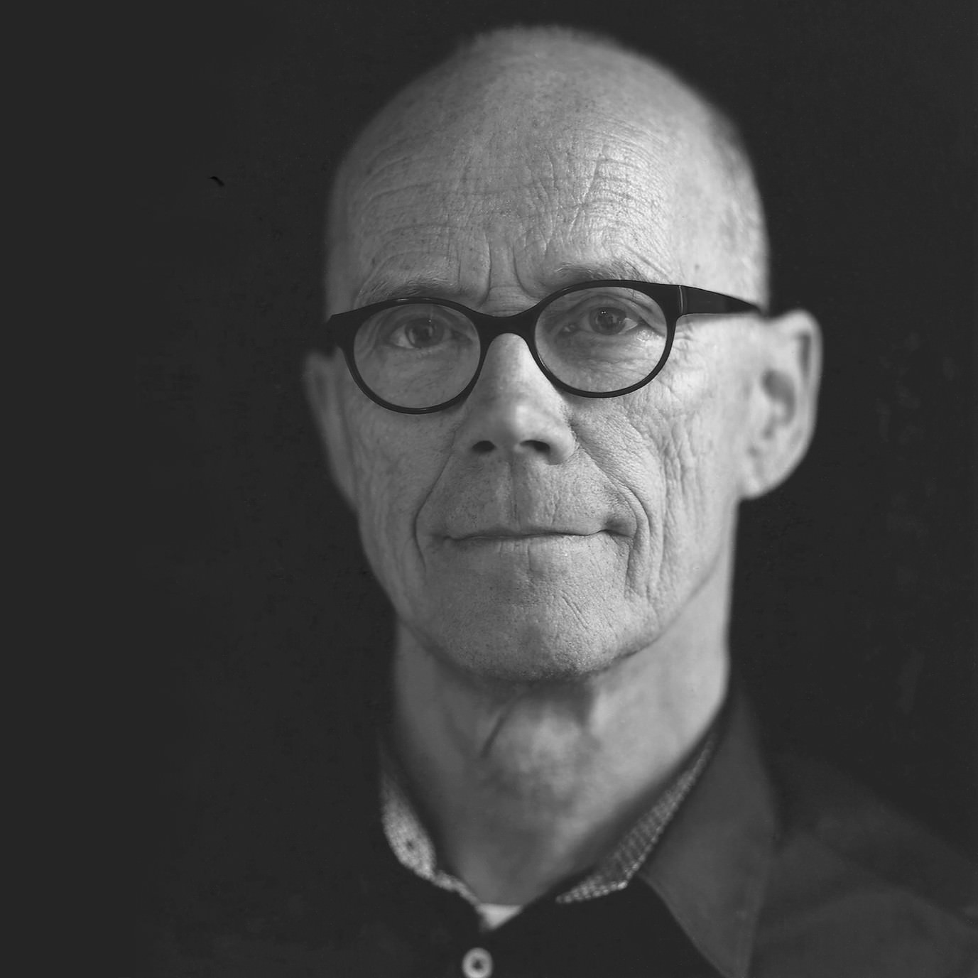
Erik Spiekermann

Anja Meiners

Ralph du Carrois
Erik Spiekermann
What else can one write about the man whose Wikipedia entry has been translated into 15 different languages?
The man, whose shelves are decorated with multiple awards for his life’s work from the most renowned associations and a beautifully framed honorary doctorate certificate. The man, whose reference books and biography became international bestsellers. The man, who has designed more successful typefaces than most foundries have to offer. The man, who is an entertaining guest in audio, film and TV productions (e.g. the legendary BBC video. He is at home in three time zones and owns more bicycles in each place than a large sporty family. He is the man who was heavily involved building two of the most relevant creative agencies, a legendary letterpress workshop, and the most important independent font distributor and the largest library of contemporary typefaces.
So, there is not much left to write about this man. Apart from the fact that Fontwerk would probably not exist without the latter two achievements, our roots lie in the ideals and friendships of the first 25 years of FontShop. The fact that Erik sees his future as a type designer for our label after his enormously successful time at ITC and FontFont is highly appreciated and a hugely motivating obligation for us.
Fonts on Fontwerk
Anja Meiners
Surrounded by the crystal-clear, ice-age lakes at the gates of Berlin, Anja Meiners finds inspiration for distinct and contemporary typefaces.
She lives in the tranquil surroundings of Brandenburg with four generations of her a not quite so tranquil family but the business of the city is always within reach.
Together with Ralph du Carrois, Anja founded bBox Type where they developed exclusive custom fonts for international brands such as ZDF, Cewe and Autodesk. They are also responsible for the popular Fira Sans for Mozilla in cooperation with Erik Spiekermann and team and the multiscript extension FiraGO for the geodata provider ‘here’. In 2022, Anja left bBox to pursue new challenges.
As well as a flair for typefaces, the communication designer has a talent for organizing events, such as the monthly Typostammtisch Berlin, for which she also loves to write for. Another big and important topic for Anja is the process of how kids learn to read and write.
Fonts on Fontwerk
Ralph du Carrois
The graphic design studio founded by Ralph and Jennifer du Carrois soon developed into a type design studio after an extensive corporate type project for Suzuki.
Ralph made a name for himself with international clients such as de Gruyter, zdf, Cisco, Bosch, TERN, Autodesk and Monotype by extending and designing fonts. One of his most extensive projects was Fira Sans for Mozilla, which he developed together with Erik Spiekermann, Anja Meiners and team as well as the extended FiraGo design for the geo provider ‘here’.
With his foundry bBox Type, Ralph serves customers and clients of various sizes from different business areas. bBox has realized projects for zdf, cewe, here, de Gruyter, Mozilla, Neue Nationalgalerie Berlin, Autodesk, Erik Spiekermann, Cisco, Bosch, the City of Rome and many more.
Born in Allgäu, Germany, the graduate Product Designer still devotes his spare time to both his actual field of study and to art. When he left the hustle and bustle of Berlin, new spaces and perspectives opened up for him and his family in Potsdam. Today he lives and works there in a wooden house, which he designed himself.
Fonts on Fontwerk
Team & Details
Design Contributions
Andreas Frohloff
Olli Meier
Eugene Yukechev Cyrillic Consultancy
Donny Trương Vietnamese Consultancy
Mastering, Production
Olli Meier
Andreas Frohloff
Christoph Koeberlin
Marketing
Ivo Gabrowitsch Naming, Conceptual Contribution, Copywriting, Specimen
Susi Sie Motion Design, Artwork
Lars Wagner Executive Producer
Nikolai von Sallwitz Sound Design
Anja Knust Graphic Design
Tobias Peil Motion Design Edits
Lucy Beckley English Translation
Design Period
2016–2023
Release History
Version 1.00: Oct 12, 2020
Version 1.01: Oct 26, 2020 minor bug fixes
Version 2.00: June 12, 2023 40 new styles added; smaller x-height (Case Text); Cyrillic, Greek and 100+ further Latin languages added (incl. Vietnamese and African Latin); unicase feature; minor bug fixes → not backward compatible with previous versions!
Version 2.01: May 19, 2025 Stylistic Set 04 added (Alternative Dollar and Cent symbol)
Technology, Licenses & Trademarks
Formats
Static .otf, .woff2
Variable .ttf, .woff2
Additional formats on request
Licenses
Trial Free test license
Base Includes Desktop, Web and Social Media use
Extended Larger volume, App or Audio-Visual
Additional licenses on request
Modifications, Extensions
Available on request
Variable Fonts
Included in the Collection package
2 axes: weight, optical size
Web file sizes .woff2: 380 KB Upright; 424 Italic
Trademarks
Case Micro™ is a trademark of Fontwerk GmbH
A
Glyphs
Uppercase
A
B
C
D
E
F
G
H
I
J
K
L
M
N
O
P
Q
R
S
T
U
V
W
X
Y
Z
Lowercase
a
b
c
d
e
f
g
h
i
j
k
l
m
n
o
p
q
r
s
t
u
v
w
x
y
z
Latin Accents
Á
Ă
Ắ
Ặ
Ằ
Ẳ
Ẵ
Â
Ấ
Ậ
Ầ
Ẩ
Ẫ
Ä
Ạ
À
Ả
Ā
Ą
Å
Ã
Æ
Ć
Č
Ç
Ĉ
Ċ
Ð
Ď
Đ
É
Ĕ
Ě
Ê
Ế
Ệ
Ề
Ể
Ễ
Ë
Ė
Ẹ
È
Ẻ
Ē
Ę
Ẽ
Ğ
Ĝ
Ģ
Ġ
Ħ
Ĥ
Í
Ĭ
Î
Ï
İ
Ị
Ì
Ỉ
Ī
Į
Ĩ
Ĵ
Ķ
Ĺ
Ľ
Ļ
Ŀ
Ł
Ń
Ň
Ņ
Ŋ
Ñ
Ó
Ŏ
Ô
Ố
Ộ
Ồ
Ổ
Ỗ
Ö
Ọ
Ò
Ỏ
Ơ
Ớ
Ợ
Ờ
Ở
Ỡ
Ő
Ō
Ø
Õ
Œ
Þ
Ŕ
Ř
Ŗ
Ś
Š
Ş
Ŝ
Ș
ẞ
Ə
Ŧ
Ť
Ţ
Ț
Ú
Ŭ
Û
Ü
Ụ
Ù
Ủ
Ư
Ứ
Ự
Ừ
Ử
Ữ
Ű
Ū
Ų
Ů
Ũ
Ẃ
Ŵ
Ẅ
Ẁ
Ý
Ŷ
Ÿ
Ỵ
Ỳ
Ỷ
Ỹ
Ź
Ž
Ż
á
ă
ắ
ặ
ằ
ẳ
ẵ
â
ấ
ậ
ầ
ẩ
ẫ
ä
ạ
à
ả
ā
ą
å
ã
æ
ć
č
ç
ĉ
ċ
ð
ď
đ
é
ĕ
ě
ê
ế
ệ
ề
ể
ễ
ë
ė
ẹ
è
ẻ
ē
ę
ẽ
ğ
ĝ
ģ
ġ
ħ
ĥ
í
ĭ
î
ï
̇
ị
ì
ỉ
ī
į
ĩ
ĵ
ķ
ĺ
ľ
ļ
ŀ
ł
ń
ň
ņ
ŋ
ñ
ó
ŏ
ô
ố
ộ
ồ
ổ
ỗ
ö
ọ
ò
ỏ
ơ
ớ
ợ
ờ
ở
ỡ
ő
ō
ø
õ
œ
þ
ŕ
ř
ŗ
ś
š
ş
ŝ
ș
ß
ə
ŧ
ť
ţ
ț
ú
ŭ
û
ü
ụ
ù
ủ
ư
ứ
ự
ừ
ử
ữ
ű
ū
ų
ů
ũ
ẃ
ŵ
ẅ
ẁ
ý
ŷ
ÿ
ỵ
ỳ
ỷ
ỹ
ź
ž
ż
Numerals & Currency Symbols
0
1
2
3
4
5
6
7
8
9
¤
€
$
¢
£
¥
₿
₫
ƒ
₴
₺
₼
₽
₹
₸
₮
0
1
2
3
4
5
6
7
8
9
(
)
+
0
1
2
3
4
5
6
7
8
9
=
−
(
)
+
0
1
2
3
4
5
6
7
8
9
=
−
Small Caps
!
$
&
(
)
0
1
2
3
4
5
6
7
8
9
?
[
]
a
b
c
d
e
f
g
h
i
j
k
l
m
n
o
p
q
r
s
t
u
v
w
x
y
z
{
}
¡
£
¥
¿
ß
à
á
â
ã
ä
å
æ
ç
è
é
ê
ë
ì
í
î
ï
ð
ñ
ò
ó
ô
õ
ö
ø
ù
ú
û
ü
ý
þ
ÿ
ā
ă
ą
ć
ĉ
ċ
č
ď
đ
ē
ĕ
ė
ę
ě
ĝ
ğ
ġ
ģ
ĥ
ħ
ĩ
ī
ĭ
į
ij
ĵ
ķ
ĺ
ļ
ľ
ŀ
ł
ń
ņ
ň
ŋ
ō
ŏ
ő
œ
ŕ
ŗ
ř
ś
ŝ
ş
š
ţ
ť
ŧ
ũ
ū
ŭ
ů
ű
ų
ŵ
ŷ
ź
ż
ž
ơ
ư
ș
ț
ȷ
ə
̀
́
̂
̃
̄
̆
̇
̈
̊
̋
̌
ά
έ
ή
ί
ΰ
α
β
γ
δ
ε
ζ
η
θ
ι
κ
λ
μ
ν
ξ
ο
π
ρ
ς
σ
τ
υ
φ
χ
ψ
ω
ϊ
ϋ
ό
ύ
ώ
а
б
в
г
д
е
ж
з
и
й
к
л
м
н
о
п
р
с
т
у
ф
х
ц
ч
ш
щ
ъ
ы
ь
э
ю
я
ѐ
ё
ђ
ѓ
є
ѕ
і
ї
ј
љ
њ
ћ
ќ
ѝ
ў
џ
ѣ
ѳ
ѵ
ґ
ғ
җ
ҙ
қ
ҝ
ҡ
ң
ҥ
ҫ
ү
ұ
ҳ
ҷ
ҹ
һ
ӂ
ӏ
ӑ
ӕ
ӗ
ә
ӣ
ӧ
ө
ӯ
ӳ
ẁ
ẃ
ẅ
ạ
ả
ấ
ầ
ẩ
ẫ
ậ
ắ
ằ
ẳ
ẵ
ặ
ẹ
ẻ
ẽ
ế
ề
ể
ễ
ệ
ỉ
ị
ọ
ỏ
ố
ồ
ổ
ỗ
ộ
ớ
ờ
ở
ỡ
ợ
ụ
ủ
ứ
ừ
ử
ữ
ự
ỳ
ỵ
ỷ
ỹ
€
₮
₴
₸
₹
₺
₼
₽
₿
№
Punctuation
.
,
:
;
…
!
¡
?
¿
&
@
·
•
*
#
/
|
\
(
)
{
}
[
]
-
–
—
‒
―
‐
‑
_
‚
„
“
”
‘
’
«
»
‹
›
‴
"
'
⟨
⟩
Mathematical Signs & Symbols
∙
≅
⋅
≙
+
−
×
÷
=
≠
>
<
≥
≤
±
≈
~
¬
^
∞
∫
Ω
∆
∏
∑
√
µ
∂
%
‰
Arrows & Shapes
↑
↗
→
↘
↓
↙
←
↖
●
○
◊
■
□
▲
▼
△
▽
▴
▸
▾
◂
Ligatures
ffi
ffj
ffl
ff
fi
fj
fl
ft
fi
fl
Greek
Α
Β
Γ
Ε
Ζ
Η
Θ
Ι
Κ
Λ
Μ
Ν
Ξ
Ο
Π
Ρ
Σ
Τ
Υ
Φ
Χ
Ψ
Ά
Έ
Ή
Ί
Ό
Ύ
Ώ
Ϊ
Ϋ
α
β
γ
δ
ε
ζ
η
θ
ι
κ
λ
ν
ξ
ο
π
ρ
σ
τ
υ
φ
χ
ψ
ω
ί
ϊ
ΐ
ύ
ϋ
ΰ
ό
ώ
ά
έ
ή
·
΄
΅
Cyrillic
А
Б
В
Г
Ѓ
Ґ
Д
Е
Ѐ
Ё
Ж
З
И
Й
Ѝ
К
Ќ
Л
М
Н
О
П
Р
С
Т
У
Ў
Ф
Х
Ч
Ц
Ш
Щ
Џ
Ь
Ъ
Ы
Љ
Њ
Ѕ
Є
Э
І
Ї
Ј
Ћ
Ю
Я
Ђ
Ѣ
Ѳ
Ѵ
Ғ
Җ
Ҙ
Қ
Ҝ
Ҡ
Ң
Ҥ
Ҫ
Ү
Ұ
Ҳ
Ҷ
Ҹ
Һ
Ӏ
Ӂ
Ӑ
Ӕ
Ӗ
Ә
Ӣ
Ӧ
Ө
Ӯ
Ӳ
а
б
в
г
ѓ
ґ
д
е
ѐ
ё
ж
з
и
й
ѝ
к
ќ
л
м
н
о
п
р
с
т
у
ў
ф
х
ч
ц
ш
щ
џ
ь
ъ
ы
љ
њ
ѕ
є
э
і
ї
ј
ћ
ю
я
ђ
ѣ
ѳ
ѵ
ғ
җ
ҙ
қ
ҝ
ҡ
ң
ҥ
ҫ
ү
ұ
ҳ
ҷ
ҹ
һ
ӏ
ӂ
ӑ
ӕ
ӗ
ә
ӣ
ӧ
ө
ӯ
ӳ
Languages
| A | Abaza Abron Abua Acheron Achinese Acholi Achuar-Shiwiar Adamawa Fulfulde Adangme Adyghe Afar Afrikaans Aghul Aguaruna Ahtna Akhvakh Akoose Alekano Aleut Altai Amahuaca Amarakaeri Amis Anaang Andaandi Angas Anufo Anuta Ao Naga Apinayé Arabela Aragonese Arbëreshë Albanian Archi Arvanitika Albanian Asháninka Ashéninka Perené Asu (Tanzania) Atayal Avar Awa-Cuaiquer Awing Azerbaijani (North, South) Azeri |
| B | Baatonum Bafia Bagirmi Fulfulde Balante-Ganja Balinese Balkan Romani Balkar Bambara Baoulé Bari Bashkir Basque Bassari Batak Dairi Batak Karo Batak Mandailing Batak Simalungun Batak Toba Belarusian Bemba (Zambia) Bena (Tanzania) Biali Bikol Bini Bislama Boko (Benin) Bomu Bora Borana-Arsi-Guji Oromo Borgu Fulfulde Bosnian Bosnian Breton Buginese Bulgarian Buryat Bushi |
| C | Candoshi-Shapra Caquinte Caribbean Hindustani Cashibo-Cacataibo Cashinahua Catalan Cebuano Centr.-East. Niger Fulfulde Central Aymara Central Kurdish Central Nahuatl Cerma Chachi Chamorro Chavacano Chayahuita Chechen Chiga Chiltepec Chinantec Chokwe Chuukese Chuvash Cimbrian Cofán Congo Swahili Cook Islands Māori Cornish Corsican Creek Crimean Tatar Crimean-Tatar Croatian Czech |
| D | Danish Dargin Daur Dehu Dendi (Benin) Dimli Dongolawi Duala Dungan Dutch Dyan Dyula |
| E | Eastern Arrernte Eastern Maninkakan Eastern Oromo Efik Embu English Ese Ejja Esperanto Estonian (Standard) |
| F | Fanti Faroese Fijian Filipino Finnish French Friulian |
| G | Ga Gagauz Gagauz Galician Ganda Garifuna Ga’anda German Gheg Albanian Gilbertese Gonja Gooniyandi Gourmanchéma Guadeloup. Creole French Gusii |
| H | Haitian Hani Hausa Hawaiian Hiligaynon Ho-Chunk Hopi Huastec Hungarian |
| I | Ibibio Icelandic Idoma Igbo Iloko Inari Sami Indonesian Ingush Irish Istro Romanian Italian Ixcatlán Mazatec |
| J | Jamaican Creole English Javanese Jenaama Bozo Jola-Fonyi Judeo-Tat |
| K | Kabardian Kabuverdianu Kaingang Kala Lagaw Ya Kalaallisut Kalenjin Kalmyk Kamba (Kenya) Kaonde Kaqchikel Karaim Karakalpak Karata Karelian Karelian Kashubian Kazakh Kekchí Kenzi Khakas Khasi Kikuyu Kimbundu Kinyarwanda Kirghyz Kirmanjki Kituba (DRC) Kom (Cameroon) Komi-Permyak Komi-Yazva Komi-Zyryan Kongo Konzo Koyra Chiini Songhay Koyraboro Senni Songhai Krio Kuanyama Kumyk Kven Finnish Kwasio Kölsch K’iche’ |
| L | Ladin Ladino Lak Latgalian Latin Latvian (Standard) Lezgian Ligurian Lingala Lithuanian Lombard Low German Lower Sorbian Lozi Luba-Katanga Luba-Lulua Lule Sami Luo (Kenya & Tanzania) Luxembourgish |
| M | Maasina Fulfulde Macedo-Romanian Macedonian Makhuwa Makhuwa-Meetto Makonde Makwe Malagasy Malay (Standard) Malaysian Maltese Mam Mamara Senoufo Mandinka Mandjak Mankanya Manx Maore Comorian Maori Mapudungun Mari (Eastern, Western) Marquesan (North, South) Marshallese Matsés Mattokki Mauritian Creole Mende (Sierra Leone) Meriam Mir Meru Meta’ Metlatónoc Mixtec Mezquital Otomi Minangkabau Mirandese Mi’kmaq Moba Modern Greek Mohawk Moldovan Mongolian Montenegrin Montenegrin Mordvin (Erzya) Mordvin (Moksha) Munsee Murrinh-Patha Murui Huitoto Muslim Tat Mwani Ménik Mískito |
| N | Naga Pidgin Nanai Ndebele (North, South) Ndonga Neapolitan Ngazidja Comorian Nigerian Fulfulde Niuean Nobiin Nogai Nomatsiguenga Noon Northern Kissi Northern Kurdish Northern Qiandong Miao Northern Sami Northern Uzbek Norwegian Nyamwezi Nyanja Nyankole Nyemba Nzima |
| O | Occitan Ojitlán Chinantec Orma Oroqen Ossetic Otuho |
| P | Palauan Paluan Pampanga Papantla Totonac Papiamento Paraguayan Guaraní Pedi Picard Pichis Ashéninka Piemontese Pijin Pintupi-Luritja Pipil Pite Sami Pohnpeian Polish Pontic Greek Portuguese Potawatomi Pulaar Purepecha Páez |
| Q | Quechua |
| R | Romanian Romansh Rotokas Rundi Russian Rusyn Rutul Rwa |
| S | Saafi-Saafi Samburu Samoan Sango Sangu (Tanzania) Saramaccan Sardinian Scottish Gaelic Secoya Sena Serbian Serbian Seri Seselwa Creole French Shambala Sharanahua Shawnee Shilluk Shipibo-Conibo Shona Shuar Sicilian Silesian Siona Slovak Slovenian Soga Somali Soninke Southern Aymara Southern Bobo Madaré Southern Dagaare Southern Sami Southern Sotho Spanish Sranan Tongo Sundanese Susu Swahili Swati Swedish Swiss German Syenara Senoufo |
| T | Tabasaran Tagalog Tahitian Taita Tajik (Cyrillic) Talysh Talysh Tasawaq Tat Tatar Tedim Chin Tetum Tetun Dili Timne Tiv Tiéyaxo Bozo Toba Tofalar Tok Pisin Tokelau Tonga (Tonga Islands) Tonga (Zambia) Tosk Albanian Totontepec Mixe Tsakhur Tsakhur Tsonga Tswana Tumbuka Turkish Turkmen Turkmen Tuvalu Tuvan Twi Tzeltal Tzotzil |
| U | Uab Meto Udmurt Uighur Ukrainian Umbundu Ume Sami Upper Guinea Crioulo Upper Sorbian Uzbek |
| V | Venetian Veps Veps Vietnamese Vlax Romani Võro |
| W | Waama Wallisian Walloon Walser Wamey Wangaaybuwan-Ngiyambaa Waorani Waray (Philippines) Warlpiri Wasa Wayuu Welsh West Central Oromo West-Central Limba Western Abnaki Western Frisian Western Niger Fulfulde Wik-Mungkan Wiradjuri Wolof |
| X | Xavánte Xhosa |
| Y | Yagua Yanesha’ Yangben Yanomamö Yao Yapese Yindjibarndi Yoruba Yucateco |
| Z | Zapotec Zarma Zulu Zuni Záparo |
| A | Abron Abua Acheron Achinese Acholi Achuar-Shiwiar Adamawa Fulfulde Adangme Afar Afrikaans Aguaruna Ahtna Akoose Alekano Aleut Amahuaca Amarakaeri Amis Anaang Andaandi Angas Anufo Anuta Ao Naga Apinayé Arabela Aragonese Arbëreshë Albanian Arvanitika Albanian Asháninka Ashéninka Perené Asu (Tanzania) Atayal Awa-Cuaiquer Awing Azerbaijani (North, South) |
| B | Baatonum Bafia Bagirmi Fulfulde Balante-Ganja Balinese Balkan Romani Bambara Baoulé Bari Basque Bassari Batak Dairi Batak Karo Batak Mandailing Batak Simalungun Batak Toba Bemba (Zambia) Bena (Tanzania) Biali Bikol Bini Bislama Boko (Benin) Bomu Bora Borana-Arsi-Guji Oromo Borgu Fulfulde Bosnian Breton Buginese Bushi |
| C | Candoshi-Shapra Caquinte Caribbean Hindustani Cashibo-Cacataibo Cashinahua Catalan Cebuano Centr.-East. Niger Fulfulde Central Aymara Central Kurdish Central Nahuatl Cerma Chachi Chamorro Chavacano Chayahuita Chiga Chiltepec Chinantec Chokwe Chuukese Cimbrian Cofán Congo Swahili Cook Islands Māori Cornish Corsican Creek Crimean Tatar Croatian Czech |
| D | Danish Dehu Dendi (Benin) Dimli Dongolawi Duala Dutch Dyan Dyula |
| E | Eastern Arrernte Eastern Maninkakan Eastern Oromo Efik Embu English Ese Ejja Esperanto Estonian (Standard) |
| F | Fanti Faroese Fijian Filipino Finnish French Friulian |
| G | Ga Gagauz Galician Ganda Garifuna Ga’anda German Gheg Albanian Gilbertese Gonja Gooniyandi Gourmanchéma Guadeloup. Creole French Gusii |
| H | Haitian Hani Hausa Hawaiian Hiligaynon Ho-Chunk Hopi Huastec Hungarian |
| I | Ibibio Icelandic Idoma Igbo Iloko Inari Sami Indonesian Irish Istro Romanian Italian Ixcatlán Mazatec |
| J | Jamaican Creole English Javanese Jenaama Bozo Jola-Fonyi |
| K | Kabuverdianu Kaingang Kala Lagaw Ya Kalaallisut Kalenjin Kamba (Kenya) Kaonde Kaqchikel Karelian Kashubian Kekchí Kenzi Khasi Kikuyu Kimbundu Kinyarwanda Kirmanjki Kituba (DRC) Kom (Cameroon) Kongo Konzo Koyra Chiini Songhay Koyraboro Senni Songhai Krio Kuanyama Kven Finnish Kwasio Kölsch K’iche’ |
| L | Ladin Ladino Latgalian Latin Latvian (Standard) Ligurian Lingala Lithuanian Lombard Low German Lower Sorbian Lozi Luba-Katanga Luba-Lulua Lule Sami Luo (Kenya & Tanzania) Luxembourgish |
| M | Maasina Fulfulde Macedo-Romanian Makhuwa Makhuwa-Meetto Makonde Makwe Malagasy Malay (Standard) Malaysian Maltese Mam Mamara Senoufo Mandinka Mandjak Mankanya Manx Maore Comorian Maori Mapudungun Marquesan (North, South) Marshallese Matsés Mattokki Mauritian Creole Mende (Sierra Leone) Meriam Mir Meru Meta’ Metlatónoc Mixtec Mezquital Otomi Minangkabau Mirandese Mi’kmaq Moba Mohawk Montenegrin Munsee Murrinh-Patha Murui Huitoto Muslim Tat Mwani Ménik Mískito |
| N | Naga Pidgin Ndebele (North, South) Ndonga Neapolitan Ngazidja Comorian Nigerian Fulfulde Niuean Nobiin Nomatsiguenga Noon Northern Kissi Northern Kurdish Northern Qiandong Miao Northern Sami Northern Uzbek Norwegian Nyamwezi Nyanja Nyankole Nyemba Nzima |
| O | Occitan Ojitlán Chinantec Orma Oroqen Otuho |
| P | Palauan Paluan Pampanga Papantla Totonac Papiamento Paraguayan Guaraní Pedi Picard Pichis Ashéninka Piemontese Pijin Pintupi-Luritja Pipil Pite Sami Pohnpeian Polish Portuguese Potawatomi Pulaar Purepecha Páez |
| Q | Quechua |
| R | Romanian Romansh Rotokas Rundi Rwa |
| S | Saafi-Saafi Samburu Samoan Sango Sangu (Tanzania) Saramaccan Sardinian Scottish Gaelic Secoya Sena Serbian Seri Seselwa Creole French Shambala Sharanahua Shawnee Shilluk Shipibo-Conibo Shona Shuar Sicilian Silesian Siona Slovak Slovenian Soga Somali Soninke Southern Aymara Southern Bobo Madaré Southern Dagaare Southern Sami Southern Sotho Spanish Sranan Tongo Sundanese Susu Swahili Swati Swedish Swiss German Syenara Senoufo |
| T | Tagalog Tahitian Taita Talysh Tasawaq Tedim Chin Tetum Tetun Dili Timne Tiv Tiéyaxo Bozo Toba Tok Pisin Tokelau Tonga (Tonga Islands) Tonga (Zambia) Tosk Albanian Totontepec Mixe Tsakhur Tsonga Tswana Tumbuka Turkish Turkmen Tuvalu Twi Tzeltal Tzotzil |
| U | Uab Meto Umbundu Ume Sami Upper Guinea Crioulo Upper Sorbian |
| V | Venetian Veps Vietnamese Vlax Romani Võro |
| W | Waama Wallisian Walloon Walser Wamey Wangaaybuwan-Ngiyambaa Waorani Waray (Philippines) Warlpiri Wasa Wayuu Welsh West Central Oromo West-Central Limba Western Abnaki Western Frisian Western Niger Fulfulde Wik-Mungkan Wiradjuri Wolof |
| X | Xavánte Xhosa |
| Y | Yagua Yanesha’ Yangben Yanomamö Yao Yapese Yindjibarndi Yoruba Yucateco |
| Z | Zapotec Zarma Zulu Zuni Záparo |
| A | Abaza Adyghe Aghul Akhvakh Altai Archi Avar Azeri |
| B | Balkar Bashkir Belarusian Bosnian Bulgarian Buryat |
| C | Chechen Chuvash Crimean-Tatar |
| D | Dargin Daur Dungan |
| G | Gagauz |
| I | Ingush |
| J | Judeo-Tat |
| K | Kabardian Kalmyk Karaim Karakalpak Karata Karelian Kazakh Khakas Kirghyz Komi-Permyak Komi-Yazva Komi-Zyryan Kumyk |
| L | Lak Lezgian |
| M | Macedonian Mari (Eastern, Western) Moldovan Mongolian Montenegrin Mordvin (Erzya) Mordvin (Moksha) |
| N | Nanai Nogai |
| O | Ossetic |
| R | Russian Rusyn Rutul |
| S | Serbian |
| T | Tabasaran Tajik (Cyrillic) Talysh Tat Tatar Tofalar Tsakhur Turkmen Tuvan |
| U | Udmurt Uighur Ukrainian Uzbek |
| V | Veps |
| M | Modern Greek |
| P | Pontic Greek |