Supermarker
Supermarker
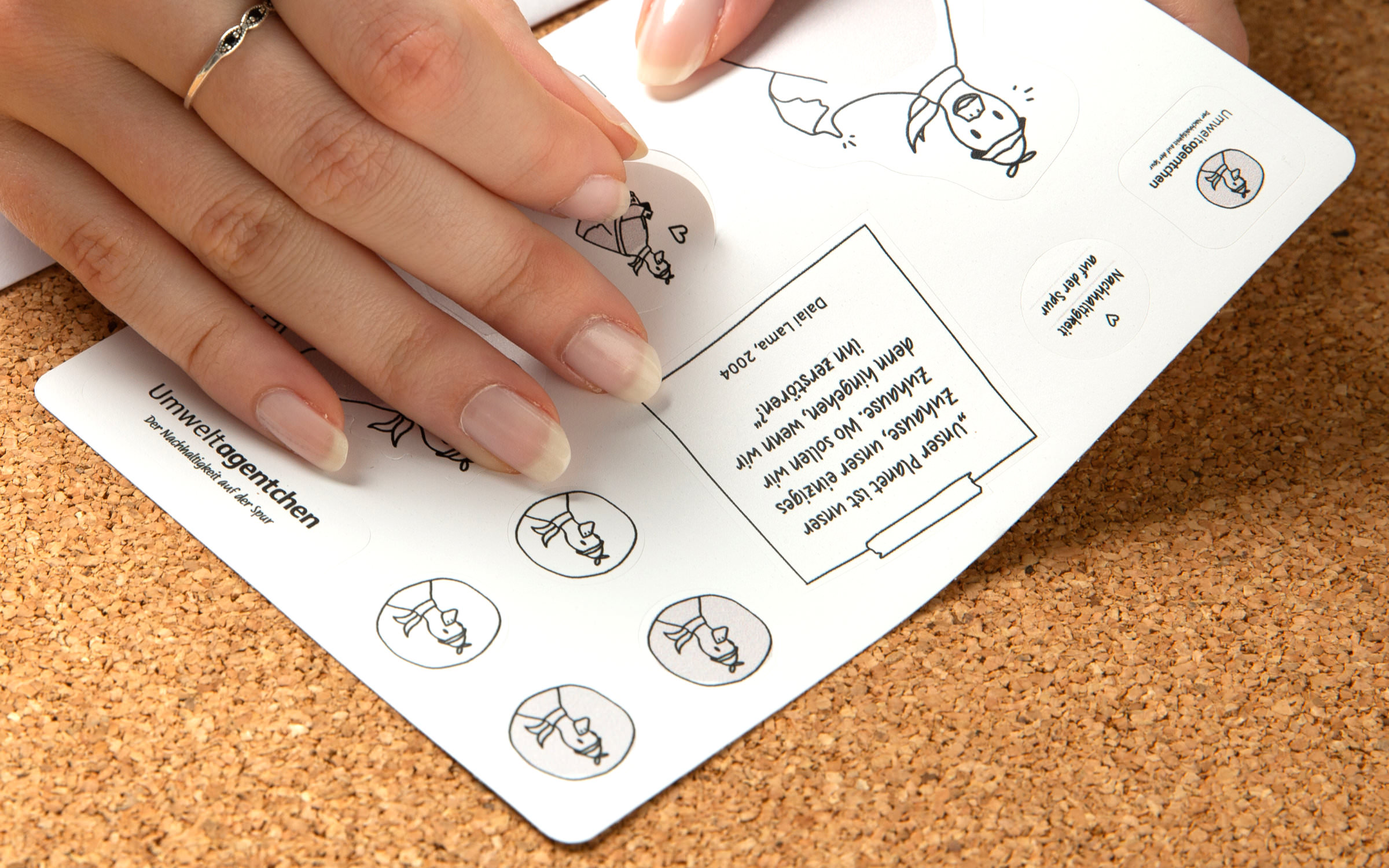
Supermarker’s Mission: To Sell!
Designer(s)
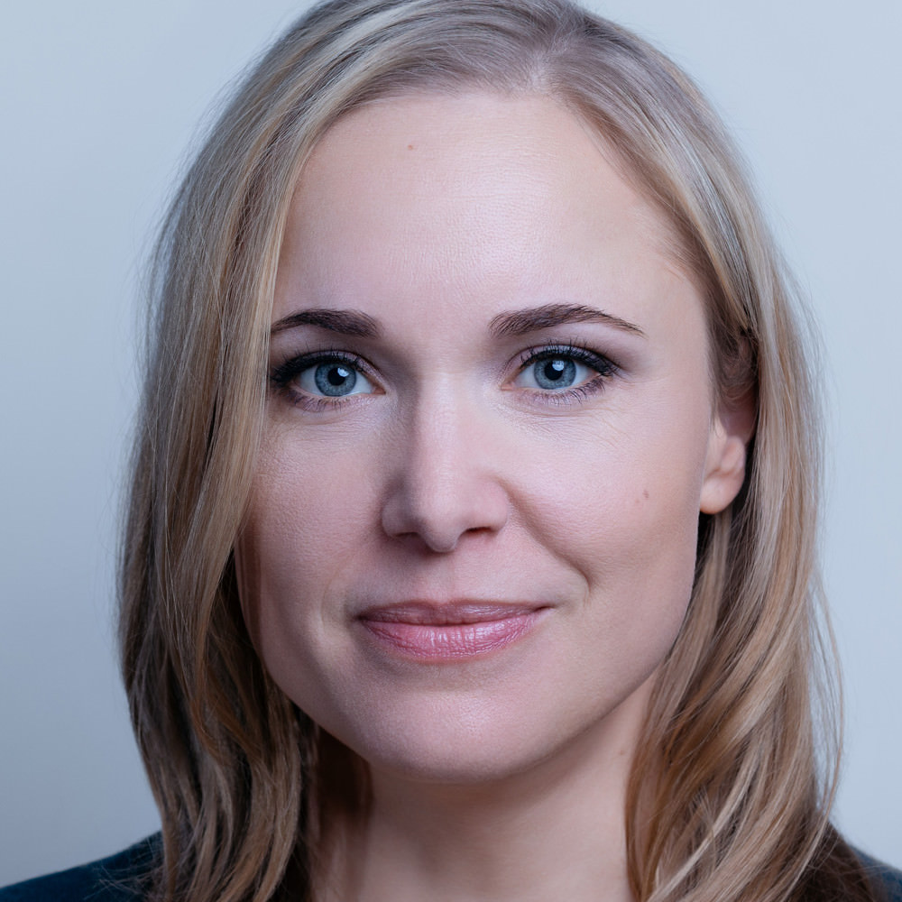
Ulrike Rausch
Ulrike Rausch
Berlin Letters is the name of the typography and lettering festival that Berlin-based Designer Ulrike Rausch set up with three other partners, and it could easily be the name of her own label.
But in fact, this is called LiebeFonts and has long been a byword for lovers of handmade fonts with outstanding quality – something that has often been missing in this particular sector. Since 2009, she has combined her creative talent with an extra special enthusiasm for code and sophisticated OpenType features. She was not only one of the pioneers for the script and lettering trend of recent years, she is also a highly valued consultant for clients such as Apple or Adobe, as well as for event organizers, at whose events she is a welcome speaker.
Together with lettering designer Chris Campe, Ulrike recently wrote a book Making Fonts!, in which she passes on her knowledge of type design and font production. Supermarker is the first font that she has published outside of her own label, and we couldn’t be happier that she chose Fontwerk.
Fonts on Fontwerk
Team & Details
Design Contributions
Mastering, Production
Andreas Frohloff
Christoph Koeberlin
Rosalie Wagner Variable Fonts
Marketing
Ulrike Rausch Naming
Ivo Gabrowitsch Naming, Copywriting, Specimen, Imagery (© Shutterstock)
Anja Knust Graphic Design, Imagery
Lucy Beckley English Translation
Design Period
2017–2020
Release History
July 20, 2020; Variable Fonts February 15, 2022
Recommended Use
Technology, Licenses & Trademarks
Formats
Static .otf, .woff2
Variable .ttf, .woff2
Additional formats on request
Licenses
Trial Free test license
Base Includes Desktop, Web and Social Media use
Extended Larger volume, App or Audio-Visual
Additional licenses on request
Modifications, Extensions
Available on request
Variable Fonts
Included in the Family package
1 axis: weight
Web file sizes .woff2: 226 KB Upright, 261 KB Italic
Trademarks
Supermarker™ is a trademark of Fontwerk GmbH
A
Glyphs
Uppercase
A
B
C
D
E
F
G
H
I
J
K
L
M
N
O
P
Q
R
S
T
U
V
W
X
Y
Z
Lowercase
a
b
c
d
e
f
g
h
i
j
k
l
m
n
o
p
q
r
s
t
u
v
w
x
y
z
Latin Accents
Á
Ă
Â
Ä
À
Ā
Ą
Å
Ã
Æ
Ć
Č
Ç
Ĉ
Ċ
Ð
Ď
Đ
É
Ĕ
Ě
Ê
Ë
Ė
È
Ē
Ę
Ğ
Ĝ
Ģ
Ġ
Ħ
Ĥ
Í
Ĭ
Î
Ï
İ
Ì
Ī
Į
Ĩ
Ĵ
Ķ
Ĺ
Ľ
Ļ
Ŀ
Ł
Ń
Ň
Ņ
Ŋ
Ñ
Ó
Ŏ
Ô
Ö
Ò
Ő
Ō
Ø
Õ
Œ
Þ
Ŕ
Ř
Ŗ
Ś
Š
Ş
Ŝ
Ș
ẞ
Ə
Ŧ
Ť
Ţ
Ț
Ú
Ŭ
Û
Ü
Ù
Ű
Ū
Ų
Ů
Ũ
Ẃ
Ŵ
Ẅ
Ẁ
Ý
Ŷ
Ÿ
Ỳ
Ź
Ž
Ż
á
ă
â
ä
à
ā
ą
å
ã
æ
ć
č
ç
ĉ
ċ
ð
ď
đ
é
ĕ
ě
ê
ë
ė
è
ē
ę
ğ
ĝ
ģ
ġ
ħ
ĥ
í
ĭ
î
ï
̇
ì
ī
į
ĩ
ĵ
ķ
ĺ
ľ
ļ
ŀ
ł
ń
ň
ņ
ŋ
ñ
ó
ŏ
ô
ö
ò
ő
ō
ø
õ
œ
þ
ŕ
ř
ŗ
ś
š
ş
ŝ
ș
ß
ə
ŧ
ť
ţ
ț
ú
ŭ
û
ü
ù
ű
ū
ų
ů
ũ
ẃ
ŵ
ẅ
ẁ
ý
ŷ
ÿ
ỳ
ź
ž
ż
Numerals & Currency Symbols
0
1
2
3
4
5
6
7
8
9
¤
€
$
¢
£
¥
₿
ƒ
₺
0
1
2
3
4
5
6
7
8
9
0
1
2
3
4
5
6
7
8
9
0
1
2
3
4
5
6
7
8
9
Punctuation
.
,
:
;
…
!
¡
?
¿
&
@
·
•
*
‽
⸘
#
/
|
\
(
)
{
}
[
]
-
–
—
‒
‐
‑
_
‚
„
“
”
‘
’
«
»
‹
›
‴
"
'
⟨
⟩
Mathematical Signs & Symbols
∙
≅
⋅
≙
+
−
×
÷
=
≠
>
<
≥
≤
±
≈
~
¬
^
∞
∫
Ω
∆
∏
∑
√
µ
∂
%
‰
Arrows & Shapes
↑
↗
→
↘
↓
↙
←
↖
●
○
◊
■
□
▲
▼
△
▽
▴
▸
▾
◂
Ligatures
ff
fi
fn
fr
ft
fu
fy
łł
th
ti
tn
tr
tt
tu
ty
Greek
π
Languages
| A | Afrikaans Albanian Asu |
| B | Basque Bemba Bena Breton |
| C | Catalan Cornish Croatian Czech |
| D | Danish Dutch |
| E | Embu English Esperanto Estonian |
| F | Faroese Filipino Finnish French Friulian |
| G | Galician Ganda German Gusii |
| H | Hungarian |
| I | Icelandic Inari Sami Indonesian Irish Italian |
| J | Jola-Fonyi |
| K | Kabuverdianu Kalenjin Kamba Kikuyu Kinyarwanda |
| L | Latvian Lithuanian Lower Sorbian Luo Luxembourgish Luyia |
| M | Machame Makhuwa-Meetto Makonde Malagasy Maltese Manx Meru Morisyen |
| N | North Ndebele Northern Sami Norwegian Bokmål Norwegian Nynorsk Nyankole |
| O | Oromo |
| P | Polish Portuguese |
| Q | Quechua |
| R | Romanian Romansh Rombo Rundi Rwa |
| S | Samburu Sango Sangu Sena Serbian Shambala Shona Slovak Slovenian Soga Somali Spanish Swahili Swedish Swiss German |
| T | Taita Teso Turkish |
| U | Upper Sorbian Uzbek |
| V | Volapük Vunjo |
| W | Walser Welsh |