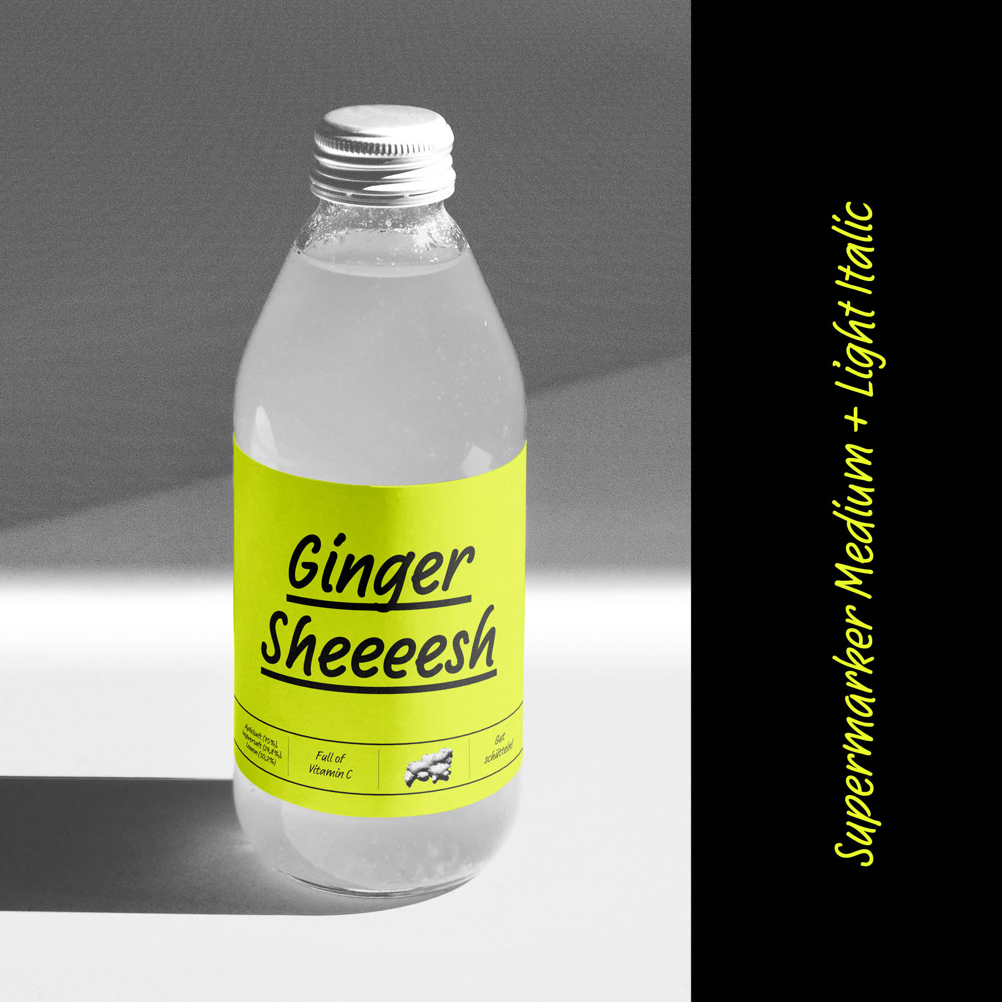
Supermarker

Font Story: Supermarker’s Mission: To Sell!

A typographic influencer for retail

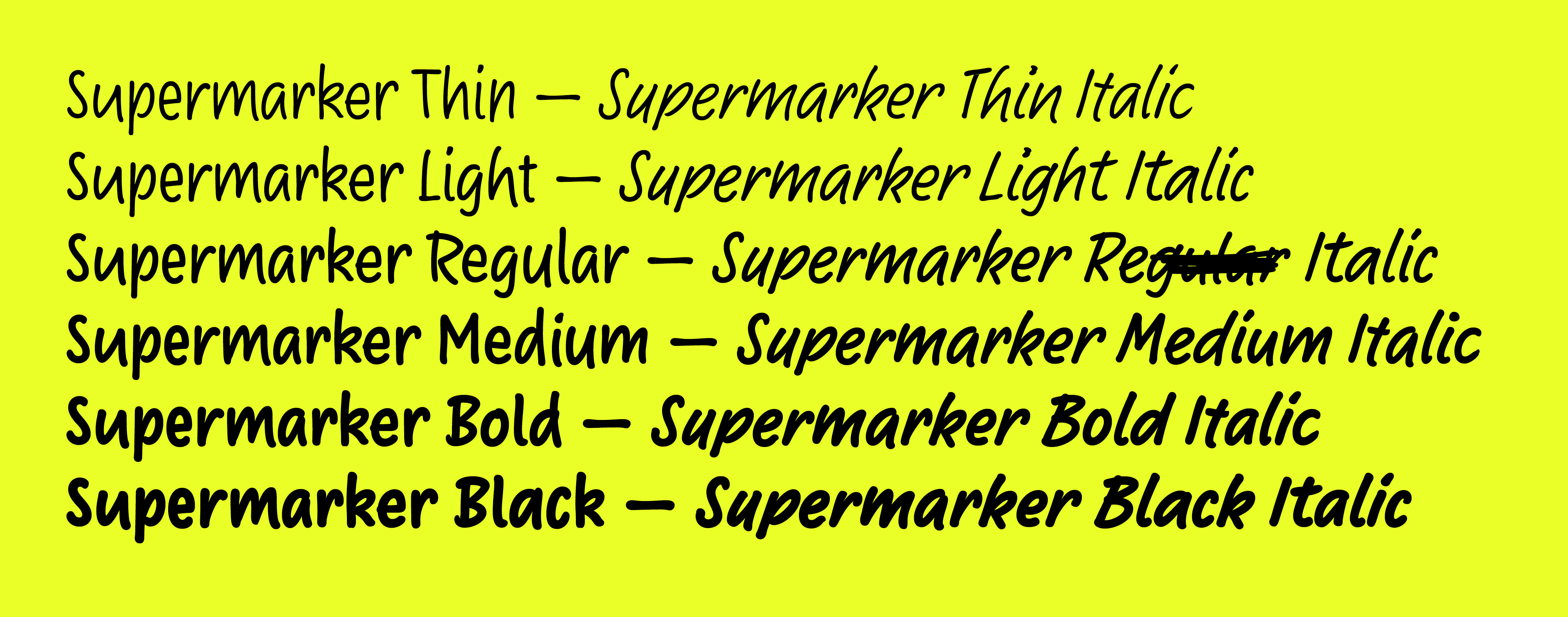
Supermarker’s 12 styles

This typeface has a mission: to sell! To fulfil this mission, Supermarker relies on authenticity and a few intelligent tricks.

W

hether in the supermarket, webshop or retail store, customers’ attention is vied for everywhere. Marketing experts have known for a long time that their purchase decision is also about sympathy. This is exactly where Ulrike Rausch’s Supermarker, whose name is a combination of supermarket and marker, shows its strength.

Its secret lies in its authentic appearance. Supermarker’s character is rooted in the usual, in the everyday. The subconscious mind perceives it as a familiar voice. Where other fonts that imitate handwriting are often too stiff or lurid, Supermarker hits the right note. She is friendly, well-groomed and personable. The whole effect does not impose anything on its viewers, instead it advises them and suggests products or services to them. Like a good friend, she is also a typographic influencer, a perfect fit for retailers.
Where other fonts that imitate handwriting are often too stiff or lurid, Supermarker hits the right note.

Supermarker also uses a very nifty technical trick. Each letter was drawn in three slightly different variants, and the vowels have four versions. These are then intelligently mixed using sophisticated OpenType programming. This creates the impression of handwriting and not a reproduced font design.

The numerous variants for each letter as well as several ligatures, combined with sophisticated OpenType feature programming create the impression of real hand-written text.
Supermarker catchwords
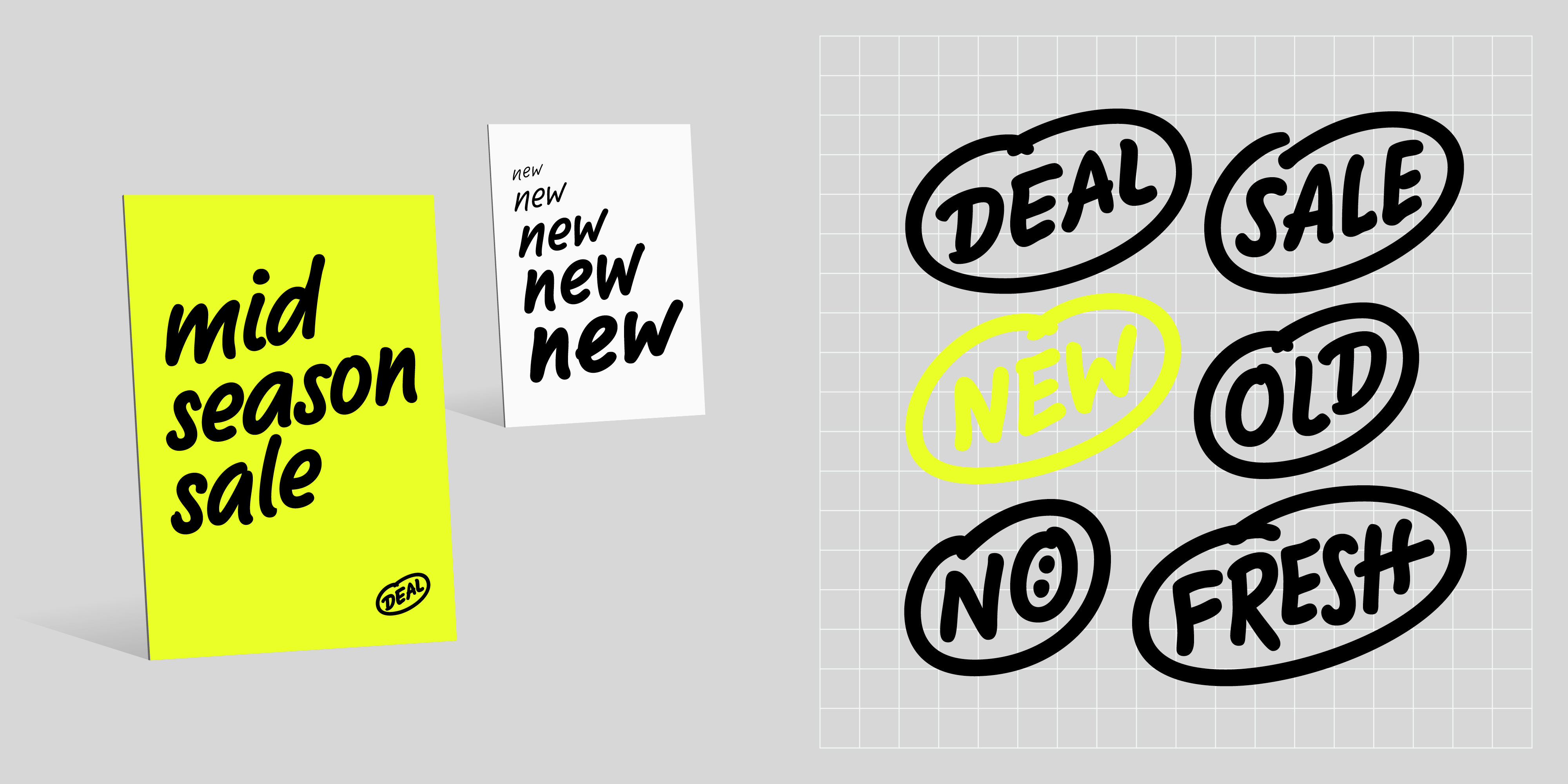
Supermarker is enriched with numerous typographic extras, such as catchwords, dingbats and doodles.

Other typographic delights that help increase sales are catchwords such as NEW, SALE, FREE or DEAL; Dingbats and symbols such as speech bubbles, strikethroughs or shopping baskets as well as international subtleties such as a real Kreska instead of an acute or the Polish ż, which in handwriting is often written as z with a dash, but is also available without using an alternative feature. Of course, all the characters that are important for price labeling, such as discounts, etc. can be found under the corresponding OpenType features.

Supermarker’s handwritten appearance
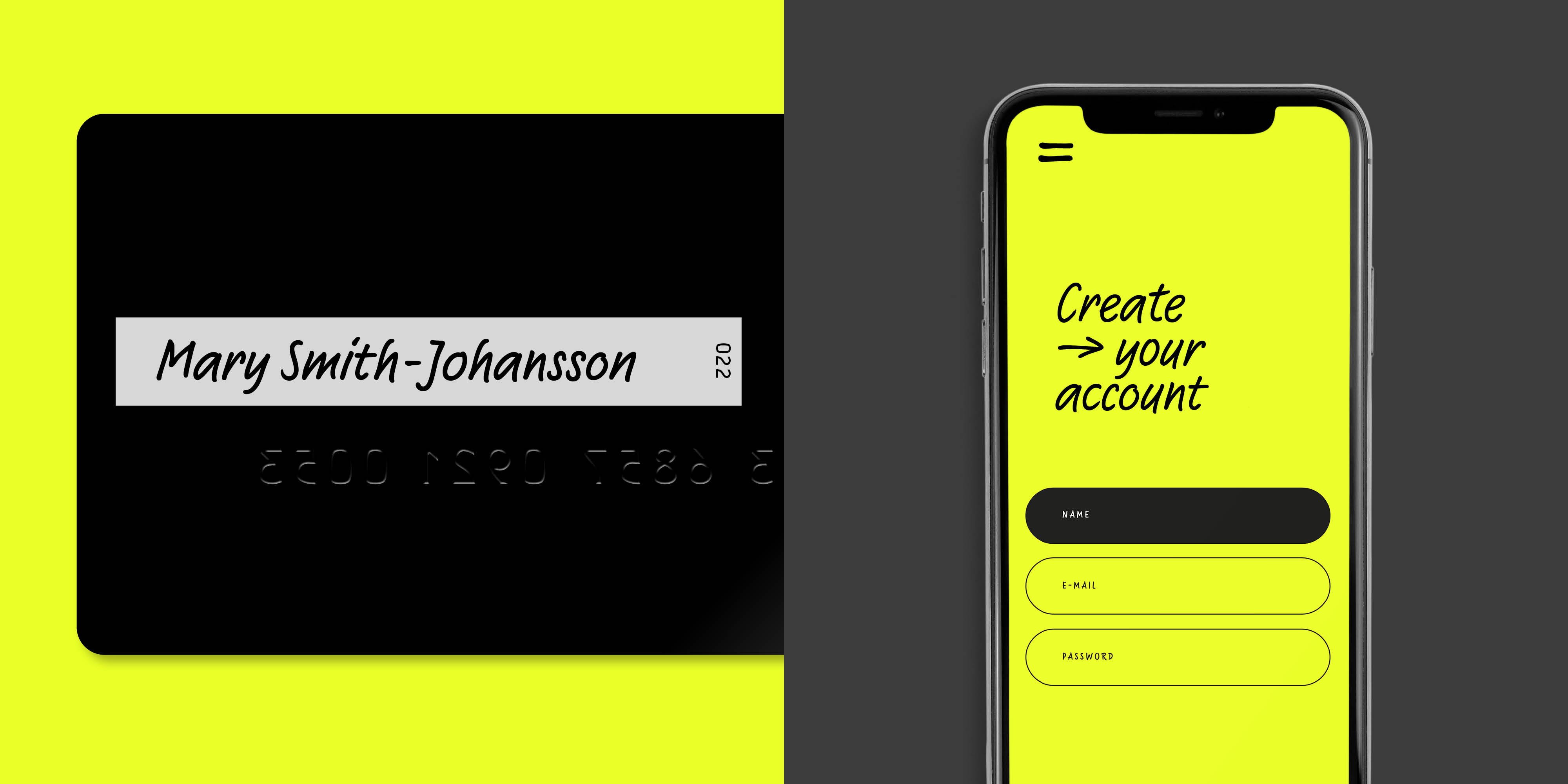
The authentic marker style has a charming personality and adds just the right analog touch to digital projects. (Images are subject to Unsplash licenses.)

The authentic appearance, intelligent technology and six styles (along with italics) make Supermarker the perfect choice for offer signs, packaging, brochures, leaflets, advertisements and advertising posters. It’s a fresh, modern alternative to classics such as Comic Sans or FF Market. The font is also a fine fit for children’s books and comics, festive occasions, as well as for sports, DIY or stationary and crafts.

Try Supermarker