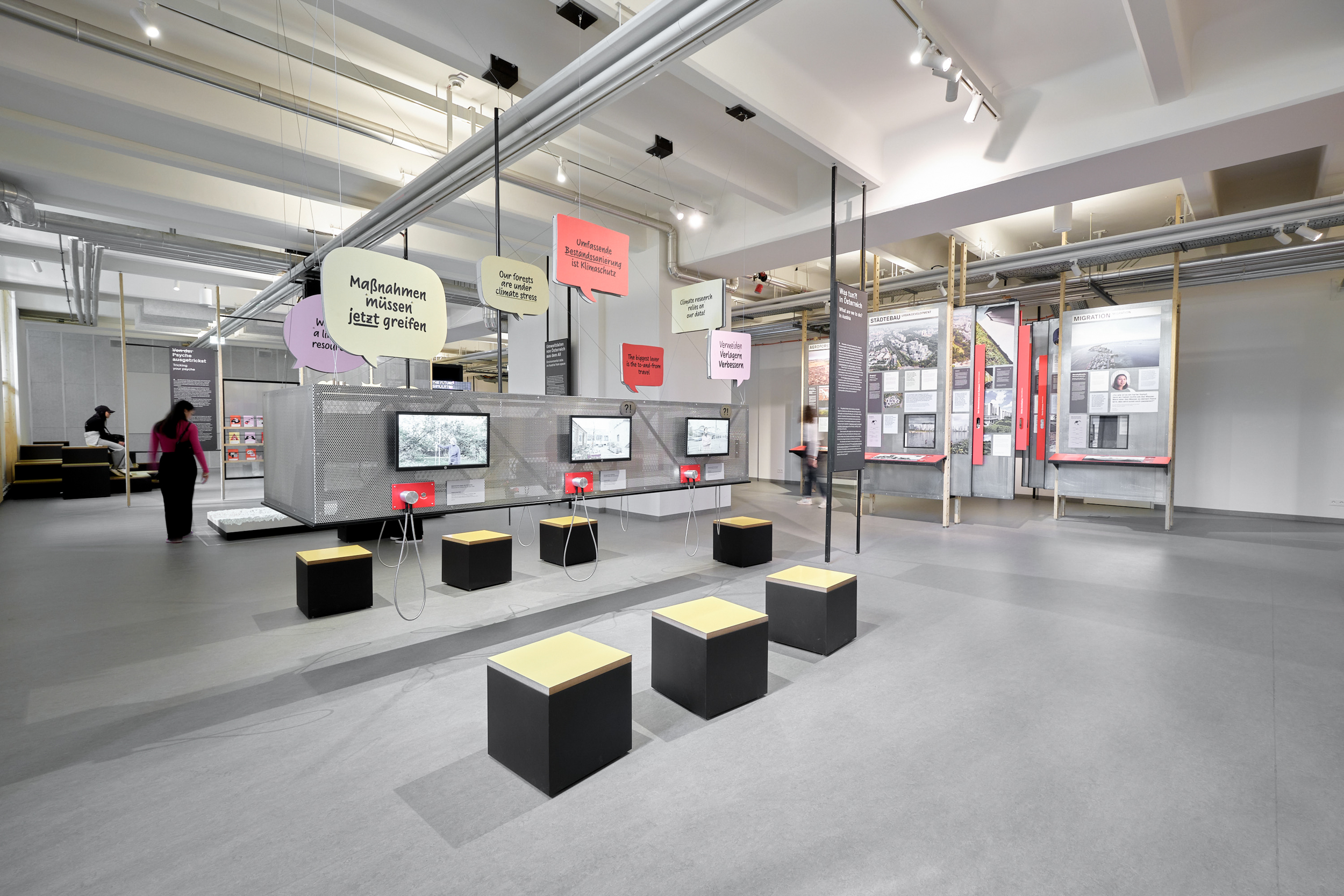
cross 600 m², a variety of information stations, interactive elements and objects highlight different perspectives on climate change. The theme of sustainability permeates the exhibition at all levels, not only in terms of content, but also in terms of the design: through the minimal use of materials, reuse of existing components and easy adaptability and updating.
Climate. Knowledge. Action!
Between facts and emotions: Fonts in exhibition design


Nina Schadensteiner and Letitia Lehner, from the collective Linz design studio MOOI, worked closely with Martina Schiller and Rainer Stadlbauer from the Viennese Architecture Studio Itzo to bring to life the design and vision for the exhibition.
A sustainable color palette is employed throughout: soft pastel shades create a friendly atmosphere, puff pastry yellow picks up on the colorfulness of the recycled compact panels, while magnolia and red act as signal colors for the more interactive and hands-on elements.

Across the exhibition the functional, geometric font PX Grotesk (Optimo) is used while Ulrike Rausch’s expressive Supermarker takes on the emotional part. “It gives the exhibition elements a human touch … for example at the interactive stations and in diagrams and quotations,” explains Nina Schadensteiner, adding:
While PX Grotesk emphasizes the analytical nature of climate facts, Supermarker ensures a direct approach and an invitation to take action.
The exhibition concludes with a “climate challenge”, which is very popular with the public. It is a playful invitation to take the newly acquired knowledge home with them and confront the climate crisis. But “Climate. Knowledge. Action!” is not only well received by the public, the exhibition design also won over the jury of the prestigious Caesar advertising award in October 2024, where it was awarded silver in the “Trade fair architecture and POS” category.


