

The Greek philosopher Thales pronounced: “The principle of all things is water; everything is made of water, and everything returns to water.”
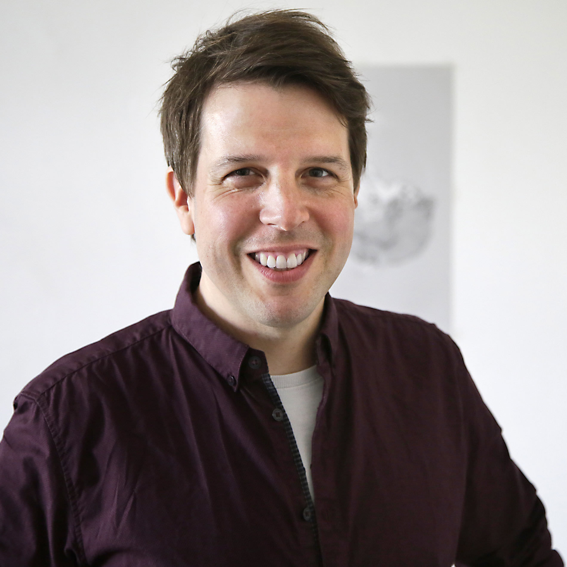
Cologne-based designer Felix Braden also appreciates and recognizes the beauty and importance of the wettest element. His own foundry Floodfonts and almost all of his fonts have a reference to water. His veritable typographic aquarium includes fonts with names such as: Pulpo, Kontiki, Capri, Tuna, FF Scuba, Bikini or Moby. His latest typeface Turbine, which is published by Fontwerk, also fittingly means the rotating turbomachine of a hydropower plant.
In terms of design, Felix’s typefaces have also been very well received. His typeface FF Scuba was recognized in the Communication Arts Typography Annual in 2013 and his typeface Kontiki was nominated for the German Design Award in 2019.
Felix Braden works full-time as an Art Director at MWK Cologne and was responsible, among other things, for the corporate design of Malteser International and the logo design of the Romano Germanic Museum. Previously, he co-founded Glashaus Design and worked with Jens Gehlhaar at Gaga Design. Felix studied Communication Design at Trier University with Prof. Andreas Hogan.
In his free time, rather than pushing pens he sometimes likes to push balls, because he is a passionate boules player. When the weather is not so good, he emulates his role model Rian Hughes and draws illustrations. If he wants a little more excitement, he loves to go to indie and alternative rock concerts.
Andreas Frohloff
Christoph Koeberlin
Rosalie Wagner Variable Fonts
Felix Braden Naming, Graphic Design
Ivo Gabrowitsch Copywriting, Imagery (© Shutterstock), Specimen
Lucy Beckley English Translation
Jana Kühl Imagery
2013–2020
Version 1.00: July 20, 2020
Variable Fonts: February 15, 2022
Version 1.03 Minor changes April 8, 2025
Static .otf, .woff2
Variable .ttf, .woff2
Additional formats on request
Trial Free test license
Base Includes Desktop, Web and Social Media use
Extended Larger volume, App or Audio-Visual
Additional licenses on request
Available on request
Included in the Family package
1 axis: weight
Web file sizes .woff2: 46 KB Upright, 46 KB Italic
Turbine™ is a trademark of Fontwerk GmbH
Uppercase
Lowercase
Latin Accents
Numerals & Currency Symbols
Punctuation
Mathematical Signs & Symbols
Arrows & Shapes
Ligatures
Greek
| A | Afrikaans Albanian Asu |
| B | Basque Bemba Bena Breton |
| C | Catalan Cornish Croatian Czech |
| D | Danish Dutch |
| E | Embu English Esperanto Estonian |
| F | Faroese Filipino Finnish French Friulian |
| G | Galician Ganda German Gusii |
| H | Hungarian |
| I | Icelandic Inari Sami Indonesian Irish Italian |
| J | Jola-Fonyi |
| K | Kabuverdianu Kalenjin Kamba Kikuyu Kinyarwanda |
| L | Latvian Lithuanian Lower Sorbian Luo Luxembourgish Luyia |
| M | Machame Makhuwa-Meetto Makonde Malagasy Maltese Manx Meru Morisyen |
| N | North Ndebele Northern Sami Norwegian Bokmål Norwegian Nynorsk Nyankole |
| O | Oromo |
| P | Polish Portuguese |
| Q | Quechua |
| R | Romanian Romansh Rombo Rundi Rwa |
| S | Samburu Sango Sangu Sena Serbian Shambala Shona Slovak Slovenian Soga Somali Spanish Swahili Swedish Swiss German |
| T | Taita Teso Turkish |
| U | Upper Sorbian Uzbek |
| V | Volapük Vunjo |
| W | Walser Welsh |


