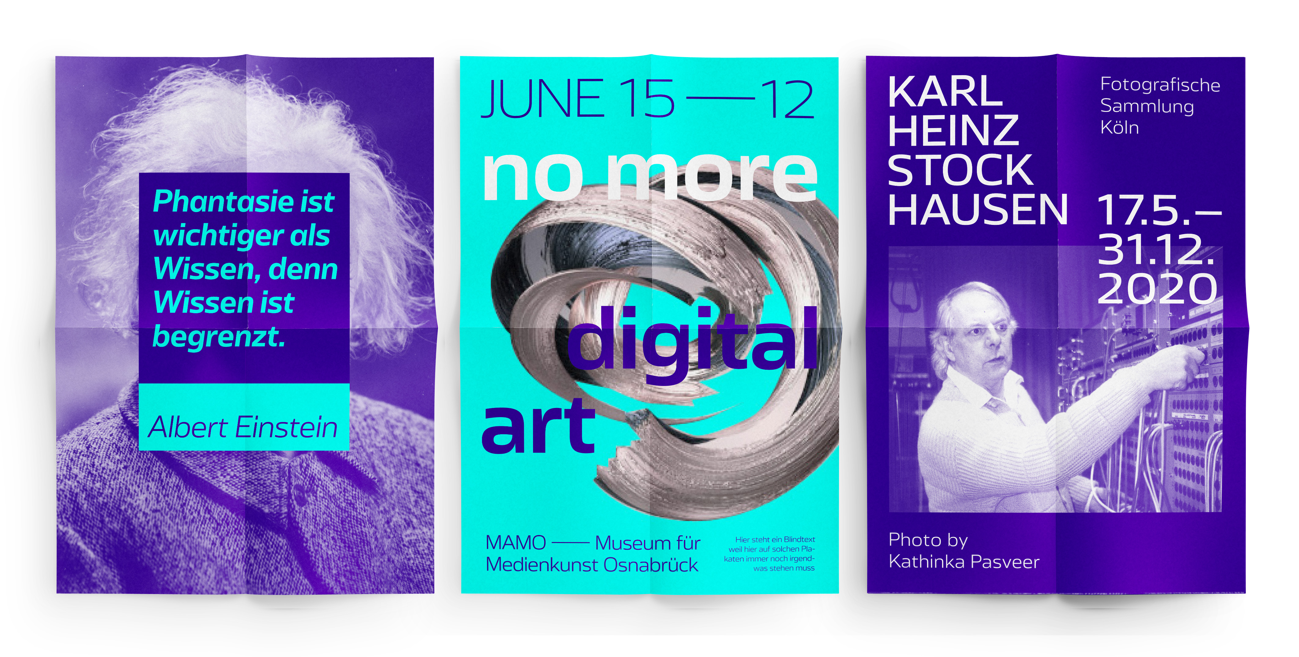
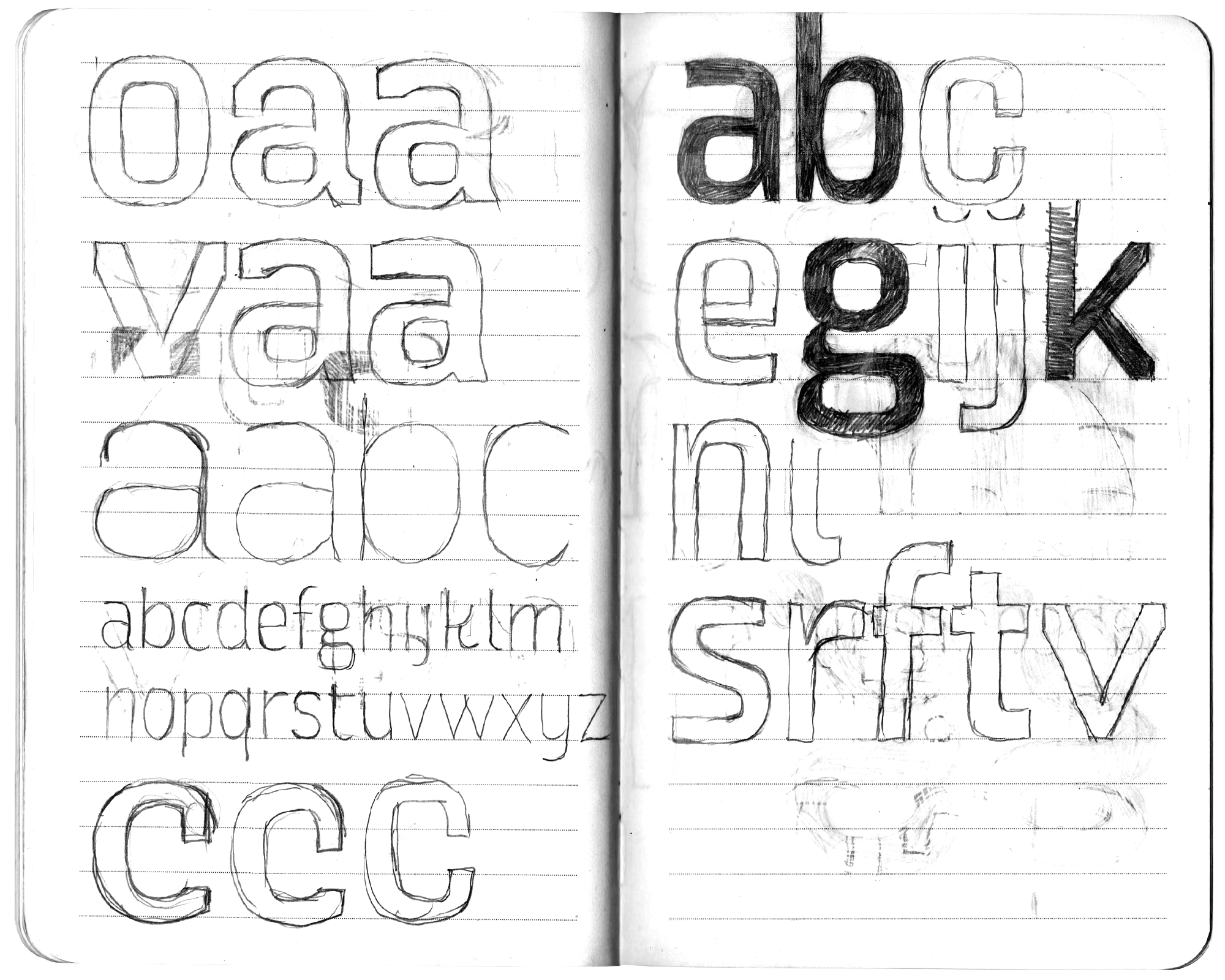
In naming this typeface, the designer from Cologne emphasizes its technical prowess and properties. The superelliptical curves (a mixture of ellipse and rectangle, also known as Lamé curve), the wide proportions, the minimal contrast and the tight spacing result in a cool appearance that is highly recognizable. It makes Turbine the perfect fit for corporate design projects and advertising campaigns, especially for clients working in engineering, technological or pharmaceutical industries.
Turbine
Neo-Grotesque with wide proportions and tight spacing


The fine geometric feature has often been applied in architecture, urban planning, product and interior design and its application exudes a friendly, approachable appearance. And here, in Turbine it comes into play. This type of design became particularly popular in the 60s and 70s, and this look and feel spills over into Turbine, giving it a little bit of a retro feel. However, less ‘retro’ in the nostalgic sense and more in the futuristic and confidence-inspiring sense, because its suitability for the here and now is without question.
The very open forms of this Neo-Grotesque achieve a significantly higher legibility and elegance compared to older typefaces of this type. Turbine’s preferred partners are slab serifs, especially Clarendon-like ones such as Bookman, Sentinel or Pulpo. But also narrow-running sans-serifs like Ika Compact are a suitable counterpart to our technical-looking Turbine.