The Nice type system in use for the Soлomiya Art Magazine Nº 2 – Cover, Nice Poster

To be continued: solomiya Nº 2 is here

Solomiya (Ukrainian for “peace”) magazine was founded in April 2022 by the two photographers, Vsevolod Kazarin (Kyiv) and Sebastian Wells (Berlin), as a response to Russia’s war against Ukraine. Artists from both cities work together on the magazine, all driven by a desire to show the world what there is to defend in Ukraine. Developed in Kyiv and designed in Berlin, the magazine is a testimony to resistance through art.

T
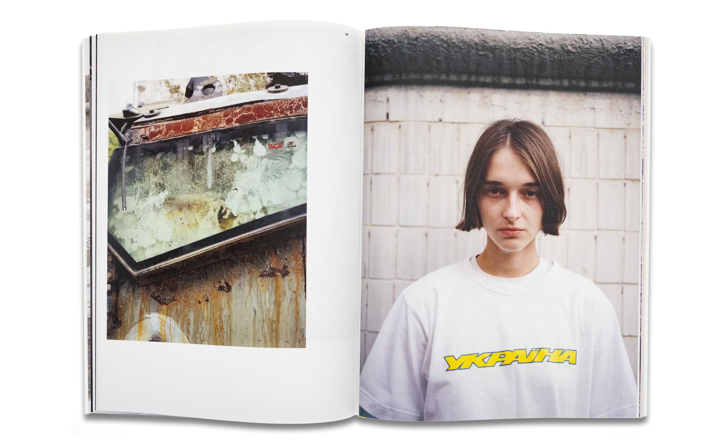
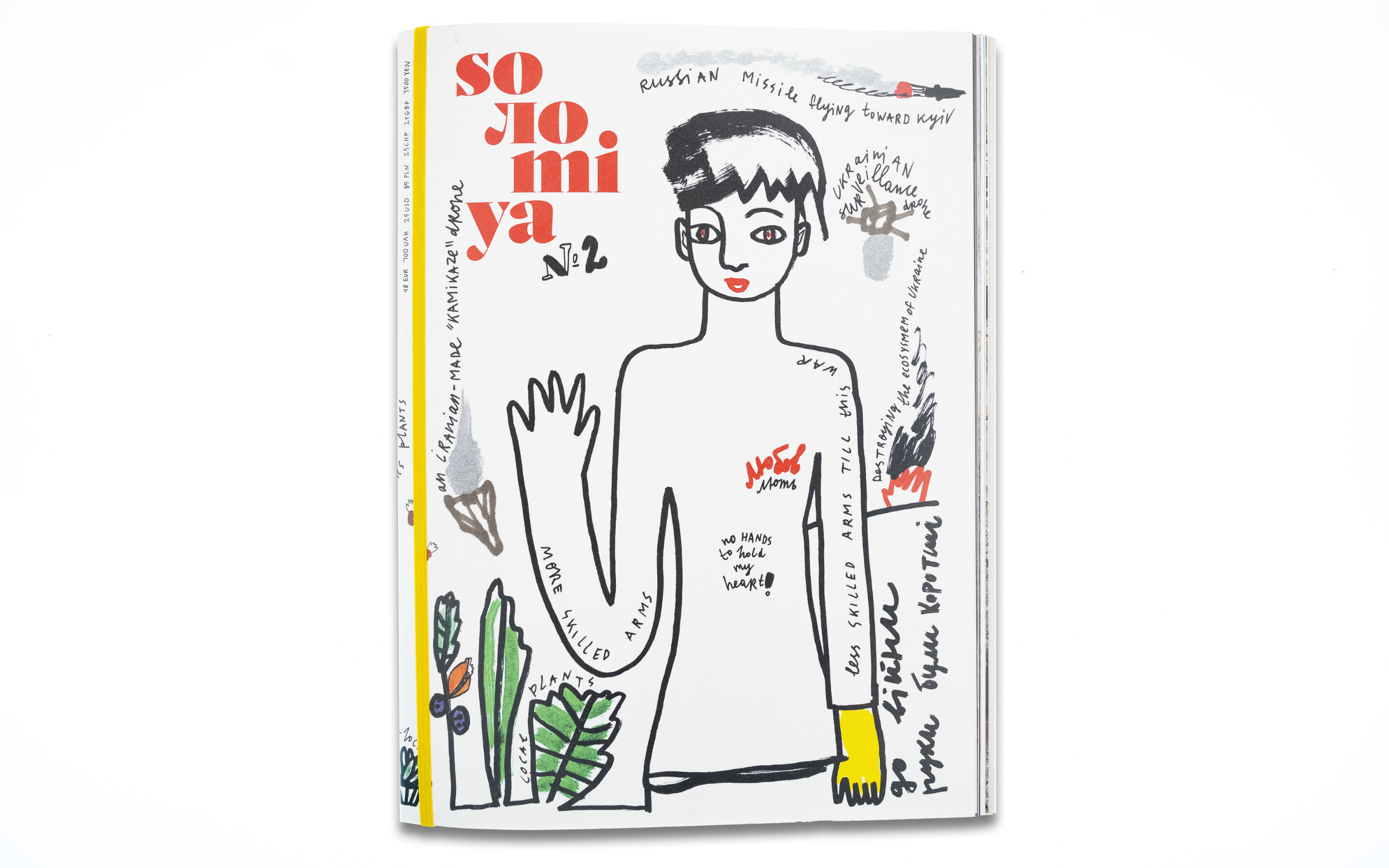
he second edition of solomiya has recently been published and the art direction was once again led by the Berlin-based Kollektiv Scrollan. It was published by Readellion and SHIFT BOOKS. After creating its own voice with the first edition of solomiya, in the second issue, the editorial team presents deeper insights into the everyday life of people in the war zone. The latest publication includes:

  • — Artworks created in Kherson during the Russian occupation
  • — Stories of Ukrainians who have had to flee the war twice – in 2014 and 2022
  • — The realities that Russia has been trying to silence for many years, and much more.
The Nice type system along with Theodor in use for the Soлomiya Art Magazine Nº 2
The Nice type system in use for the Soлomiya Art Magazine Nº 2 – Preface
The Nice typeface in use for the Soлomiya Art Magazine Nº 2

The single-family house photo series in solomiya Nº 2

The distinctive logo and editorial texts of solomiya have been set in Jan Fromm’s Nice Poster and Nice Text. As Art director Anne-Lene Proff, part of the Scrollan collective, explains: “We chose Nice when there was no design and we had a blank page as the content was still being decided upon when we worked on the first issue.”

“So we needed a typeface that was very flexible: with many weights, matching different headline fonts and something that left an impression. The serifs of Nice, especially in the bold weights, convinced us.”

Anne-Lene Proff

After the first edition, the design trio from Kollektiv Scrollan were so “thrilled with the smooth appearance of the typeface” that many Nice weights will be used again in the 2nd edition: Nice Text Regular serves as a running script, Italic for awards, a photo series about the roofs of family homes works well with Nice Headline Light and Nice Text Black Italic plays a leading role in the names in the Polaroid section. In the headline fonts, Theodor by Philipp Neumeyer celebrates its premiere (Future Fonts).

Try Nice

The Nice type system along with Theodor in use for the Soлomiya Art Magazine Nº 2

The fact that Nice Text Regular is “compatible with all headline fonts” was an important deciding factor for the design team from the Scrollan collective. Here it is paired with Theodor, which was designed by Philipp Neumeyer (Future Fonts).

The Nice type system along with Theodor in use for the Soлomiya Art Magazine Nº 2

The Nice type system along with Theodor in use for the Soлomiya Art Magazine Nº 2