R+V

Sans, Slab, and Serif – Custom-made for one of Germany’s largest insurance companies

RuV Type: An exclusive typeface superfamily for one of Germany’s largest insurance companies, R+V — In use
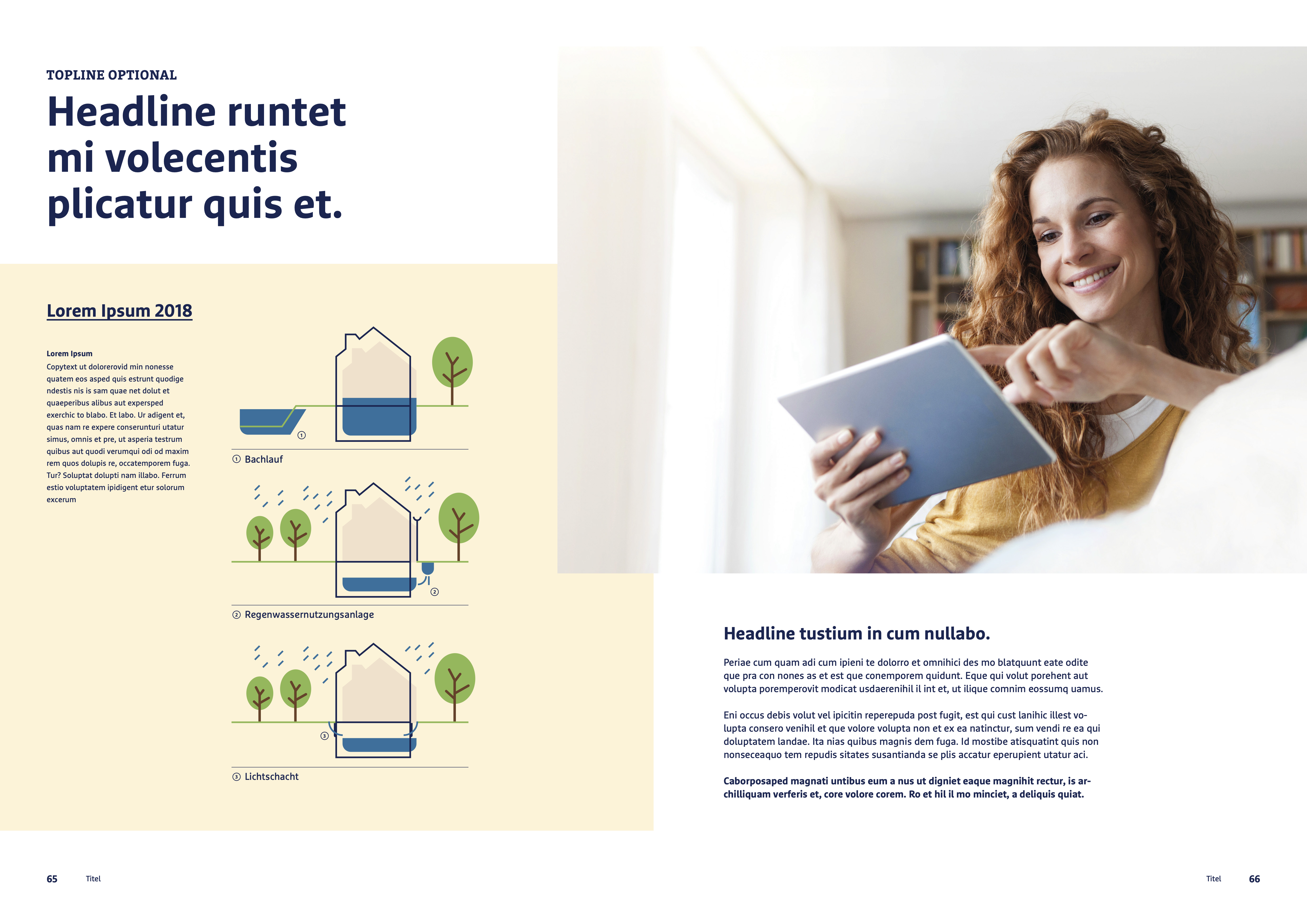
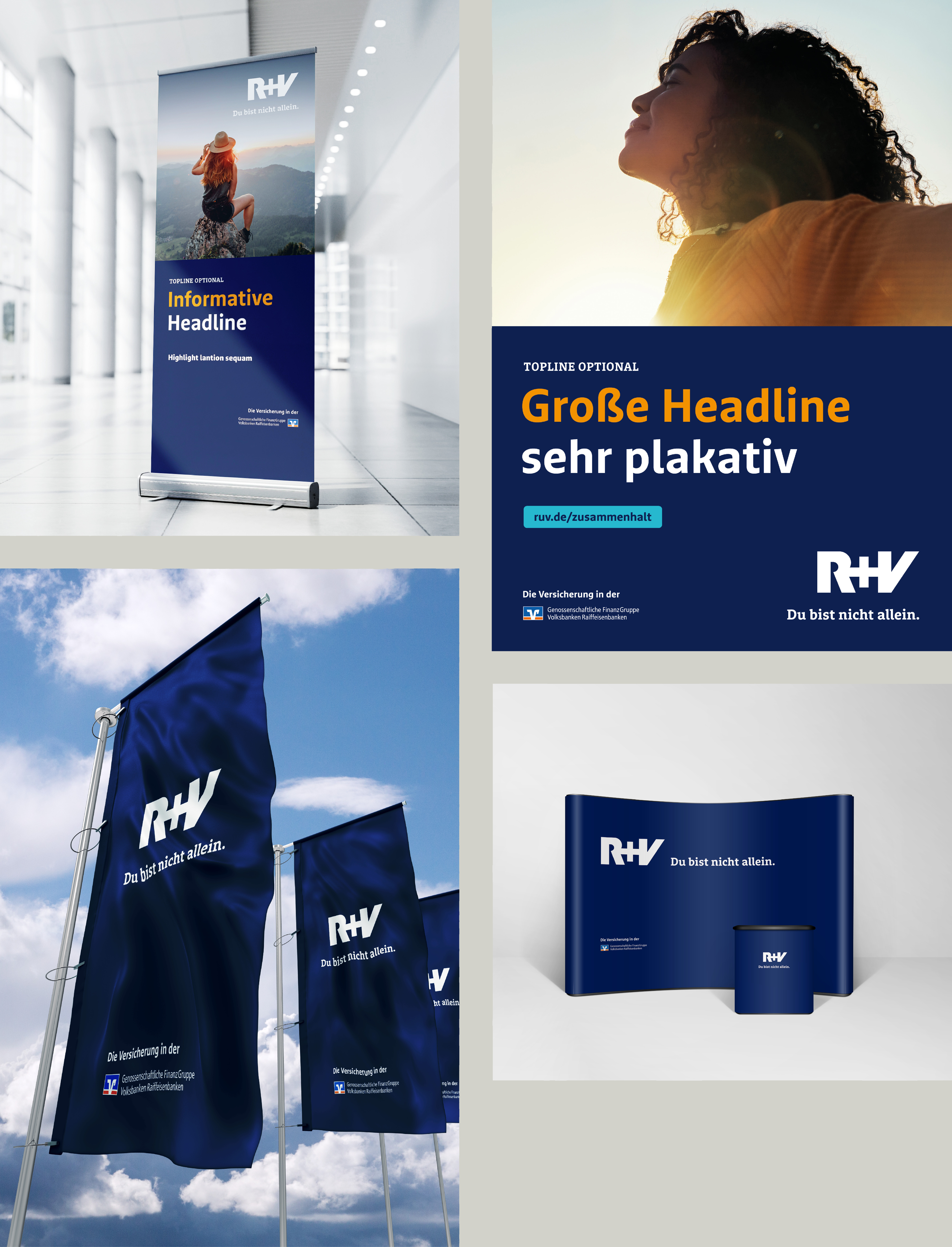
Typical applications of the new RuV Sans and RuV Slab fonts (Visualization by R+V)

When switching corporate typefaces, retail and semi-custom fonts remain the top choice due to their quick availability and lower costs. However, in some cases, the requirements for the new typeface are so specific that a custom solution is necessary. We had the privilege of designing such an exclusive font for one of Germany’s largest insurance companies, R+V Insurance.

T

he need for a custom typeface arose from the desire to replace the existing typeface, FF Marselis, with a future-proof alternative, to expand its stylistic and content-related scope, and thereby carefully evolve the brand. Its distinctive feature is its breadth: the superfamily consists of a sans serif, a slab serif, and a serif family. While sans-serif/serif or sans-serif/slab pairs are not uncommon, the situation is different with such a three-part configuration. After extensive research, no retail alternative was found that met the requirements.

Fontwerk’s agile structure allows us to assemble the ideal team for every project. Whenever needed, we can expand our core team with experts from our international network. For RuV Type, we rounded out our team with Jan Fromm, who is known for his wide stylistic range and with whom we had previously collaborated on the extensive serif typeface family “Nice” (which is currently being expanded to include a similarly extensive sans serif counterpart).
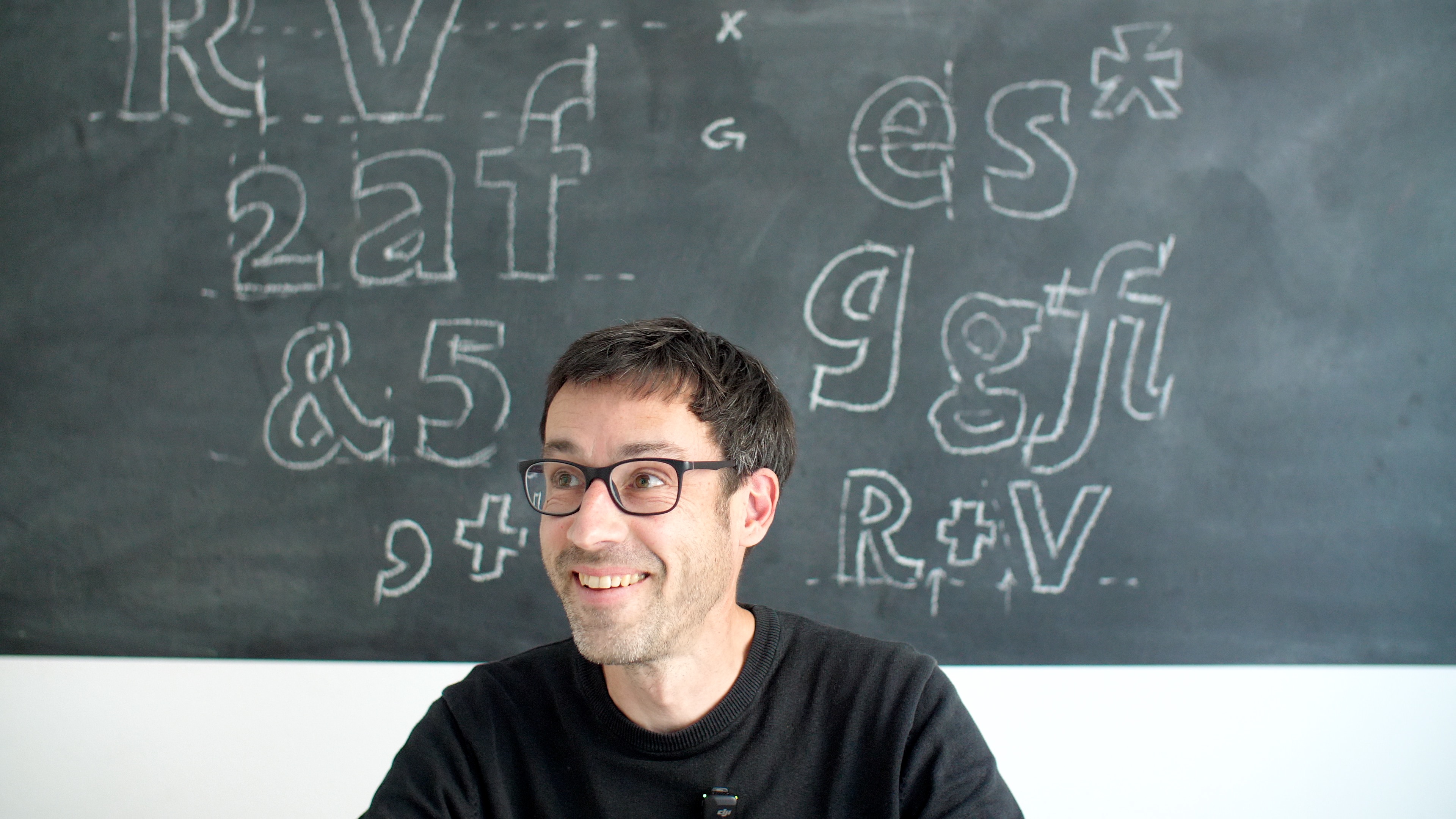
RuV Type: An exclusive typeface superfamily for one of Germany’s largest insurance companies, R+V — Type designer Jan Fromm, seen here in a video produced for R+V’s internal launch
Type designer Jan Fromm, seen here in a video produced for R+V’s internal launch, was the key figure in the project. (© Victor Holland, Hotel Galaxy Films)
From Brand Values to Design Criteria

At the start of the project, we traveled to the company headquarters in Wiesbaden to conduct a workshop, which we facilitated with R+V’s marketing, UI, and design teams, as well as MetaDesign Düsseldorf. During the session, we addressed the question of what form-defining requirements are embedded in the three R+V brand values: inspiring, cooperative, and solid.

These brand values should also be translated into design criteria through a collaborative process. We applied them to fundamental conceptual considerations: the overall impression of the typeface, its structure, and its details.

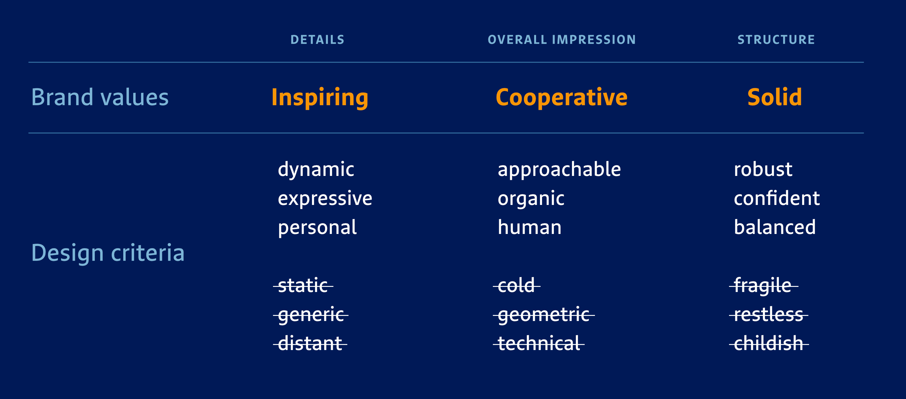
For the brand value of “inspiring”, the typeface should be dynamic, expressive, and personal, for the brand value of “cooperative”, the typeface should be approachable, organic, and human, and last but not least, for “solid”, it should be robust, confident, and balanced.

To define the design criteria even more clearly for all workshop participants, we took it a step further. We also agreed on characteristics that should be explicitly excluded. The new typeface should not be static, generic, or distant in its details; it should not be cold, geometric, or technical in its overall impression and it should not be fragile, childish, or restless in its construction.

RuV Type: An exclusive typeface superfamily for one of Germany’s largest insurance companies, R+V — Translating brand values into design criteria
The outcome of the joint workshop on translating brand values into design criteria for the overall impression, construction, and details.
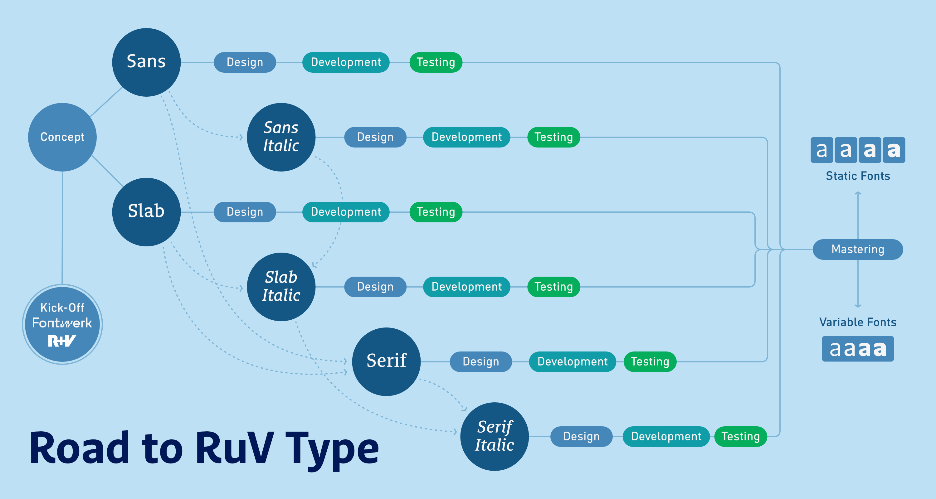
RuV Type: An exclusive typeface superfamily for one of Germany’s largest insurance companies, R+V — Milestones
The overview of milestones illustrates the increasing complexity as the project progresses and the interdependence of the three styles.
Our Process

Armed with these clear definitions and exclusion criteria, we began designing the sans serif core family. To do this, we developed four possible design directions based on initial letters that could be compared and evaluated as headlines. Only after the design of RuV Sans was finalized were RuV Slab and RuV Serif to be designed, though we sketched out a suitable Slab variant at this stage.

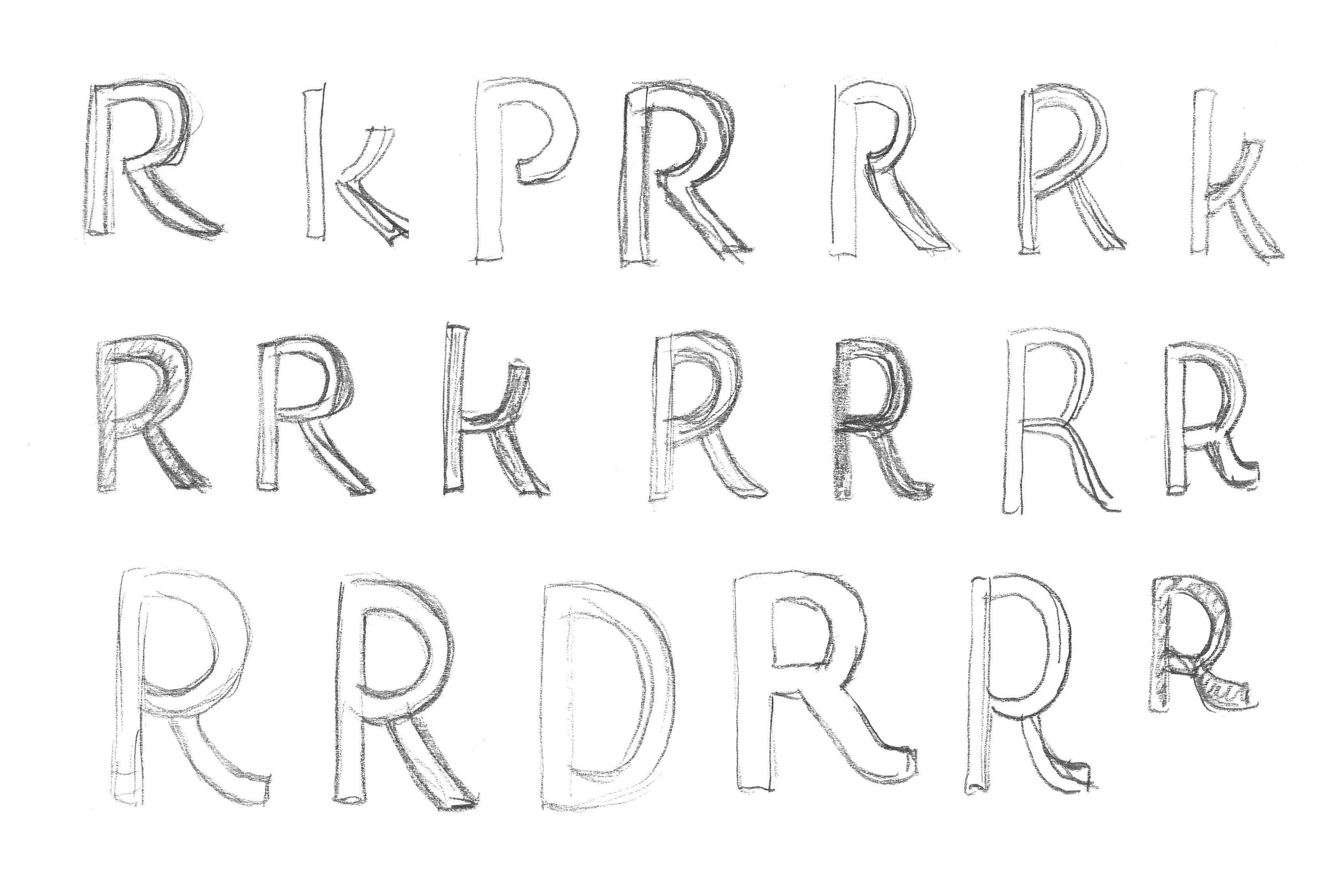
RuV Type: An exclusive typeface superfamily for one of Germany’s largest insurance companies, R+V — Scan R
The initial drafts, based in part on the ubiquitous capital letter R, were hand-drawn by Jan Fromm, …

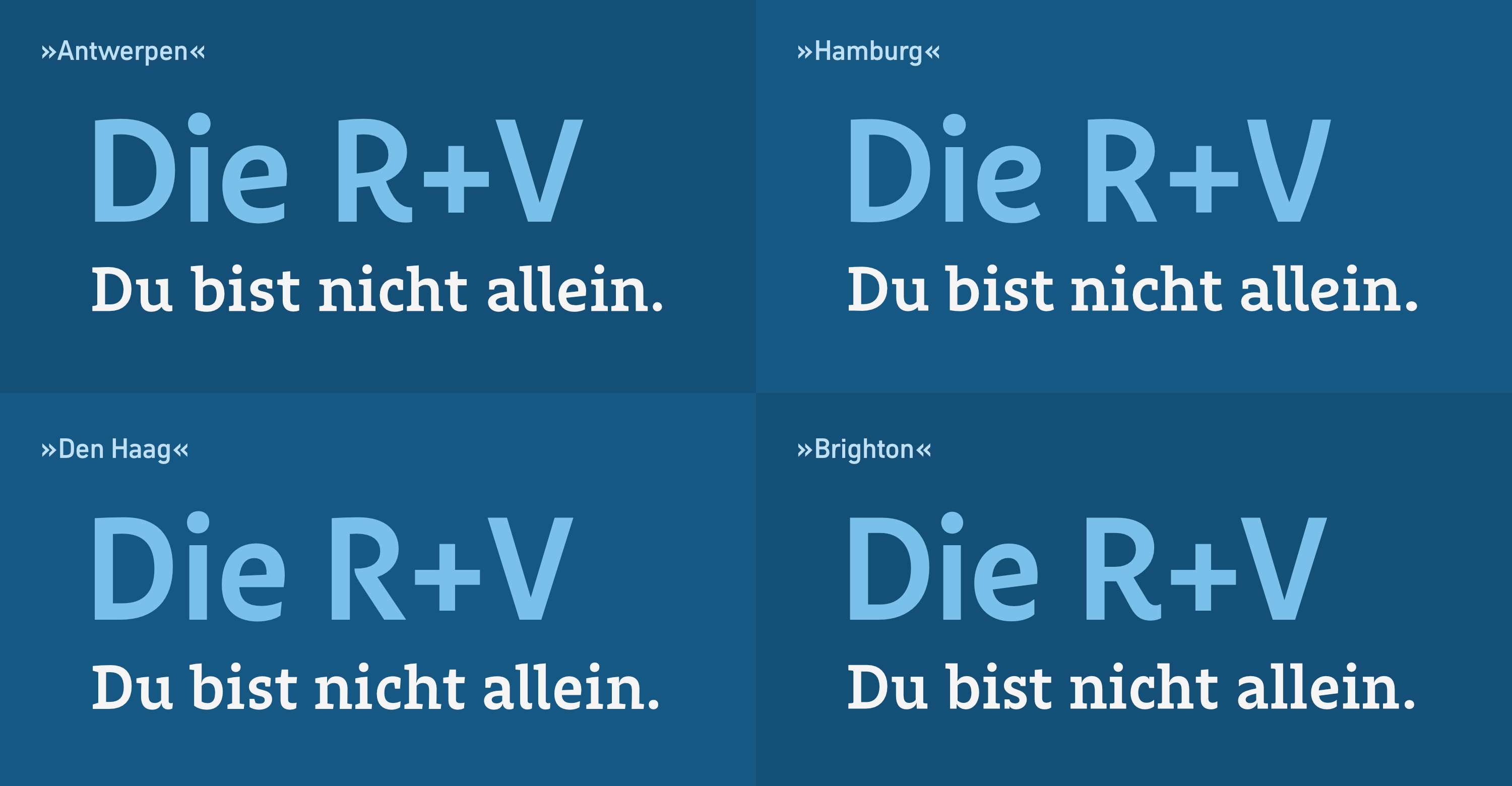
For the sans serif typeface, we interpreted the characteristics in four different ways. We developed one concept with a more modern, lively, and open character, which we named Antwerp. We also designed a typeface called Hamburg which had a more bold and warm character, a third style called The Hague was created with more classic, handwritten features, and lastly we developed a more understated English-style variant named Brighton.

We presented our four proposals, highlighting their individual characteristics, and incorporated them into rough mockups so that the R+V team could evaluate them more effectively. We also presented the four design directions side by side to ensure better comparability.

RuV Type: An exclusive typeface superfamily for one of Germany’s largest insurance companies, R+V — Drafts
Comparison of the four concepts: Antwerp, The Hague, Hamburg, and Brighton

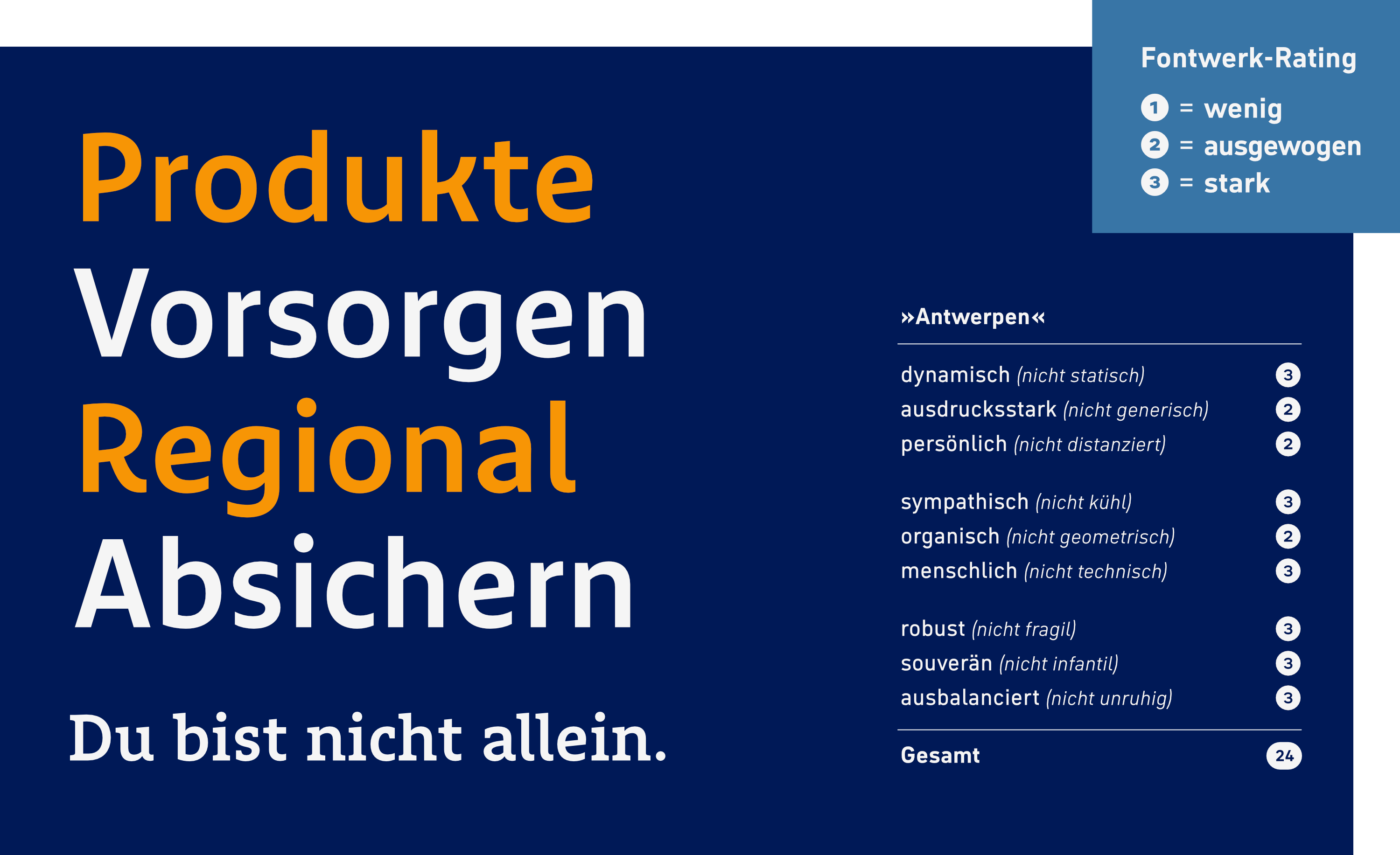
Then came the most exciting part of the project. First, we conducted an internal evaluation at Fontwerk to assess how well our own designs met the design criteria. To do this, we created three specific definitions for each of the three brand values and analyzed whether the designs aligned with them to a small, moderate, or strong degree. In the best-case scenario, a total of 3 × 9 = 27 points was possible.

For “calibration,” we started with R+V’s existing corporate typeface, FF Marselis. We tried to remain as objective as possible. Since the choice of typeface predated the definition of the brand values, we arrived at a score of only 22 points, which can be interpreted as very decent from this perspective. It scored particularly well in terms of its dynamic and personal details, its human overall impression, and its robust and confident construction. Our intention was, of course, not to criticize what already existed; therefore, we applied a similarly critical and objective approach to our own designs.

For example, we assessed Antwerp as somewhat less expressive, though it revealed its strengths in its dynamism, humanity, robustness, and confidence.

RuV Type: An exclusive typeface superfamily for one of Germany’s largest insurance companies, R+V — Rating drafts
We let our clients decide how well our four designs aligned with the three brand values and their jointly defined design criteria: slightly, moderately, or strongly. The maximum possible score was 3 × 9 = 27 points (the image shows our internal rating).

With 24 points, we rated the Dutch variant “The Hague,” which draws on cursive script, on par with “Antwerp.” In terms of overall impression, it checked all the boxes.

The English variant “Brighton” scored the lowest, if one even wants to use that word with such excellent designs ;), with 20 points. According to our own assessment, three designs were therefore a bit better suited to R+V’s brand values than the current corporate typeface, while one concept fell slightly short.

But the truth lies with the client. So we had the exercise carried out by our counterparts from the R+V marketing, UI, and design teams, as well as MetaDesign’s Creative Director Arne Schmidt. Their results were similar to ours (they rated Marselis and Hamburg as somewhat more suitable, and The Hague and Brighton as somewhat less suitable). Bolstered by their ratings, they unanimously agreed on the Antwerp design.

We unanimously chose the Antwerp concept and we’re still thrilled with it. The font’s impression won us over and, in our assessment, has proven to be exceptionally strong, particularly in terms of its robust, confident, and balanced character.
RuV Type: An exclusive typeface superfamily for one of Germany’s largest insurance companies, R+V — Details
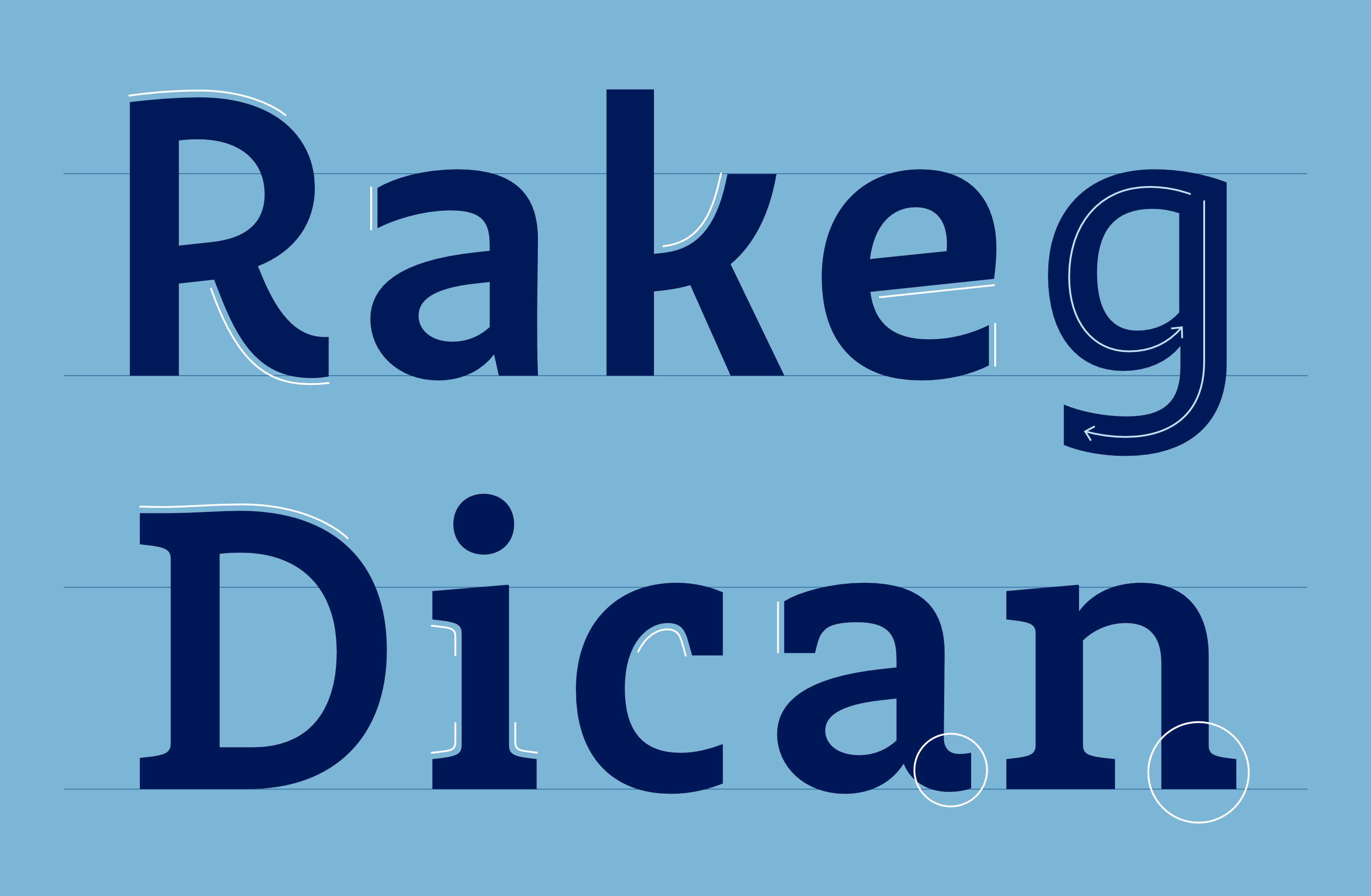
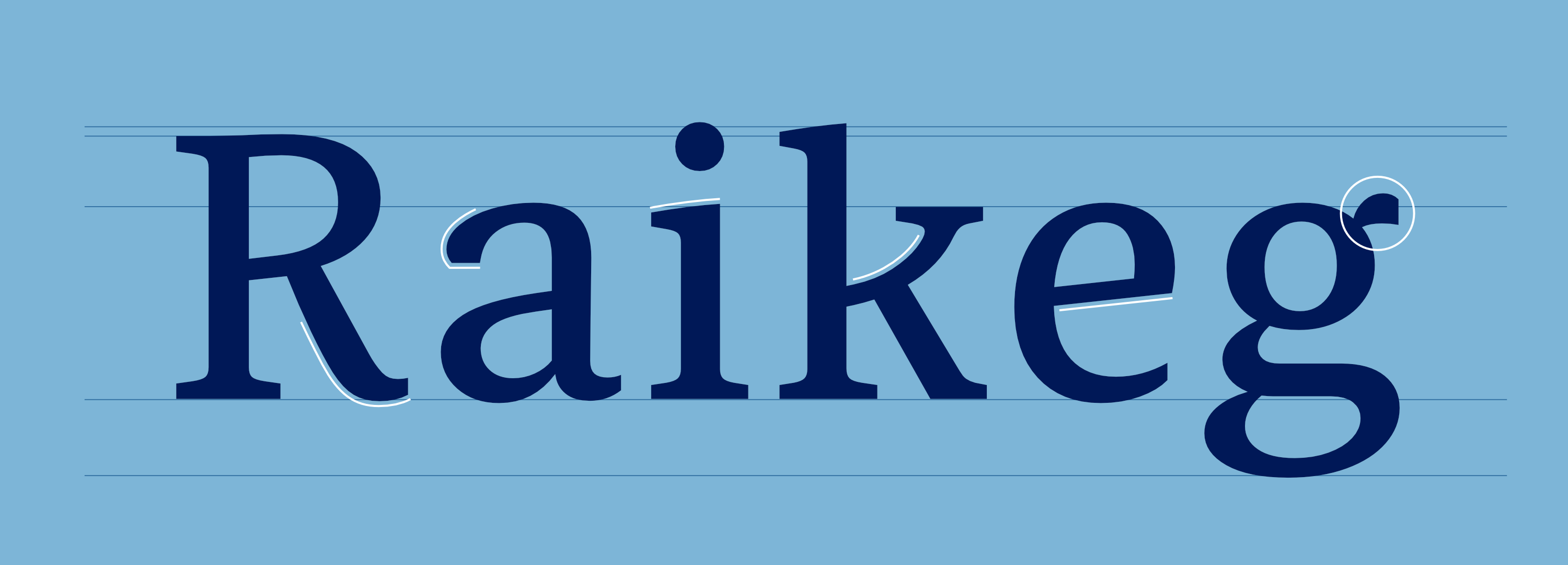
The distinctive features of the eventual “winning design” Antwerp: modern character, lively, open, unadorned; rounded diagonals (R, k), straight terminals (a), slightly ascending crossbar (e), handwritten form (g), wavy cap (Slab-D), bracketed serifs (Slab-i), soft interior shapes (Slab-c), curved terminals (Slab-a), single right serifs (Slab-n)
I was very impressed by how Fontwerk incorporated the strategic foundations of the R+V brand into the development of the new ‘RuV Type.’ It’s a real design highlight that perfectly represents the brand on a typographic level.
RuV Type: An exclusive typeface superfamily for one of Germany’s largest insurance companies, R+V — Scan
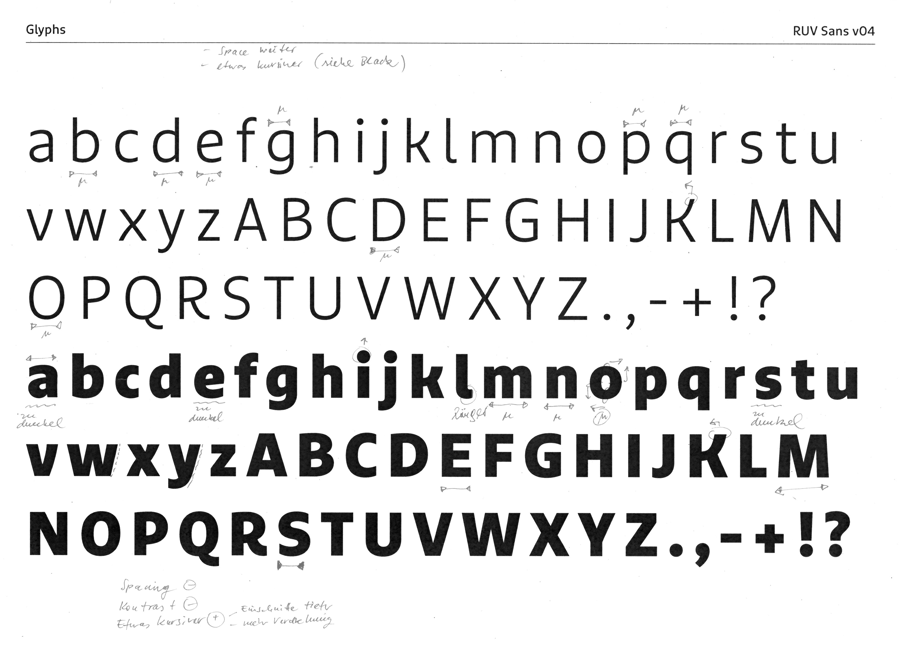
The transition from a digital design to an analog proof is still an effective way to improve typeface design.
RuV Type: An exclusive typeface superfamily for one of Germany’s largest insurance companies, R+V — Scan Slab

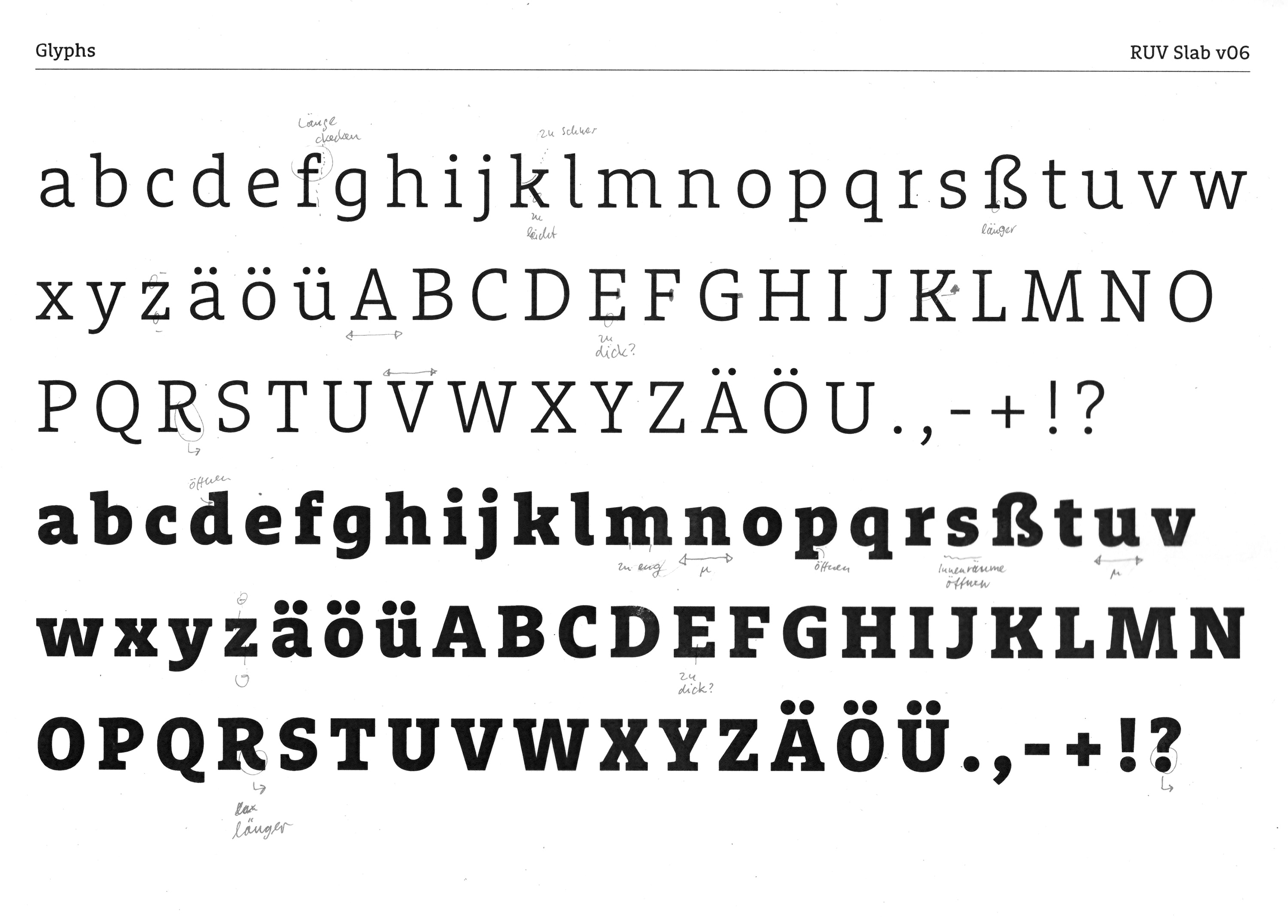
Based on this, we quickly incorporated initial revision requests and focused on fine-tuning, developing the stroke weights and a basic alphabet from A to z, as well as a first proper draft of the slab.

RuV Type: An exclusive typeface superfamily for one of Germany’s largest insurance companies, R+V — Feedback by the client
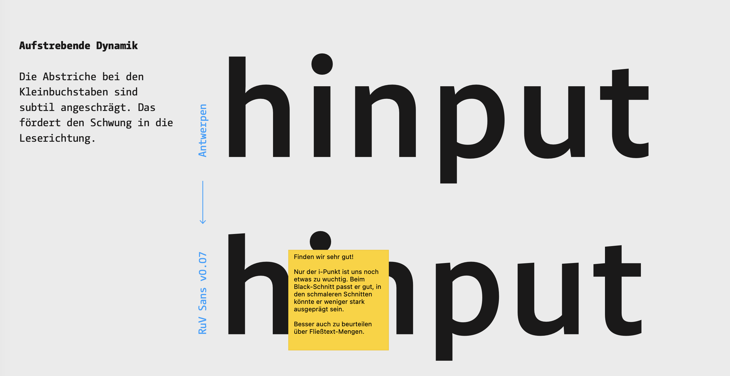
Feedback was discussed verbally or exchanged via comments in digital preview documents.

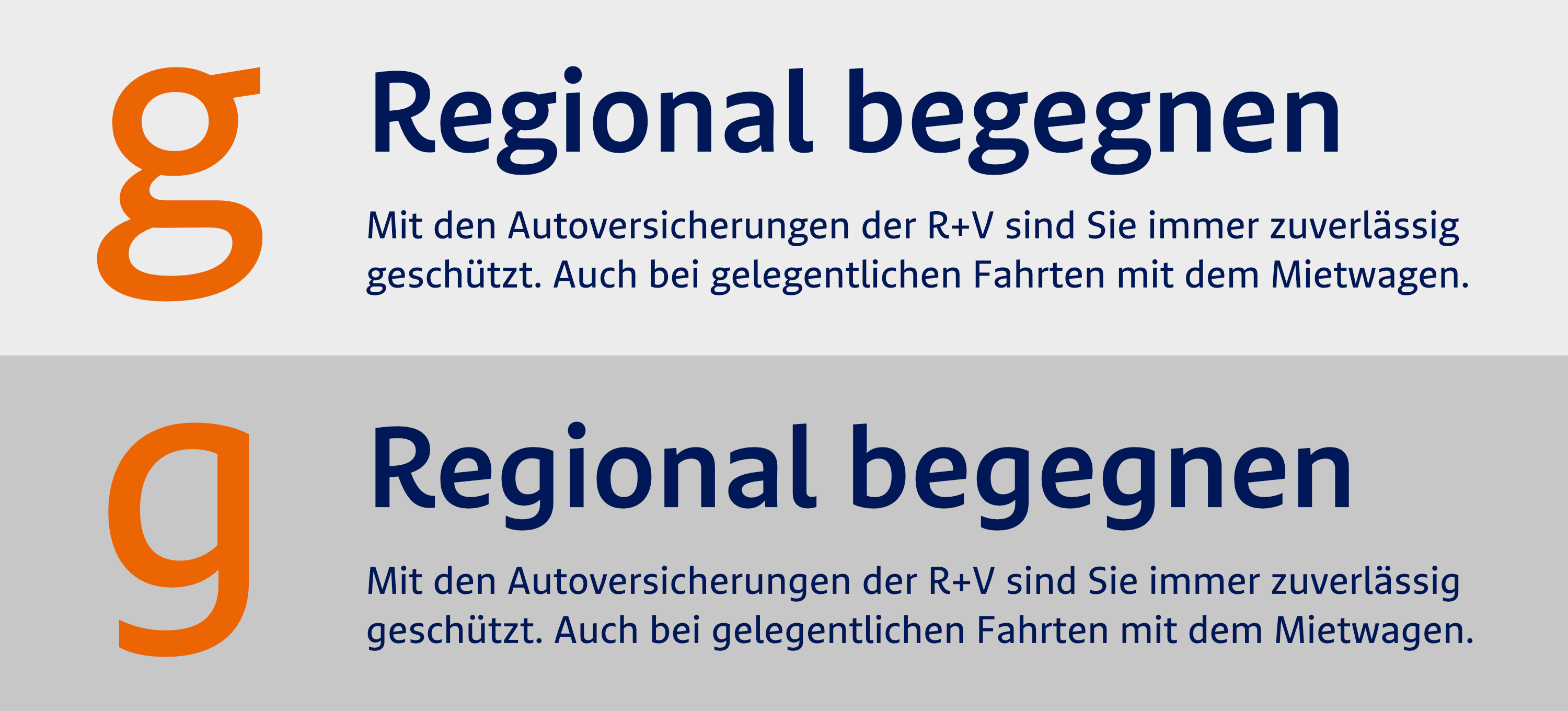
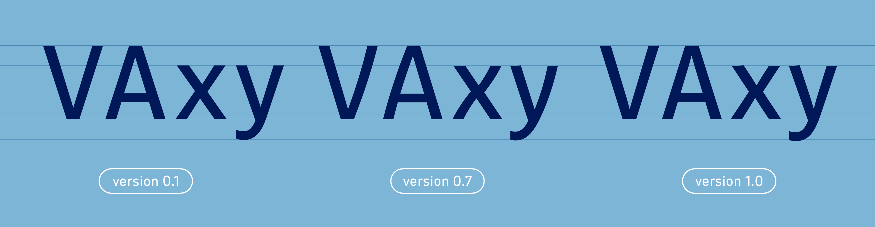
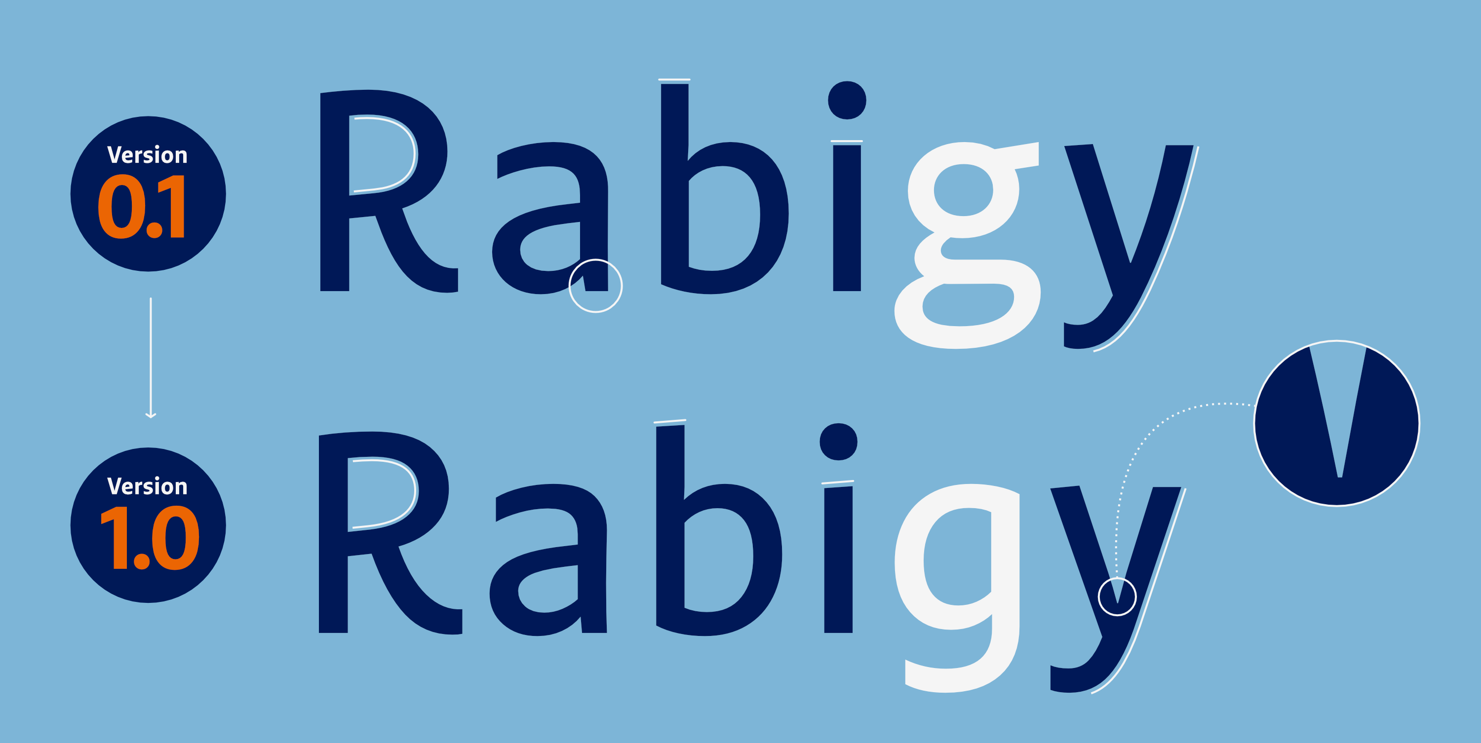
Some notable changes included, “straightening out” the diagonals, a shorter shoulder on the prominent “r", the replacement of the double-story “g,” and lighter dots. Subtle ink traps were also added to compensate for optical convergence.

RuV Type: An exclusive typeface superfamily for one of Germany’s largest insurance companies, R+V — Lowercase g alternatives
Replacing a single character, such as the double-story “g,” can already significantly influence the overall impression of a typeface.

In the following iterations, countless detail improvements were added, allowing us to complete the basic alphabet in the upright weights fairly quickly.

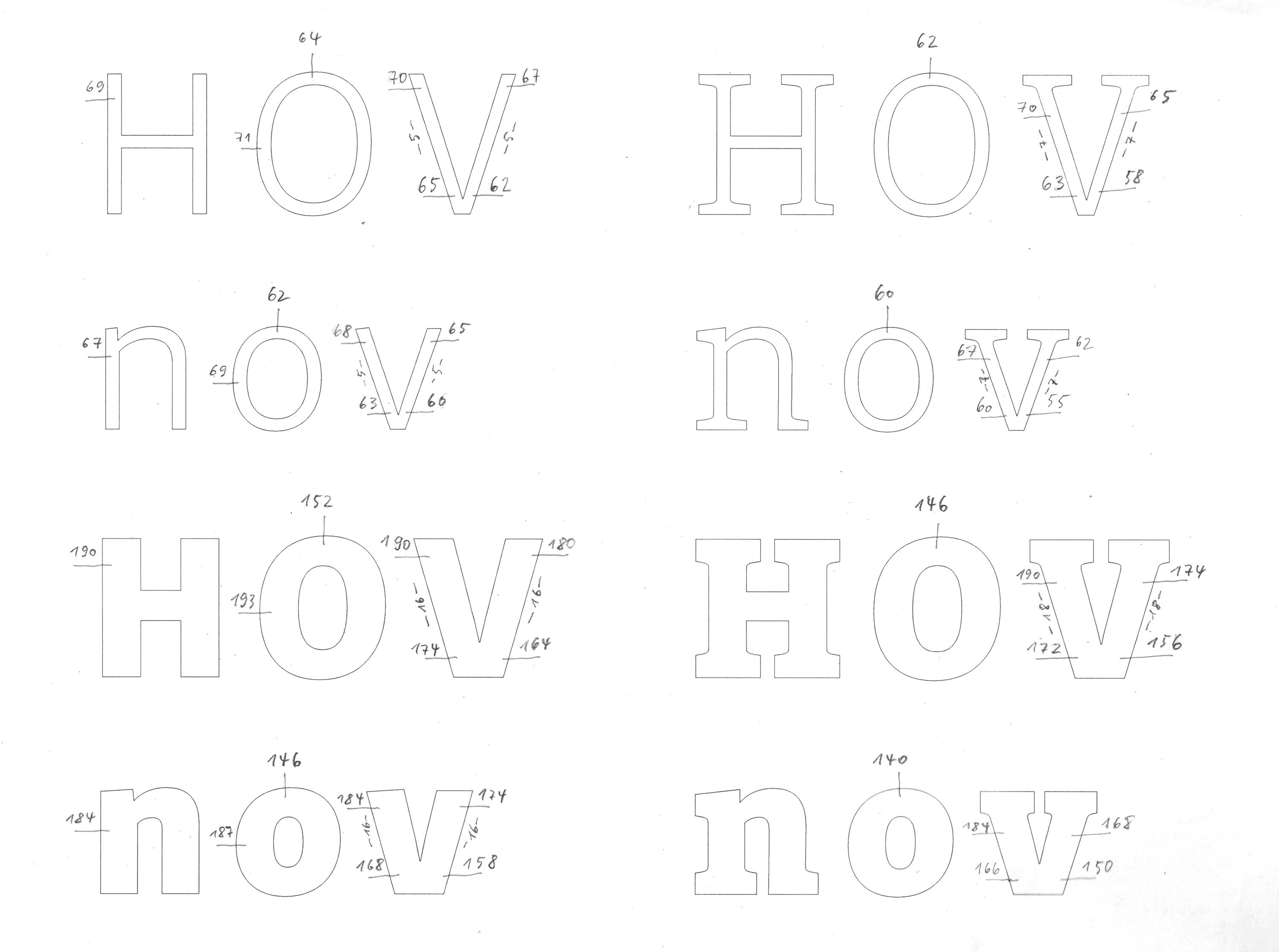
RuV Type: An exclusive typeface superfamily for one of Germany’s largest insurance companies, R+V — Scan measurement
As seen here, in the harmonization of the sans and slab styles, type design often also has a mathematical component.

We then adjusted the Slab to a comparable level. To do this, we repeatedly ran parallel tests using actual marketing materials provided to us by the client. This allowed us to assess how well the first two members of the family harmonize with one another. With the delivery of the first beta fonts (TTF format, initially only auto-hinting and basic kerning), the R+V team also had the opportunity to provide better feedback and “get comfortable” with the new visual identity early on.

I’m really excited. The typeface looks super modern yet professional and ‘solid.’ Because it’s slightly more elongated than the old one, I find it more readable, and it looks more appealing and professional. Yet it loses none of its fresh appeal. Absolutely fantastic and a great result!
RuV Type: An exclusive typeface superfamily for one of Germany’s largest insurance companies, R+V — Tests alpha fonts
As soon as the first alpha test fonts are available, they are tested, tested, and tested in real marketing templates.
RuV Type: An exclusive typeface superfamily for one of Germany’s largest insurance companies, R+V — Test alpha fonts
Although the badge says, “awesome typeface”, we don’t want to subtly influence our clients in the process, of course… ;)
RuV Type: An exclusive typeface superfamily for one of Germany’s largest insurance companies, R+V — Scan
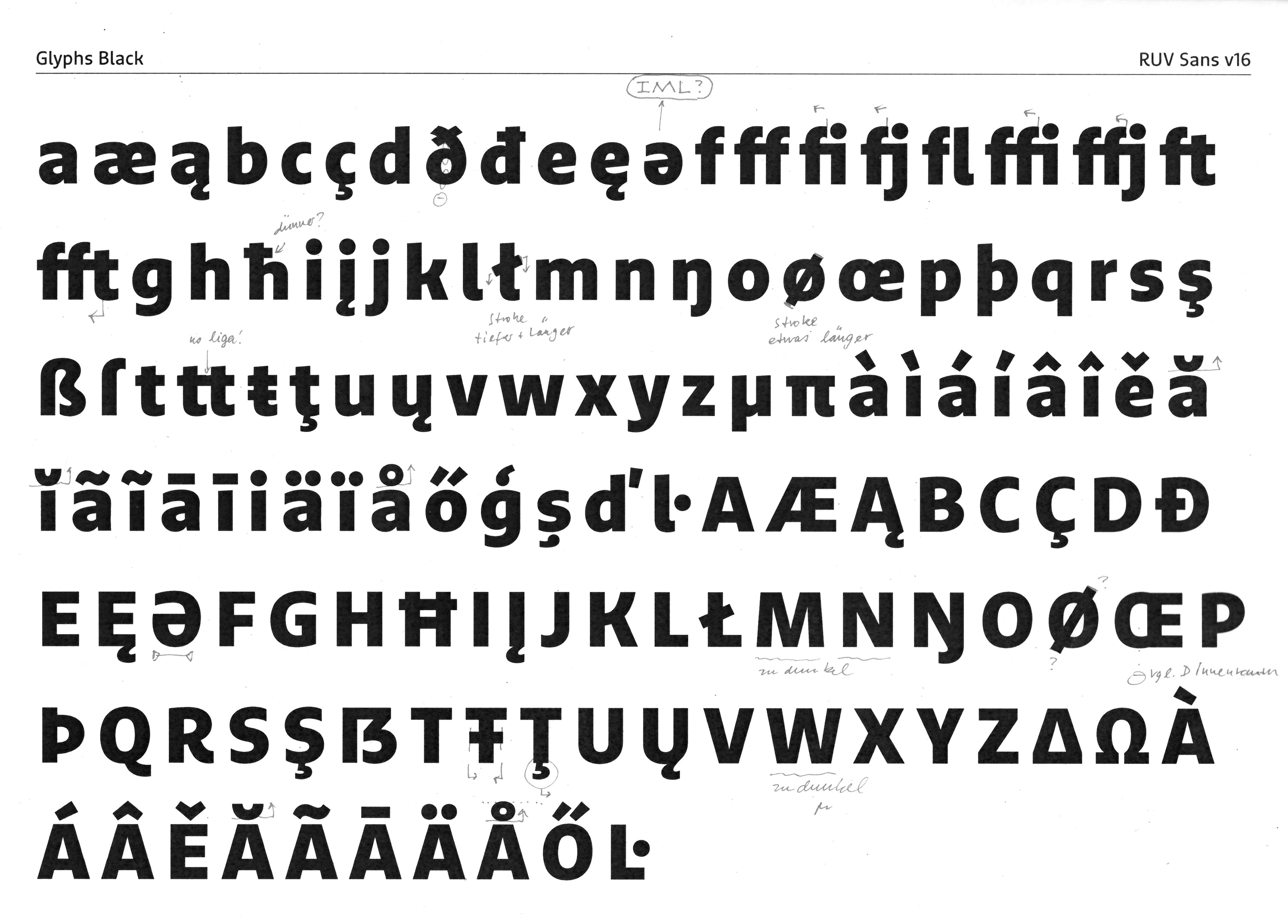
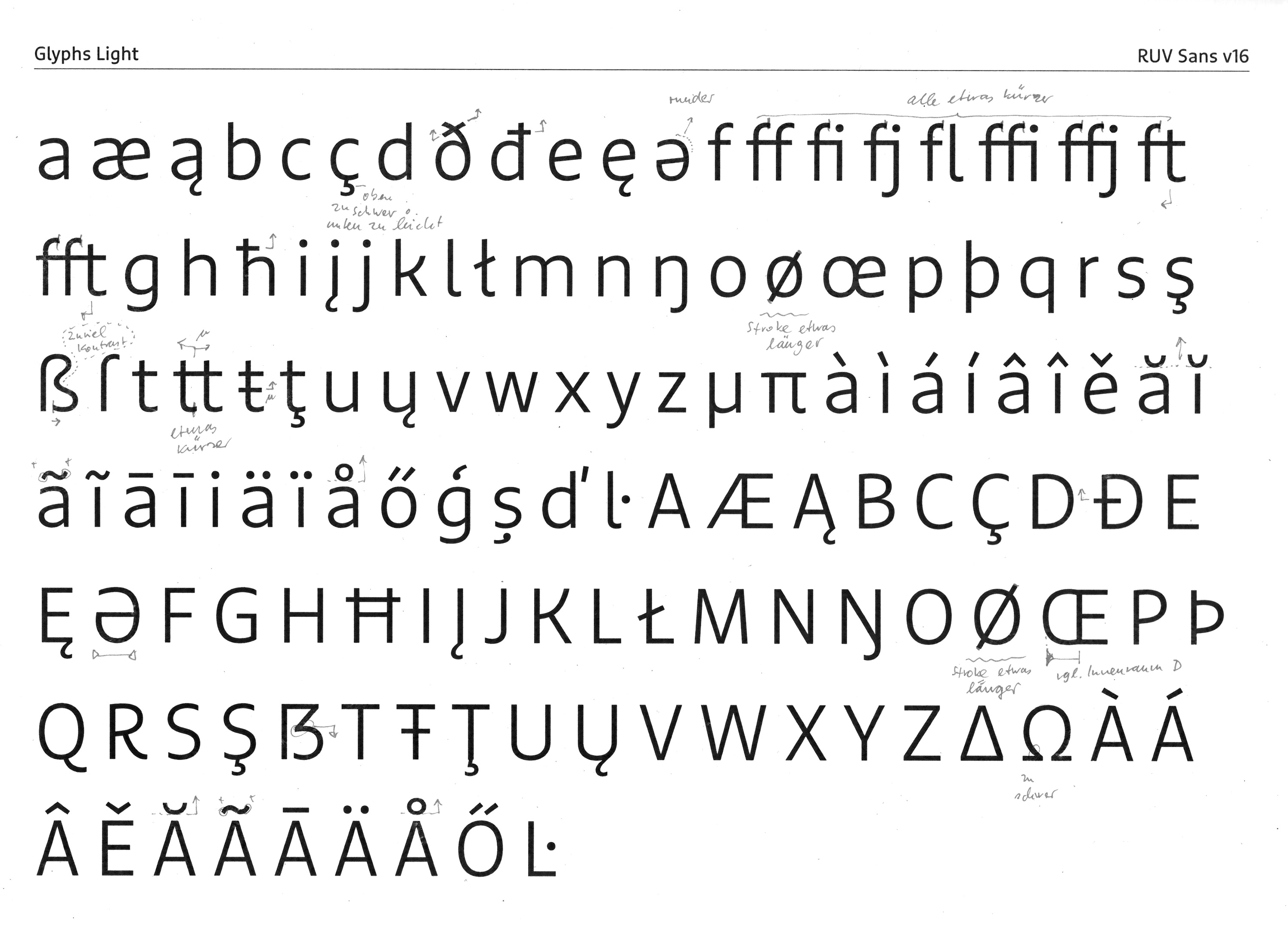
Each iteration brought numerous detail improvements, for example regarding the typographic color…
RuV Type: An exclusive typeface superfamily for one of Germany’s largest insurance companies, R+V — Scan
… placement of diacritics, kerning, or character widths.

The subsequent intensive testing phase at R+V gave us the opportunity to begin work on the third typeface in the family, the serif. Although it will be used less prominently, as a stylistic option for the future it will be treated with the same meticulous care as its two sisters. The first step here was to design a well-crafted basic alphabet to make a good first impression.

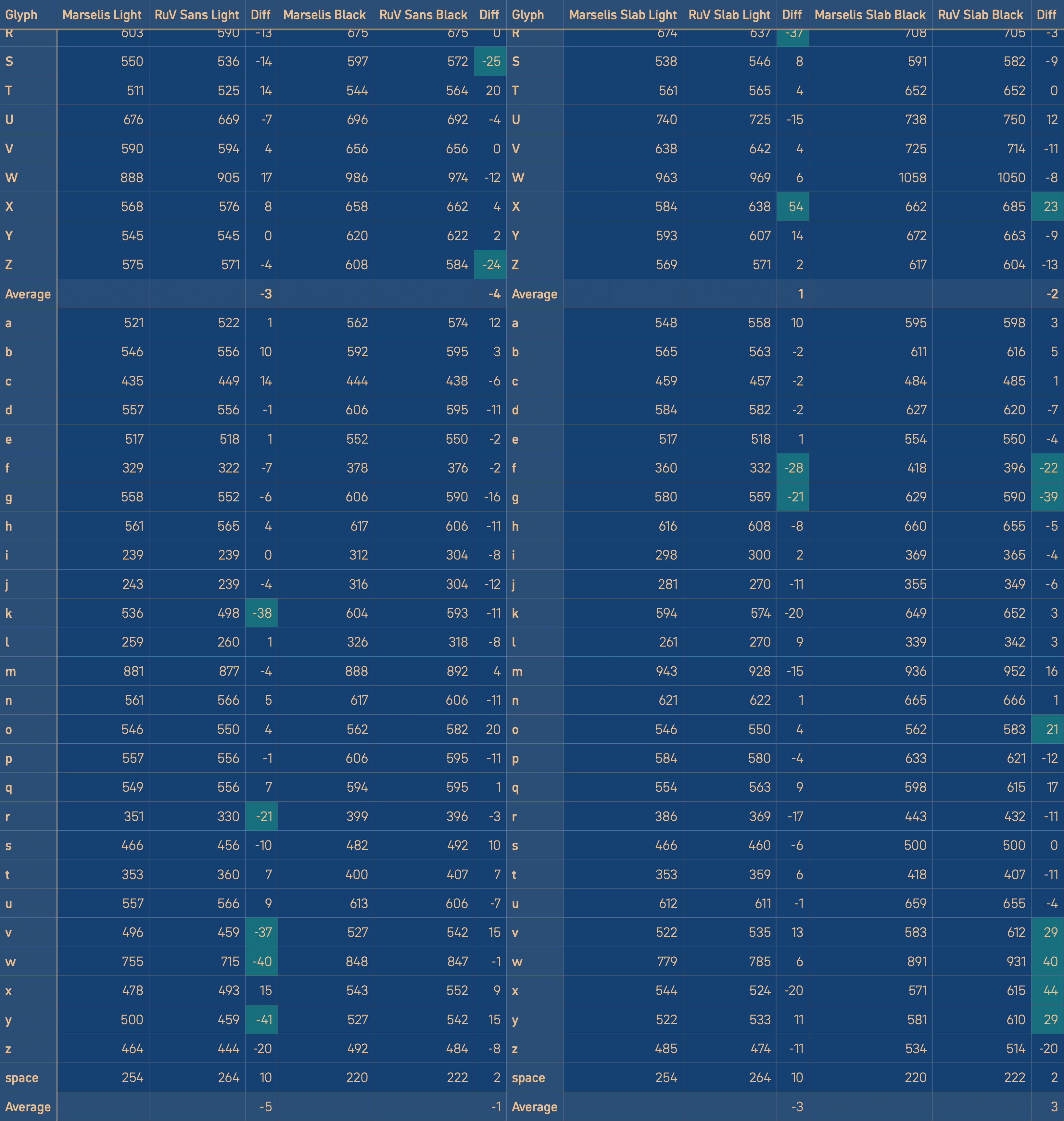
Since switching fonts in such large companies typically involves a significant amount of work updating existing templates and documents, we still needed to determine how closely we should align with the letter spacing of the previous typeface. In principle, the letter spacing was already similar, but of course not identical. It was agreed to reduce the deviations as much as the character of the new typeface allowed, without, however, making painful compromises.

RuV Type: An exclusive typeface superfamily for one of Germany’s largest insurance companies, R+V — Comparison character widths
To preserve line breaks as much as possible when replacing the fonts, the character widths were aligned to a reasonable extent. The table shows the approximate character width equivalence between RuV Type and Marselis.

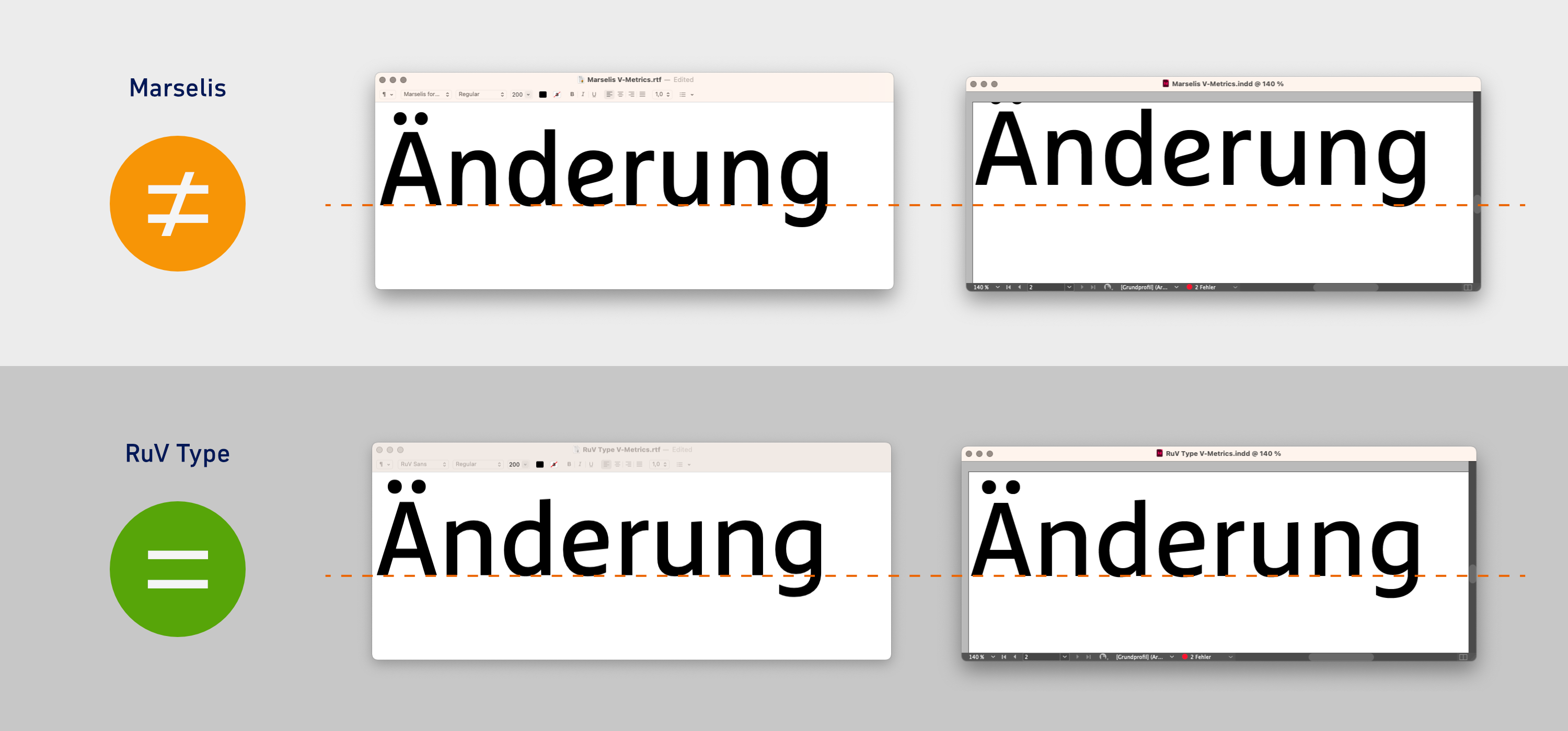
Other technical issues that needed to be clarified at this point concerned the vertical metrics. For historical reasons, fonts contain three different sets of data that programs use for interpretation.

These three pairs of values were not identical in Marselis, this resulted in an upward shift in some programs, such as InDesign.

RuV Type: An exclusive typeface superfamily for one of Germany’s largest insurance companies, R+V — Baseline shift
In Marselis, the value pairs that programs use to interpret vertical metrics are historically based (and therefore not a bug!) but are not identical. This results in an upward offset in DTP apps such as InDesign and QuarkXPress.

Our goal therefore was to synchronize the value pairs to ensure consistent vertical spacing across all programs. While this would cause issues with existing InDesign templates, it would be the most reliable solution in the long run.

The next step involved laying out the new versions of the Sans and Slab beta fonts. These new versions were thoroughly optimized, included a complete character set, finalized spacing and kerning, full OpenType functionality (figure sets, superscript and subscript figures and letters, ordinals, fractions, slashed zero, ligatures, contextual alternates, case-sensitive forms for capital letters, and language-specific forms), as well as optimized hinting; and initial betas for the italics and serif fonts with a basic character set and finalized spacing. Here, too, the practice of testing using real-world application examples was continued, which allowed for continuous feedback on the design.

RuV Type: An exclusive typeface superfamily for one of Germany’s largest insurance companies, R+V — Modifications diagonals
Evolution from the first draft …
RuV Type: An exclusive typeface superfamily for one of Germany’s largest insurance companies, R+V — Modifications
to the finished font, …
RuV Type: An exclusive typeface superfamily for one of Germany’s largest insurance companies, R+V — Modifications animated
… easier to understand in animated form.
From a technical SEO perspective, everything is flawless. The file size has been further reduced compared to the previous typeface.

The serif counterpart could be designed more efficiently based on the existing sans and slab families. In the final phase of the project, in addition to expanding the italics, we were able to focus entirely on the third family member, which had previously been developed only in broad strokes. Since it will initially be used exclusively in the employee magazine, we designed it with a focus on its use in editorial design.

RuV Type: An exclusive typeface superfamily for one of Germany’s largest insurance companies, R+V — Details RuV Serif
Finally, the serif typeface also took shape.
RuV Type: An exclusive typeface superfamily for one of Germany’s largest insurance companies, R+V — Mockup RuV Serif
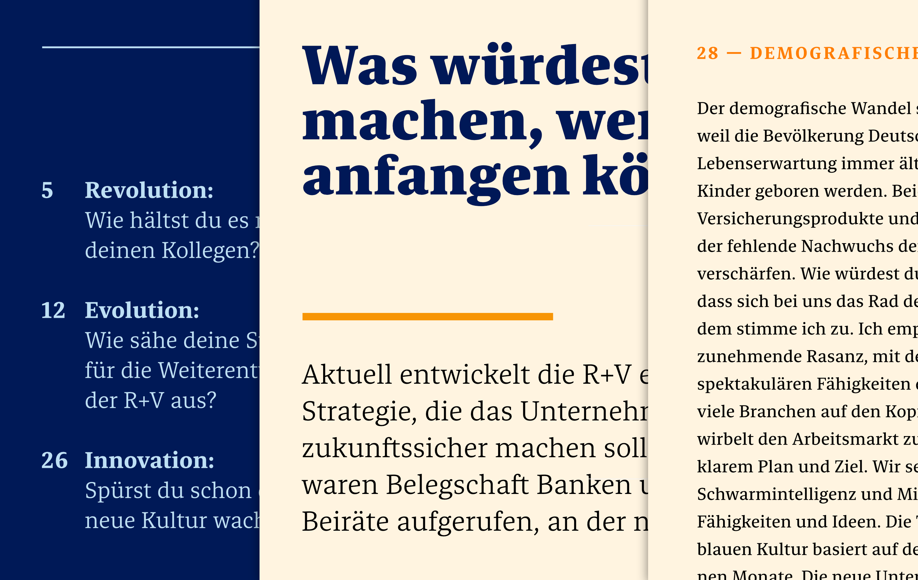
We tested the serif family in the employee magazine, where the typeface will initially be used exclusively.
Conclusion

In conclusion, we were able to deliver the three-part exclusive superfamily, including comprehensive documentation: 24 static and six variable fonts, each with 568 characters and support for approximately 100 Latin-based languages.

Thanks to the ongoing involvement of the relevant departments at R+V, the implementation has proceeded without any significant issues so far—with equal joy and enthusiasm on the part of both the client and the producers.

We are not only proud of our most extensive custom font project to date, but also deeply inspired by the exceptionally great collaboration. When a client embodies its brand values as R+V does, translating them into design criteria comes easily.

This project demonstrates once again that respectful collaboration on a level playing field, as was the case here, from the initial contact through to the distribution of the finished fonts, guarantees the best results and that when a custom solution is unavoidable, involving all internal stakeholders early on is crucial to a project’s success.

The new typeface reflects our values and gives our brand identity a distinctive character.
Fontwerk impressed us across the board. The result for R+V is a brand-defining and highly functional typeface family that brilliantly represents our brand across all touchpoints! From participating in the pitch process through the initial ideation workshop right through to the rigorous and efficient development of the typeface variants, we felt we were in excellent hands every step of the way. Aside from the perfect result, the human element at Fontwerk deserves special mention. Ivo and Jan guided us through the project with convincing authenticity, treating us as equals, and with just the right amount of humor, keeping us completely at ease throughout.
RuV Type: An exclusive typeface superfamily for one of Germany’s largest insurance companies, R+V — Details
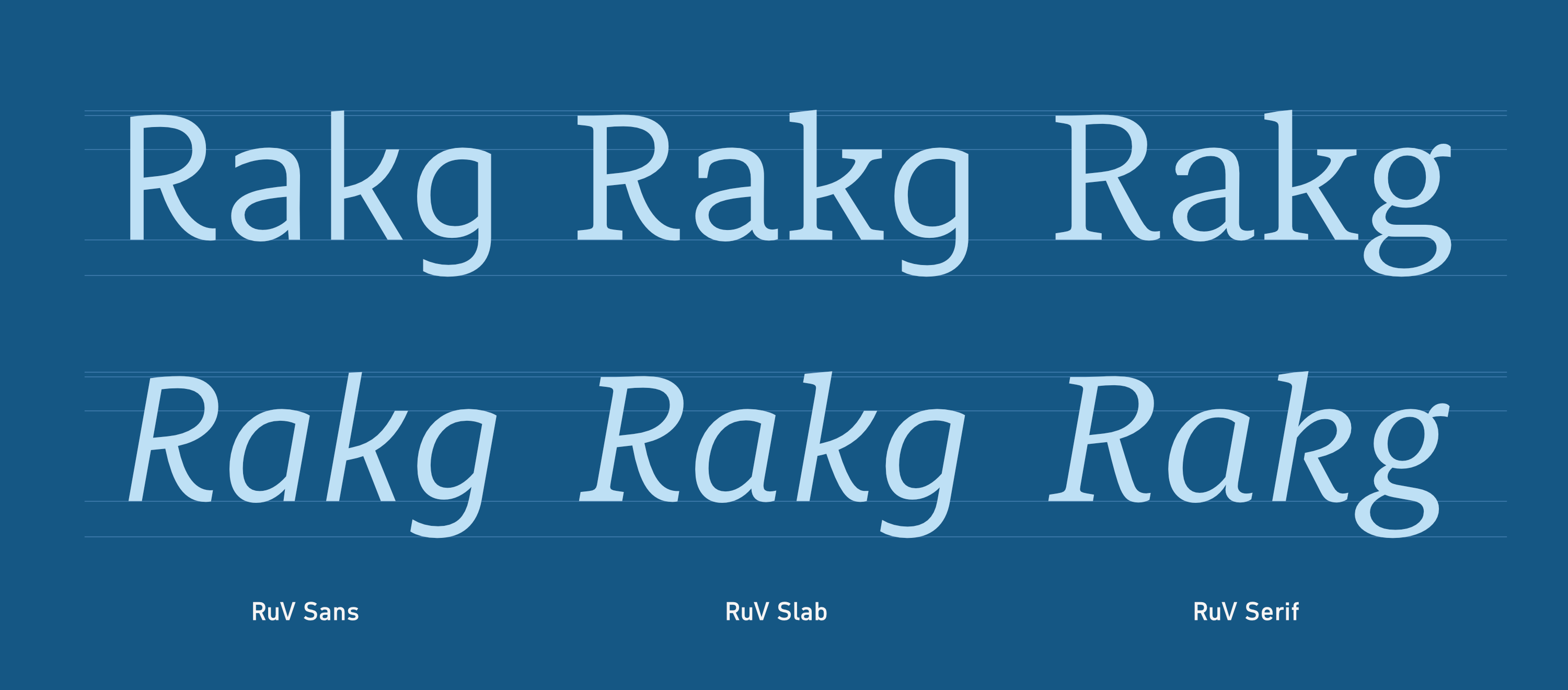
Comparison of RuV Sans, RuV Slab, and RuV Serif
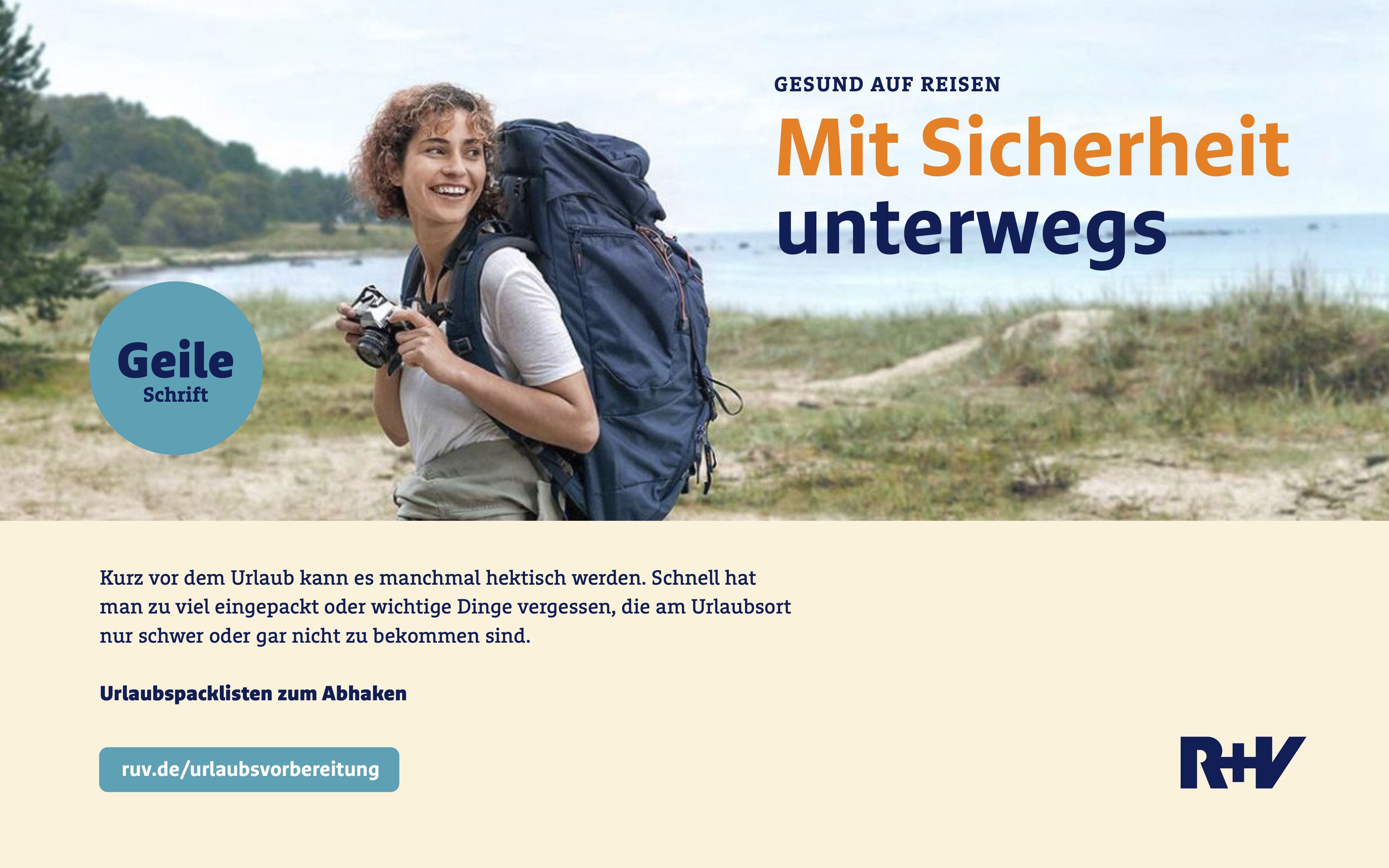
RuV Type: An exclusive typeface superfamily for one of Germany’s largest insurance companies, R+V — Draft ad
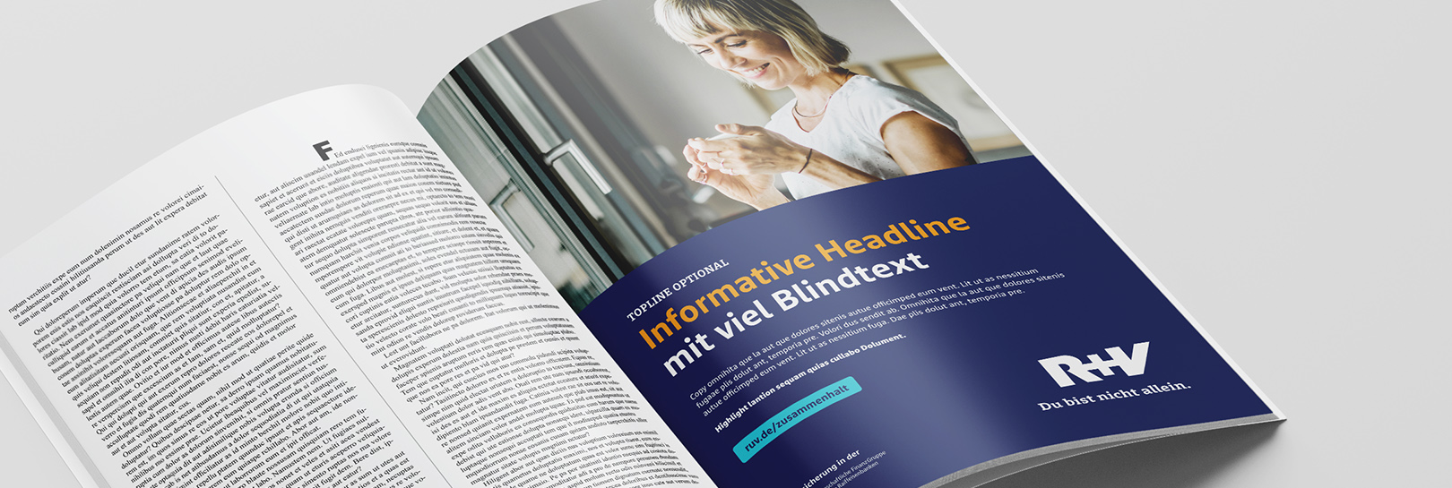
Example of a full-page ad in a magazine using the new fonts (Visualization by R+V)
For the internal launch, R+V produced this video in which we—type designer Jan Fromm and project manager Ivo Gabrowitsch—had the opportunity to introduce the new fonts to the (huge) team. (© Victor Holland, Hotel Galaxy Films)