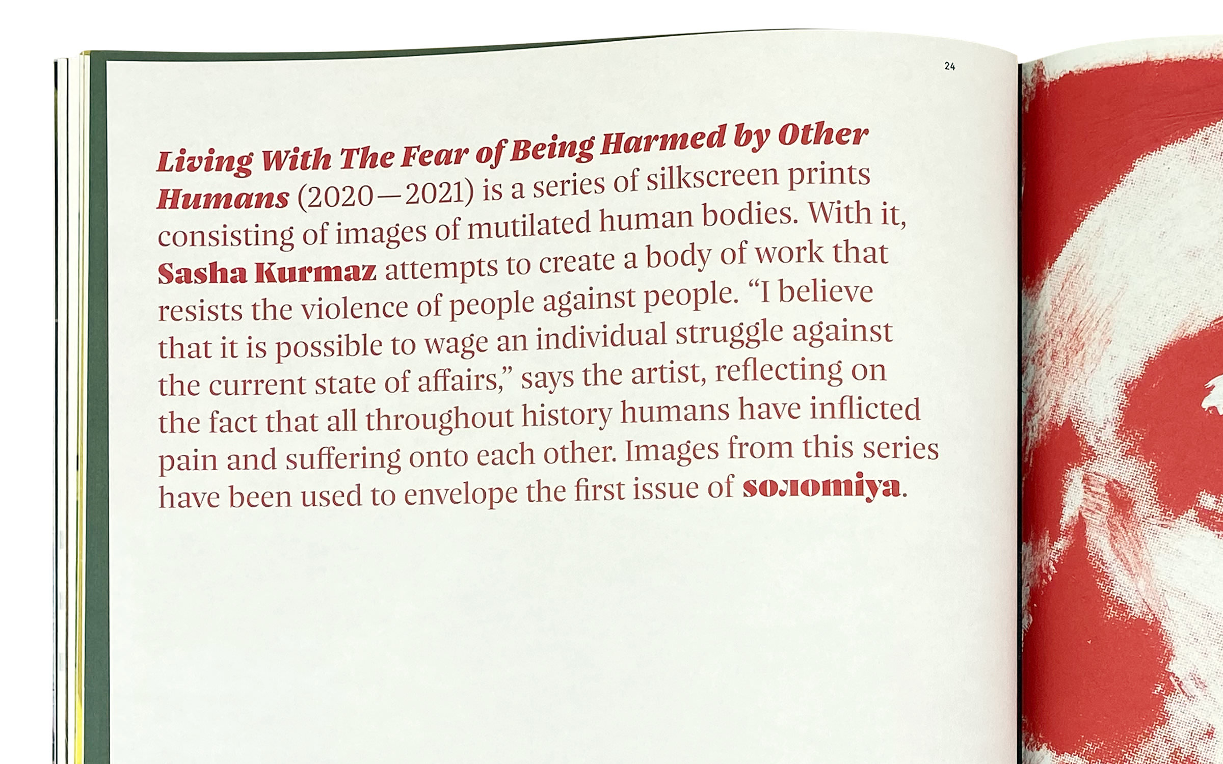
The Nice typeface superfamily in use for the Soлomiya Art Magazine – Cover, Nice Poster

Make art not war.

In April 2022, the 26-year-old Ostkreuz photographer, Sebastian Wells, travelled to Kyiv because he no longer wanted to work on art projects as Russia invaded Ukraine. “I didn’t know what I wanted to do there either … And so I just went there, without any aim or goal …”.

Two days after his arrival, he met 21-year-old Vsevolod Kazarin, who had just made a name for himself in fashion photography. “He was now practically unemployed and didn’t know what to do with himself either,” recalled Wells. They spontaneously decided to start a project with and about young people in Ukraine and so the foundation was laid for an extraordinary art magazine called Soлomiya (Ukrainian for ‘peace’).

On the 103rd day of the Russian invasion of Ukraine, work began on Soлomiya. With the premiere edition, Kazarin and Wells wanted to show what there is to defend in Ukraine: Young people with hope and courage, who grew up in an independent country and who are not ready to give up their freedom.
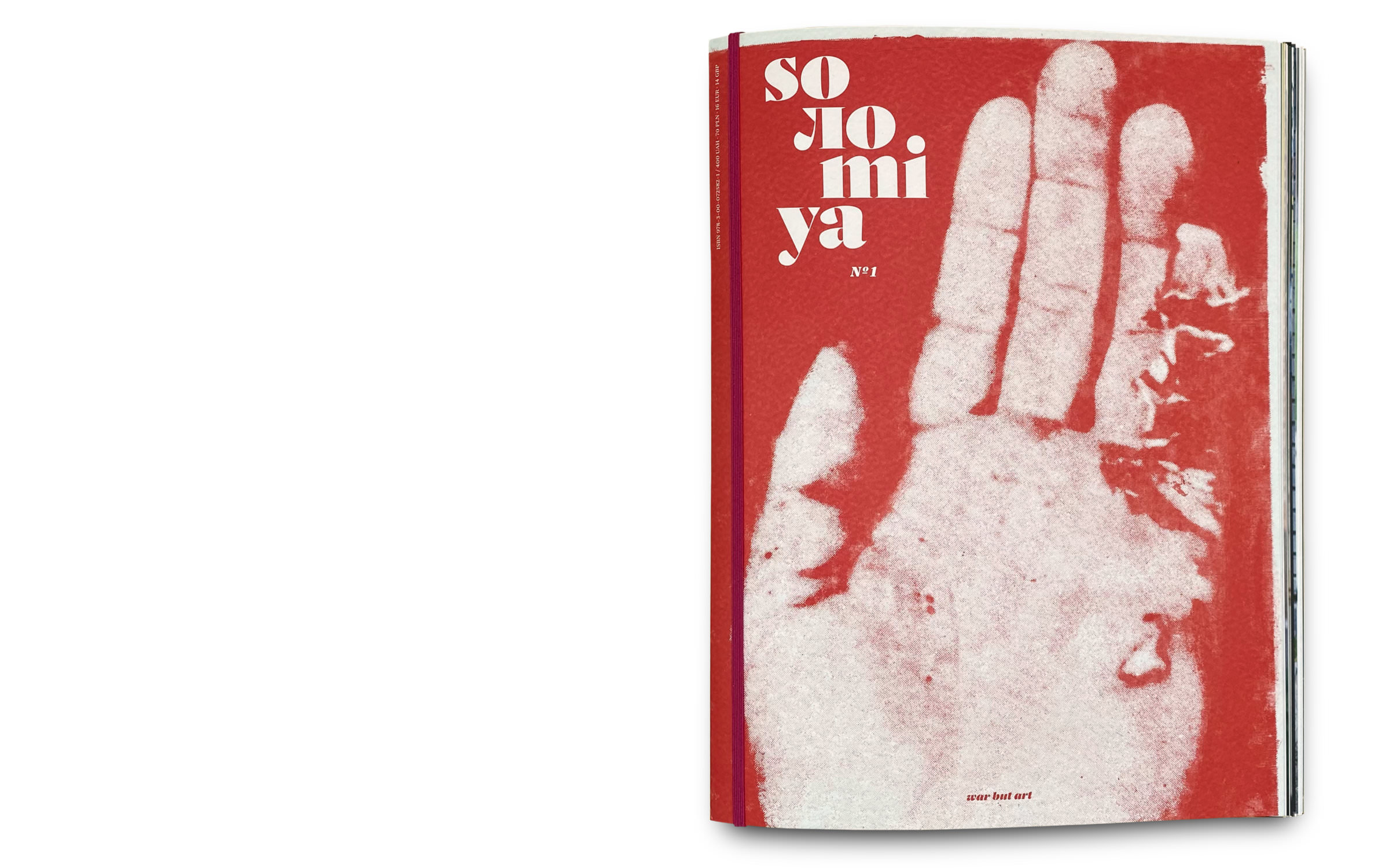
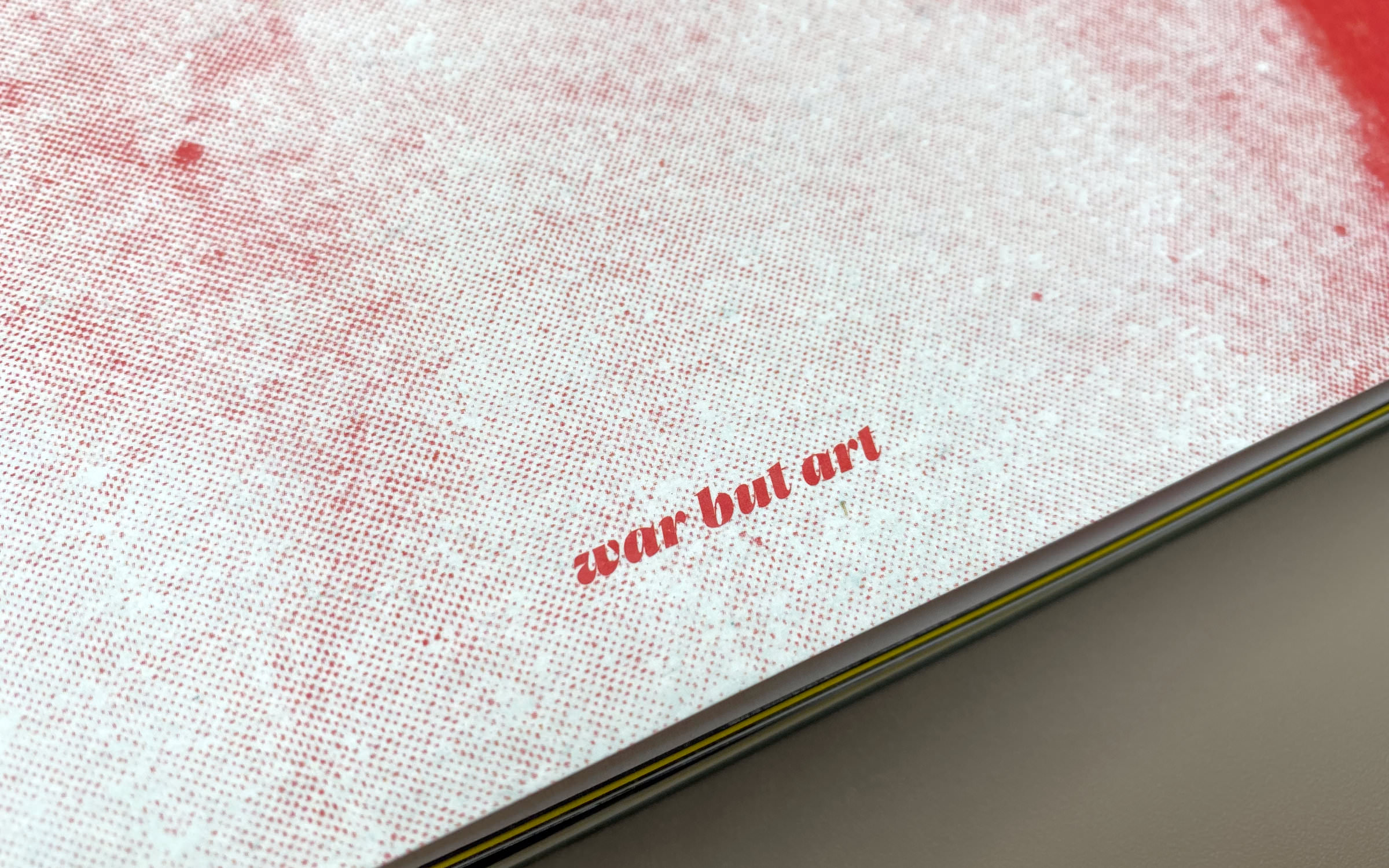
The Nice typeface superfamily in use for the Soлomiya Art Magazine – Cover, Nice Poster Italic

Header image: The logotype with a custom-л was created by Jan Fromm using Nice Poster; Image above: Nice Poster ExtraBold Italic

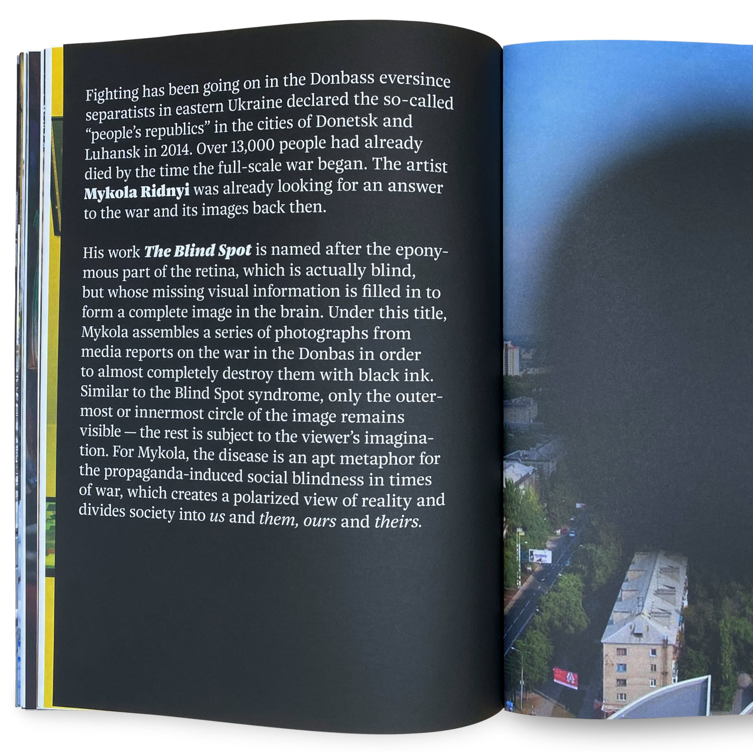
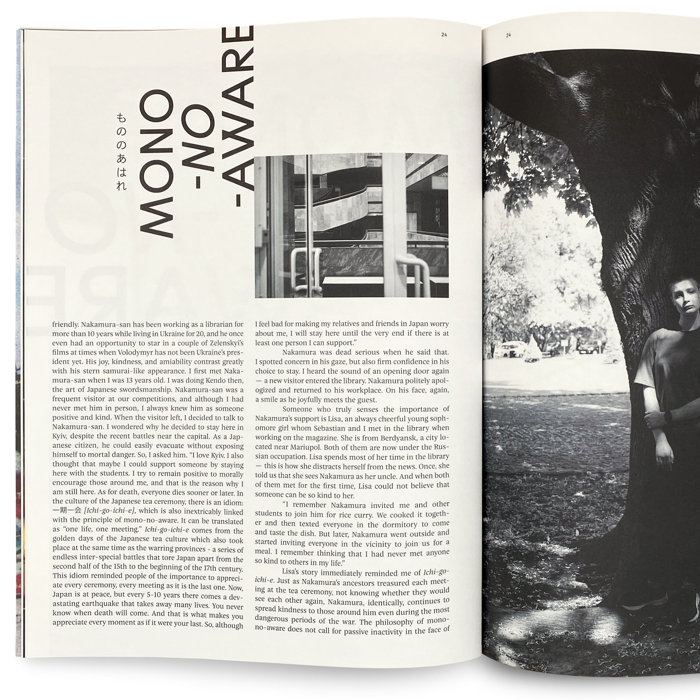
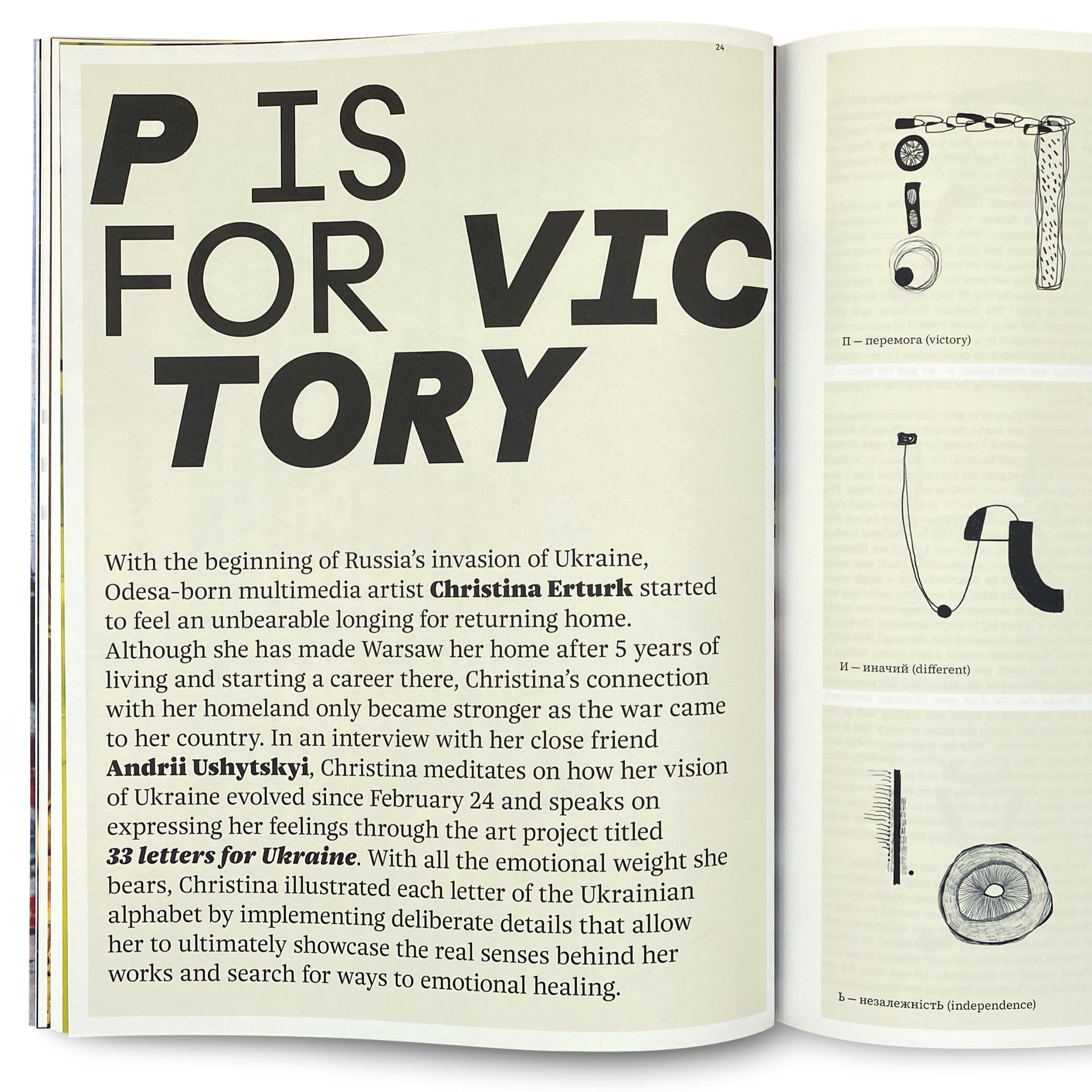
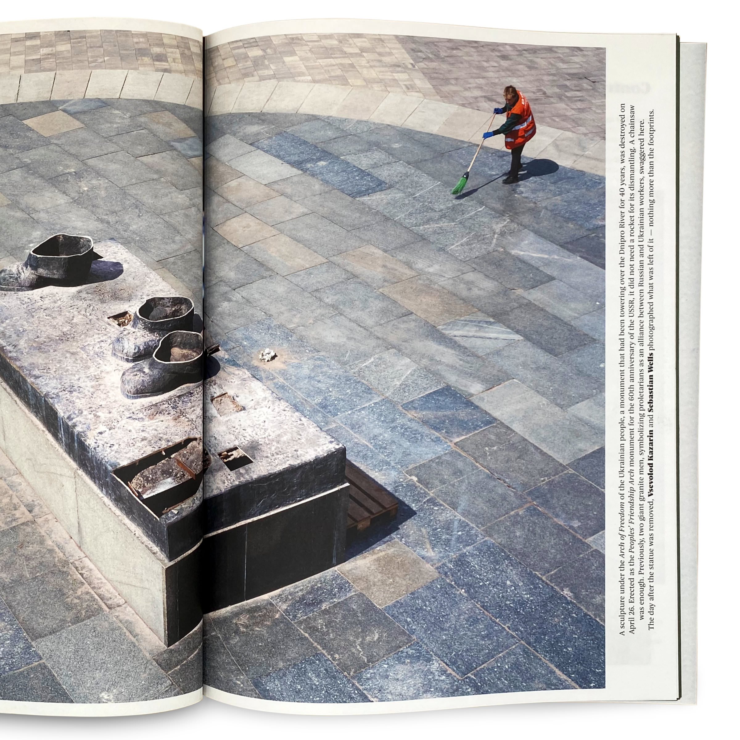
The first issue was printed by Pinguin Druck Berlin and is entitled “War but Art”. Designed by Anne-Lene Proff and Peter Bünnagel from the Berlin design studio Kollektiv Scrollan in cooperation with the Akademie der Künste, it contains photographs, collages, texts and illustrations and features work by well-known Ukrainian artists, such as Sasha Kurmaz and Mykola Ridny, as well as new and emerging talent. The logo and editorial are set in Jan Fromm’s typeface Nice, which is published by Fontwerk. Apart from Nice Micro, all optical sizes are used: The logotype with a custom-л was created by Jan Fromm using Nice Poster, inside the magazine both Nice Headline and Nice Text are being used. Other typefaces in the issue include the extraordinary Habitas by Tightype and Grotta by Due Studio, which underlines Soлomiya’s typographic claim.

For more information on the first issue and subsequent editions, visit solomiyamag.com.

Printed by: Pinguin Druck Berlin
Paper: Peyprint Bison, 245 g/m2, Arena natural rough, 120 g/m2.

Try Nice

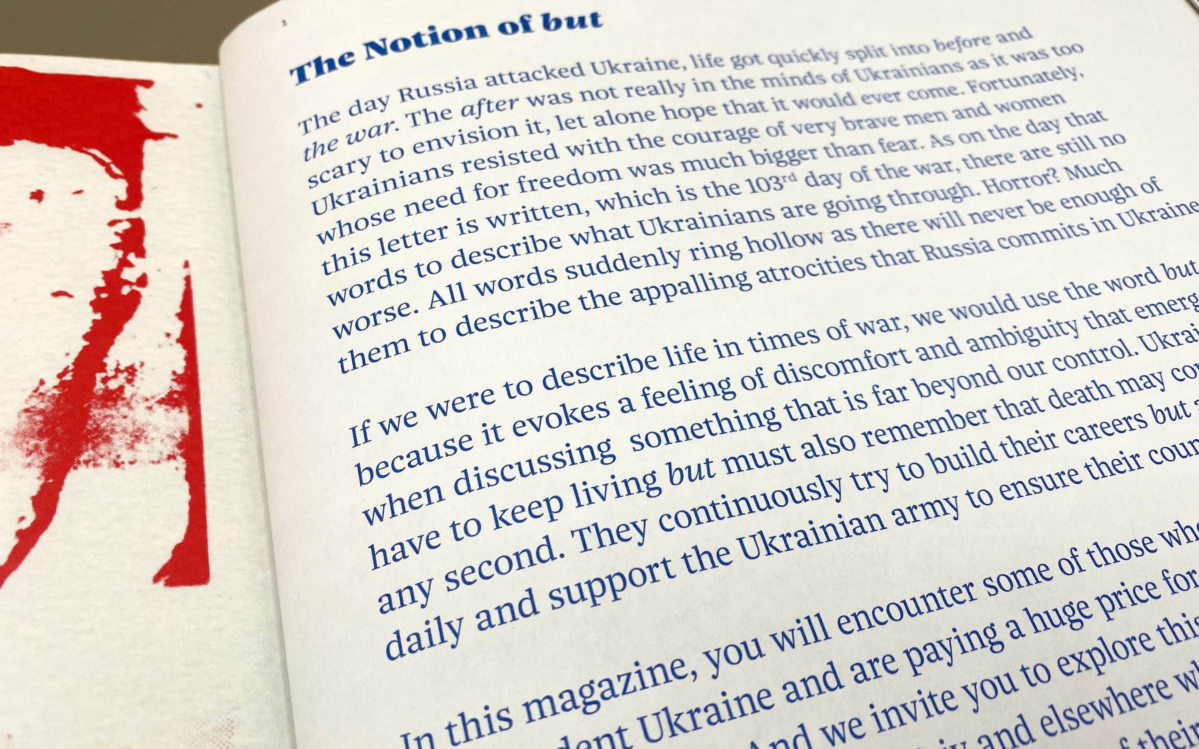
The Nice typeface superfamily in use for the Soлomiya Art Magazine – Preface, Nice Headline and Nice Text

Preface, Nice Headline and Nice Text

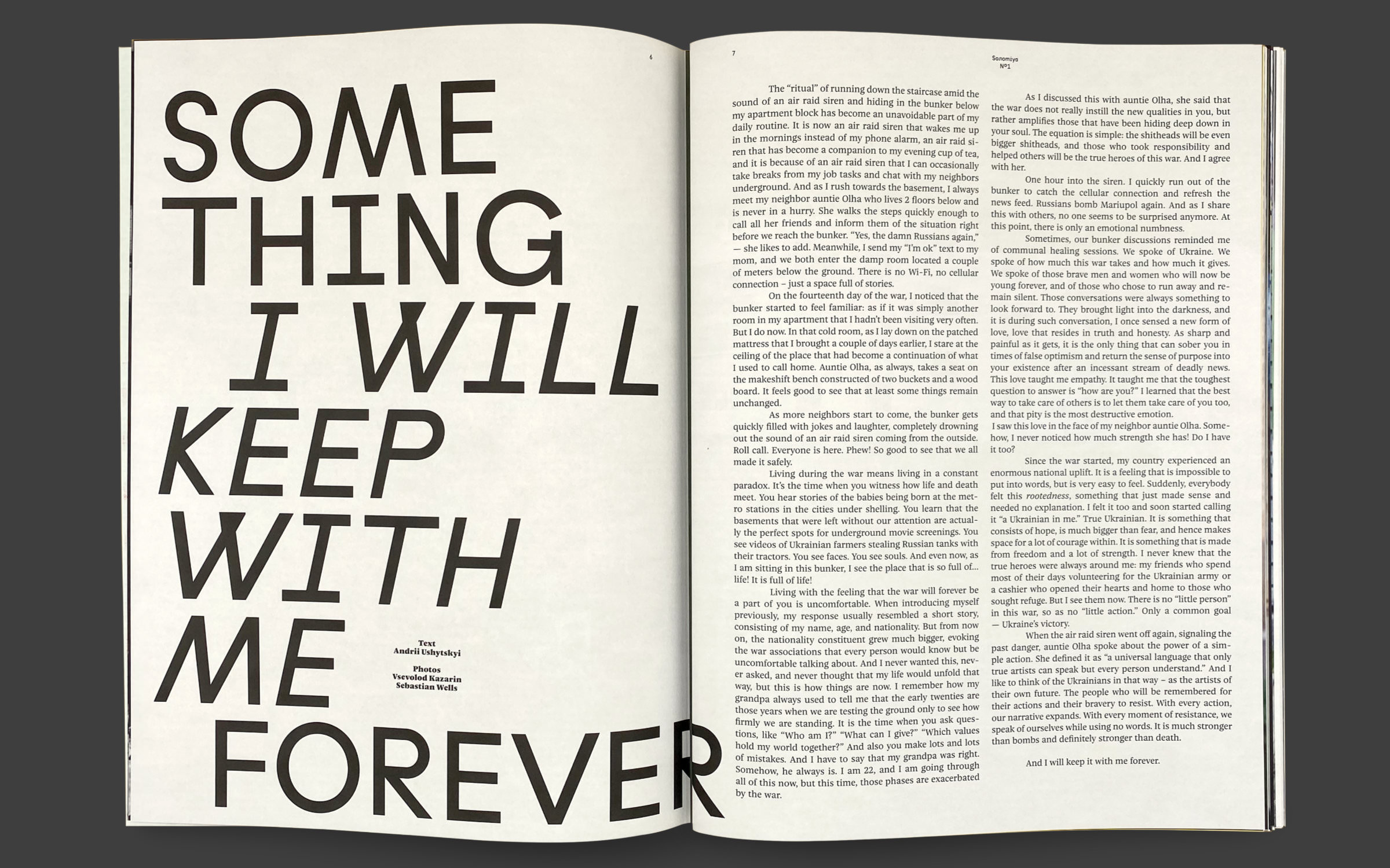
The Nice typeface superfamily in use for the Soлomiya Art Magazine – Pages 6 and 7, Habitas (Tightype) and Nice Text

Pages 6 and 7, Habitas (Tightype) and Nice Text

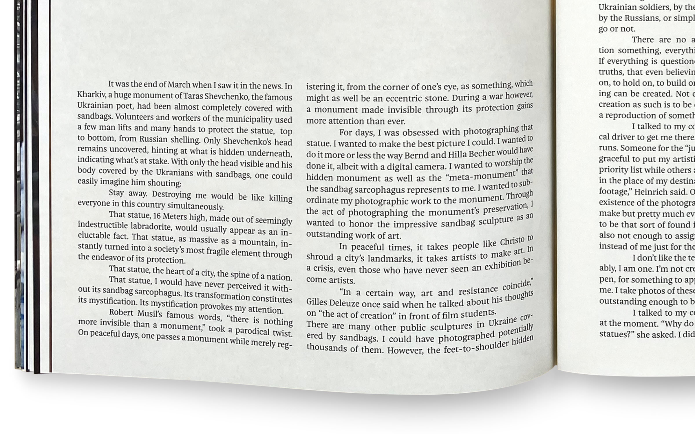
The Nice typeface superfamily in use for the Soлomiya Art Magazine – Nice Text

Nice Text

The Nice typeface superfamily in use for the Soлomiya Art Magazine – Nice Headline and Nice Text

Nice Headline and Nice Text

The Nice typeface superfamily in use for the Soлomiya Art Magazine – Nice Text and Nice Headline

Nice Text and Nice Headline

The Nice typeface superfamily in use for the Soлomiya Art Magazine – Habitas (Tightype) and Nice Text

Habitas (Tightype) and Nice Text

The Nice typeface superfamily in use for the Soлomiya Art Magazine – Habitas (Tightype) and Nice Text

Habitas (Tightype) and Nice Text

The Nice typeface superfamily in use for the Soлomiya Art Magazine – Nice Text and Nice Headline

Nice Text and Nice Headline

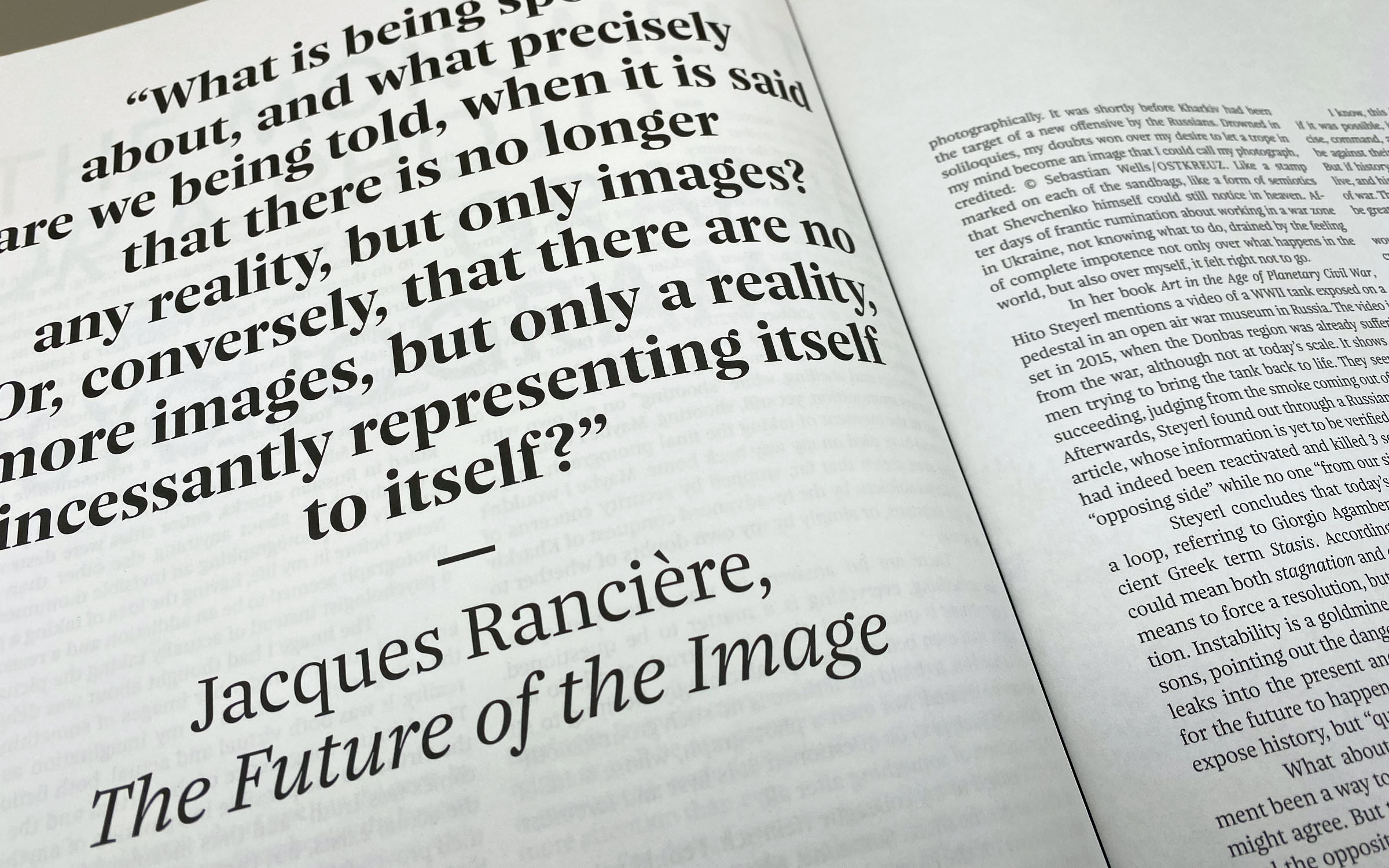
The Nice typeface superfamily in use for the Soлomiya Art Magazine – Nice Headline and Nice Poster

Nice Headline and Nice Poster