Neue DIN
Neue DIN
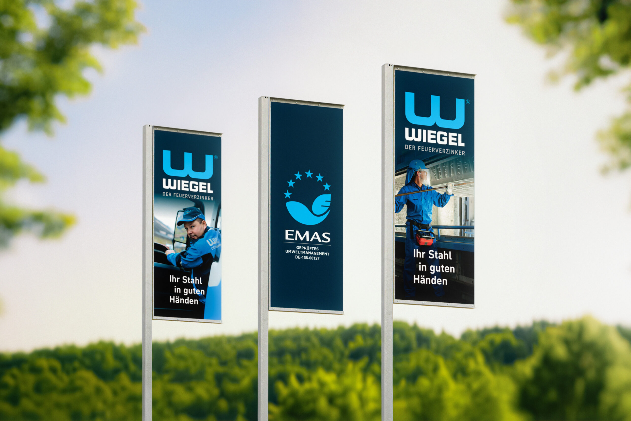
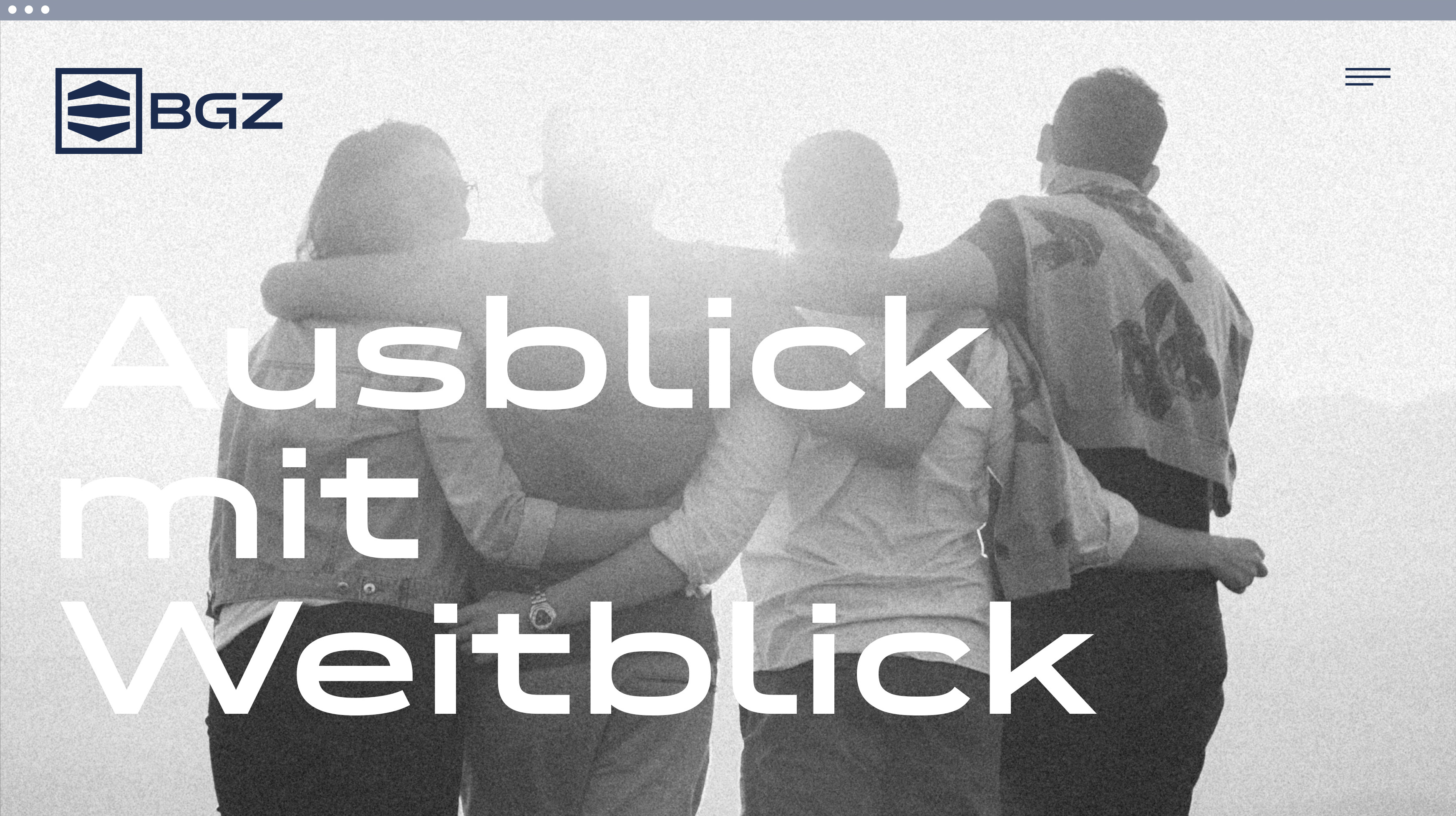
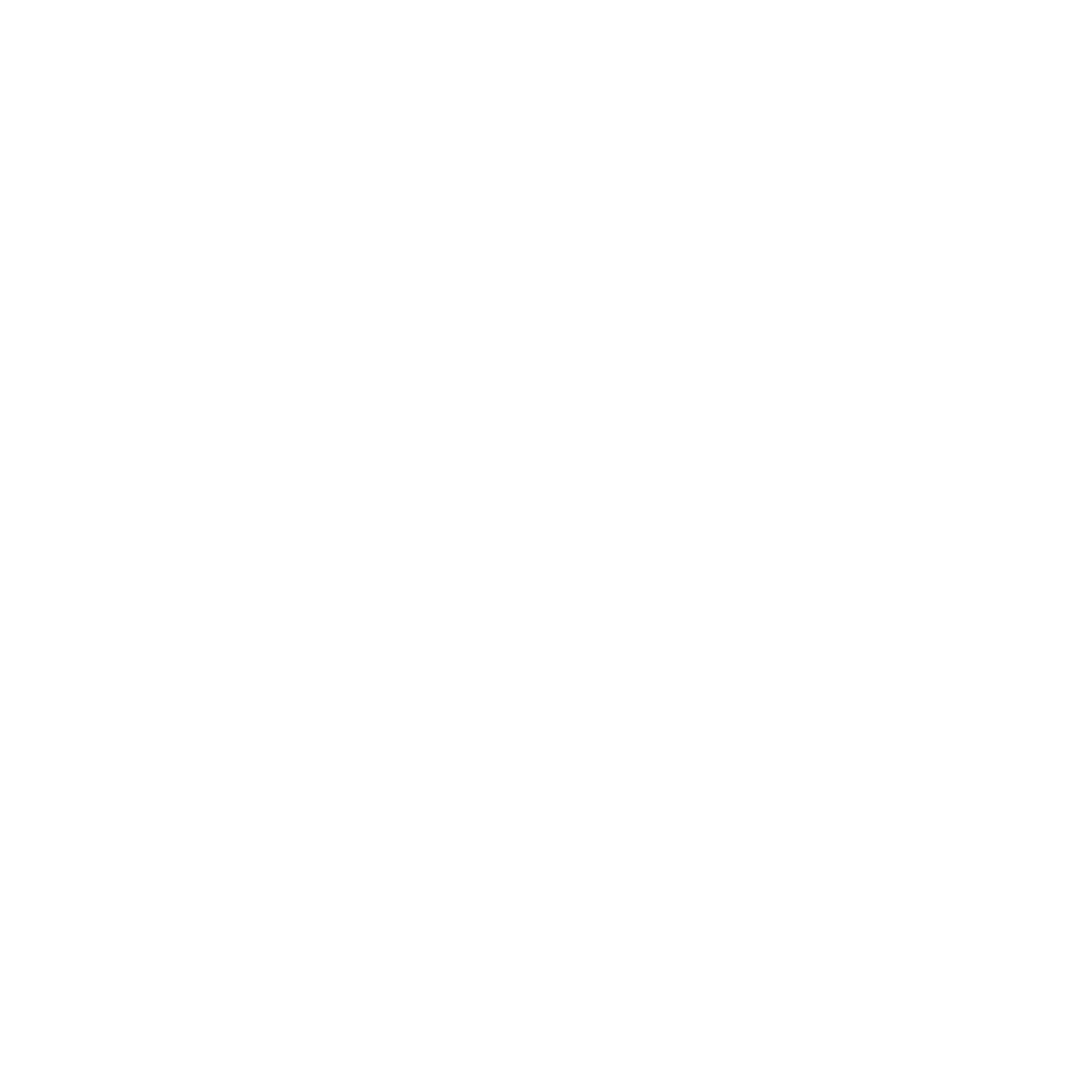
The German type icon reimagined with compactness and elegance, extreme widths and a variable-first approach.

Designer(s)
Andreas Frohloff
Hendrik Weber

Olli Meier
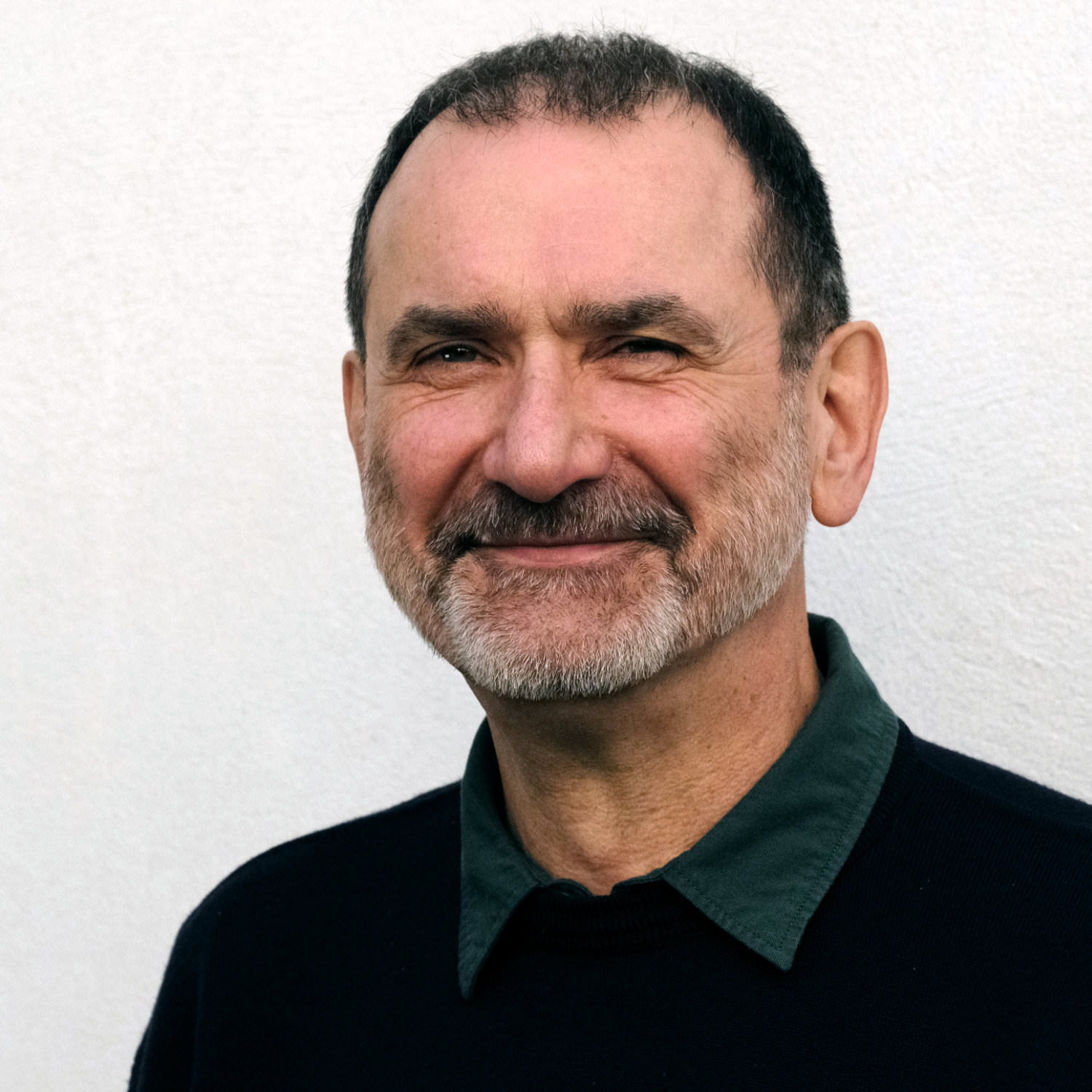
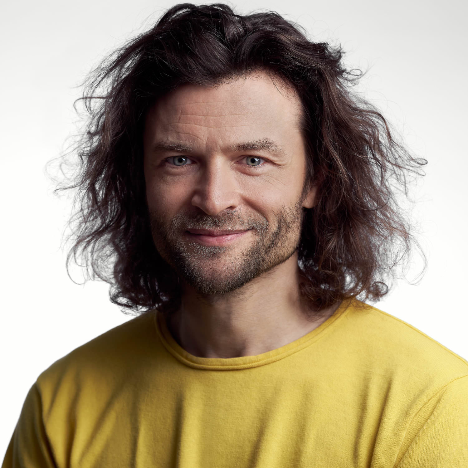
Andreas Frohloff
As Type Director, Andreas Frohloff was our first employee and now works for us on a freelance basis. His mentoring approach and expert eagle eye have been instrumental in informing our own approach as to how we want to publish fonts.
During the 16 years that he headed up the TypeDepartment at FontFont, his guiding hand was highly appreciated by numerous designers. Many FontFont superstars, including FF DIN, FF Meta, FF Mark and FF Spinoza, all benefited from his precision and meticulousness.
Andreas is perhaps best known for his workshops and type design teaching. There was hardly a TYPO Berlin visitor from 2001 to 2018 who didn’t benefit from his highly interactive and engaging calligraphy workshops and from his hilarious puns and wordplay.
Together with Axel Bertram he published two font families Rabenau and FF Videtur and revised the characterful Berlin street signs after German reunification. His latest major project is Neue DIN, which he created together with Hendrik Weber and Olli Meier and whose design he influenced decisively.
Fonts on Fontwerk
Hendrik Weber
Simple is the best. Hendrik Weber has been guided by this seemingly uncomplicated yet in reality rather challenging design principle for the past 20 years when designing in public spaces.
As the Type Director of KMS Team – one of Germany’s leading agencies – Hendrik sees his work as inextricably linked with neighbouring disciplines. He strives for a constant exchange with designers from the fields of motion, 2D/3D, interactive and print and his exclusive typefaces for top brands such as Porsche, Bentley, BMW Motorbike, Santander and Canyon bikes, as well as his retail fonts for TypeBy and Monotype (Lirico, Edward, Unitext) are proof of his determination to create visible quality even in demanding environments. One of his dreams came true while working as Type Director for the DACH region at Monotype, where he led the team that worked on the revision of the most popular typeface in the western world (Helvetica) which resulted in the creation of Helvetica Now.
The foundations for his impressive CV were laid during his studies at the Leipzig Academy of Fine Arts. His patron Fred Smeijers, Professor of the then newly founded specialist class for type design, recognized his talent and has regularly relied on Weber’s services since he graduated.
The final phase of his studies was dominated by research on cursive typography and culminated in a book on the subject. “Italic – What gives Typography its Emphasis” is regarded as the first detailed treatise on the subject. It has since been translated into English and the second edition is available from the Swiss publisher Niggli. Since graduating, Hendrik Weber has passed on his knowledge and experience to students at the Weißensee Academy of Art Berlin, the Academy of Fine Arts Nuremberg, the Munich University of Applied Sciences and the Augsburg University of Applied Sciences.
Together with Andreas Frohloff and Olli Meier he took on Fontwerk’s challenge to rethink the German design icon, DIN. With clever design ideas, precision craftsmanship and following his design principle of simplicity, they came up with a solution that allows for a completely new feel – Neue DIN. Following in the footsteps of its predecessors, Neue DIN has a strict overall impression but it has been completely revitalized and reimagined to incorporate extreme widths, a variable-first approach and an extra special touch of elegance.
Fonts on Fontwerk
Olli Meier
Olli Meier joined the Fontwerk family in 2022. As our Font Engineer, he is responsible for ensuring the high technical quality of our fonts.
He began his career as a Communications Designer for agencies such as MetaDesign and Stan Hema. He also taught the basics of typography at the University of Applied Sciences Dresden before he was drawn to Monotype’s production team. There he found his calling in font technology, most recently as a Senior Software Engineer, and was responsible for internal font tools, among many other things.
His projects for the market leader included: Helvetica Now, Neue Frutiger World (working on Quality Engineering). He worked with Bernd Volmer on the corporate design of TYPOLabs, which used a variable font as a logo for the first time and was awarded a Red Dot. He also created his own family Vary and the interactive font specimen website FontSpecimen.com, which was an Awwwards-nominee. As a committed member of the Unicode consortium, Olli is involved in the development of one of the most important tools in our industry and has worked closely with Dave Opstad, Apple’s TrueType and Unicode Pioneer. Working in cooperation with Glyphs, he also ensures the quality of the app and supports the development of new features.
In addition to font technology work, he also designed Neue DIN together with Hendrik Weber and Andreas Frohloff.
His reputation as a DIY king also proves that he can also do things by hand. He lives on a farm in Barnim and is passionate about growing vegetables, working with wood and jumping on his randonneur bike to cycle to the North Cape.
Fonts on Fontwerk
Team & Details
Design Contributions
Oleksandr Parkhomovskyy Cyrillic
Irene Vlachou Greek
Boom Promphan Suksumek Thai
Anja Meiners
Donny Trương Vietnamese Consultancy
Eugene Yukechev Cyrillic Consultancy
Mastering, Production
Olli Meier
Andreas Frohloff
Marketing
Ivo Gabrowitsch Concept, Naming, Copywriting, Specimen, Photos
Susi Sie Direction & Production (Film Version 2)
Julian Braun 3D Motion Design, 3D Artwork (Film Version 1)
Giovanni Dubini Music & Sound Design
Jana Heinz Artwork
Olli Meier Artwork, Microsite
Dr. Thomas Maier Archive
Dorothee Lange Legal Consulting
Jan Kuhlen Legal Consulting
Lucy Beckley English Translation
Design Period
2020–2026
Release History
Version 1.00: January 10, 2023
Version 1.10: December 1, 2023 mandatory language support of DIN 91379 added (230+ additional characters, 37 additional languages), minor changes (e.g. dots, comma, ampersand)
Version 1.11: February 6, 2024 minor changes
Version 1.20: March 7, 2024 Regular weights slightly lighter, Regular spacing slightly wider
Version 2.00: September 4, 2025 Italic, Retalic
Version 2.10: March 23, 2026 Cyrillic, Greek, Thai
Awards
iF DESIGN AWARD 2024 Winner
German Design Award 2024 Winner
Hiiibrand Design Awards 2023 Silver Award
Communication Arts 2024 Award of Excellence
ADC Award 2023 Bronze (Art Directors Club Germany)
ADC*E Awards 2023 Finalist (Art Directors Club of Europe)
awwwards Honorable Mention Jan 24, 2023 (Microsite)
Mindsparkle Mag Site of the Day Jan 24, 2023 (Microsite)
Technology, Licenses & Trademarks
Formats
Static .otf, .woff2
Variable .ttf, .woff2
Additional formats on request
Licenses
Trial Free test license
Base Includes Desktop, Web and Social Media use
Extended Larger volume, App or Audio-Visual
Additional licenses on request
Modifications, Extensions
Available on request
Variable Fonts
Included in the Family package
3 axes: weight, width, slant
Web file size .woff2: 1.1 MB (subsetting recommended)
Trademarks
Neue DIN™ is a trademark of Fontwerk GmbH
A
Glyphs
Uppercase
A
B
C
D
E
F
G
H
I
J
K
L
M
N
O
P
Q
R
S
T
U
V
W
X
Y
Z
Lowercase
a
b
c
d
e
f
g
h
i
j
k
l
m
n
o
p
q
r
s
t
u
v
w
x
y
z
a
á
ă
â
ä
à
ā
ą
å
ã
ǎ
ạ
Latin Accents
Á
Ă
Ǎ
Â
Ä
Ạ
À
Ā
Ą
Å
Ã
Æ
Ắ
Ặ
Ằ
Ẳ
Ẵ
Ấ
Ậ
Ầ
Ẩ
Ẫ
Ǟ
Ả
Ǻ
Ḁ
Ǽ
Ǣ
Ḅ
Ɓ
Ḃ
Ḇ
Ć
Č
Ç
Ĉ
Ċ
Ƈ
Ð
Ď
Đ
Ḍ
Ɗ
Ḑ
Ḋ
Ḏ
É
Ĕ
Ě
Ê
Ë
Ė
Ẹ
È
Ē
Ę
Ɛ
Ǝ
Ẽ
Ə
Ȩ
Ḝ
Ế
Ệ
Ề
Ể
Ễ
Ẻ
Ʒ
Ǯ
Ḟ
Ğ
Ǧ
Ĝ
Ģ
Ġ
Ḡ
Ǵ
Ǥ
Ħ
Ĥ
Ḧ
Ḥ
Ḫ
Ȟ
Ḩ
Ḣ
IJ
Í
Ĭ
Ǐ
Î
Ï
İ
Ị
Ì
Ī
Į
Ɨ
Ĩ
Ỉ
Ĵ
Ķ
Ƙ
Ḱ
Ǩ
Ḳ
Ḵ
Ĺ
Ľ
Ļ
Ŀ
L
Ł
Ḷ
Ḻ
Ṁ
Ṃ
Ń
Ň
Ņ
Ṅ
Ṇ
Ɲ
Ñ
Ŋ
Ǹ
Ṉ
Ó
Ŏ
Ǒ
Ô
Ö
Ọ
Ò
Ő
Ō
Ɔ
Ø
Õ
Œ
Ố
Ộ
Ồ
Ổ
Ỗ
Ȫ
Ȯ
Ȱ
Ỏ
Ơ
Ớ
Ợ
Ờ
Ở
Ỡ
Ṓ
Ǫ
Ǭ
Ǿ
Ȭ
Ṗ
Þ
Ṕ
Ŕ
Ř
Ŗ
Ṙ
Ṛ
Ȓ
Ṟ
Ś
Š
Ş
Ŝ
Ș
Ṣ
ẞ
Ṡ
Ŧ
Ť
Ţ
Ț
Ṫ
Ṭ
Ṯ
Ú
Ŭ
Ǔ
Û
Ü
Ụ
Ù
Ű
Ū
Ų
Ů
Ũ
Ǘ
Ǚ
Ǜ
Ǖ
Ủ
Ư
Ứ
Ự
Ừ
Ử
Ữ
Ʌ
Ẃ
Ŵ
Ẅ
Ẁ
Ẇ
Ẍ
Ý
Ŷ
Ÿ
Ỳ
Ƴ
Ȳ
Ỹ
Ẏ
Ỵ
Ỷ
Ź
Ž
Ż
Ẓ
Ẑ
Ẕ
á
ă
â
ä
à
ā
ą
å
ã
ǎ
ạ
æ
ắ
ặ
ằ
ẳ
ẵ
ấ
ậ
ầ
ẩ
ẫ
ǟ
ȧ
ả
ǻ
ḁ
ǽ
ǣ
ḅ
ɓ
ḃ
ḇ
ć
č
ç
ĉ
ċ
ƈ
ð
ď
đ
ḍ
ɗ
ḑ
ḋ
ḏ
é
ĕ
ě
ê
ë
ė
è
ē
ę
ẹ
ɛ
ẽ
ǝ
ȩ
ḝ
ế
ệ
ề
ể
ễ
ẻ
ḗ
ʒ
ǯ
ḟ
ğ
ĝ
ģ
ġ
ǧ
ḡ
ǵ
ǥ
ħ
ĥ
ḧ
ḥ
ḫ
ȟ
ḩ
ḣ
ẖ
ı
í
ĭ
î
ï
ì
ī
į
ĩ
ǐ
ị
ɨ
ḯ
ỉ
ȷ
ĵ
ǰ
ķ
ƙ
ḱ
ǩ
ḳ
ĸ
ḵ
ĺ
ľ
ļ
ŀ
l
ł
ḷ
ḻ
ṁ
ṃ
ń
ň
ņ
ñ
ŋ
ṅ
ṇ
ɲ
ʼn
ǹ
ṉ
ó
ŏ
ô
ö
ò
ő
ō
ø
õ
ǒ
ọ
ɔ
œ
ố
ộ
ồ
ổ
ỗ
ȫ
ȯ
ȱ
ỏ
ơ
ớ
ợ
ờ
ở
ỡ
ṓ
ǫ
ǭ
ǿ
ȭ
ṗ
þ
ṕ
ŕ
ř
ŗ
ṙ
ṛ
ȓ
ṟ
ś
š
ş
ŝ
ș
ṣ
ß
ṡ
ŧ
ť
ţ
ț
ẗ
ṫ
ṭ
ṯ
ú
ŭ
û
ü
ù
ű
ū
ų
ů
ũ
ǔ
ụ
ǘ
ǚ
ǜ
ǖ
ủ
ư
ứ
ự
ừ
ử
ữ
ʌ
ẃ
ŵ
ẅ
ẁ
ẇ
ẍ
ý
ŷ
ÿ
ỳ
ƴ
ȳ
ỹ
ẏ
ỵ
ỷ
ź
ž
ż
ẓ
ẑ
ẕ
Q
a
á
ă
â
ä
à
ā
ą
å
ã
ǎ
ạ
l
ĺ
ľ
ļ
ŀ
l
ł
r
ŕ
ř
ŗ
u
ú
ŭ
û
ü
ù
ű
ū
ų
ů
ũ
ǔ
ụ
Ä
Ċ
Ë
Ė
Ġ
Ï
İ
Ŀ
Ö
Ü
Ẅ
Ÿ
Ż
Ạ
Ḅ
Ḍ
Ẹ
Ḧ
Ḥ
Ị
Ṅ
Ṇ
Ọ
Ṗ
Ṣ
Ụ
Ẍ
Ẓ
ä
ċ
ë
ė
ġ
i
ï
j
ŀ
ö
ü
ẅ
ÿ
ż
ạ
ḅ
ḍ
ẹ
ḧ
ḥ
ị
ɨ
ṅ
ṇ
ọ
ṗ
ṣ
ụ
ẍ
ẓ
ä
ŀ
ü
ạ
ụ
ä
ạ
Cyrillic
А
Б
В
Г
Ѓ
Ґ
Ғ
Д
Е
Ѐ
Ё
Ж
З
И
Й
Ѝ
К
Ќ
Л
М
Н
О
П
Р
С
Т
У
Ў
Ф
Х
Ц
Ч
Ш
Щ
Џ
Ь
Ы
Ъ
Љ
Њ
Ѕ
Є
Э
І
Ї
Ј
Ћ
Ю
Я
Ђ
Ѣ
Ѳ
Ѵ
Җ
Қ
Ң
Ү
Ұ
Ҳ
Ҷ
Һ
Ӏ
Ә
Ӣ
Ө
Ӯ
а
б
в
г
ѓ
ґ
ғ
д
е
ѐ
ё
ж
з
и
й
ѝ
к
ќ
л
м
н
о
п
р
с
т
у
ў
ф
х
ц
ч
ш
щ
џ
ь
ы
ъ
љ
њ
ѕ
є
э
і
ї
ј
ћ
ю
я
ђ
ѣ
ѳ
ѵ
җ
қ
ң
ү
ұ
ҳ
ҷ
һ
ӏ
ә
ӣ
ө
ӯ
Ё
Ї
ё
і
ї
ј
Greek
Α
Β
Γ
Δ
Ε
Ζ
Η
Θ
Ι
Κ
Λ
Μ
Ν
Ξ
Ο
Π
Ρ
Σ
Τ
Υ
Φ
Χ
Ψ
Ω
Ά
Έ
Ή
Ί
Ό
Ύ
Ώ
Ϊ
Ϋ
Ϗ
α
β
γ
δ
ε
ζ
η
θ
ι
κ
λ
μ
ν
ξ
ο
π
ρ
σ
τ
υ
φ
χ
ψ
ω
ς
ά
έ
ή
ί
ύ
ό
ώ
ϊ
ϋ
ΐ
ΰ
ϗ
δ
Thai
ก
ข
ฃ
ค
ฅ
ฆ
ง
จ
ฉ
ช
ซ
ฌ
ญ
ญ
ฎ
ฏ
ฐ
ฑ
ฒ
ณ
ด
ต
ถ
ท
ธ
น
บ
ป
ผ
ฝ
พ
ฟ
ภ
ม
ย
ร
ฤ
ล
ฦ
ว
ศ
ษ
ส
ห
ฬ
อ
ฮ
Numerals & Currency Symbols
0
1
2
3
4
5
6
7
8
9
0
6
7
9
0
1
2
3
4
5
6
7
8
9
0
6
7
9
0
1
2
3
4
5
6
7
8
9
0
6
7
9
0
1
2
3
4
5
6
7
8
9
6
7
9
0
1
2
3
4
5
6
7
8
9
ª
º
ʰ
ⁿ
ʳ
ˢ
ᵈ
ᵗ
ʿ
ʾ
6
7
9
1/2
1/3
2/3
1/4
3/4
1/5
2/5
3/5
4/5
1/6
1/7
1/8
3/8
5/8
7/8
1/9
1/10
🄋
➀
➁
➂
➃
➄
➅
➆
➇
➈
➅
➆
➈
⓿
❶
❷
❸
❹
❺
❻
❼
❽
❾
❻
❼
❾
🄋
➀
➁
➂
➃
➄
➅
➆
➇
➈
➅
➆
➈
⓿
❶
❷
❸
❹
❺
❻
❼
❽
❾
❻
❼
❾
๐
๑
๒
๓
๔
๕
๖
๗
๘
๙
$
€
₿
₵
¢
₡
₲
₺
₼
₦
₹
£
¥
₴
₽
₸
₮
¤
Punctuation
·
;
⟨
⟩
.
,
:
;
…
!
¡
?
¿
·
•
*
‽
⸘
#
/
\
-
–
—
‒
‐
‑
_
(
)
{
}
[
]
‚
„
“
”
‘
’
«
»
‹
›
‴
”
’
ฯ
๚
ๆ
๏
๛
Mathematical Signs & Symbols
ƒ
✓
@
&
¶
§
©
®℗
™
℅
°
′
″|
¦
ℓ
†
‡
℮
∙
⁒
≅
∕
⋅
≙
+
−
×
÷
=
≠
>
<≥
≤
±
≈
¬
~
^
∞
∅
∫
Ω
∆
∏
∑
√
µ
π
∂
%
‰
ᵻ
ˌ
Arrows & Shapes
↑
↗
→
↘
↓
↙
←
↖
↔
↕
⬆
⮕
⬈
⬊
⬇
⬋
⬅
⬉
●
○
◌
◆
◇
◊
■
□
▲
▶
▼
◀
△
▷
▽
◁
▴
▸
▾
◂
☐
☑
☒
Languages
| A | Abaza Abron Abua Acheron Achinese Acholi Achuar-Shiwiar Adamawa Fulfulde Adangme Adyghe Afar Afrikaans Aghul Aguaruna Ahtna Akoose Albanian (Arbëreshë, Arvanitika, Gheg, Tosk) Alekano Aleut Algonquin Amahuaca Amarakaeri Amis Anaang Andaandi Andi Angas Anufo Anuta Ao Naga Apinayé Arabela Aragonese Archi Asháninka Ashéninka Perené Asturian Asu (Tanzania) Atayal Avaric Awa-Cuaiquer Awing Aymara (Central, Southern) Azerbaijani (North, South) |
| B | Baatonum Bafia Bagirmi Fulfulde Balante-Ganja Balinese Balkan Romani Bambara Banjar Baoulé Bari Basque Bassari Batak Dairi Batak Karo Batak Mandailing Batak Simalungun Batak Toba Belarusian Bemba (Zambia) Bena (Tanzania) Bezhta Biali Bikol Bini Bislama Boko (Benin) Bomu Bora Borana-Arsi-Guji Oromo Borgu Fulfulde Bosnian Breton Budukh Buginese Bulgarian Bushi |
| C | Candoshi-Shapra Caquinte Caribbean Hindustani Cashibo-Cacataibo Cashinahua Catalan Cebuano Central Nahuatl Central-Eastern Niger Fulfulde Cerma Chachi Chamalal Chamorro Chavacano Chayahuita Chechen Chiga Chiltepec Chinantec Chinese Buriat Chokwe Chuukese Cimbrian Cofán Congo Swahili Cook Islands Māori Cornish Corsican Creek Crimean Tatar Crimean Tatar Croatian Czech |
| D | Danish Dargwa Dehu Dendi (Benin) Dido Dimli Duala Dungan Dutch Dyan Dyula |
| E | Eastern Arrernte Eastern Maninkakan Eastern Oromo Efik Embu English Erzya Ese Ejja Esperanto Ewondo |
| F | Falam Chin Fanti Faroese Fijian Filipino Finnish French Friulian |
| G | Ga Gagauz Galician Ganda Garifuna Ga’anda German Gilbertese Gonja Gooniyandi Gourmanchéma Guadeloupean Creole French Gusii Gwich’in |
| H | Haitian Hakha Chin Halh Mongolian Hani Hausa Hawaiian Hiligaynon Ho-Chunk Hopi Huastec Hungarian Hunzib Hän |
| I | Ibibio Icelandic Idoma Igbo Iloko Inari Sami Indonesian Ingush Interglossa Interlingua Interlingue Irish Istro Romanian Italian Ixcatlán Mazatec |
| J | Jamaican Creole English Japanese Javanese Jenaama Bozo Jola-Fonyi Judeo-Tat |
| K | Kabardian Kabuverdianu Kaingang Kako Kala Lagaw Ya Kalaallisut Kalenjin Kalmyk Kamba (Kenya) Kaonde Kaqchikel Kara-Kalpak Karachay-Balkar Karata Karelian Kashubian Kazakh Kekchí Kenzi/Mattoki Khasi Khinalugh Kikuyu Kimbundu Kinyarwanda Kirghiz Kirmanjki Kituba (DRC) Klingon Kom (Cameroon) Kongo Konzo Koyra Chiini Songhay Koyraboro Senni Songhai Krio Kuanyama Kumyk Kurdish (Central, Northern) Kven Finnish Kwasio Kölsch K’iche’ |
| L | Ladin Ladino Lak Lakota Latgalian Lezghian Ligurian Lingala Lithuanian Lojban Lombard Low German Lower Sorbian Lozi Luba-Katanga Luba-Lulua Lule Sami Luo (Kenya and Tanzania) Luxembourgish |
| M | Maasina Fulfulde Macedo-Romanian Macedonian Madurese Makhuwa Makhuwa-Meetto Makonde Makwe Malagasy Malaysian Maltese Mam Mamara Senoufo Mandinka Mandjak Mankanya Manx Maore Comorian Maori Mapudungun Marquesan (North, South) Marshallese Matsés Mauritian Creole Mende (Sierra Leone) Meriam Mir Meru Meta’ Metlatónoc Mixtec Mezquital Otomi Minangkabau Mirandese Mizo Mi’kmaq Moba Modern Greek Mohawk Moksha Mongolian Buriat Montenegrin Montenegrin Munsee Murrinh-Patha Murui Huitoto Muslim Tat Muslim Tat Mwani Ménik Mískito |
| N | Naga Pidgin Navajo Ndebele (North, South) Ndonga Neapolitan Ngazidja Comorian Nigerian Fulfulde Niuean Nobiin Nogai Nomatsiguenga Noon Northern Kissi Northern Qiandong Miao Northern Sami Northern Uzbek Northwestern Ojibwa Norwegian Novial Nyamwezi Nyanja Nyankole Nyemba Nzima |
| O | Occitan Ojitlán Chinantec Old Prussian Omaha-Ponca Orma Oroqen Otuho |
| P | Palauan Paluan Pampanga Papantla Totonac Papiamento Paraguayan Guaraní Pedi Picard Pichis Ashéninka Piemontese Pijin Pintupi-Luritja Pipil Pite Sami Pohnpeian Polish Pontiac Greek Pontic Greek Pontic Greek Portuguese Potawatomi Pulaar Purepecha Páez |
| Q | Quechua |
| R | Romanian Romansh Rotokas Rundi Russian Russian Buriat Rusyn Rutul Rwa |
| S | Saafi-Saafi Samburu Samoan Sango Sangu (Tanzania) Saramaccan Sardinian Scots Scottish Gaelic Secoya Sena Serbian Seri Seselwa Creole French Shambala Sharanahua Shawnee Shilluk Shipibo-Conibo Shona Shuar Shughni Sicilian Silesian Siona Skolt Sami Slovak Slovenian Soga Somali Soninke Southern Bobo Madaré Southern Dagaare Southern Qiandong Mia Southern Sami Southern Samo Southern Sotho Spanish Sranan Tongo Standard Estonian Standard Latvian Standard Malay Sundanese Susu Swahili Swati Swedish Swiss German Syenara Senoufo |
| T | Tabassaran Tagalog Tahitian Taita Tajik Talysh Tasawaq Tatar Tedim Chin Tetum Tetun Dili Thai Tiéyaxo Bozo Tlingit Toba Tok Pisin Tokelau Tonga (Tonga Islands) Tonga (Zambia) Totontepec Mixe Tsakhur Tsakhur Tsonga Tswana Tumbuka Turkish Turkmen Tuvalu Tuvinian Twi Tzeltal Tzotzil |
| U | Uab Meto Ukrainian Umbundu Ume Sami Upper Guinea Crioulo Upper Sorbian |
| V | Venetian Veps Vietnamese Vlax Romani Volapük Võro |
| W | Waama Wallisian Walloon Walser Wamey Wangaaybuwan-Ngiyambaa Waorani Waray (Philippines) Warlpiri Wasa Wayuu Welsh West Central Oromo West-Central Limba Western Abnaki Western Frisian Western Niger Fulfulde Wik-Mungkan Wiradjuri Wolof |
| X | Xavánte Xhosa |
| Y | Yagua Yanesha’ Yangben Yanomamö Yao Yapese Yindjibarndi Yoruba Yucateco |
| Z | Zapotec Zarma Zulu Zuni Záparo |
| A | Abron Abua Acheron Achinese Acholi Achuar-Shiwiar Adamawa Fulfulde Adangme Afar Afrikaans Aguaruna Ahtna Akoose Albanian (Arbëreshë, Arvanitika, Gheg, Tosk) Alekano Aleut Algonquin Amahuaca Amarakaeri Amis Anaang Andaandi Angas Anufo Anuta Ao Naga Apinayé Arabela Aragonese Asháninka Ashéninka Perené Asturian Asu (Tanzania) Atayal Awa-Cuaiquer Awing Aymara (Central, Southern) Azerbaijani (North, South) |
| B | Baatonum Bafia Bagirmi Fulfulde Balante-Ganja Balinese Balkan Romani Bambara Banjar Baoulé Bari Basque Bassari Batak Dairi Batak Karo Batak Mandailing Batak Simalungun Batak Toba Bemba (Zambia) Bena (Tanzania) Biali Bikol Bini Bislama Boko (Benin) Bomu Bora Borana-Arsi-Guji Oromo Borgu Fulfulde Bosnian Breton Buginese Bushi |
| C | Candoshi-Shapra Caquinte Caribbean Hindustani Cashibo-Cacataibo Cashinahua Catalan Cebuano Central Nahuatl Central-Eastern Niger Fulfulde Cerma Chachi Chamorro Chavacano Chayahuita Chiga Chiltepec Chinantec Chokwe Chuukese Cimbrian Cofán Congo Swahili Cook Islands Māori Cornish Corsican Creek Crimean Tatar Croatian Czech |
| D | Danish Dehu Dendi (Benin) Dimli Duala Dutch Dyan Dyula |
| E | Eastern Arrernte Eastern Maninkakan Eastern Oromo Efik Embu English Ese Ejja Esperanto Ewondo |
| F | Falam Chin Fanti Faroese Fijian Filipino Finnish French Friulian |
| G | Ga Gagauz Galician Ganda Garifuna Ga’anda German Gilbertese Gonja Gooniyandi Gourmanchéma Guadeloupean Creole French Gusii Gwich’in |
| H | Haitian Hakha Chin Hani Hausa Hawaiian Hiligaynon Ho-Chunk Hopi Huastec Hungarian Hän |
| I | Ibibio Icelandic Idoma Igbo Iloko Inari Sami Indonesian Interglossa Interlingua Interlingue Irish Istro Romanian Italian Ixcatlán Mazatec |
| J | Jamaican Creole English Japanese Javanese Jenaama Bozo Jola-Fonyi |
| K | Kabuverdianu Kaingang Kako Kala Lagaw Ya Kalaallisut Kalenjin Kamba (Kenya) Kaonde Kaqchikel Kara-Kalpak Karelian Kashubian Kekchí Kenzi/Mattoki Khasi Kikuyu Kimbundu Kinyarwanda Kirmanjki Kituba (DRC) Klingon Kom (Cameroon) Kongo Konzo Koyra Chiini Songhay Koyraboro Senni Songhai Krio Kuanyama Kurdish (Central, Northern) Kven Finnish Kwasio Kölsch K’iche’ |
| L | Ladin Ladino Lakota Latgalian Ligurian Lingala Lithuanian Lojban Lombard Low German Lower Sorbian Lozi Luba-Katanga Luba-Lulua Lule Sami Luo (Kenya and Tanzania) Luxembourgish |
| M | Maasina Fulfulde Macedo-Romanian Madurese Makhuwa Makhuwa-Meetto Makonde Makwe Malagasy Malaysian Maltese Mam Mamara Senoufo Mandinka Mandjak Mankanya Manx Maore Comorian Maori Mapudungun Marquesan (North, South) Marshallese Matsés Mauritian Creole Mende (Sierra Leone) Meriam Mir Meru Meta’ Metlatónoc Mixtec Mezquital Otomi Minangkabau Mirandese Mizo Mi’kmaq Moba Mohawk Montenegrin Munsee Murrinh-Patha Murui Huitoto Muslim Tat Mwani Ménik Mískito |
| N | Naga Pidgin Navajo Ndebele (North, South) Ndonga Neapolitan Ngazidja Comorian Nigerian Fulfulde Niuean Nobiin Nomatsiguenga Noon Northern Kissi Northern Qiandong Miao Northern Sami Northern Uzbek Northwestern Ojibwa Norwegian Novial Nyamwezi Nyanja Nyankole Nyemba Nzima |
| O | Occitan Ojitlán Chinantec Old Prussian Omaha-Ponca Orma Oroqen Otuho |
| P | Palauan Paluan Pampanga Papantla Totonac Papiamento Paraguayan Guaraní Pedi Picard Pichis Ashéninka Piemontese Pijin Pintupi-Luritja Pipil Pite Sami Pohnpeian Polish Pontiac Greek Portuguese Potawatomi Pulaar Purepecha Páez |
| Q | Quechua |
| R | Romanian Romansh Rotokas Rundi Rwa |
| S | Saafi-Saafi Samburu Samoan Sango Sangu (Tanzania) Saramaccan Sardinian Scots Scottish Gaelic Secoya Sena Seri Seselwa Creole French Shambala Sharanahua Shawnee Shilluk Shipibo-Conibo Shona Shuar Sicilian Silesian Siona Skolt Sami Slovak Slovenian Soga Somali Soninke Southern Bobo Madaré Southern Dagaare Southern Qiandong Mia Southern Sami Southern Samo Southern Sotho Spanish Sranan Tongo Standard Estonian Standard Latvian Standard Malay Sundanese Susu Swahili Swati Swedish Swiss German Syenara Senoufo |
| T | Tagalog Tahitian Taita Talysh Tasawaq Tedim Chin Tetum Tetun Dili Tiéyaxo Bozo Tlingit Toba Tok Pisin Tokelau Tonga (Tonga Islands) Tonga (Zambia) Totontepec Mixe Tsakhur Tsonga Tswana Tumbuka Turkish Turkmen Tuvalu Twi Tzeltal Tzotzil |
| U | Uab Meto Umbundu Ume Sami Upper Guinea Crioulo Upper Sorbian |
| V | Venetian Veps Vietnamese Vlax Romani Volapük Võro |
| W | Waama Wallisian Walloon Walser Wamey Wangaaybuwan-Ngiyambaa Waorani Waray (Philippines) Warlpiri Wasa Wayuu Welsh West Central Oromo West-Central Limba Western Abnaki Western Frisian Western Niger Fulfulde Wik-Mungkan Wiradjuri Wolof |
| X | Xavánte Xhosa |
| Y | Yagua Yanesha’ Yangben Yanomamö Yao Yapese Yindjibarndi Yoruba Yucateco |
| Z | Zapotec Zarma Zulu Zuni Záparo |
| A | Abaza Adyghe Aghul Andi Archi Avaric |
| B | Belarusian Bezhta Budukh Bulgarian |
| C | Chamalal Chechen Chinese Buriat Crimean Tatar |
| D | Dargwa Dido Dungan |
| E | Erzya |
| H | Halh Mongolian Hunzib |
| I | Ingush |
| J | Judeo-Tat |
| K | Kabardian Kalmyk Karachay-Balkar Karata Kazakh Khinalugh Kirghiz Kumyk |
| L | Lak Lezghian |
| M | Macedonian Moksha Mongolian Buriat Montenegrin Muslim Tat |
| N | Nogai |
| P | Pontic Greek |
| R | Russian Russian Buriat Rusyn Rutul |
| S | Serbian Shughni |
| T | Tabassaran Tajik Tatar Tsakhur Tuvinian |
| U | Ukrainian |
| M | Modern Greek |
| P | Pontic Greek |
| T | Thai |