ith a compact overall impression, extreme widths, a variable-first approach and a touch of elegance, we have combined the requirements of the digital world with modern German engineering. The DIN typeface has been thoroughly reimagined in a way that our brand new flexible incarnation breathes life into the Normschrift standard. And just like 100 years ago … It’s 100% Made in Berlin.
Neue DIN
Compactness, elegance, extreme widths and a variable-first approach
The abbreviation DIN is sometimes assumed to stand for Deutsche Industrie Norm. However, this meaning is outdated; today the three letters stand for the German Institute for Standardization, (Deutsches Institut für Normung) which sees itself as an independent platform.
A century ago, engineers – under the leadership of the Siemens employee Ludwig Goller – began working for what was then known as the Standardization Committee of German Industry (NADI). NADI began standardizing the lettering of technical drawings, starting in 1919 with oblique block letters and then in 1938 with upright standard lettering (DIN 16 and 17).
As well as working on these standards, the committee also published a narrow grotesque typeface which was based on one by the Royal Prussian Railway Administration from 1905. The committee started working on it in around 1924 and it became part of DIN 1451 “Normschriften – Engschrift, Mittelschrift, Breitschrift” (Standard typefaces – Narrow, Medium, Wide Typefaces). In 1936, it was published for the fields of technology and transport.

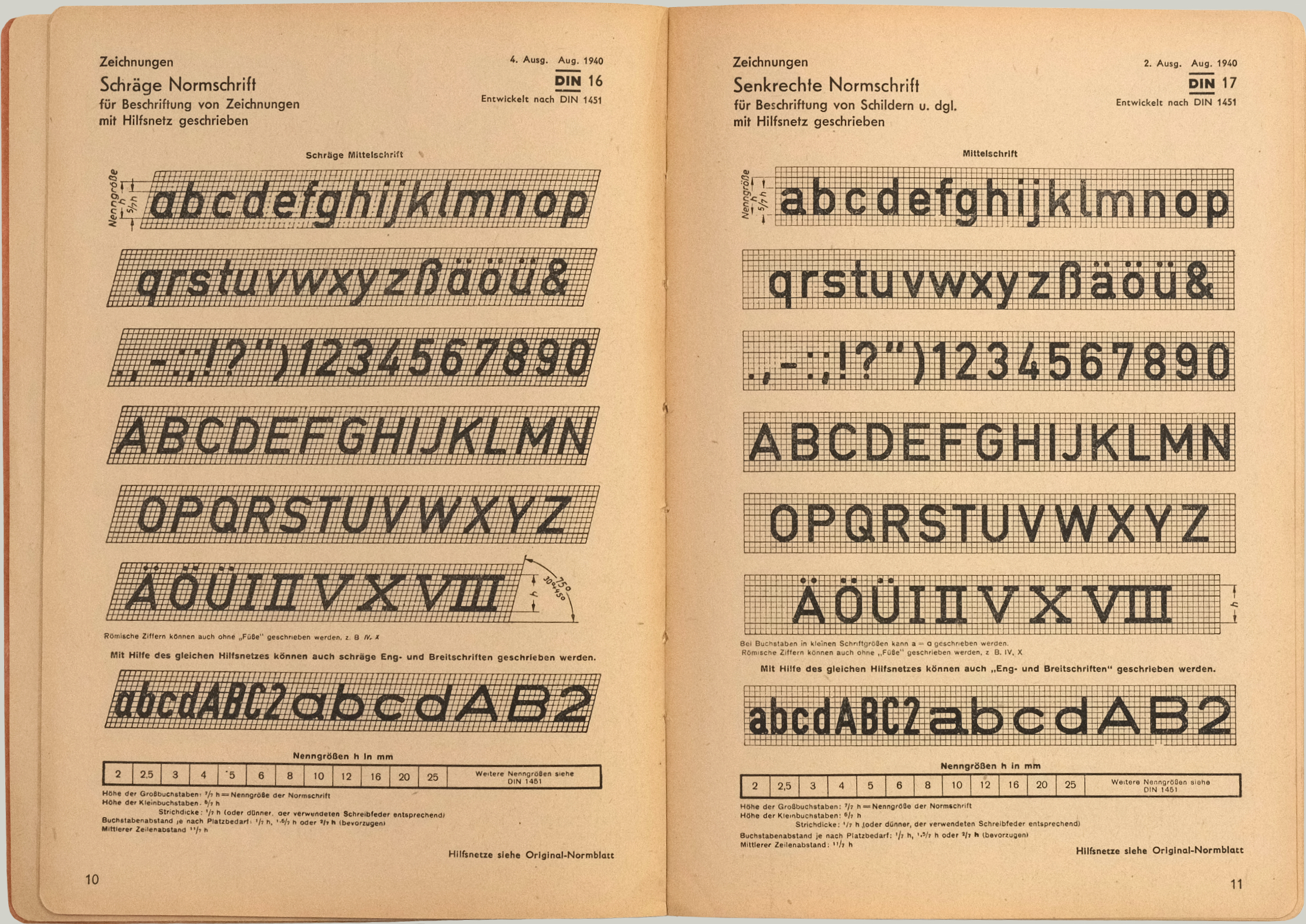
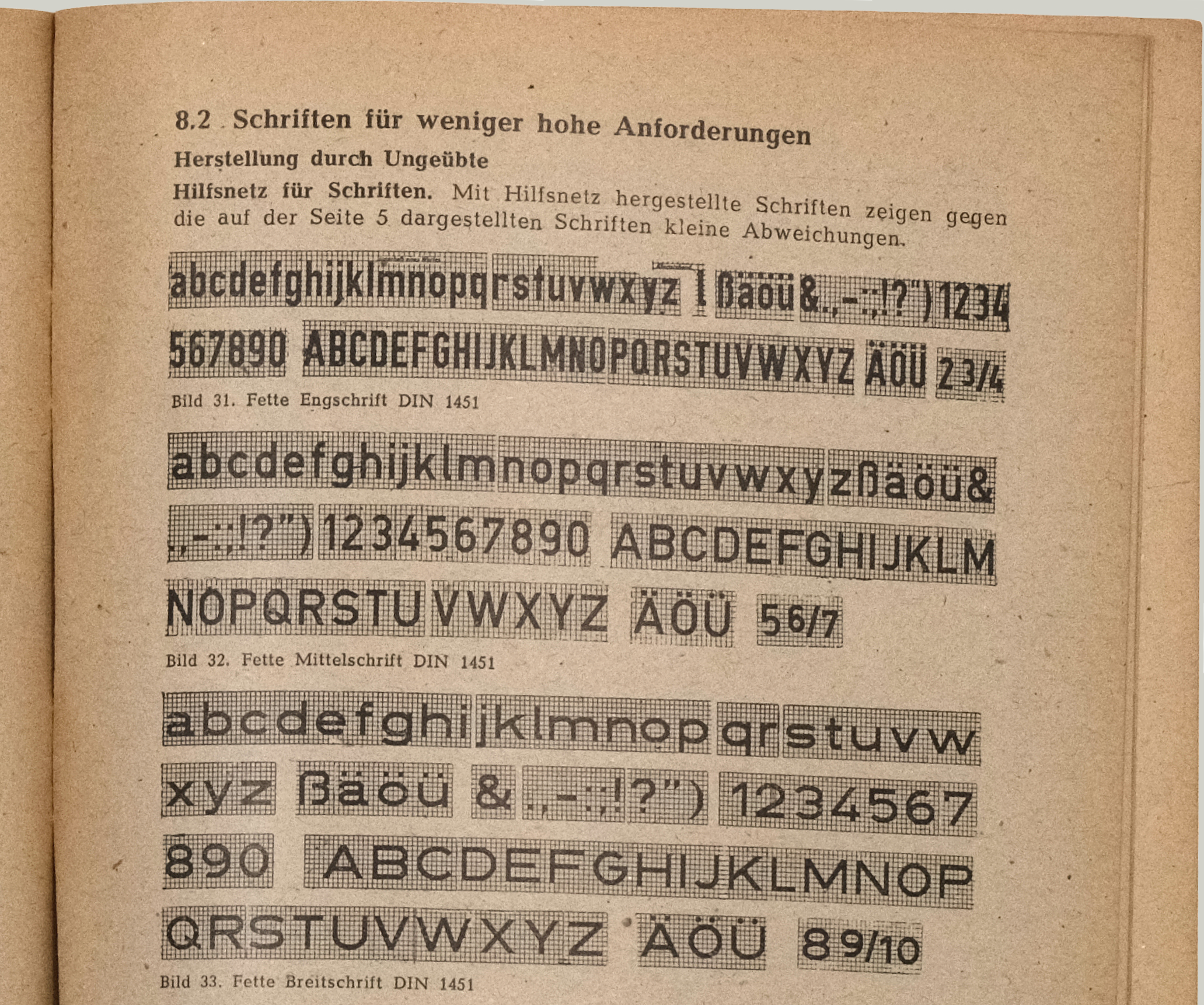
The core characteristics of this sans-serif, that was based on a coarse grid, were a quick and easy reproducibility and a high legibility which was also recognized internationally. These requirements resulted in a monolinear stroke width that had up until then been taboo. Apart from modernist movements such as the Bauhaus and a few block letter alphabets for sign painters, typefaces at that time were normally artfully designed, emphasizing individual expression and were subject to changing fashions.

The engineers’ constructed script was intended to function independently of future trends and technical limitations. Its geometric character was ideally suited to the tasks it was intended for. For many decades, it was reserved for use on street and place signs, license plates as well as postmarks, technical drawings, documentations, traffic signs, road signs and signposts and lettering for the German Reichsbahn and Deutsche Bahn.
Although more than 50 countries have adapted the sans-serif for similar purposes, “DIN” is considered by many to be the official typeface of Germany.
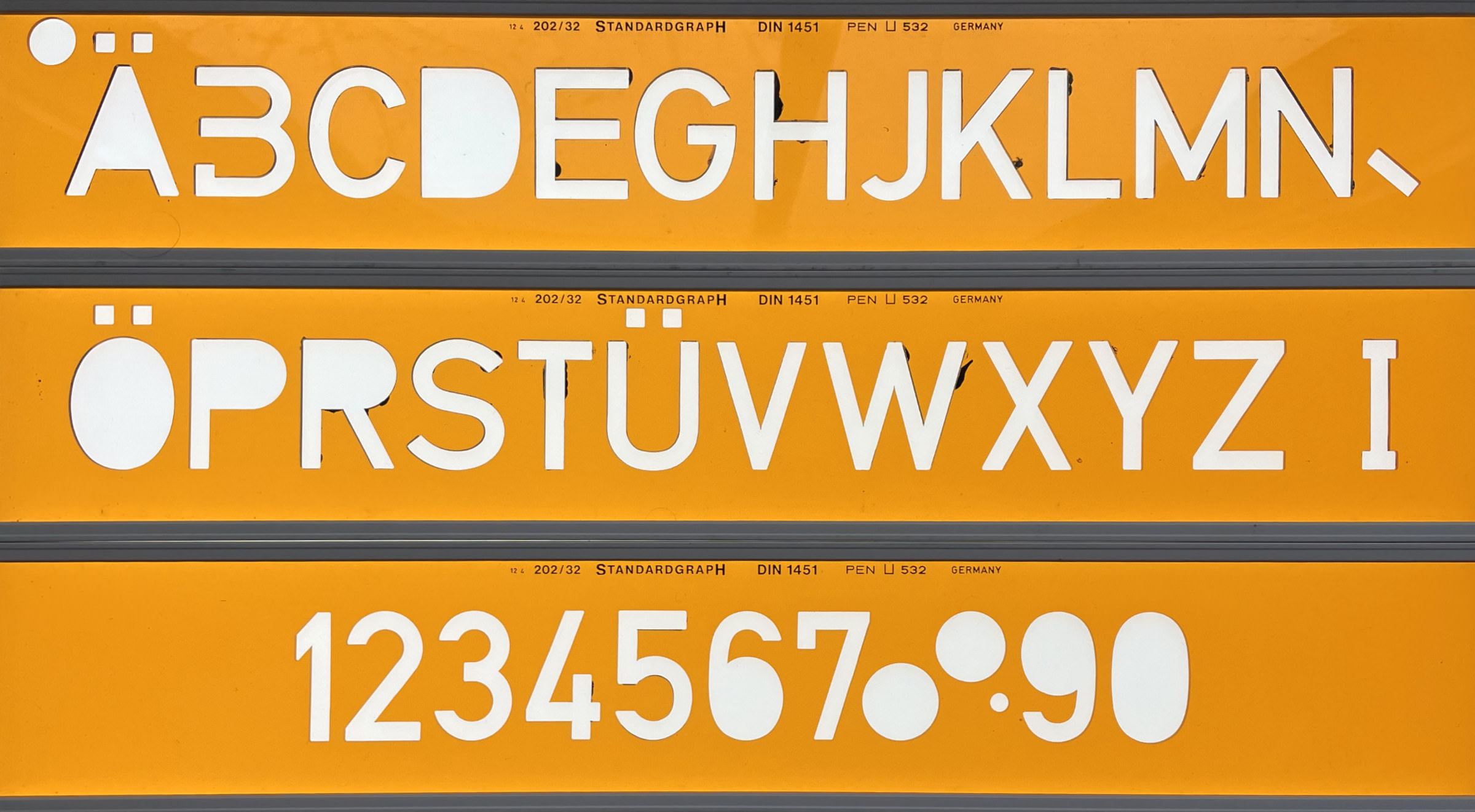
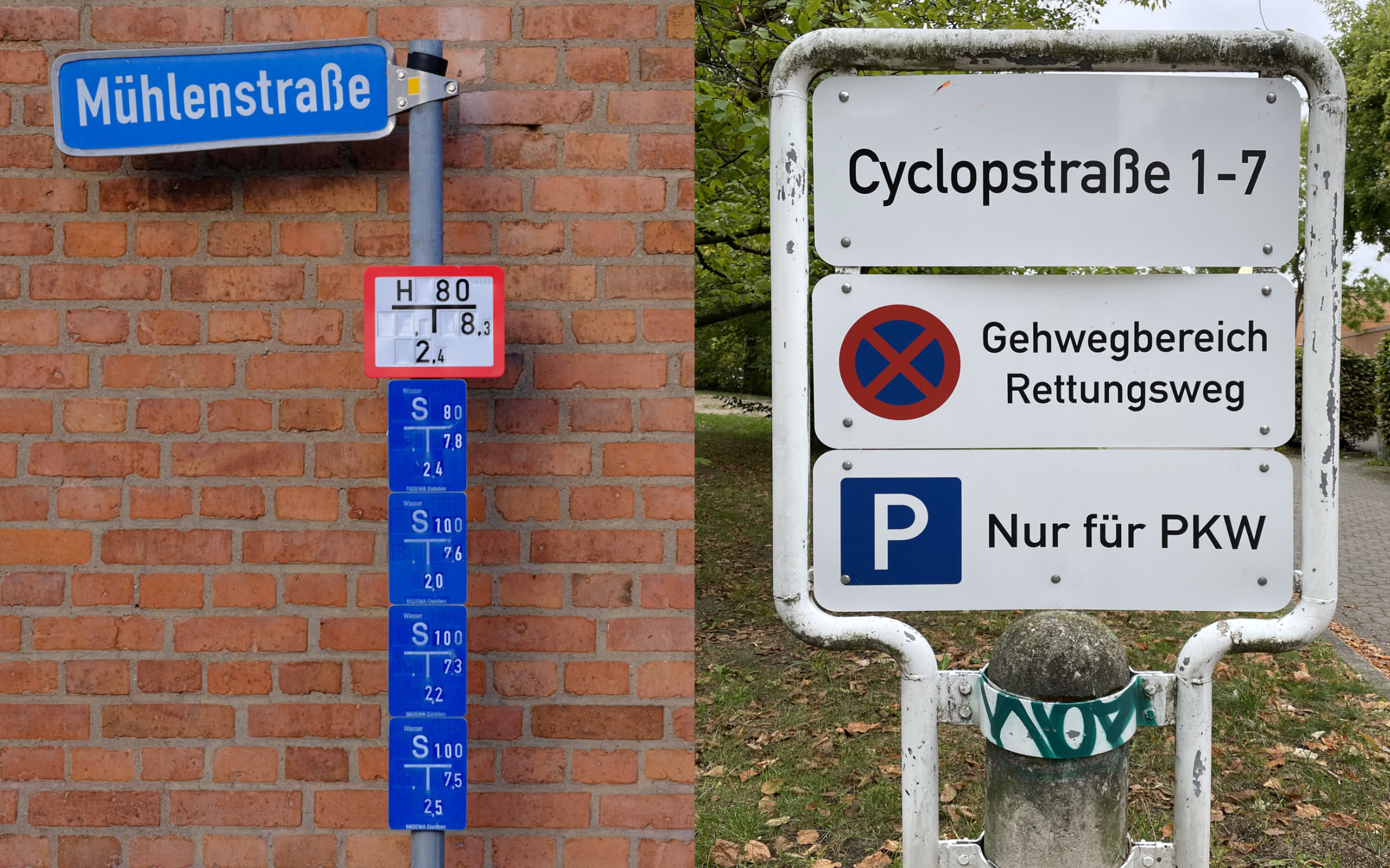
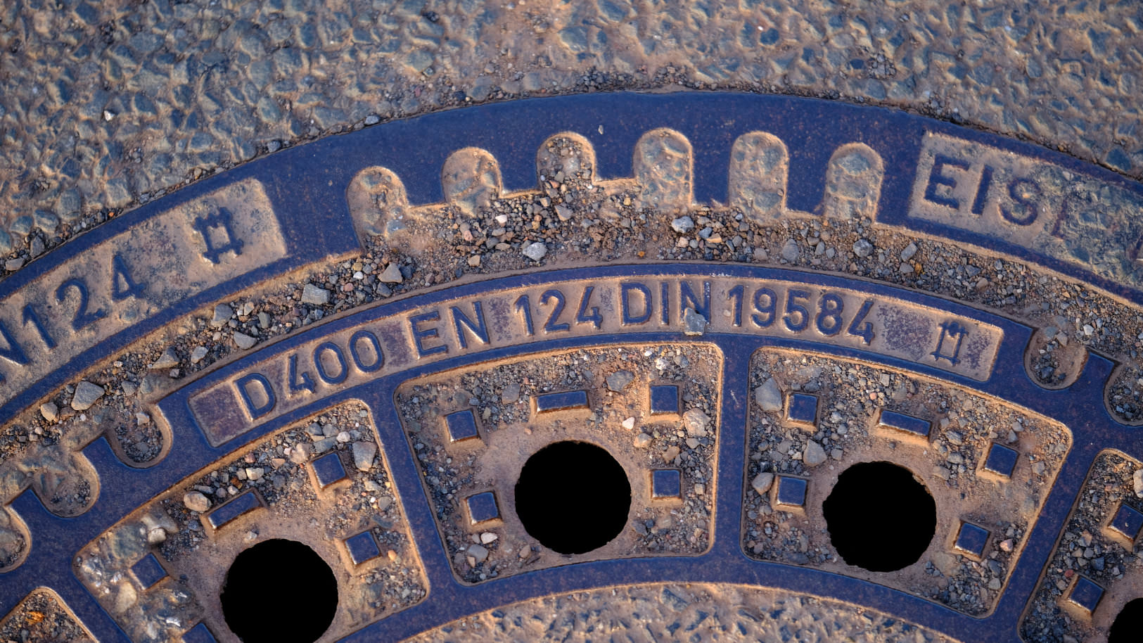
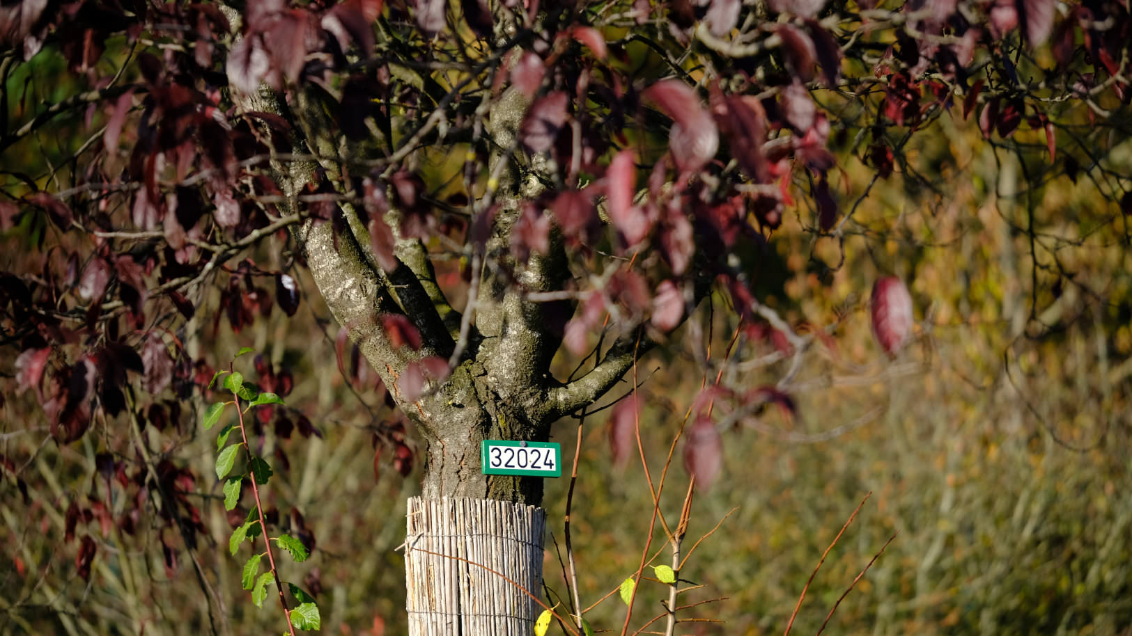
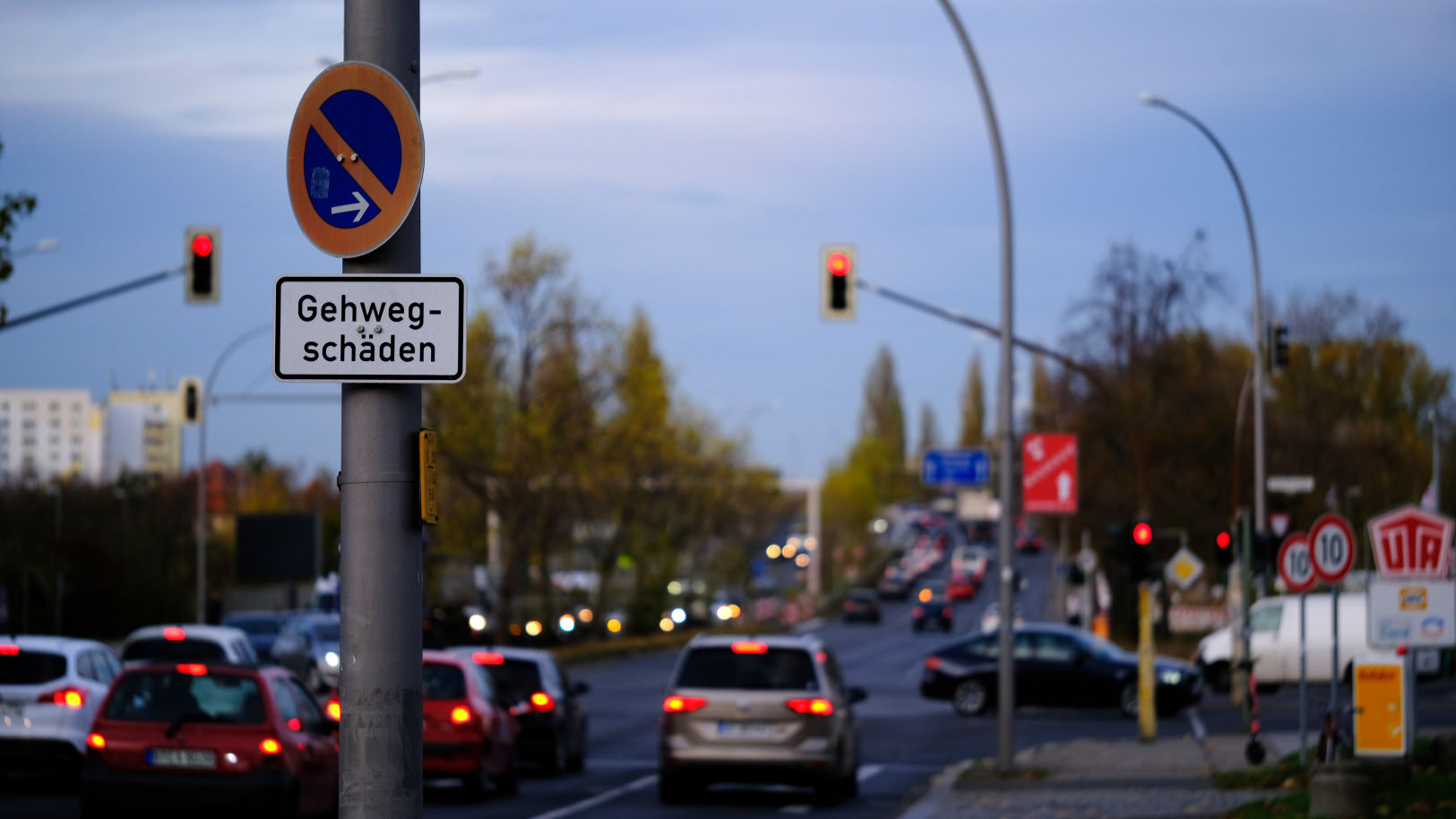
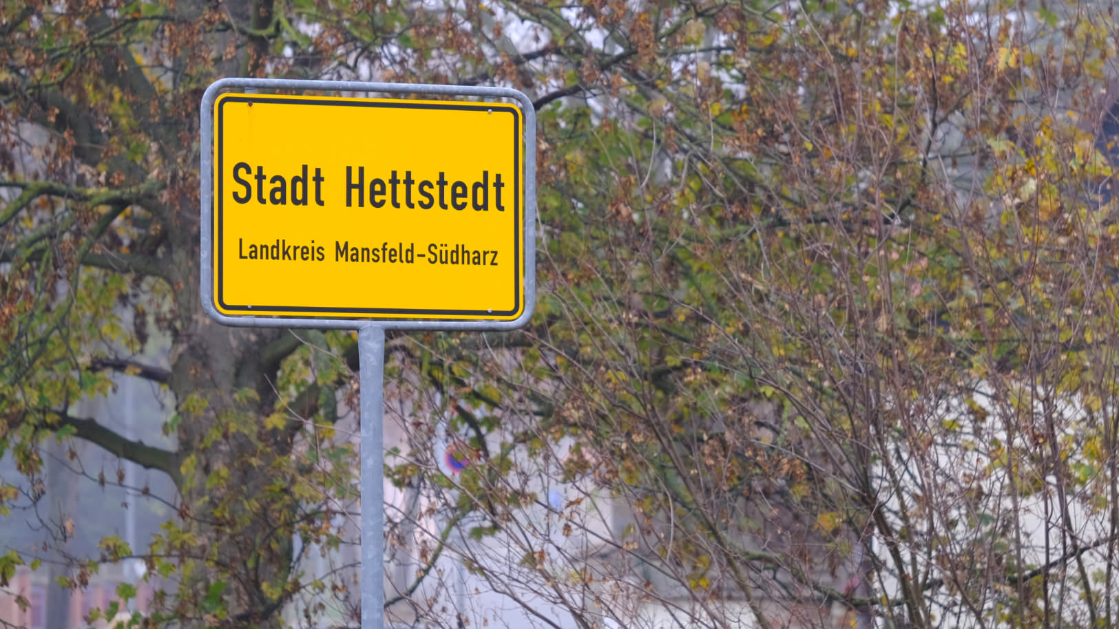
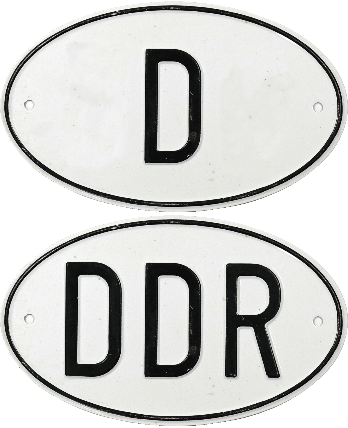
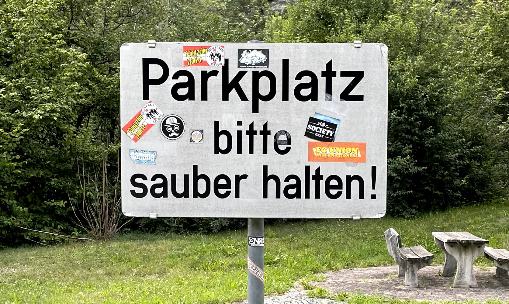
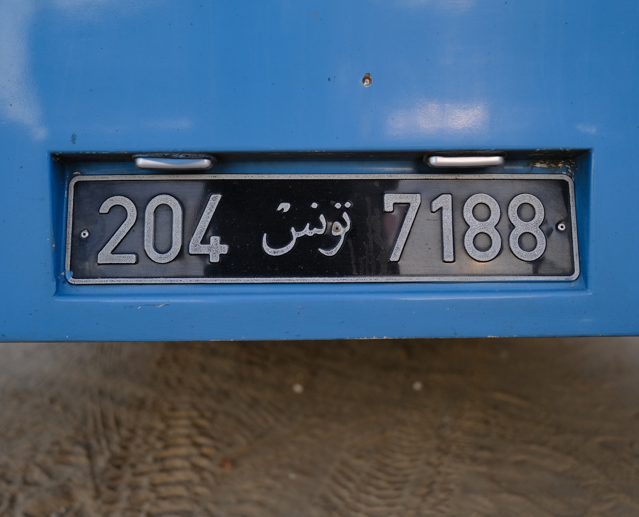
DIN 1451 has been revised or supplemented several times, most recently in 2018. But one adaptation stands out: In 1981, the Federal Highway Research Institute revised the “Autobahn-Schrift” for use in road traffic. The Frankfurt Master Signmaker, Adolf Gropp focused on improving legibility for wayfinding systems and display sizes. The tracking was adjusted and the recommendation for the wide width was dropped altogether. As a result it largely disappeared from the West German street scene.
In the GDR, it became more visually humanistic from 1978 onwards, as East Germany gradually switched to GIL, a modified Gill Sans. Its legibility resulted from open, easy-to-read letters and easily distinguishable numerals.
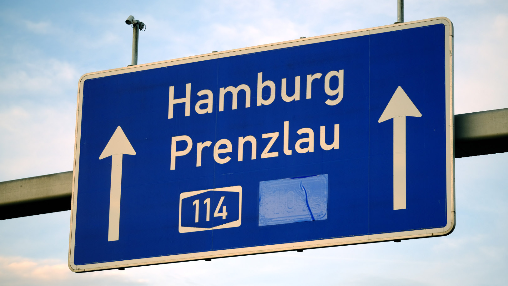
At the beginning of the 1980s, under the direction of Günther Gerhard Lange, the Berlin type foundry, Berthold, developed a version of the standardized typeface for phototypesetting. This was before Linotype and Adobe cooperated in 1990 to produce the first digital publication of PostScript fonts, which were defined in the standard as the medium and narrow versions.
With this new availability, the graphic significance of the DIN type also gained momentum. More and more designers turned to the typeface for its straightforward, constructed and timeless aesthetic.
In 1995, Erik Spiekermann recognized the growing trend and demand for DIN and so he suggested that Albert-Jan Pool redraw the typeface as FF DIN for his Berlin-based label FontFont. With the help of Achaz Reuß, Albert-Jan Pool expanded it to five weights and also extended its language support. Pool succeeded in improving the legibility of continuous text without sacrificing the industrial rawness of the design. To achieve this, he drew the horizontal strokes thinner and made the curves and their transitions to straight lines smoother. Some characters were made rounder, and terminals of the letters, such as c or s, were finished with diagonal ends. Also the x-height increased with the width of the stroke. For individual expression there are alternative round dots, oldstyle figures and a single-storey a. Pool’s interpretation is still considered by many today, as the best version of DIN.
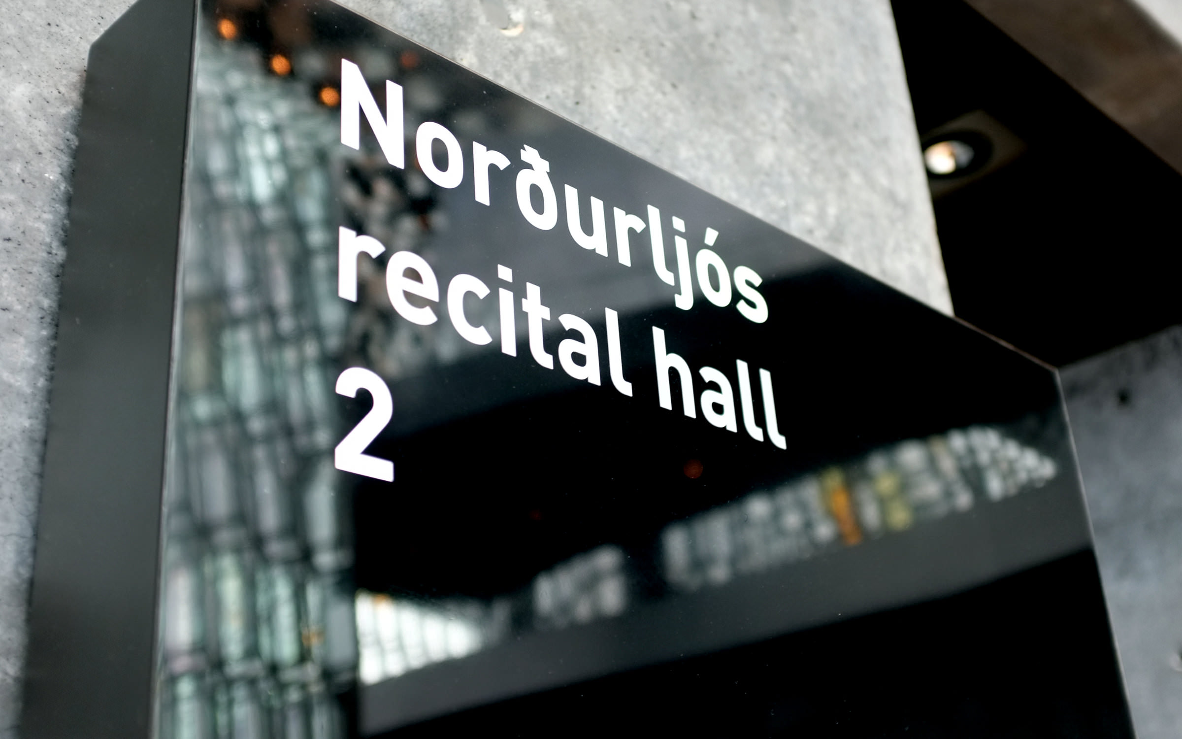
After FF DIN was further developed with italics and condensed widths, a veritable DIN boom began at the start of the millennium. DIN became a typographic icon and still shapes the graphic design in many parts of the world today. Not only was it used for a wide variety of projects, it was also followed by an increasing number of interpretations of the basic form. With each new interpretation, the trend was refueled.
Among the most interesting interpretations are those by Parachute (PF Din, 2002, free interpretation, largest extension), Linotype (DIN Next, 2008, soft overall impression), Paratype (DIN 2014, 2014), Dharma Type (Compasse, 2014, free interpretation), Astype (Vtg Stencil DIN, 2016, stencil variant), Type-Ø-Tones (DINosaur, 2016, based on upright standard typeface DIN 17), Revolver Type (Dinamit, 2017, based on Breitschrift), Microsoft (Bahnschrift, 2017; Grandview, 2021, first variable version, Uniwidth) and Fontsmith (FS Industrie, 2018, free interpretation).
The history of the DIN typeface is a history of continual revisions, with each interpretation adding a new color to the concept.
We believe there are still colors missing in the DIN font spectrum. As a Berlin-based foundry, we feel its our calling to bring out these nuances in order to strengthen its vitality. And where better place to rethink and reimagine this German original than in the city of its origin. At the same time, we want to give a dynamic answer to a dynamic world. To achieve this, we started with the original construction and combined the requirements of the digital world with a modern idea of the German art of engineering.
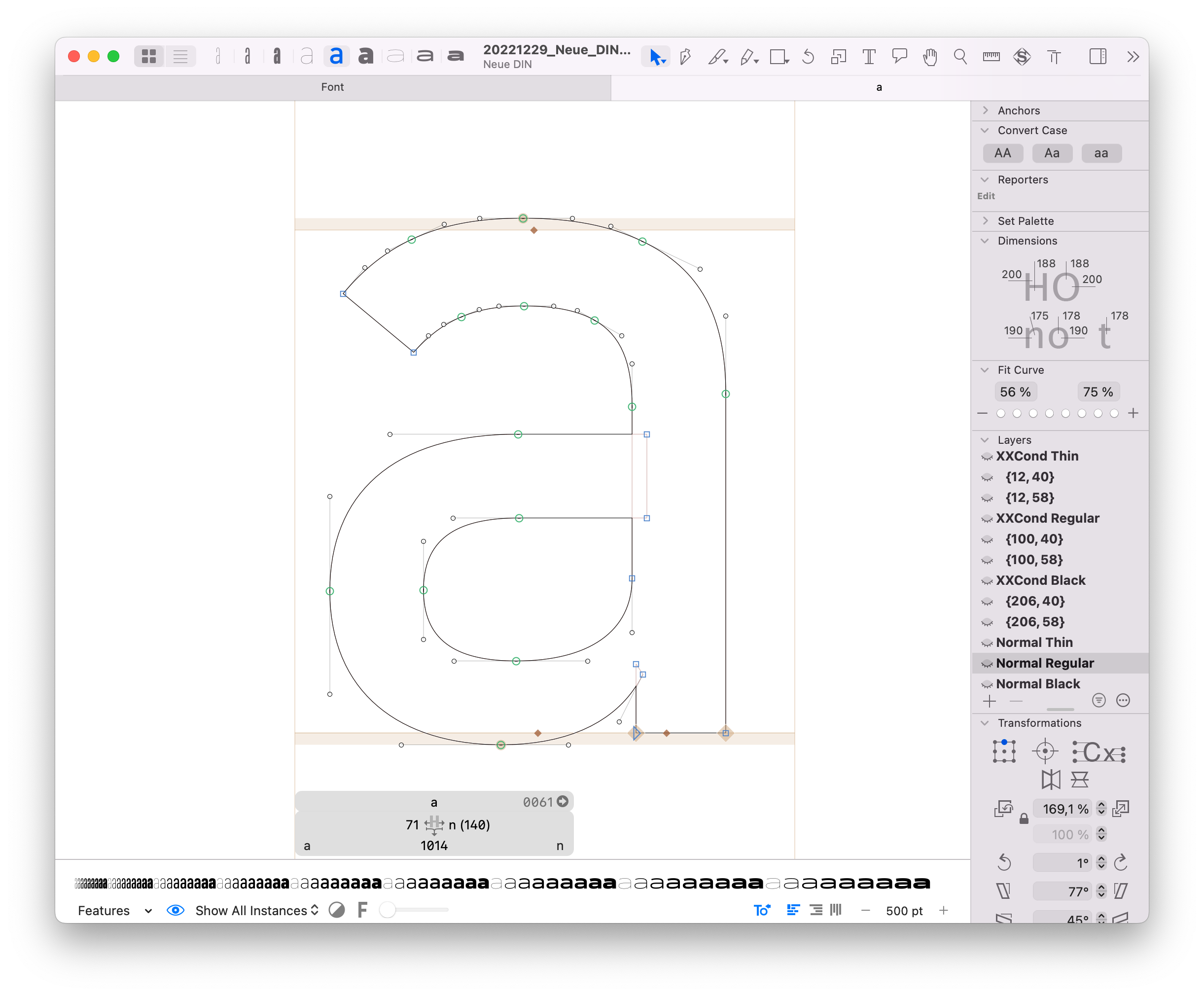
Just like at the beginning of Berlin’s Standard typeface history, the technical conditions that had arisen shortly before its inception were decisive influencing factors. Yet whereas 100 years ago, the focus was on reproducibility, today the factors that influenced our own design decisions are variable fonts. When approaching our design, we placed this technology at the center of our consideration.
In order to make the best possible use of the synergies of design and technology, the designers Hendrik Weber (type director of the top agency KMS Team) and Andreas Frohloff (freelance type director) worked hand in hand with Fontwerk’s Font Engineer, Olli Meier, who also contributed ideas and took on design tasks. The variable width (especially the Condensed and Wide widths) became style-defining in many respects. As a result, the normal width appears more neutral than other DINs derived from the basic form.
The most difficult question to answer was how far one could deviate from the norm. We discarded courageous yet appealing explorations that threatened to lose the concise mix of geometric construction and openness. The typeface should remain a DIN – in all its simplicity and timelessness. The key to its design is its strict geometry and letters, which hang together like a chain.
Nevertheless, the desire for an elegant touch germinated in us, Andreas Frohloff had the brilliant idea: “All vertical curves, such as the sides of the o, d or g, are round, have no straight lines and swing easily.” The curves are not eye-catching, but they give the typeface the desired touch of elegance. With these subtle organic forms and a balanced spacing, the business-like character is preserved and we are convinced that we have nevertheless created an independent and sustainable design.
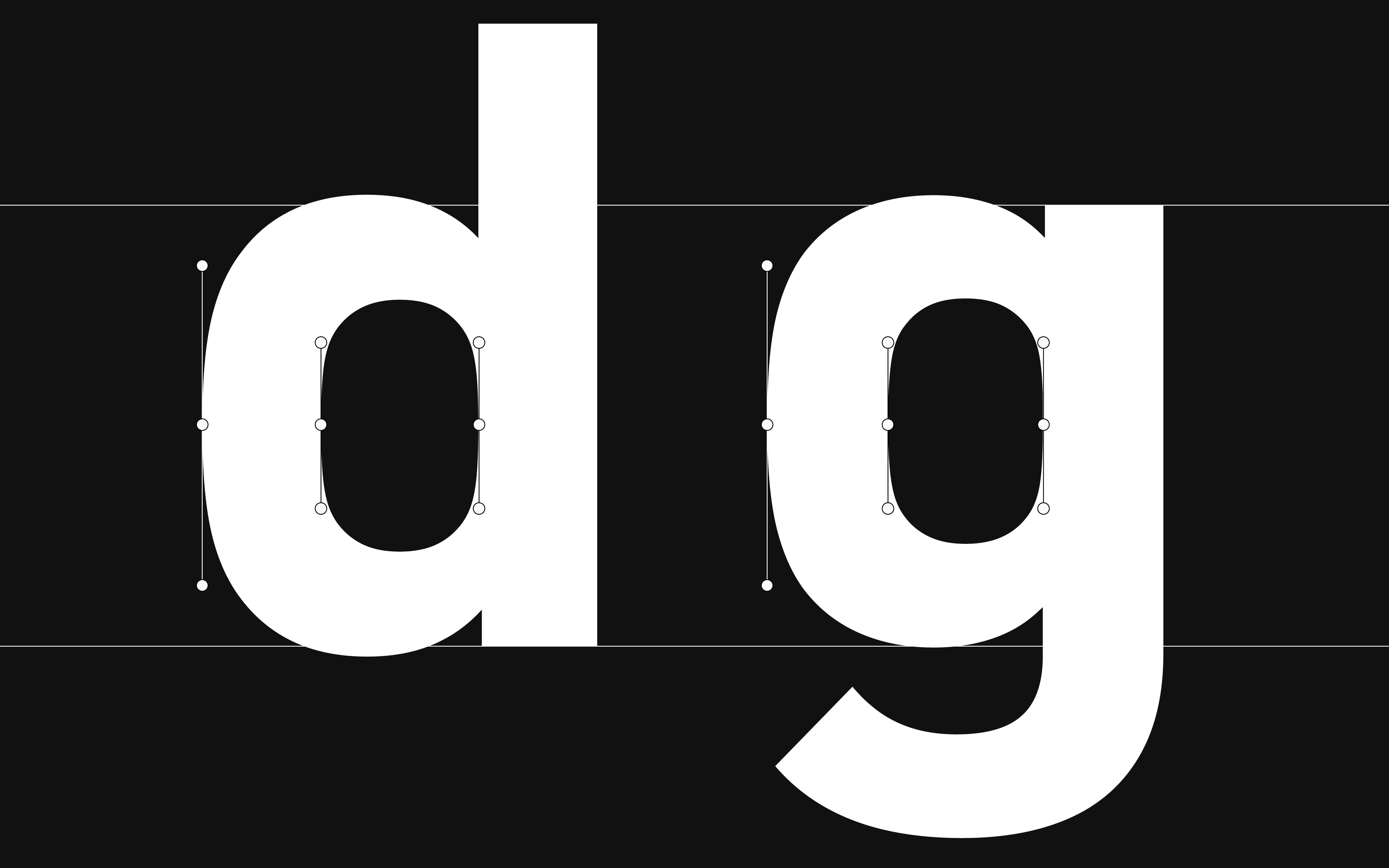
All vertical curves, such as the sides of the o, d or g, are round, have no straight lines and swing easily.
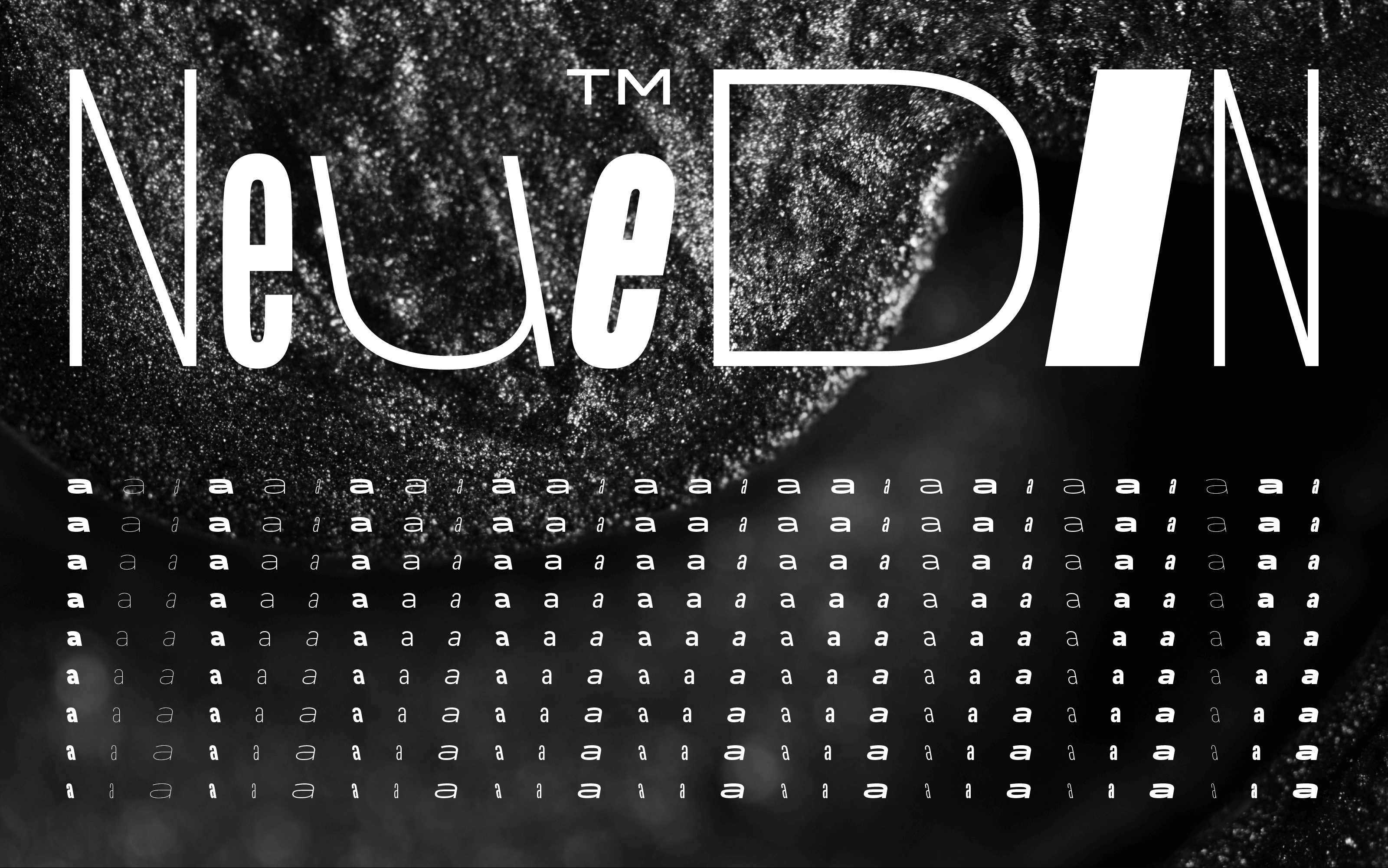
However, the most obvious unique selling point of Neue DIN is the stringent interplay of nine weights (Thin–Black) and nine widths (XXCondensed, XCondensed, Condensed, SemiCondensed, Normal, SemiWide, Wide, XWide, XXWide). The enormous bandwidth paired with the flexibility of the Variable Fonts technology creates a thoroughly new DIN feeling, also because the extreme widths feel unfamiliar at first. But with DIN 1451’s very own engineering approach, they are not only consistent, they are also great fun to use. Maintaining the robust industrial feel in these areas was one of the biggest challenges.
Olli Meier explains the decision for nine widths as follows: “Rethinking DIN also means starting from the web and responsive environments and designing it in such a way that it works smoothly in CSS”. That is why the 81 sections correspond to those specified in the CSS specification (Cascading Style Sheets: Language for designing electronic documents, e.g. on the web).
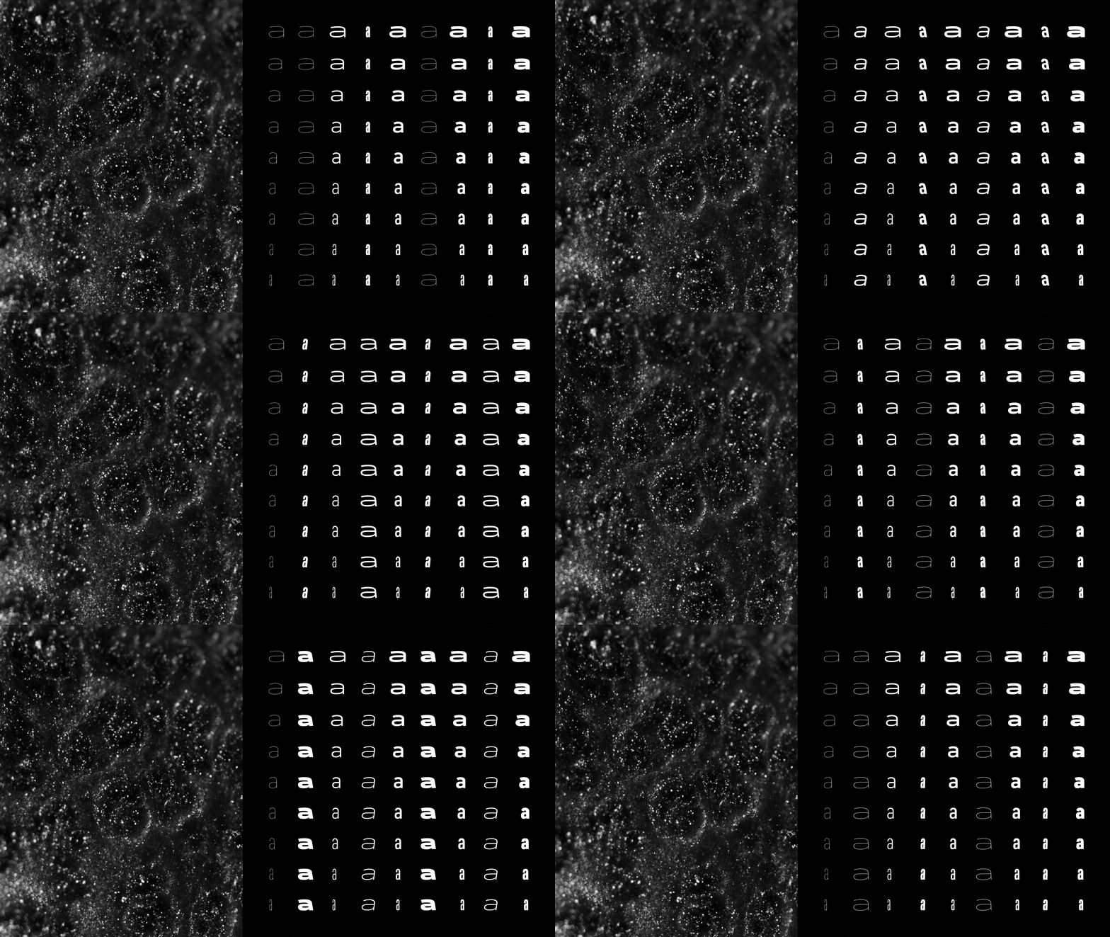
The specification provides for a matrix in which the widths of a font lie on the x-axis and the stroke widths on the y-axis. Here, the Thin cut has a value of 100, the Regular one of 400 and the Black one of 900. The Normal width is 100 percent, the Condensed 75 and the Wide 150 percent. Condensed Thin therefore has a value of 75 on the x-axis and 100 on the y-axis. If you change the width, the line width value remains at 100. In the static world, however, one often makes an optical balance, for example, making the narrow weights lighter and the wide ones bolder. Neue DIN offers 100% CSS compatibility, just as Ludwig Goller’s engineers would probably have implemented it today.
Rethinking DIN also means starting from the web and responsive environments and designing it in such a way that it works smoothly in CSS.
More subtle design differences to its predecessors can be seen in the compact overall impression and the clear reinterpretation of the stroke course, which appears more rigorous and more standardized. Due to the technical orientation of the body shapes, we drew broad counters. We made characters like t, f, r and 1 a little wider. Alternative forms for Q, a, u, r, l, 6, 7, and 9, round dots and arrows, numerals in circles and squares complete the variable overall picture.
A special feature — recently proposed by Christoph Koeberlin — is an expansion of the Standard Latin character set, which now includes an additional 100 languages that have often been overlooked. Inspired by his initiative, Neue DIN can be used by at least 3 billion people.
In December 2023, we gave the typeface its first update. It already supports what German authorities will be required to do by November 2024 when DIN 91379 comes into force. Put simply DIN 91379 is a standard that will require them to recognize and machine-read a normative subset of the Latin Unicode character set in the exchange of data between authorities or with citizens and business. This means that finally, the names of people (İlkay Gündoğan, Pippi Långstrump, Lech Wałęsa, …) and companies (Kärcher, İşbank, Kværner, …) will be securely processed electronically and spelled correctly throughout Europe.
Even when it comes to italics, we are breaking new ground in terms of DIN fonts. In the summer of 2025, we added not ‘only’ the 81 normal oblique fonts, but also the same number of backslanted variants. These Retalics offer novel possibilities in display contexts, for example. This latest update increases the number of static fonts to a whopping 243. For those who prefer a more manageable approach, the variable font has been given a third axis for slanting in both directions.
Alongside the addition of the double-slanted style, we’ve expanded the typeface to include three new alphabets. Thanks to Oleksandr Parkhomovskyy 🇺🇦 (with support from Eugene Yukechev 🇷🇺), Irene Vlachou 🇬🇷, and Boom Promphan Suksumek 🇹🇭, since Spring 2026 Neue DIN supports Cyrillic, Greek, and – for the first time in a DIN typeface – Thai (in the Loopless variant). While this means we can no longer describe the project as ‘100% Made in Berlin,’ it was more important to us to have the non-Latin language extensions designed by native-speaking designers.
As always, the price for the linguistically enhanced fonts remains the same. The new files are available free of charge to all registered users and can be found in their Fontwerk account. For anyone who has previously licensed Neue DIN as a guest, you can ‘upgrade’ your account: Simply click the ‘Create New Account’ link and use the email address you previously used. Your orders placed as a guest will then be linked to the new account.
The multitude of details and long-awaited flexibility of Neue DIN add a vital new variant to the range of DIN typefaces. Thanks to the interplay of design and modern technology, our new version has evolved into a typeface that moves with the times. Neue DIN is compact, considered and exudes a discreet elegance. It sets the perfect standard for dealing with the demands of today.
OFFLINE: Norms: DIN 1451; 1949, 1987, 2018; DIN 16, 1949; DIN 17, 1949; TGL 1451, 1962; TGL 16, 1961; TGL 17, 1961; Jan Middendorp, Erik Spiekermann – Made with FontFont, FontShop International, BIS Publishers 2006; Paul McNeil – The Visual History of Type, Laurence King Publishing Ltd. 2017; Stephen Coles – The Anatomy of Type: A Graphic Guide to 100 Typefaces, Harper Design 2012; Preußische Staatsbahnverwaltung – Dienstvorschrift über Anstrich, Bezeichnung und Nummerung der Wagen, H. G. Hermann, Berlin 1906; Wolfgang Diener – Anstrich und Bezeichnung von Güter- und Dienstwagen, Das äussere Erscheinungsbild deutscher Güterwagen von 1864 bis heute, Verlag Dr. Bernhard Abend 1992; Deutscher Normenausschuß Berlin W 15 – DIN Taschenbuch 2 ‘Zeichnungsnormen’, 1950; Ludwig Goller – DIN Normenheft 5 ‘Groteskschriften DIN 1451’, Deutscher Normenausschuß Berlin W 15, 1949; Jürgen Siebert, Claudia Guminski – 100 beste Schriften, FontShop AG, Berlin 2007; Antje Dohmann – DIN mit Swing (PAGE 10.22), Ebner Media Group GmbH & Co. KG, Hamburg 2022 | ONLINE: din.de, 2022; Yves Peters – FF DIN: Eine FontFont-Erfolgsgeschichte, 2015; Albert-Jan Pool – FF DIN Round – Digitale Blockschrift, Eine Broschüre zur Geschichte runder serifenloser Schriften und zur Entstehung der FF DIN Round. 2010; Dirk Vorwerk – Zwei, die sich getroffen haben, um Charakter zu entwickeln, 2019; Typografie.info – Font-Wiki: Gill Sans von Eric Gill, 2013; Typografie.info – Font-Wiki: DIN 1451 von Ludwig Goller und andere, 2013; Wikipedia: Gill Sans, 2022; Wikipedia: DIN 1451 (Eng), 2022; Wikipedia: DIN 1451 (De), 2022; Wikipedia: Normenliste DIN 1 bis DIN 499, 2022; Wikipedia: FF DIN, 2022; Identifont, 2022; Fontsinuse.com, 2022; Luc Devroye – DIN, 2022; beuth.de, 2022; Microsoft Typography – OS/2 and Windows Metrics Table, 2022; W3Schools – CSS font-stretch Property, 2022
All trademarks are the property of their respective owners.