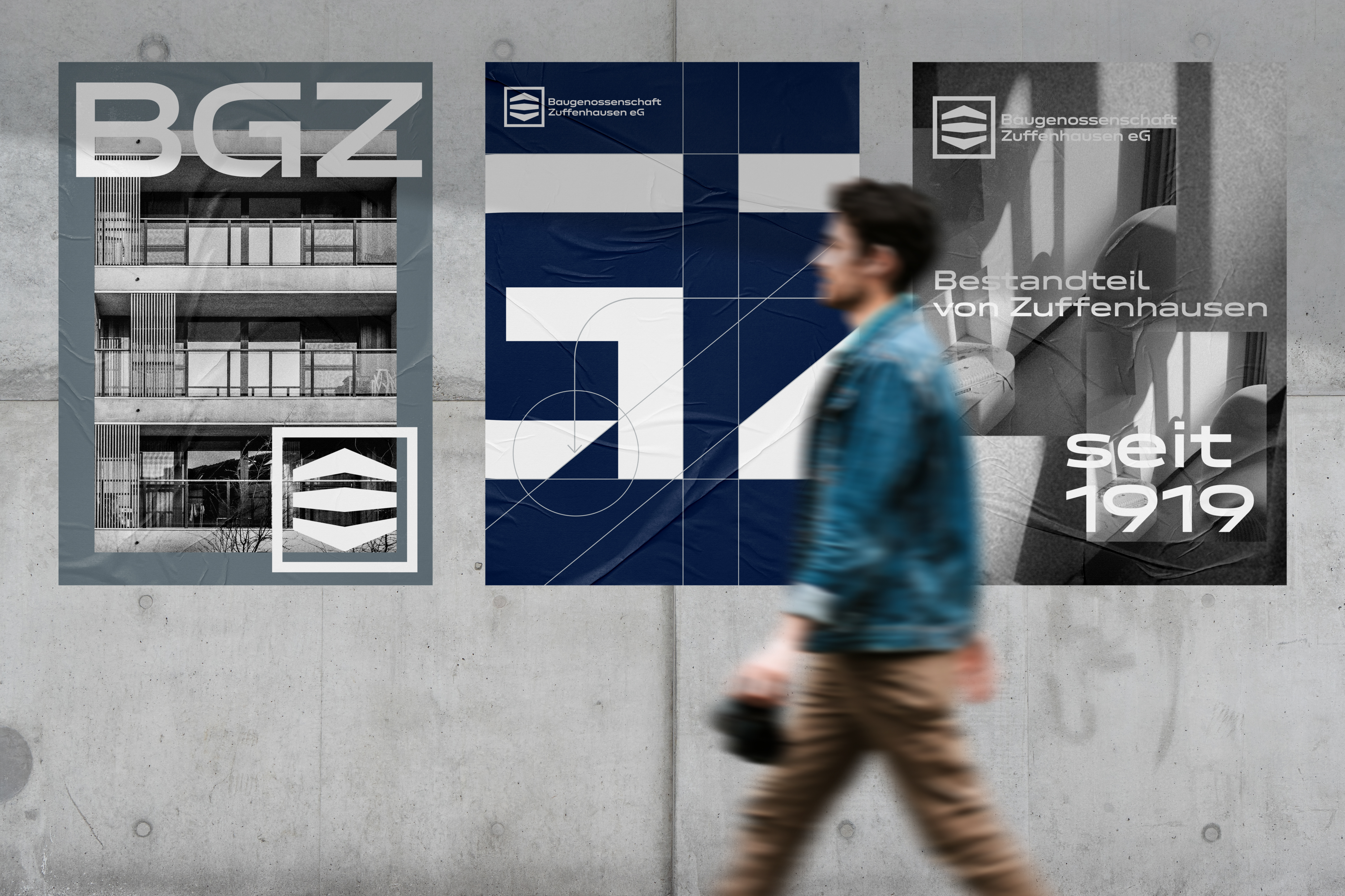
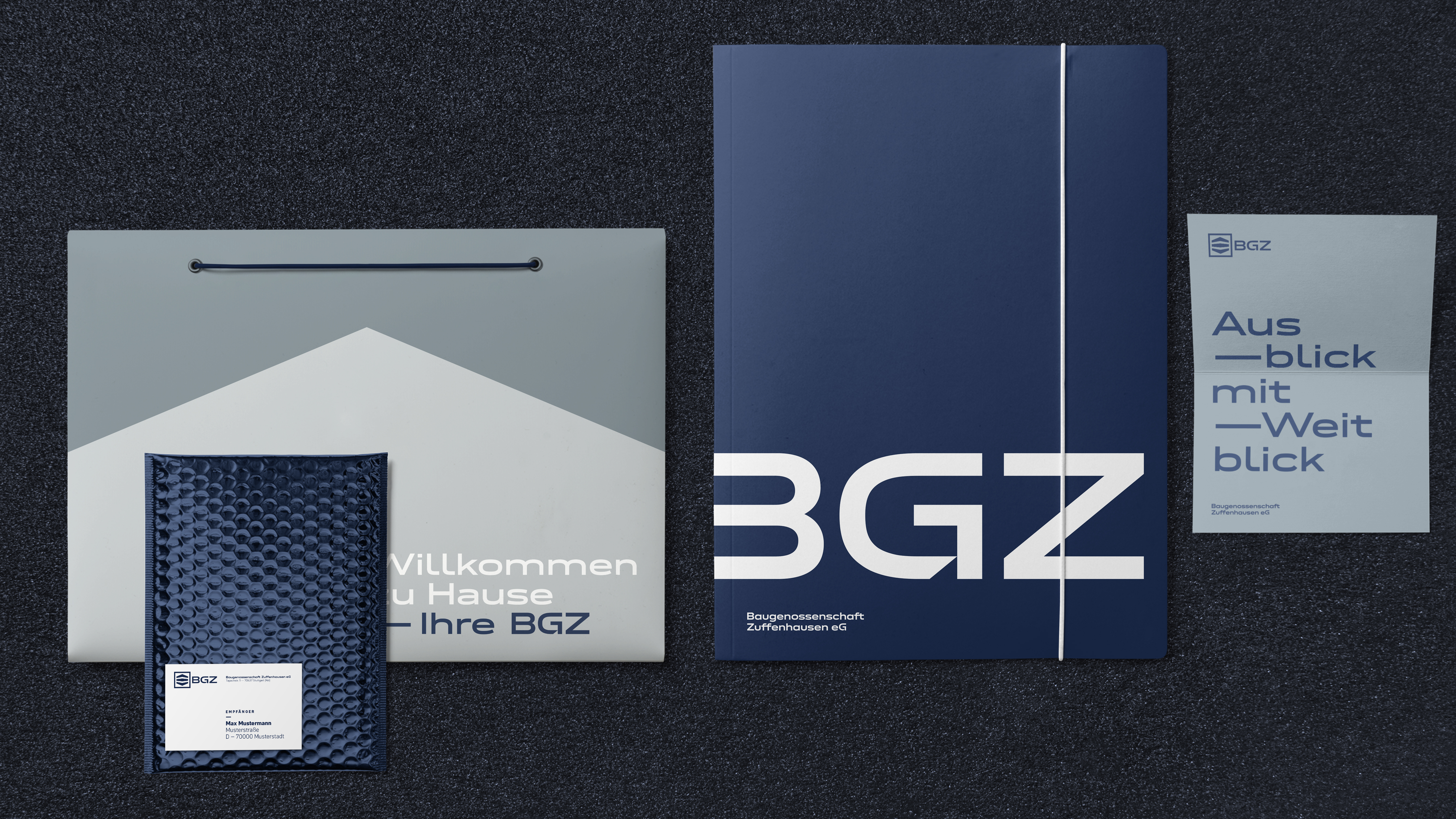
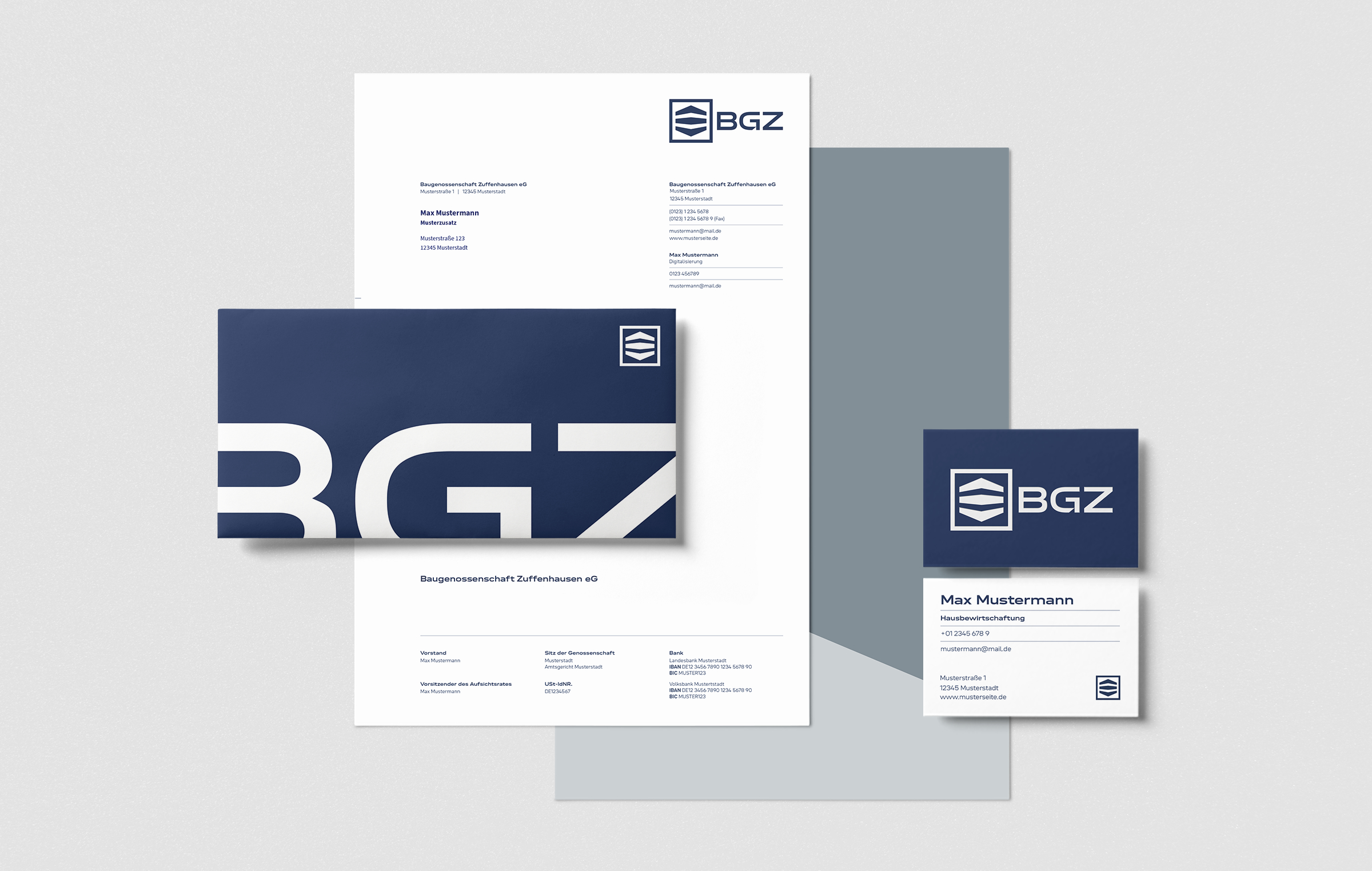
fter the relevant laws were abolished, market-based trading gained in importance and with it the need for a professional brand image. BGZ looked to Scope, an interdisciplinary office for architecture, interior architecture and design based in Stuttgart, to help them on this journey.
First of all, the logo was put to the test. During its revamp, the aim was to preserve the building cooperative’s tradition while still giving it a contemporary facade.
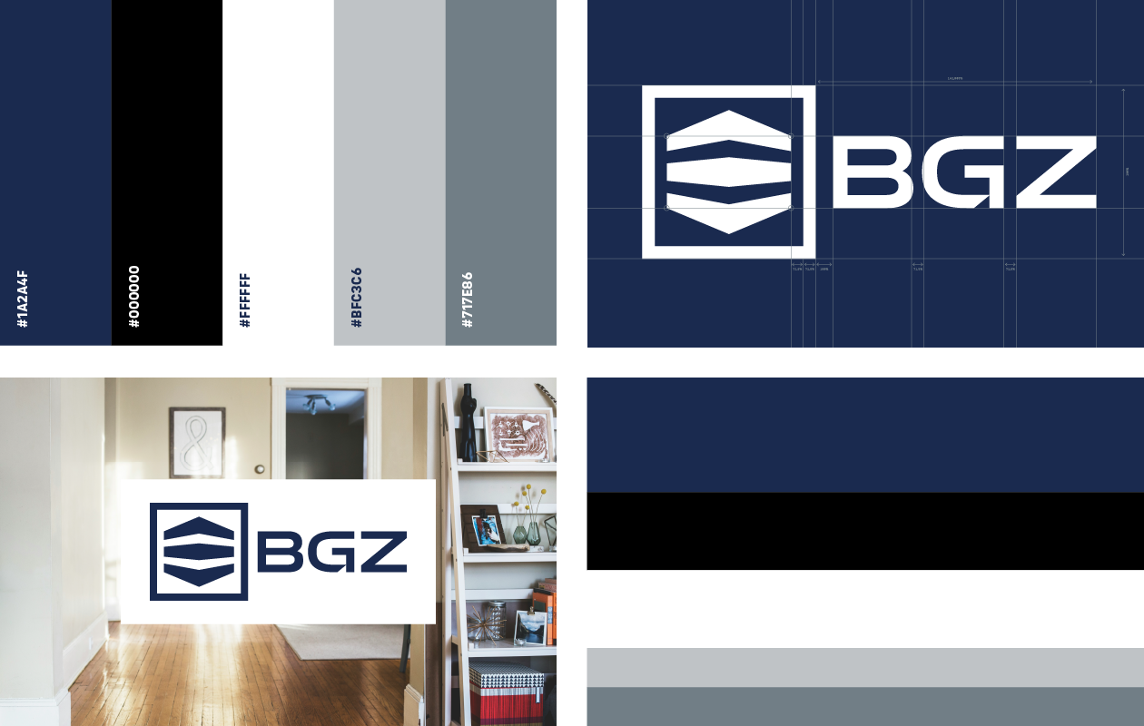
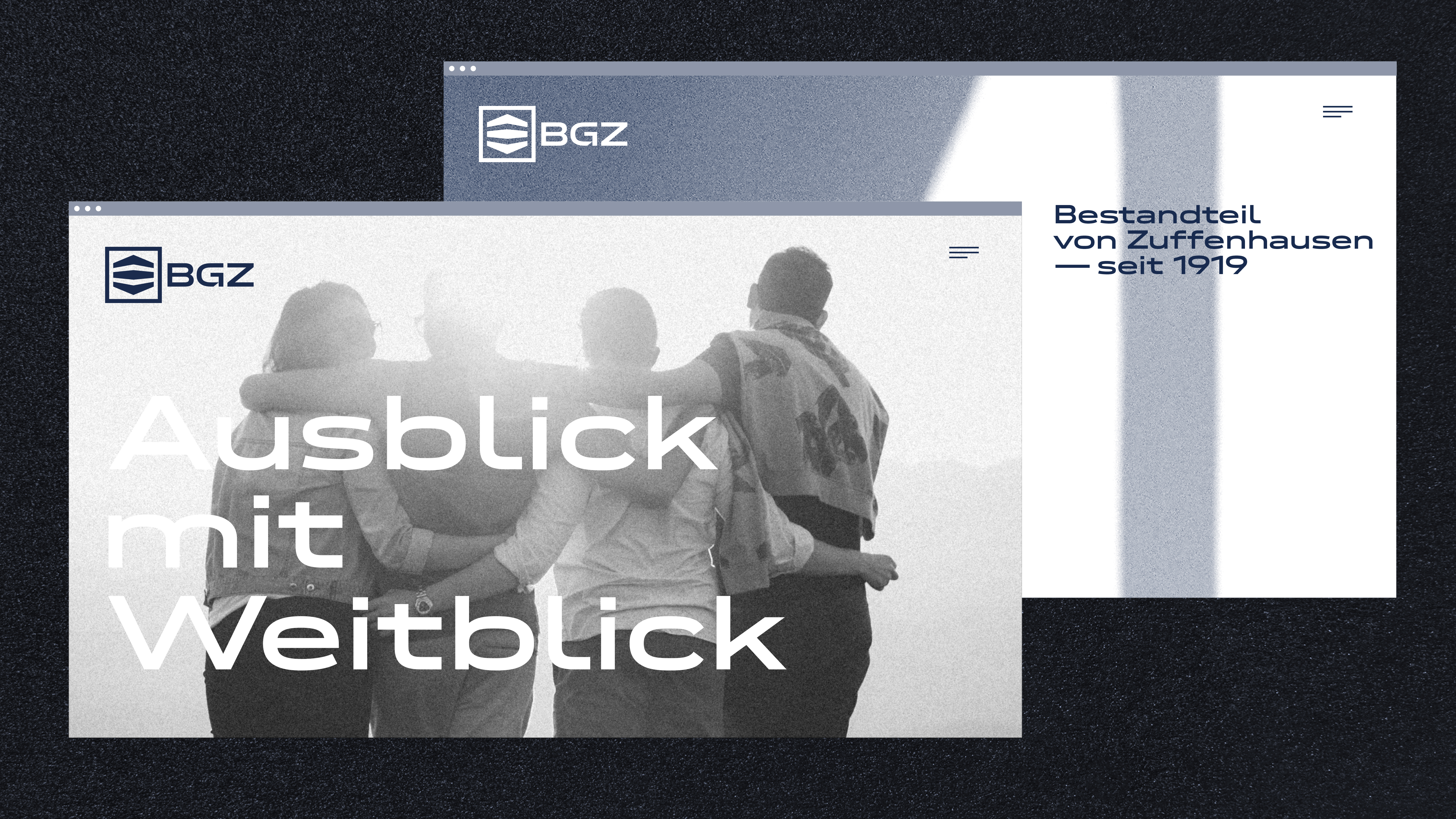
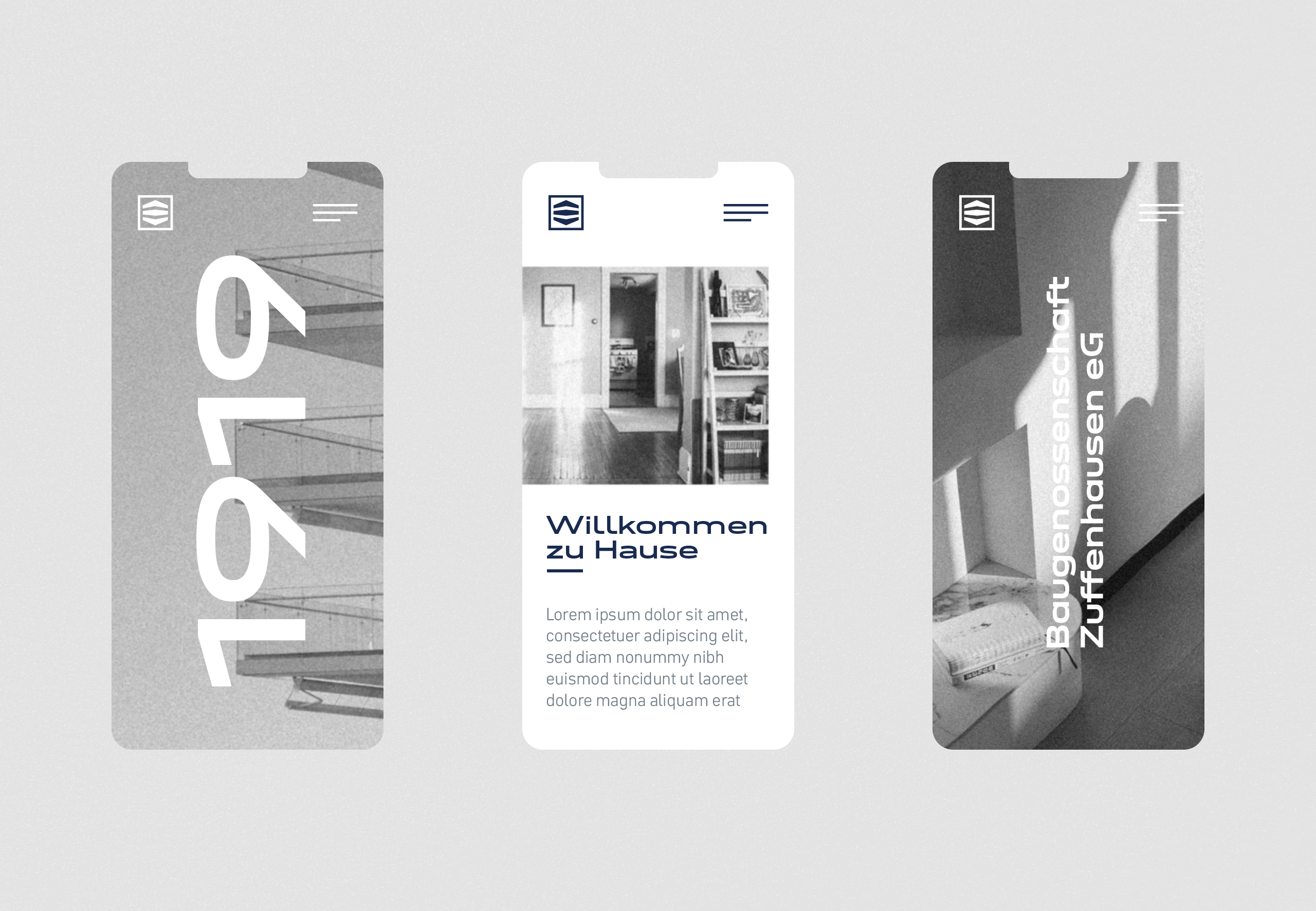
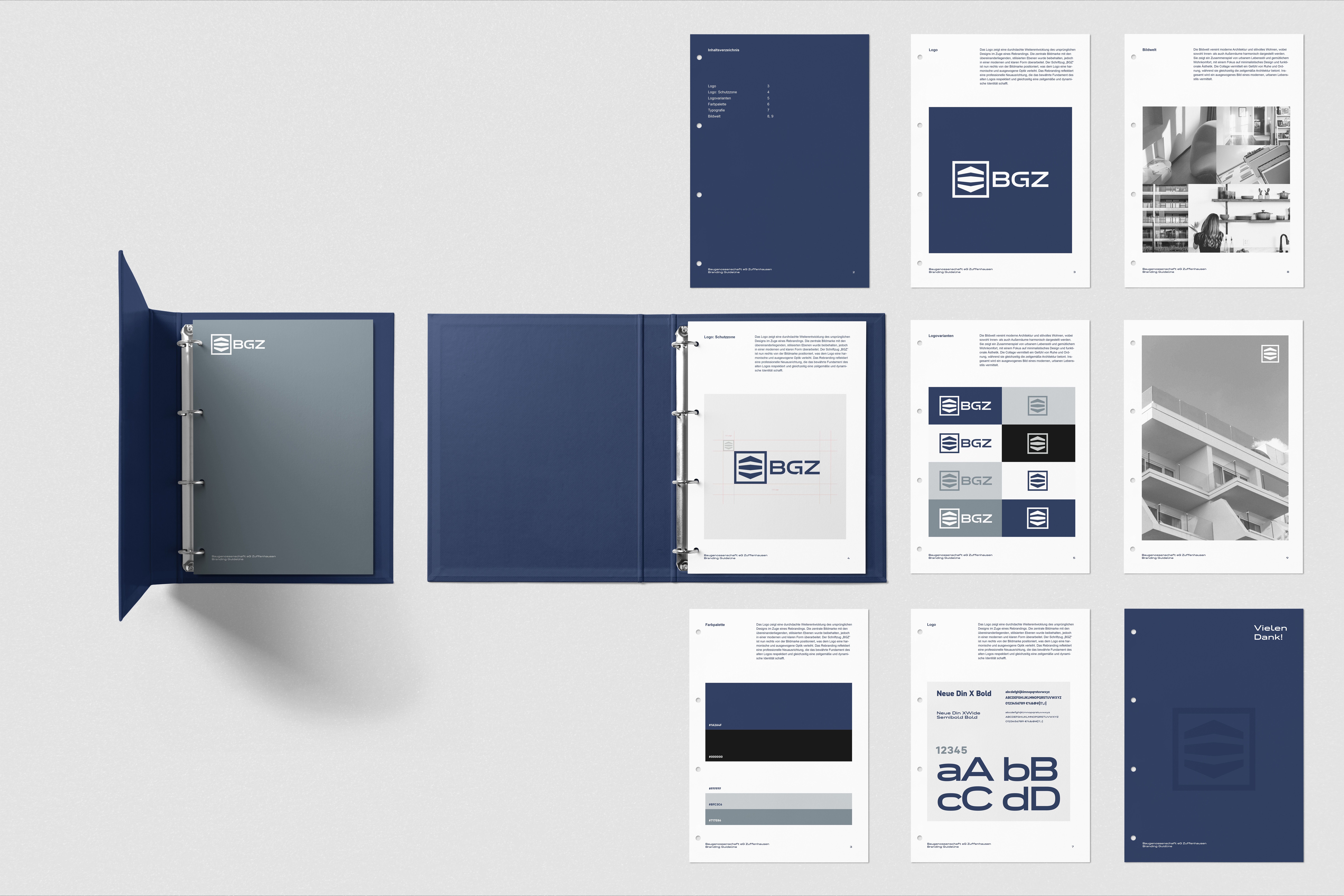
The basis of the new BGZ logo is the semibold variant of Neue DIN XWide from Fontwerk, which is also used as the corporate font. The square pictogram in the logo has been simplified and the capital G has been modified in such a way that it builds a bridge to its serif predecessor, which served the brand for over 100 years. Mathis Weymann from Scope emphasizes: “By subtly developing the logo further, we have succeeded in creating a creative link between tradition and modernity.”
