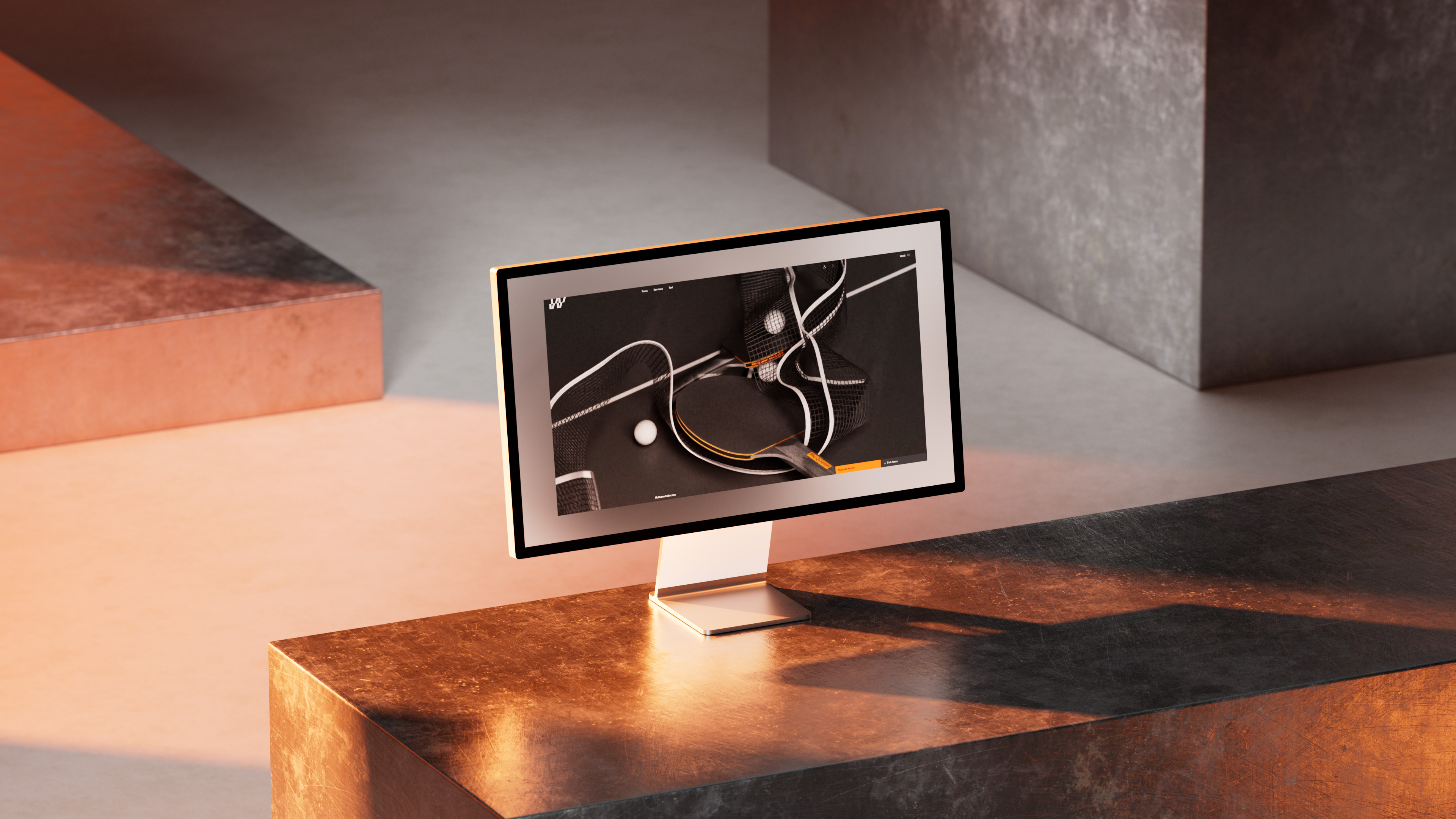
One reason for the relaunch was our desire to create a sharper visual profile. What sounds simple is actually a challenge for any Type Foundry website. The fonts should take center stage and very often foundries face a dilemma of how to maintain the difficult balancing act of creating breathing space and a place for the fonts while still creating an original online presence.
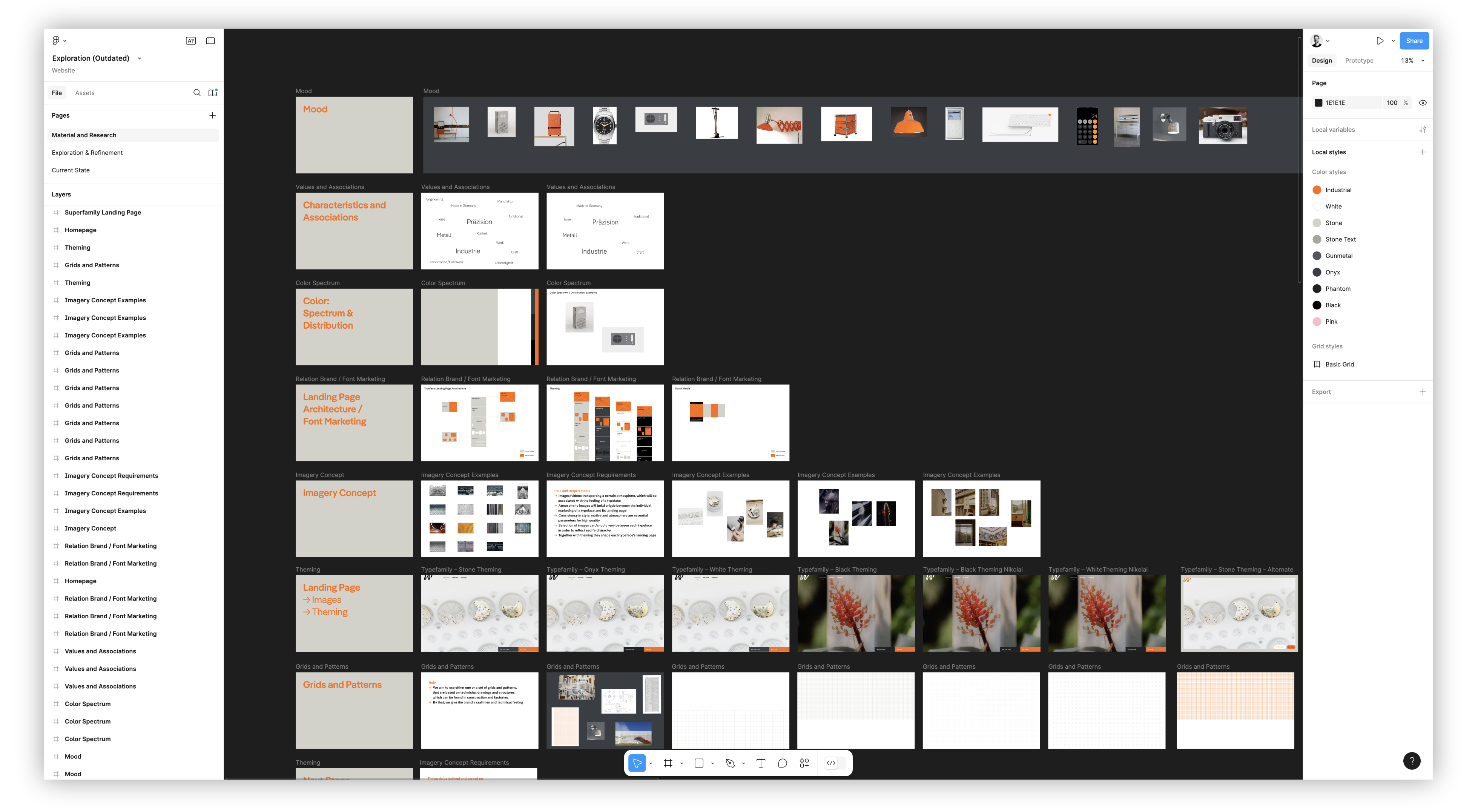
Our new look is inspired by our name Fontwerk, which quite simply, stands for a factory with an industrial character. Related to this are our core values and also the associations that our name makes, such as precision, metal, workbench, functionality, craftsmanship and clarity as well as our brand promise of Made in Germany. Bearing these in mind, led us to reimagining and redesigning our look which now includes the striking yet functional highlight color, a constructed-looking design, technical-looking grids and patterns and a “more neutral” UI font (Neue DIN with activated stylistic alternatives). The main font is also set in just one style and one size, keeping a low profile while our library of super stars take center stage.
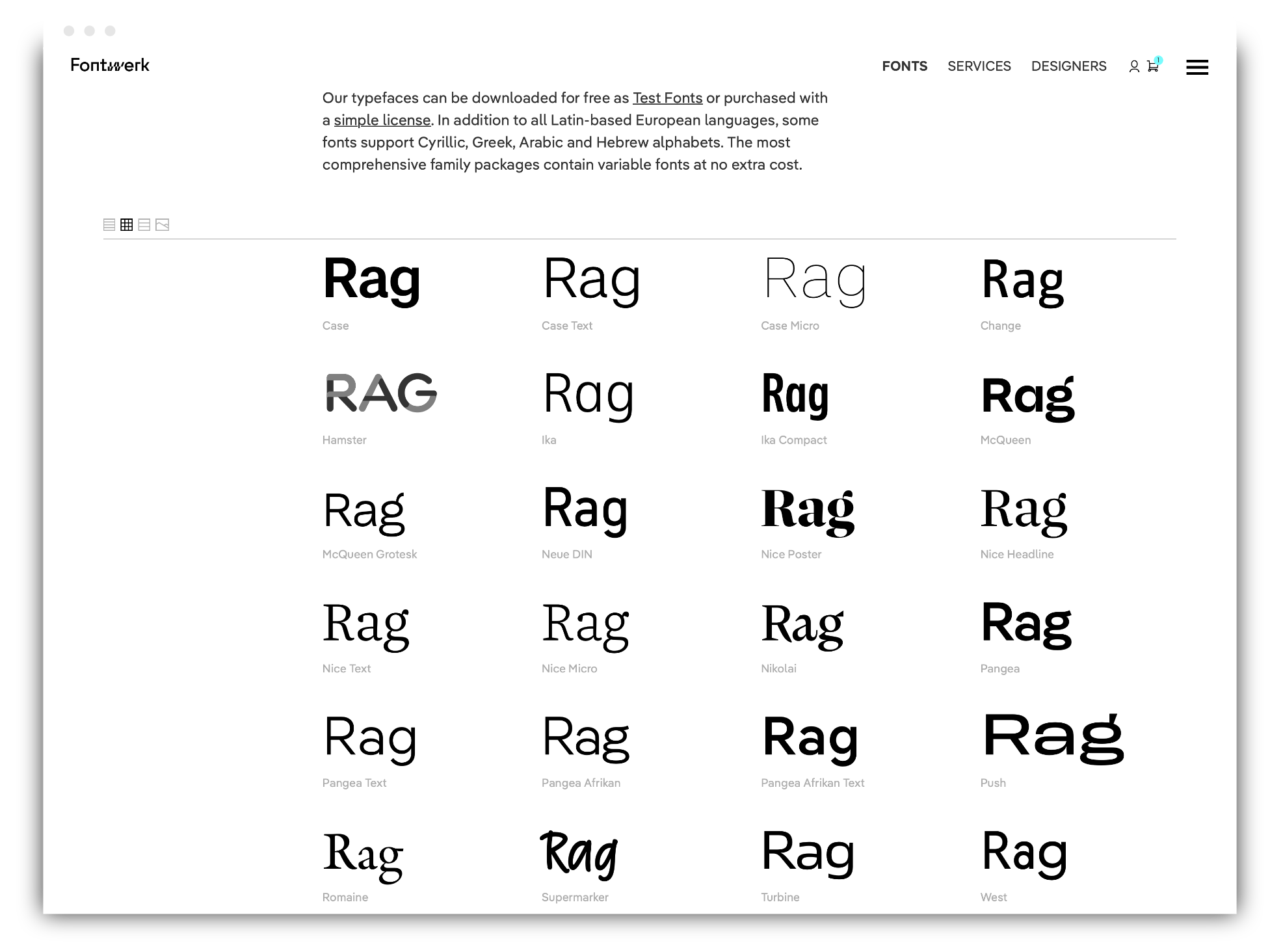
Despite wanting to ensure Fontwerk stands out, the focus should not be on our brand, but on our fonts and their marketing campaigns. These are very important to us and we wanted to give them more prominence on the new website. This is one of the reasons for putting Superfamilies and Collections front and center. Nice does not have to be presented four times (Poster, Headline, Text, Micro), McQueen (‘Normal’, Grotesk) also doesn’t have to appear twice. This also means that the growing library is presented in a more organized way and a new and improved filter function provides further orientation. There are still sub-family pages (e.g. for Nice Poster or McQueen Grotesk), but the focus is one level higher. Four different themes are available for Collection and Family pages, this provides variety and supports moods that match the typefaces.


