- McQueen
- McQueen Grotesk
McQueen
McQueen
Swiss Typography off the beaten grid
Designer(s)
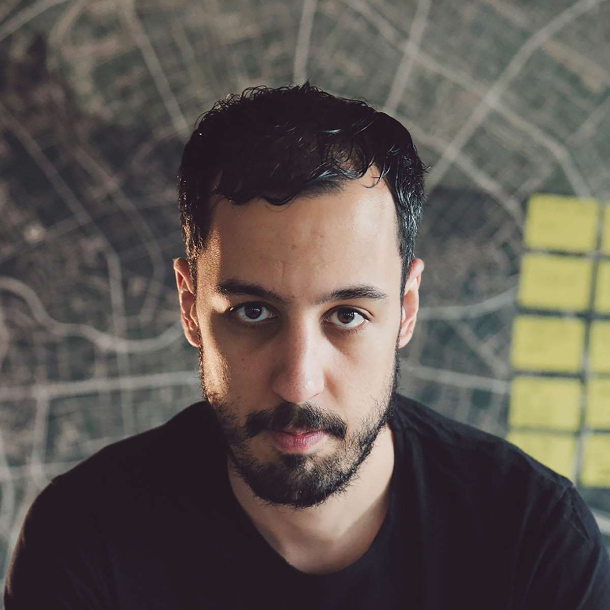
Loris Olivier
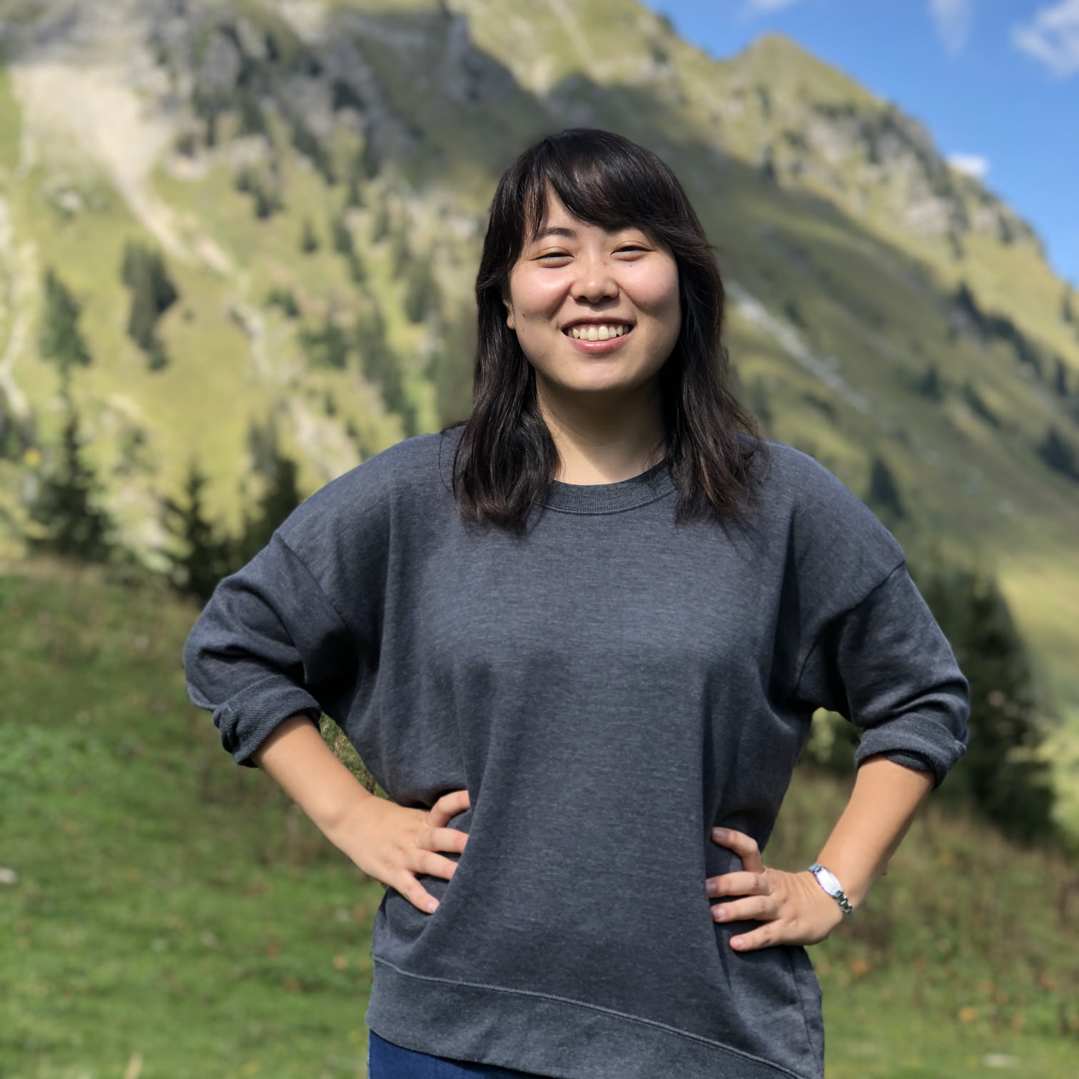
Noheul Lee
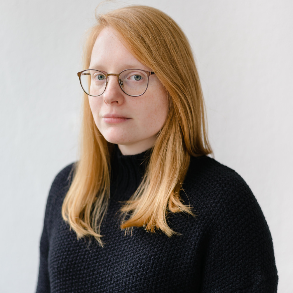
Katja Schimmel

Olli Meier
Loris Olivier
For Loris Olivier, typography is a small splash of color in the palette with which we paint our future.
This defining principle has unleashed an enviable talent for trends and experimental type design in the Swiss Designer. He proves this at Future Fonts, among others, where he is active as lo-ol typefoundry with his wife Noheul Lee. So far, he has published three families under this label: Gloubi (2018), Civilitate (2018) and Brienz (2019). The philosophizing designer still has enough designs for ten libraries up his sleeves.
Before he obtained his TypeMedia Masters in Type Design at the Royal Academy of Art in The Hague, he studied Art Direction at the ÉCAL in Lausanne. His passion for letter shapes was ignited in 2009 during a calligraphy course with Claude Dieterich in San Francisco.
Loris likes to leave his comfort zone of UI/UX, brand, graphic and type design by working on a project with a friend using CNC controls to cut wood.
Fonts on Fontwerk
Noheul Lee
When Noheul Lee looks at the cover of Joy Division’s “Unknown Pleasures” album, she thinks less about their mysterious and enigmatic music, but rather about the design of the cover by Peter Saville that can be described with the same adjectives.
As a fan of his work, she shares the fate of many designers who are less touched and inspired by the content of a product but by its shape.
The Korean book, editorial and type designer runs the Swiss lo-ol Typefoundry together with her husband, Loris Olivier. It was type design that also brought the two together: both studied TypeMedia at the Royal Academy of Art, in The Hague. Noheul previously obtained a Master’s Degree in Visual Communication Design from the renowned Kookmin University and a Bachelor’s Degree from Sangmyung University in Seoul.
Noheul – pronounced “Noelle” – specializes in multi-scripts font design and is particularly committed to her mother tongue, Korean. Her work has received recognition and acclaim; she won the 6th Bang Il Young Cultural Foundation Fund Competition for her Hangul design of her previous version of Arvana, which is available on Future Fonts. She also received Gold in the Morisawa Type Design Competition for the Latin design of her TypeMedia final font project, Areon.
Fonts on Fontwerk
Katja Schimmel
“Hope is for losers.” Katja Schimmel interpreted the advice of her teacher Peter Verheul very clearly: she does not hope, she just gets on and does it.
She designs typefaces, develops tools and scripts, creates animations, practices lettering and calligraphy, and last but by no means least, Katja produces and masters fonts. She developed her font engineering skills intensively during her time with the specialists from Alphabet Type and more recently through working with Grilli Type.
One of her rather unusual talents is creating 3D installations. She once built a wooden construction at a festival, which was stimulated by a pulse sensor and reacted with light to the rhythm of the heartbeat of the visitors. In this and many other ways, she continually keeps herself open to new creative worlds in a multidisciplinary manner.
Katja has a Bachelor from the Weimar Bauhaus University as well as a TypeMedia Master in Type Design from the Royal Academy of Art in The Hague. Before working with Loris Olivier and Noheul Lee on McQueen, she published her KABK graduation on the Future Fonts platform (Tweak Text and Tweak Display).
Fonts on Fontwerk
Olli Meier
Olli Meier joined the Fontwerk family in 2022. As our Font Engineer, he is responsible for ensuring the high technical quality of our fonts.
He began his career as a Communications Designer for agencies such as MetaDesign and Stan Hema. He also taught the basics of typography at the University of Applied Sciences Dresden before he was drawn to Monotype’s production team. There he found his calling in font technology, most recently as a Senior Software Engineer, and was responsible for internal font tools, among many other things.
His projects for the market leader included: Helvetica Now, Neue Frutiger World (working on Quality Engineering). He worked with Bernd Volmer on the corporate design of TYPOLabs, which used a variable font as a logo for the first time and was awarded a Red Dot. He also created his own family Vary and the interactive font specimen website FontSpecimen.com, which was an Awwwards-nominee. As a committed member of the Unicode consortium, Olli is involved in the development of one of the most important tools in our industry and has worked closely with Dave Opstad, Apple’s TrueType and Unicode Pioneer. Working in cooperation with Glyphs, he also ensures the quality of the app and supports the development of new features.
In addition to font technology work, he also designed Neue DIN together with Hendrik Weber and Andreas Frohloff.
His reputation as a DIY king also proves that he can also do things by hand. He lives on a farm in Barnim and is passionate about growing vegetables, working with wood and jumping on his randonneur bike to cycle to the North Cape.
Fonts on Fontwerk
Team & Details
Design Contributions
Jan Charvat
Andreas Frohloff
Mastering, Production
Olli Meier
Andreas Frohloff Version 1.0
Christoph Koeberlin Version 1.0
Rosalie Wagner Variable Fonts Version 1.03
Marketing
Ivo Gabrowitsch Naming, Copywriting, Specimen
Studio Sowieso Graphic Design, Imagery
Julian Braun 3D Motion Design
Lucy Beckley English Translation
Design Period
2016–2023
Release History
Version 1.0: July 20, 2020
Version 1.03: February 15, 2022 Variable Fonts
Version 2.0: December 22, 2023 16 new styles added; corrections to spacing, kerning, outlines; merged Grotesk and Display into one variable font with ‘Optical Size’ axis; small caps removed; renamed McQueen Display to McQueen
Technology, Licenses & Trademarks
Formats
Static .otf, .woff2
Variable .ttf, .woff2
Additional formats on request
Licenses
Trial Free test license
Base Includes Desktop, Web and Social Media use
Extended Larger volume, App or Audio-Visual
Additional licenses on request
Modifications, Extensions
Available on request
Variable Fonts
Included in the Collection package
2 axes: weight, optical size
Web file sizes .woff2: 90 KB Upright;
101 Italic
Trademarks
McQueen™ is a trademark of Fontwerk GmbH
A
Glyphs
Uppercase
A
B
C
D
E
F
G
H
I
J
K
L
M
N
O
P
Q
R
S
T
U
V
W
X
Y
Z
Lowercase
a
b
c
d
e
f
g
h
i
j
k
l
m
n
o
p
q
r
s
t
u
v
w
x
y
z
Latin Accents
Á
Ă
Â
Ä
À
Ā
Ą
Å
Ã
Æ
Ć
Č
Ç
Ĉ
Ċ
Ð
Ď
Đ
É
Ĕ
Ě
Ê
Ë
Ė
È
Ē
Ę
Ğ
Ĝ
Ģ
Ġ
Ħ
Ĥ
Í
Ĭ
Î
Ï
İ
Ì
Ī
Į
Ĩ
Ĵ
Ķ
Ĺ
Ľ
Ļ
Ŀ
Ł
Ń
Ň
Ņ
Ŋ
Ñ
Ó
Ŏ
Ô
Ö
Ò
Ő
Ō
Ø
Õ
Œ
Þ
Ŕ
Ř
Ŗ
Ś
Š
Ş
Ŝ
Ș
ẞ
Ə
Ŧ
Ť
Ţ
Ț
Ú
Ŭ
Û
Ü
Ù
Ű
Ū
Ų
Ů
Ũ
Ẃ
Ŵ
Ẅ
Ẁ
Ý
Ŷ
Ÿ
Ỳ
Ź
Ž
Ż
á
ă
â
ä
à
ā
ą
å
ã
æ
ć
č
ç
ĉ
ċ
ð
ď
đ
é
ĕ
ě
ê
ë
ė
è
ē
ę
ğ
ĝ
ģ
ġ
ħ
ĥ
í
ĭ
î
ï
̇
ì
ī
į
ĩ
ĵ
ķ
ĺ
ľ
ļ
ŀ
ł
ń
ň
ņ
ŋ
ñ
ó
ŏ
ô
ö
ò
ő
ō
ø
õ
œ
þ
ŕ
ř
ŗ
ś
š
ş
ŝ
ș
ß
ə
ŧ
ť
ţ
ț
ú
ŭ
û
ü
ù
ű
ū
ų
ů
ũ
ẃ
ŵ
ẅ
ẁ
ý
ŷ
ÿ
ỳ
ź
ž
ż
Numerals & Currency Symbols
0
1
2
3
4
5
6
7
8
9
¤
€
$
¢
£
¥
₿
ƒ
₺
₼
₽
0
1
2
3
4
5
6
7
8
9
π
0
1
2
3
4
5
6
7
8
9
0
1
2
3
4
5
6
7
8
9
Punctuation
.
,
:
;
…
!
¡
?
¿
&
@
·
•
*
‽
⸘
#
/
|
\
(
)
{
}
[
]
-
–
—
‒
‐
‑
_
‚
„
“
”
‘
’
«
»
‹
›
‴
"
'
⟨
⟩
Mathematical Signs & Symbols
∙
≅
≙
+
−
×
÷
=
≠
>
<
≥
≤
±
≈
~
¬
^
∞
∫
Ω
∆
∏
∑
√
µ
∂
%
‰
Arrows & Shapes
↑
↗
→
↘
↓
↙
←
↖
●
○
◊
■
□
▲
▼
△
▽
▴
▸
▾
◂
Ligatures
fi
fl
Greek
π
Languages
| A | Acheron Achinese Acholi Afar Afrikaans Alekano Aleut Amahuaca Amarakaeri Amis Anaang Andaandi, Dongolawi Anuta Ao Naga Aragonese Arbëreshë Albanian Arvanitika Albanian Asháninka Ashéninka Perené Asu (Tanzania) Atayal |
| B | Balinese Bari Basque Batak Dairi Batak Karo Batak Mandailing Batak Simalungun Batak Toba Bemba (Zambia) Bena (Tanzania) Bikol Bislama Borana-Arsi-Guji Oromo Bosnian Breton Buginese |
| C | Candoshi-Shapra Caquinte Caribbean Hindustani Cashibo-Cacataibo Catalan Cebuano Central Aymara Central Kurdish Chamorro Chavacano Chiga Chiltepec Chinantec Chokwe Chuukese Cimbrian Cofán Congo Swahili Cook Islands Māori Cornish Corsican Creek Crimean Tatar Croatian Czech |
| D | Danish Dehu Dutch |
| E | Eastern Arrernte Eastern Oromo Embu English Ese Ejja |
| F | Faroese Fijian Filipino Finnish French Friulian |
| G | Gagauz Galician Ganda Garifuna Ga’anda German Gheg Albanian Gilbertese Gooniyandi Gourmanchéma Guadeloupean Creole French Gusii |
| H | Haitian Hani Hiligaynon Ho-Chunk Hopi Huastec Hungarian |
| I | Icelandic Iloko Inari Sami Indonesian Irish Istro Romanian Italian Ixcatlán Mazatec |
| J | Jamaican Creole English Japanese Javanese Jola-Fonyi |
| K | Kabuverdianu Kala Lagaw Ya Kalaallisut Kalenjin Kamba (Kenya) Kaonde Karelian Kashubian Kekchí Kenzi, Mattokki Khasi Kikuyu Kimbundu Kinyarwanda Kituba (DRC) Kongo Konzo Kuanyama Kven Finnish Kölsch K’iche’ |
| L | Ladin Ladino Latgalian Ligurian Lithuanian Lombard Low German Lower Sorbian Luba-Lulua Lule Sami Luo (Kenya & Tanzania) Luxembourgish |
| M | Macedo-Romanian Makhuwa Makhuwa-Meetto Makonde Makwe Malagasy Malaysian Maltese Mandinka Mandjak Mankanya Manx Maore Comorian Maori Mapudungun Marshallese Matsés Mauritian Creole Meriam Mir Meru Minangkabau Mirandese Mohawk Montenegrin Munsee Murrinh-Patha Mwani Mískito |
| N | Naga Pidgin Ndonga Neapolitan Ngazidja Comorian Niuean Nobiin Nomatsiguenga North Ndebele Northern Kurdish Northern Qiandong Miao Northern Sami Northern Uzbek Norwegian Nyanja Nyankole |
| O | Occitan Ojitlán Chinantec Orma Oroqen |
| P | Palauan Paluan Pampanga Papantla Totonac Papiamento Pedi Picard Pichis Ashéninka Piemontese Pijin Pintupi-Luritja Pipil Pohnpeian Polish Portuguese Potawatomi Purepecha |
| Q | Quechua |
| R | Romanian Romansh Rotokas Rundi Rwa |
| S | Samburu Samoan Sango Sangu (Tanzania) Saramaccan Sardinian Scots Scottish Gaelic Sena Seri Seselwa Creole French Shambala Shawnee Shipibo-Conibo Shona Sicilian Silesian Slovak Slovenian Soga Somali Soninke South Ndebele Southern Aymara Southern Qiandong Miao Southern Sami Southern Sotho Spanish Sranan Tongo Standard Estonian Standard Latvian Standard Malay Sundanese Swahili Swati Swedish Swiss German |
| T | Tagalog Tahitian Taita Tedim Chin Tetum Tetun Dili Tiv Tok Pisin Tokelau Tonga (Tonga Islands) Tonga (Zambia) Tosk Albanian Tsonga Tswana Tumbuka Turkish Turkmen Tzeltal Tzotzil |
| U | Uab Meto Ume Sami Upper Guinea Crioulo Upper Sorbian |
| V | Venetian Veps Võro |
| W | Walloon Walser Wangaaybuwan-Ngiyambaa Waray (Philippines) Warlpiri Wayuu Welsh West Central Oromo Western Abnaki Western Frisian Wik-Mungkan Wiradjuri Wolof |
| X | Xhosa |
| Y | Yanesha’ Yao Yapese Yindjibarndi Yucateco |
| Z | Zapotec Zulu Záparo |