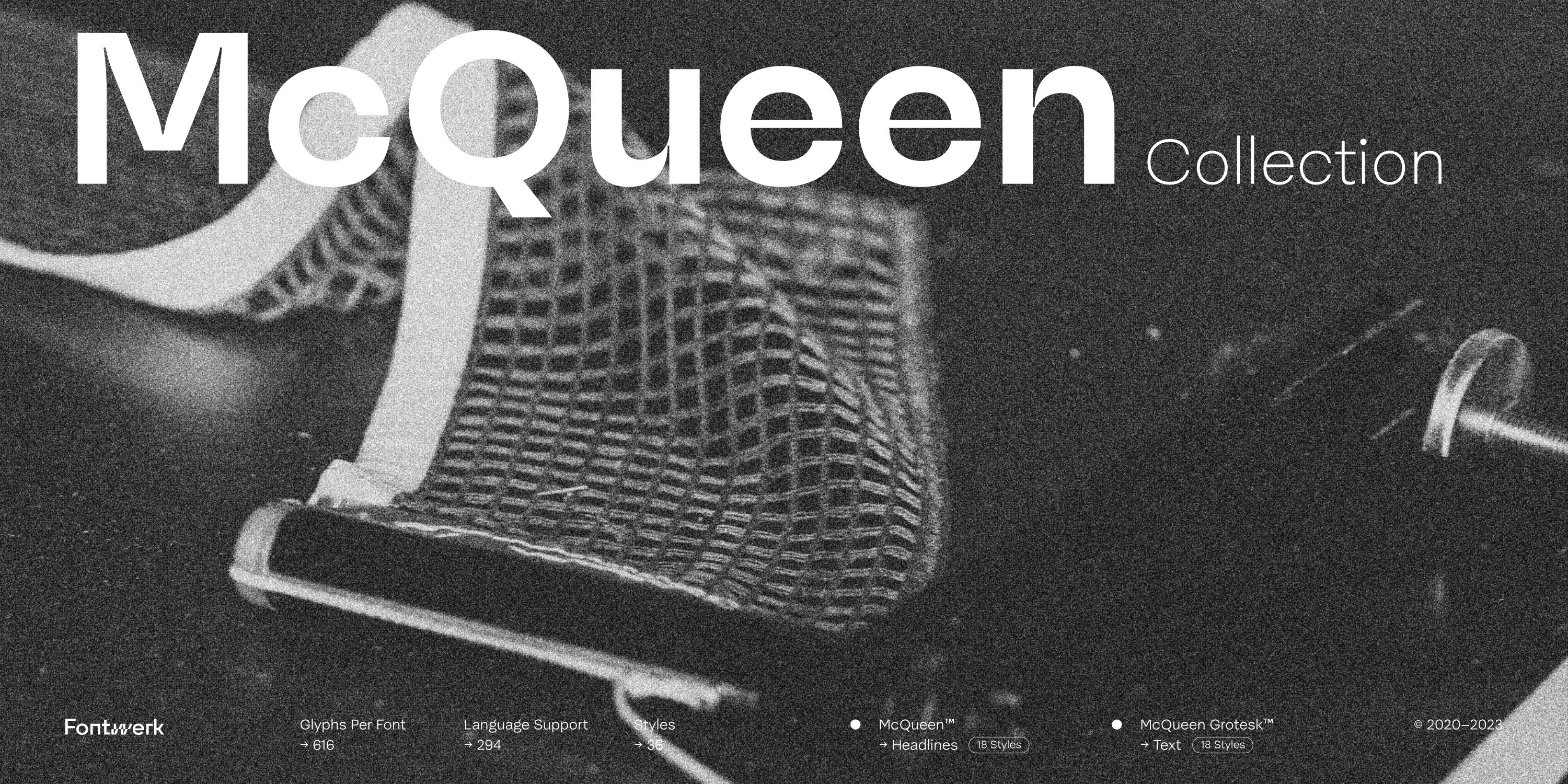
hrough the veins of the McQueen Collection flows the blood of three designers. Loris Olivier, who came up with the idea, is a Swiss designer with an enviable talent for creating trends. He knows the ‘Swiss Style’ all too well but the search for his own appeals to him much more. Noheul Lee also lives in Switzerland but hails from Korea and brings with her a quiet yet precise tone to the typeface as befitting with traditional Korean culture. Katja Schimmel from Germany completes the trio and adds meticulous font engineering to the typographical mix.
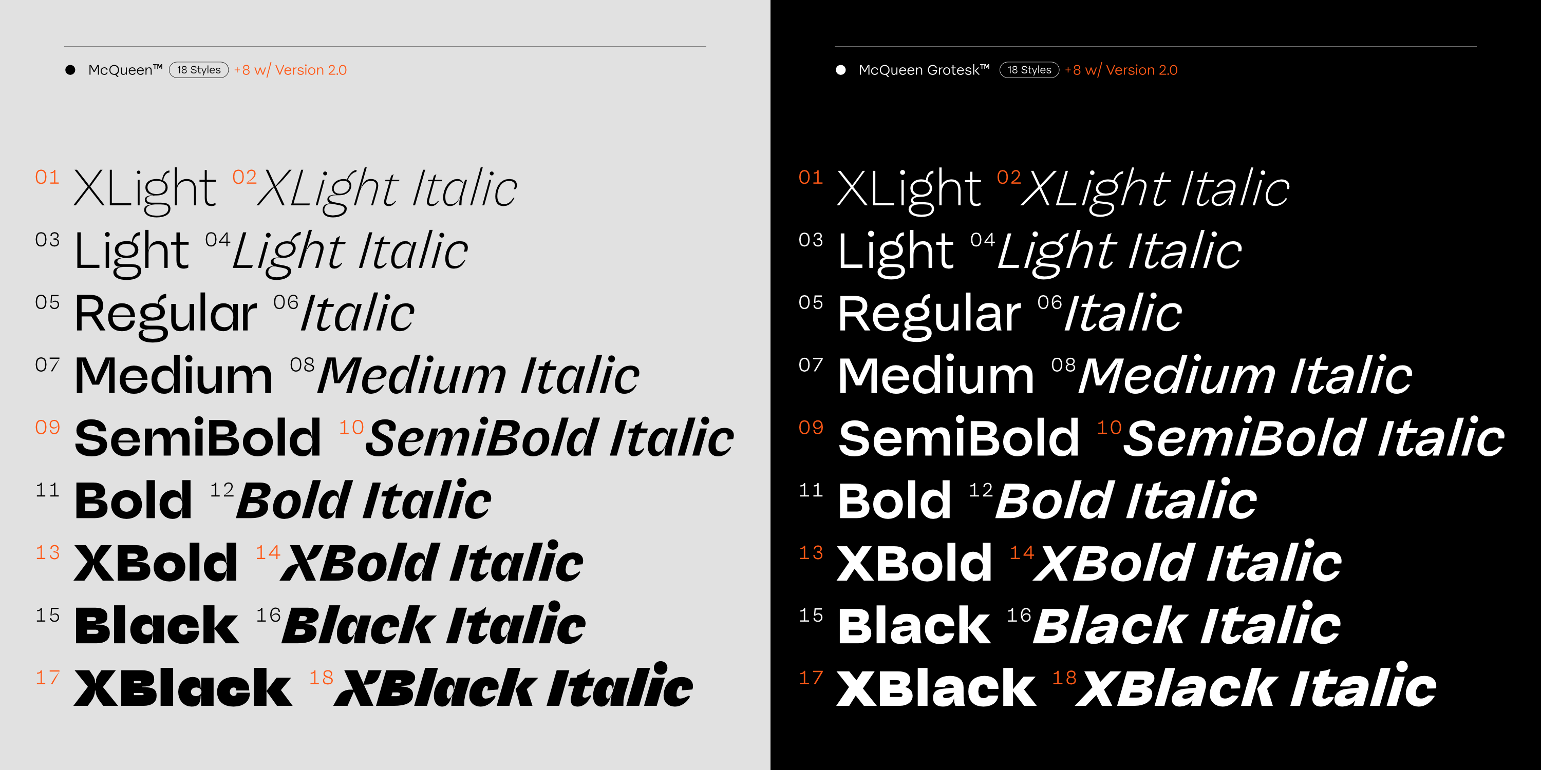
With the extensive update of the McQueen Collection to version 2.0, a fourth designer joins the already diverse group: Olli Meier, who has continued the meticulousness and turned the family completely inside out. He revised and harmonized all the characters and added eight new styles to each of the two families.
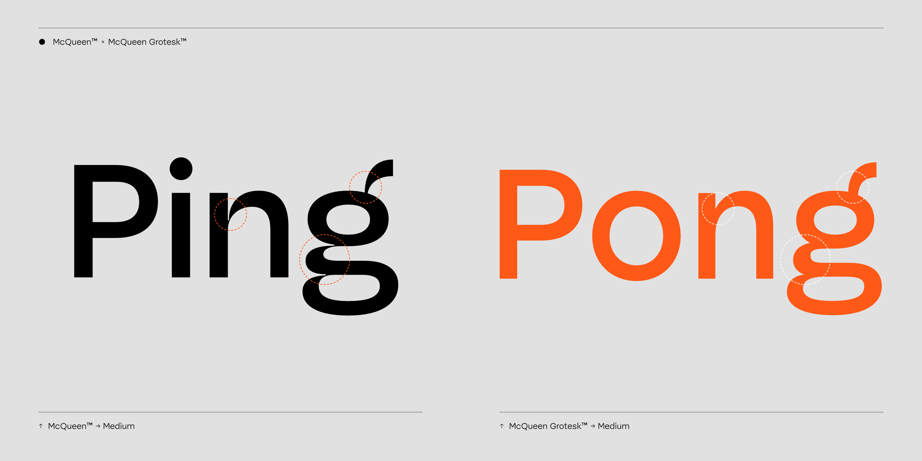
The core McQueen family, originally called “Display”, reconciles what are actually incompatible principles of enormous contrast, ink-trap-like ornaments and geometric shapes. Its counterpart, McQueen Grotesk, dispenses with these differences in line thickness and expressive characteristics and therefore appears more stable and restrained. At the same time, however, it retains the playfulness, dynamism and curves of its counterpart. In their own way, both families bear witness to a bold and cheeky character.
Both McQueens clamor for attention but with different game plans. McQueen is like a Lady Gaga outfit – showy and spectacular, fit for the stage. While McQueen Grotesk, is more stealth-like, akin to a pair of fashionable but reliable sneakers – in it for the long run, in other words extensive amounts of text. As in any good family, they like to spend time together, but equally allow each other to live their own lives.
