As an expert in diversity, mental health and neurodivergence, Katrin Terwiel took the plunge into self-employment in April 2024. She contacted Cigarsauerkraut’s art director Enrico Kunze about her new visual identity. She wanted a brand that would reflect her way of working and philosophy – a visual identity that could grow and flex with her.
Katrin Terwiel
Driven by freedom
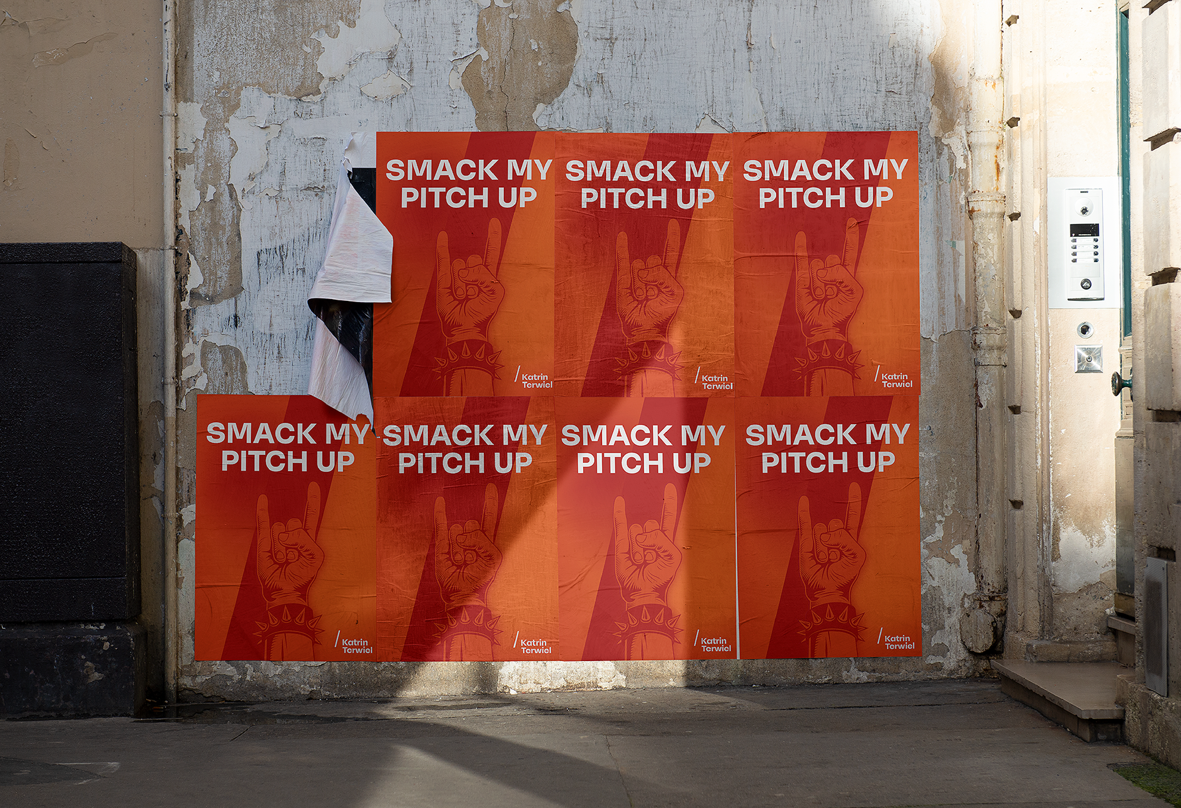
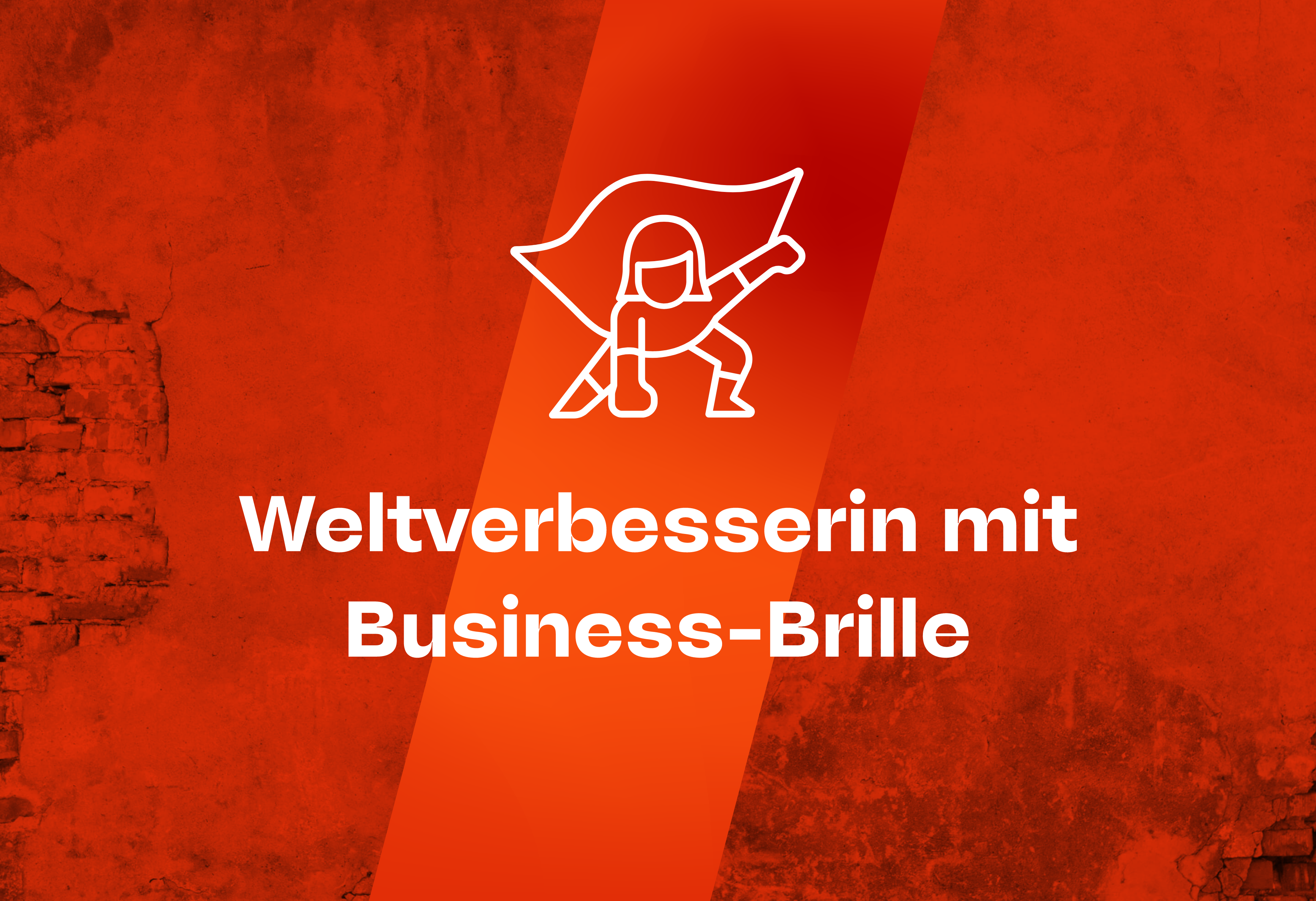
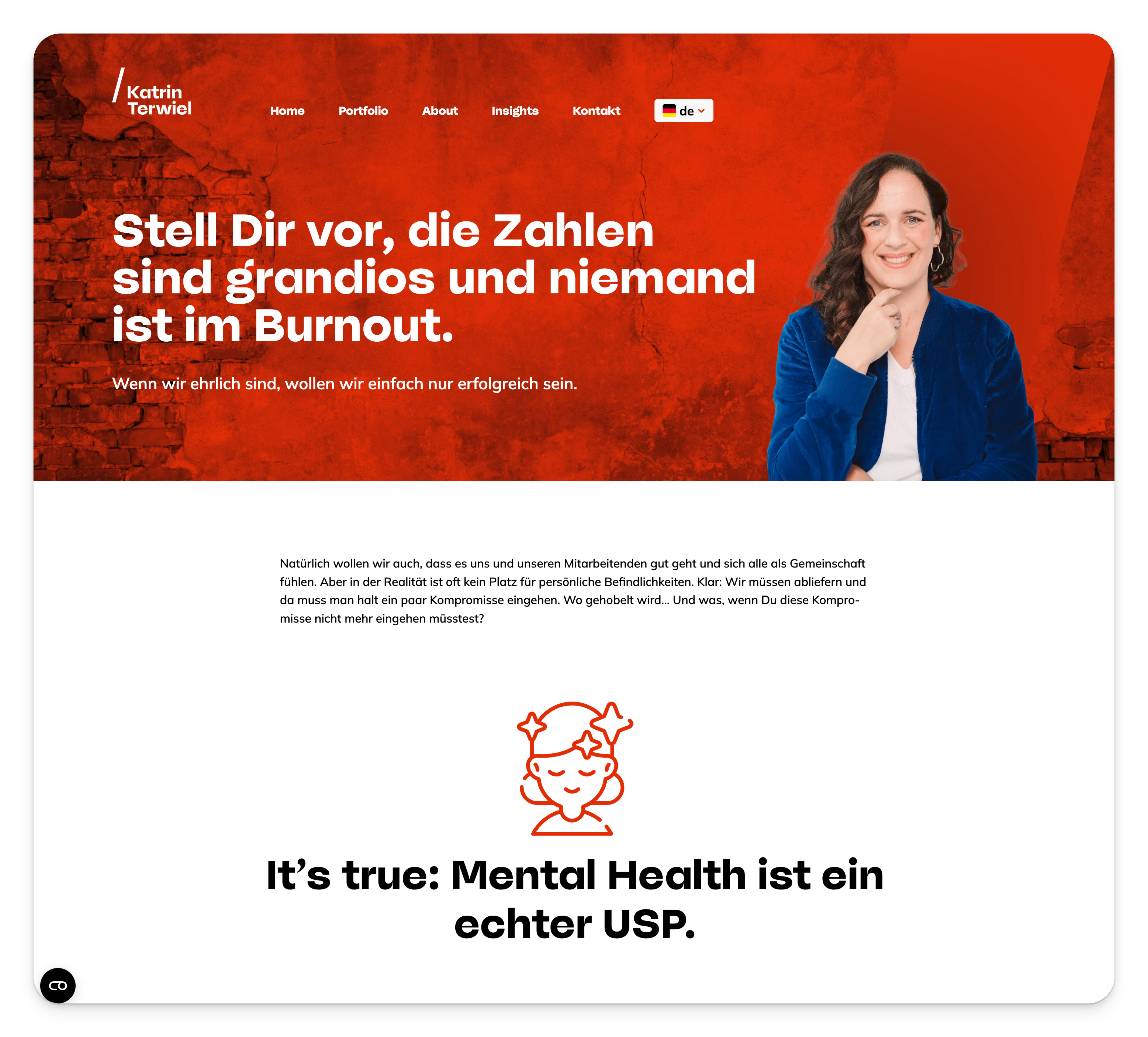
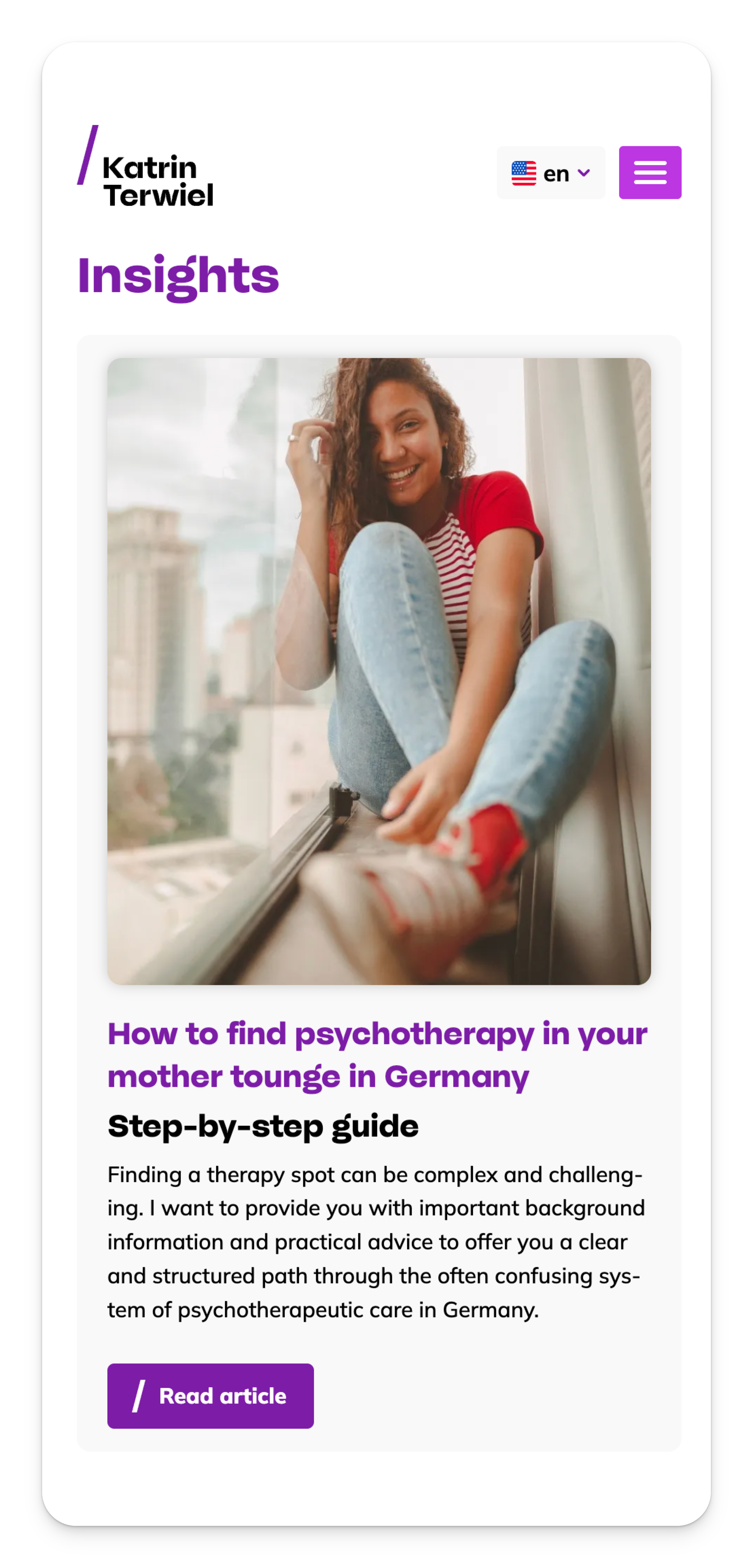
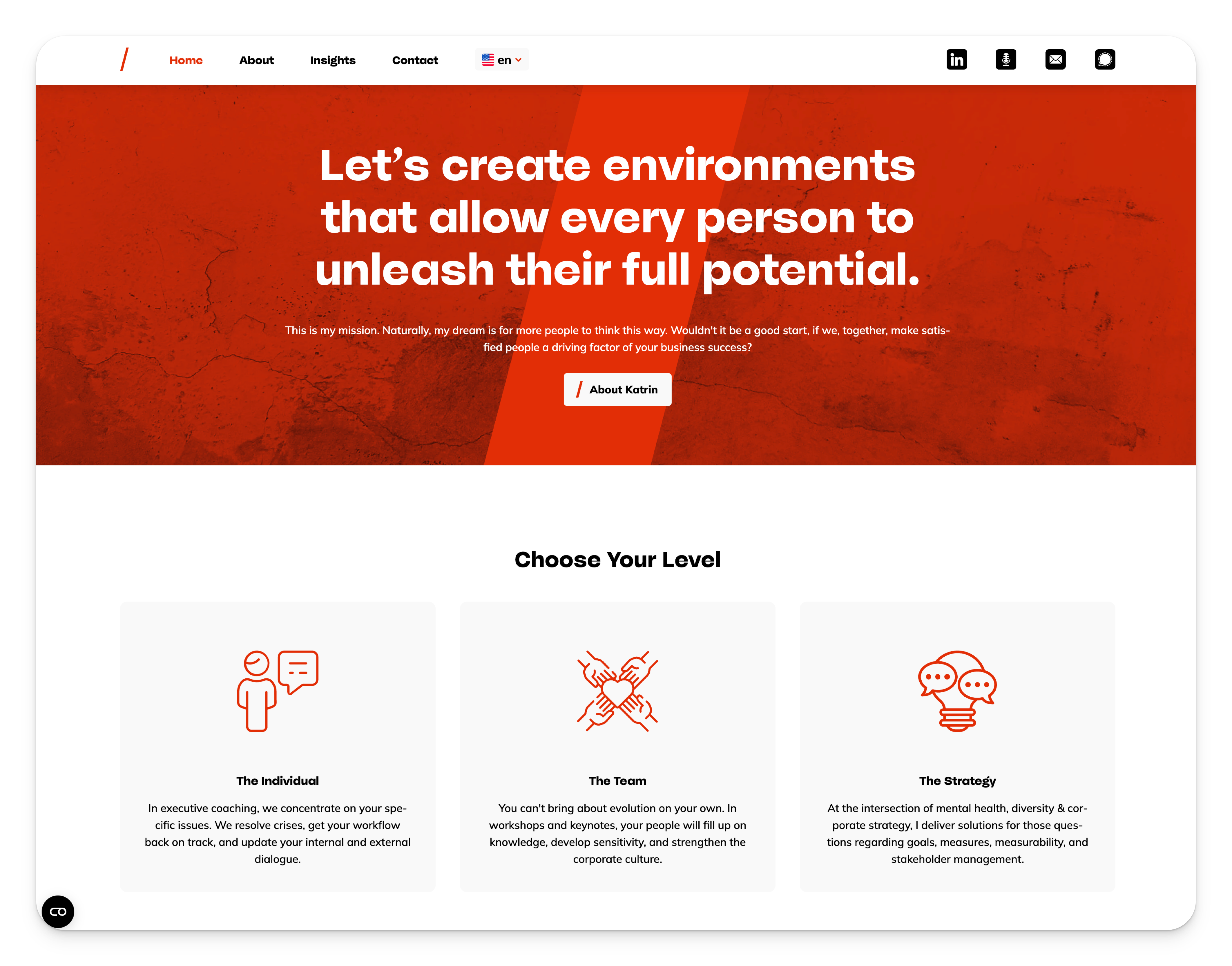
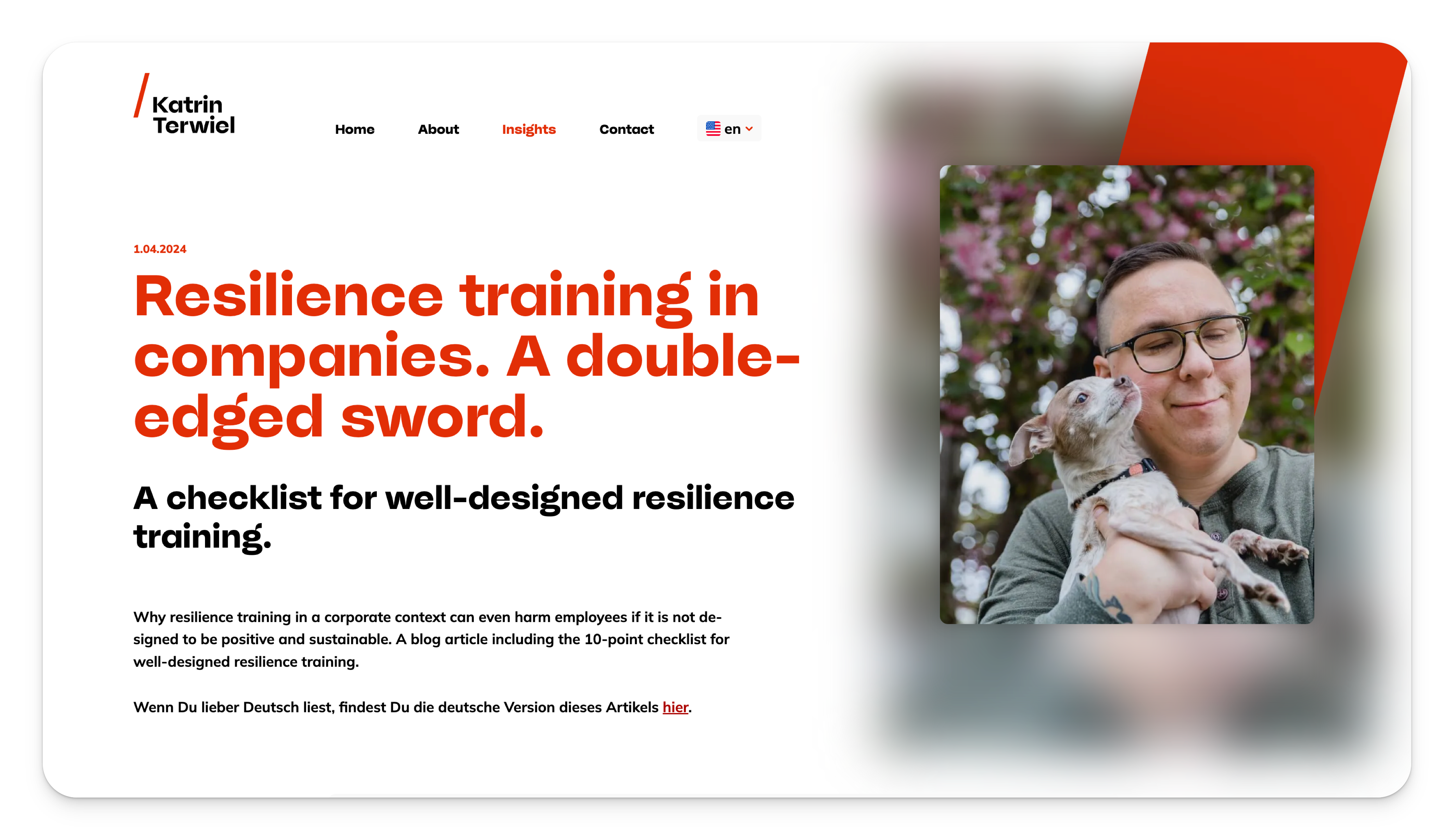
A flexible and fluid brand design was created that can change and adapt with Terwiel’s own development and evolution of her business. The new website focuses on clear, comprehensible communication of technical content. Three guiding colors take the lead: elements such as buttons, icons or text labels automatically adopt the appropriate color depending on the topic.
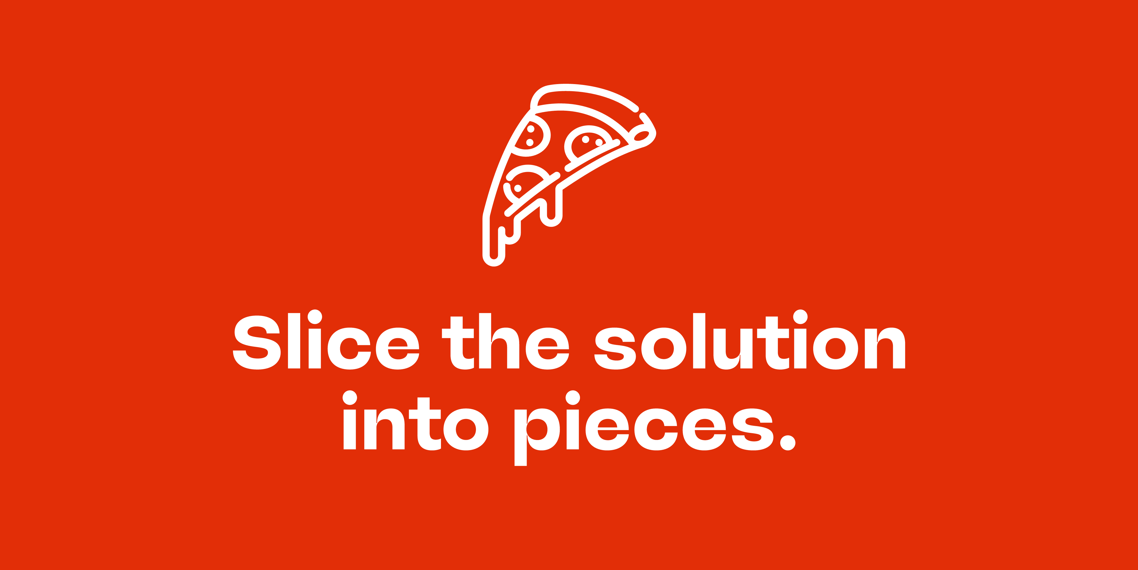
“Uncompromising and yet corporate … how can that work?” asked Enrico Kunze in the middle of the project while he was searching for a suitable font. He came across McQueen, designed by Loris Olivier, Noheul Lee, Katja Schimmel and Olli Meier. This font gets to the heart of Terwiel’s brand positioning: “Loud, but not annoying. Strong, but not dominant. This is Swiss typography that really gets you going.” With McQueen, Kunze found the perfect match for Katrin Terwiel’s vision.
The strong character of McQueen shows that business doesn’t have to be boring.
