

VormVijf, Proforma and Total Design: For 30 years, Aad van Dommelen worked as Creative Director for some of the most important agencies in the Graphic Design paradise of the Netherlands.
During this time, he undertook numerous well-known corporate design and branding projects, including KLM, the Dutch Ministries of Foreign Affairs and Defense, Koninklijke BAM and the Protestant Church. Another milestone was the re-design of Total Design itself together with Leon Stolk when it transformed into Total Identity in 2000. In the course of this, Aad began to (seriously) start to work on type design for the first time and developed the agency’s much-noticed corporate typeface, Oneliner.
Three years later, he worked on the corporate design of Hyundai Card. This left such an impression on the South Korean design scene that many other projects and briefs followed from there, often also for exclusive typefaces. Aad’s corporate fonts are now omnipresent in South Korea. They have graced and adorned the likes of the internet company Daum, LG Electronics, Heungkuk Insurance (together with Christoph Dunst), SK Telecom (together with André Mol), Total Impact and JTBC Television. He also created custom fonts for MRO Industries, Stern Groep, Vigilius Mountain Resort, Friesland Campina, Gaffel and Lotte Duty Free (awarded the “Red Dot Award, Best of the Best”).
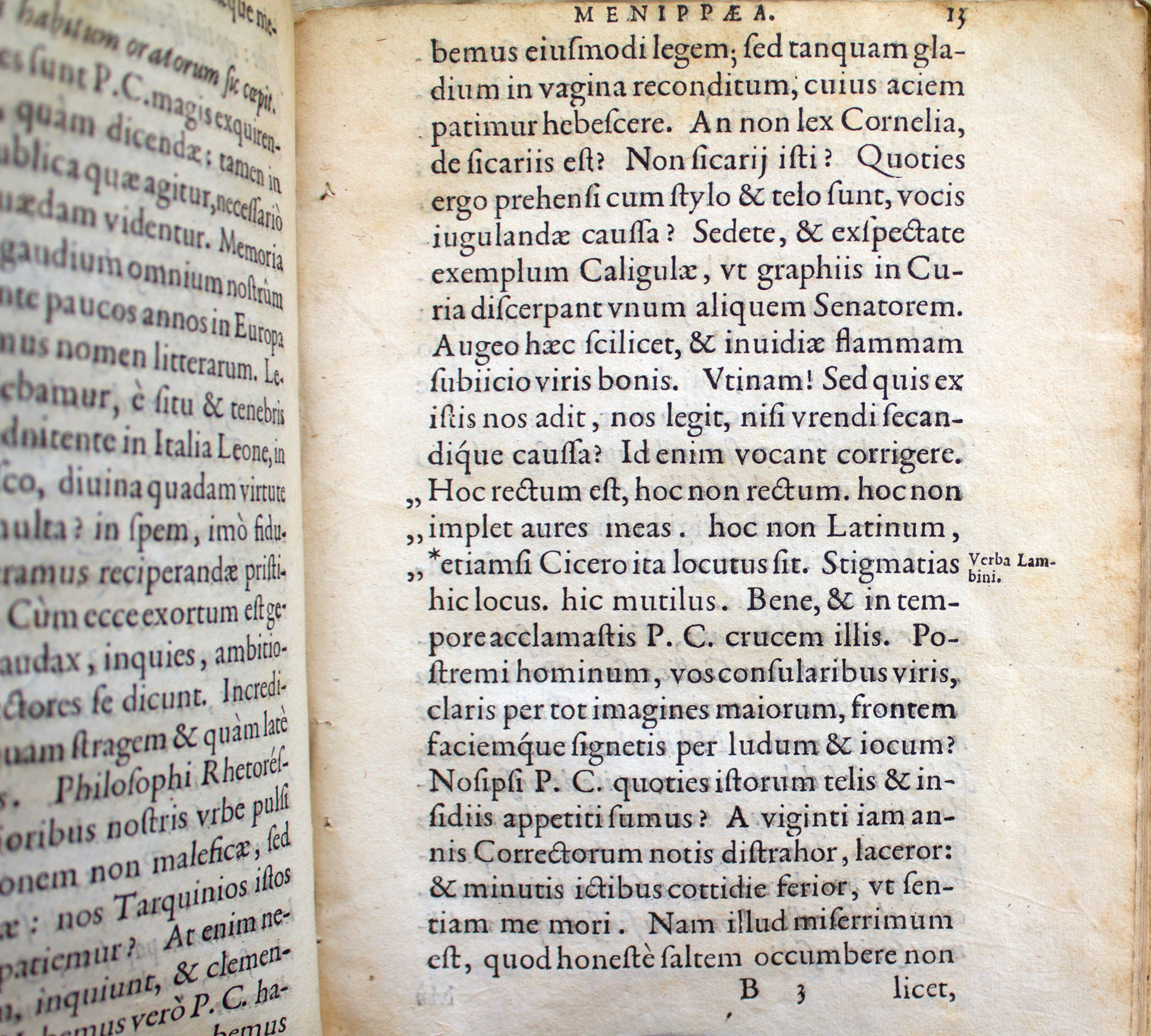
Romaine is Aad’s second retail font that he has published. In 2012, he brought FF Aad into the world via the FontFont library. Incidentally, at the time he wasn’t so keen on the idea of naming the font after himself. His modest manner initially stood in the way of the proposal. But Fontwerk founder Ivo Gabrowitsch – who was Marketing Director for FontFont back then – finally convinced him with the argument that there was only one other font that could ever appear before the FF Aad in the font menu or other alphabetically sorted overviews: Letraset’s Aachen.
Aad’s design skills, like that of many other Fontwerk designers, were influenced by the Royal Academy of Fine Arts in The Hague. There he studied Graphic and Typographic design with Gerrit Noordzij, among others.
A riddle that we have not yet been able to solve is where the Dutchman finds sufficient space for his passion of collecting old Macintosh computers and pop-up books. But he will undoubtedly have mastered that too with his extraordinary calm and meticulous nature.
Andreas Frohloff
Christoph Koeberlin
Rosalie Wagner Variable Fonts
Aad van Dommelen Naming, Copywriting, Imagery, Graphic Design
Ivo Gabrowitsch Copywriting, Imagery, Specimen
Lucy Beckley English Translation
1570, 2015–2020
Version 1.0: July 20, 2020
Version 1.002: October 8, 2020
Version 1.05 Variable Fonts only: February 15, 2022 Variable Fonts
Static .otf, .woff2
Variable .ttf, .woff2
Additional formats on request
Trial Free test license
Base Includes Desktop, Web and Social Media use
Extended Larger volume, App or Audio-Visual
Additional licenses on request
Available on request
Included in the Family package
1 axis: weight
Web file sizes .woff2: 84 KB Upright, 279 KB Italic
Romaine™ is a trademark of Fontwerk GmbH
Uppercase
Lowercase
Latin Accents
Numerals & Currency Symbols
Small Caps
Punctuation
Mathematical Signs & Symbols
Arrows & Shapes
Ligatures
Greek
| A | Afrikaans Albanian Asu |
| B | Basque Bemba Bena Breton |
| C | Catalan Cornish Croatian Czech |
| D | Danish Dutch |
| E | Embu English Esperanto Estonian |
| F | Faroese Filipino Finnish French Friulian |
| G | Galician Ganda German Gusii |
| H | Hungarian |
| I | Icelandic Inari Sami Indonesian Irish Italian |
| J | Jola-Fonyi |
| K | Kabuverdianu Kalenjin Kamba Kikuyu Kinyarwanda |
| L | Latvian Lithuanian Lower Sorbian Luo Luxembourgish Luyia |
| M | Machame Makhuwa-Meetto Makonde Malagasy Maltese Manx Meru Morisyen |
| N | North Ndebele Northern Sami Norwegian Bokmål Norwegian Nynorsk Nyankole |
| O | Oromo |
| P | Polish Portuguese |
| Q | Quechua |
| R | Romanian Romansh Rombo Rundi Rwa |
| S | Samburu Sango Sangu Sena Serbian Shambala Shona Slovak Slovenian Soga Somali Spanish Swahili Swedish Swiss German |
| T | Taita Teso Turkish |
| U | Upper Sorbian Uzbek |
| V | Volapük Vunjo |
| W | Walser Welsh |


