Scarlet Imprint

Fonts in use: Romaine

Magic in every line

Fonts in use: The typeface Romaine for the book ‘Holy Heretics’ by Frater Acher, published by Scarlet Imprint
“Holy Heretics”, the third volume of the ‘Holy Daimon’ series by Frater Acher: thread-bound, 120 g/m² paper, slipcase with gold foil printing

Scarlet Imprint is an independent Cornwall-based publisher specializing in contemporary occult texts and practices. Founded in 2007 by Peter Grey and Alkistis Dimech, it has become the leading platform for magical and esoteric literature since its publication of “The Red Goddess”.

A

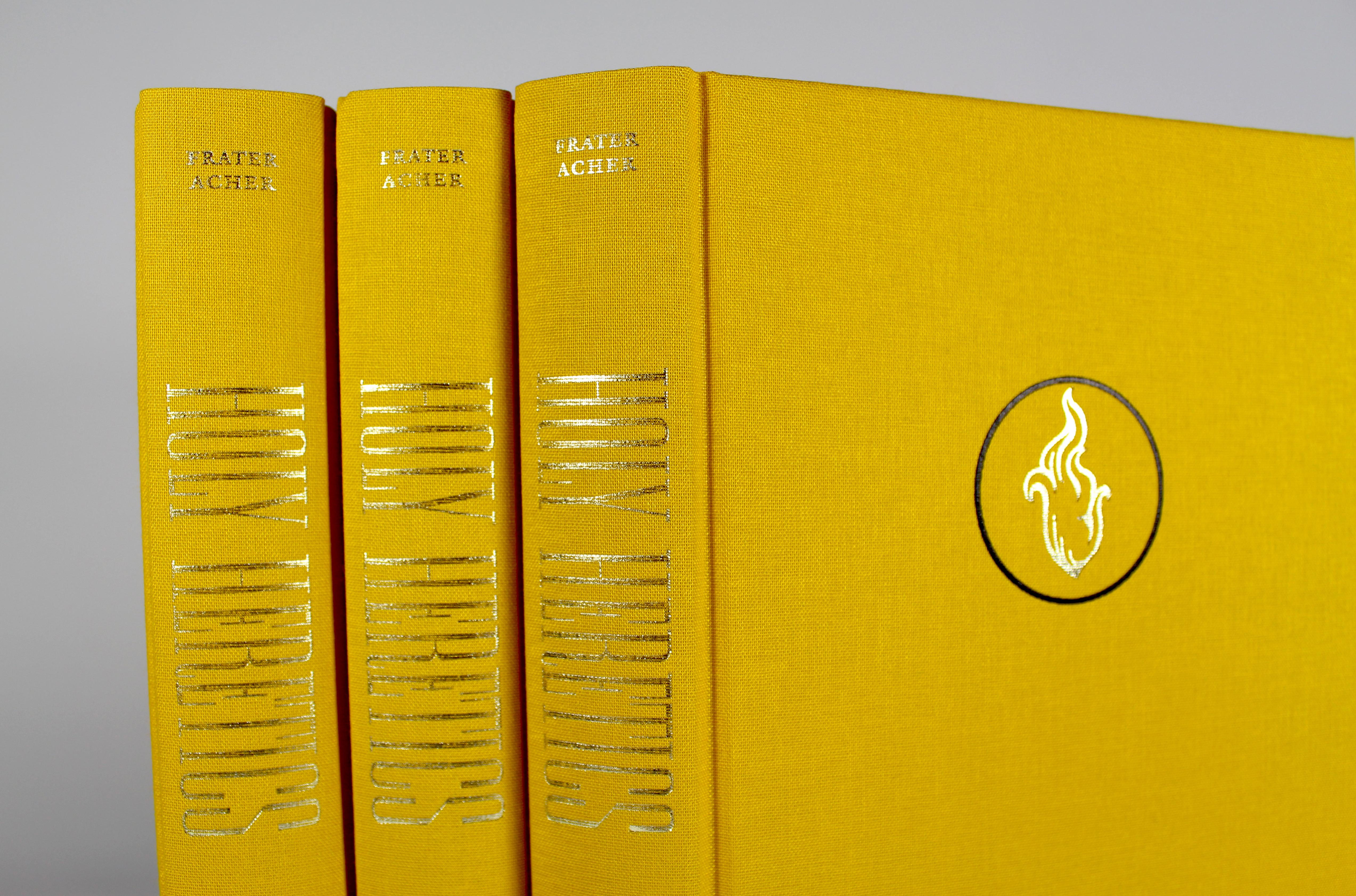
trademark of Scarlet Imprint is the handcrafted design of its books. Each edition is published in both digital and hardback form and around five titles are published each year. The focus is on high editorial standards and careful production and the publishing house works exclusively with printers and suppliers who are committed to sustainability and reducing environmental impact. All materials used are of archival quality and FSC-certified to ensure the longevity of the books.

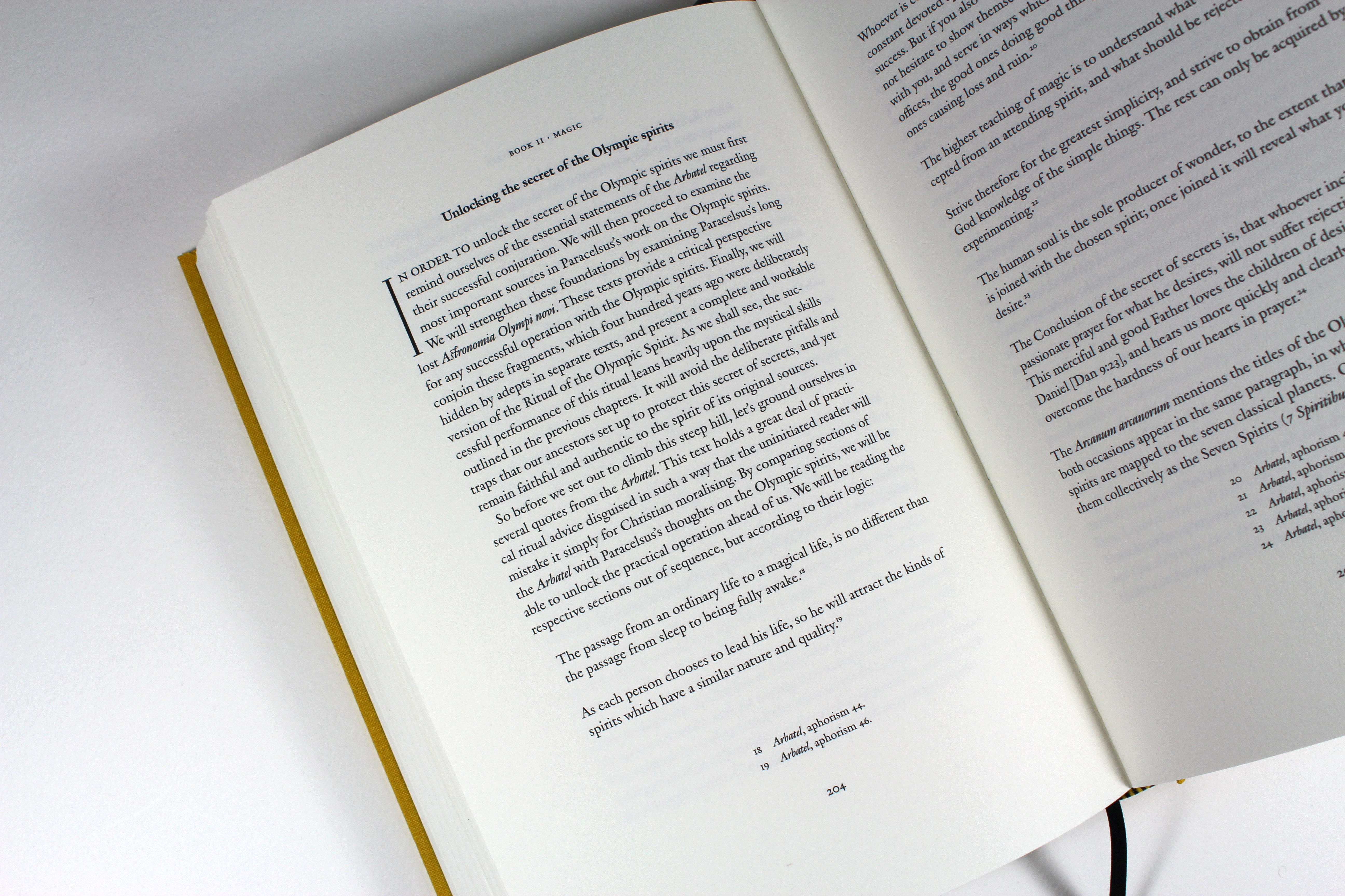
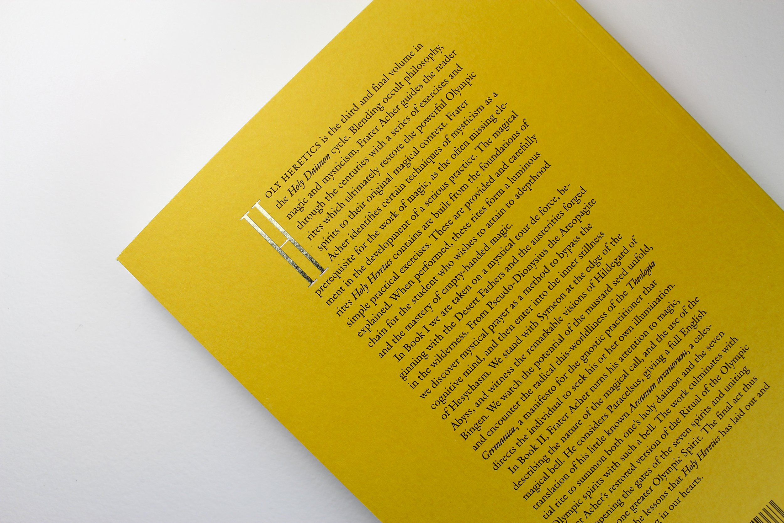
Special attention is also paid to the typography. For the typesetting of “Holy Heretics”, the third and final volume of Frater Acher’s “Holy Daimon” series, editor and designer Alkistis Dimech chose Romaine by Aad van Dommelen.

Fonts in use: The typeface Romaine for the book ‘Holy Heretics’ by Frater Acher, published by Scarlet Imprint
Outstanding typesetting with Fontwerk’s Romaine, an interpretation of Robert Granjon’s Ascendonica from 1570. The initial is set in Remnants (Apfel Type Foundry)
Fonts in use: The typeface Romaine for the book ‘Holy Heretics’ by Frater Acher, published by Scarlet Imprint
It was a gut decision. I can’t rationally explain what I particularly like about a font. Romaine is beautifully designed and has everything I need. The italics are wonderful: energetic, not too oblique.

The title and initials are set in Remnants (Apfel Type Foundry) and form an exciting contrast to the text font.

Fonts in use: The typeface Romaine for the book ‘Holy Heretics’ by Frater Acher, published by Scarlet Imprint

The book “Holy Daimon”, which combines historical knowledge with practical ritual work, also uses Romaine as a body text font. The title is set in Garda Nova 2 (Feliciano Type), while the initials are set in Optimum Compress (The Designers Foundry).

“The typeface looks contemporary, although it is an interpretation of Ascendonica. The typesetting harmonizes well with the embedded illustrations by Jose Gabriel Alegría Sabogal,” adds Dimech.

Fonts in use: Romaine for the book ‘Holy Daimon’ by Frater Acher, published by Scarlet Imprint
View of the typesetting of “Holy Daimon”, set using three styles of the Romaine family
Fonts in use: Romaine for the book ‘Holy Daimon’ by Frater Acher, published by Scarlet Imprint
The first edition of “Holy Daimon”, limited to 72 copies: each edition is hand bound in black goatskin, gilt edges, ribbon marker, gold foil print and marbled slipcase
Fonts in use: Romaine for the book ‘Holy Daimon’ by Frater Acher, published by Scarlet Imprint
© All photos: Scarlet Imprint

Even the digital editions of the Scarlet imprint books – as far as the format allows – are designed with the utmost care. And for all direct purchasers of the printed books, they also receive the matching ebook free of charge.

Try Romaine