Romaine

Font Story: A shockingly modern 450 year old

Our one and only – but highly necessary – revival.

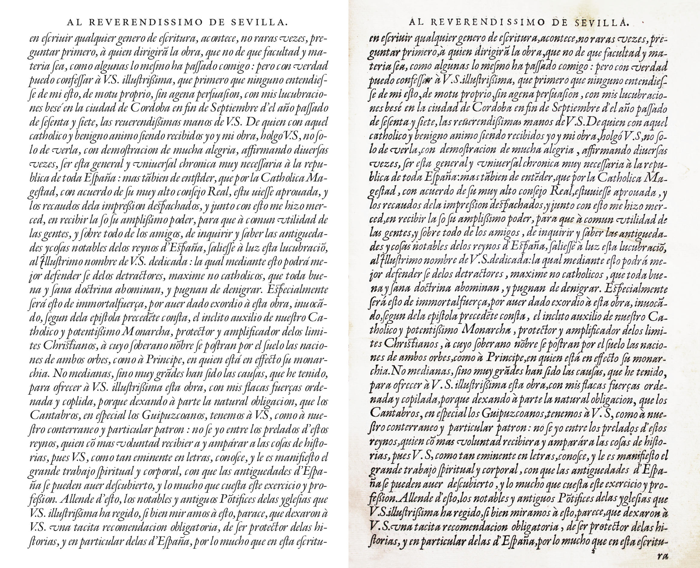
Page from the printed book template with Granjon’s Ascendonica

Romaine is a carefully interpreted digitization of Ascendonica by Robert Granjon from 1570. Despite her old age, she cuts a very good figure. No wonder.

T

he typeface owes its existence to a very current challenge. This is the story of a typeface that is all at once ancient yet still modern and current. Aad van Dommelen was recently faced with this task when working on the design of a corporate identity for a client. One condition of the brief was to use a Flemish letter from the baroque period. Although Christophe Plantin did not live in the 17th Century, the important book printer and his font of the same name immediately came to mind. However, it was not what the client had in mind. Neither was the proposed alternative DTL VandenKeere.

The only typeface that seemed to fit the bill was designed by Robert Granjon (1513–1590). The problem was that the existing digitization by Linotype deviated too much from the original and showed some inconsistencies. Digitizing the old templates seemed to be the best solution.

Aad van Dommelen’s first attempts to do this were based on photos of printed Plantin books. However, not all of the characters were used, and he had doubts about the quality of the type design presented to him. He wanted to get as close as possible to the designer’s original intent. For this he had to get closer to the origin of the typeface and go to Plantin-Moretus-Museum in Antwerp, where some original punches and matrices are still kept today.
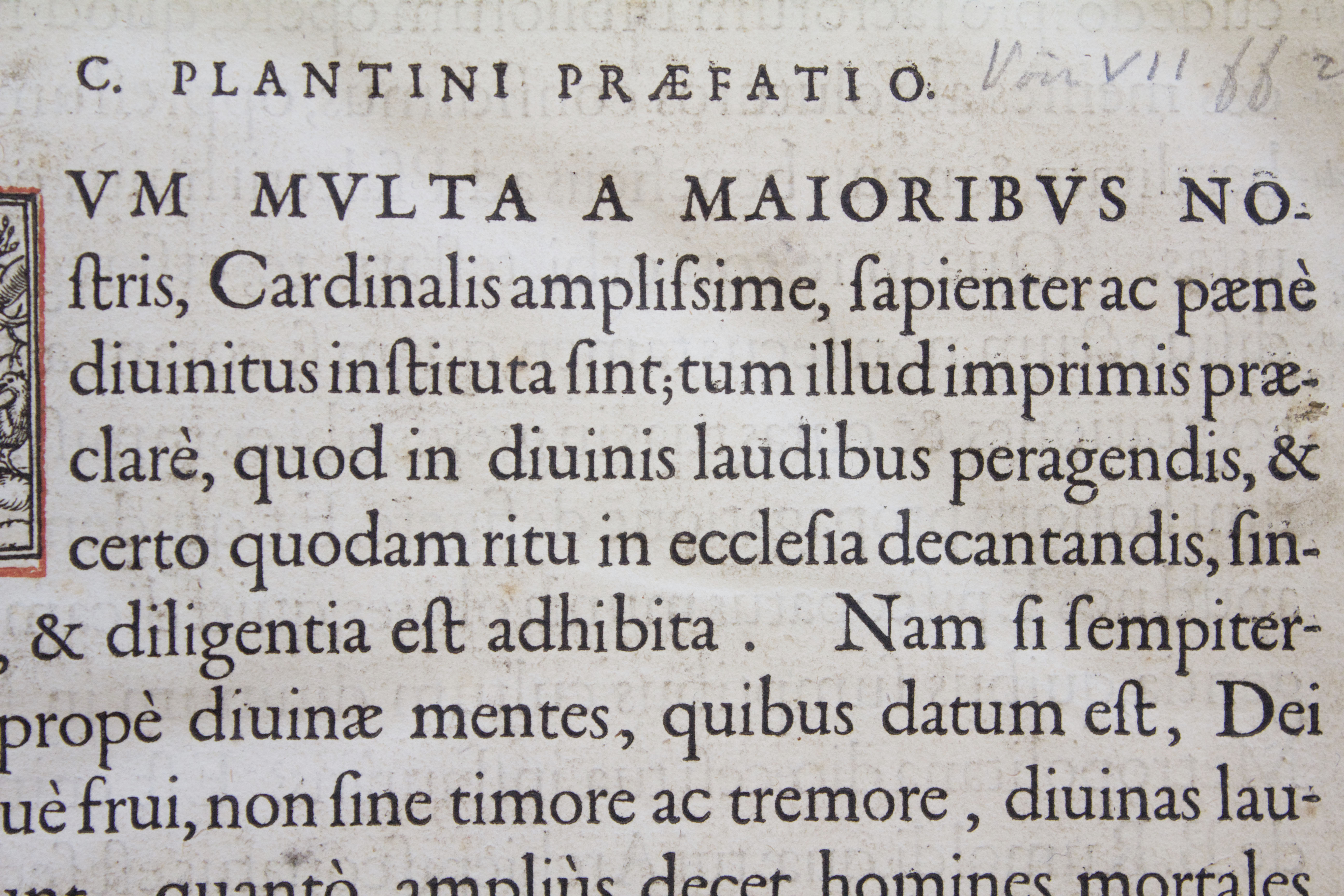
First drafts based on this book template
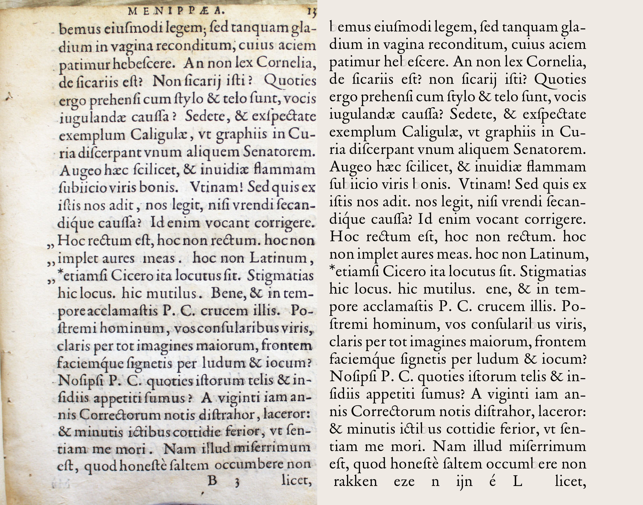
First drafts of the Italic based on this book template

The Museum gave van Dommelen access to ‘smoke proofs’ of Granjon’s typeface. These test prints, made with the soot from a candle were used by the designer — at that time, designer and punch cutter were one and the same person — to check whether the design had been implemented correctly. Such a smoke proof can represent draft stages of the work as well as the final version. In this case, Aad van Dommelen had of course the final versions, which were in fact the most faithful to the design because they were made by the museum itself.

If the digitization is based on the punches, the actual intention of the type designer can be missed. For example, the punches were sometimes deliberately cut thinner in order to get the desired result in print, where the ink application often made the glyphs bolder than intended.

Exceptionally fine details on the smoke proofs

The quality and details of the smoke proofs were exceptional. Especially the Ascendonica Romaine/Parangonne (names for the cut font sizes, ± 20 pt) from the Plantin catalog number MA 8. The type size used as a template is decisive for the design, because each size was designed and cut separately. Each digitization is also a separate interpretation by the interpreter. There are now many Garamonds, but no two are the same. There are also two digitizations of Granjon Ascendonica available: the previously mentioned Granjon LT and Matthew Carter’s ITC Galliard. Carter’s version is quite rightly very popular and widespread, but he allowed himself significantly more freedom, especially with the Italic.

The fine details of the template led to a special feature of Romaine. While all other digital Garamonds or Granjons have rounded or cut serifs, Romaine has sharp ends. Aad van Dommelen assumed that Granjon only rounded it off due to physical limitations. For the same reason, he also neglected the curve in the bottom of the serifs. In print, they mostly look protruded instead of hollow. It seemed clear to him that this curve should only serve to prevent unsightly bumps caused by squeezing edges and to produce straight feet.

Van Dommelen was enthusiastic about how accurate the digitization of the smoke proofs was. He could not imagine that Granjon had intended anything other than the resulting form, which was so clear and appealing. He was surprised at how fresh and modern his conscientious interpretation appeared.

Comparison Garamond Granjon
From left to right: Robert Granjon’s Ascendonica, printed by Christophe Plantin (the shape is bolder than the original matrix, and sharp details have become round); Smoke proof of Granjon’s punchcut (this print illustrates the mindblowing precision he established in his punches, it is especially remarkable considering the small font size); Romaine (no rounded corners, no arching on the feet)
Different interpretations of the same idea
Different interpretations of the same idea, from left to right: Garamond Premier (by Robert Slimbach 2005, inspired by the imperfection of printed type); ITC Garamond (by Tony Stan 1975, the round effect of printed type is clearly visible here); Garamond #3 LT (by Morris F. Benton 1936, also rounded, with a rougher outline than the one from ITC, sharp negative (white) corner); Adobe Garamond (by Robert Slimbach 1989, more constructed shape featuring curved edges with obtuse corners, Italics based on Granjon’s Ascendonica Italic); Stempel Garamond LT (by D. Stempel AG 1925, sharp inner corners and slightly rounded straight corners, inconsistent digitization); Granjon LT (striking contrast in the stem, combination of sharp and rounded edges, straight serifs); Sabon LT (by Jan Tschichold 1964–1967, all corners are straight, just except the top one); ITC Galliard (by Matthew Carter 1978, based on Granjon’s Ascendonica, deliberately drawn with more freedom, especially in the Italic (and rightfully so)).

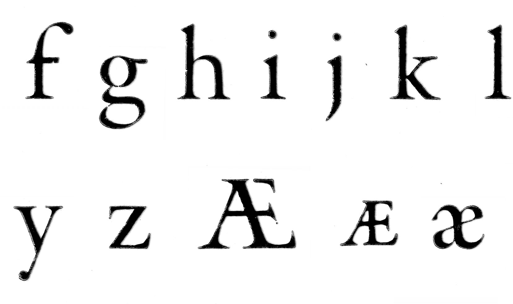
Only a few elements of the typeface show their true age. The tail of a modern j bends the other way than that of the cursive Ascendonica and the pelican beak of the italic g is unusual (hence available as an alternative form only). The italic tilde is completely unknown today. Van Dommelen retained elements that are no longer used as alternative characters as a reminder of the old master. It also makes it possible to typeset old texts as they were originally, e.g. with a long s. The modern additions and extra special characters are especially exciting: over 20 ligatures, uppercase and tabular numbers in two sizes, uppercase ẞ, 14 currency symbols (including ₿itcoin), swashes, ornaments (fleuronné) and much more.

Aad van Dommelen drew a separate set of small caps because the small capitals themselves are quite small and the capital letters are rather powerful. These are now available by default, but can also be used as a somewhat smaller uppercase set. The original small caps can be used as Petite Caps via OpenType (Small-Caps-Feature + Stylistic Set 1).

Capital variations of the typeface Romaine

Granjon did not draw a Bold style let alone a Bold Italic, because at that time typefaces simply did not have different styles. If a heading or title was needed, different typefaces were combined instead. So the Bold and Bold Italic styles are van Dommelen’s own creation, designed in the spirit of their role model.

We owe the primary form of our present script to the works of Arnold Pannartz, Konrad Sweynheim, Nicolas Jenson and Aldus Manutius in Italy in the 15th century. However, it was perfected by 16th-century French typographers such as Simon de Colines, Claude Garamont, Pierre Haultin and Robert Granjon, undoubtedly one of the greatest punch cutters in history. The punches of this time were so good that for centuries no one has dared to challenge or change it.

Granjon may be known for its beautiful, slightly extravagant italic cuts, but the upright form is just as outstanding. It exudes clarity, purity and neutrality. While Garamont shows a somewhat personal style, Granjon strives for the ultimate form. That is what makes his work so timeless and still serves as a model for contemporary typefaces. Romaine proves that its shape is still very modern today. Perhaps more so than with the better-known Garamont, whose designs were again the basis for Granjon.

Romaine has everything that is required of a font today. It is legible, unobtrusive, resilient and is especially suitable for extensive texts. This makes it particularly at home in classic book and editorial design. Its history of origin also proves its suitability for corporate design projects, for logos or high-quality packaging design. It is in no way inferior to more famous Garalde fonts such as Garamond, Sabon, Bembo, Arno, Minion or Times. In fact, Romaine’s large range of characters, more neutral appearance and authenticity often makes it a better choice. Pairing options for Romaine include countless serious sans serif, such as Ika or FF Aad.

Here’s to the next 450 years!

Try Romaine