Nice Collection
Nice Collection
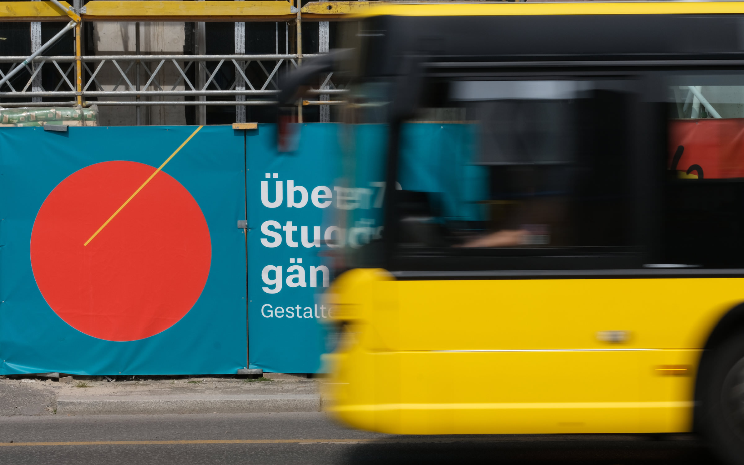
Clarity × Liveliness × Legibility.


Designer(s)
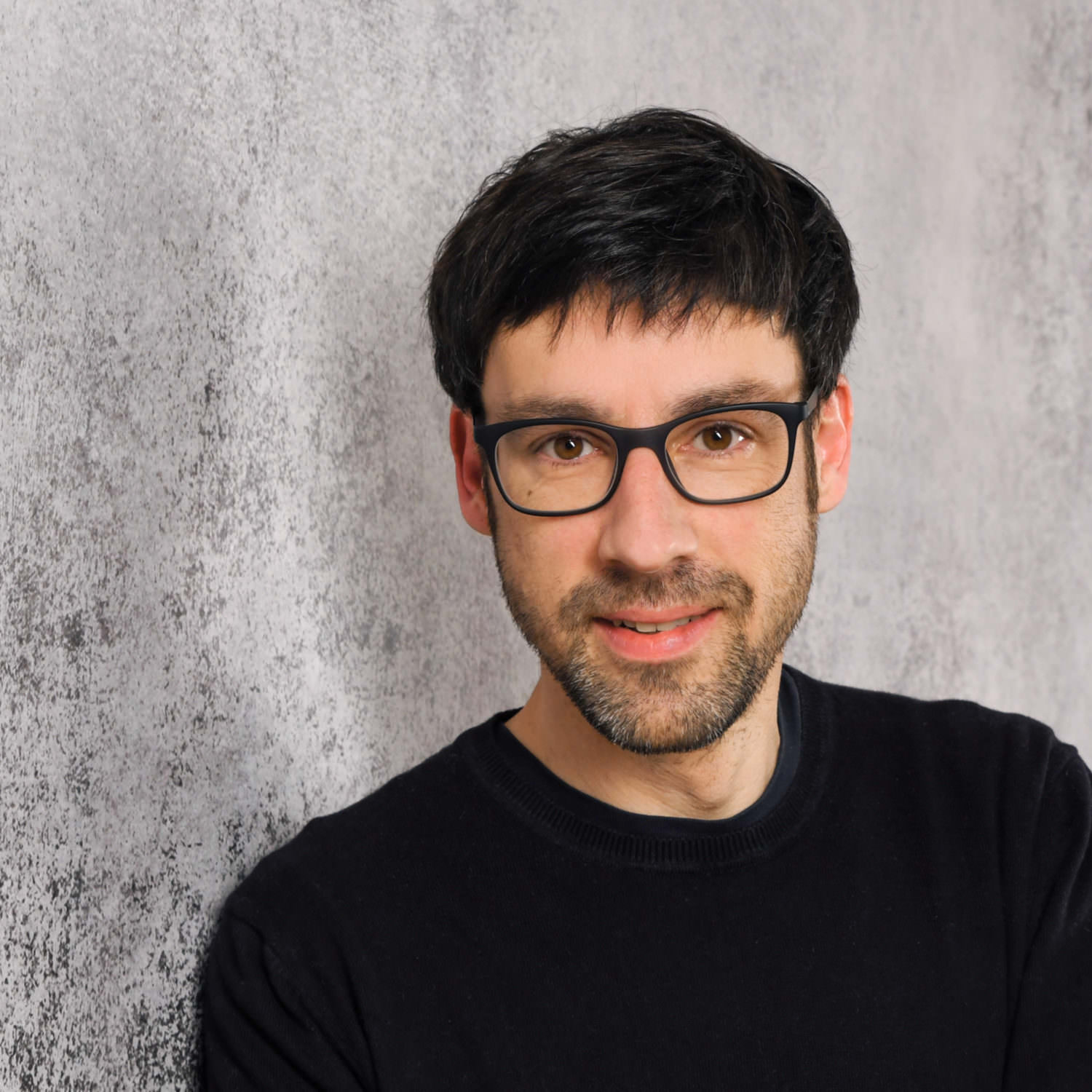
Jan Fromm
Jan Fromm
The typefaces of the typography legend Lucas de Groot are still making a mark after thirty years. But it’s not just his designs that leave a lasting impression, through his teaching at the Potsdam University of Applied Sciences, he has also shaped and influenced many other Designers. One such Designer was Jan Fromm, whose special talent de Groot recognized and who he invited to work alongside him during his studies.
Jan supported LucasFonts with extensive custom font projects and the expansion of the type library. He was also heavily involved in the concept and design of the website. Today, the multidisciplinary designer works freelance on his own fonts, logos, graphic and web projects. He considers type to be a fundamental component of visual communication, as it can convey not only information but also emotions.
His work is characterized by functionality and clarity and a considered reduction to all but that which is essential. His keen eye for detail is evident throughout. Jan is convinced that the harmonious interplay of those details decides on the overall quality.
One of his most interesting jobs is working for 29Letters, the foundry of Pascal Zoghbi. Jan drew and harmonized many of the Latin members and versions of Pascal’s Zarid Superfamily. Jan’s own families Camingo, Komet, Capito and Rooney are also worth mentioning, as they demonstrate his wide ranging stylistic and technical ability. Rooney Sans has been used for over ten years by the largest marketplace for digital fonts, MyFonts.
With the complex type system Nice, the coffee-loving cineaste is publishing a typeface outside his own label for the first time. We are delighted to be joining him on this journey, taking care of the production and distribution of the distribution of the 56-part typeface. Having completed this extensive project, we can attest to Jan’s exceptionally high quality standards—both in terms of design and technology.
Fonts on Fontwerk
Team & Details
Design Contributions
Mastering, Production
Olli Meier
Marketing
Jan Fromm Copywriting
Ivo Gabrowitsch Naming, Copywriting, Specimen
Anja Knust Graphic Design, Imagery
Neo Motion Studio Motion Graphics
Lucy Beckley English Translation
Design Period
2013–2022
Release History
March 29, 2022
Awards
2023 Communication Arts Award of Excellence
Technology, Licenses & Trademarks
Formats
Static .otf, .woff2
Variable .ttf, .woff2
Additional formats on request
Licenses
Trial Free test license
Base Includes Desktop, Web and Social Media use
Extended Larger volume, App or Audio-Visual
Additional licenses on request
Modifications, Extensions
Available on request
Variable Fonts
Included in the Collection package
2 axes: weight, optical size
Web file sizes .woff2: 135 KB Upright, 136 KB Italic
Trademarks
Nice™ is a trademark of Fontwerk GmbH
A
Glyphs
Uppercase
A
B
C
D
E
F
G
H
I
J
K
L
M
N
O
P
Q
R
S
T
U
V
W
X
Y
Z
Lowercase
a
b
c
d
e
f
g
h
i
j
k
l
m
n
o
p
q
r
s
t
u
v
w
x
y
z
Latin Accents
Á
Ă
Â
Ä
À
Ā
Ą
Å
Ã
Æ
Ć
Č
Ç
Ĉ
Ċ
Ð
Ď
Đ
É
Ĕ
Ě
Ê
Ë
Ė
È
Ē
Ę
Ğ
Ĝ
Ģ
Ġ
Ħ
Ĥ
Í
Ĭ
Î
Ï
İ
Ì
Ī
Į
Ĩ
Ĵ
Ķ
Ĺ
Ľ
Ļ
Ŀ
Ł
Ń
Ň
Ņ
Ŋ
Ñ
Ó
Ŏ
Ô
Ö
Ò
Ő
Ō
Ø
Õ
Œ
Þ
Ŕ
Ř
Ŗ
Ś
Š
Ş
Ŝ
Ș
ẞ
Ə
Ŧ
Ť
Ţ
Ț
Ú
Ŭ
Û
Ü
Ù
Ű
Ū
Ų
Ů
Ũ
Ẃ
Ŵ
Ẅ
Ẁ
Ý
Ŷ
Ÿ
Ỳ
Ź
Ž
Ż
á
ă
â
ä
à
ā
ą
å
ã
æ
ć
č
ç
ĉ
ċ
ð
ď
đ
é
ĕ
ě
ê
ë
ė
è
ē
ę
ğ
ĝ
ģ
ġ
ħ
ĥ
í
ĭ
î
ï
̇
ì
ī
į
ĩ
ĵ
ķ
ĺ
ľ
ļ
ŀ
ł
ń
ň
ņ
ŋ
ñ
ó
ŏ
ô
ö
ò
ő
ō
ø
õ
œ
þ
ŕ
ř
ŗ
ś
š
ş
ŝ
ș
ß
ə
ŧ
ť
ţ
ț
ú
ŭ
û
ü
ù
ű
ū
ų
ů
ũ
ẃ
ŵ
ẅ
ẁ
ý
ŷ
ÿ
ỳ
ź
ž
ż
Numerals & Currency Symbols
0
1
2
3
4
5
6
7
8
9
¤
€
$
¢
£
¥
₿
ƒ
₺
$
0
1
2
3
4
5
6
7
8
9
¢
£
¥
ƒ
€
₺
₿
0
1
2
3
4
5
6
7
8
9
0
1
2
3
4
5
6
7
8
9
Small Caps
a
b
c
d
e
f
g
h
i
j
k
l
m
n
o
p
q
r
s
t
u
v
w
x
y
z
ß
à
á
â
ã
ä
å
æ
ç
è
é
ê
ë
ì
í
î
ï
ð
ñ
ò
ó
ô
õ
ö
ø
ù
ú
û
ü
ý
þ
ÿ
ā
ă
ą
ć
ĉ
ċ
č
ď
đ
ē
ĕ
ė
ę
ě
ĝ
ğ
ġ
ģ
ĥ
ħ
ĩ
ī
ĭ
į
ı
ij
ĵ
ķ
ĺ
ļ
ľ
ŀ
ł
ń
ņ
ň
ŋ
ō
ŏ
ő
œ
ŕ
ŗ
ř
ś
ŝ
ş
š
ţ
ť
ŧ
ũ
ū
ŭ
ů
ű
ų
ŵ
ŷ
ź
ż
ž
ș
ț
ȷ
ə
ẁ
ẃ
ẅ
ỳ
Punctuation
.
,
:
;
…
!
¡
?
¿
&
@
·
•
*
‽
⸘
#
/
|
\
(
)
{
}
[
]
-
–
—
‒
‐
‑
_
‚
„
“
”
‘
’
«
»
‹
›
‴
"
'
⟨
⟩
Mathematical Signs & Symbols
∙
≅
⋅
≙
+
−
×
÷
=
≠
>
<
≥
≤
±
≈
~
¬
^
∞
∫
Ω
∆
∏
∑
√
µ
∂
%
‰
Arrows & Shapes
↑
↗
→
↘
↓
↙
←
↖
●
○
◊
■
□
▲
▼
△
▽
▴
▸
▾
◂
Ligatures
ffi
ffl
ff
fi
fl
Greek
π
Languages
| A | Afrikaans Albanian Asu |
| B | Basque Bemba Bena Breton |
| C | Catalan Cornish Croatian Czech |
| D | Danish Dutch |
| E | Embu English Esperanto Estonian |
| F | Faroese Filipino Finnish French Friulian |
| G | Galician Ganda German Gusii |
| H | Hungarian |
| I | Icelandic Inari Sami Indonesian Irish Italian |
| J | Jola-Fonyi |
| K | Kabuverdianu Kalenjin Kamba Kikuyu Kinyarwanda |
| L | Latvian Lithuanian Lower Sorbian Luo Luxembourgish Luyia |
| M | Machame Makhuwa-Meetto Makonde Malagasy Maltese Manx Meru Morisyen |
| N | North Ndebele Northern Sami Norwegian Bokmål Norwegian Nynorsk Nyankole |
| O | Oromo |
| P | Polish Portuguese |
| Q | Quechua |
| R | Romanian Romansh Rombo Rundi Rwa |
| S | Samburu Sango Sangu Sena Serbian Shambala Shona Slovak Slovenian Soga Somali Spanish Swahili Swedish Swiss German |
| T | Taita Teso Turkish |
| U | Upper Sorbian Uzbek |
| V | Volapük Vunjo |
| W | Walser Welsh |