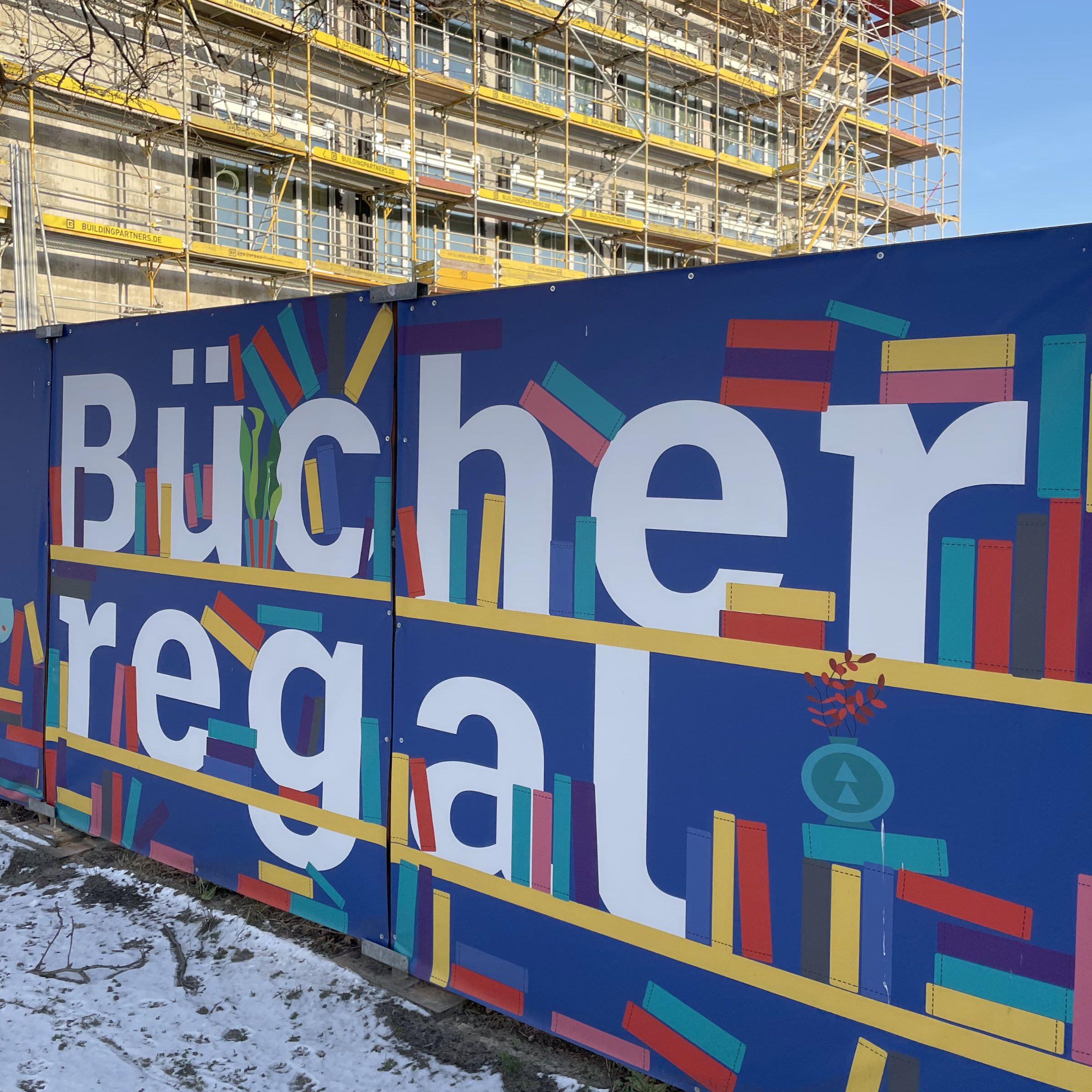
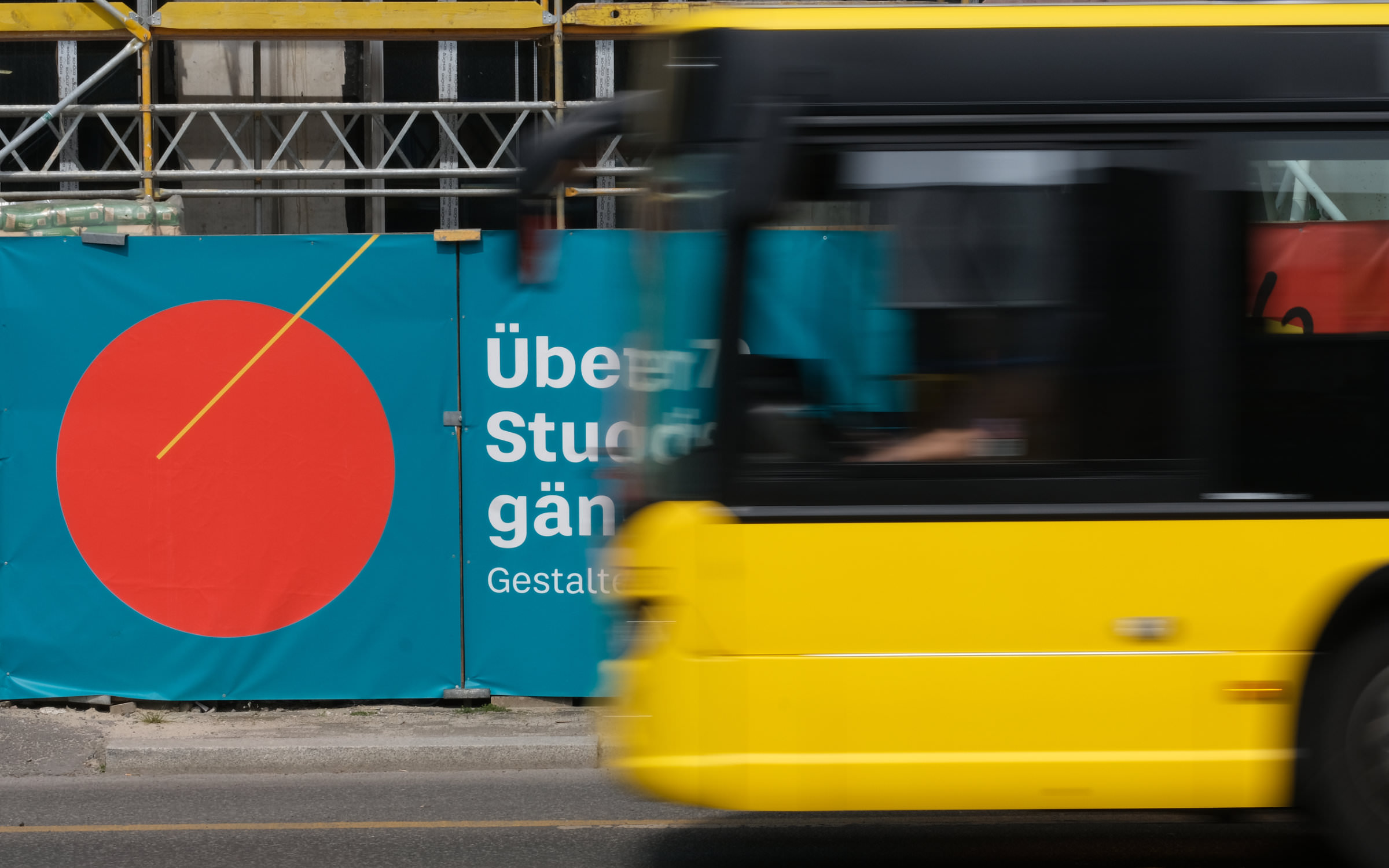
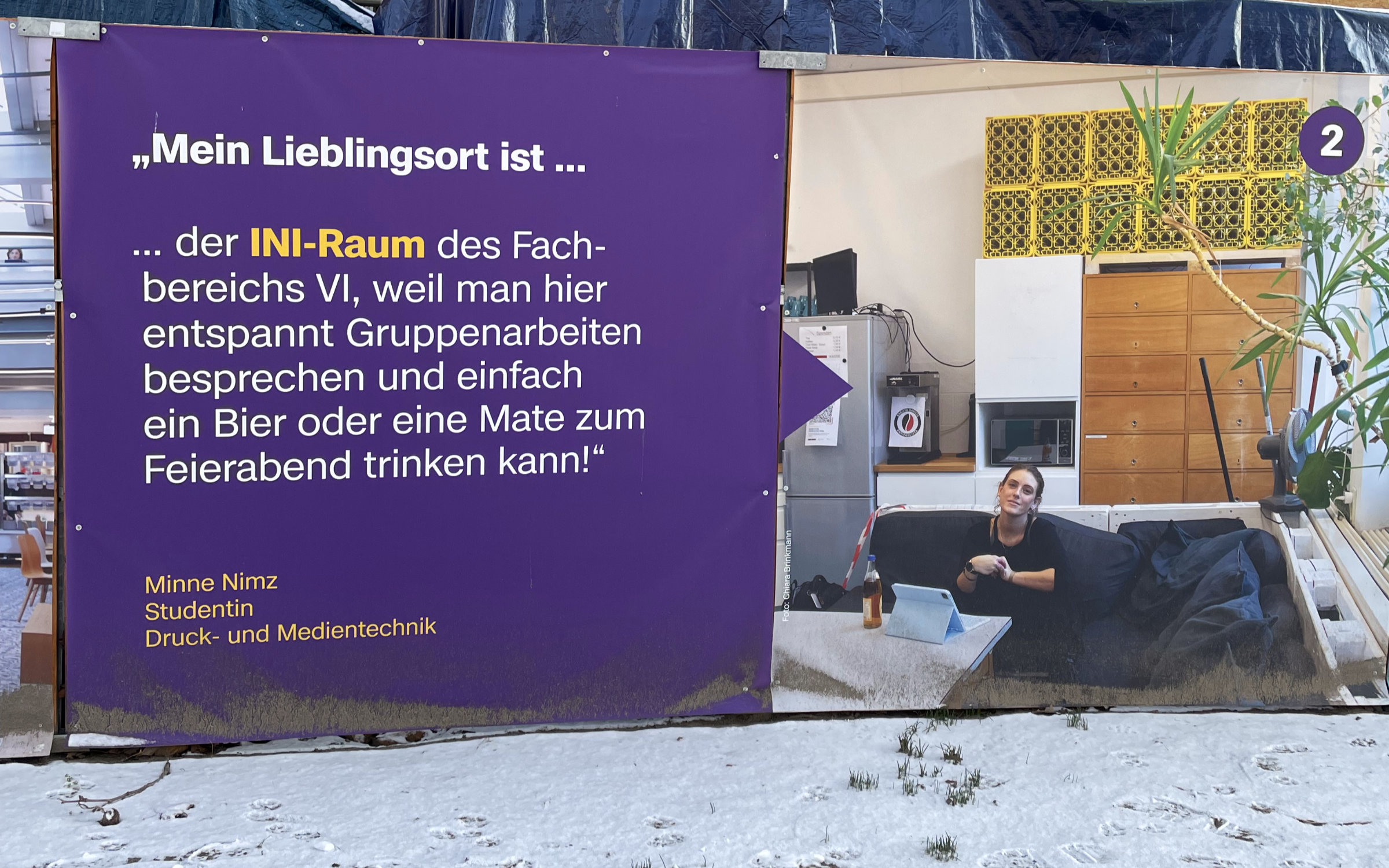
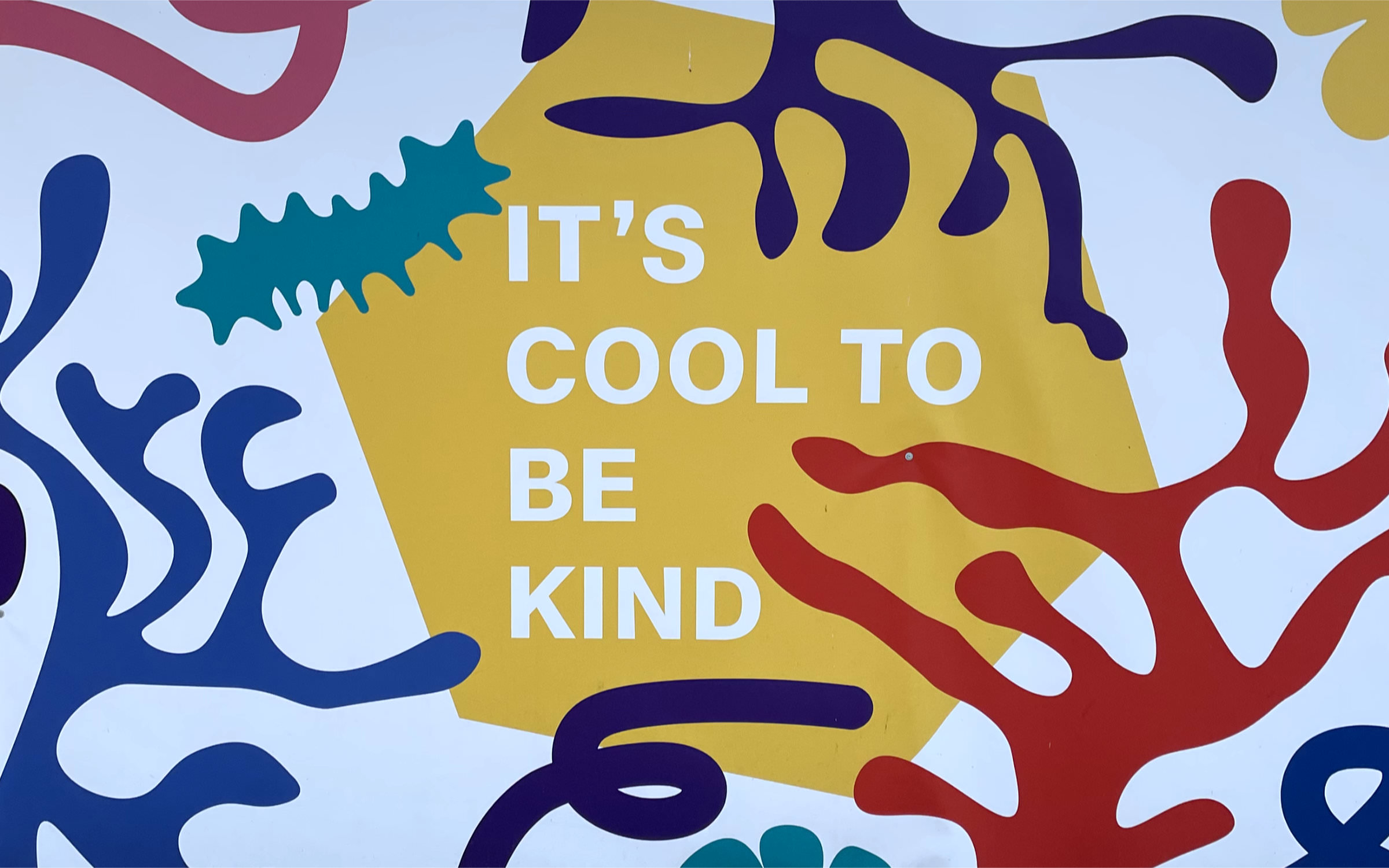
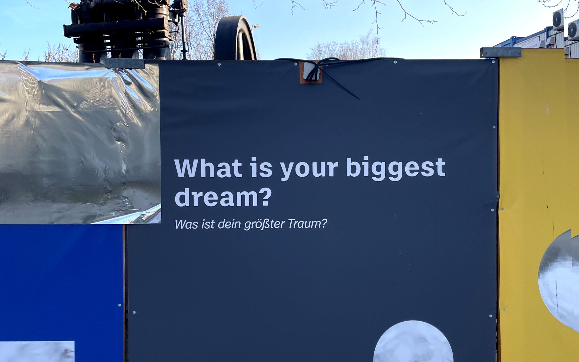
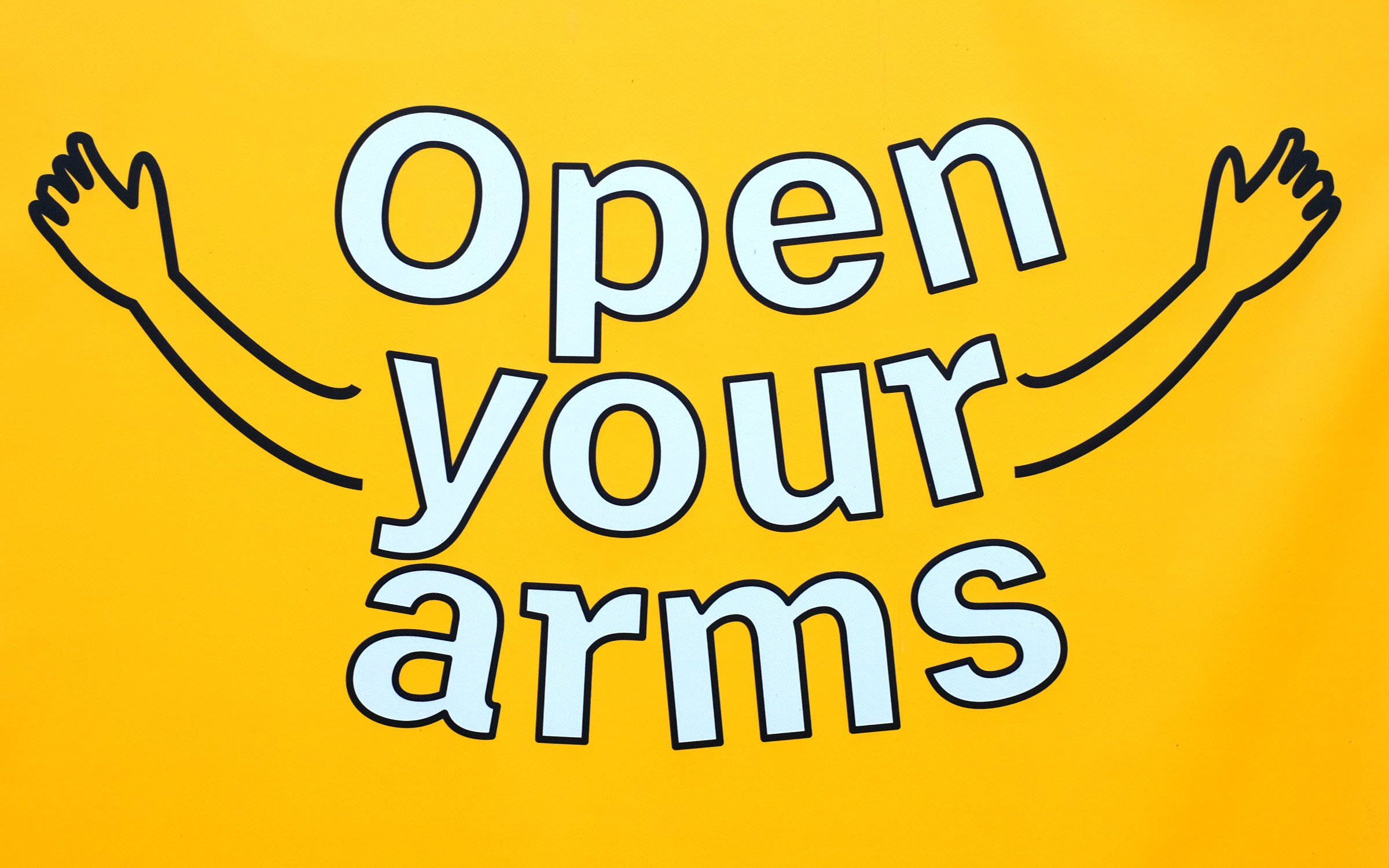
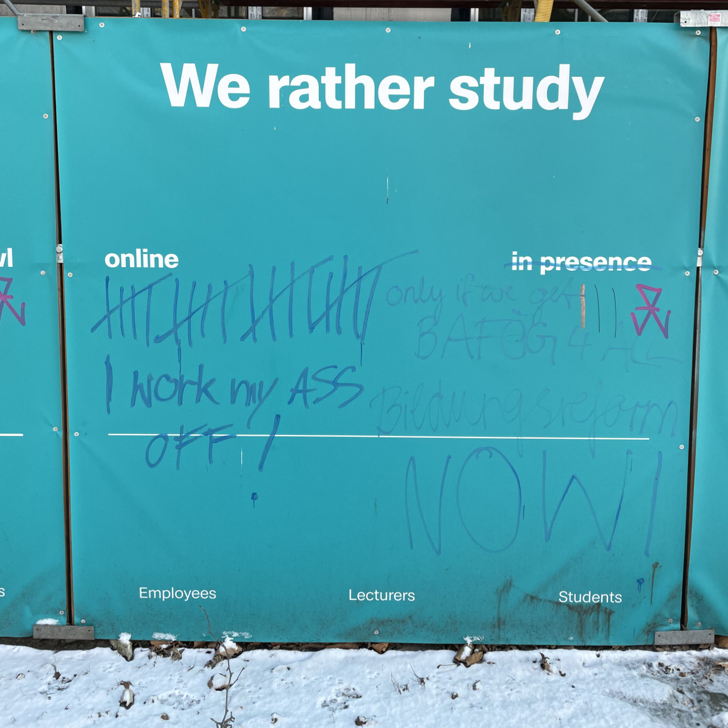
On 1 October 2021, the Beuth University became the Berliner Hochschule für Technik (BHT). To mark the occasion, the tradition-rich university in Wedding launched a new, colorful and varied corporate design – in keeping with the diverse range of courses on offer: 72 degree programmes and 13,000 students from over 132 countries. Their Motto: Study the future!
BHT
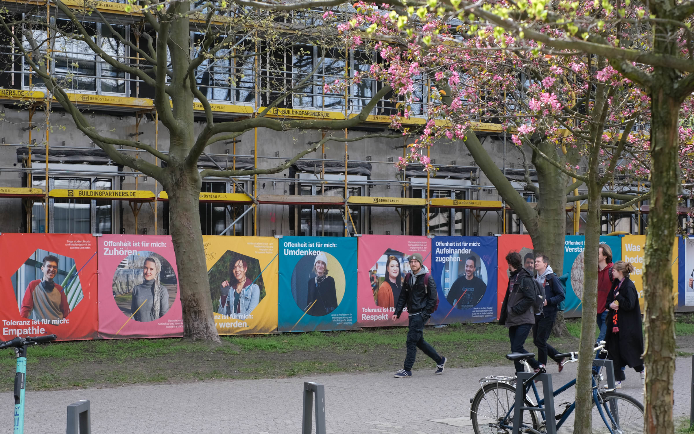
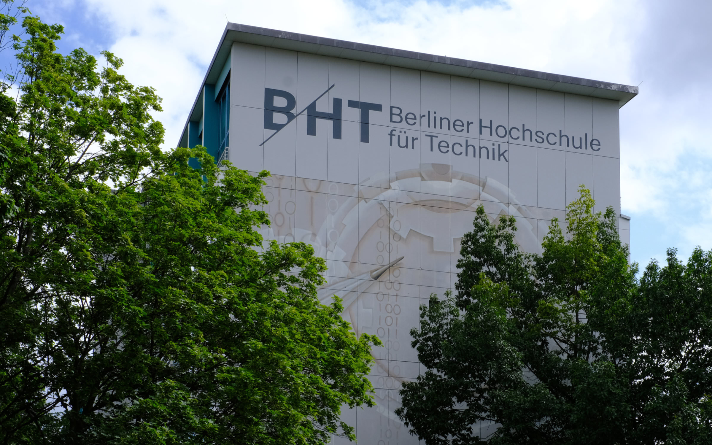
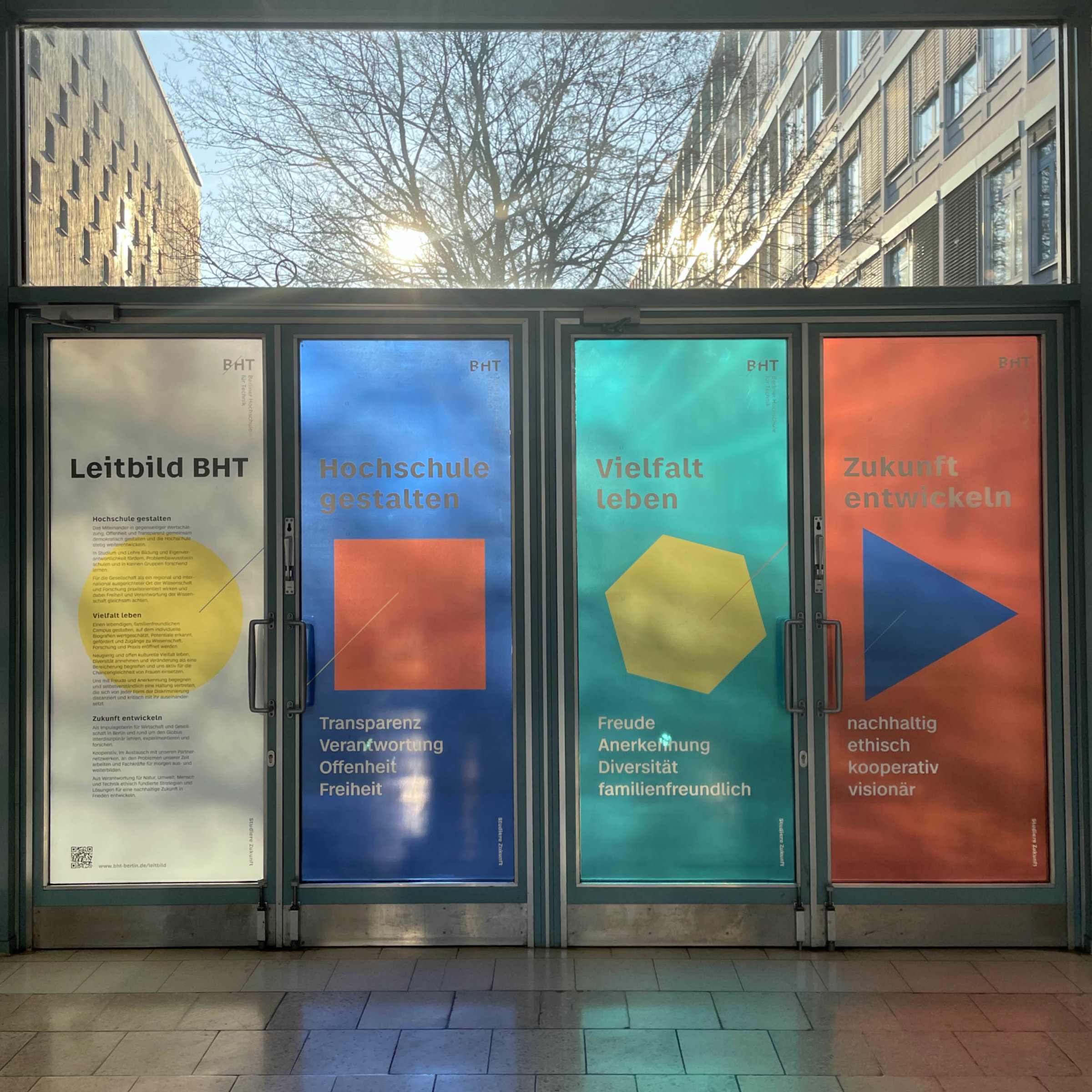
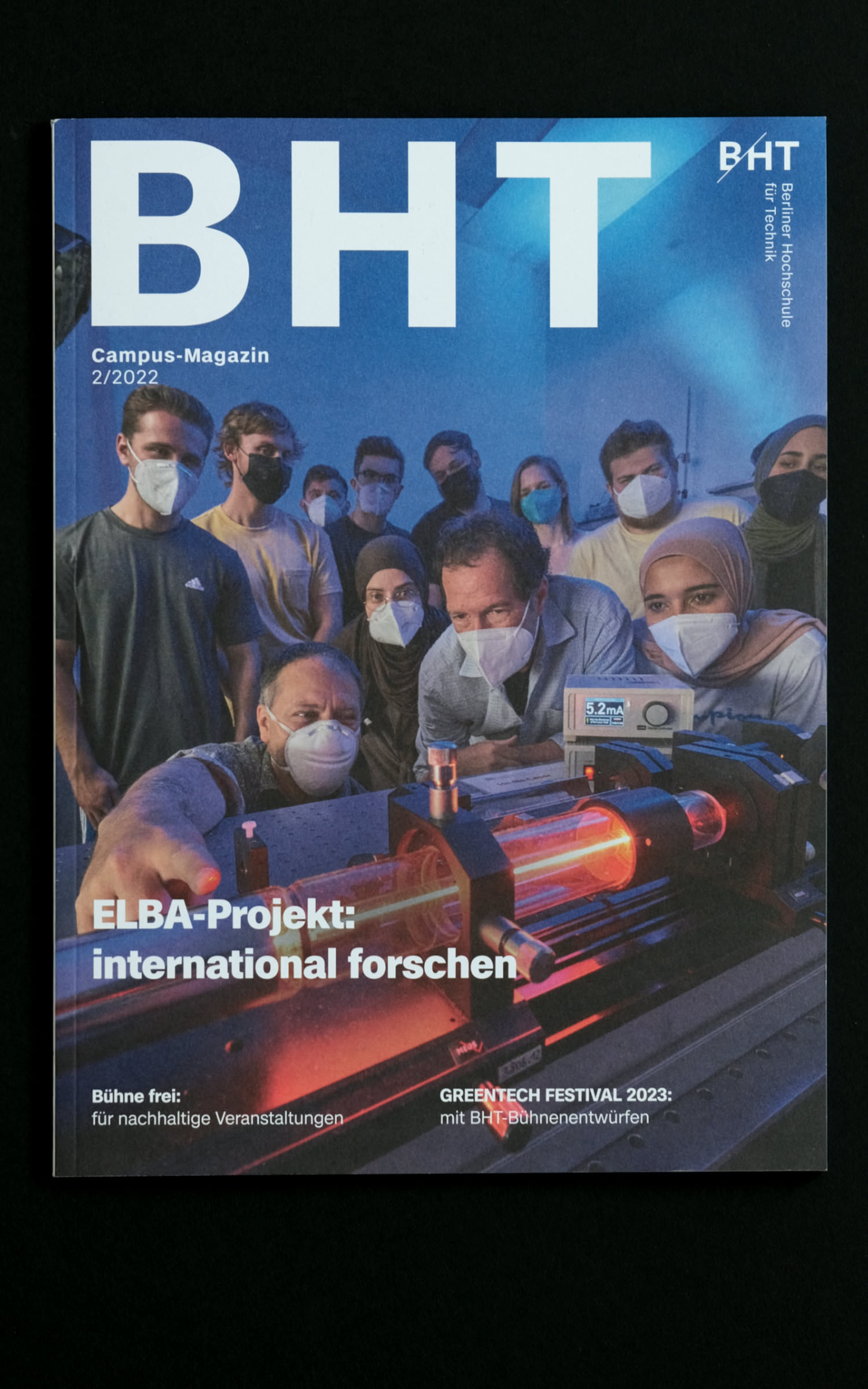
In addition to a new logo, colors and shapes, new fonts were also introduced. Different styles from the entire Case Collection (consisting of Case, Case Text and Case Micro) are used in the university’s corporate design. Prof. Dr. Franziska Loh, Professor of Print and Online Media Design, was responsible for overseeing the redesign. Regarding the new identity, she said:
With Case, our democratic and diverse mission as a university becomes visible. We invite all members of BHT to shape our university, to embody diversity and to develop the future – this message is helped by the clear and familiar basic character of the Case family.
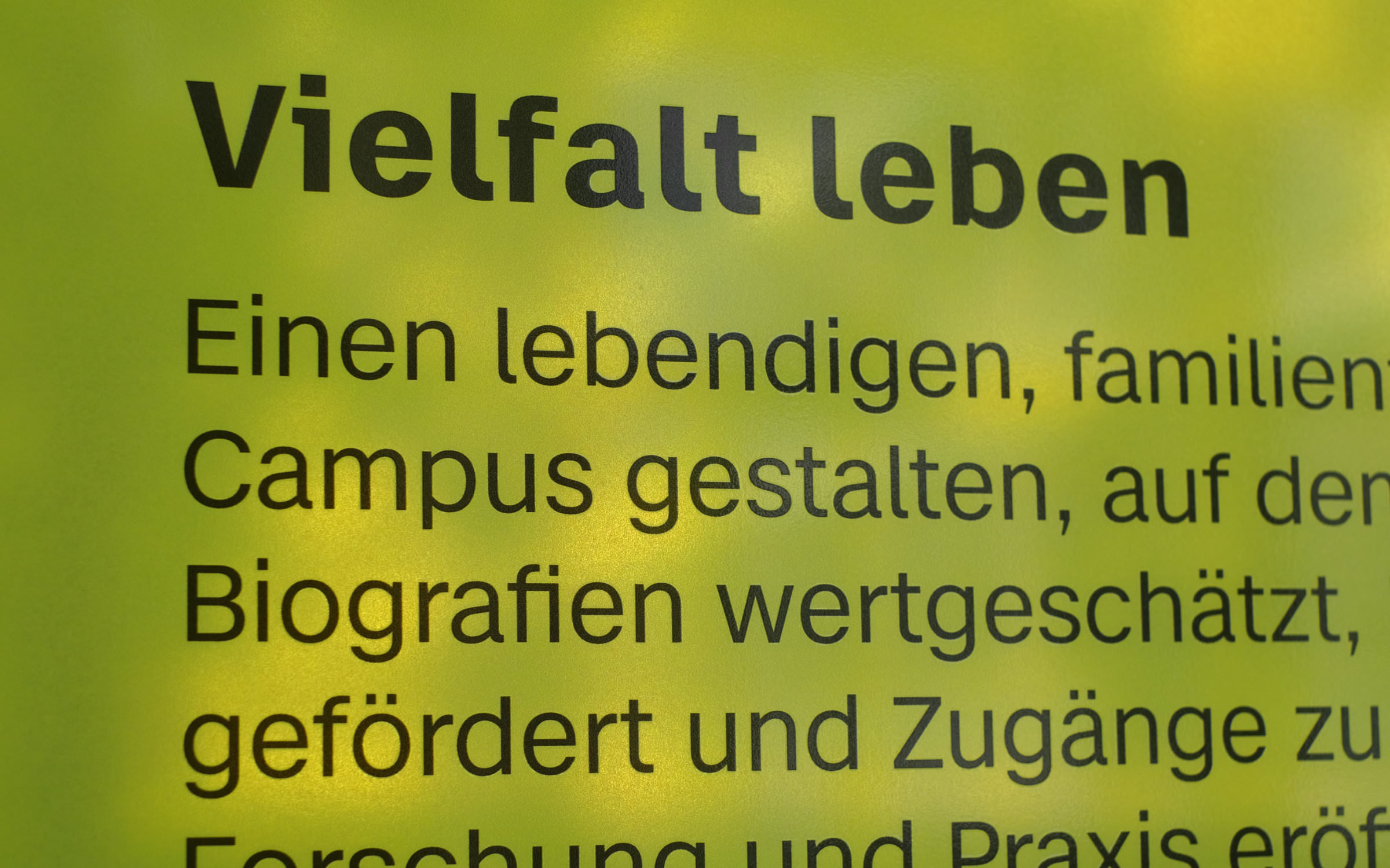
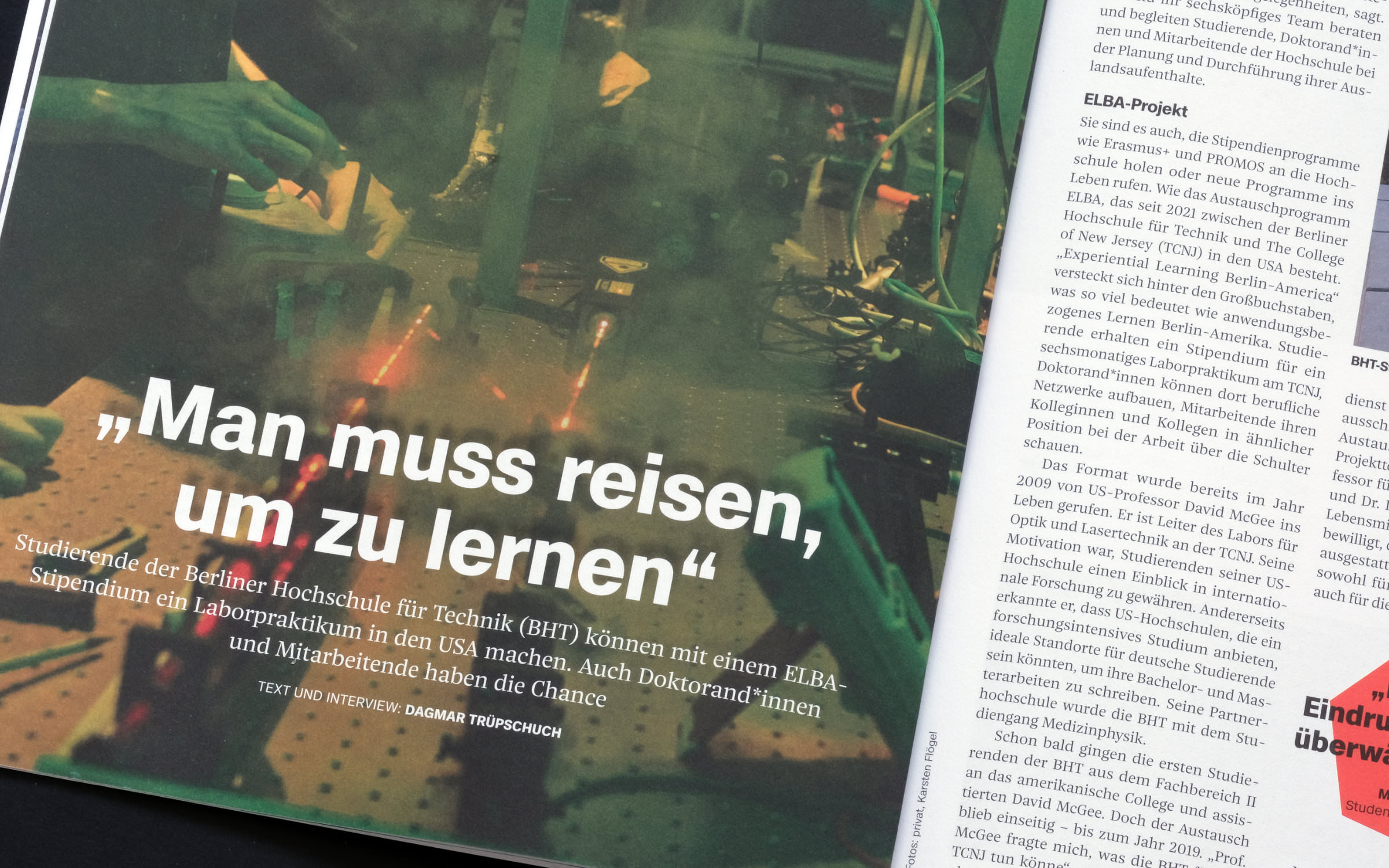
The Micro version of Case plays a surprisingly dominant role in the new visual identical. Micro is actually intended for small print (under 7pts), but it has an unmistakable voice even on a large scale thanks to its angular letter details. Prof. Dr. Franziska Loh explains its use:
The airiness in the spacing makes our headlines sound even more likable, at the same time the Bold gives weight to the statements and the idiosyncrasies in the i, r and j underline the individual sound of our communication.
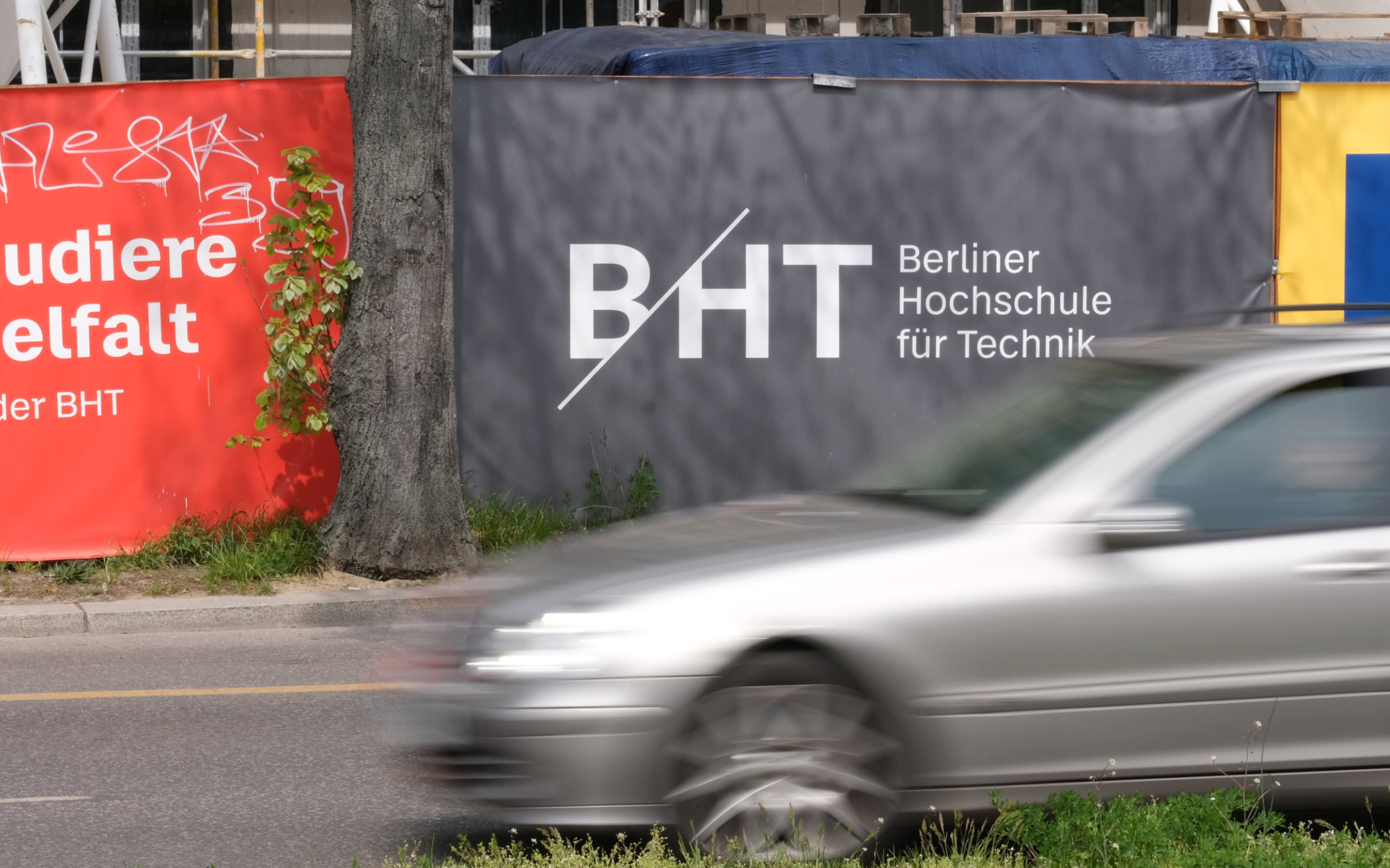
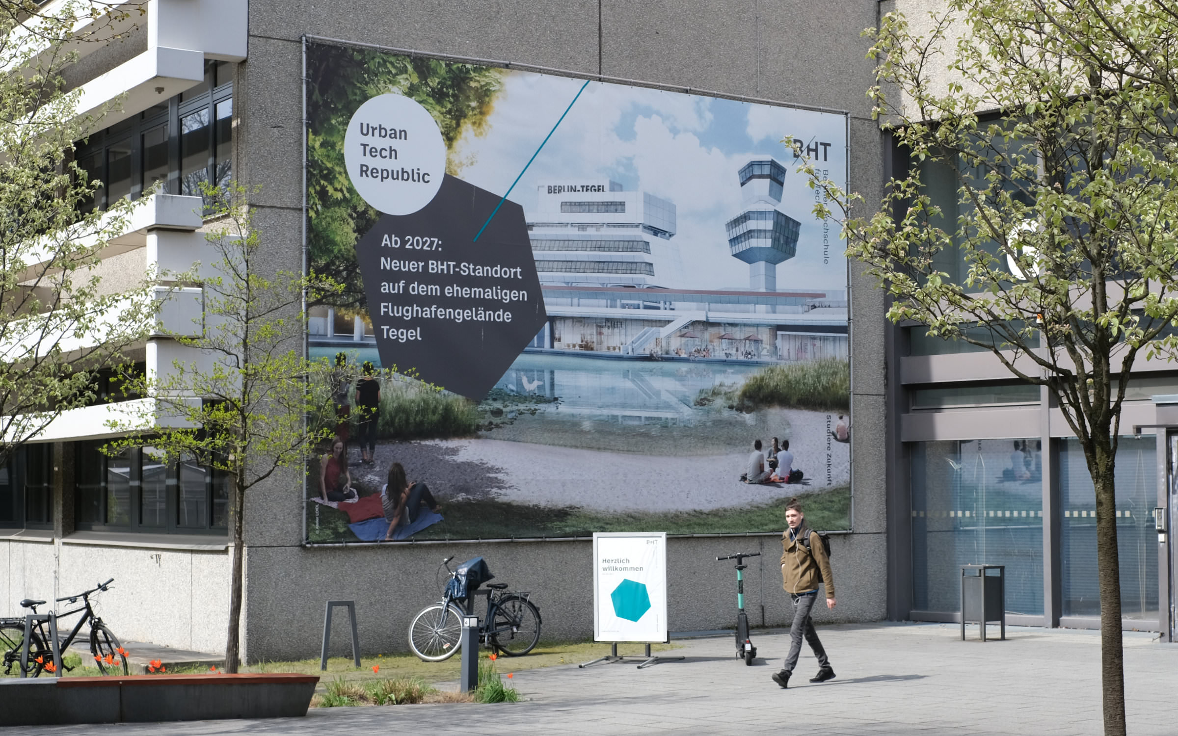
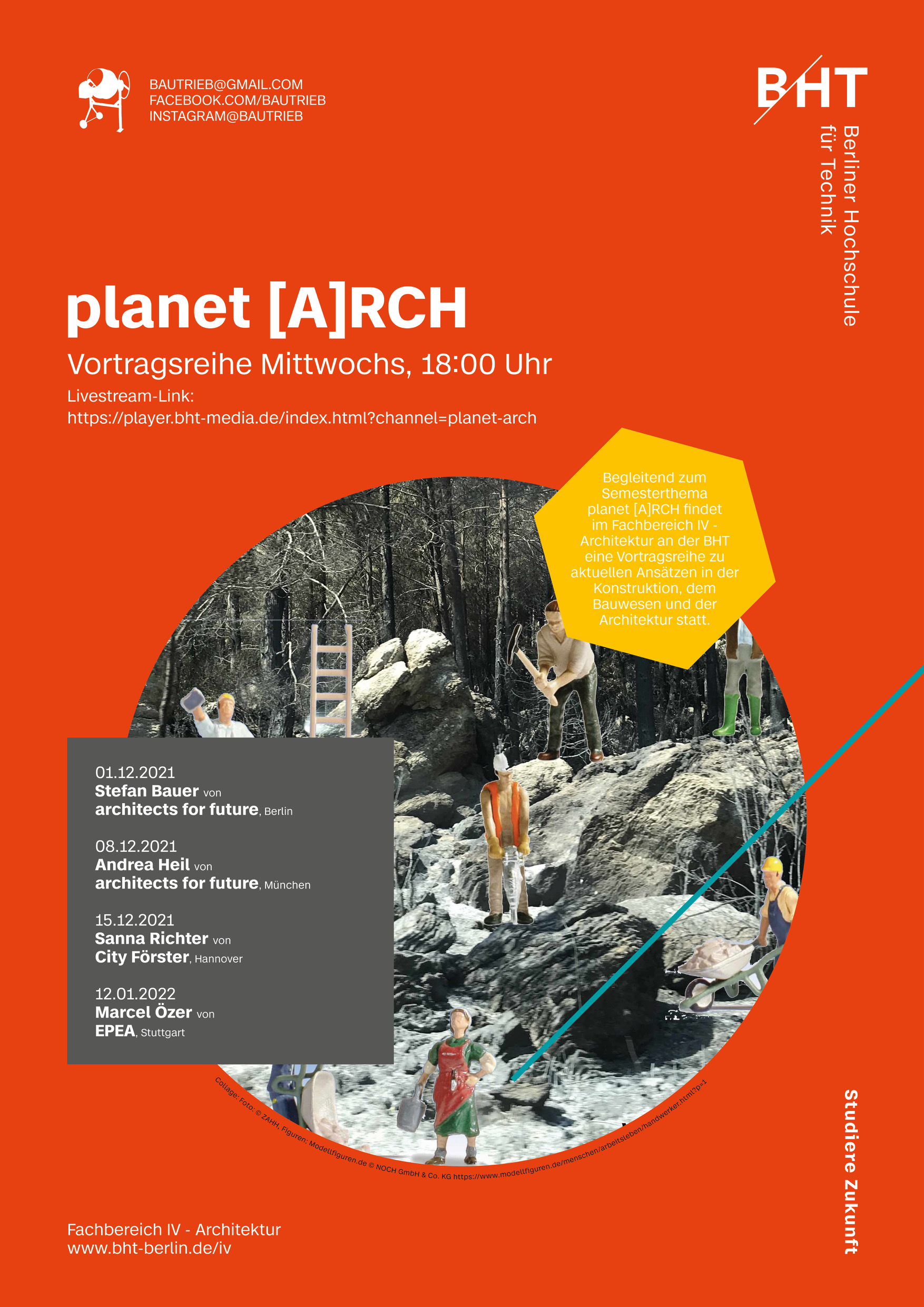
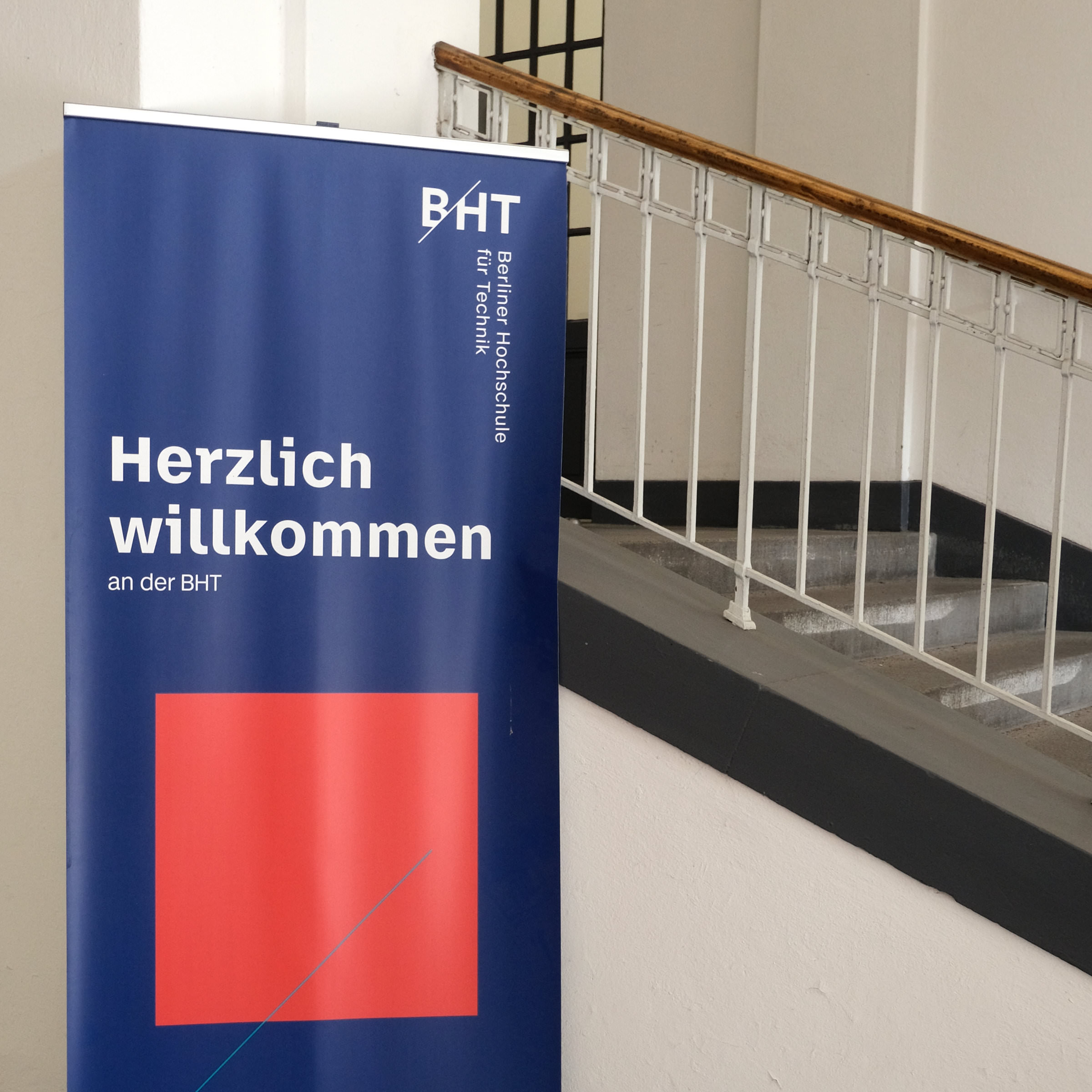
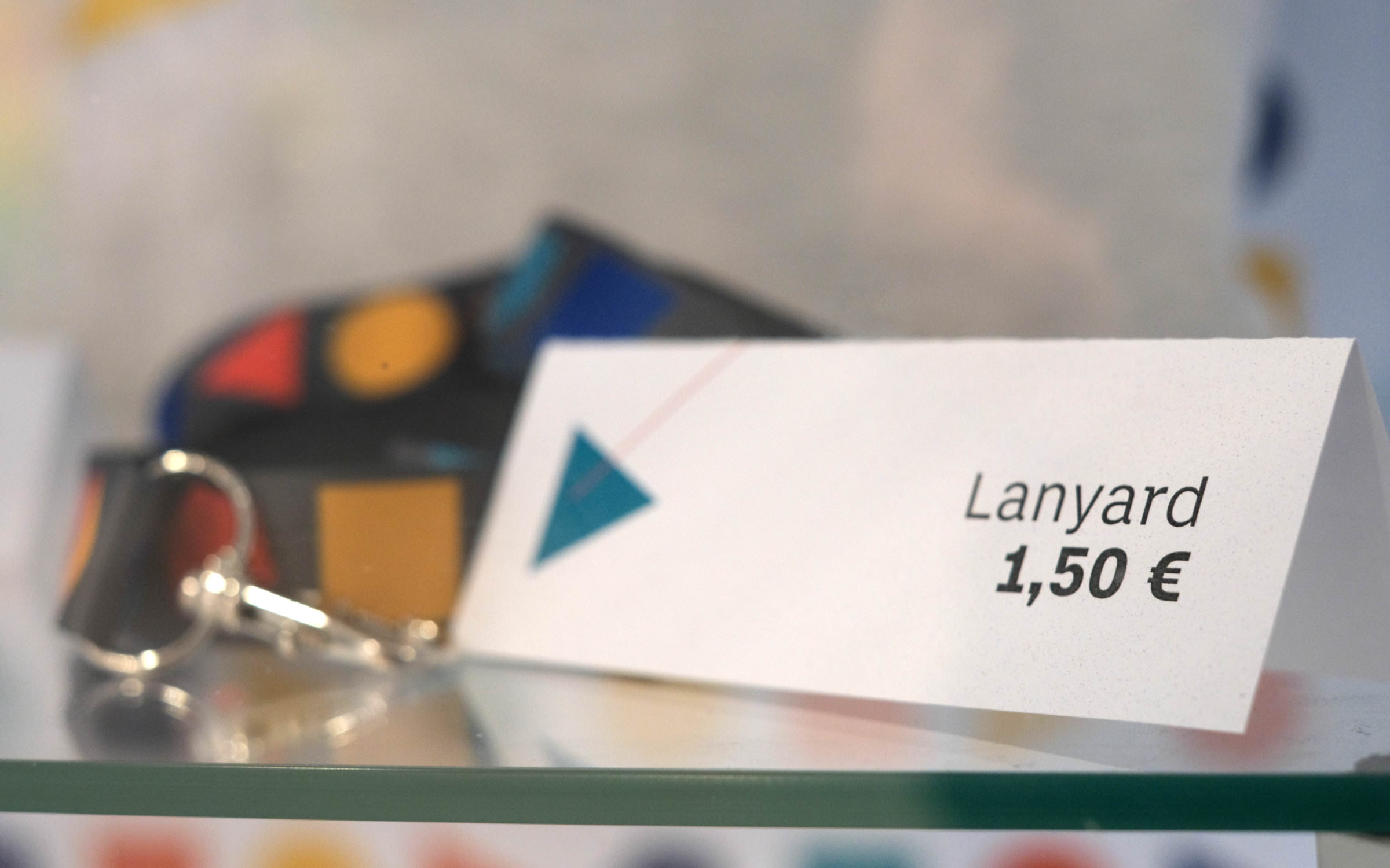
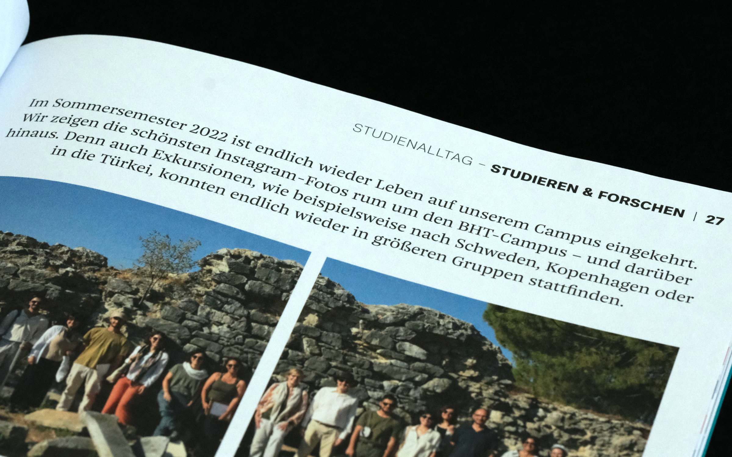
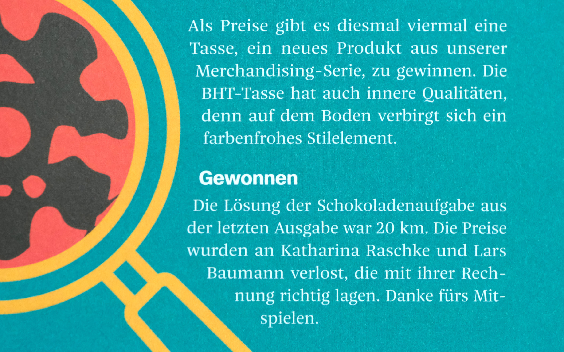
The university magazine treats itself to an even more extensive set. Besides using the broad spectrum of all optical sizes and styles, Jan Fromm’s refreshing serif family Nice Text (Light, Regular) is used in the body text. Nice Poster is also used occasionally.

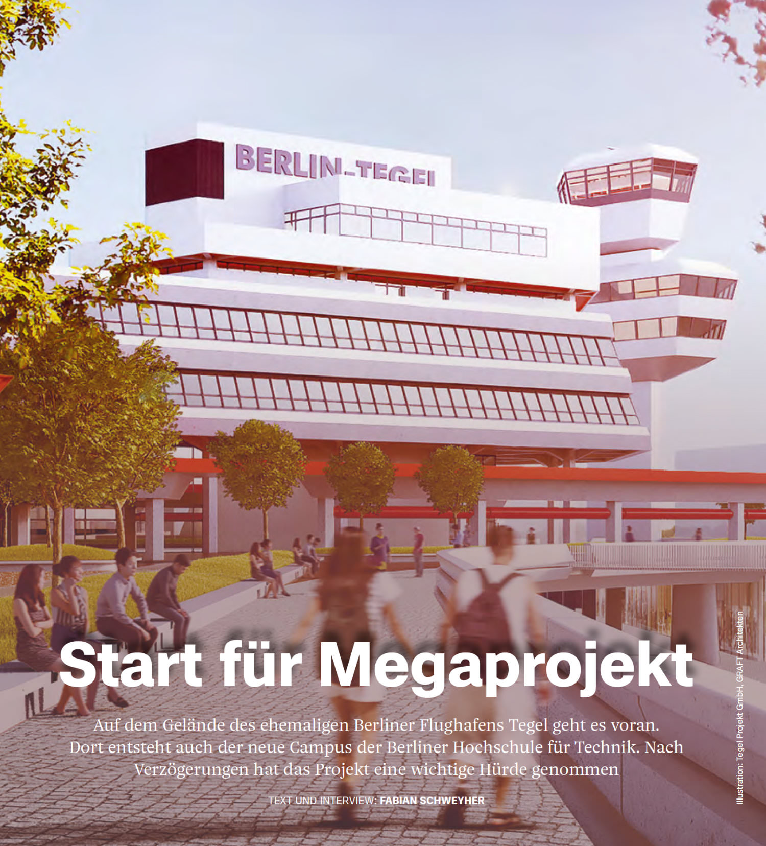
In this context, it should be mentioned that in June 2023 a major update of the Case superfamily by Erik Spiekermann, Anja Meiners and Ralph du Carrois appeared. Compared to the first version, the number of individual styles has more than doubled from 32 to 72. The styles of the Text and Micro subfamilies have been extended to reflect the broad spectrum of the core family. The harmonization of weights brings into play finely graded intermediate styles (new: SemiLight, SemiBold, ExtraBold), a newly drawn extreme ExtraBlack and subtle adjustments to existing weights. This broad spectrum, from a super light Case Hairline to the uncompromising extreme Bold styles, unleashes new creative power, especially when you use the variable fonts on offer.
In addition, the range of characters has doubled. The reason for this is the addition of Cyrillic, Greek, Vietnamese and African-Latin characters as well as the new unicase function. The combination of upper and lower case letters (with the same letter height) invites you to experiment with logos, headlines and branding.
