Change
Change
The only constant


Designer(s)
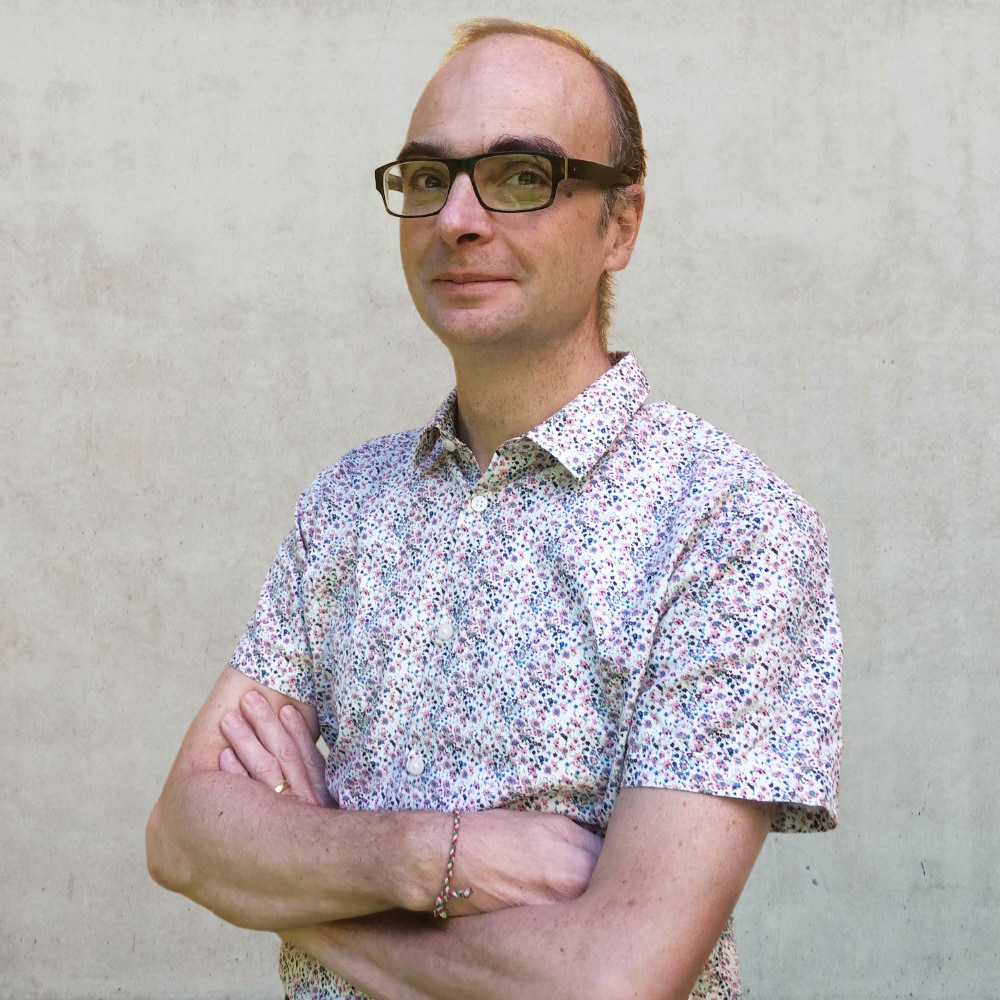
Alessio Leonardi
Alessio Leonardi
Even though he has spent three decades in his “new” home in Berlin, Alessio Leonardi has retained that extra special Florentine gene that exudes a wit rarely experienced in this country. A coffee with the young-at-heart professional always promises to lead to a stimulating discussion covering everything from professional to personal topics.
A glance at his CV proves that the Communication Designer and Type Designer knows what he is talking about. After studying at ISIA in Urbino, he was drawn to Erik Spiekermann at MetaDesign Berlin before running his own design offices (Leonardi.Wollein, Lion&Bee) and finally, after being employed as a Visiting Professor for Corporate and Information Design at Burg Giebichenstein and for Typography at HBKsaar, in 2010 he was appointed as Professor of Visual Communication at HAWK Hildesheim. Throughout his career, he has been (co-)responsible for numerous large corporate design projects, including WDR, Springer Verlag, Schering, Linotype or CECIL.
Alessio Leonardi designed his first analog typeface families in 1989. In 1992, he created his first digital famlies for FontShop International and Linotype. With Alexander Branczyk, Heike Nehl, Sybille Schlaich and Thomas Nagel, he founded one of the first digital type publishers called Face2Face. He then went on to set up Fontology with Fabrizio Schiavi. Some of his typefaces were designed exclusively for the legendary techno magazine Frontpage.
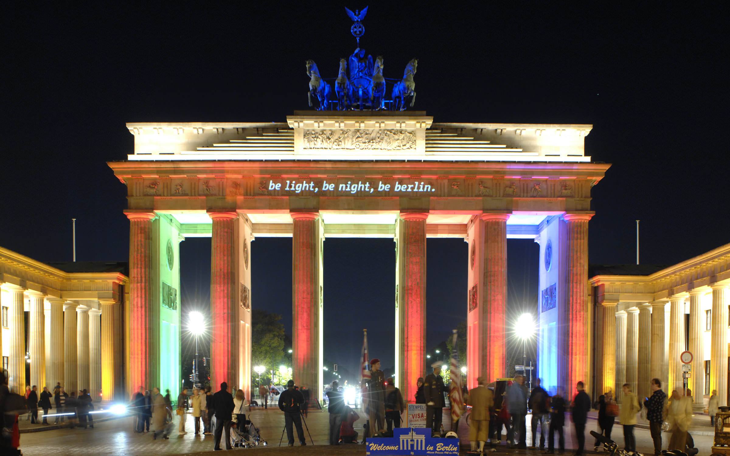
In the new millennium, he started his own label BuyMyFonts. This is also where the Corporate typeface for Berlin, the BMF Change, which is now published by Fontwerk in revised form for the rest of the world. Other work highlights include the complex type system for Schering AG (now Bayer), the Bröhan typeface for Bröhan Art Advisors Inc. and BDFoundation for the Bröhan Design Foundation, as well as FF Letterine, FF Matto, FF Handwriter and FF Graffio for FontFont and BMF Elettriche, which, in his own words, is “the largest type family in the world … until now”.
Besides speaking at (always a highlight!) and moderating conferences (e.g. TYPO Berlin), Alessio Leonardi also writes for design magazines and has published numerous books including: “From the Cow to the Typewriter: the (true) History of Writing”, “A Line of Type. 120 years typographic history” (with Jan Middendorp for the Mergenthaler Edition), “Mr. Typo and the lost letters” (also with Jan Middendorp) and “How passion ruins our lives.” and the typo graphic novel “Mr.Typo and the treasure of design”. This concludes his bio for now, before we have to publish it as a book …
Fonts on Fontwerk
Team & Details
Design Contributions
Andreas Frohloff
Imme Leonardi
Amélie Bonet Cyrillic and Greek Consultancy
Donny Trương Vietnamese Consultancy
Mastering, Production
Olli Meier
Marketing
Alessio Leonardi Naming, Illustrations
Priska Wollein Naming, Conceptual Contribution
Helmut Ness Naming, Conceptual Contribution
Ivo Gabrowitsch Copywriting, Specimen
Norman Posselt Photography
Anja Knust Graphic Design
Jürgen Siebert Copywriting
Lucy Beckley English Translation
Design Period
2008–2022
Release History
September 22, 2022
Technology, Licenses & Trademarks
Formats
Static .otf, .woff2
Variable .ttf, .woff2
Additional formats on request
Licenses
Trial Free test license
Base Includes Desktop, Web and Social Media use
Extended Larger volume, App or Audio-Visual
Additional licenses on request
Modifications, Extensions
Available on request
Variable Fonts
Included in the Family package
1 axis: weight
Web file sizes .woff2: 108 KB Upright;
118 Italic
Trademarks
Change™ is a trademark of Fontwerk GmbH
A
Glyphs
Uppercase
A
B
C
D
E
F
G
H
I
J
K
L
M
N
O
P
Q
R
S
T
U
V
W
X
Y
Z
Lowercase
a
b
c
d
e
f
g
h
i
j
k
l
m
n
o
p
q
r
s
t
u
v
w
x
y
z
Latin Accents
Á
Ă
Ắ
Ặ
Ằ
Ẳ
Ẵ
Â
Ấ
Ậ
Ầ
Ẩ
Ẫ
Ä
Ạ
À
Ả
Ā
Ą
Å
Ã
Æ
Ć
Č
Ç
Ĉ
Ċ
Ð
Ď
Đ
É
Ĕ
Ě
Ê
Ế
Ệ
Ề
Ể
Ễ
Ë
Ė
Ẹ
È
Ẻ
Ē
Ę
Ẽ
Ğ
Ĝ
Ģ
Ġ
Ħ
Ĥ
Í
Ĭ
Î
Ï
İ
Ị
Ì
Ỉ
Ī
Į
Ĩ
Ĵ
Ķ
Ĺ
Ľ
Ļ
Ŀ
Ł
Ń
Ň
Ņ
Ŋ
Ñ
Ó
Ŏ
Ô
Ố
Ộ
Ồ
Ổ
Ỗ
Ö
Ọ
Ò
Ỏ
Ơ
Ớ
Ợ
Ờ
Ở
Ỡ
Ő
Ō
Ø
Õ
Œ
Þ
Ŕ
Ř
Ŗ
Ś
Š
Ş
Ŝ
Ș
ẞ
Ə
Ŧ
Ť
Ţ
Ț
Ú
Ŭ
Û
Ü
Ụ
Ù
Ủ
Ư
Ứ
Ự
Ừ
Ử
Ữ
Ű
Ū
Ų
Ů
Ũ
Ẃ
Ŵ
Ẅ
Ẁ
Ý
Ŷ
Ÿ
Ỵ
Ỳ
Ỷ
Ỹ
Ź
Ž
Ż
á
ă
ắ
ặ
ằ
ẳ
ẵ
â
ấ
ậ
ầ
ẩ
ẫ
ä
ạ
à
ả
ā
ą
å
ã
æ
ć
č
ç
ĉ
ċ
ð
ď
đ
é
ĕ
ě
ê
ế
ệ
ề
ể
ễ
ë
ė
ẹ
è
ẻ
ē
ę
ẽ
ğ
ĝ
ģ
ġ
ħ
ĥ
í
ĭ
î
ï
̇
ị
ì
ỉ
ī
į
ĩ
ĵ
ķ
ĺ
ľ
ļ
ŀ
ł
ń
ň
ņ
ŋ
ñ
ó
ŏ
ô
ố
ộ
ồ
ổ
ỗ
ö
ọ
ò
ỏ
ơ
ớ
ợ
ờ
ở
ỡ
ő
ō
ø
õ
œ
þ
ŕ
ř
ŗ
ś
š
ş
ŝ
ș
ß
ə
ŧ
ť
ţ
ț
ú
ŭ
û
ü
ụ
ù
ủ
ư
ứ
ự
ừ
ử
ữ
ű
ū
ų
ů
ũ
ẃ
ŵ
ẅ
ẁ
ý
ŷ
ÿ
ỵ
ỳ
ỷ
ỹ
ź
ž
ż
Numerals & Currency Symbols
0
1
2
3
4
5
6
7
8
9
¤
€
$
¢
£
¥
₿
ƒ
₴
₺
₼
₽
₸
₮
₩
0
1
2
3
4
5
6
7
8
9
0
1
2
3
4
5
6
7
8
9
0
1
2
3
4
5
6
7
8
9
Small Caps
!
"
#
$
%
&
'
(
)
*
+
-
/
0
1
2
3
4
5
6
7
8
9
:
;
<
=
>
?
@
[
\
]
^
_
a
b
c
d
e
f
g
h
i
j
k
l
m
n
o
p
q
r
s
t
u
v
w
x
y
z
{
|
}
~
¡
¢
£
¤
¥
¦
§
©
ª
«
¬
®
°
±
¶
·
º
»
¿
×
ß
à
á
â
ã
ä
å
æ
ç
è
é
ê
ë
ì
í
î
ï
ð
ñ
ò
ó
ô
õ
ö
÷
ø
ù
ú
û
ü
ý
þ
ÿ
ā
ă
ą
ć
ĉ
ċ
č
ď
đ
ē
ĕ
ė
ę
ě
ĝ
ğ
ġ
ģ
ĥ
ħ
ĩ
ī
ĭ
į
ij
ĵ
ķ
ĺ
ļ
ľ
ŀ
ł
ń
ņ
ň
ŋ
ō
ŏ
ő
œ
ŕ
ŗ
ř
ś
ŝ
ş
š
ţ
ť
ŧ
ũ
ū
ŭ
ů
ű
ų
ŵ
ŷ
ź
ż
ž
ƒ
ơ
ư
ǿ
ȁ
ȃ
ȅ
ȇ
ȉ
ȋ
ȍ
ȏ
ȑ
ȓ
ȕ
ȗ
ș
ț
ȷ
ə
ɵ
̀
́
̂
̃
̄
̆
̇
̈
̉
̊
̋
̌
̏
̑
;
΄
΅
·
ΐ
ά
έ
ή
ί
ΰ
α
β
γ
δ
ε
ζ
η
θ
ι
κ
λ
μ
ν
ξ
ο
π
ρ
ς
σ
τ
υ
φ
χ
ψ
ω
ϊ
ϋ
ό
ύ
ώ
а
б
в
г
д
е
ж
з
и
й
к
л
м
н
о
п
р
с
т
у
ф
х
ц
ч
ш
щ
ъ
ы
ь
э
ю
я
ѐ
ё
ђ
ѓ
є
ѕ
і
ї
ј
љ
њ
ћ
ќ
ѝ
ў
џ
ѡ
ѣ
ѥ
ѧ
ѩ
ѫ
ѭ
ѯ
ѱ
ѳ
ѵ
ѷ
ґ
ғ
ҕ
җ
ҙ
қ
ҝ
ҟ
ҡ
ң
ҥ
ҫ
ү
ұ
ҳ
ҷ
ҹ
һ
ӂ
ӏ
ӑ
ӗ
ә
ӧ
ӫ
ӯ
ӳ
ẁ
ẃ
ẅ
ạ
ả
ấ
ầ
ẩ
ẫ
ậ
ắ
ằ
ẳ
ẵ
ặ
ẹ
ẻ
ẽ
ế
ề
ể
ễ
ệ
ỉ
ị
ọ
ỏ
ố
ồ
ổ
ỗ
ộ
ớ
ờ
ở
ỡ
ợ
ụ
ủ
ứ
ừ
ử
ữ
ự
ỳ
ỵ
ỷ
ỹ
‐
‑
‒
–
—
‘
’
“
”
†
‡
•
‰
′
″
‴
‹
›
‽
⁒
₣
₤
₨
₩
€
₮
₴
₸
₺
₼
₽
₿
ℓ
№
℗
™
∆
∏
∑
−
√
∞
∫
≅
≈
≙
≠
≤
≥
⟨
⟩
⸘
Punctuation
.
,
:
;
…
!
¡
?
¿
&
@
·
•
*
‽
⸘
#
/
|
\
(
)
{
}
[
]
-
–
—
‒
―
‐
‑
_
‚
„
“
”
‘
’
«
»
‹
›
‴
"
'
⟨
⟩
Mathematical Signs & Symbols
∙
≅
⋅
≙
+
−
×
÷
=
≠
>
<
≥
≤
±
≈
~
¬
^
∞
∫
Ω
∆
∏
∑
√
µ
∂
%
‰
Arrows & Shapes
↑
↗
→
↘
↓
↙
←
↖
●
○
◊
■
□
▲
▼
△
▽
▴
▸
▾
◂
Ligatures
ffi
ffl
ff
fi
fl
ch
ck
ct
ffb
fff
ffh
ffj
ffk
fft
ftt
fb
fh
fj
fk
ft
sc
st
ſt
ſt
Greek
Α
Β
Γ
Ε
Ζ
Η
Θ
Ι
Κ
Λ
Μ
Ν
Ξ
Ο
Π
Ρ
Σ
Τ
Υ
Φ
Χ
Ψ
Ά
Έ
Ή
Ί
Ό
Ύ
Ώ
Ϊ
Ϋ
α
β
γ
δ
ε
ζ
η
θ
ι
κ
λ
ν
ξ
ο
π
ρ
σ
τ
υ
φ
χ
ψ
ω
ί
ϊ
ΐ
ύ
ϋ
ΰ
ό
ώ
ά
έ
ή
·
΄
΅
Cyrillic
А
Б
В
Г
Ѓ
Ґ
Д
Е
Ѐ
Ё
Ж
З
И
Й
Ѝ
К
Ќ
Л
М
Н
О
П
Р
С
Т
У
Ў
Ф
Х
Ч
Ц
Ш
Щ
Џ
Ь
Ъ
Ы
Љ
Њ
Ѕ
Є
Э
І
Ї
Ј
Ћ
Ю
Я
Ђ
Ѣ
Ѳ
Ѵ
Ғ
Җ
Ҙ
Қ
Ҝ
Ҡ
Ң
Ҥ
Ҫ
Ү
Ұ
Ҳ
Ҷ
Ҹ
Һ
Ӏ
Ӂ
Ӑ
Ӗ
Ә
Ӧ
Ӯ
Ӳ
а
б
в
г
ѓ
ґ
д
е
ѐ
ё
ж
з
и
й
ѝ
к
ќ
л
м
н
о
п
р
с
т
у
ў
ф
х
ч
ц
ш
щ
џ
ь
ъ
ы
љ
њ
ѕ
є
э
і
ї
ј
ћ
ю
я
ђ
ѣ
ѳ
ѵ
ғ
җ
ҙ
қ
ҝ
ҡ
ң
ҥ
ҫ
ү
ұ
ҳ
ҷ
ҹ
һ
ӏ
ӂ
ӑ
ӗ
ә
ӧ
ӯ
ӳ
Languages
| A | Afrikaans Albanian Asu |
| B | Basque Belarusian Bemba Bena Bosnian Breton Bulgarian |
| C | Catalan Chechen Cornish Croatian Czech |
| D | Danish Dutch |
| E | Embu English Esperanto Estonian |
| F | Faroese Filipino Finnish French Friulian |
| G | Galician Ganda German Greek Gusii |
| H | Hungarian |
| I | Icelandic Inari Sami Indonesian Irish Italian |
| J | Jola-Fonyi |
| K | Kabuverdianu Kalenjin Kamba Kikuyu Kinyarwanda |
| L | Latvian Lithuanian Lower Sorbian Luo Luxembourgish Luyia |
| M | Macedonian Machame Makhuwa-Meetto Makonde Malagasy Maltese Manx Meru Morisyen |
| N | North Ndebele Northern Sami Norwegian Bokmål Norwegian Nynorsk Nyankole |
| O | Oromo |
| P | Polish Portuguese |
| Q | Quechua |
| R | Romanian Romansh Rombo Rundi Russian Rwa |
| S | Samburu Sango Sangu Sena Serbian Serbian Shambala Shona Slovak Slovenian Soga Somali Spanish Swahili Swedish Swiss German |
| T | Taita Teso Turkish |
| U | Ukrainian Upper Sorbian Uzbek |
| V | Vietnamese Volapük Vunjo |
| W | Walser Welsh |
| A | Afrikaans Albanian Asu |
| B | Basque Bemba Bena Breton |
| C | Catalan Cornish Croatian Czech |
| D | Danish Dutch |
| E | Embu English Esperanto Estonian |
| F | Faroese Filipino Finnish French Friulian |
| G | Galician Ganda German Gusii |
| H | Hungarian |
| I | Icelandic Inari Sami Indonesian Irish Italian |
| J | Jola-Fonyi |
| K | Kabuverdianu Kalenjin Kamba Kikuyu Kinyarwanda |
| L | Latvian Lithuanian Lower Sorbian Luo Luxembourgish Luyia |
| M | Machame Makhuwa-Meetto Makonde Malagasy Maltese Manx Meru Morisyen |
| N | North Ndebele Northern Sami Norwegian Bokmål Norwegian Nynorsk Nyankole |
| O | Oromo |
| P | Polish Portuguese |
| Q | Quechua |
| R | Romanian Romansh Rombo Rundi Rwa |
| S | Samburu Sango Sangu Sena Serbian Shambala Shona Slovak Slovenian Soga Somali Spanish Swahili Swedish Swiss German |
| T | Taita Teso Turkish |
| U | Upper Sorbian Uzbek |
| V | Vietnamese Volapük Vunjo |
| W | Walser Welsh |
| G | Greek |
| B | Belarusian Bosnian Bulgarian |
| C | Chechen |
| M | Macedonian |
| R | Russian |
| S | Serbian |
| U | Ukrainian |