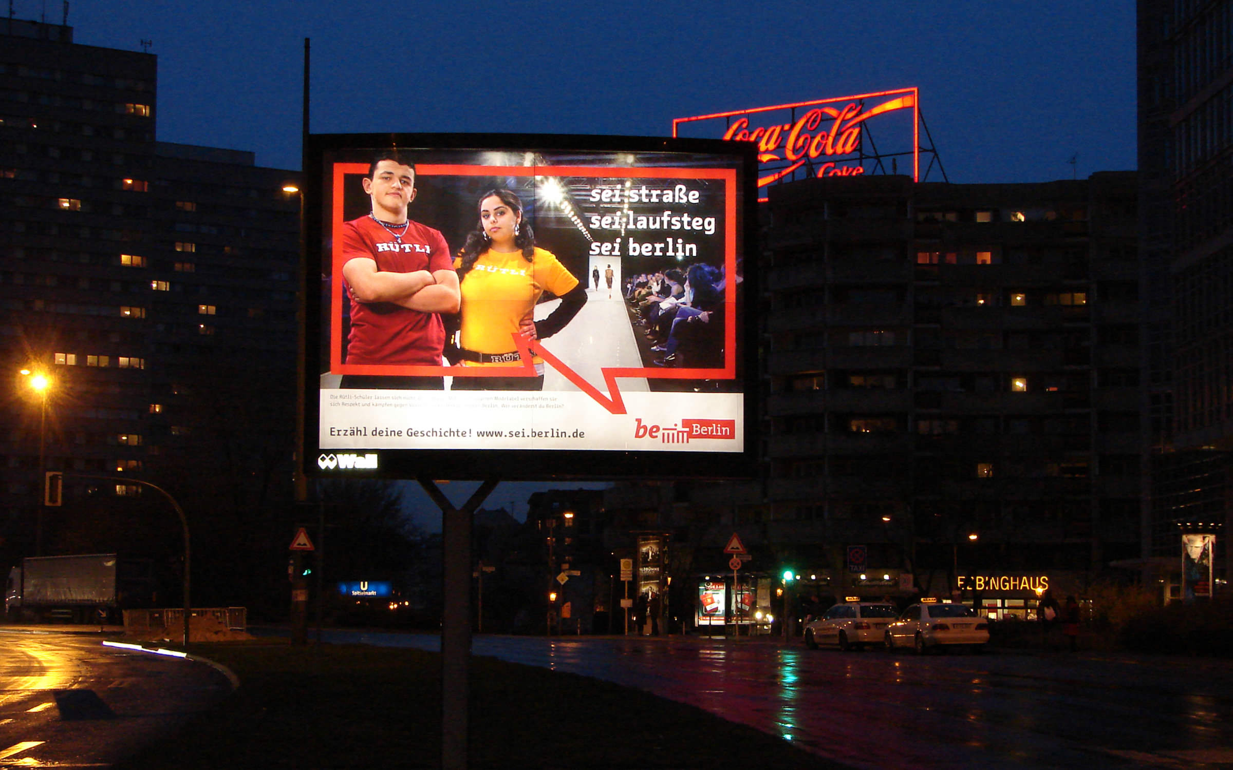
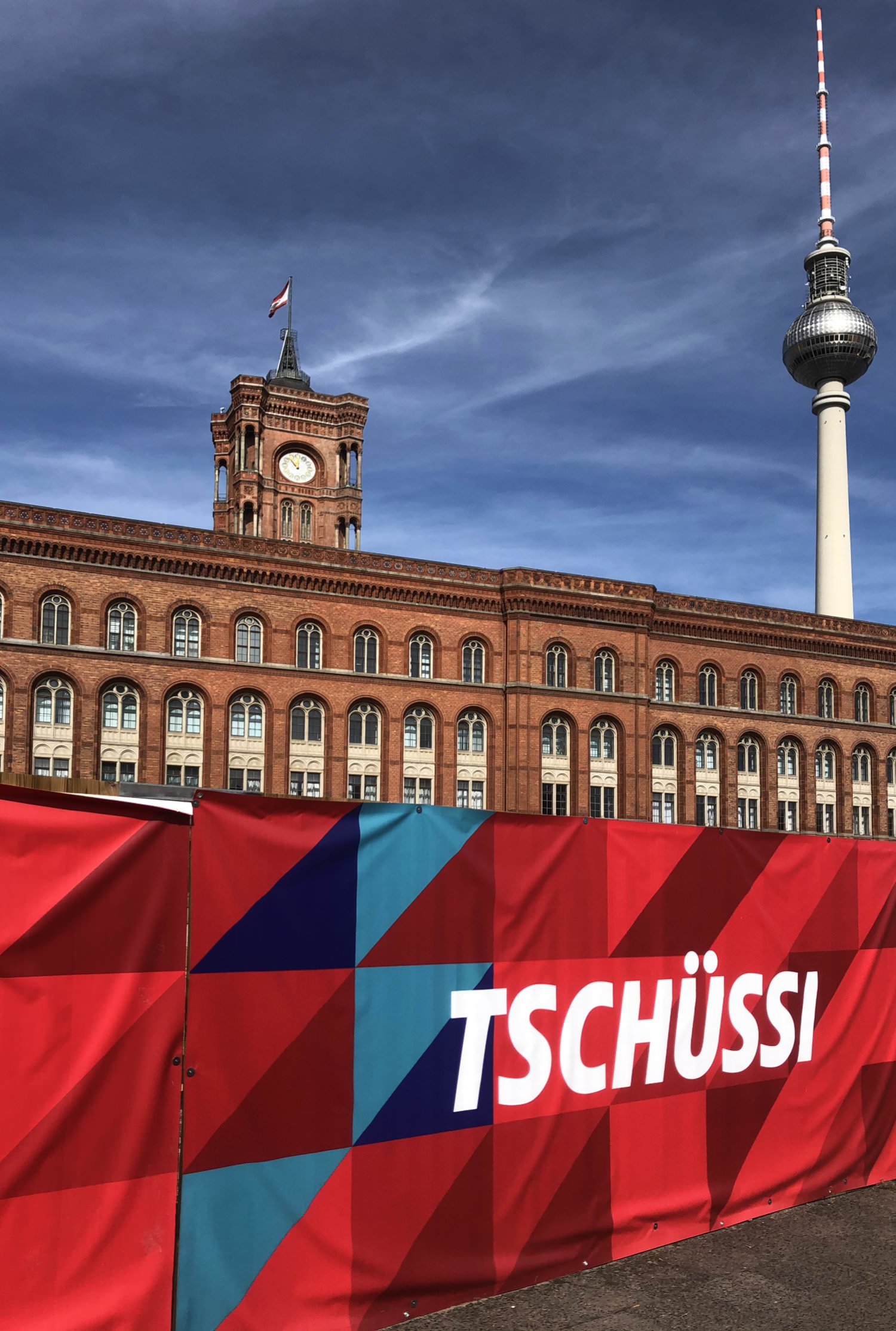
The original draft, Change Letter, with which the Berlin campaign was launched, has a special significance. With its contrasting interplay of hardness and subtlety, it lends emphasis to texts and headlines. The conically shaped strokes and angled diagonals in the letters A, M, V, W, v and w make it unmistakable. The typewriter look, enriched with slab serifs, carries the three-line core messages of the campaign and becomes a set piece for all Berliners. With three fixed letter widths, it is located between monospaced and proportional typefaces and makes the texts it is set in appear strong and self-confident.
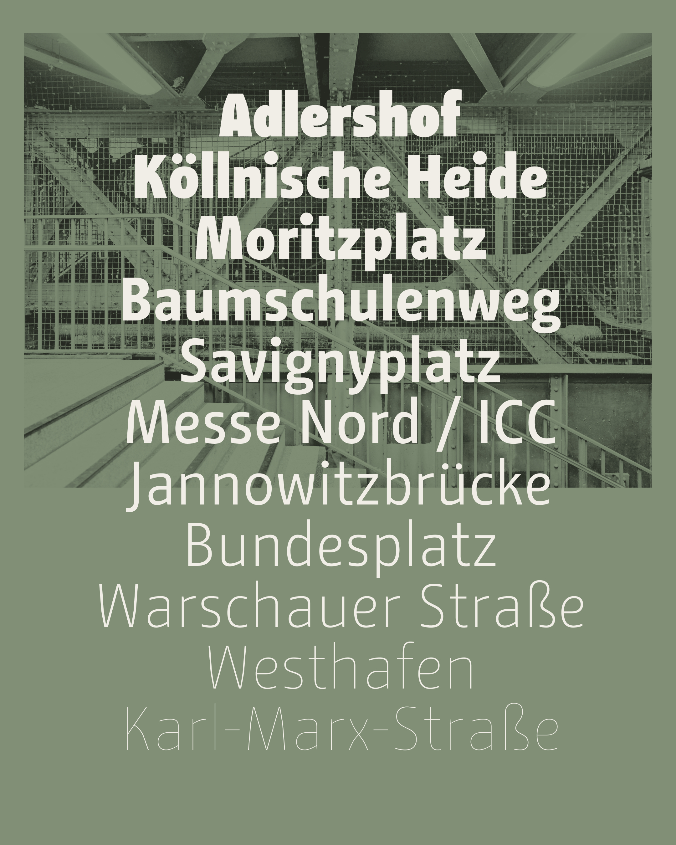
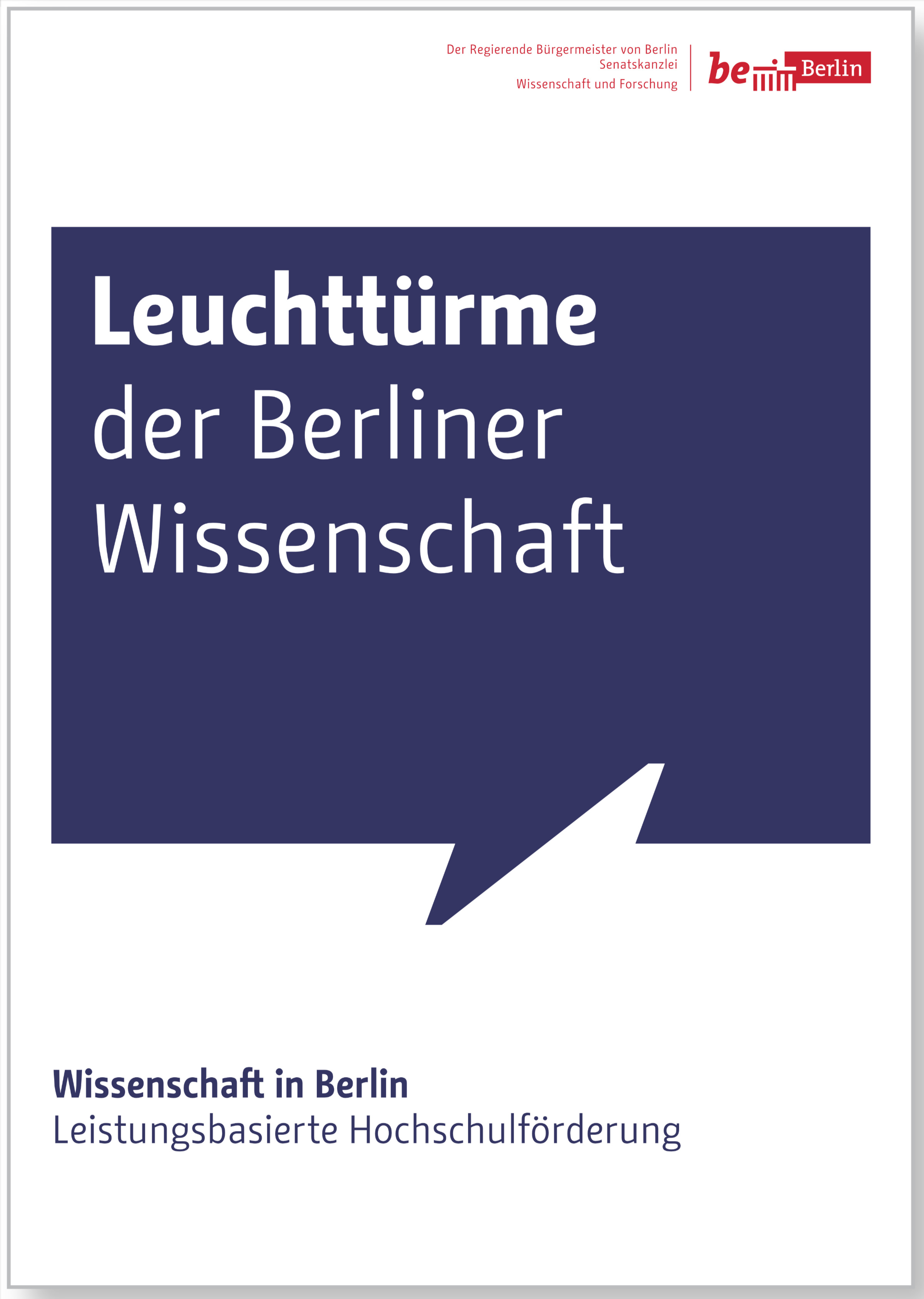
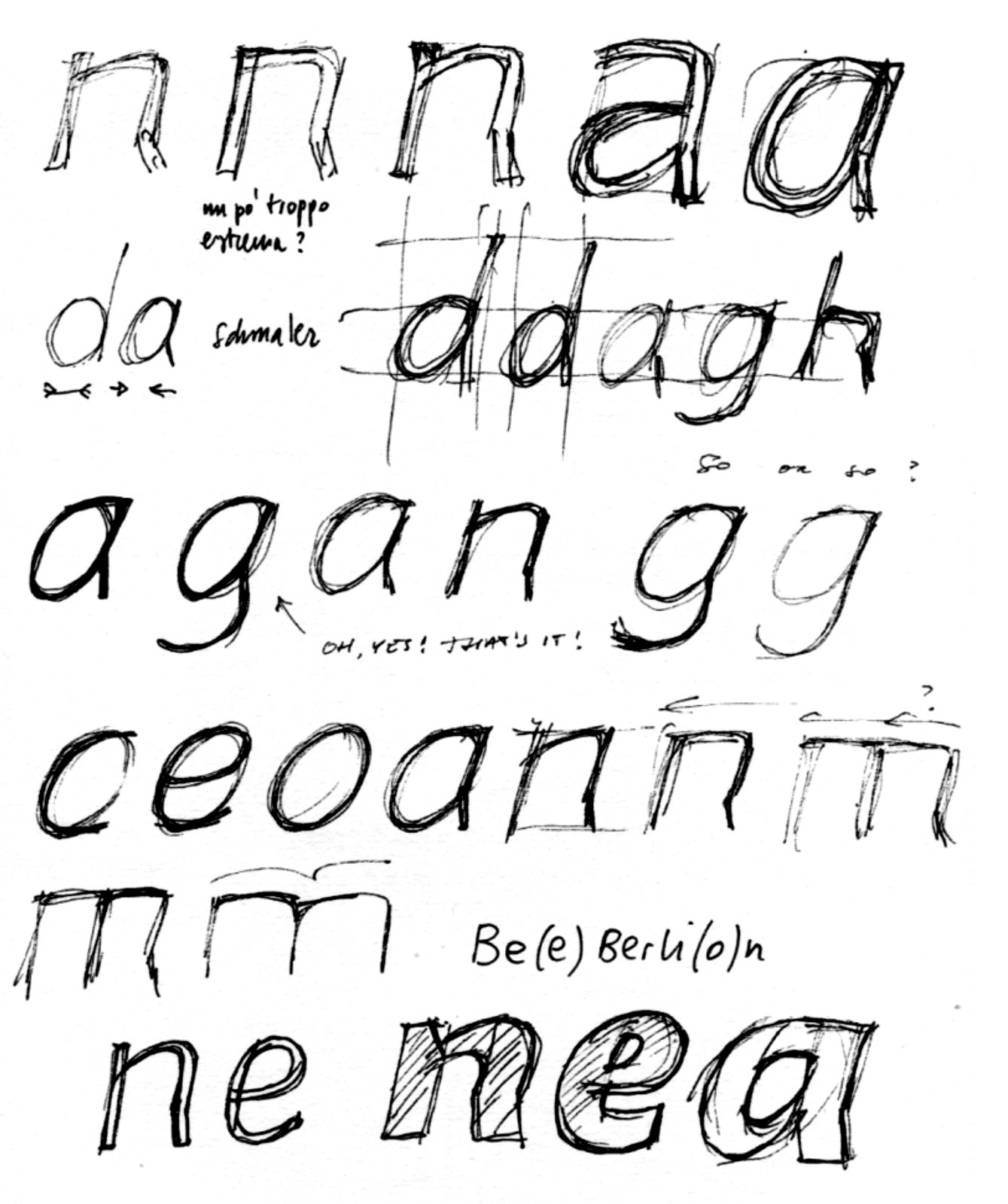
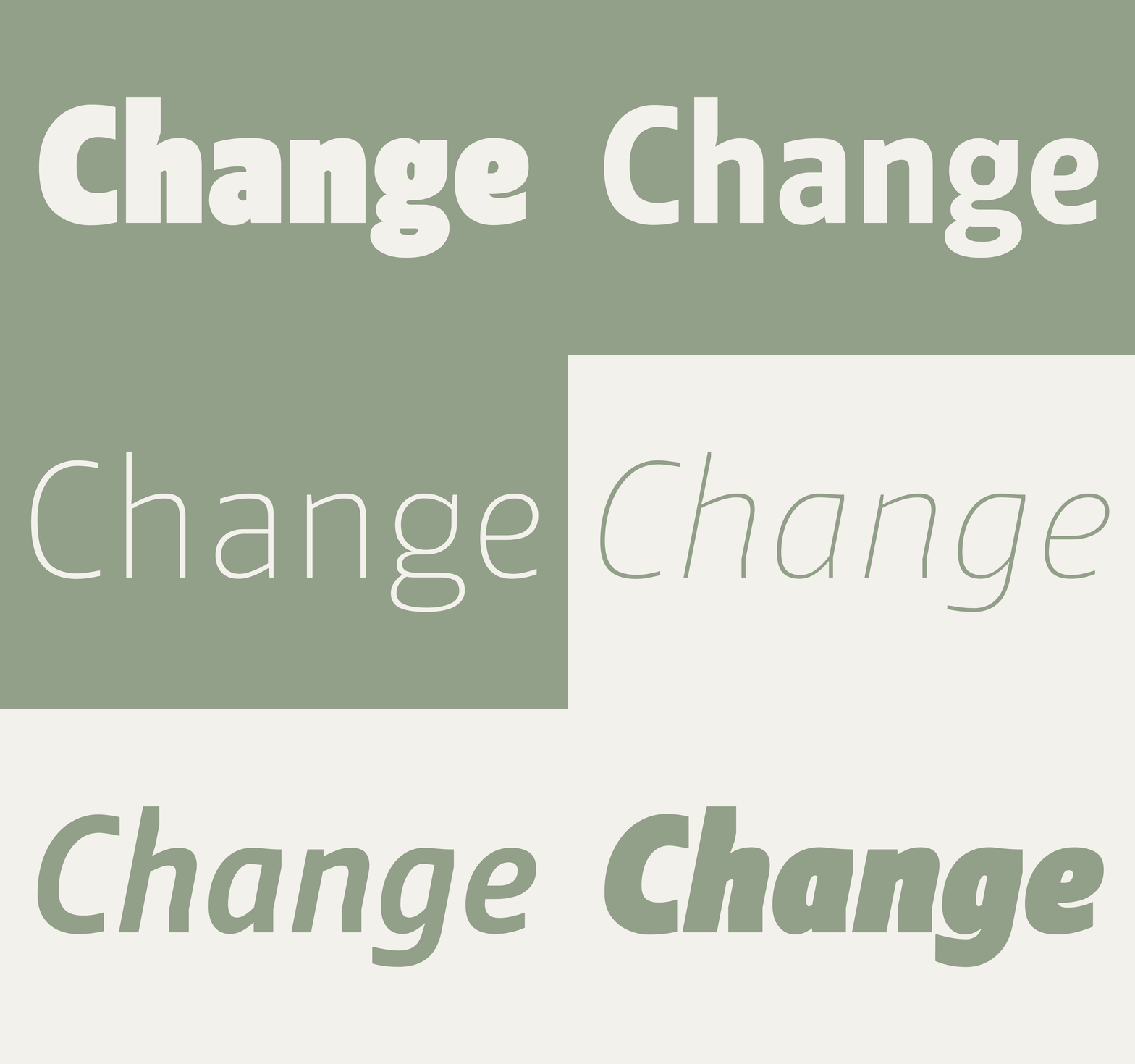
The desire of the Governing Mayor of Berlin to expand the use of Change across all of the city’s general communication, led to the development of Change Sans a year later. Change Sans became the second typeface in the family with a somewhat more neutral appearance, but with the same features as Letter: Regular, Bold, Italic and Bold Italic. In 2010, it was expanded with lighter and bolder weights. As its designer says: “Change Sans was developed for longer texts, with proportional widths, the basic cut slightly lighter and narrower. This gives texts a pleasant gray value for better reading and increases the contrast between Regular and Bold. The italics are also high-contrast. Some vertical bars are curved. The 11° slant makes them fast and rhythmic.”
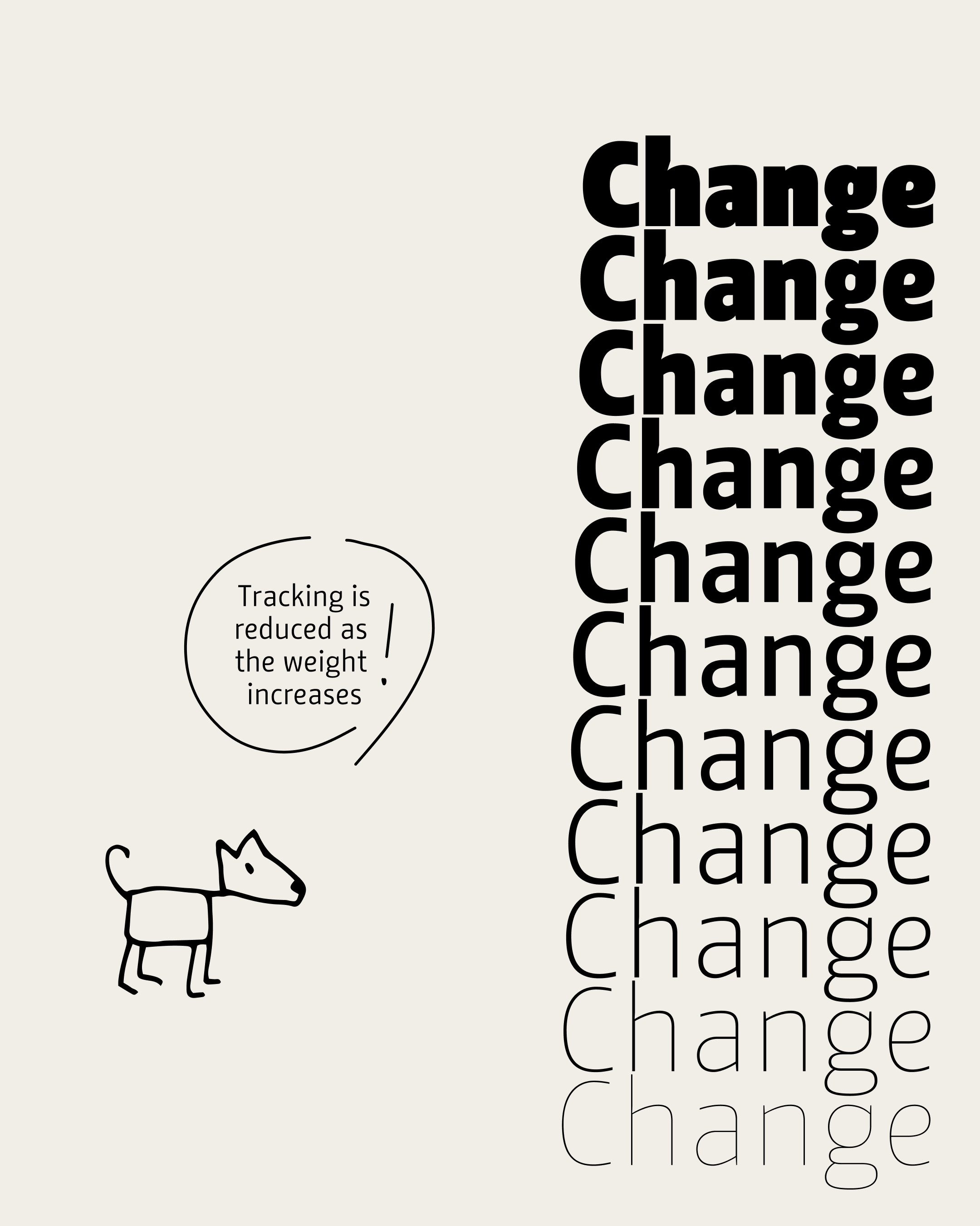
Another unusual feature of Change is that the tracking is reduced as the stroke width increases. This means that a bold cut like ExtraBlack takes up less space than a thin cut like Hairline. At the same time, a more harmonious white space of the counters and the spacing is achieved.
