In the summer of 2024, Tausend designer Christoph Koeberlin drew his colleague Gabriel Richter’s attention to Dan Reynold’s article on the history of Akzidenz-Grotesk. Reynolds proves that the 1895 Schattierte Grotesk typeface by Bauer & Co. Type Foundry was more than just a decorative offshoot. In fact, it can be considered the origin of the form from which Berthold AG – shortly after taking over Bauer – developed Akzidenz-Grotesk. Reynolds: “If you remove the drop shadow from the letters of Schattierte Grotesk, the forms of Akzidenz-Grotesk clearly emerge.”
Tausend Shaded
The form lies in the shadow
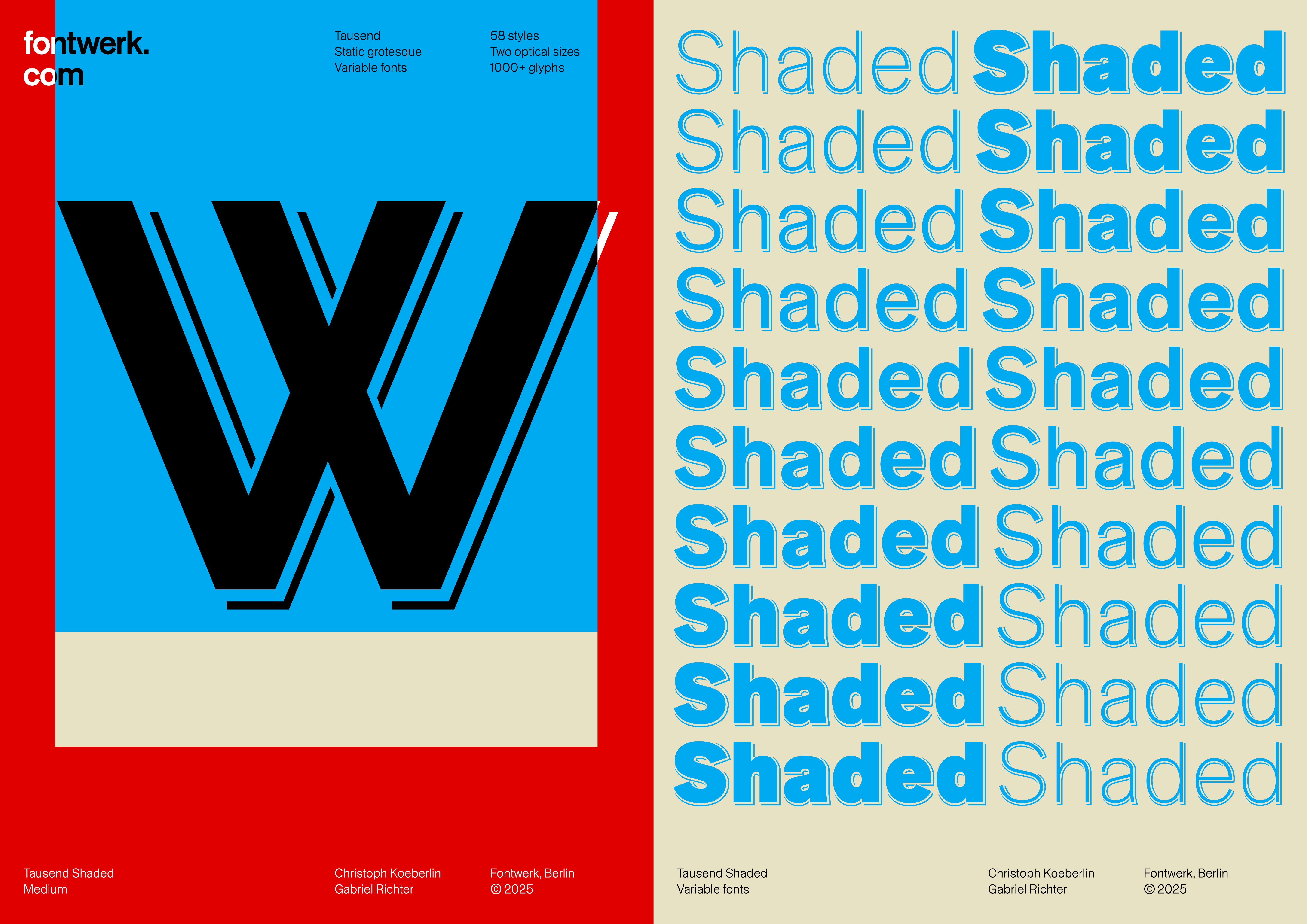
If you remove the drop shadow from the letters of Schattierte Grotesk, the forms of Akzidenz-Grotesk clearly emerge.
This sparked curiosity and fascination from Christoph and immediately ignited an idea. “Why not revive the earliest version of Akzidenz-Grotesk with two or three shaded weights?” Tausend already contained the basic form: a contemporary, systematically developed grotesque typeface with a touch of Bauhaus. Therefore, enriching it with a shaded variant shouldn’t be that much of a problem.
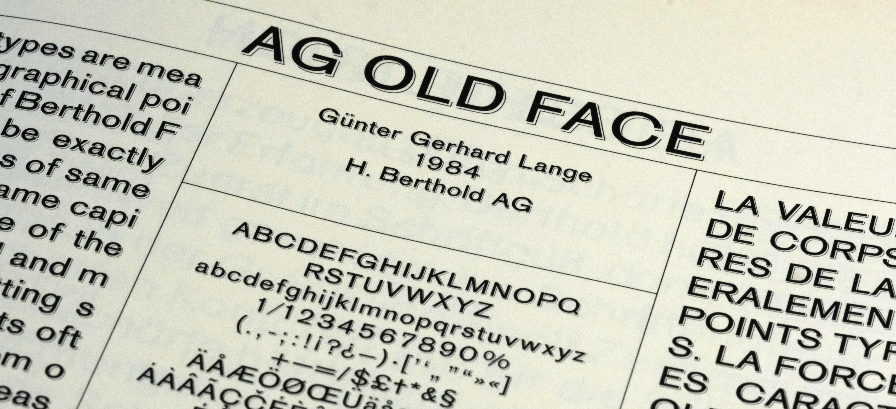
In the early 1980s, Günter Gerhard Lange, the artistic director of Berthold AG, once again took a close look at the original Akzidenz Grotesk. He developed a new version, which was released in 1984 under the name AG Old Face and, according to the manufacturer, it was more closely based on the early Akzidenz Grotesk. It had only three weights but it didn’t contain any italics. Instead, it included a Shaded style, which once again underlines the important role of this style.
Gabriel Richter, who tongue-in-cheek calls himself an “old systematics expert,” took on the task of expanding Tausend Shaded. His mission: to create a consistent shadow typeface based on Tausend across multiple stroke weights. It sounds simple, but it wasn’t.
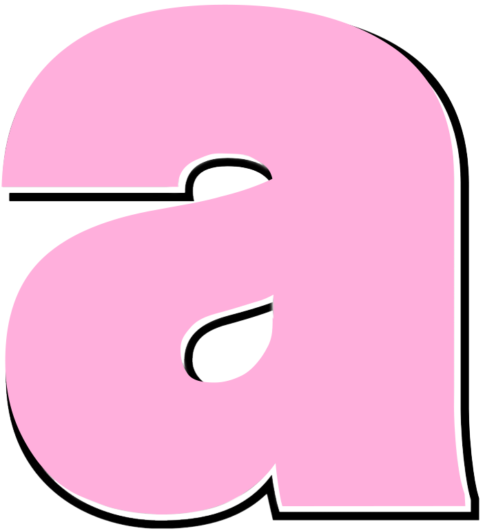
The first challenge: As the stroke weight increases, the space for shading shrinks. While there is plenty of space in Light, it becomes very tight in Black. In an initial test, a shadow was applied to the lowercase letter a in Black.
“How deep, how wide, how airy should the shadow be?” Gabriel asked himself and found the answer: The eye decides! Christoph’s reaction to the initial draft: “Fancy! But I think we should give it a little more space. And the tricky part will probably be that the line doesn’t touch the base outline anywhere!” In fact, it will be even more intense: in critical letters, the outline will skip over its own shadow… after the two designers had done so beforehand.

In several rounds of testing, the designers explored the ideal spacing, curve guidance and parallelism.

It quickly became clear that a static system would not work. The solution: shading that adapts organically – depending on the character, curves, and stroke thickness. Gabriel: “The depth varies, as in the original font: more manual than mathematical.”
However, the original idea of “two to three weights” was no longer enough for them. They had long since set their sights on developing a complete subfamily.
After several weeks of development, a look inside Tausend Shaded revealed an unparalleled feat of ingenuity:
- Each a, e, and s had to be individually edited in all styles.
- Accents were slightly shifted upward in the bolder styles instead of being compressed.
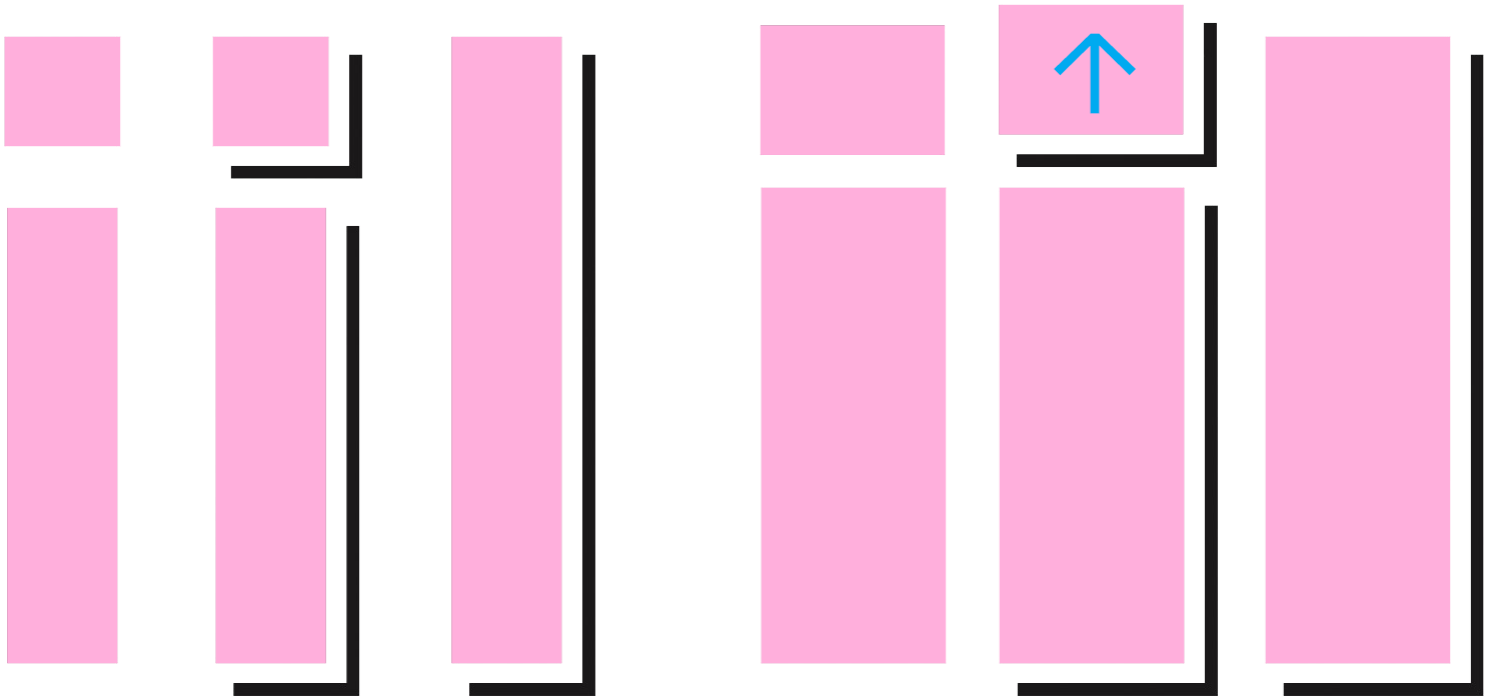
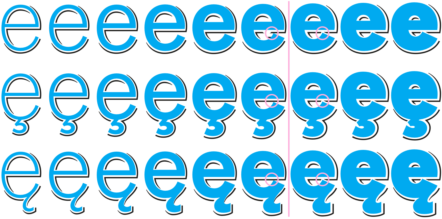
- The shadows do not simply run alongside the letters; no, they are deliberately guided, shaped, adjusted, narrowed, and even jump over the contours.
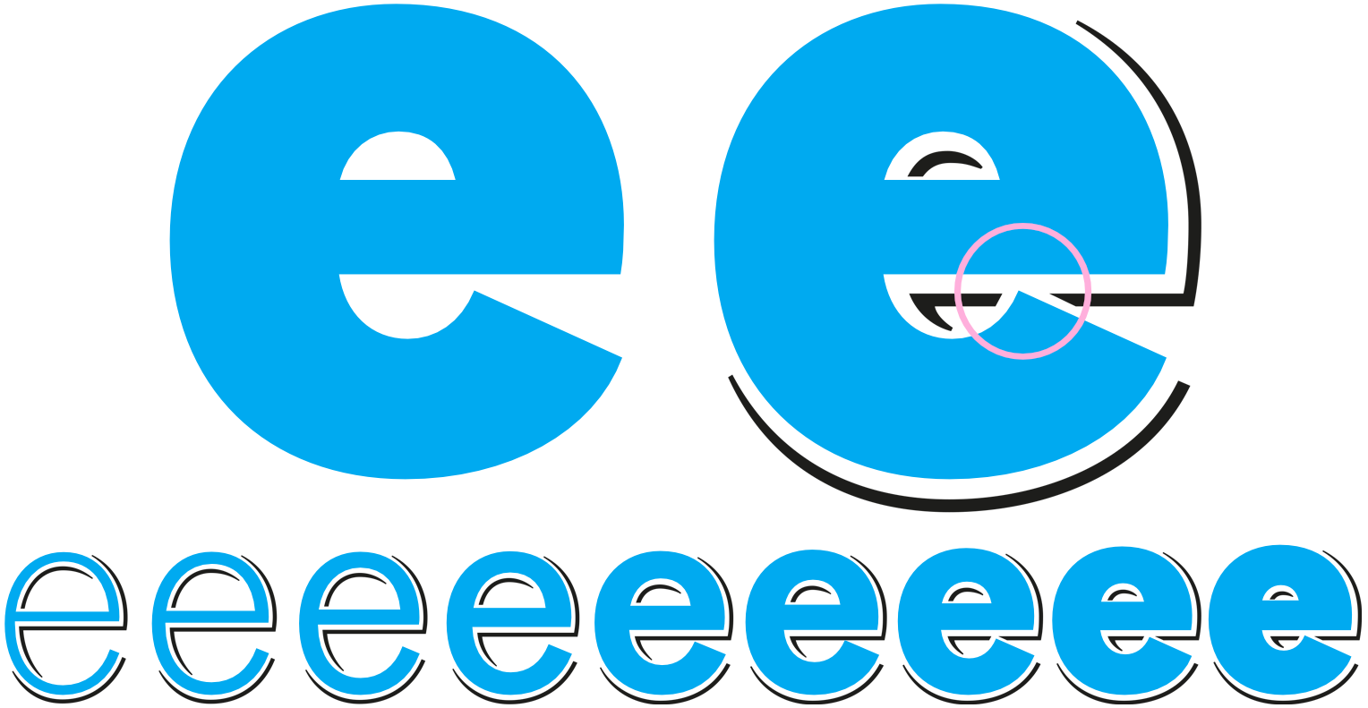
- Many characters, especially those with diacritics, required complex, unique shadow shapes.
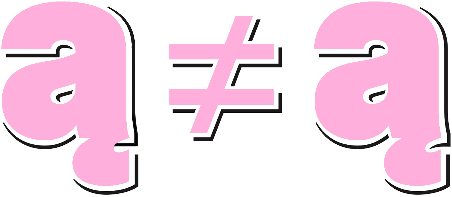
Gabriel is self-deprecating: “How wonderful that conventional components no longer fit together.” Just one example: The letter ą in the original Tausend is a combination of a and ˛ … This does not work in Shaded; here, a separate, manually created transition shadow is required.
Tausend Shaded is not a gimmicky typeface. It is a statement for craftsmanship and it rallies against the algorithmic arbitrariness that has characterized many display fonts for decades.
The shadow shape is not the result of a geometric filter, but of individual design decisions – for each character in each stroke weight. All transitions are drawn, not generated. Every curve is conceived, not interpolated.
The “Schattierte Grotesk” from 1895 was a decorative precursor to the later Akzidenz-Grotesk. Tausend Shaded draws upon this idea – not as an imitation, but as a transformation. It carries the spirit of that time, but takes it further.
Tausend Shaded proves that shadows do not always stand for darkening, but that they can have the opposite effect. Shaded reveals what holds a font together at its core.
The best for last (thanks for reading to the end!): Tausend Shaded is available free of charge as a Base License (1 Desktop-User, 10,000 Web-Pageviews, 10,000 Social-Media-Followers).
Akzidenz-Grotesk, AG Old Face and Berthold are registered trademarks of Monotype Imaging Inc.