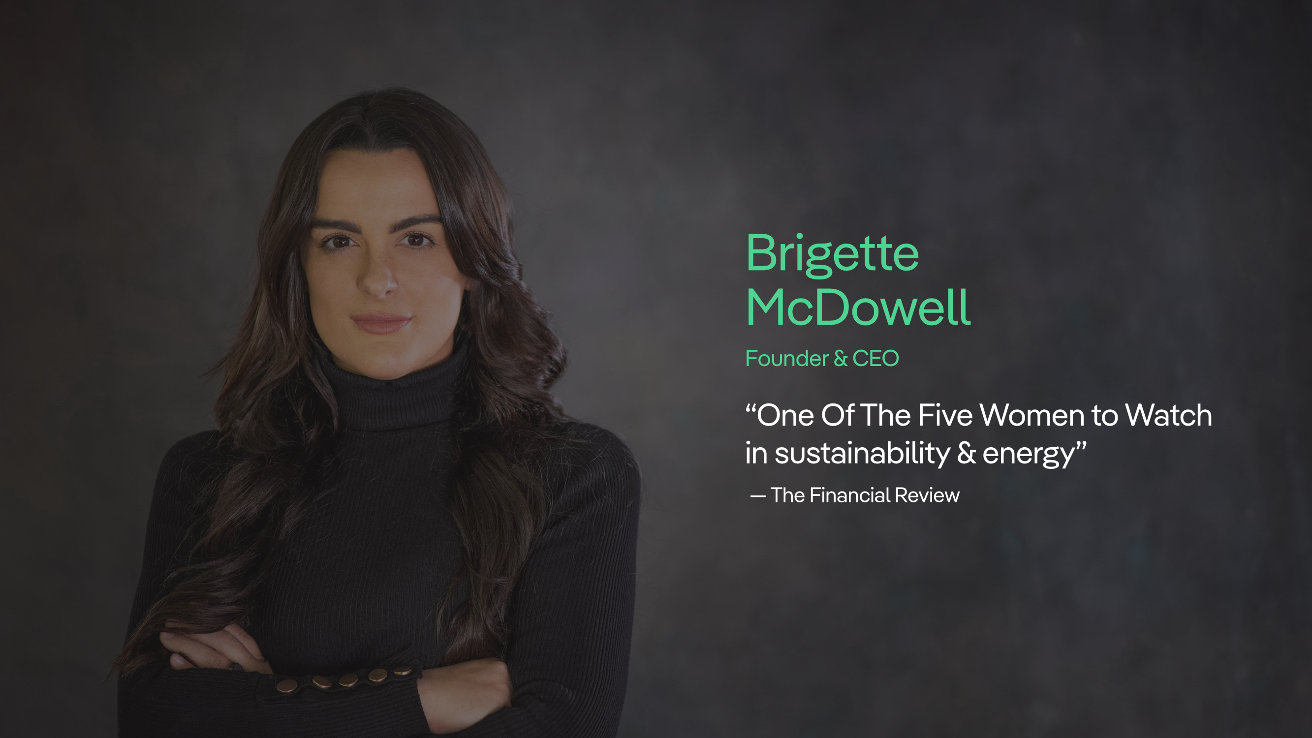
ecause Aboriginal people have a keen awareness of these systems, their perspectives, cultural knowledge, and collaboration are critical to designing successful projects” emphasizes Powerhouse’s founder Brigette McDowell in her Capability Statement. This guiding principle forms the basis for all decisions made by the consulting firm in its projects and initiatives.
Powerhouse
Rethinking renewable energy
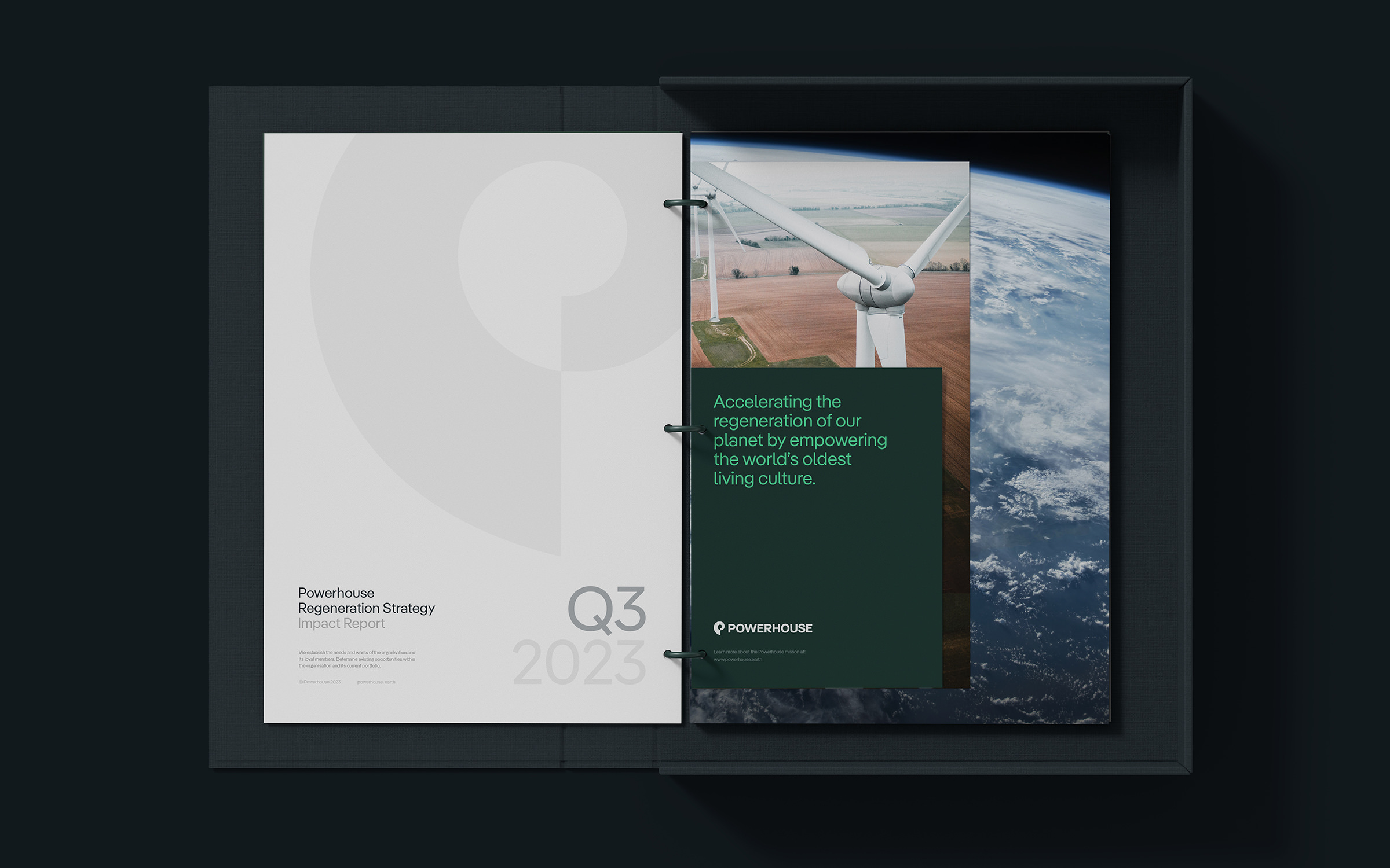
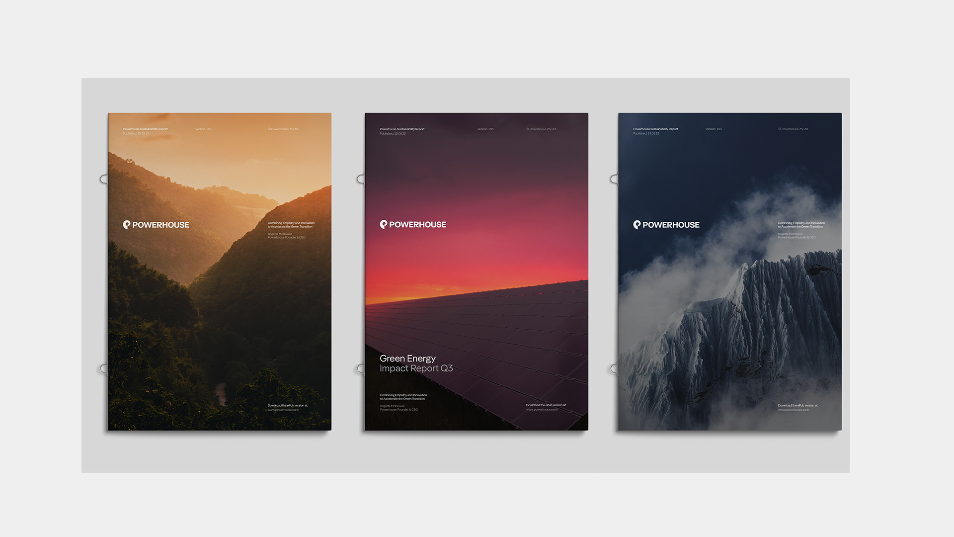
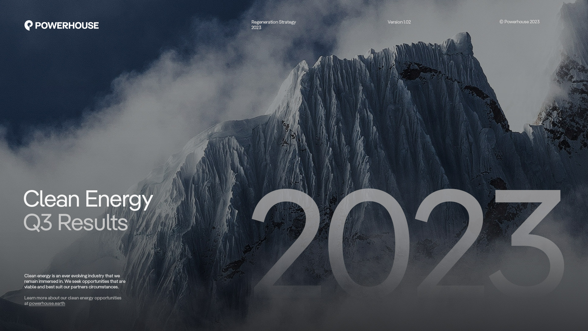
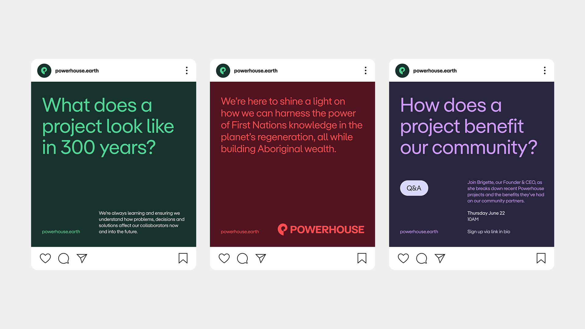
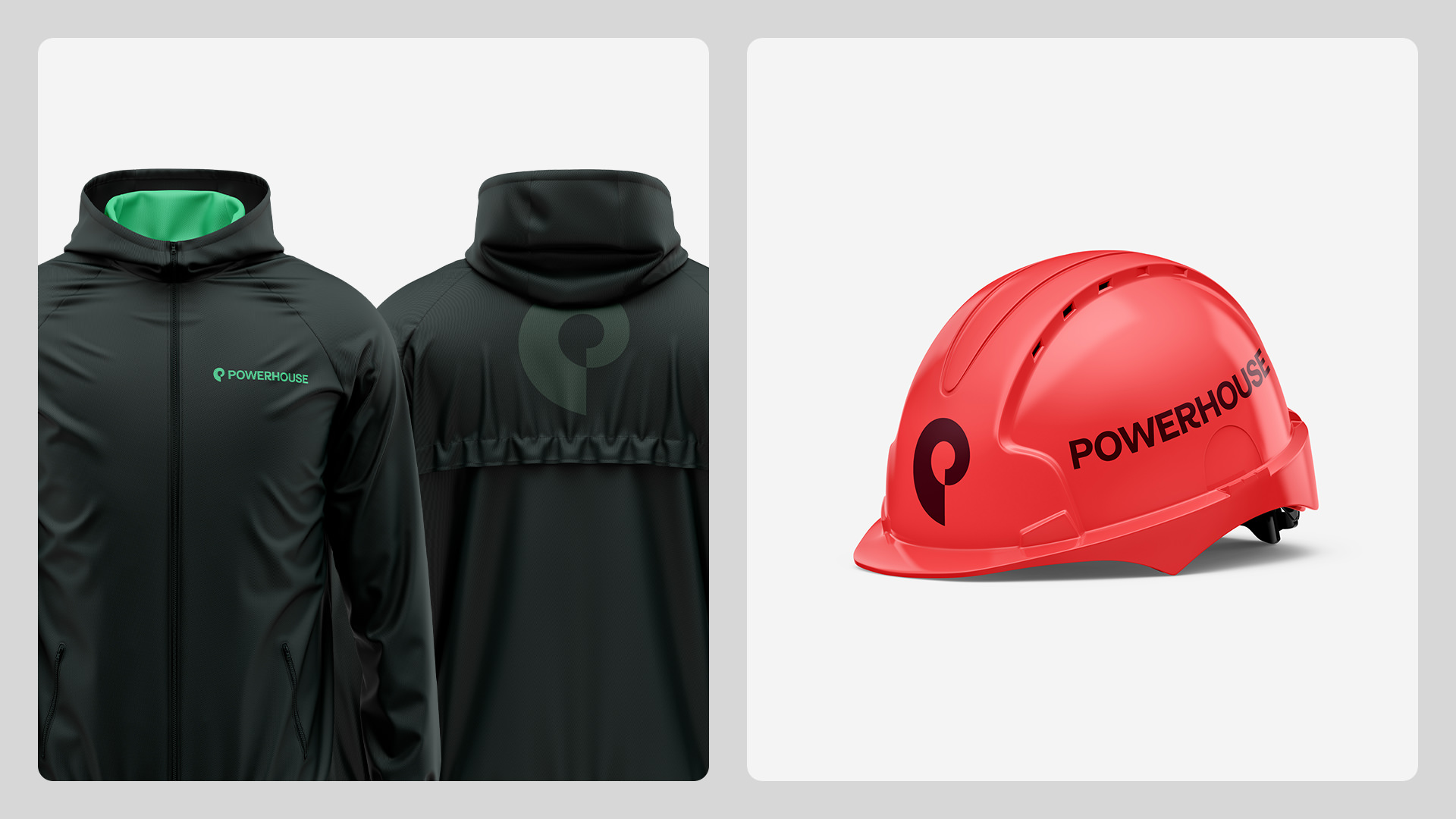
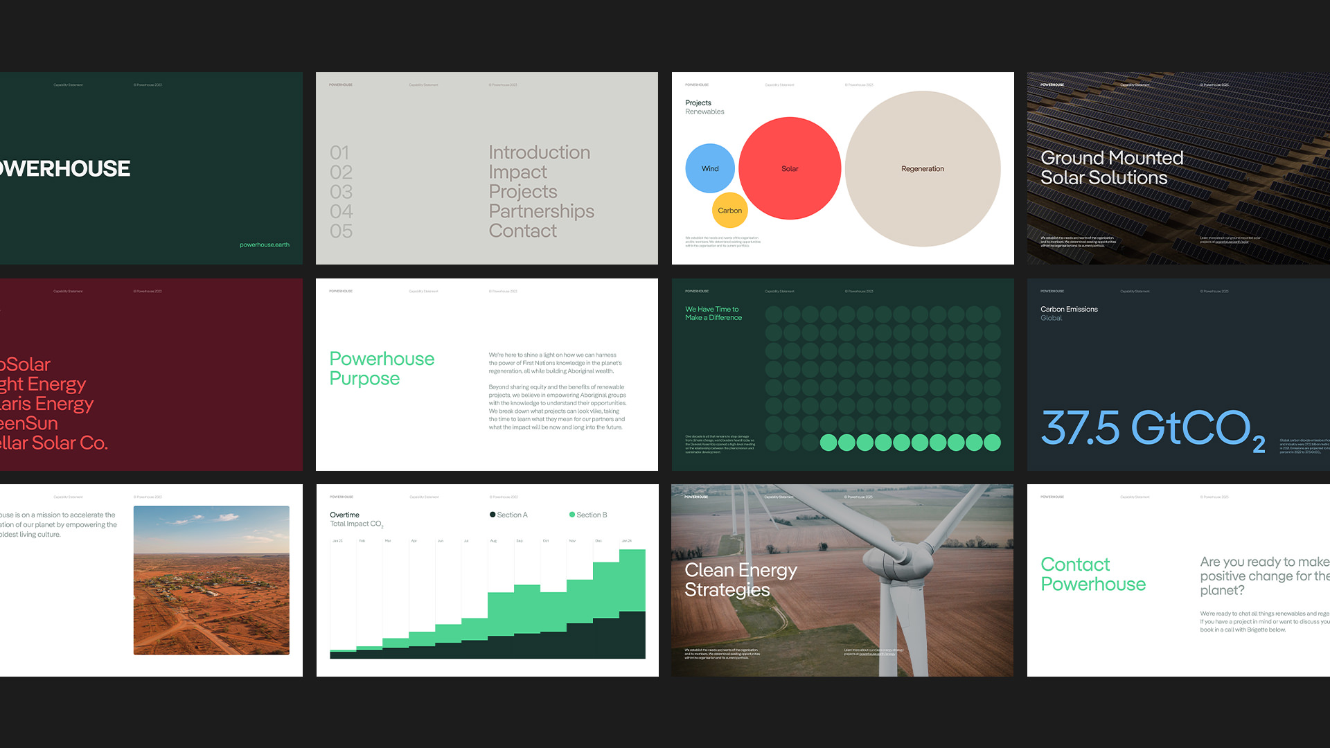
The Creative Agency Side By Side Studio from Melbourne is responsible for the visual identity of Powerhouse. The logo is set in Marguerite Grotesk, which was designed in 2017 by the Berlin Artist and Type Designer Charlotte Rohde. The distinctive trunk of the R gives the otherwise neutral logotype a strong personality, even a certain exclusivity, because in the latest version of Marguerite Grotesk this shape of the letter is only available as a stylistic alternative hidden in the character set.
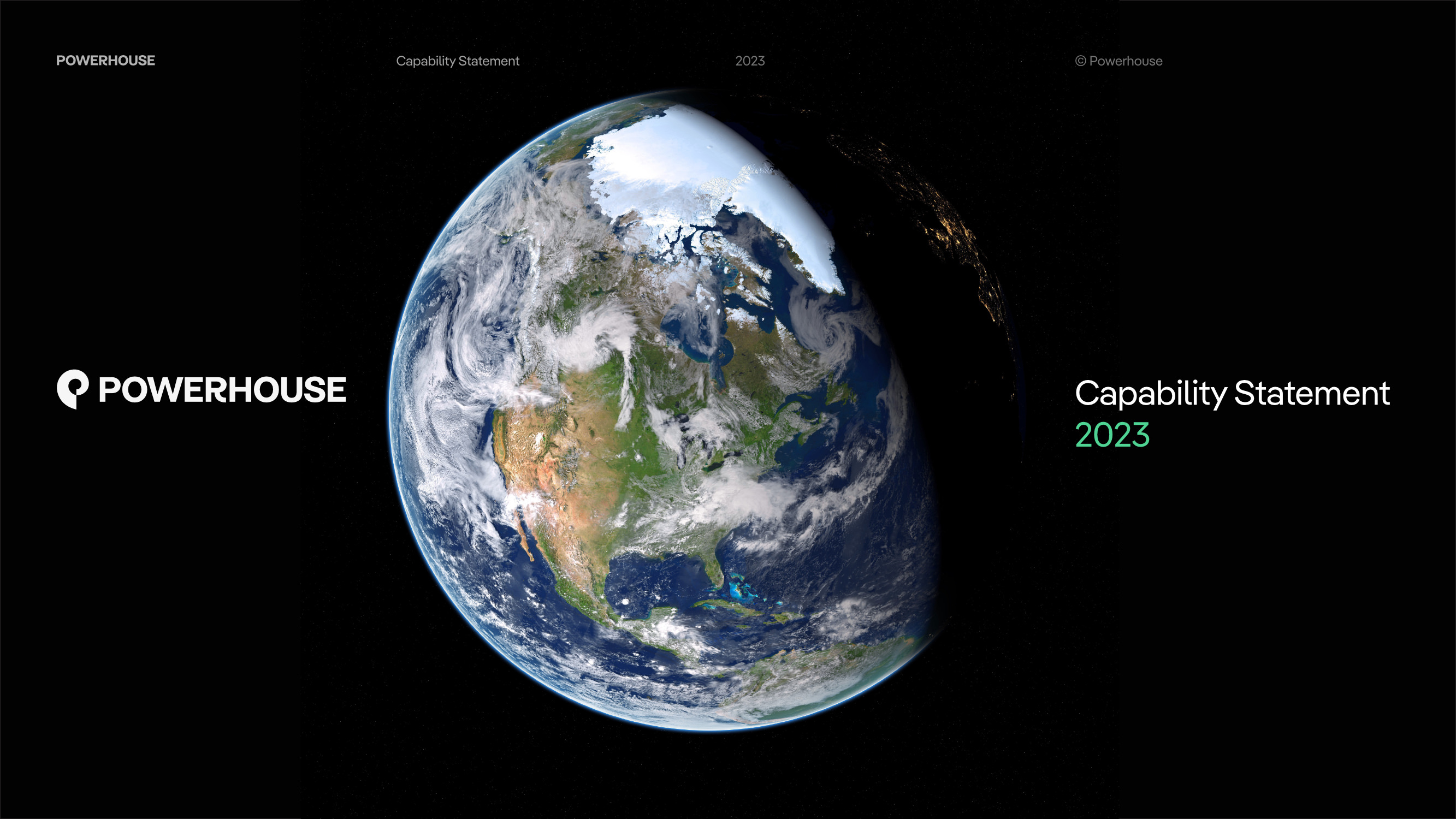
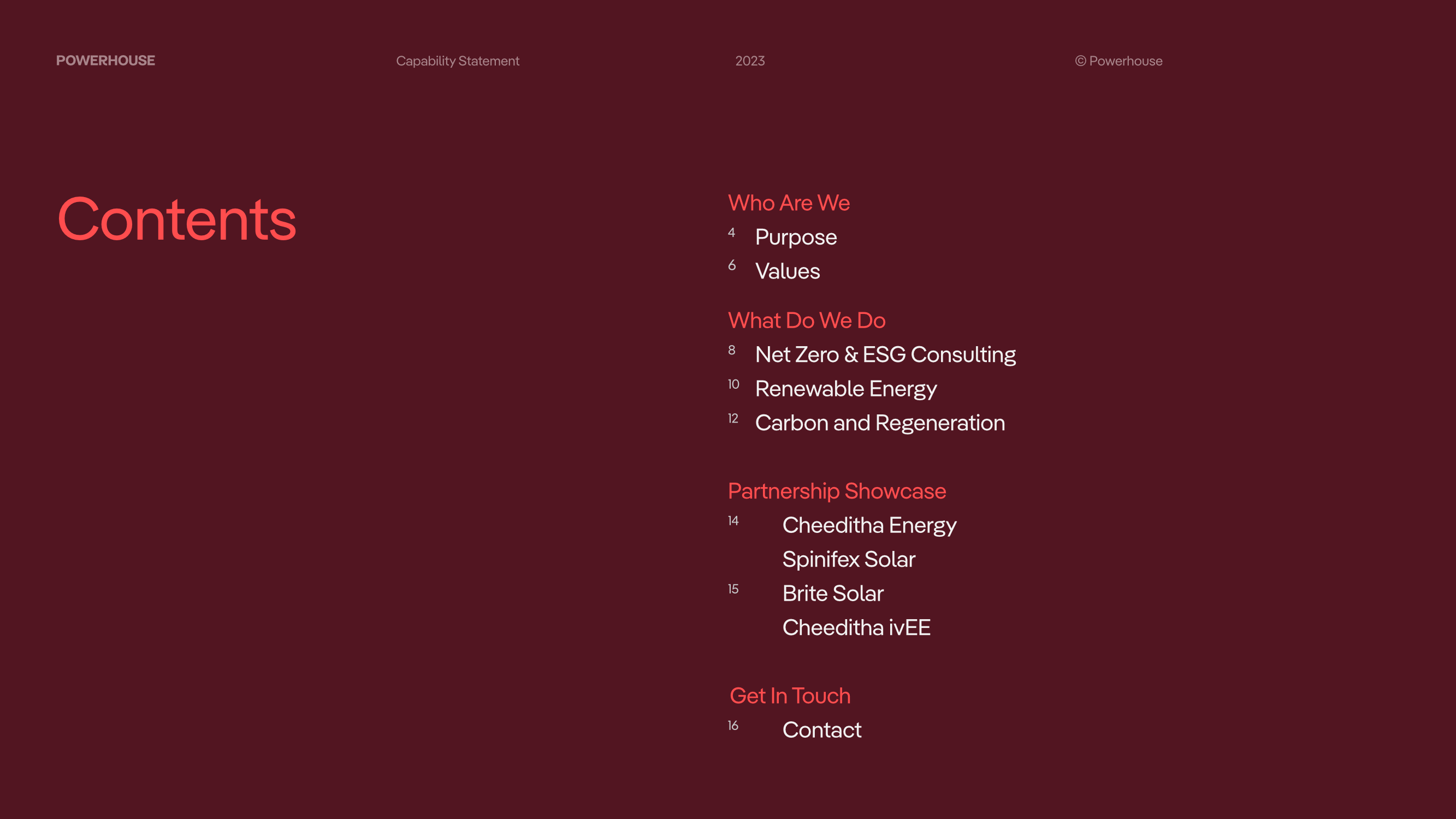
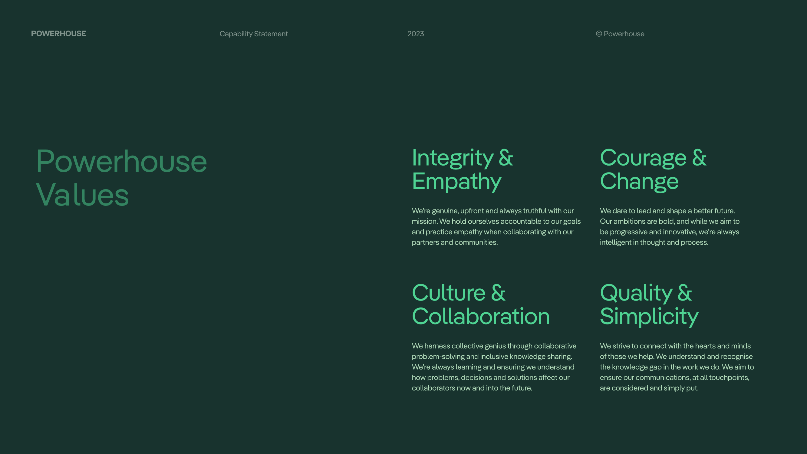
The house font is Pangea, an obvious choice because its designer, Christoph Koeberlin, invests 25 percent of his royalties for this font in reforestation projects. Jack O’Sullivan, the Founder and Art Director of Side By Side, describes his design strategy as follows: “Ethical and thoughtful design decisions are important in all projects, and we felt this particularly when working with Powerhouse because the company is committed to environmental solutions and social problems in Australia. Pangea is a beautiful font with clarity and character, but its added environmental benefits made the choice an easy one for the studio and the client.”
Pangea is a beautiful font with clarity and character, but its added environmental benefits made the choice an easy one for the studio and the client.
As a brand consultant, O’Sullivan knows the fine line between greenwashing and credibility. “The description of Pangea on Fontwerk’s website says, ‘Can a typeface make the world a better place? It can try to.’ We like this approach and we support it because the font gives a voice to a company that is doing just that.”
