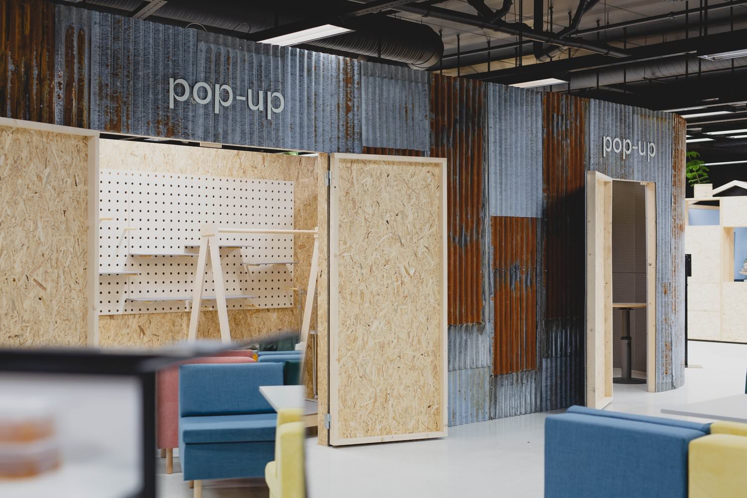
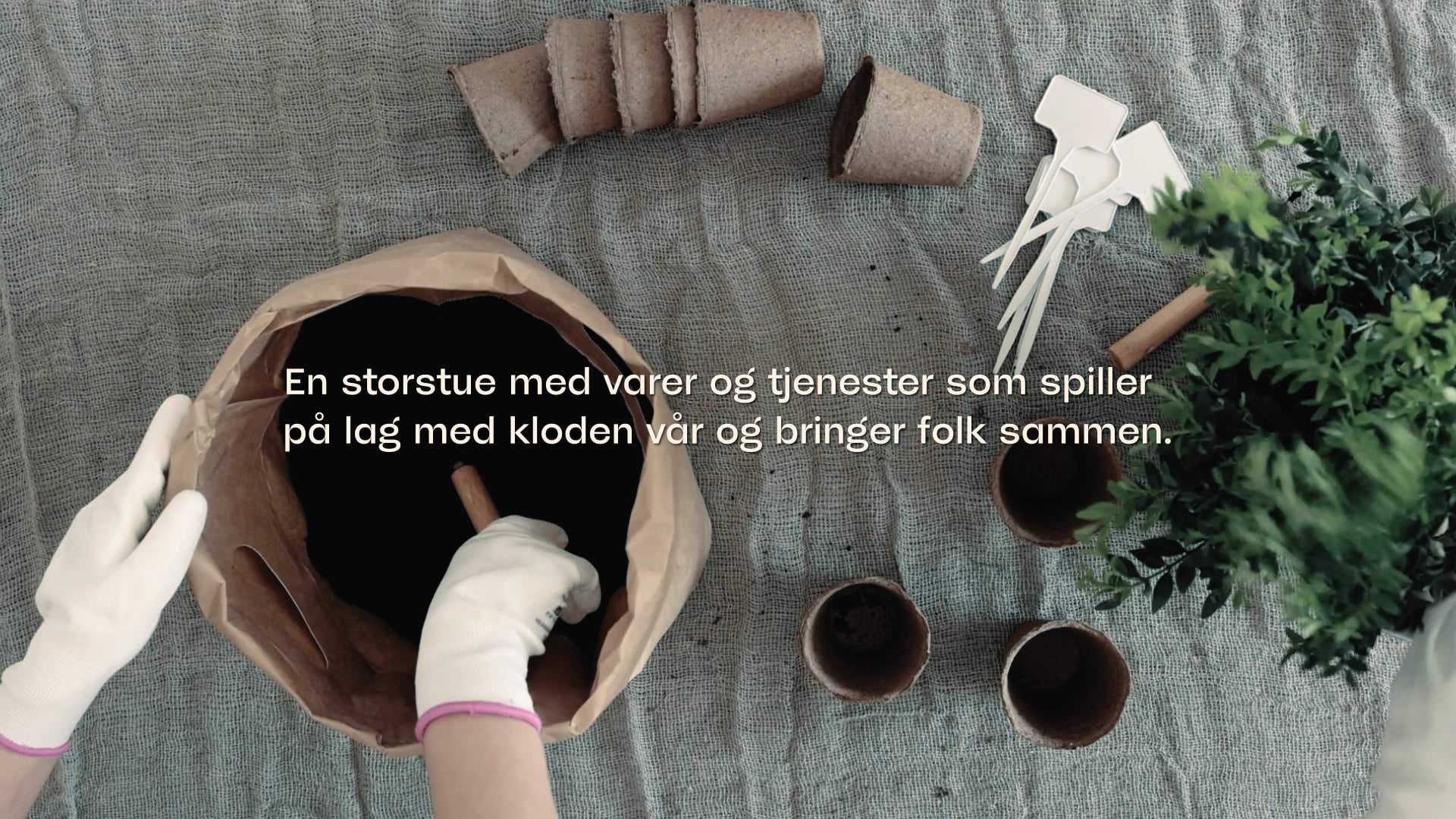
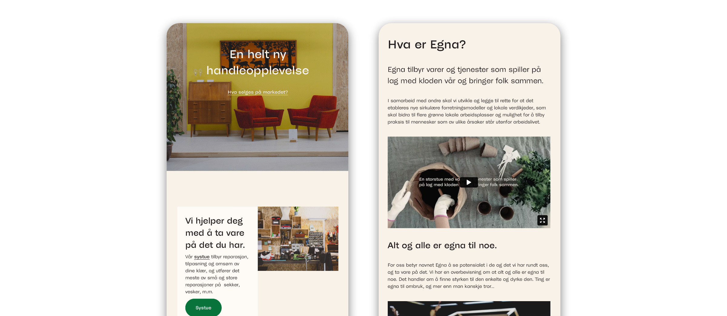
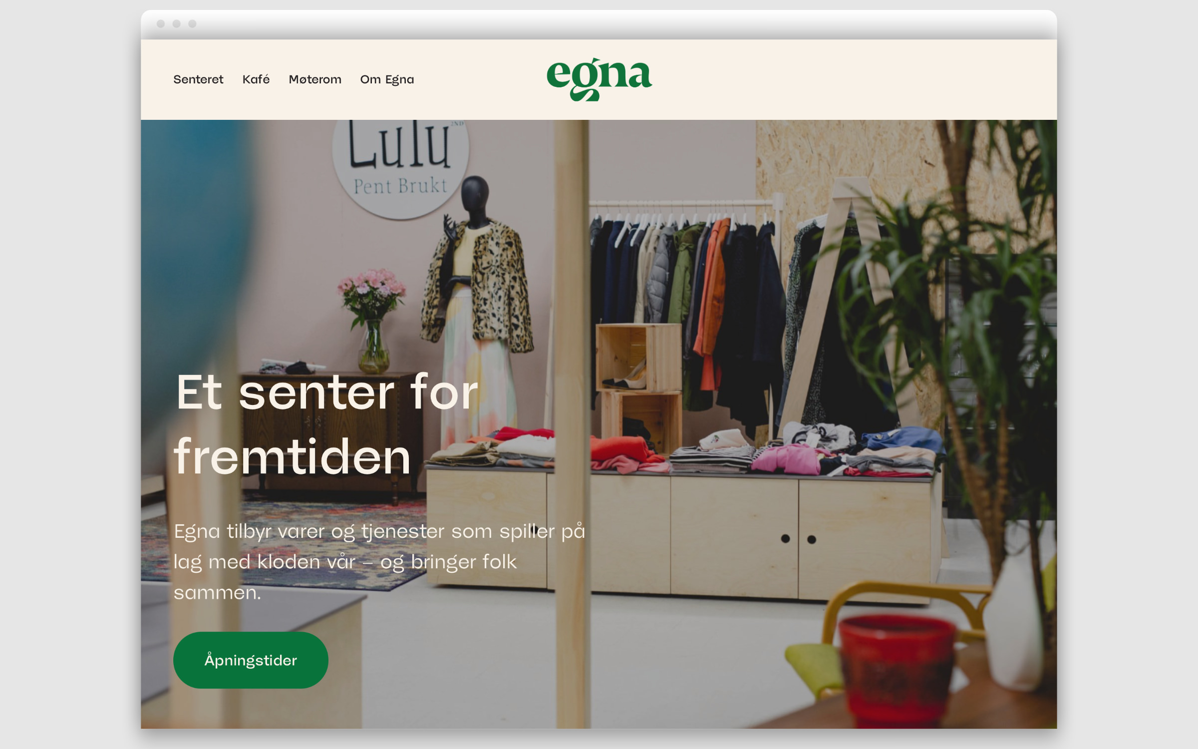
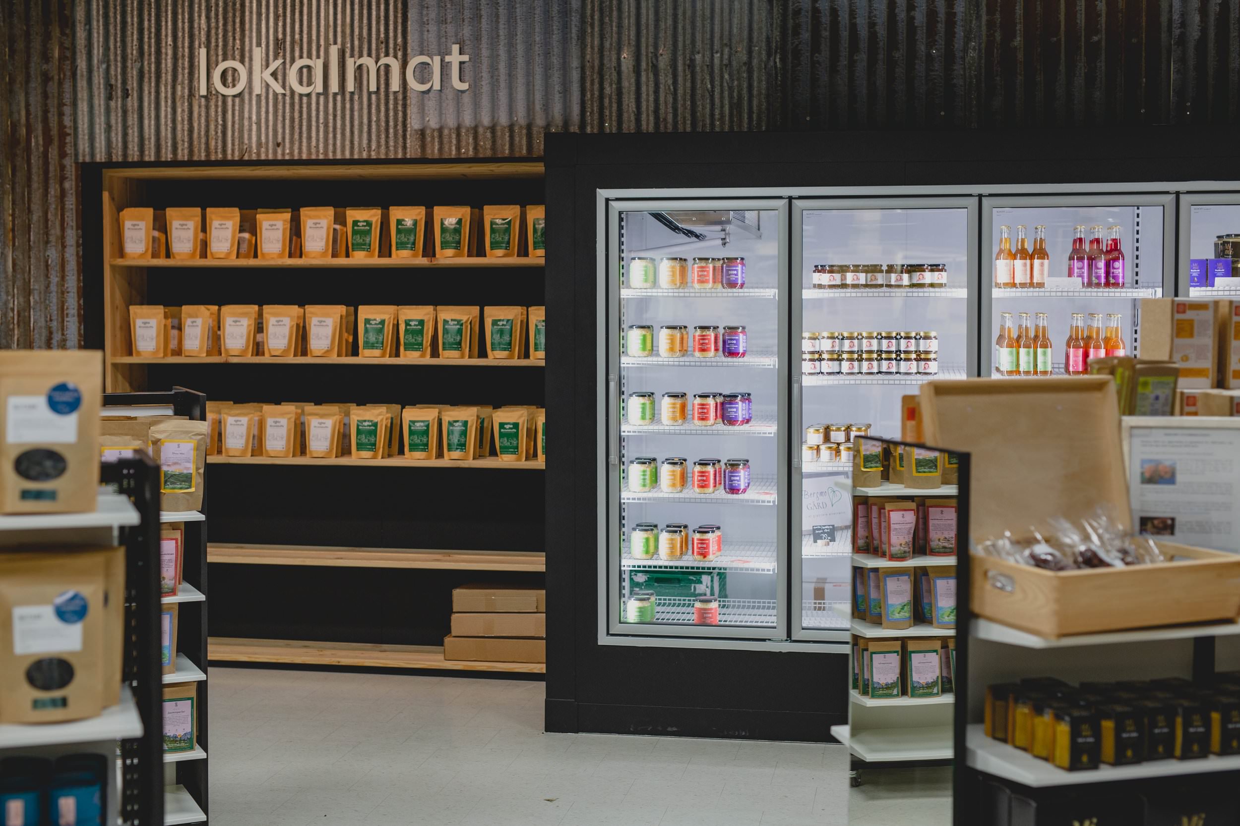
ut Egna is more than just a secondhand department store, it is a sustainability market. “In cooperation with a number of partners, we develop and promote new, circular businesses and local supply chains that contribute to more environmentally friendly jobs and business models. In addition, we offer people, who are outside the labor market, the opportunity to further their education” says the store about its concept and vision. The shops offer goods and services that are “in harmony with our planet”: recycled, refurbished, redesigned or locally sourced products.
Egna
Branding with secondhand charm
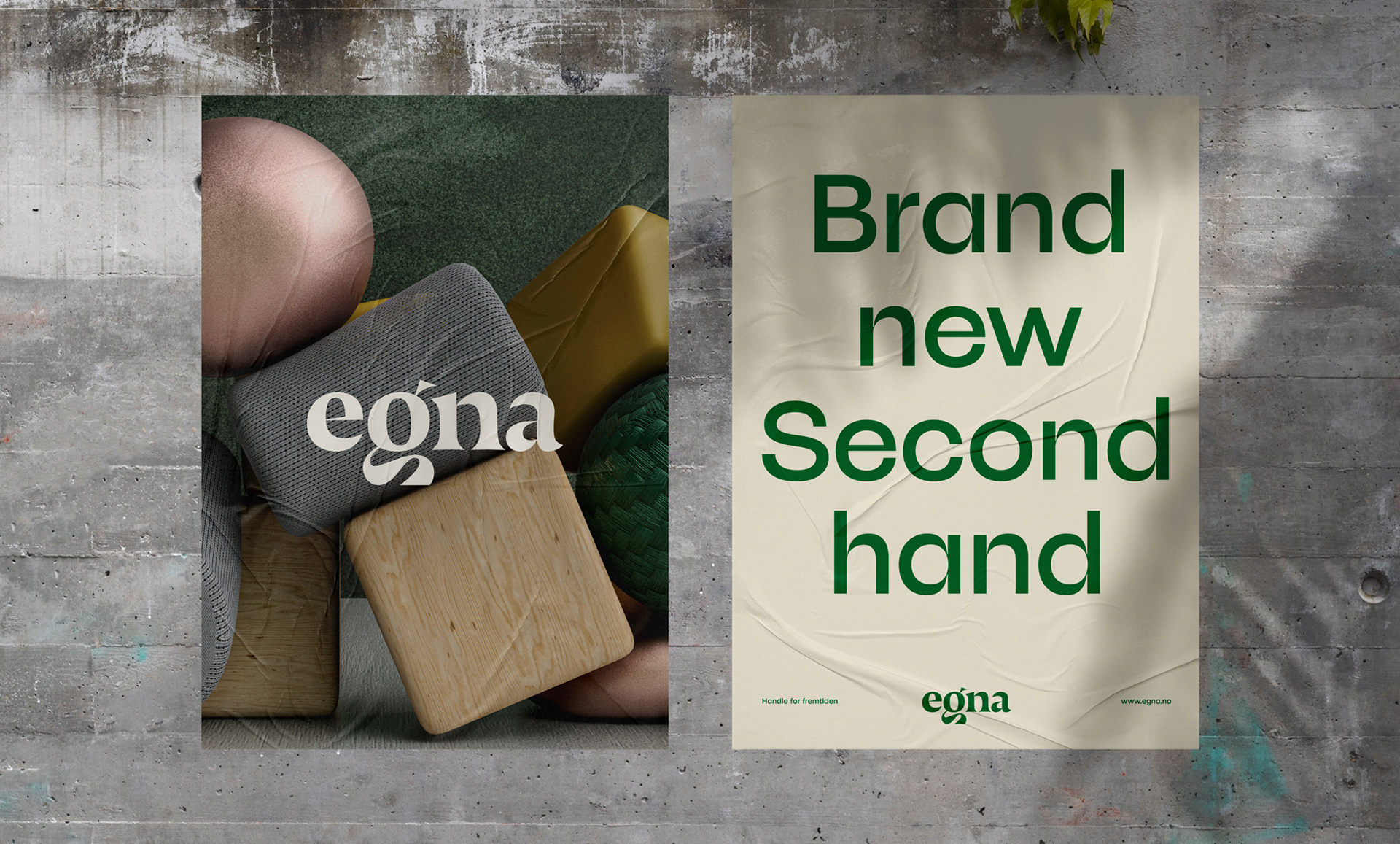
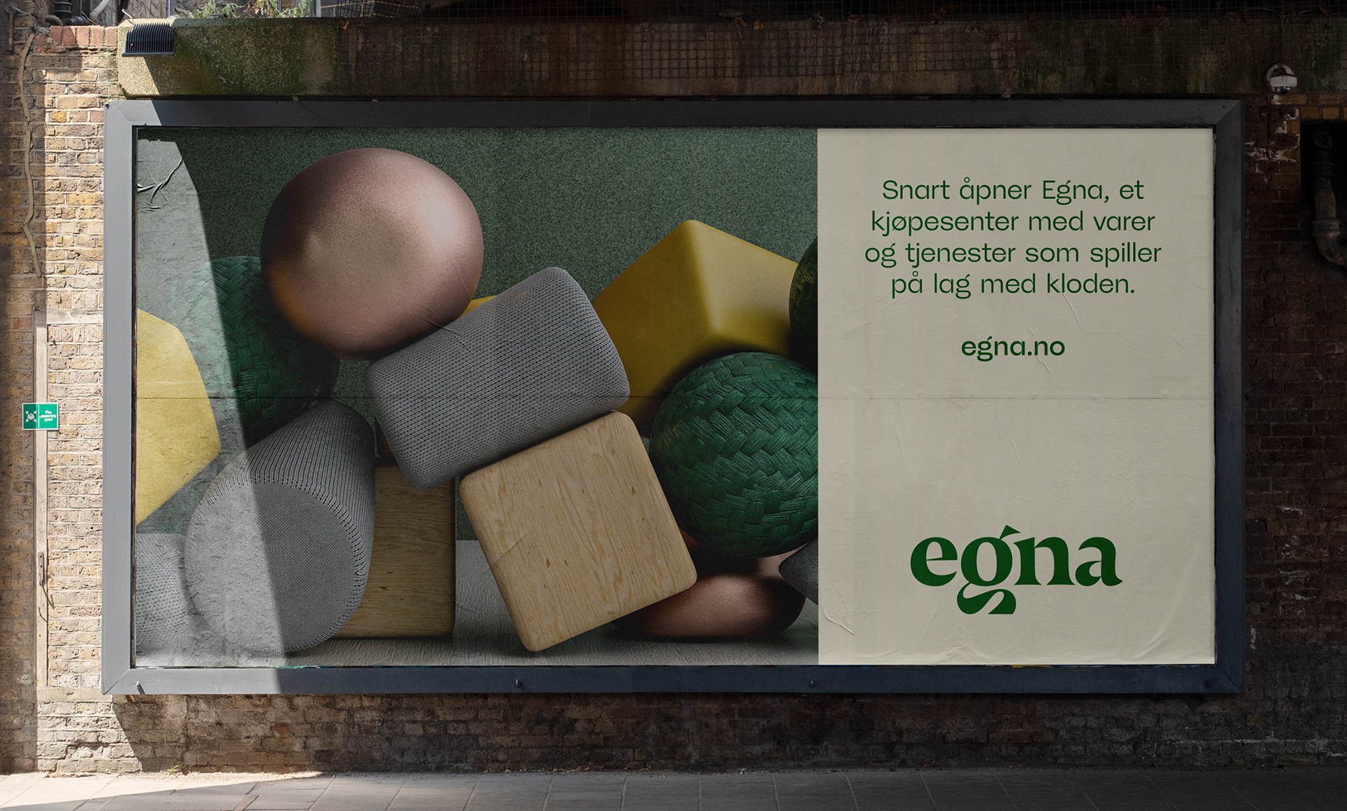
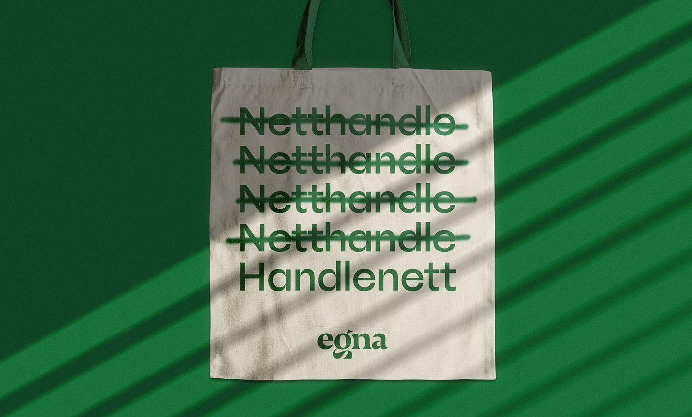
The development of Egna’s brand identity is also in line with its sustainability strategy. It was created by the local design company by north, an ambitious and forward-looking studio that works under the motto “Big Impact with a Small Footprint”. For their house font, by north chose the upright styles of the eccentric McQueen (Light to Black).
In their brand manual, the designers point out the strong contrasts and the whimsical ink traps of the McQueen letters, which underline the family’s craftsmanship: Each letter is an original, with small traces of use, so to speak. This formal character of the typeface fits seamlessly with the philosophy of the Egna Mall. Its logo, by the way, is set in Nocturno Display by Typotheque, with a specially designed lowercase g in the Nordic style, i.e. with a shortened descender.
