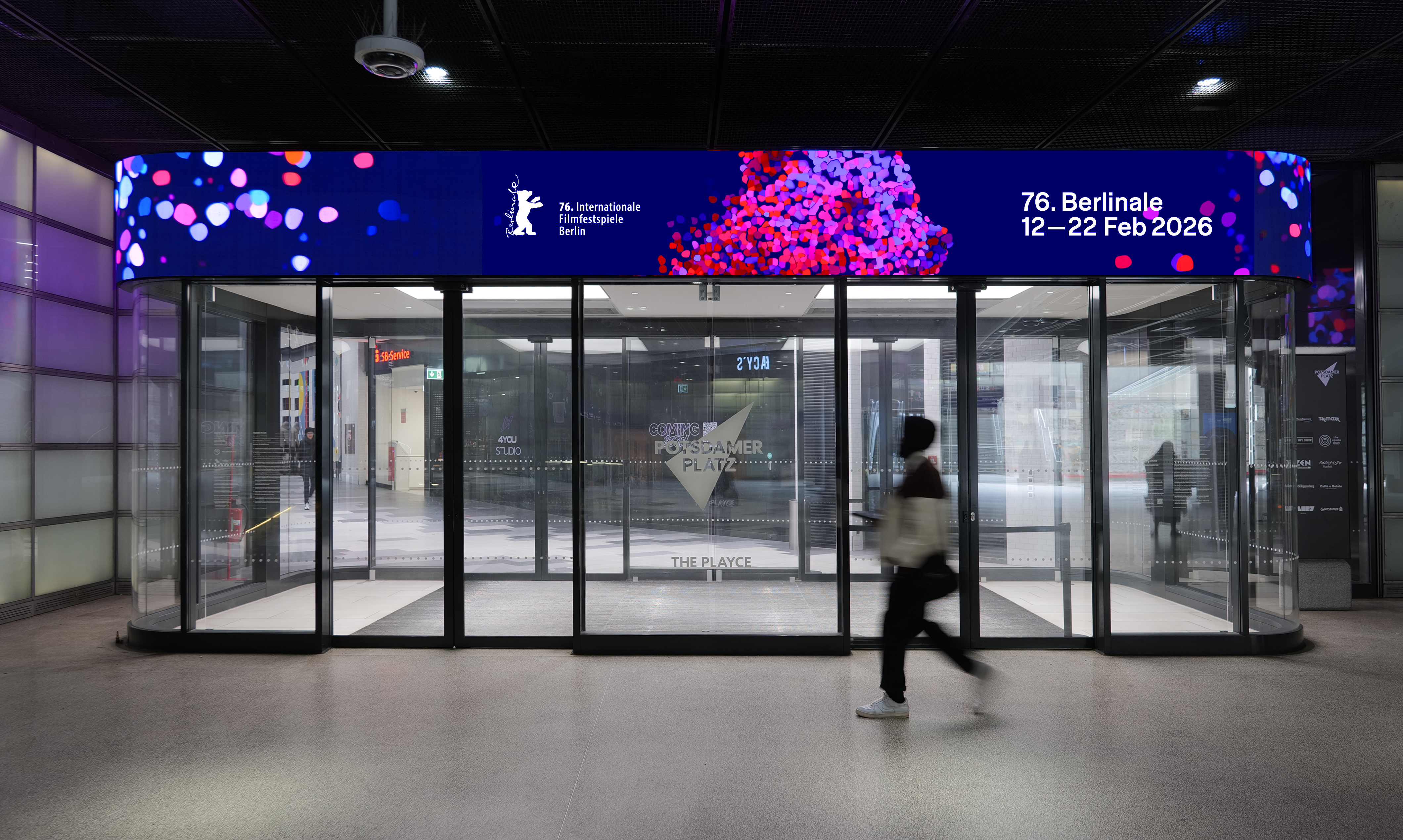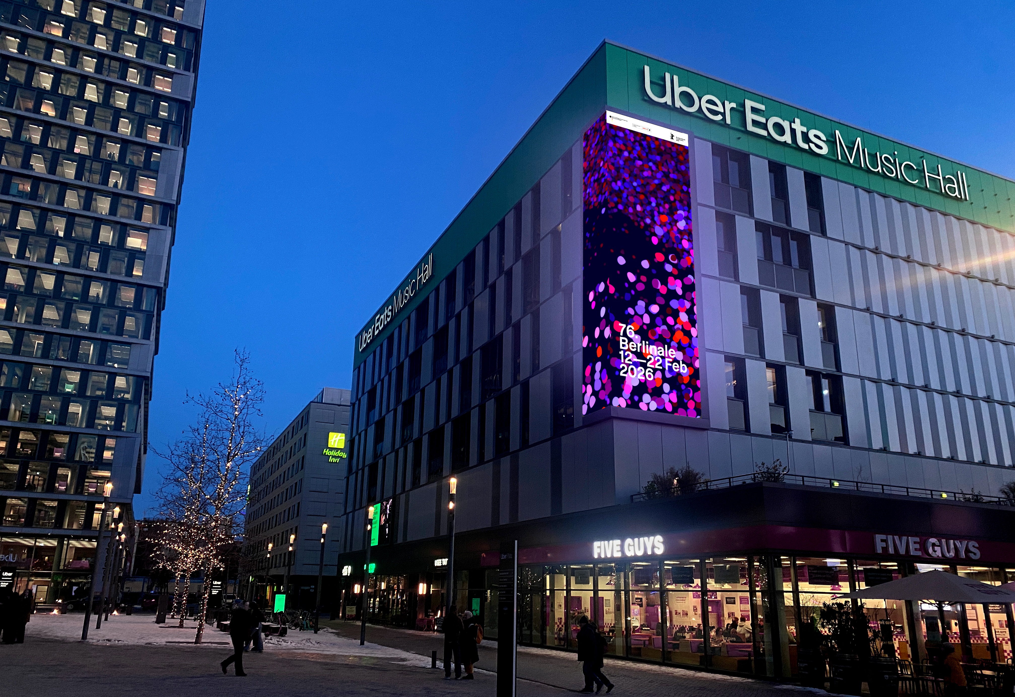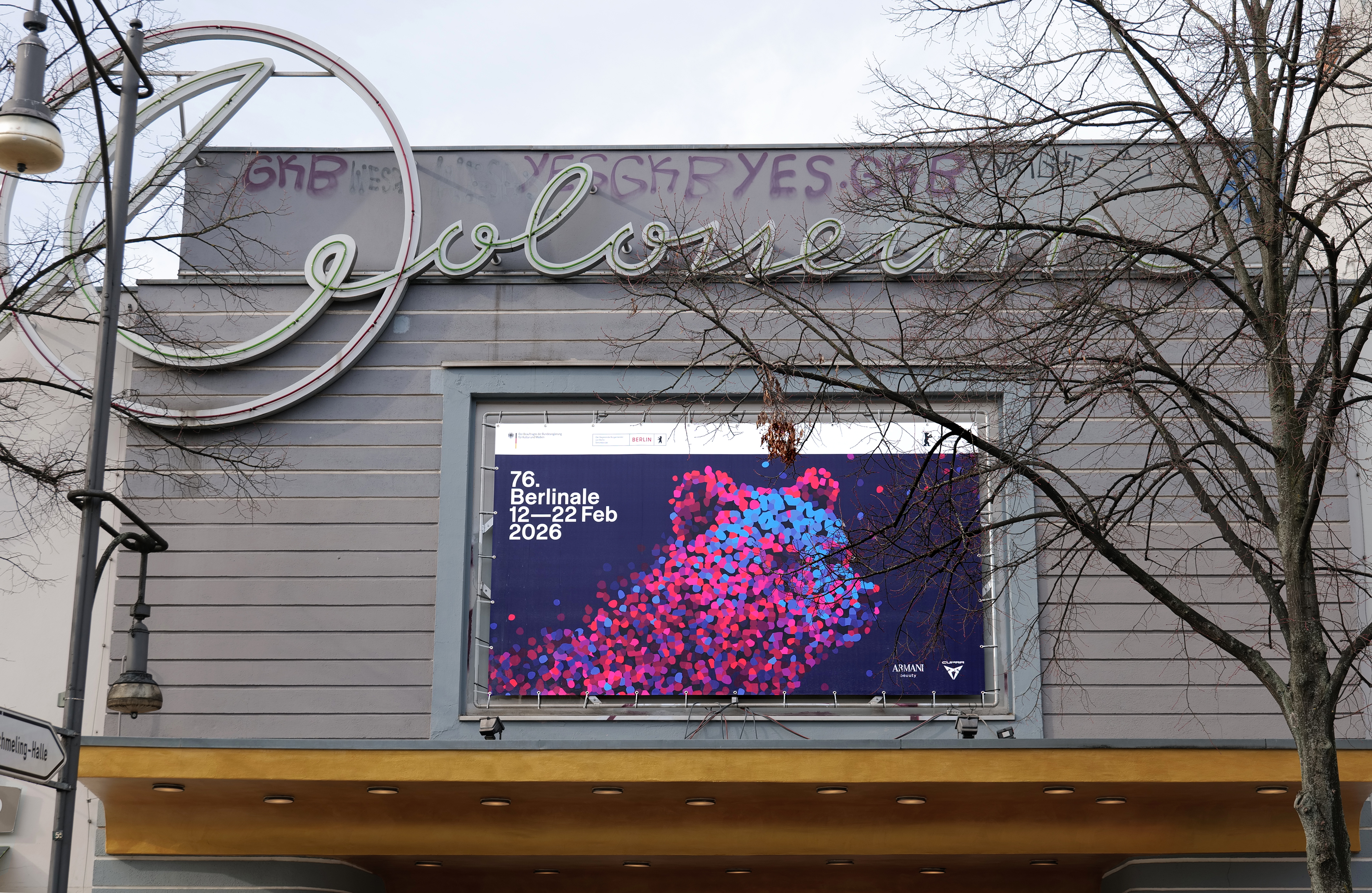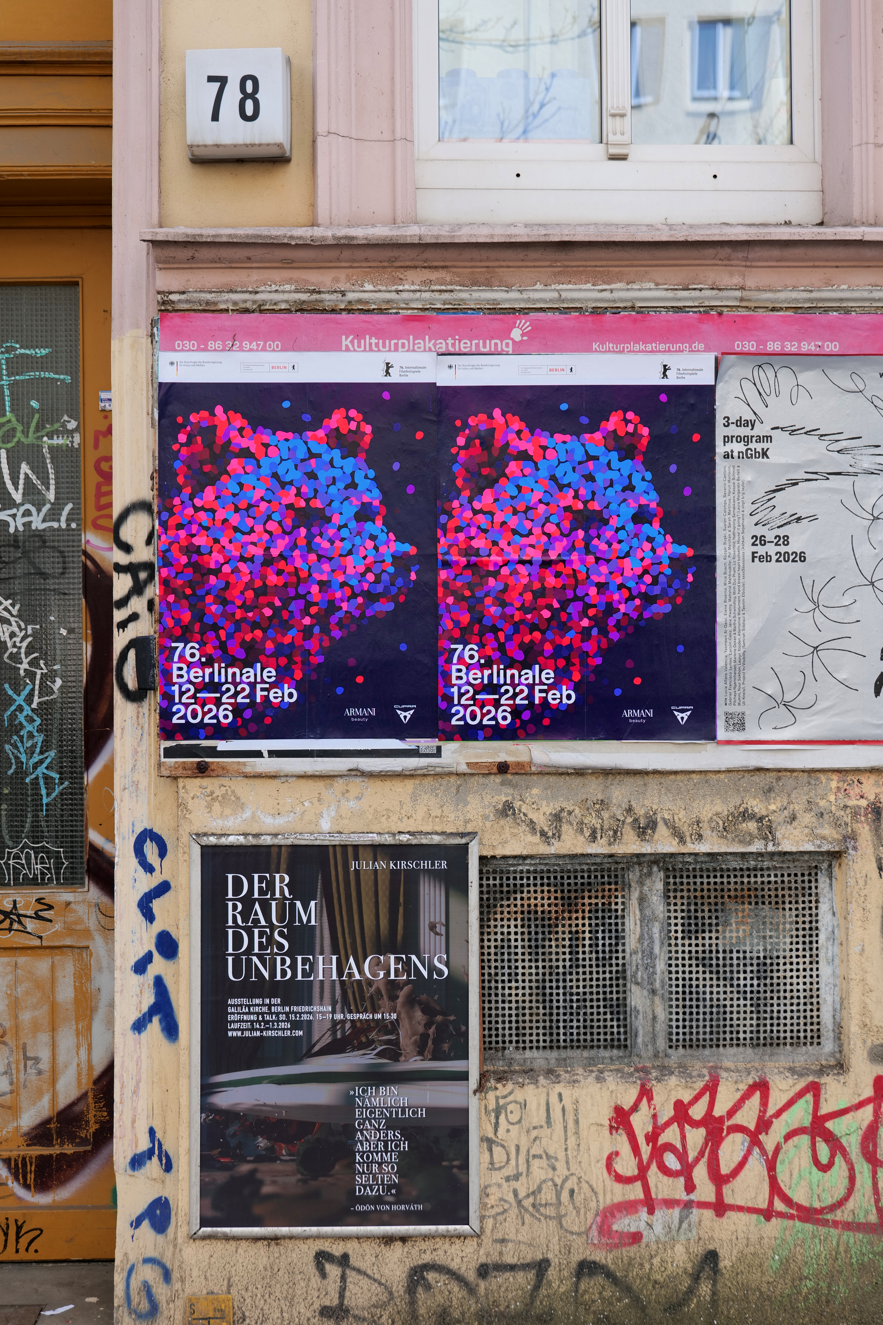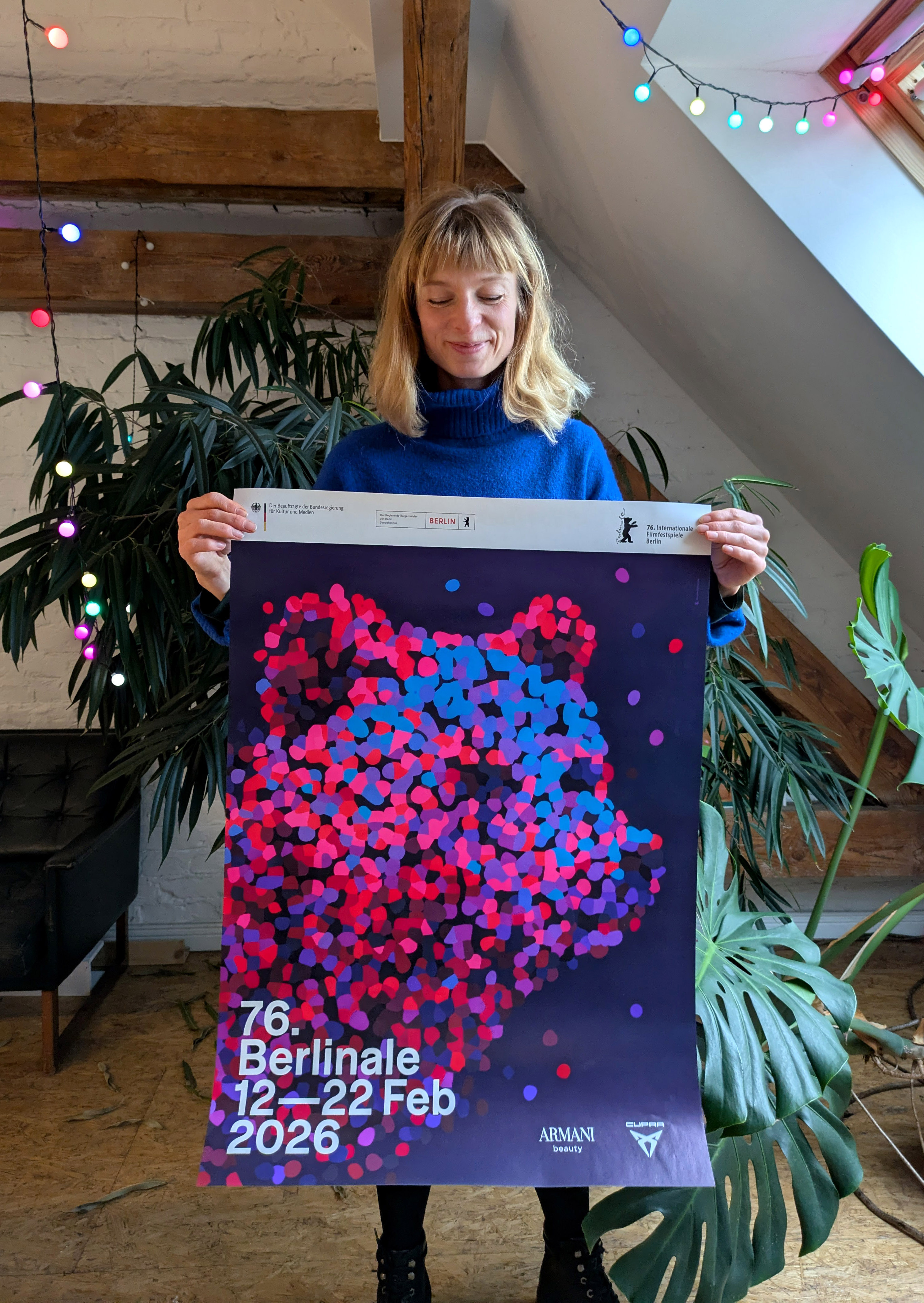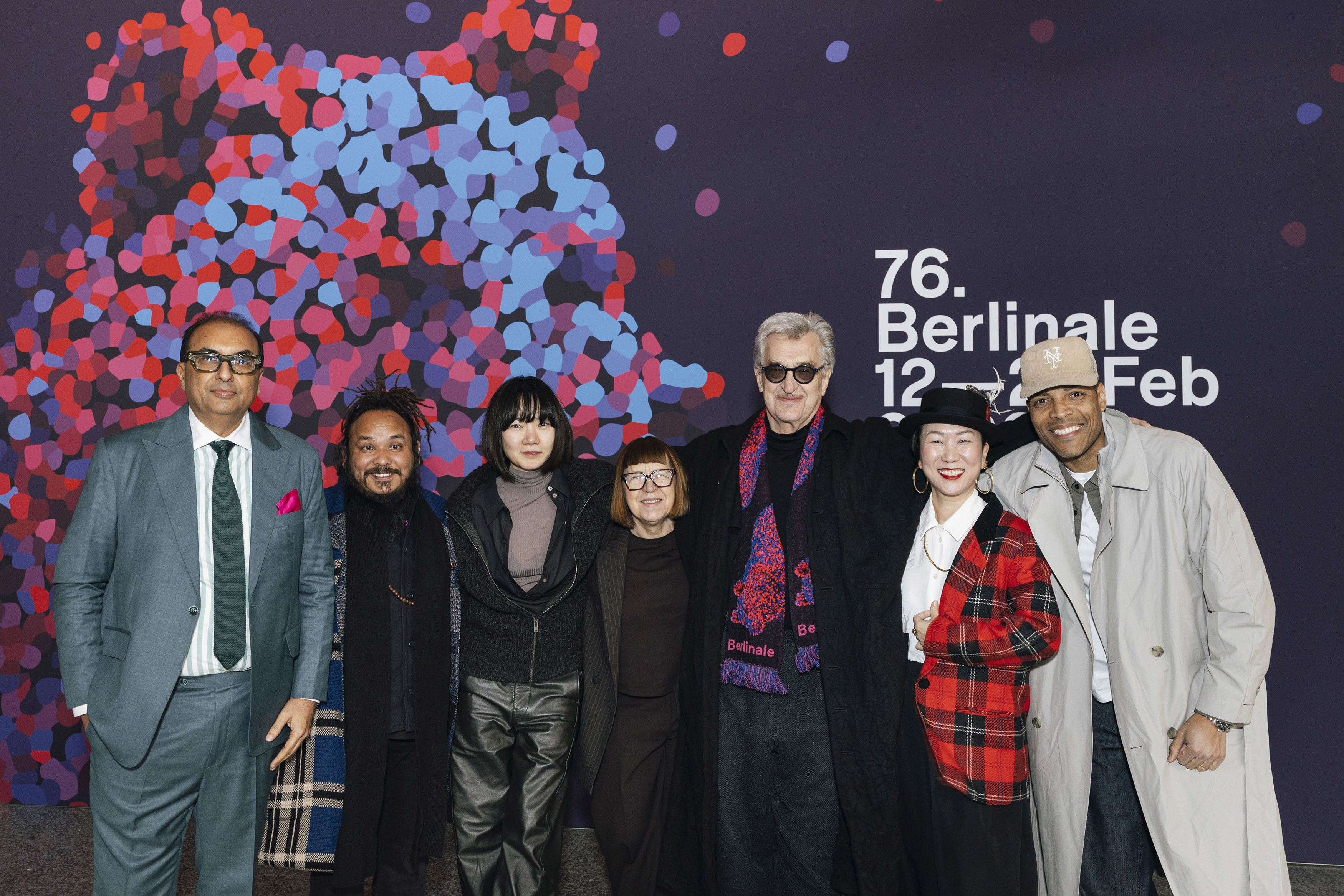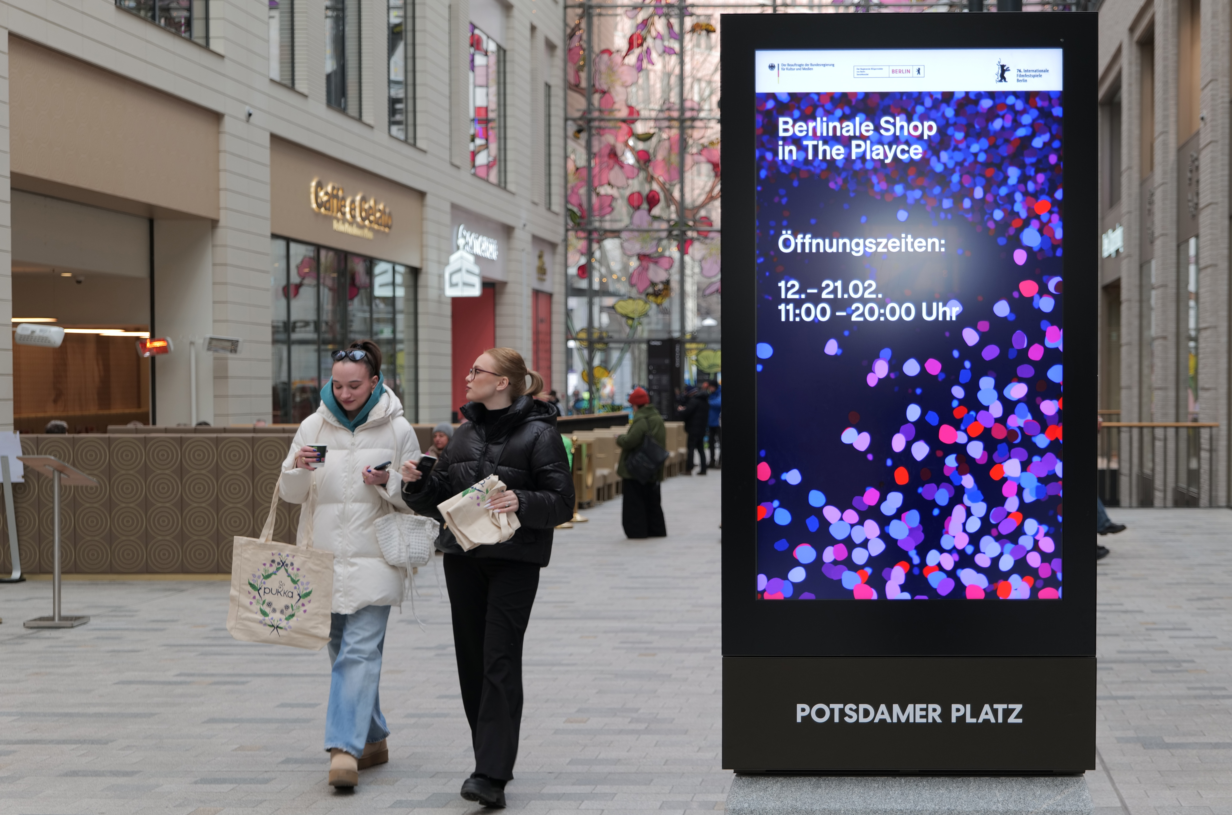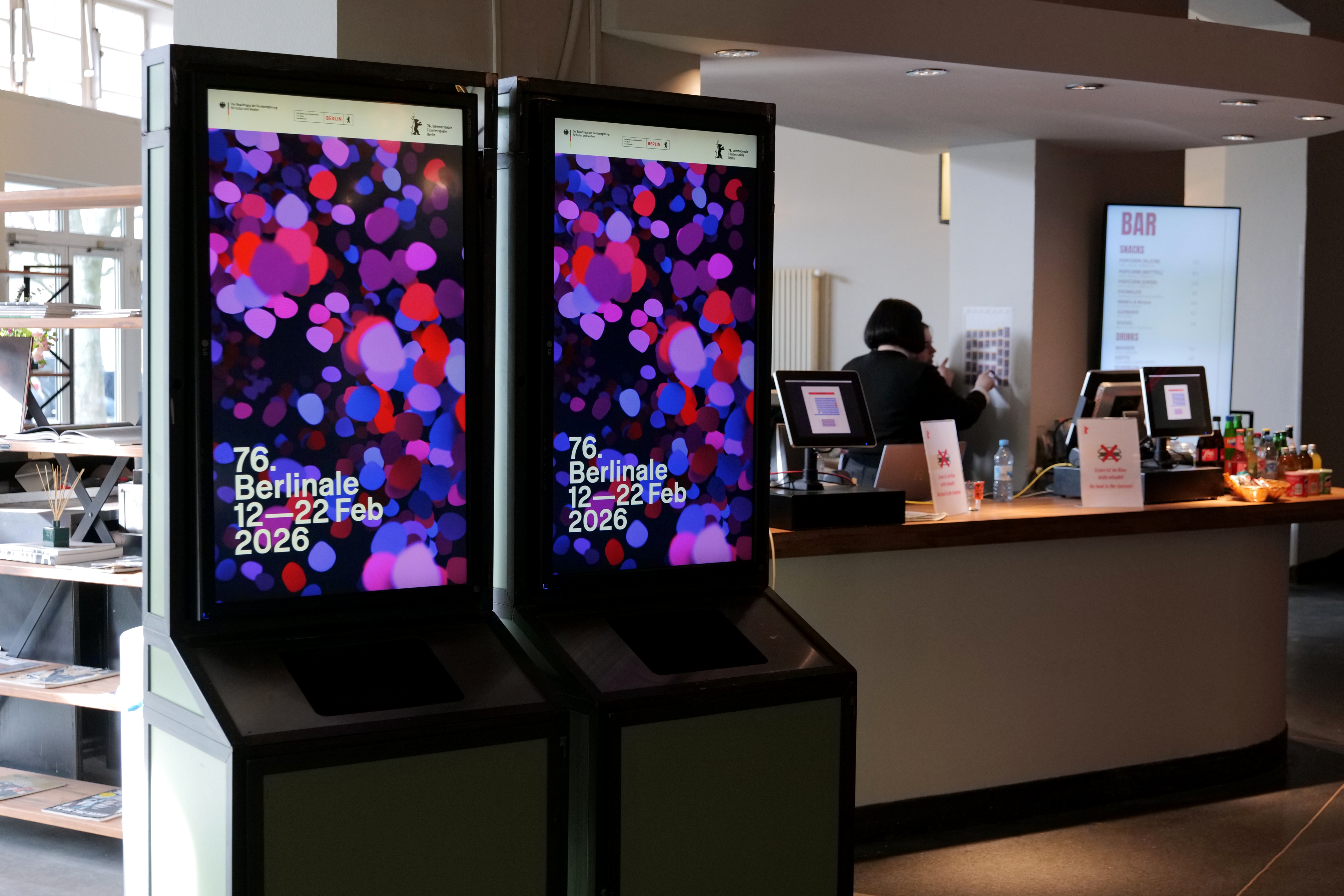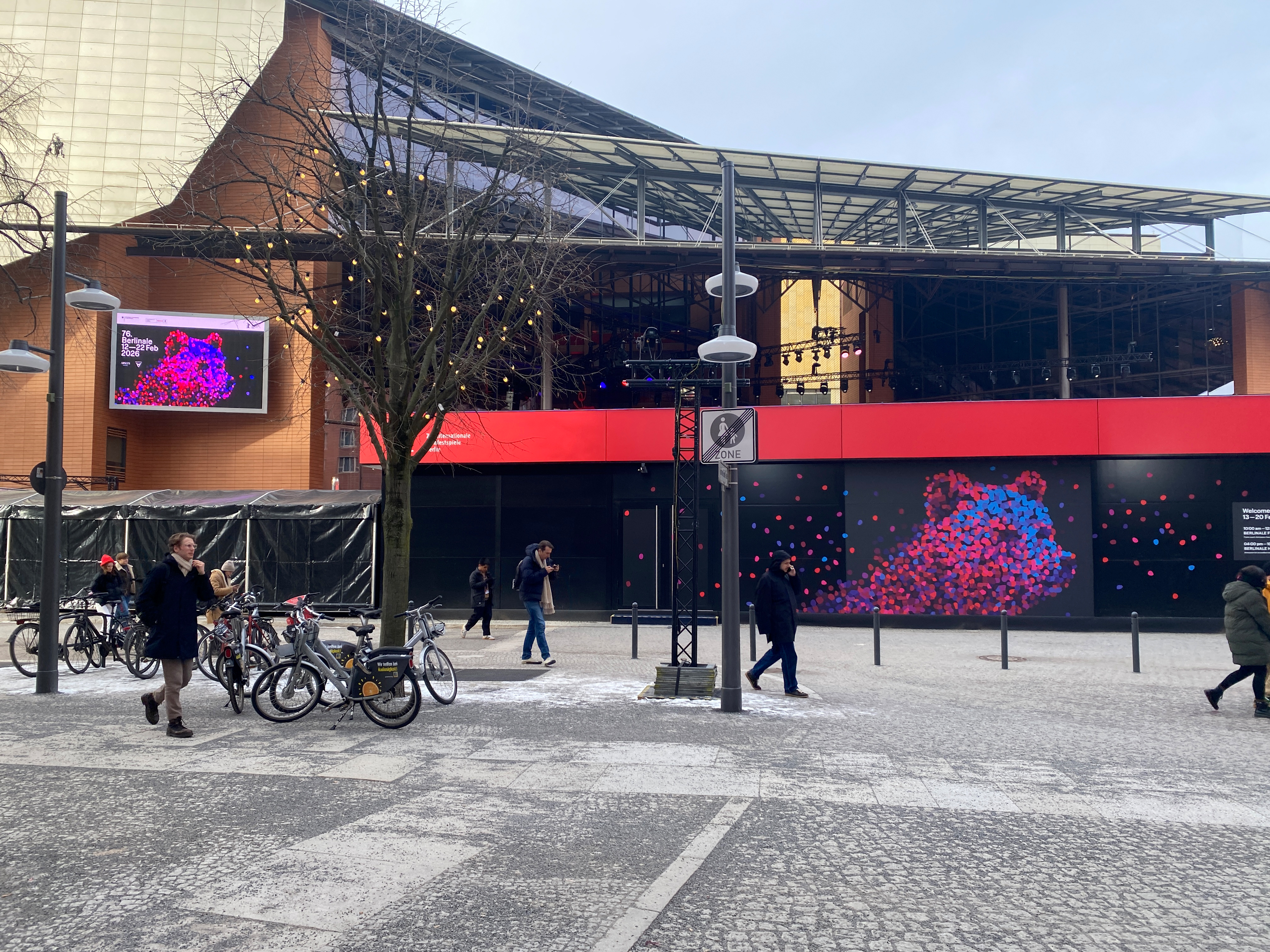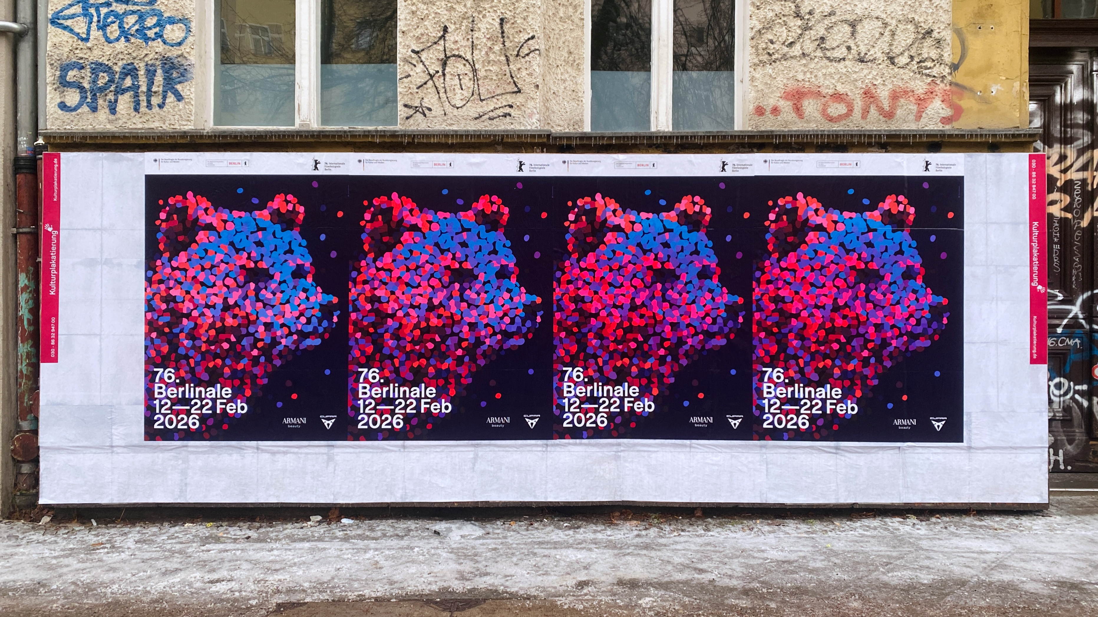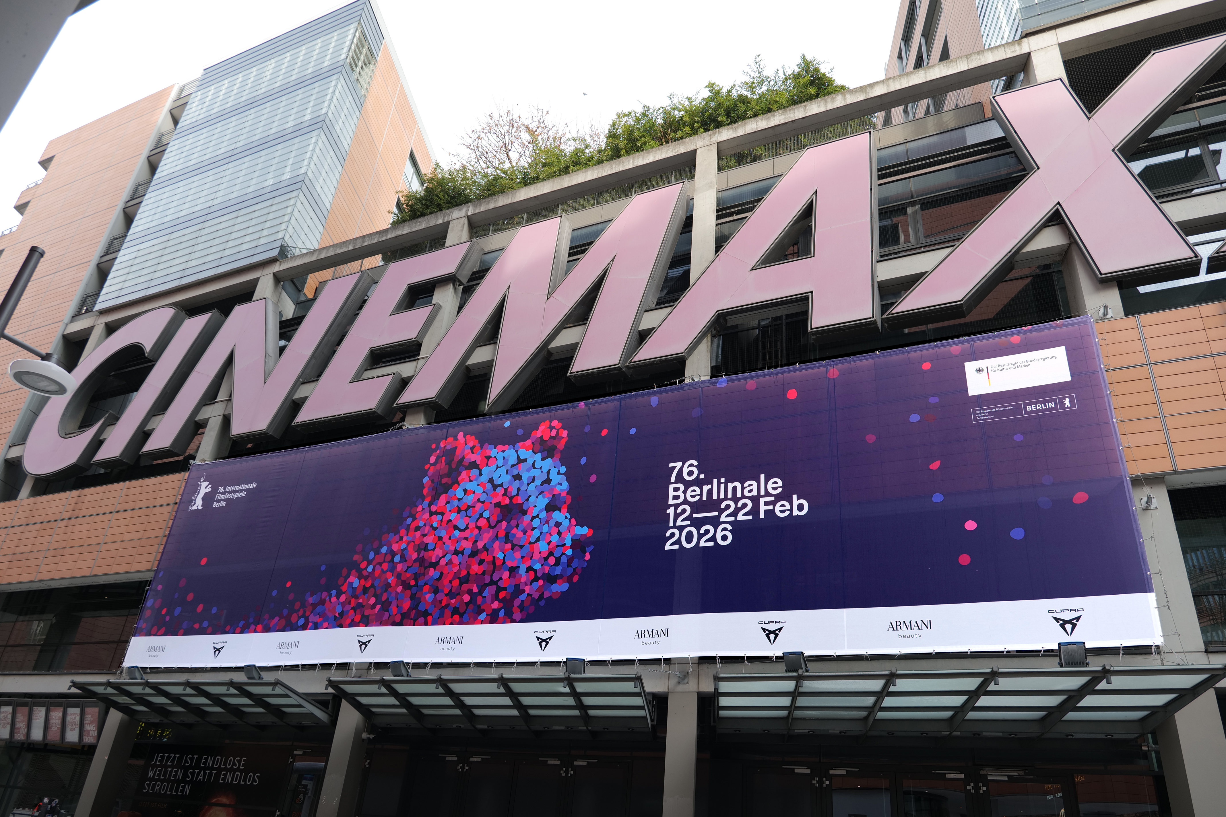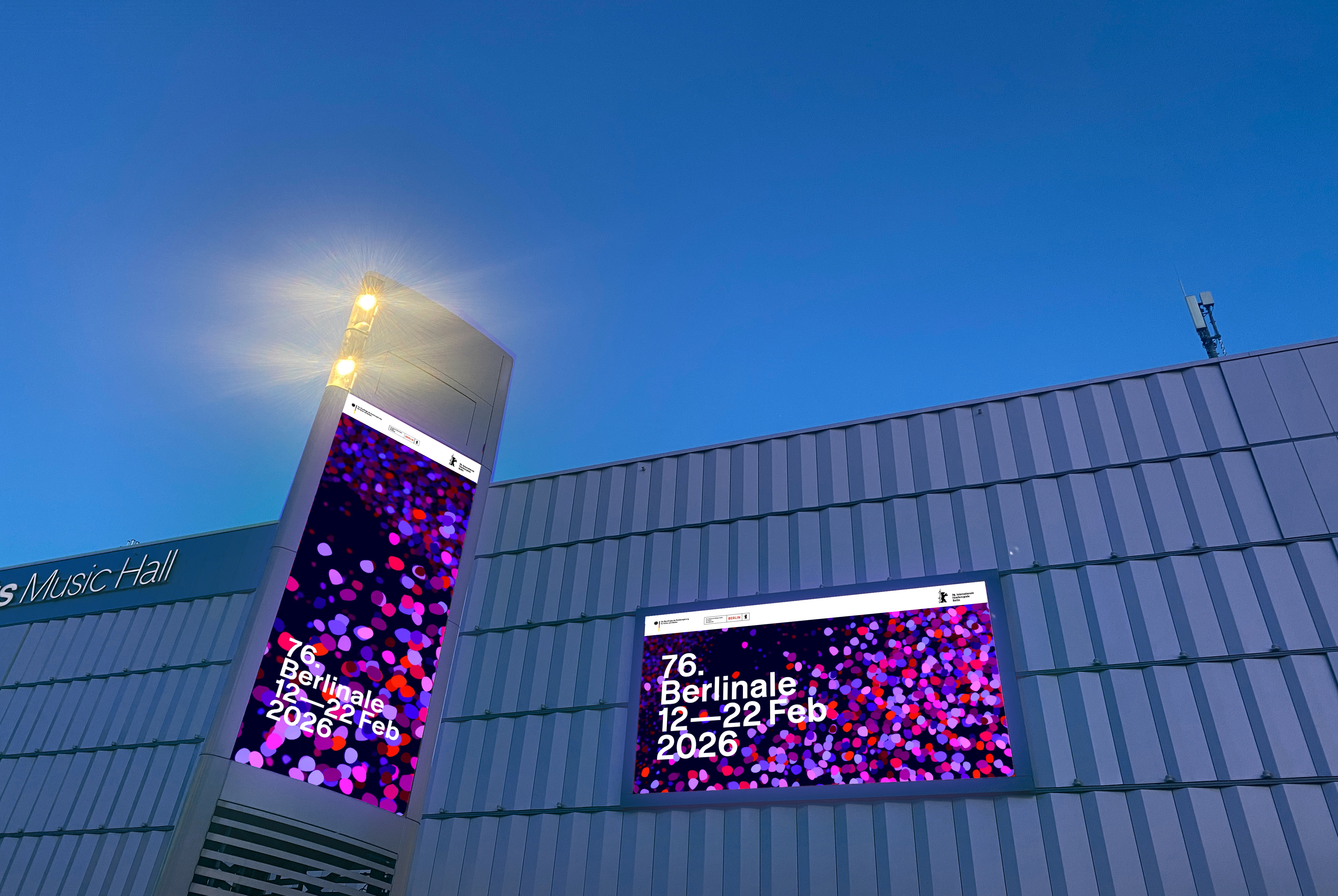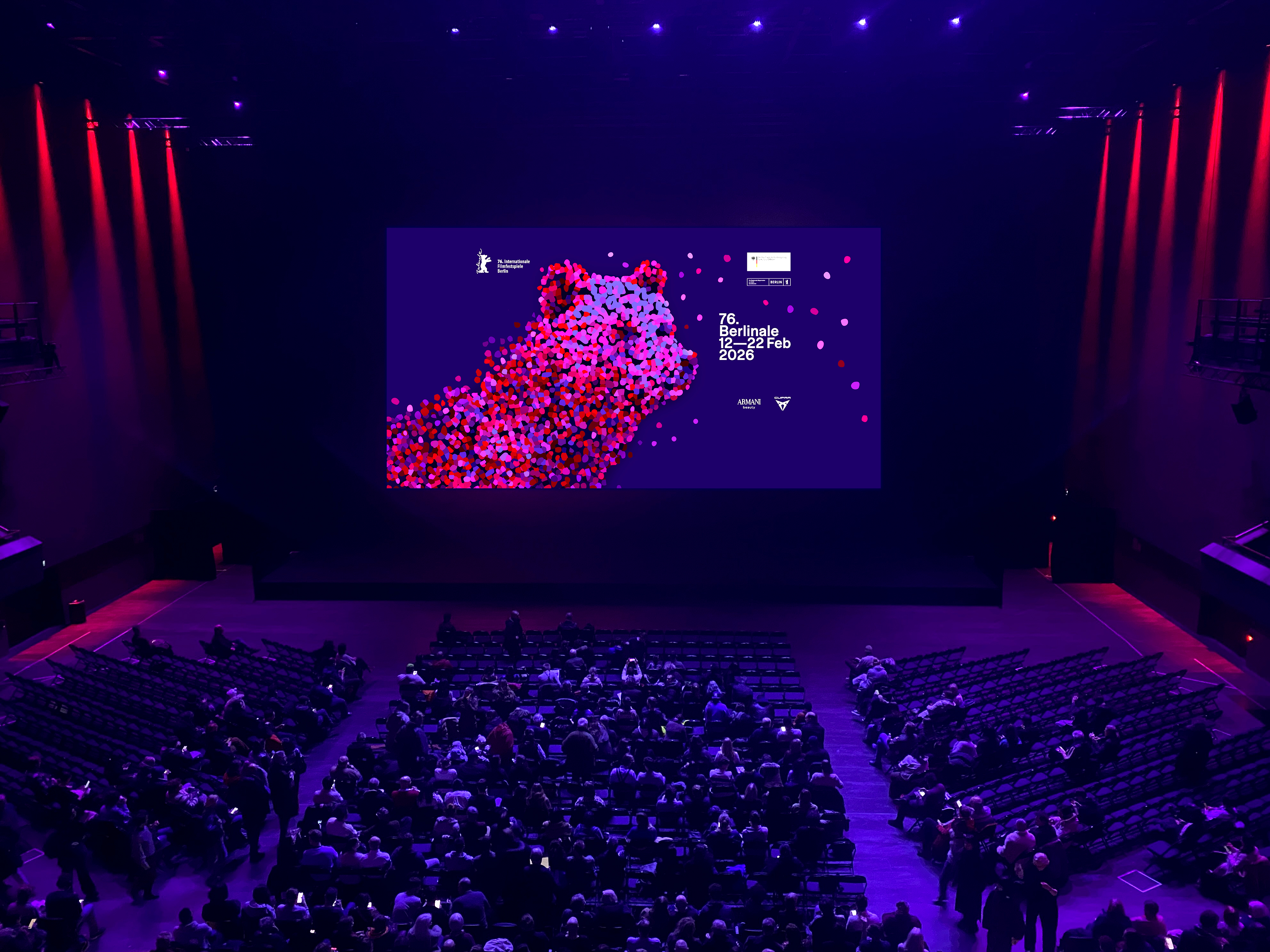
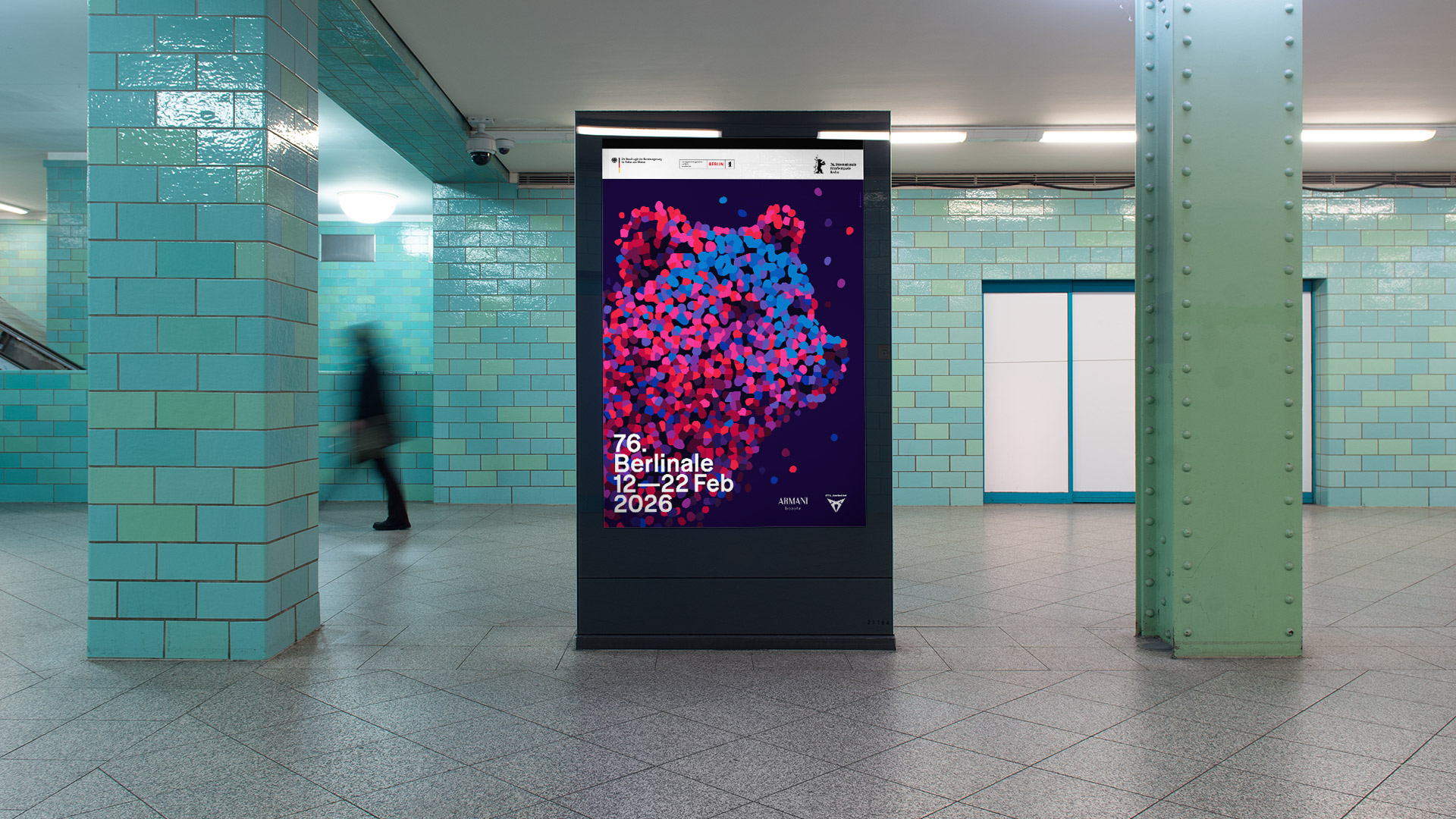
evertheless, the festival will be remembered for its powerful films and outstanding actors and actresses. Perhaps also for its visual identity, even if it only reached Berliners, tourists, and festival-goers. Berlin-based designer Claudia Schramke was once again responsible for the poster and key visual of the 2026 Berlinale. Festive, colorful, and playful, the bear returned to the center stage of the visual identity. Schramke describes the core concept of the brand as follows: “This year’s Berlinale Bear is a veritable festival creature, composed of points of light that represent people, perspectives, and films. They come together, connect, enter into a dialogue, and collectively become something greater and stronger.”
Berlinale 2026
Light, Color, Attitude: The Visual Identity of the 2026 Berlinale
To contrast with the vibrant colors of the key visual, Schramke chose a clean typography. White, static text set as a consistent typographic block — compact, precise, and in a uniform font size. This rigor ensures a powerful visual presence and clear legibility. For the typeface, the choice fell on Tausend, a new sans-serif family from Fontwerk, designed by Christoph Koeberlin in collaboration with Gabriel Richter. Tausend follows in the tradition of German sans-serif typefaces, but with an anarchic core: the slight overhang, the gentle top-heaviness, the smile and wink in the curves.
Koeberlin describes his typeface’s personality as: “Brutally honest, self-assured, and confident.” Not a bad choice for a festival that has had to weather a lot of headwinds. In particular the optical size, Tausend Medium, which is dense, compact and with unpolished forms, leaves a strong and lasting impression on the branding.
“Visually, Tausend stands out with its clear, concise design and unmistakable Berlin flair: minimalist, self-assured, and subtly distinctive. It remains understated enough not to dominate, yet possesses enough character to lend depth to the visual identity. Providing an ideal complement to the expressive yet delicate, particle-based key visual.” noted Claudia Schramke.
Tausend remains understated enough not to dominate, yet possesses enough character to lend depth to the visual identity.
For Fontwerk, the 2026 Berlinale appearance is more than just another case study. For the second year in a row, Claudia Schramke has chosen a typeface from our library for the globally renowned film festival (in 2025, she chose Pangea). The fact that a designer has once again reached for one of our fonts is no coincidence: it speaks to the breadth and contemporary appeal of the Fontwerk portfolio.