News of a fantastic in-use case for Pangea Text, another award win for Neue DIN, some Pangea Condensed reviews and a little reminder about DIN 91379
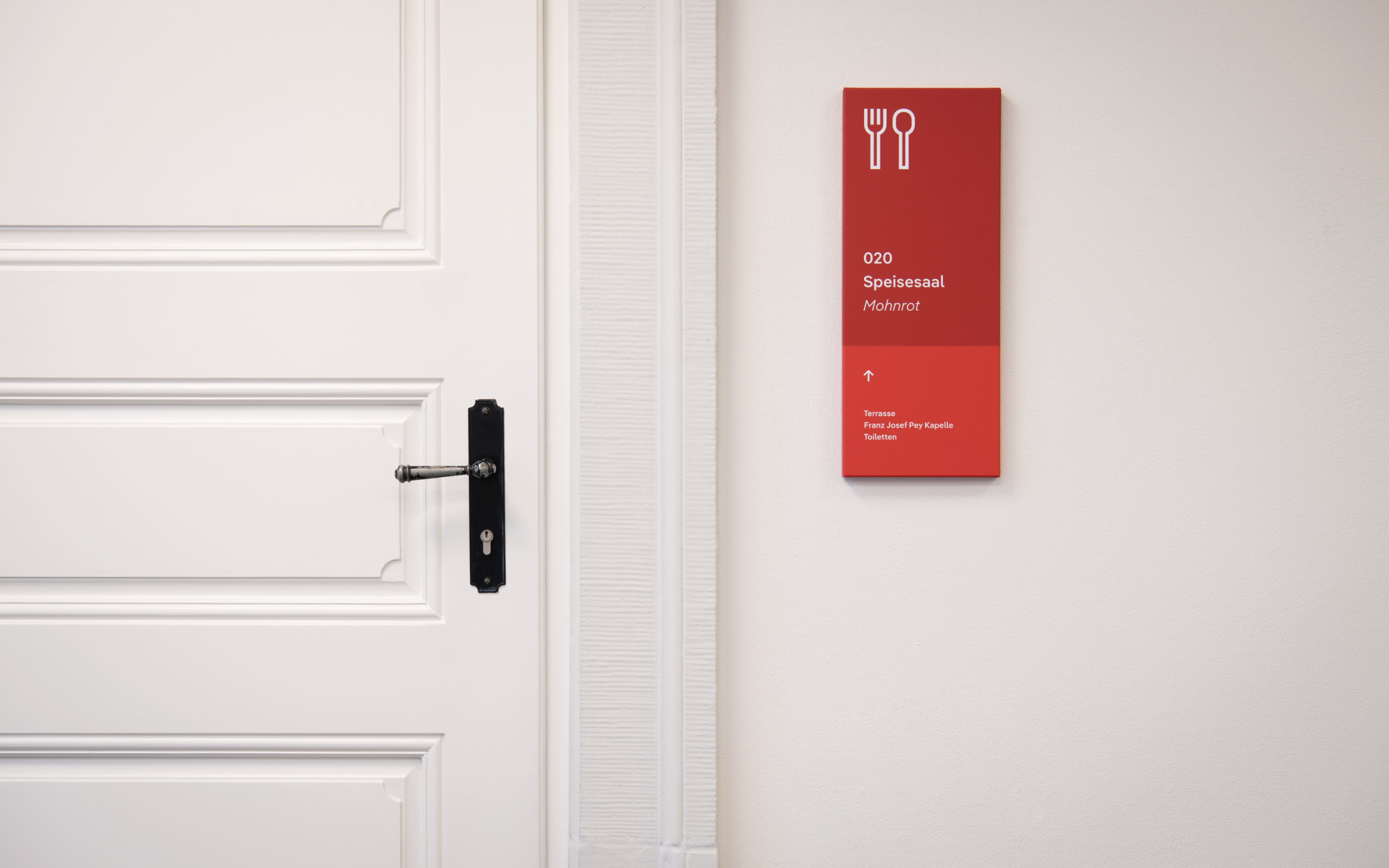 | DIFFERENT SHADES OF RED AND PANGEA |
|---|
|
As Summer slips away and we look towards September, in this month’s round-up we’re delighted to share news of a fantastic in-use case for Pangea Text, another award win for Neue DIN, some Pangea Condensed reviews and a little reminder about DIN 91379. So settle down and read on to find out more. |
|
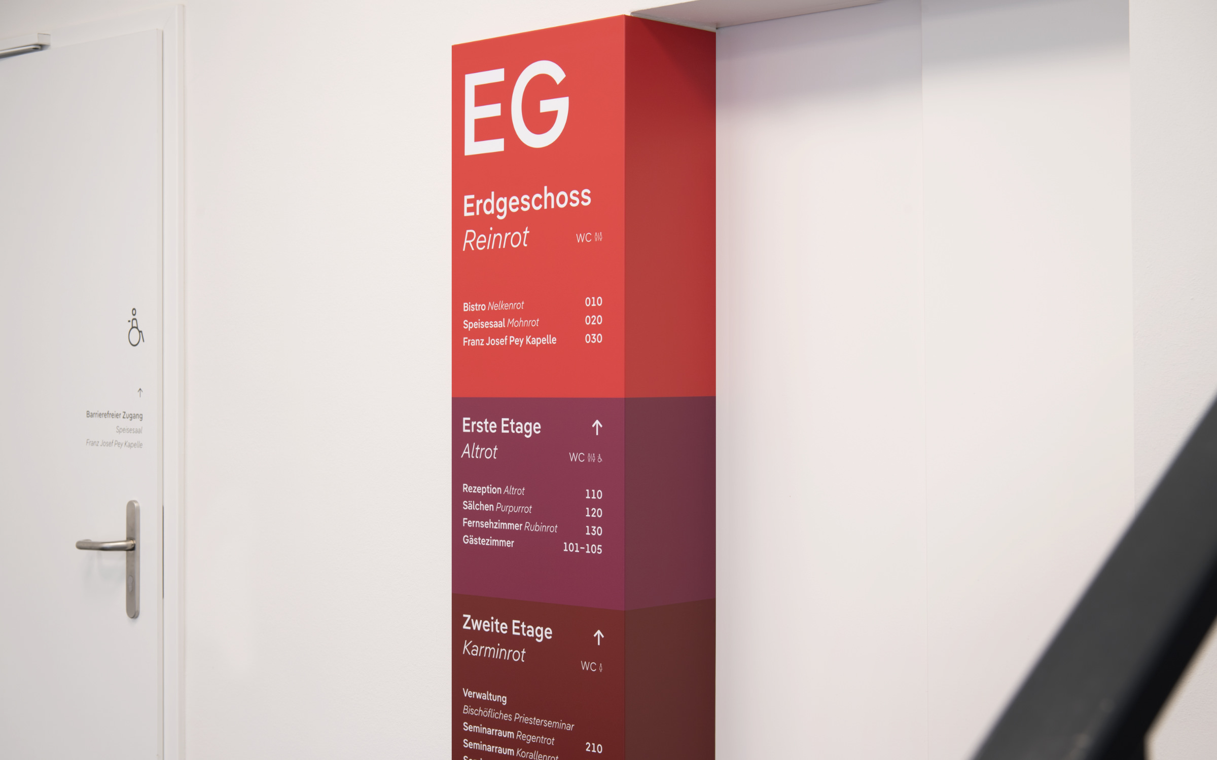 | | The three floors of the seminary are characterized by different shades of red; the white lettering is set in the geometric-humanistic sans-serif Pangea Text. (© Linda Blatzek) | |
|
| | Pangea Text and different shades of red: the perfect fitWe are huge fans of smart orientation systems and are all the more pleased when our fonts are picked just for this purpose. Legibility and accessibility are fundamental components in the design of many of our typefaces, so it really makes us smile when we see them doing what they do best in the environments that they are made for. We first came across Jana Heinz’ work during her studies and were impressed with her Bachelor’s thesis using Supermarker. Now in her professional capacity, she continues to impress us with her approach to deftly and aptly utilising typography in her design work. In her latest project, Jana worked with the architectural firm Hardt und Partner to revamp and restore the ‘Bischöfliches Priesterseminar’ in Trier into a barrier free conference center. By using just a palette of the color red and one typeface, Pangea Text, she not just proved one minimalistic design principle to be still relevant, but the newly redesigned space is now convincing and yet easy to navigate. The flexibility and broad scope of Pangea Text means that within the seminary it impresses with its neutrality and yet its round dots and diagonal connections ensure a friendly appearance. Christoph Koeberlin designed Pangea in two optical sizes. This allowed him to create each variant in a more uncompromising way, making Pangea Text ideal for signage, wayfinding, copy and so on, while Pangea is more suited for headlines, logos etc. But that is still not enough for him: The type system was recently given further flexibility with three new widths, SemiCondensed, Condensed and XCondensed. | |
|
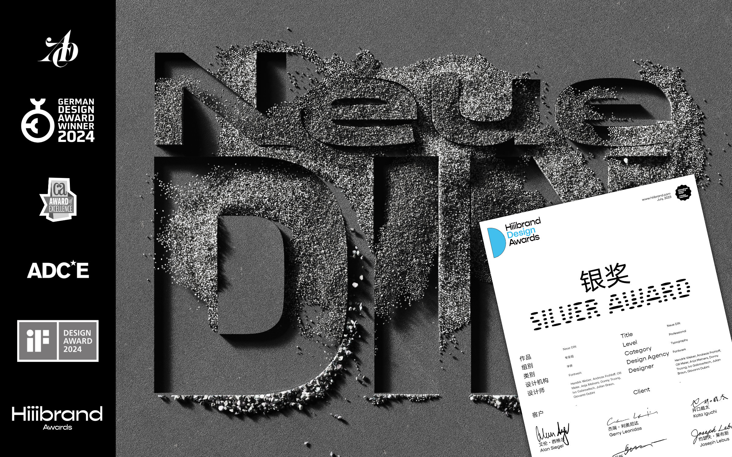 | | Award number 6 for Neue DIN: Silver at Hiiibrand Design Awards 2023 | |
|
| | Neue DIN wins Silver at Hiiibrand Awards 2023Neue DIN has been awarded yet another award (number 6 now!) and we are absolutely over the moon that this relative newbie to the Fontwerk family continues to gain recognition. After winning the iF Design Award 2024, the German Design Award 2024, the Communication Arts 2024 Award of Excellence as well as Bronze in the ADC Award 2023 and Finalist in the ADC*E Awards 2023, designers Hendrik Weber, Andreas Frohloff and Olli Meierhave just won Silver at Hiiibrand Design Awards 2023. The Hiiibrand Design Awards are internationally recognized awards that focus on outstanding branding and design. Out of 130 submissions in the Professional Typography category, we are so proud that Neue DIN has been awarded Silver (meaning it’s one of the top 3%). The award is particularly popular in Asia, which makes us especially happy, as we have an ever-growing customer base from this part of the world. Speaking of which, in collaboration with our local partners, we can offer CJK (Chinese, Japanese, Korean) solutions for Neue DIN and all our other fonts too. | |
|
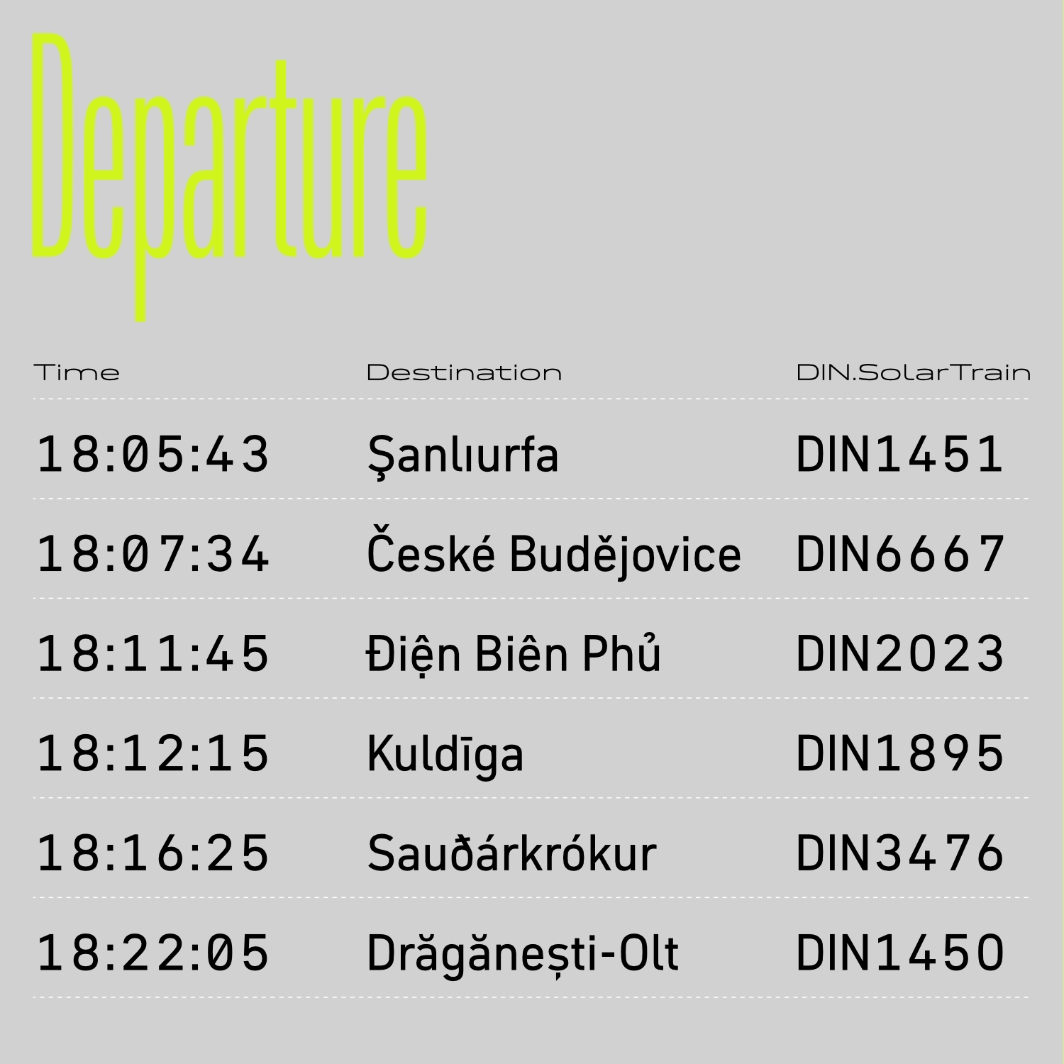 Towards the end of last year, we shared the news that Neue DIN now conforms to the new German DIN Standard, 91379. This is just a little reminder that DIN 91379 will apply from November 2024 and that if you’re looking for a font that is fit for this purpose and conforms to this standard, we can help! We can equip all our other fonts with the required character set upon request. Just get in touch. Both Neue DIN and Pangea already support the standard off-the-shelf. What is DIN 91379? Put simply, DIN 91379 is a standard that will require German authorities and organizations to recognize and machine-read a normative subset of the Latin Unicode character set in the exchange of data between authorities or with citizens and business. You can read more about it in our previous Werknews and on Wikipedia. ↗ |
|
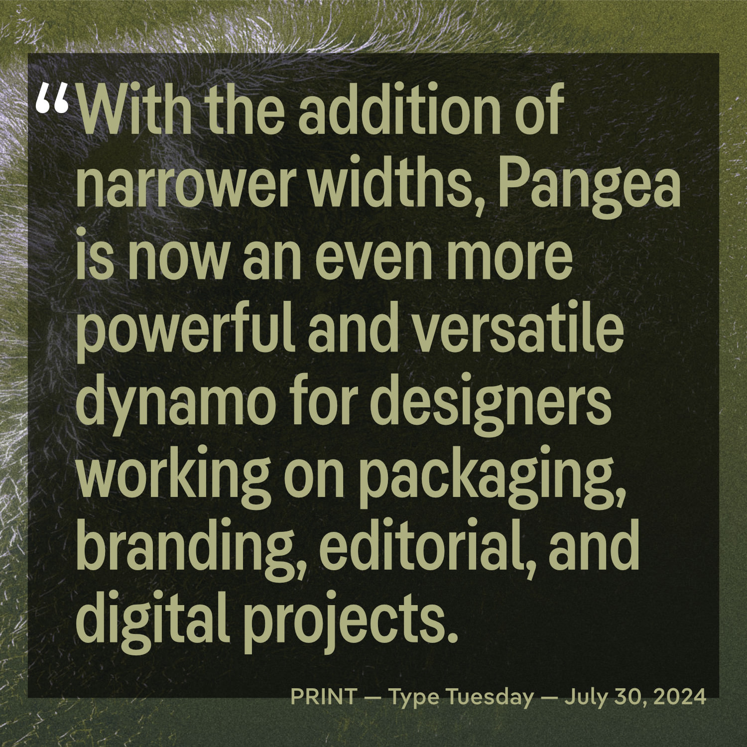 Following the recent release of Pangea Condensed, we have been delighted to see the warm and welcome reception it has received. In a recent article for PRINT’s Type Tuesday series, Kim Tidwell commented on how Pangea is ‘now an even more powerful and versatile dynamo for designers working on packaging, branding, editorial, and digital projects’. Some other recent nice articles include Designer in Action and PAGE Online (both in German). ↗ |
|
Want to know what a Superfamily is? Or what font is used in our logo? Or what file formats we support? Then head to our FAQ section to find the answer to your question. Got a burning question that you can’t find the answer to there? Contact us, we’d be happy to help! |
|
|
|