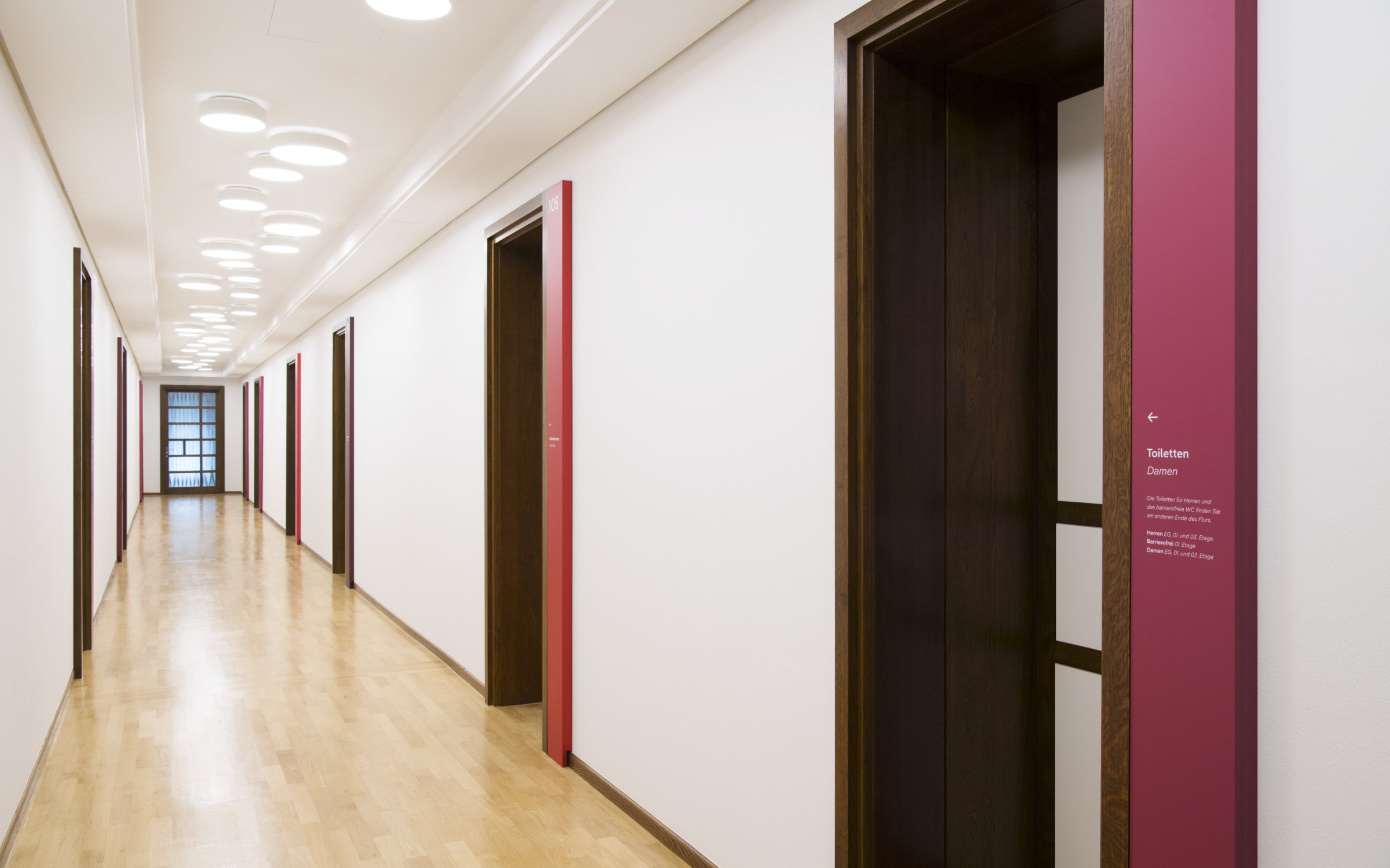
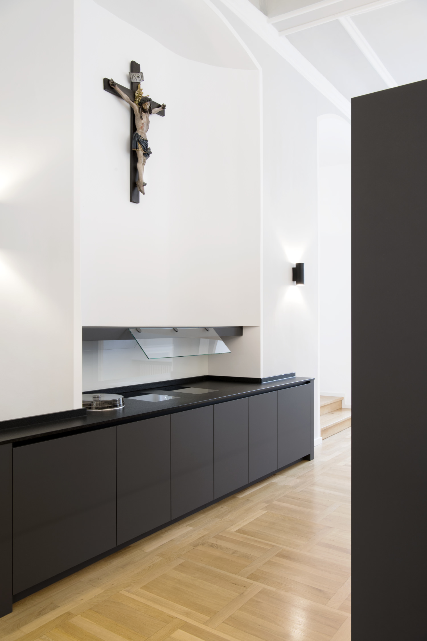
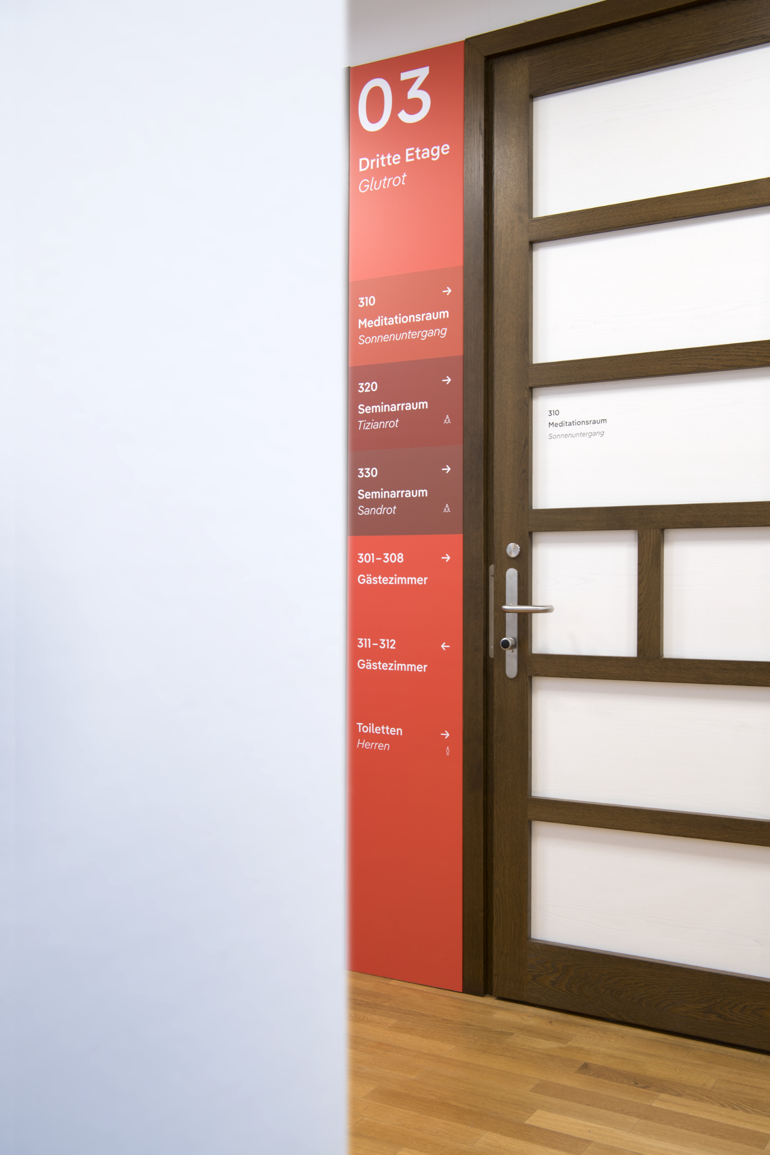
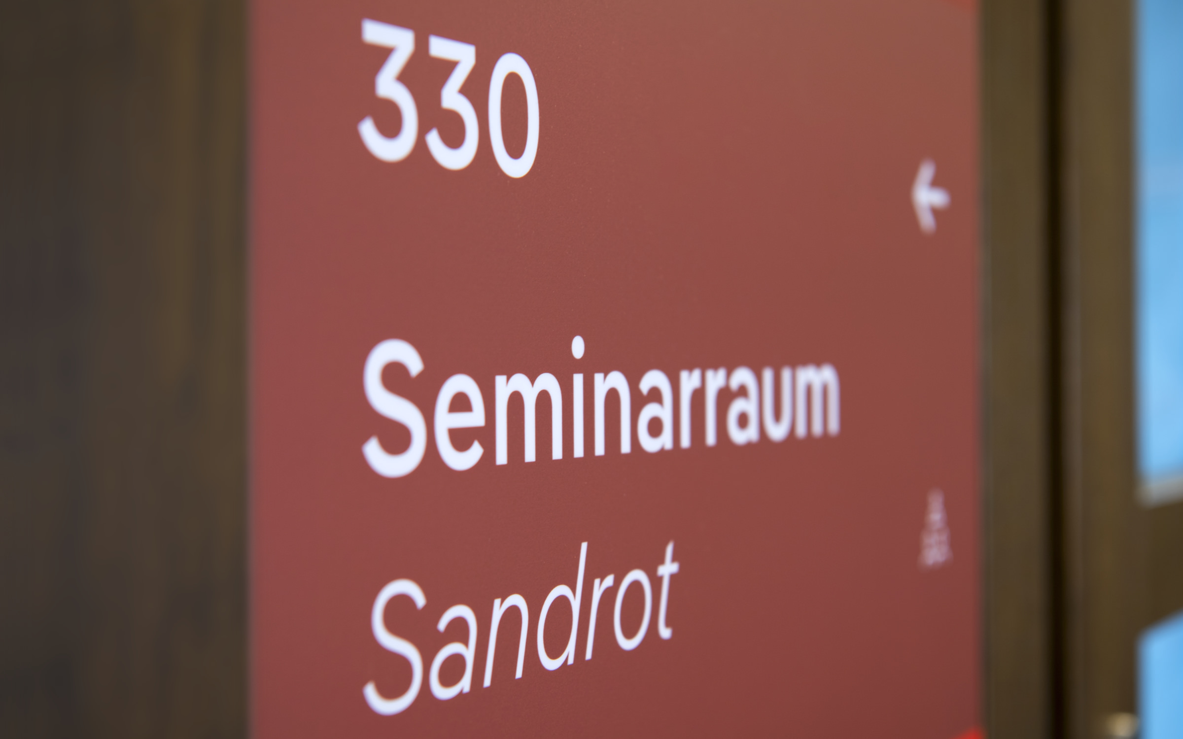
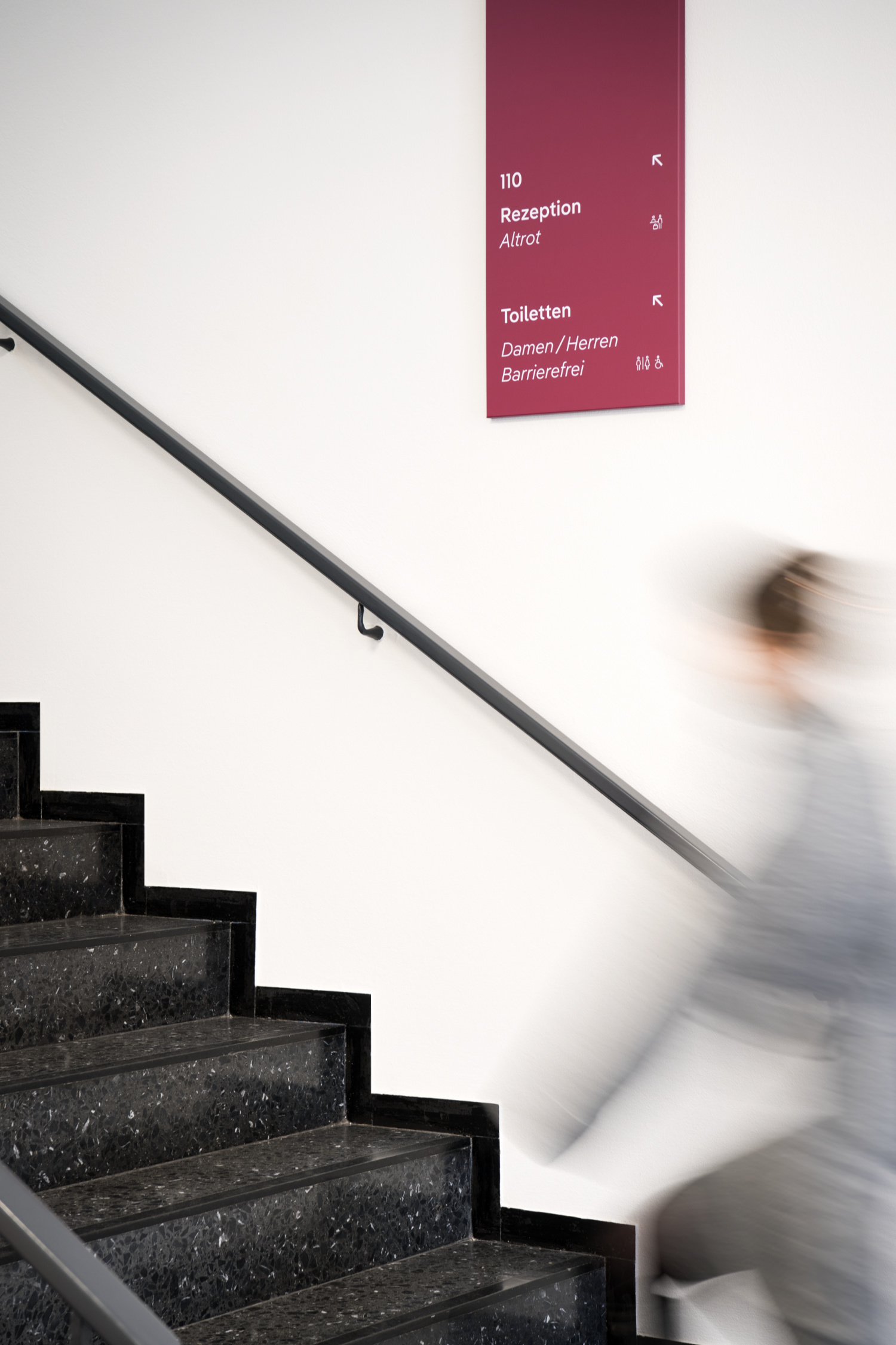
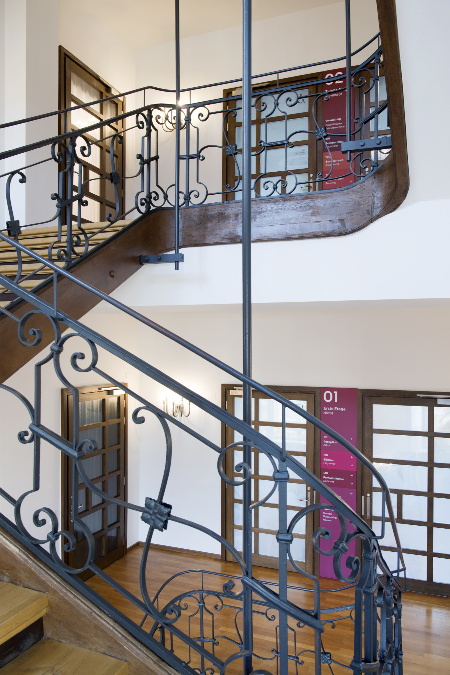
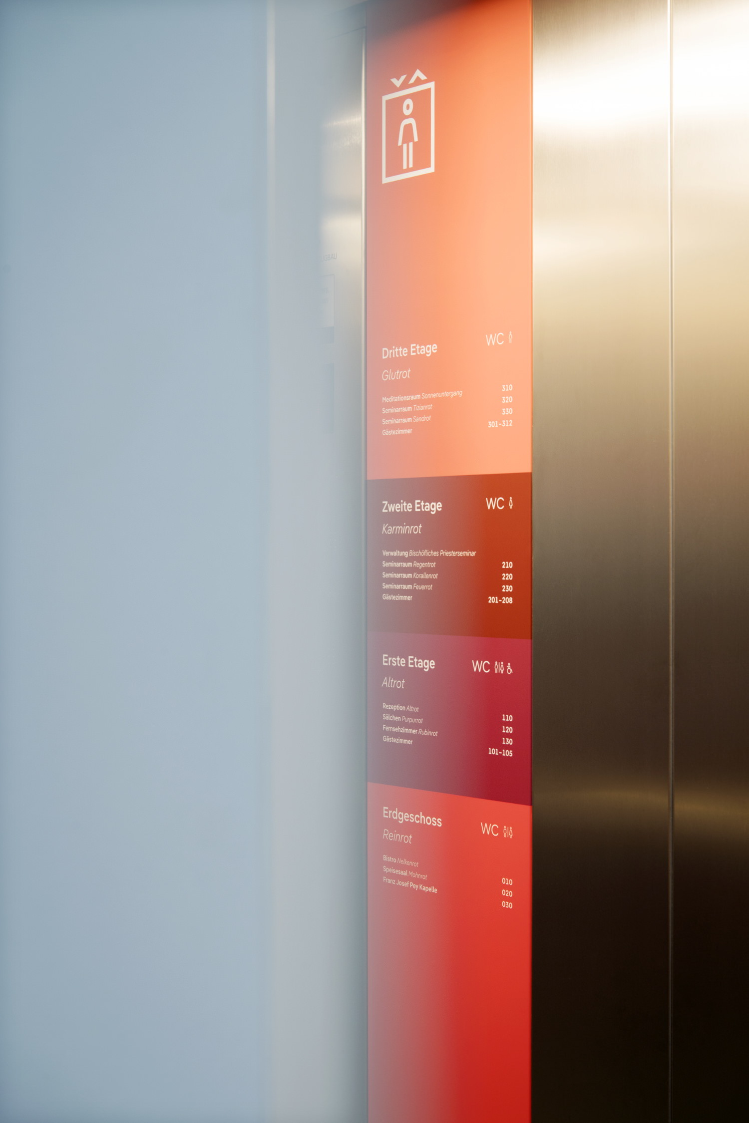
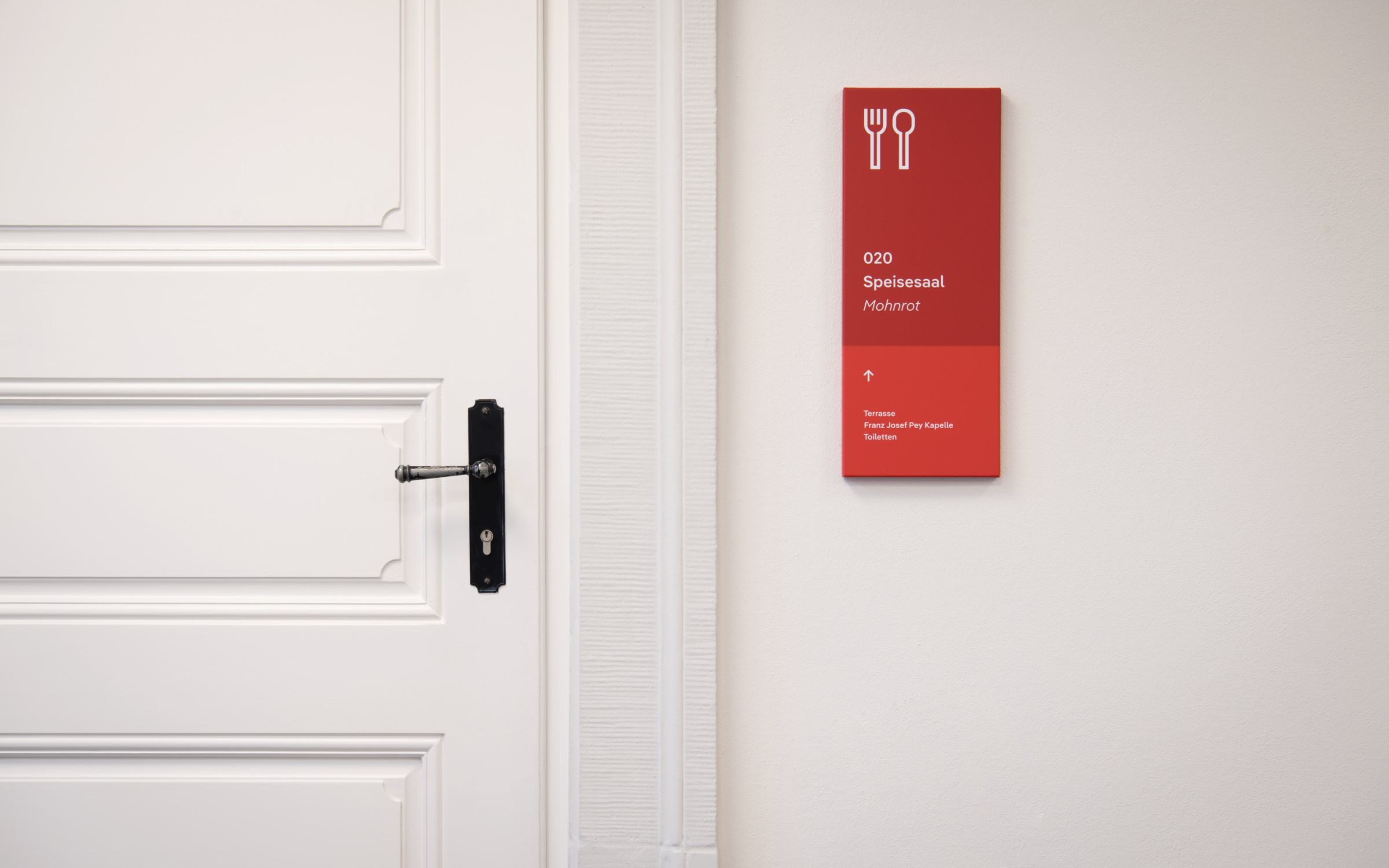
Pangea Text typeface is the new corporate font family for the Bischöfliches Priesterseminar in Trier, also used as part of their orientation system.

Leitmotiv with an emotional impact

The conversion of the Bischöfliches Priesterseminar in the center of Trier was one of the highlights of the “Day of Architecture” organized by the Architektenkammer Rheinland-Pfalz (Architectural Association of Rhineland-Palatinate) at the end of June 2024.

F
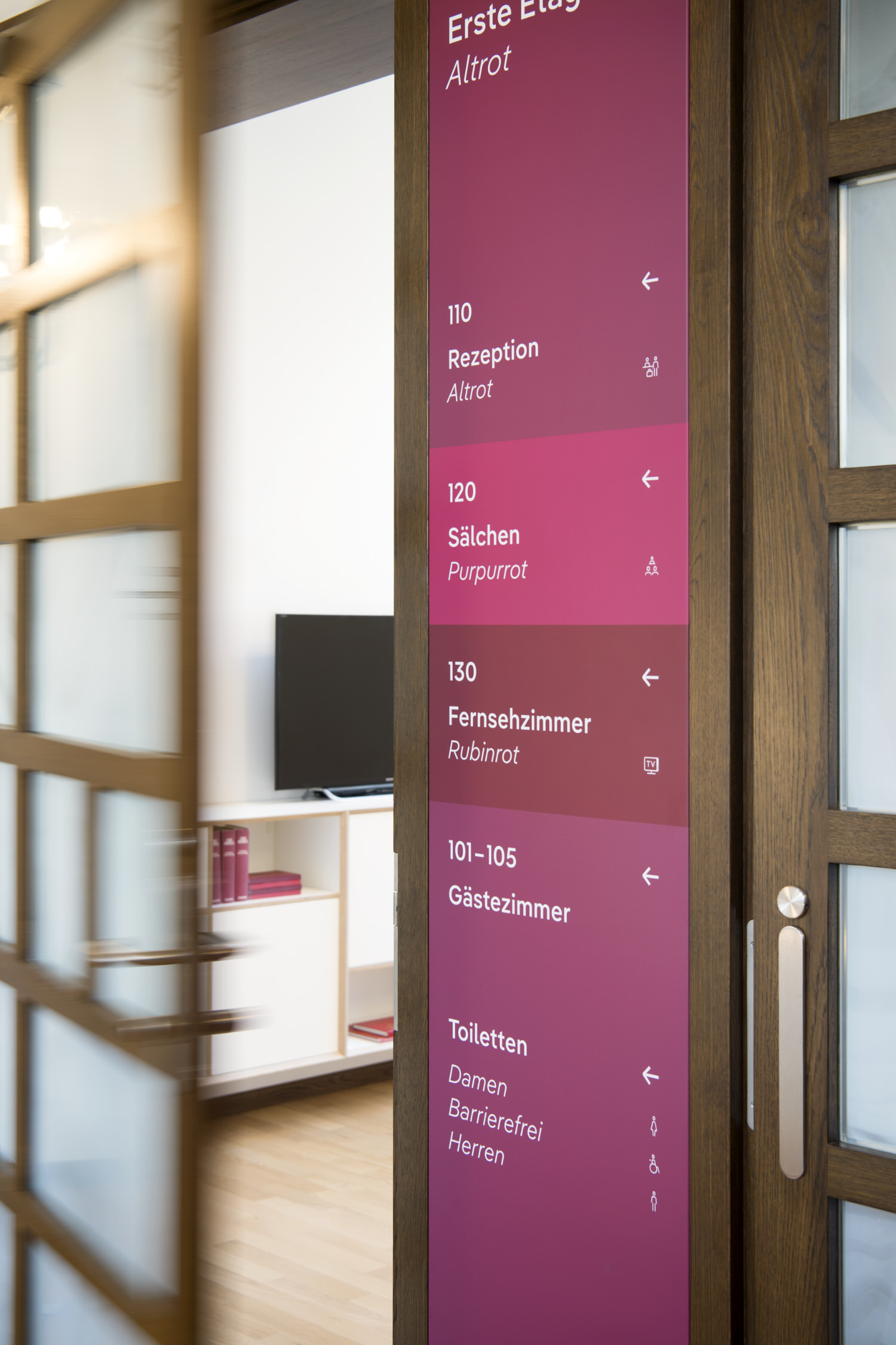
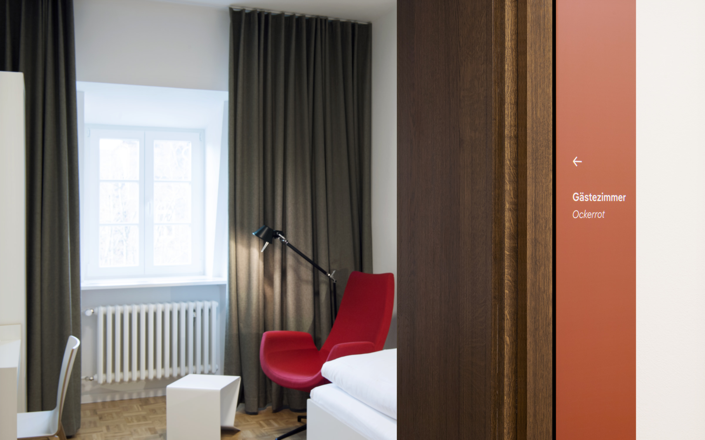
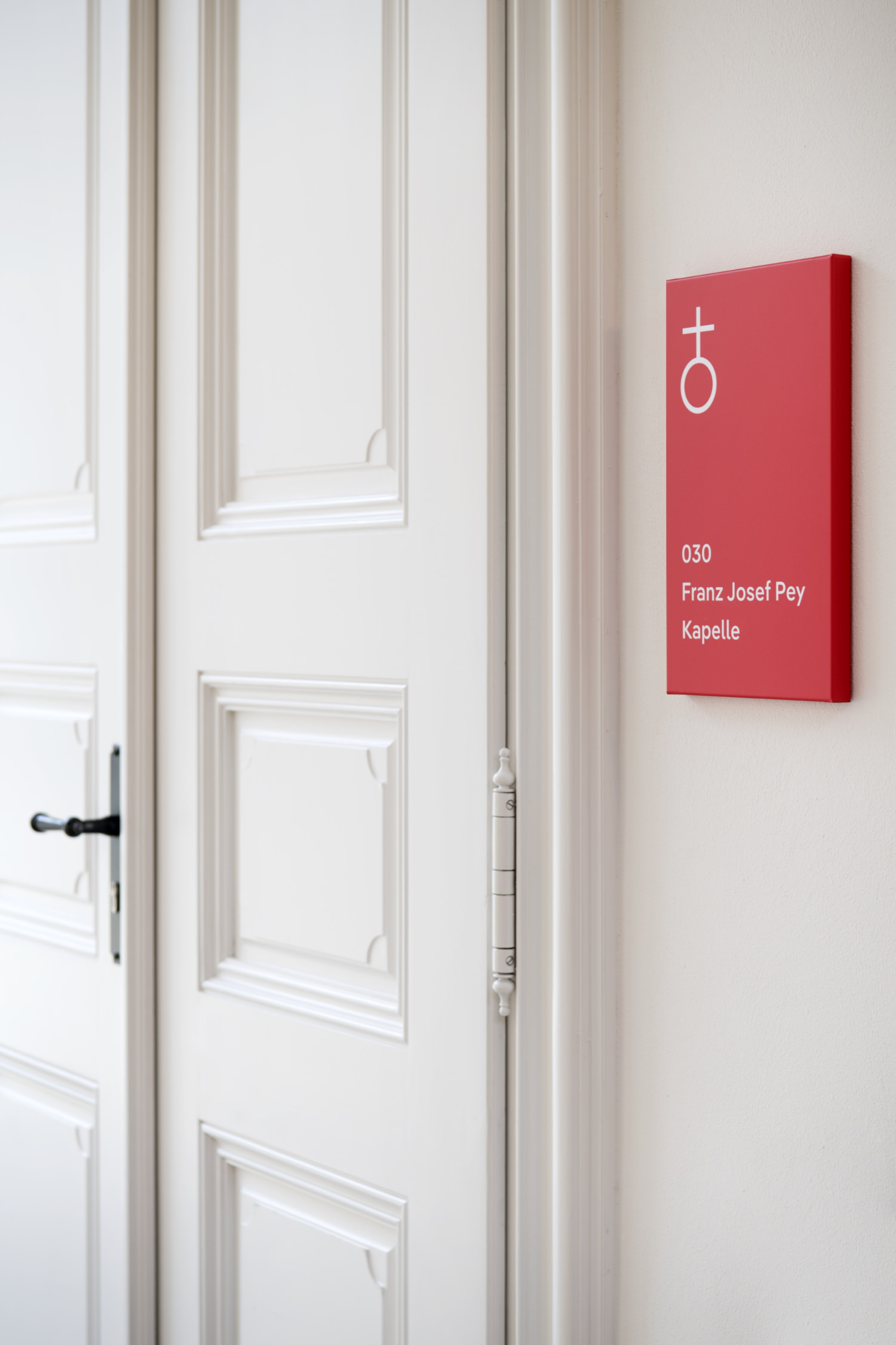
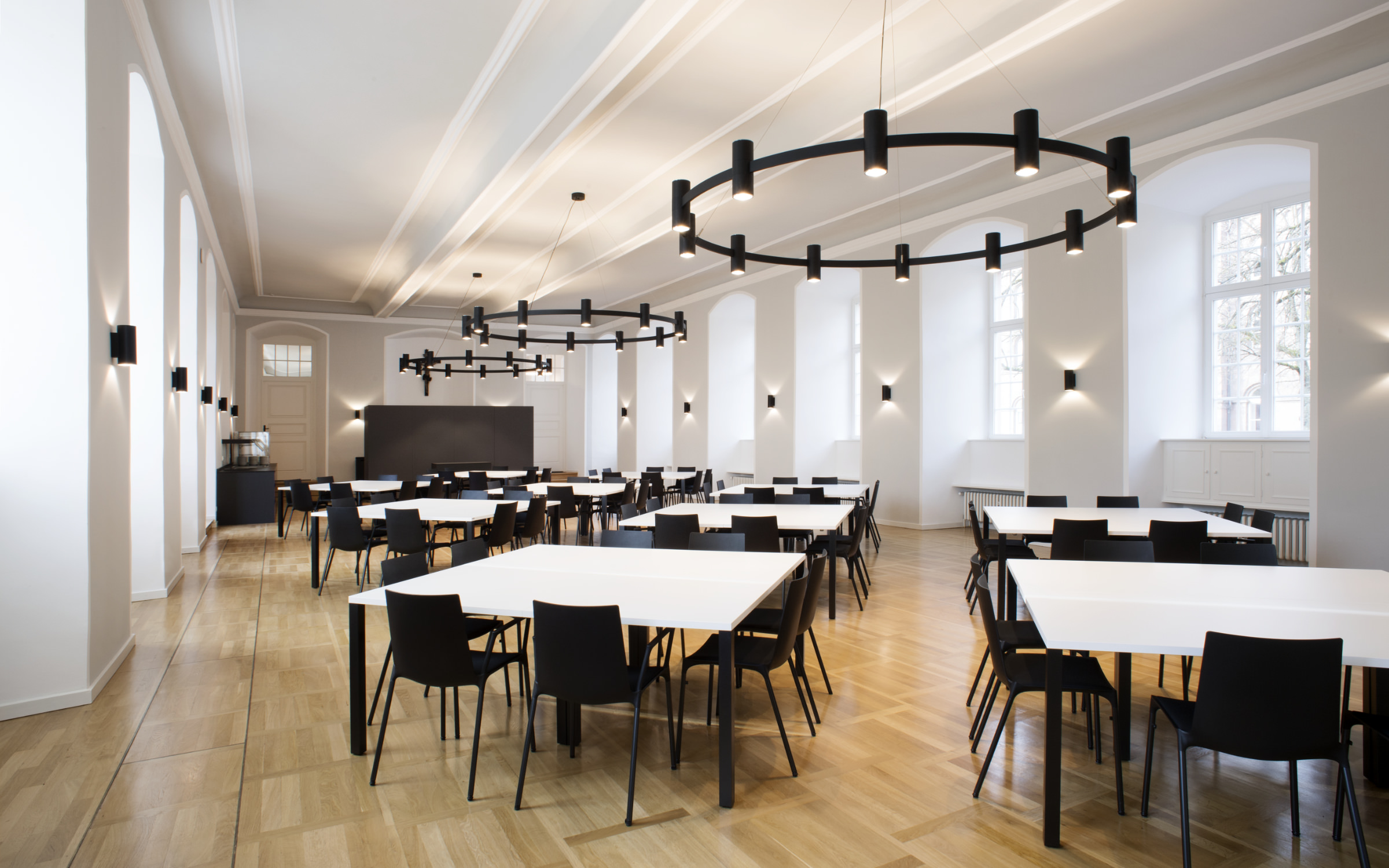
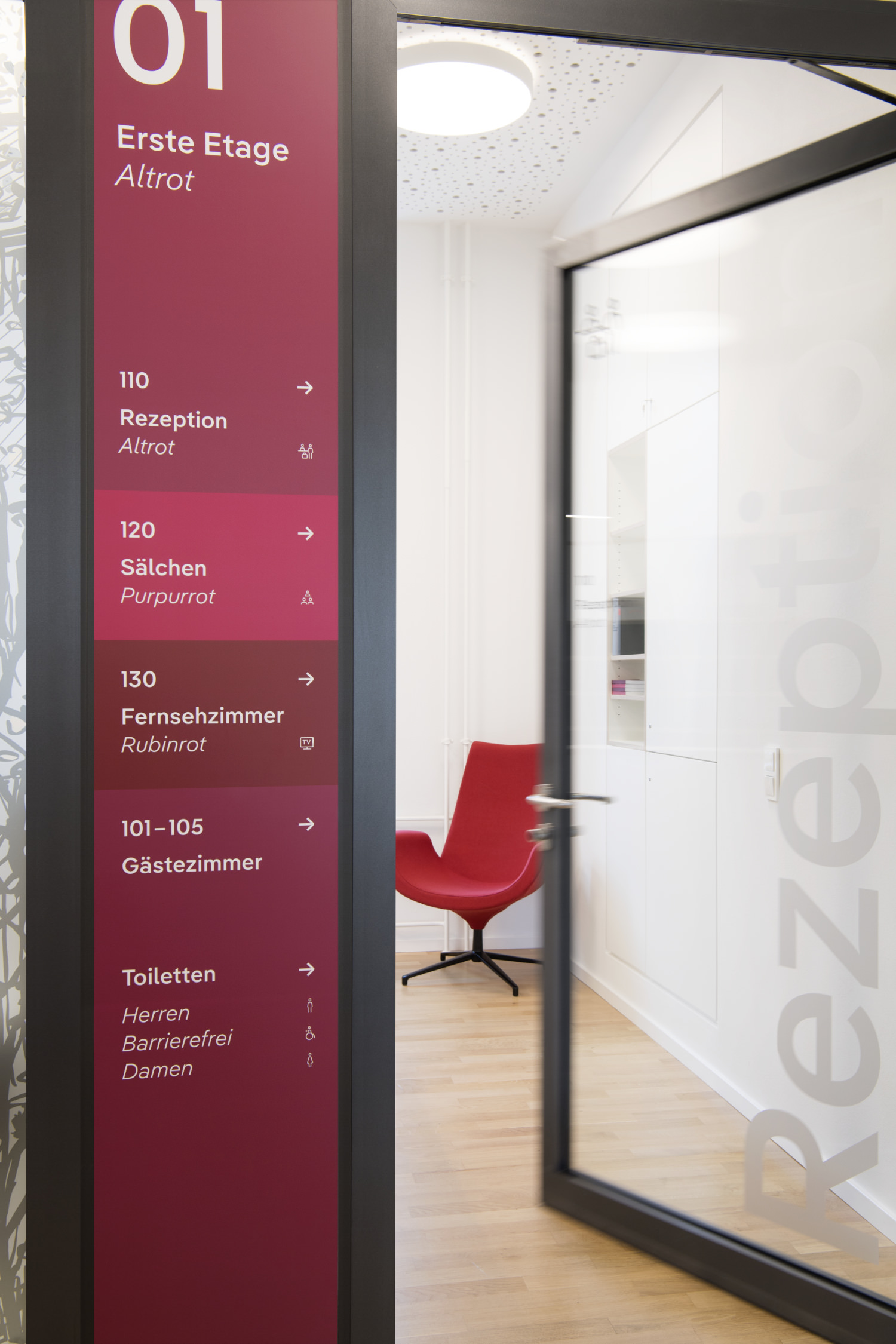
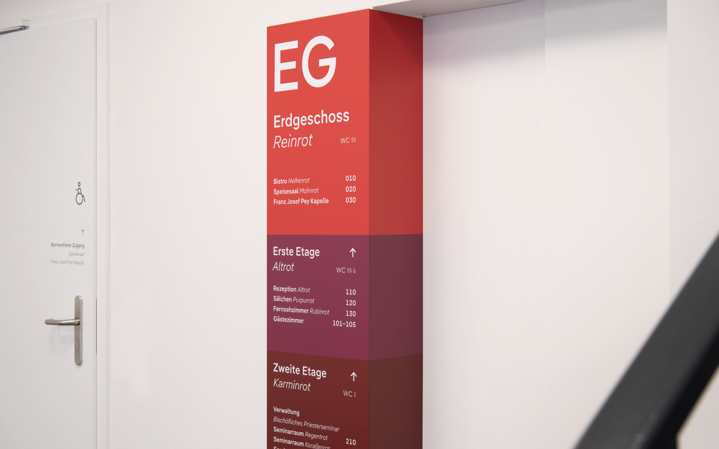
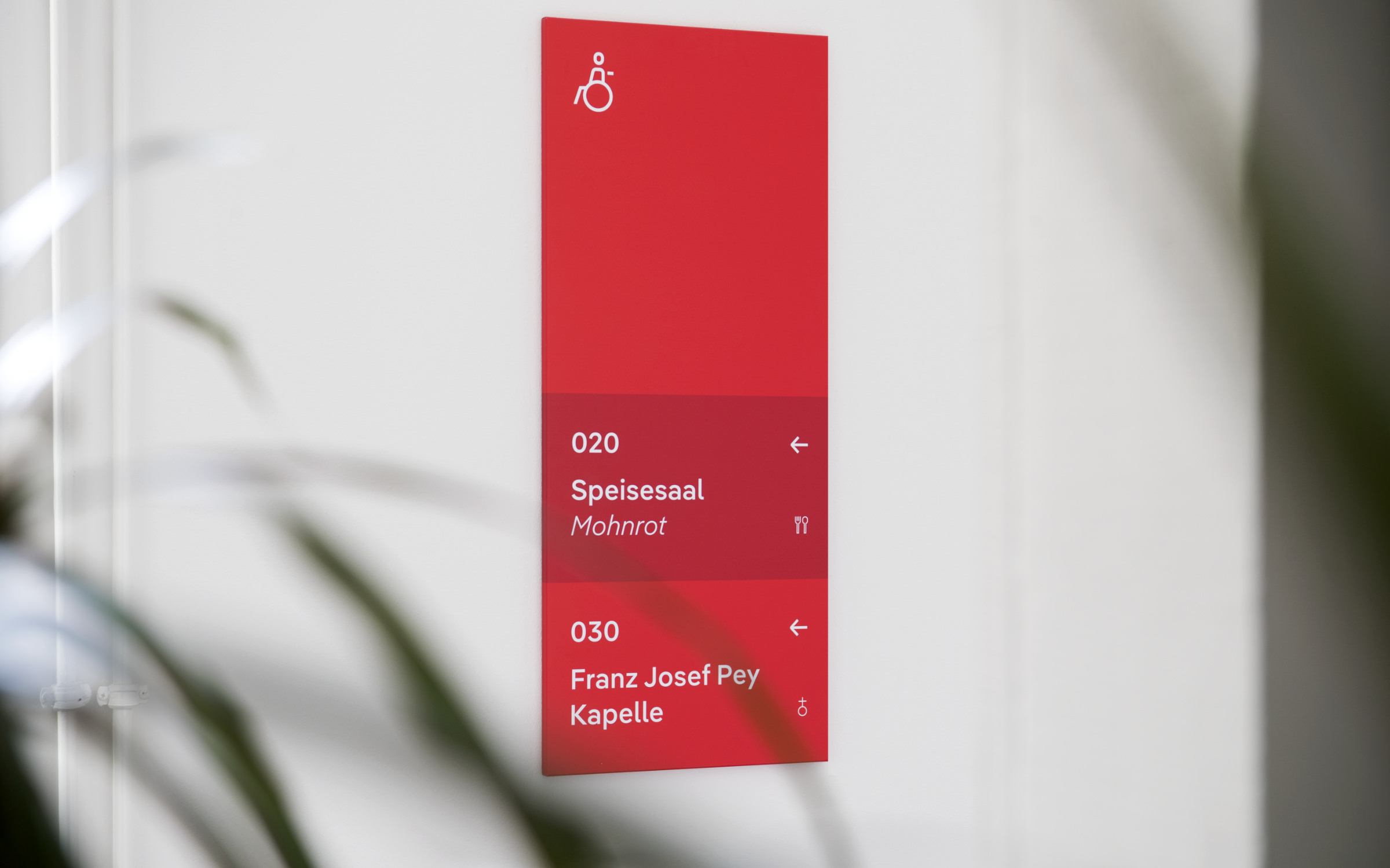
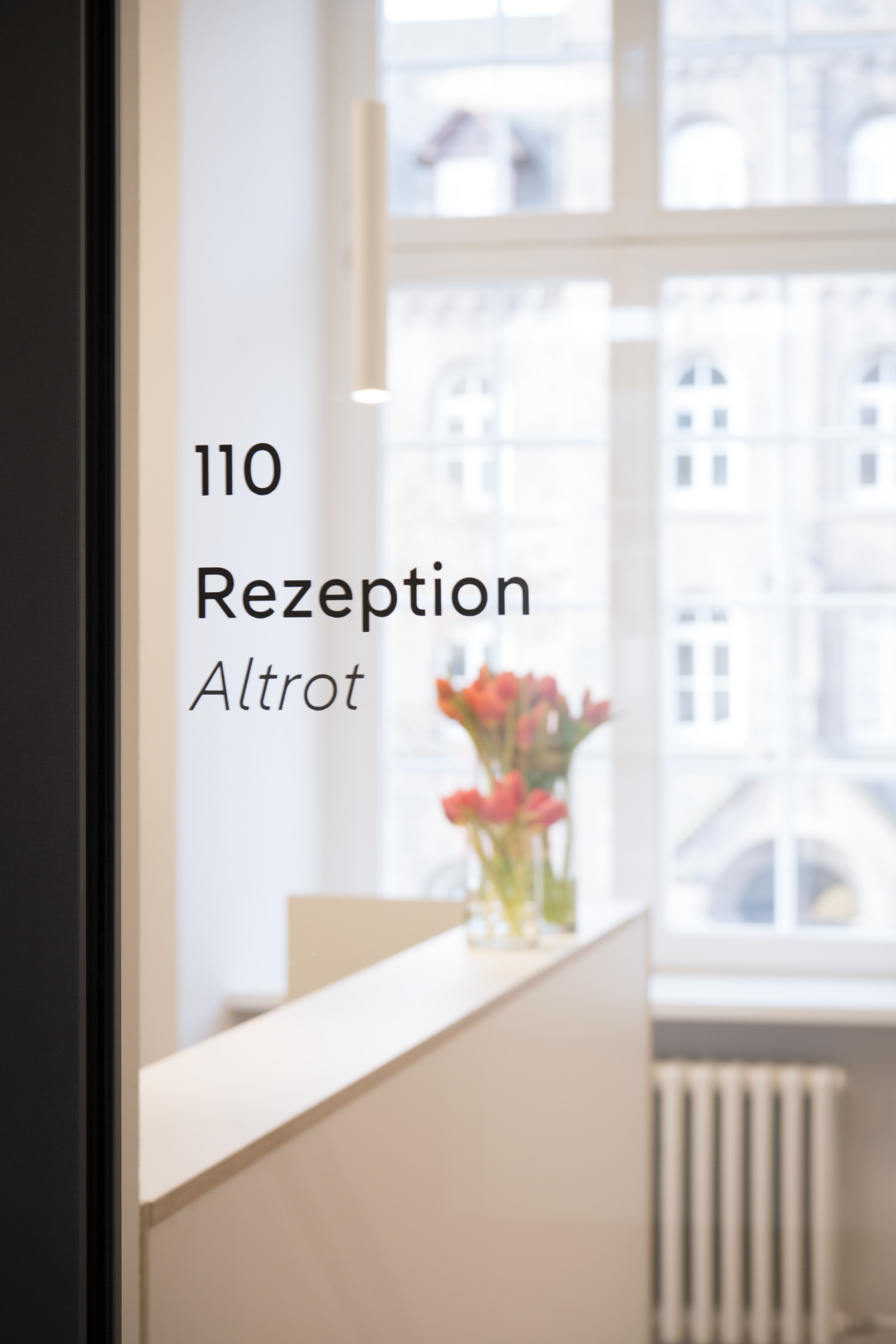
ollowing the relocation of the theological training for priesthood candidates to Frankfurt am Main in 2016, the interior of the “Haus Clementinum” was completely redesigned. Parts of the building were converted for church training events, while other areas were designed for external tenants. A barrier-free conference center with reception, 23 guest rooms, 9 conference rooms, dining room, bistro and kitchen was created in the remaining space.

Pangea Text typeface is the new corporate font family for the Bischöfliches Priesterseminar in Trier, also used as part of their orientation system.

Through the careful handling of the existing building and restrained and considered renovation it was possible to preserve the charm of the old architecture while paving the way for the new use. Visual accents are set by the color red, which both reflects the identity of the seminary and creates decorative points of tension in the individual parts of the building. Of particular note is the signage system, which was developed by the young designer Jana Heinz (Die Creativistin) in collaboration with the architectural firm Hardt und Partner.

Pangea Text typeface is the new corporate font family for the Bischöfliches Priesterseminar in Trier, also used as part of their orientation system.

Her task was to design an orientation system that blended seamlessly into the architecture whilst creating a link to the history of the building. It was important to her to create a visually inviting atmosphere that encourages visitors to explore the conference center. The color red, which has always been a distinguishing feature of the seminary, characterizes the new orientation system of the Clementinum in various facets, from imposingly bright to subtle to earthy. On the one hand, the color blocking concept clearly shows the hierarchy of the pathways, while on the other hand, it gives the individual rooms and levels an emotional character.

Pangea Text typeface is the new corporate font family for the Bischöfliches Priesterseminar in Trier, also used as part of their orientation system.

The three floors of the seminary are characterized by different shades of red; the white lettering is set in the geometric-humanistic sans-serif Pangea Text.

The corporate font used is Pangea Text, designed by Christoph Koeberlin. When set within the seminary, Pangea impresses with its neutrality – white on red, partly upright, partly in italics – while the diagonal connections and round dots ensure a friendly appearance. Due to its large x-height, it is also very legible from a distance. Pangea’s proportional lining figures are a perfect match when numbering floors and rooms, as they exude confidence rather than bureaucracy.

“Central to my design is the color red and its emotional diversity as well as the friendly font Pangea and these act as a basis for future developments in interior design.”

is how Jana Heinz summarizes the core of her guidance system and its future.

Try Pangea Text

Pangea Text typeface is the new corporate font family for the Bischöfliches Priesterseminar in Trier, also used as part of their orientation system.

Pangea Text typeface is the new corporate font family for the Bischöfliches Priesterseminar in Trier, also used as part of their orientation system.

Convincing and yet light-footed: The guidance system of the converted episcopal seminary in Trier (Bischöfliches Priesterseminar).

Pangea Text typeface is the new corporate font family for the Bischöfliches Priesterseminar in Trier, also used as part of their orientation system.

Pangea Text typeface is the new corporate font family for the Bischöfliches Priesterseminar in Trier, also used as part of their orientation system.

Pangea Text typeface is the new corporate font family for the Bischöfliches Priesterseminar in Trier, also used as part of their orientation system.

The guidance system of the Bischöfliches Priesterseminar is based on a broad spectrum of the color red that offers space for emotional accents.

Pangea Text typeface is the new corporate font family for the Bischöfliches Priesterseminar in Trier, also used as part of their orientation system.

Pangea Text typeface is the new corporate font family for the Bischöfliches Priesterseminar in Trier, also used as part of their orientation system.

Pangea Text typeface is the new corporate font family for the Bischöfliches Priesterseminar in Trier, also used as part of their orientation system.

Pangea Text typeface is the new corporate font family for the Bischöfliches Priesterseminar in Trier, also used as part of their orientation system.

  • Client: Episcopal seminary represented by Oliver Laufer-Schmitt (rector) and Ulrike Wendling (acting director)
  • Architects: Hardt und Partner
  • Project managers: Peter Hardt, Stefanie Junges and Paulina Schäfer
  • Concept for orientation system: collaboration between Hardt und Partner and Die Creativistin (design office for visual communication, Jana Heinz)
  • Implementation of orientation system: Wilko Lichtwerbung und Beschriftungen
  • Photography: Linda Blatzek

Try Pangea Text