As we gallop our way towards the end of June, we are over the moon to share some brand new additions to Christoph Koeberlin’s Pangea. Also in this month’s round-up, there are some lovely words about Push and news about our founder’s upcoming appearance at the Berlin Letters Festival. So, don’t delay, grab a cuppa and take a moment to read on. |
|
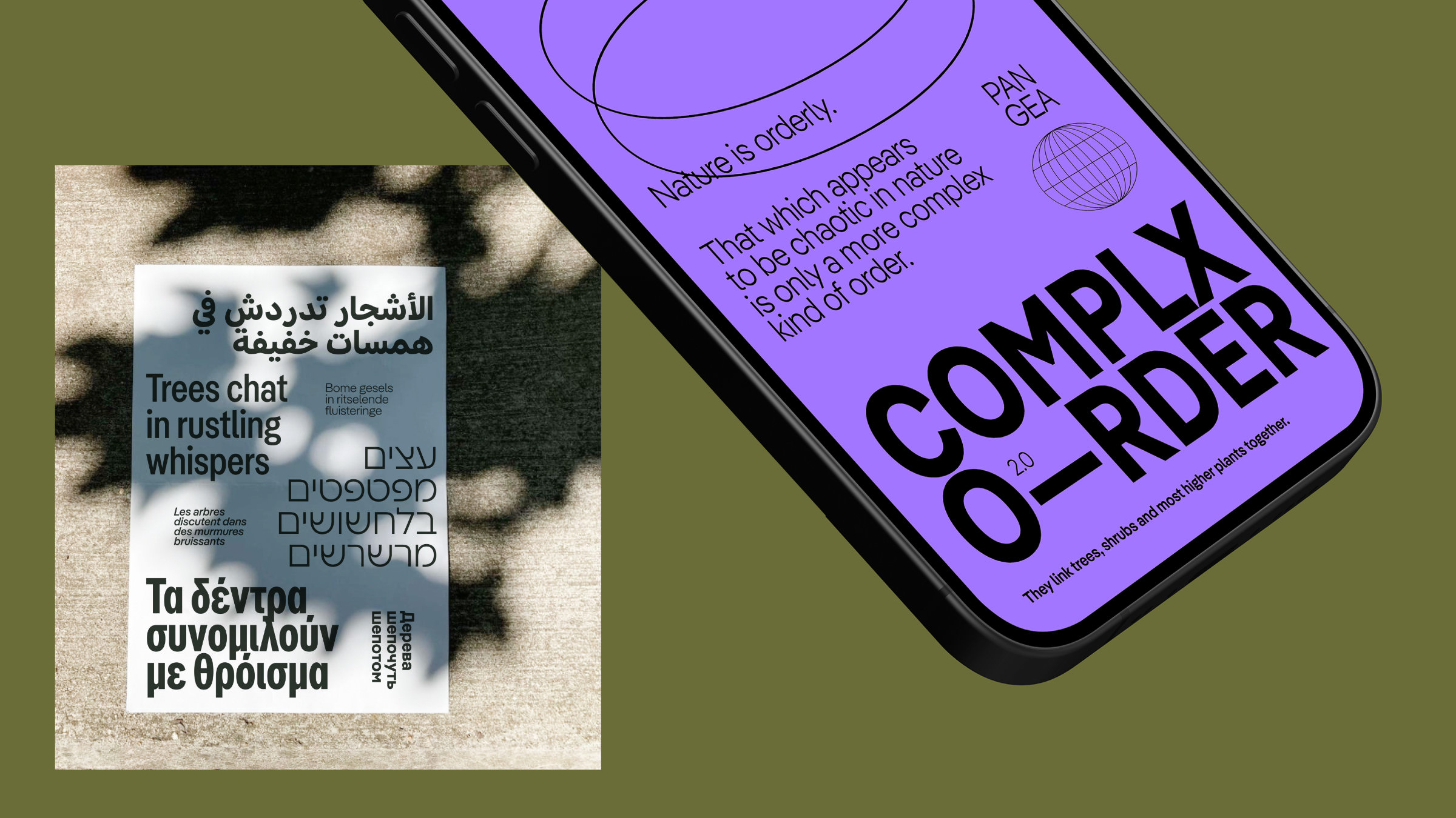 | | Thanks to the addition of SemiCondensed → Condensed → XCondensed, Pangea’s stylistic range has now quadrupled. | |
|
| | Introducing Pangea CondensedNot content with already being a multilingual typographic shapeshifting superfamily, Pangea by Christoph Koeberlin just got even bigger and better! In his ever-evolving quest to further develop and improve his typeface, Christoph has designed three new widths to the Latin, Cyrillic and Greek parts: SemiCondensed, Condensed and XCondensed. So there are now many more fonts to play with, 80 of them in fact! This makes Pangea an even more powerful tool, particularly in editorial, responsive, branding and packaging contexts. Apart from that, there have been some improvements to the variable font (which, as always, is included free of charge in the Superfamily package), some minor optimizations ‘under the hood’ and, from now on, webfont subsets to optimize loading times. But long story short, the best thing is to test the Trial Fonts and experience the new Pangea widths or download the specimen PDF. By the way: the designer’s commitment to donate 25% of his earnings to preserving the rainforest and to implementing large-scale reforestation projects still stands! | |
|
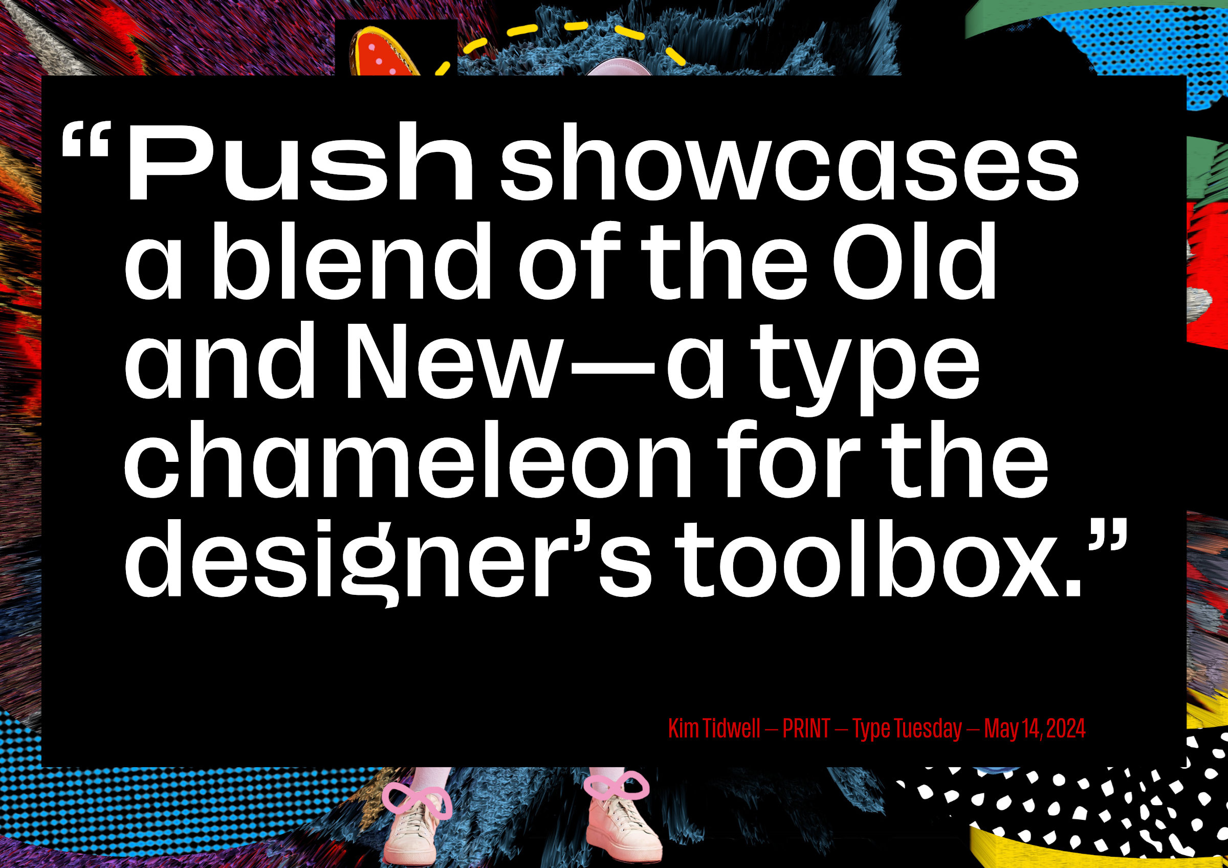 | | One of our favorite reactions to the release of Push | |
|
| | Have you met Push?We are over the moon by the reception that our newest typeface Push has received in the press and beyond and thought we would share a few of our favorite quotes and articles so far: In the online edition of PAGE, there is a full feature and the behind the scenes story of Push, head to their website find out all about story behind the marketing campaign by Rocket & Wink and much more (paywall). Designer Christine Gertsch was also recently interviewed in Communication Arts and shares some insights into her design process and thinking. Across the web, there’s a fantastic profile of Push on We and the Color: “Push is more than just a font; it’s a carefully considered system, a tribute to design history, and a powerful tool for the modern designer. With its confident presence and clever curvature transformation, Push compels you to push the boundaries of your creativity.” While PRINT explains, “Push showcases a blend of the Old and New—a type chameleon for the designer’s toolbox. The range of possibilities across the width, weight, and shape spectrum gives designers typographic versatility for today’s multifaceted, complex, and multi-media brand applications.” You can also read more reactions to Push here (DE), here (DE), here (ES) and here. | |
|
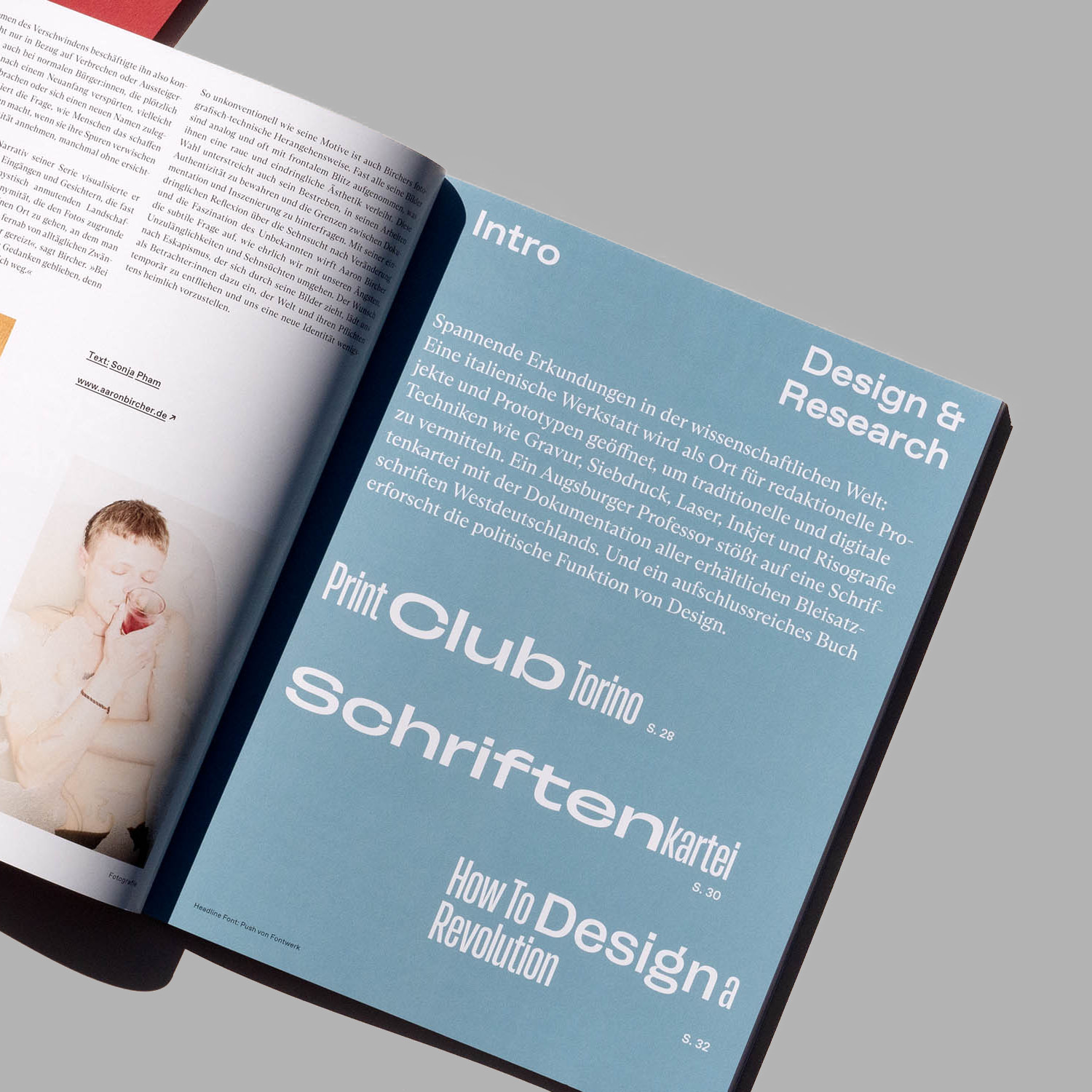 As we said earlier, Push really has been making waves over the past couple of months. So we were delighted to see the first documented in use case of Push in print for the latest edition of Grafikmagazin which came out a few days ago. Used as a headline font in the ‘Design & Research’ section, we're so pleased to see Push in action and working hard on the page alongside Favorit and Arizona from our fellows at Dinamo. ↗ |
|
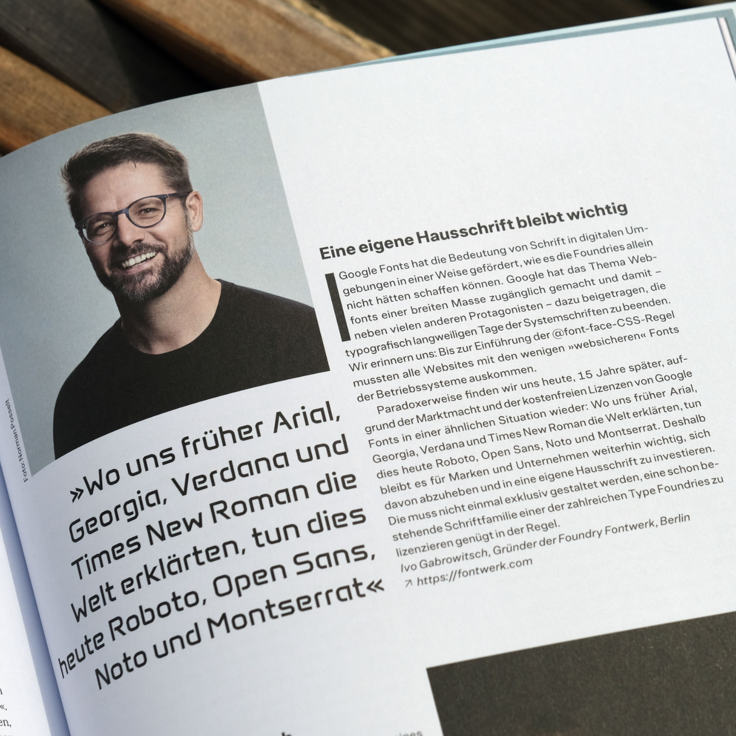 Another one of our favorite magazines is reinventing itself, the brand new PAGE will now be published quarterly, with more content and a brand new design. In the latest edition, our founder, Ivo Gabrowitsch, was delighted to be asked to comment on the rise of Google Fonts and their impact. For Ivo, while Google Fonts have opened up the world of webfonts to many ‘having your own House Font remains important’. As an independent type foundry, we are delighted to help brands, businesses and individuals stand out from the crowd with their own personalized and unique typefaces. Be sure to pick up the latest copy to read Ivo’s insight and many others in full. ↗ |
|
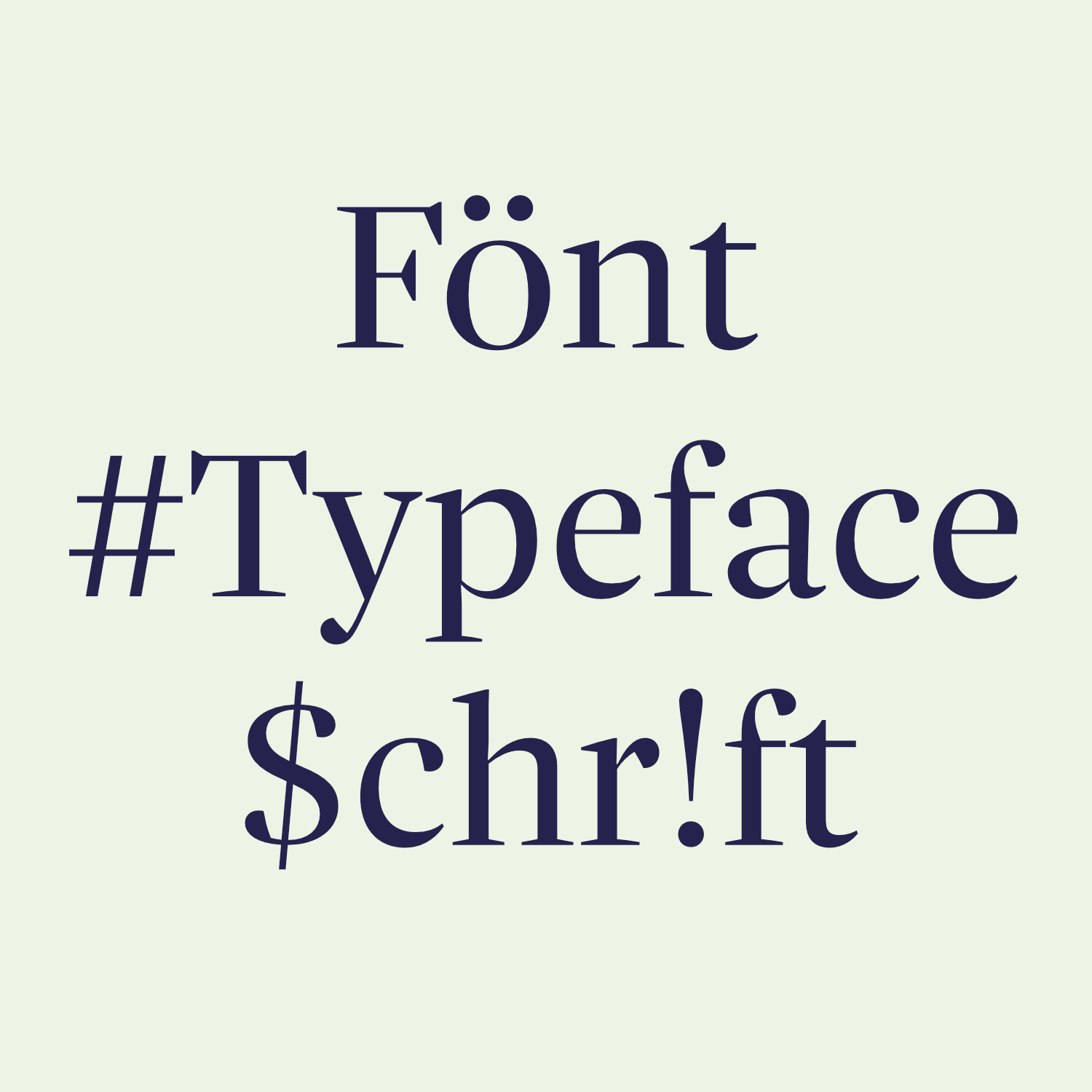 We love to talk type, in fact our founder Ivo was the one who set up the first Typostammtisch in Berlin back in the day. So, it’s always a pleasure and a privilege to be invited to speak in depth about typography and dive behind the scenes of the wonderful world of all things fonts! In a couple of weeks time at the Berlin Letters Festival, Ivo will lift the curtain on what it takes to publish a typeface and what ingredients (all beginning with P) it takes to bring a font to life. Berlin Letters is a type conference unlike any other, with a jammed packed schedule of talks, workshops and super fun things to do, it’s a not-to-be-missed occasion and we can’t wait to go! If you’re quick (June 28), you can still grab a 20% discount off tickets using the code ig6d9vb8. ↗ |
|
Did you know we can also provide additional languages and script systems? Our typefaces already support all Latin-based European languages such as English, French, Spanish, German, Czech, Polish and Turkish. Some families also support Greek, Cyrillic, Arabic or Hebrew. But if you’re looking for something specific, we can make custom fonts for you. From Thai to Cyrillic, from Greek to Japanese, from Arabic to Chinese, from Korean (CJK) to Devanagari, we’d love to help your brand speak more languages. |
|
|
|