 | NEUE DIN CROWNED IN THE GERMAN DESIGN AWARDS |
|---|
|
As the festive season comes into view, we thought we would share a little seasonal cheer with some good news about some award win(s) for Neue DIN and say a BIG thank you to all our customers, designers and supporters. Also in this newsletter, Neue DIN becomes even more DIN-like, we share a beautiful use case for Pangea and this month it’s Turbine’s turn to strut its stuff in our brand new Big Glyph feature. |
|
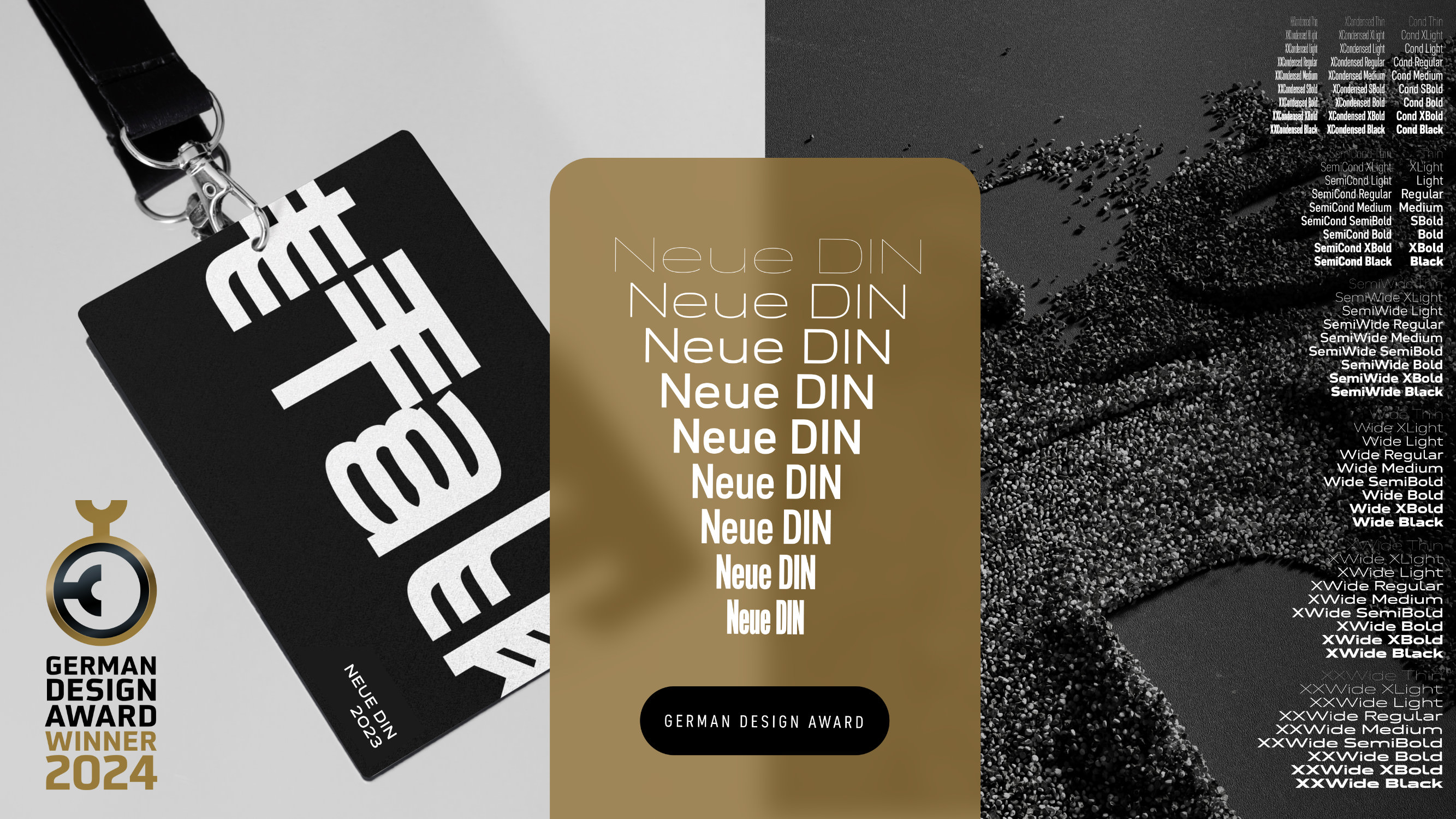 | | Being awarded a German Design Award in the category of Excellent Communications Design (Typography) means the world to us. | |
|
| | Neue DIN wins a German Design AwardWhen we launched Neue DIN earlier this year, we looked at how we could reimagine the German type icon and bring together a type-tastic team that included Hendrik Weber, Andreas Frohloff and Olli Meier. The joy and magic of designing, producing and mastering fonts is something that we feel very grateful to be able to call work. Yet it truly takes a village to create a typeface and very often the blood, sweat and tears that goes into bringing a new typeface to market remains hidden from view. So, when we heard the news that Neue DIN had been awarded a German Design Award in the category Excellent Communications Design (Typography), we literally jumped off our seats and did a happy dance. Even more when we read the jury’s statement: “The typographic design of ‘Neue DIN’ fully meets the requirements of digital transformation and thus raises the timelessly clear elegance of the classic standard typeface, which served as the starting point for the project, to a contemporary level.” The German Design Award is one of the most prestigious creative awards in the world and we are so incredibly proud that our work has been recognized and awarded this accolade by the German Design Council. This motivates us even more to further improve and extend the typeface in the future. | |
|
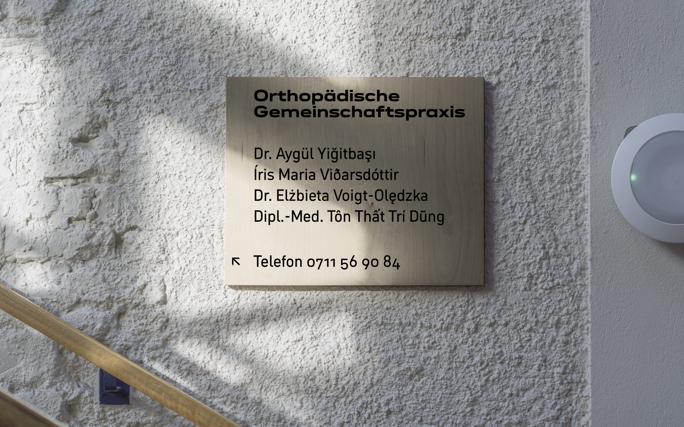 | | Meeting the new DIN 91379 standard means Neue DIN supports an additional 230 characters and 37 additional languages, including Vietnamese. | |
|
| | Neue DIN conforms to new DIN 91379 standardWith nine weights and nine widths, Neue DIN is one of the most variable standard fonts on the market. With its first update, the type family now supports what German authorities will be required to do by November 2024 when DIN 91379 comes into force. Put simply DIN 91379 is a standard that will require German authorities and organizations to recognize and machine-read a normative subset of the Latin Unicode character set in the exchange of data between authorities or with citizens and business. So that finally, the names of people (İlkay Gündoğan, Pippi Långstrump, Lech Wałęsa, …) and companies (Kärcher, İşbank, Kværner, …) will be securely processed electronically and spelled correctly throughout Europe. Existing customers can now download the updated Version 1.1 of Neue DIN – with 230 additional characters and 37 additional languages – for free by logging into their account. While new customers can enjoy 81 generously extended DIN styles from 500€ or use the variable font to utilize a customized version from thousands of DIN variants. | |
|
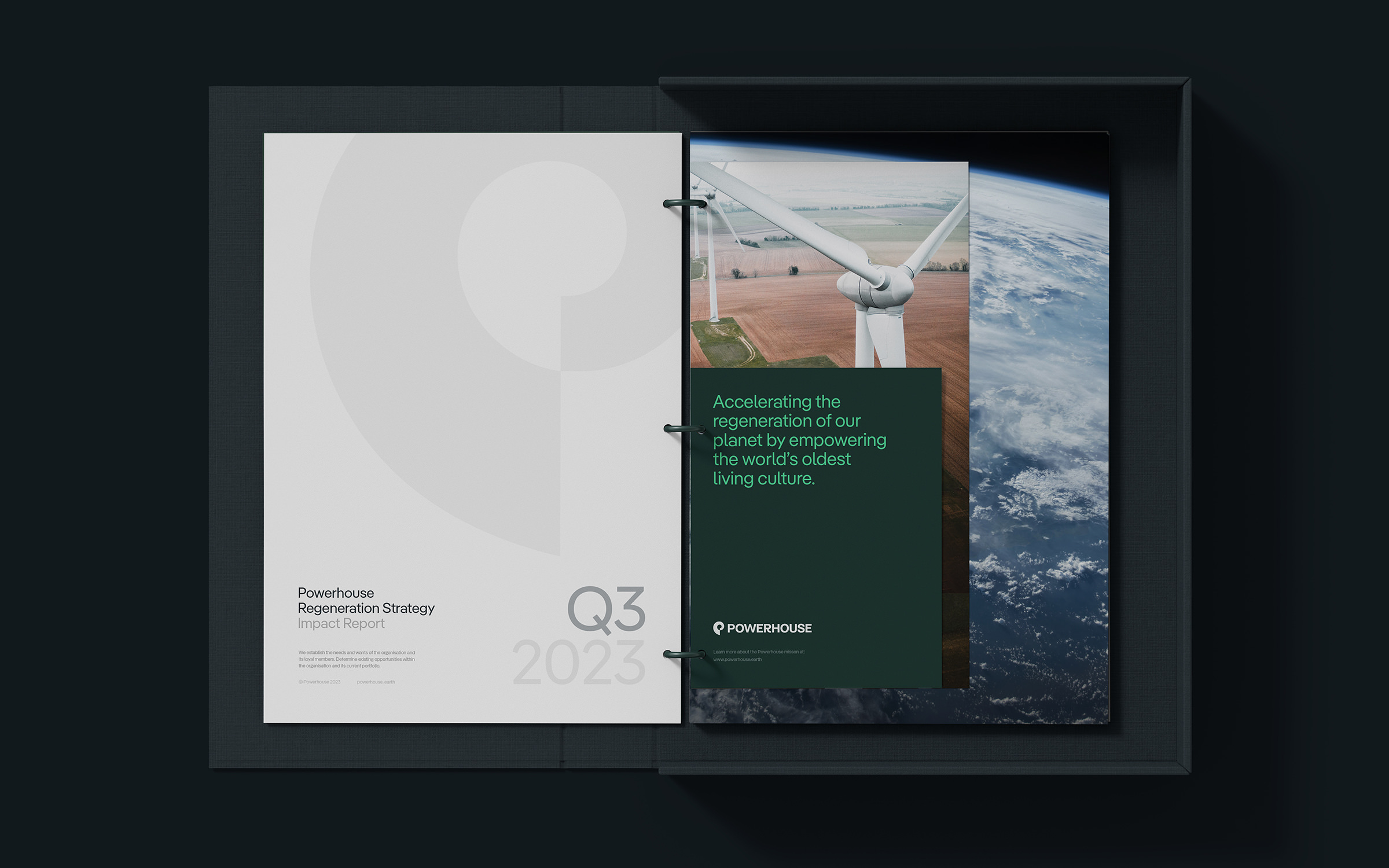 | | Art Director Jack O’Sullivan knows the fine line between greenwashing and credibility. “The description of Pangea on Fontwerk’s website says, ‘Can a typeface make the world a better place? It can try to.’ We like this approach and we support it because the font gives a voice to a company that is doing just that.” | |
|
| | Pangea packs a punch for PowerhouseIn the latest in use case for Christoph Koeberlin’sPangea, the Australian environmental company Powerhouse Renewables Group employs the typeface across their visual identity. Powerhouse is committed to rethinking sustainable energy. They work closely with the continent’s indigenous people and rather than focusing solely on decarbonization and electrification, they strive for “true sustainability” based on nurturing and revitalizing natural systems. The idea for using Pangea in the new brand was therefore a no-brainer. In the words of Jack O’Sullivan, Founder and Art Director of Side By Side the creative agency who created Powerhouse’s brand, “Pangea is a beautiful font with clarity and character, but its added environmental benefits made the choice an easy one for the studio and the client.” | |
|
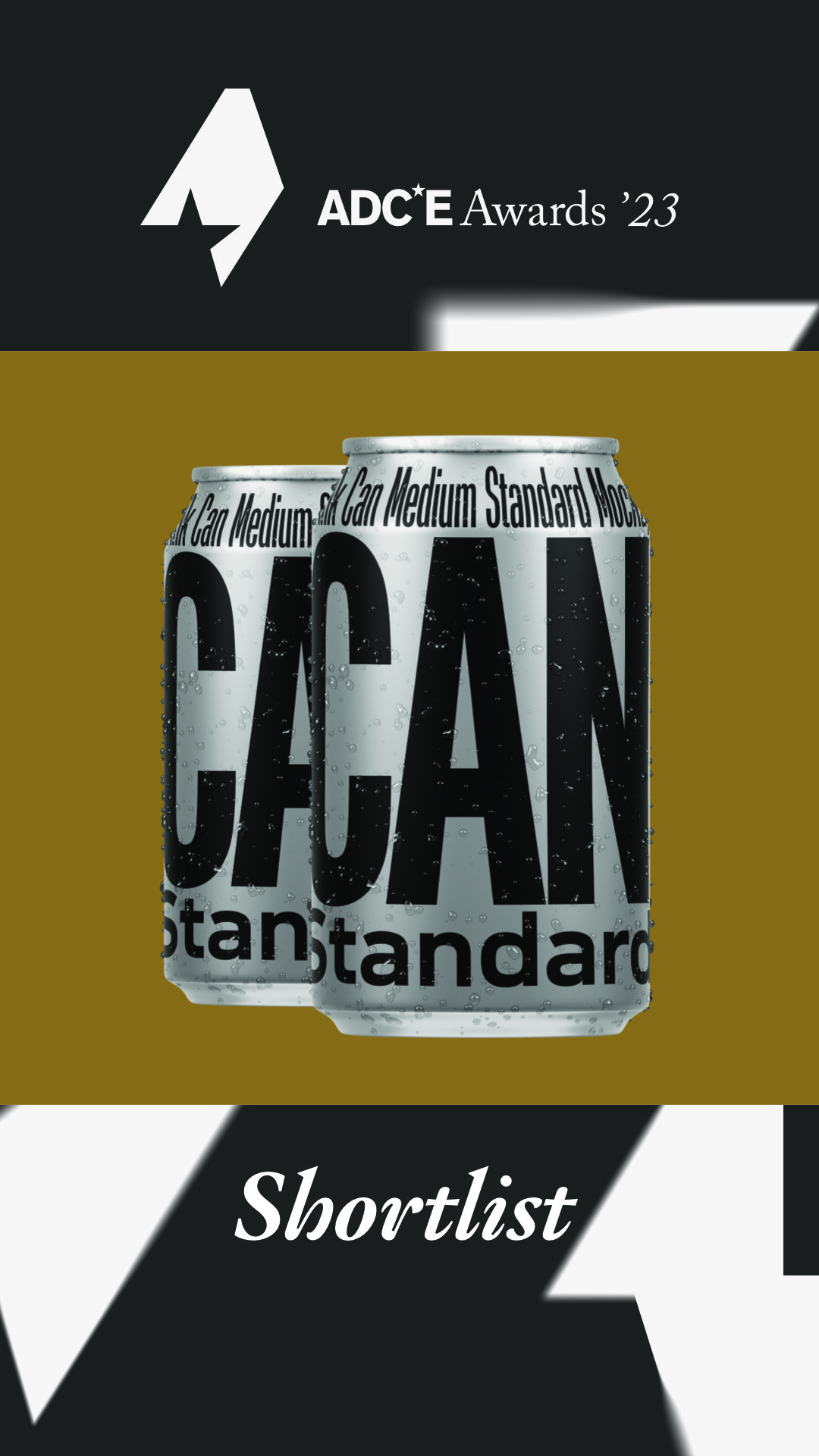 After winning an ADC Bronze Award earlier this year, we are over the moon to announce that Neue DIN has also been shortlisted in the ADCE Awards 2023. The ADCE Awards (Art Directors Club of Europe) brings together the best of European award-winning work under one competition and we are so proud that one of our NEUest additions to the Fontwerk family has received further recognition in these prestigious awards. We think it’s a good reason and time to finally … ↗ |
|
In more lovely news, we were delighted to see that – following the ADC Award – Fontwerk ranked among the most successful German agencies in the ADC Creative Ranking for 2023 (PDF download) for the first time. We now officially belong to the best creatives in the country. So, you’d better hire us quick for type design and font engineering services before somebody else does ;) ↗ |
|
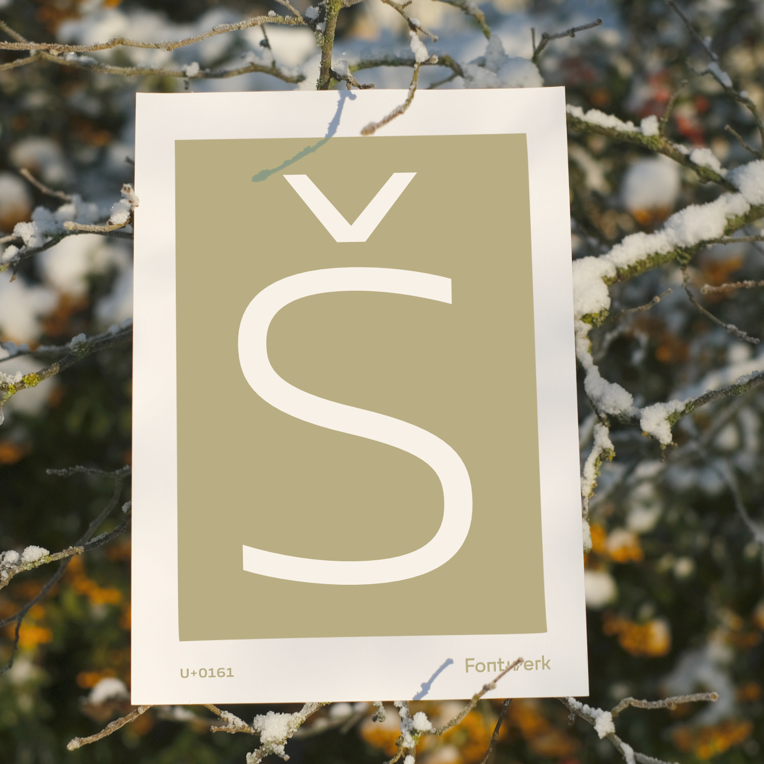 In our last newsletter, we introduced a brand new little series called Big Glyph. For this month’s feature, we’re delighted to share the Š set in Felix Braden’sTurbine Light. The typeface is crafted with technical precision and has a cool appearance that makes it very recognizable. The superelliptical curves (a mixture of ellipse and rectangle), wide proportions and minimal contrast ensure that the attention of the reader is captured and held. The letter Š (S with caron) is often used to represent the sh sound (such as in the word Shaquille). Although originally a Czech character, it is used in several languages today, including Latvian, Lithuanian, Slovene or Sami. The Unicode codepoint for Š is U+0160 and for š it’s U+0161. ↗ |
|
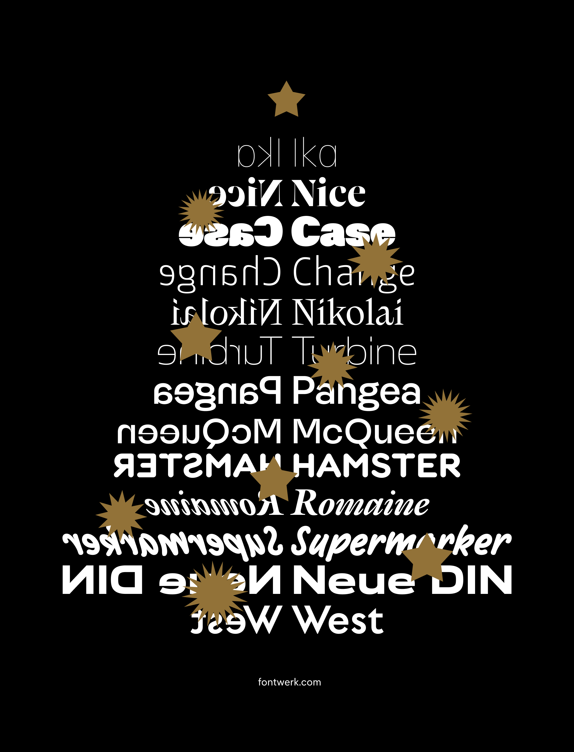 As another year of Fontwerk draws to a close and we look forward to taking a little break over the holidays, we want to send all of our customers, designers and supporters best wishes for the festive season. As we said earlier, we are so grateful to be able to do what we love and we couldn’t do it without the support from you all. ↗ |
|
From sturdy and serious superfamilies to one-off, off-the-wall and experimental display fonts, if you have an original design we would love to hear from you. We work in close partnership with our designers, giving them the time and space to craft and perfect their work, while we take care of all the other background things such as engineering, distribution, marketing and sales. Sounds interesting? Read our Ten Reasons to Become a Fontwerk Designer and find out more about the process. |
|
|
|