We share some fantastic in-use cases for three brands who are committed to change for good. Featuring Nice, Pangea and Nikolai, it’s great to see how Fontwerk fonts are put to use to raise the voice of companies who are taking action against climate change. We’re also super excited to introduce a brand new BIG regular feature to Werknews.
 | ECO-CONSCIOUS BRANDS LEADING THE WAY WITH OUR FONTS |
|---|
|
In this month’s newsletter, we share some fantastic in-use cases for three brands who are committed to change for good. Featuring Nice, Pangea and Nikolai, it’s great to see how Fontwerk fonts are put to use to raise the voice of companies who are taking action against climate change. We’re also super excited to introduce a brand new BIG regular feature to Werknews. Read on to find out more. |
|
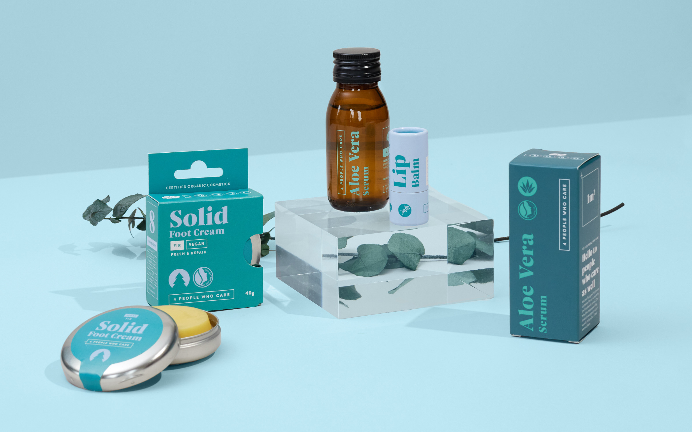
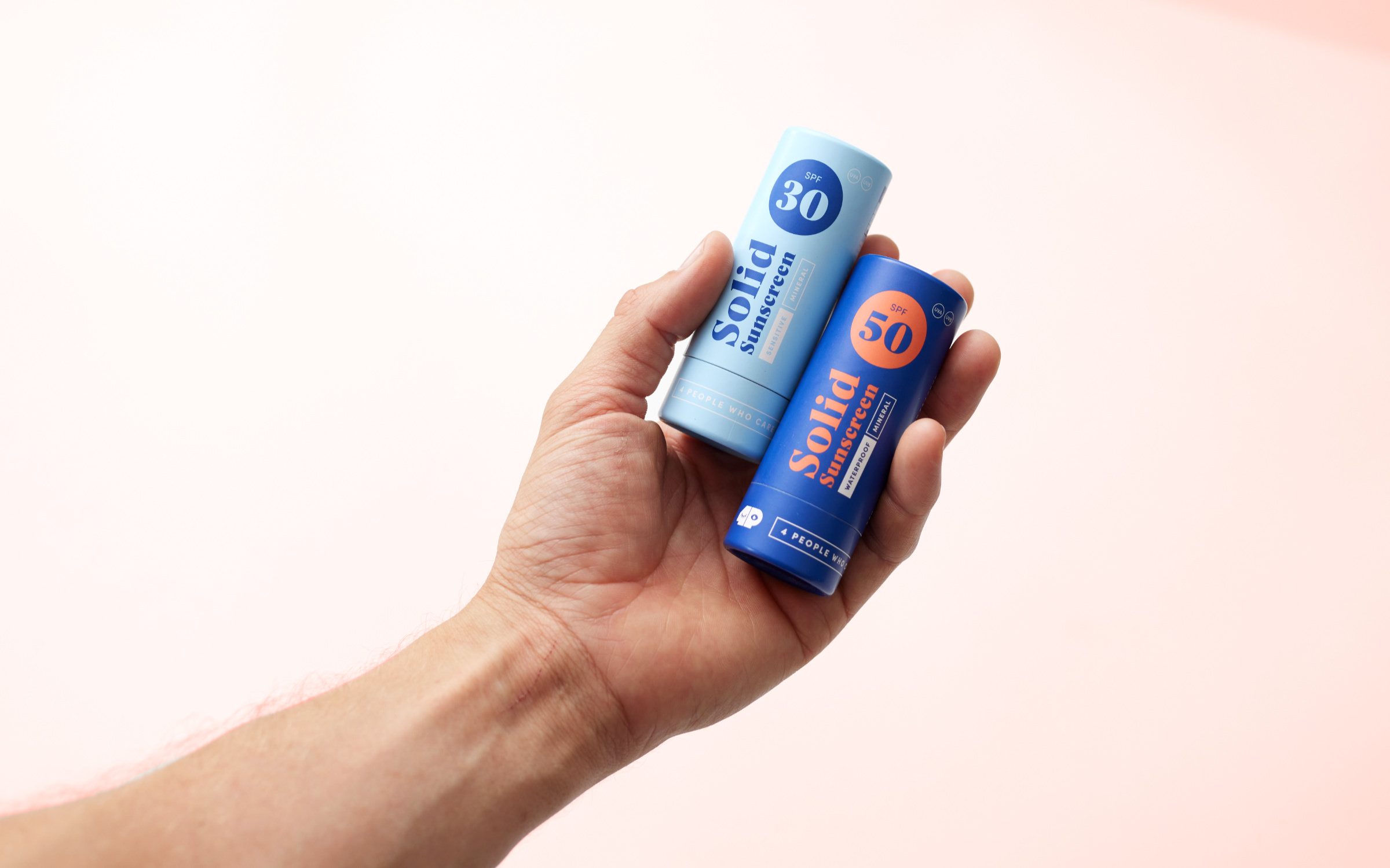 | | In harmony with nature and yourself: The brand new design of the vegan skincare range from 4 People Who Care, set in Nice Headline | |
|
| | Nice takes center stage 4 People Who CareIn our latest use case for Nice, an eco-conscious cosmetics brand uses Nice as its hero typeface for their brand. For Benno Hinrichsmeyer, an experienced Climbing Instructor and Sport Masseur, the road to finding a natural care product for his hard-working hands was a long one, so much so that he decided to create his own cosmetics brand. In 2019, he began experimenting with natural ingredients to develop his first vegan hand cream. A few months later he founded 4 People Who Care with his brother and two friends. As part of a packaging overhaul and redesign, Nice Headline by Jan Fromm adorns the brand new product range and in the words of the Designer, Kathrin Burschyk, they “chose Nice because the typeface commands a great presence both at the POS and in the webstore … just the right warmth and emotionality.” | |
|
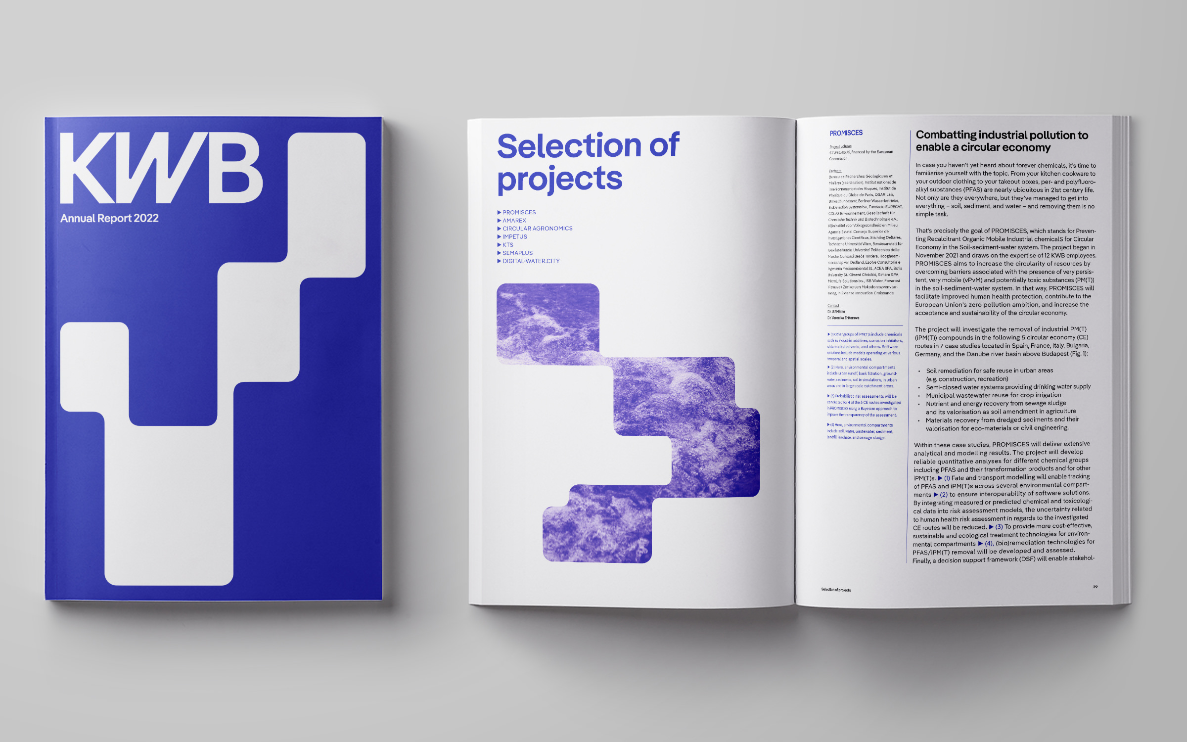 | | KWB’s Annual Report 2022 in the brand new design: Headline and display font is Pangea, with an exclusively-designed W and w, the text font is Pangea Text | |
|
| | Pangea helps KWB find its flowLiving in a highly modernised world, it’s very easy to take water for granted. Yet for the KWB (Competence Center for Water, Berlin), the topic of water is at the heart of what they do. They are tasked with ensuring the ‘promotion of science, research and development on the subject of water, so that Berlin can work efficiently, considerately and in a forward-looking manner with its urban water cycle.’ As the world changes and faces a climate crisis, KWB’s work is becoming ever more important. As their prominence and role has grown so has the need for a visual identity that connects and engages with their audience. They recently collaborated with Bureau Est agency, to create and develop a completely new brand under the artistic direction of. Featuring our very own climate-conscious Pangea Superfamily, the new visual identity elevates the voice and tone of KWB and is utilized across the whole brand. A particular special feature is the brand new logo which includes an exclusive alternative letter W designed by Christoph Koeberlin. | |
|
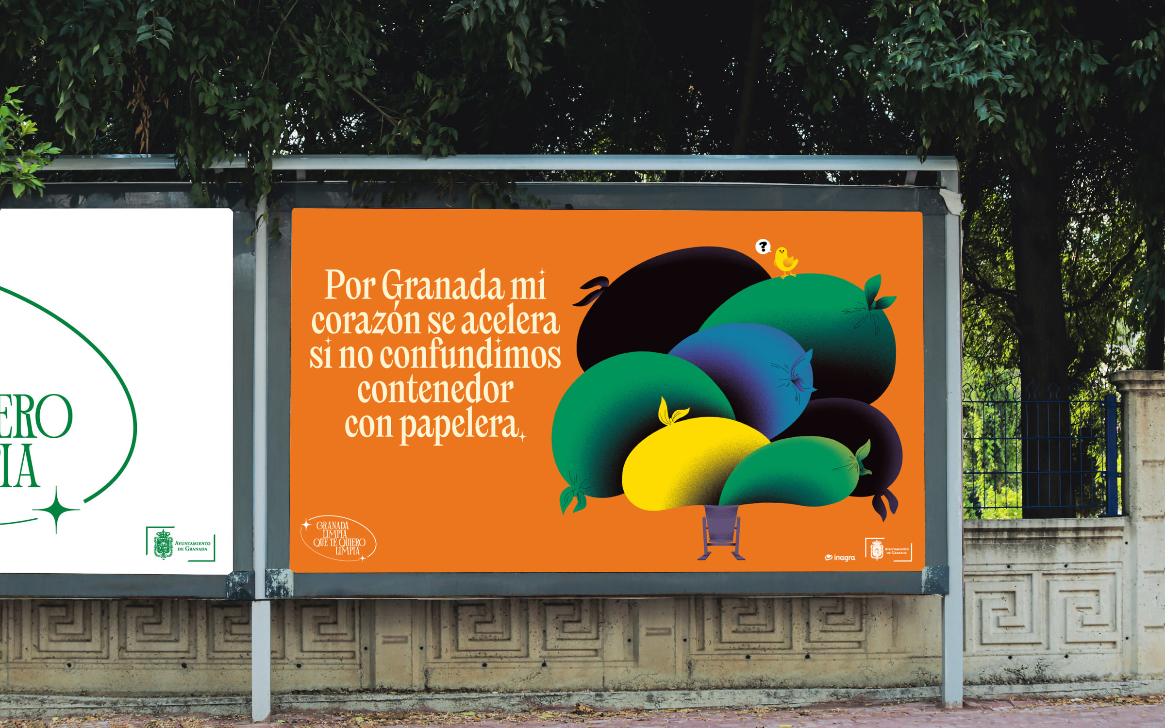 | | The space-saving, high-contrast Nikolai proves to be extremely helpful because it keeps the wordy messages together in an easy-to-read manner. | |
|
| | Granada: Nikolai on a mission to cleanFor many large cities across Europe, waste can be a big problem and for the Andalusian capital, Granada, they have to deal with their fair share of abandoned trash. Yet the City Council has been on a mission to change public attitude and behaviour and have enlisted the help of a range of agencies to help address the problem. With support from the environmental service provider PreZero, the local cleaning service Inagra, the Creative Agency Viernes and Franziska Weitgruber’sNikolai font, they have created a motivational campaign to keep the city clean. ‘Clean Granada, I love you clean’ aims to ensure that every individual can make a modest contribution to help clean up. With a range of brightly coloured posters that are adorned with a broad array of call to actions and beautiful illustrations, it’s an eye-catching and compelling campaign guaranteed to catch the attention of the local population. | |
|
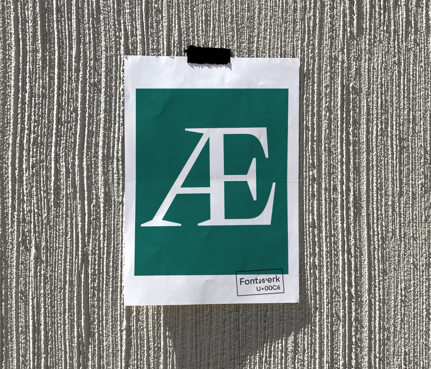 In a brand new monthly addition to Werknews, we’ll be casting the spotlight on some of the hidden gems of our typefaces in a brand new feature called Big Glyph. This month’s gorgeous Big Glyph is the Æ set in Nikolai Regular. Nikolai is perhaps our most striking typeface to date and was designed by Franziska Weitgruber. Full of character and highly versatile, Nikolai really packs a punch in headlines, logos and set large on posters (as proven in the use-case described before). Nerd knowledge: Æ is formed from the letters a and e and is used in some languages (such as Danish, Norwegian, Icelandic, and Faroese for instance) as a letter. It is the code point U+00C6 in Unicode. ↗ |
|
Want to see more Fontwerk fonts out in the wild? Or need some inspiration for your latest design project? Then head to our growing In Use Gallery to see many examples of our typefaces in use. If you have used one of our fonts in a project then we’d love to hear from you. |
|
|
|