Fonts in Use: A customized Pangea typeface for the Competence Center for Water, Berlin

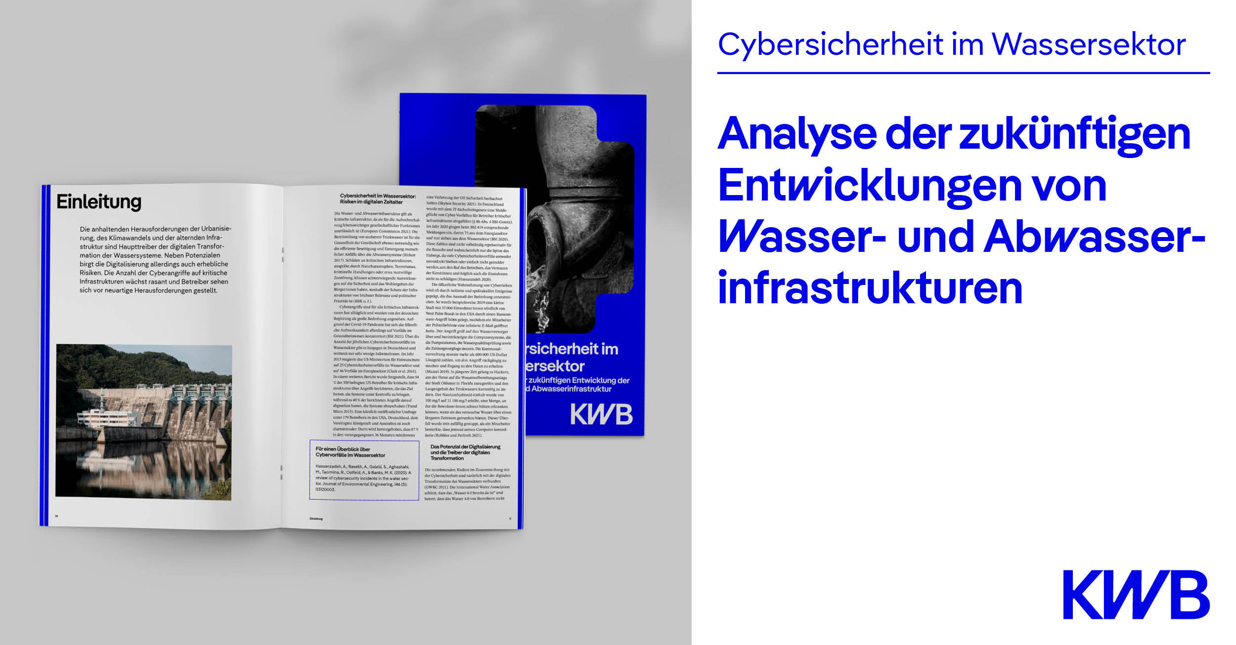
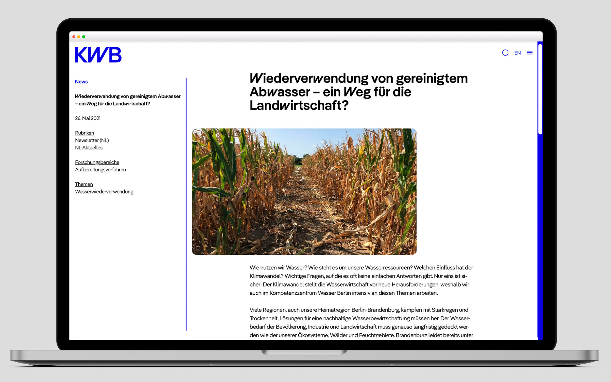
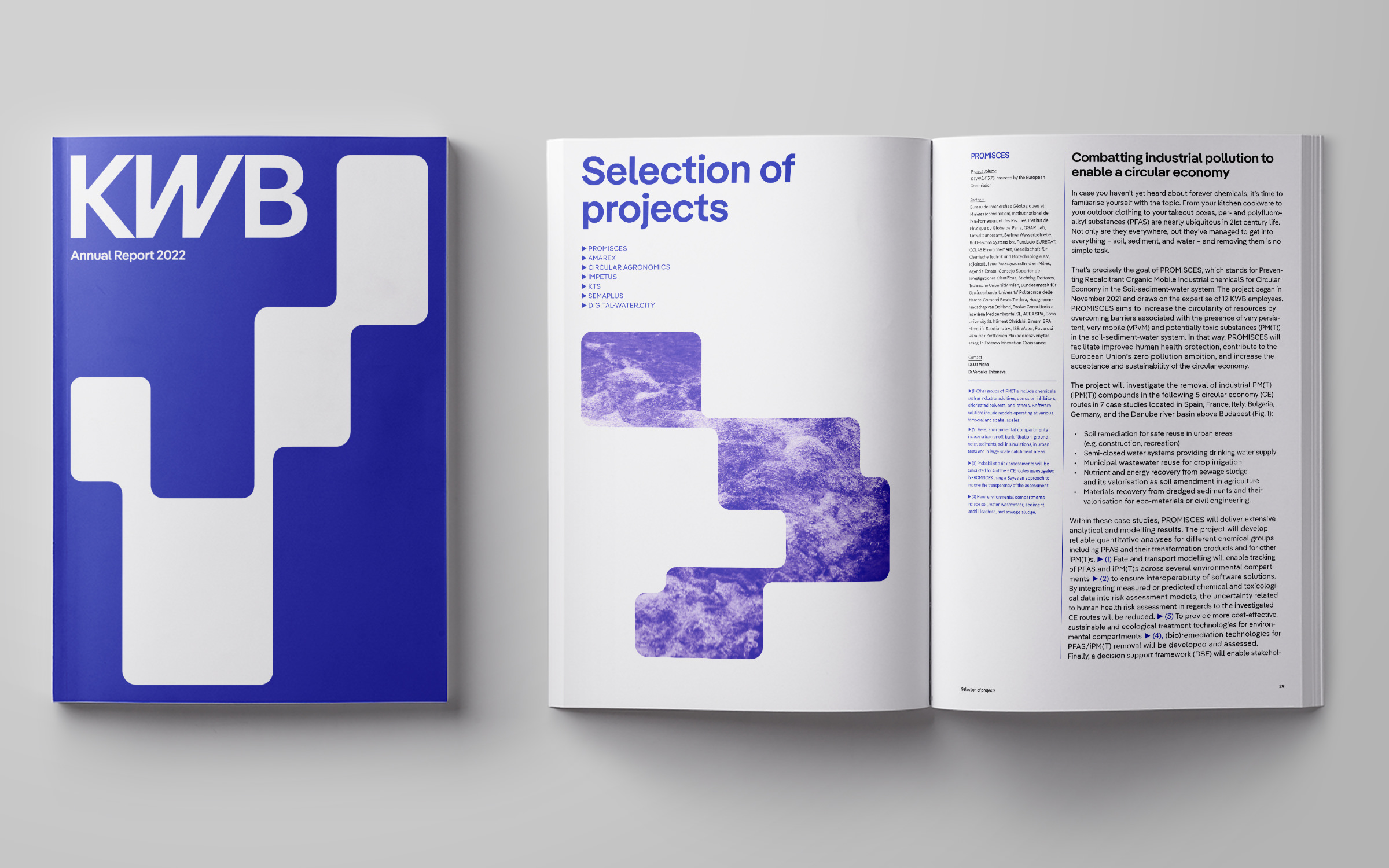
The annual report 2022 of the KWB in the new brand design: Headline and display font is Pangea, with an exclusively-designed W and w, the text font is Pangea Text

Water: more precious than gold

Water is one of life’s greatest elixirs and is essential for all living things. When it flows, we hardly think about it.

But it doesn’t flow everywhere.

Across the globe, 1.1 billion people do not have access to clean drinking water. And yet increasingly, even in industrialized countries, it flows in an uncontrolled manner. Global warming is changing the water cycle and we must learn to be reconciled with water.

The KWB (Competence Center for Water, Berlin) is a non-profit limited company and it was founded in 2001. KWB scientifically monitors the topic of water. The shareholders are the Berliner Wasserbetriebe, the Berlinwasser Holding GmbH and the Technology Foundation Berlin. The statutory mandate of the KWB is the ‘promotion of science, research and development on the subject of water, so that Berlin can work efficiently, considerately and in a forward-looking manner with its urban water cycle.’
Fonts in Use: A customized Pangea typeface for the Competence Center for Water, Berlin

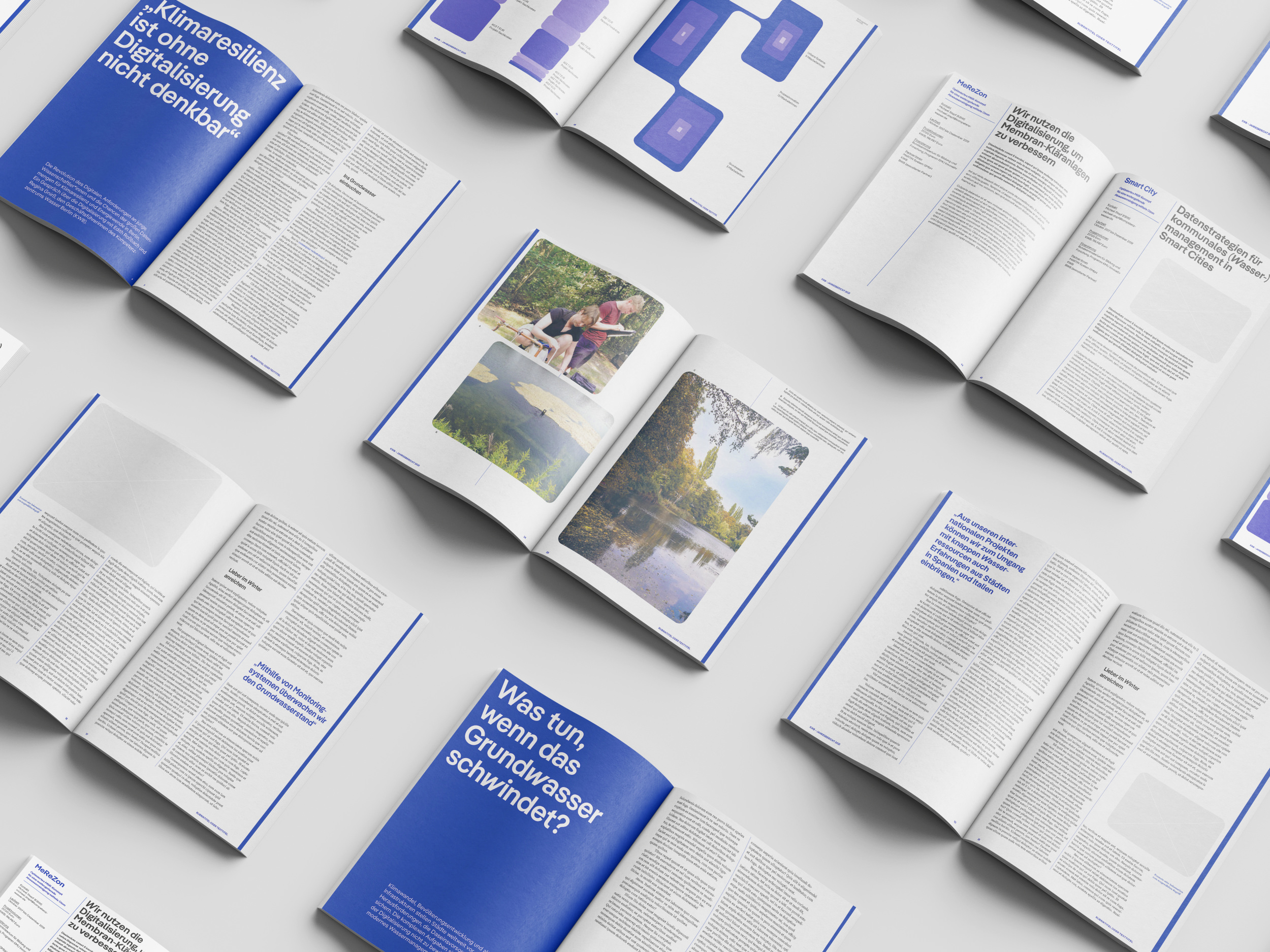
Since the work of the KWB is now of high importance and their reach has grown, they decided to reposition and revamp their 20 year old brand. Working with the Bureau Est agency, they have developed a completely new brand, website and literature concept with artistic direction from Ondine Pannet and Marie Schuster.

Fonts in Use: A customized Pangea typeface for the Competence Center for Water, Berlin

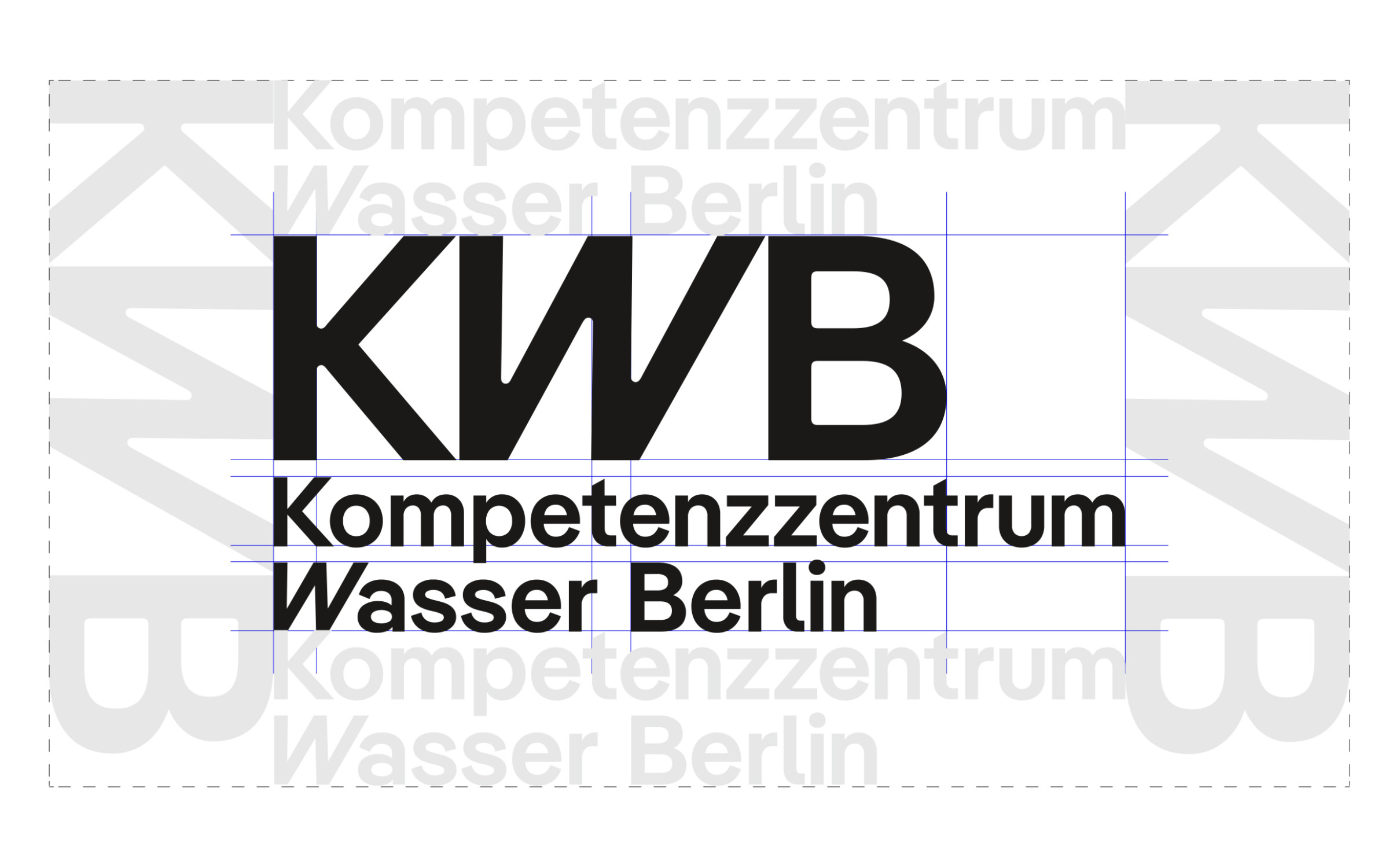
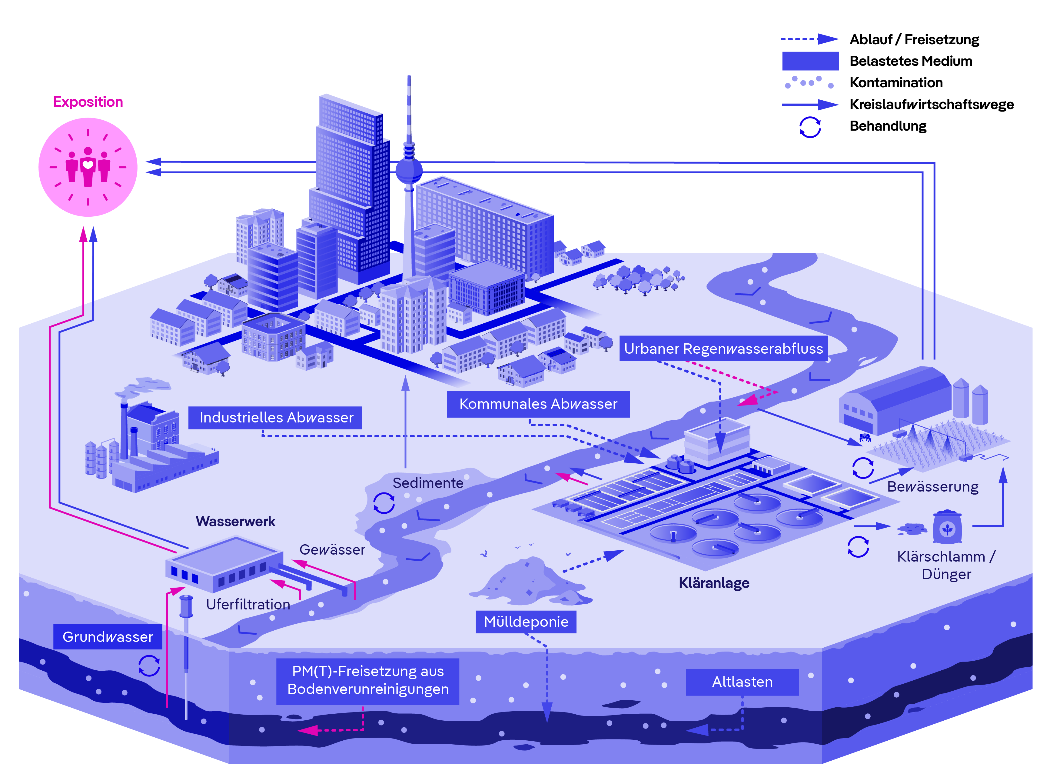
The beautiful and thematically appropriate Pangea font is now the corporate font; more precisely the SemiBold and SemiBold Italic weights, as well as Pangea Text Regular and Text Italic. As the letter W (= water) plays a pivotal role in the new logo, both the lowercase and the uppercase letter W were incorporated into the fonts in an exclusive alternative (italicized and with two vertical strokes) which was designed by Christoph Koeberlin.

Fonts in Use: A customized Pangea typeface for the Competence Center for Water, Berlin

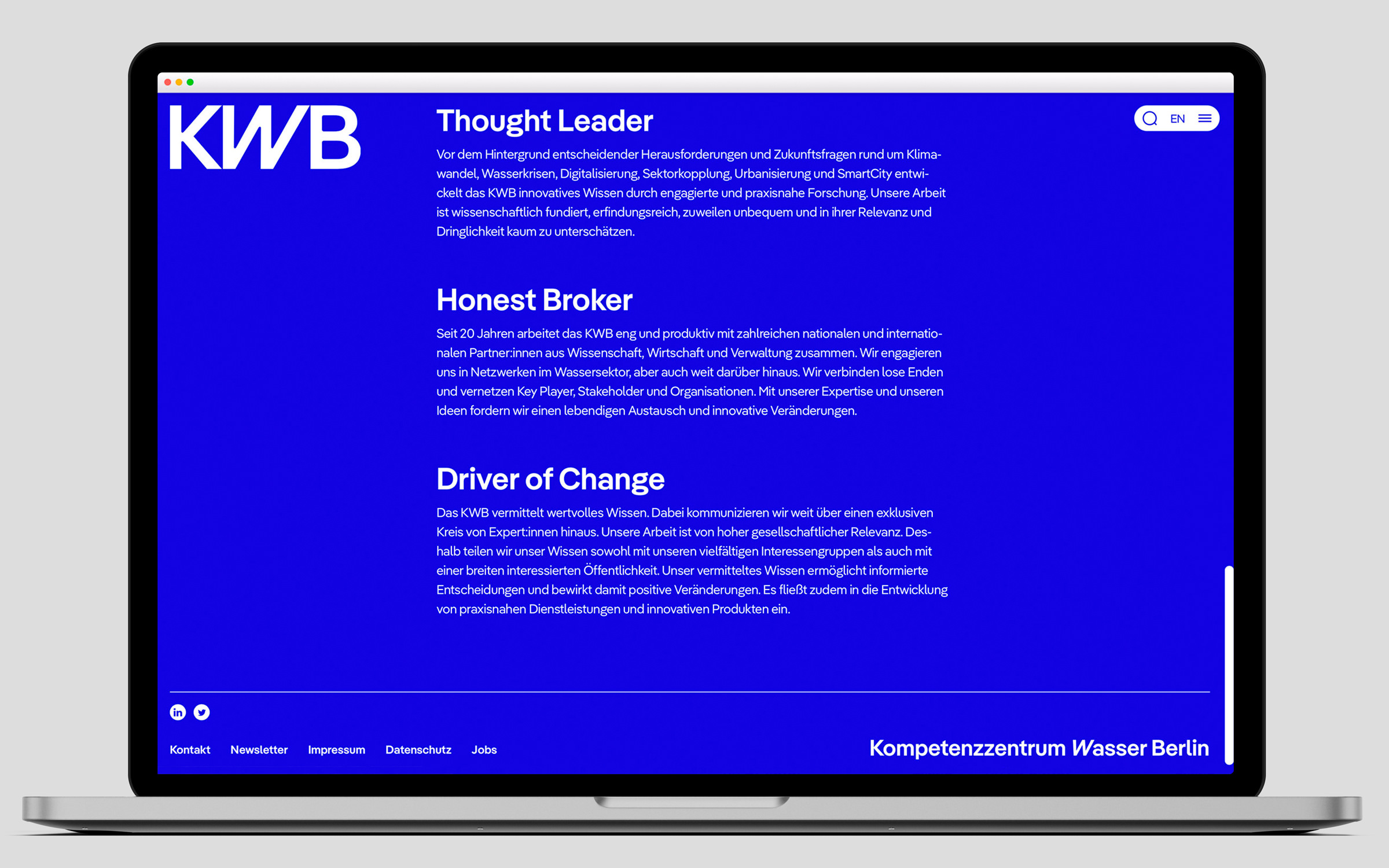
With this micro-typographic leitmotif, both the KWB website and its printed matter have an unmistakable identity. The intention behind the leitmotif is explained, as follows, in their annual report: “With the redesign of our communication, we have created the basis for the scientifically-based, inventive, sometimes uncomfortable and yet urgent work of the KWB in a modern, targeted way with a clear attitude.”

Try Pangea

Fonts in Use: A customized Pangea typeface for the Competence Center for Water, Berlin