he Communication Designer Jana Heinz dealt with an educational discrepancy in her Bachelor’s thesis she wrote while studying at the Trier University of Applied Sciences. “Every day, a lot of waste is produced in classrooms. This is particularly true when it comes to materials that are used or created on project days, such as posters (which have a very short lifespan).” Ironically, learning materials used when teaching sustainability are in strong contradiction to the learning objective. “In my concept of a project day on the topic of sustainability and consumption, the linking of content and form has the highest priority. All materials, their design and the handling of the final product are designed to consistently embody the learning objectives.”
Environment Agent
Leading by example
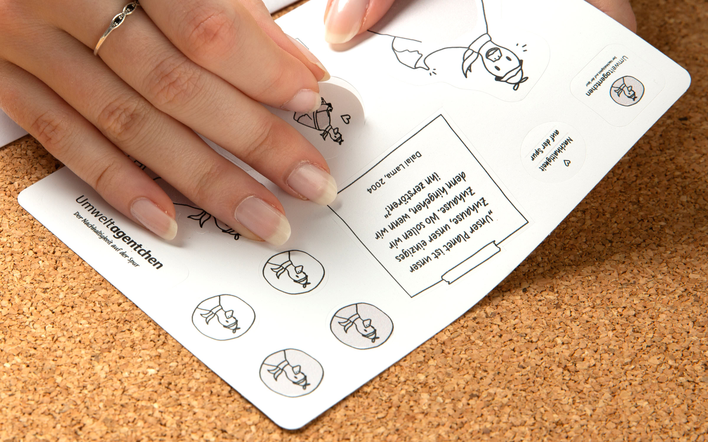
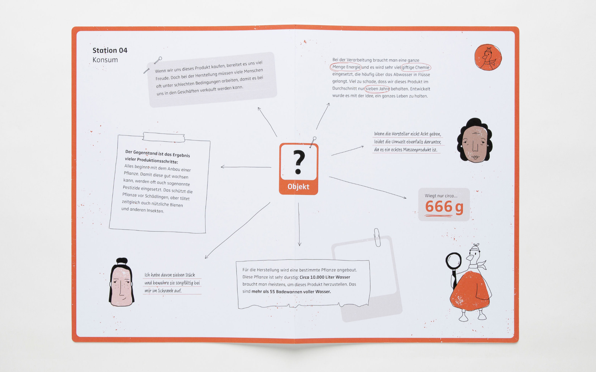
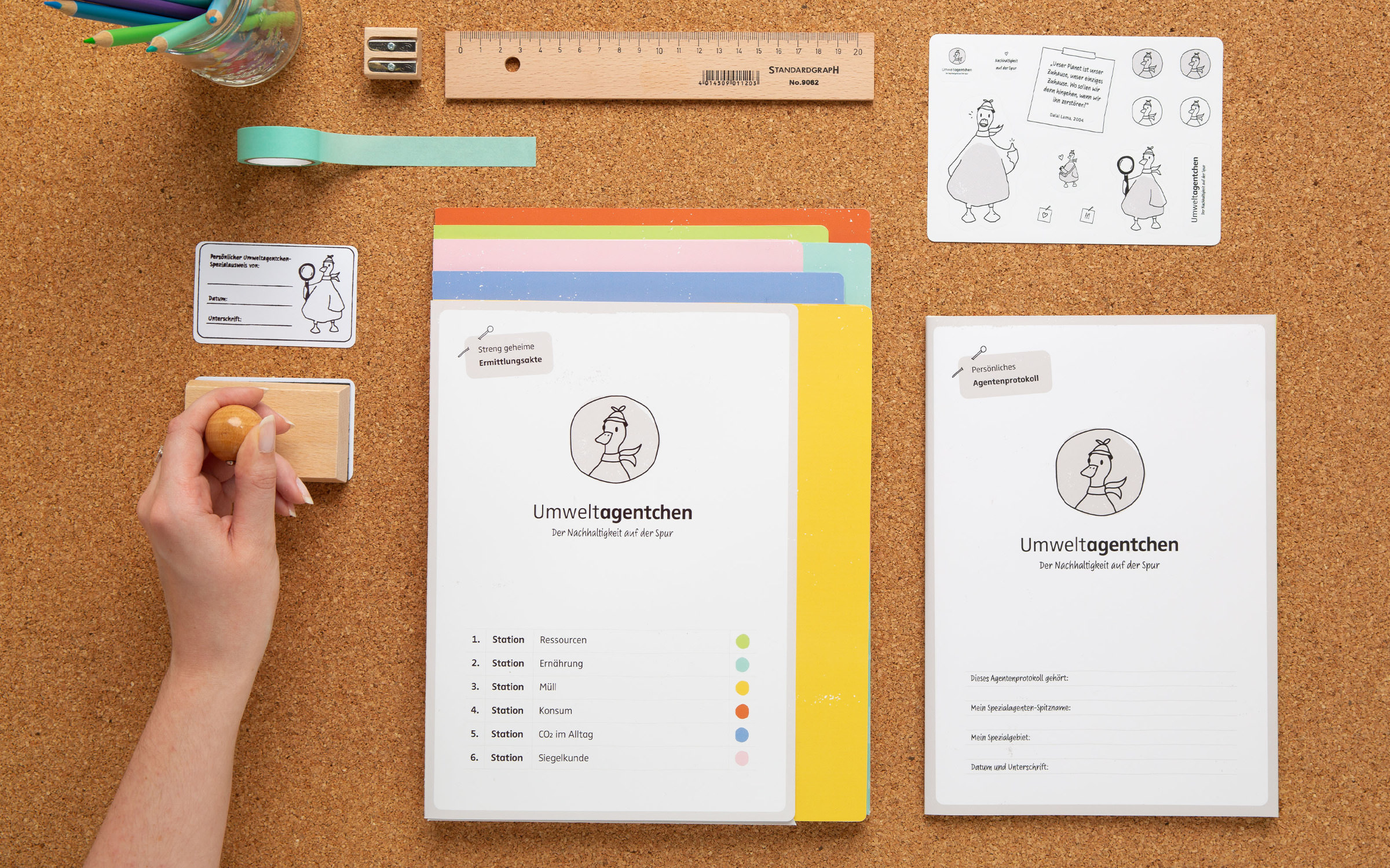
She developed a mascot called the Environment Agent that guides primary school pupils through six stations each with a different puzzle tasks: Resources, Nutrition, Waste, Consumption, CO₂ in everyday life and Eco-labelling. The children are made aware of these topics in a playful way and learn how to deal with raw materials and their own consumption in a reflective way.
When designing the teaching materials, Jana Heinz always paid attention to the children’s perspective, which strongly influenced the typography and visual hierarchies. Explanatory texts and tasks are set using the Bold and Regular weights of the typeface FF Zwo. Its designer, Jörg Hemker, is an expert in the development of highly readable typefaces that combine humanistic and geometric qualities. The most recent example of this is his Superfamily Ika.
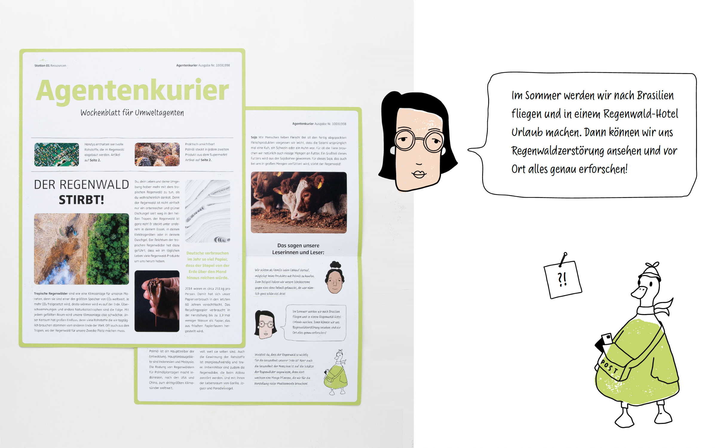
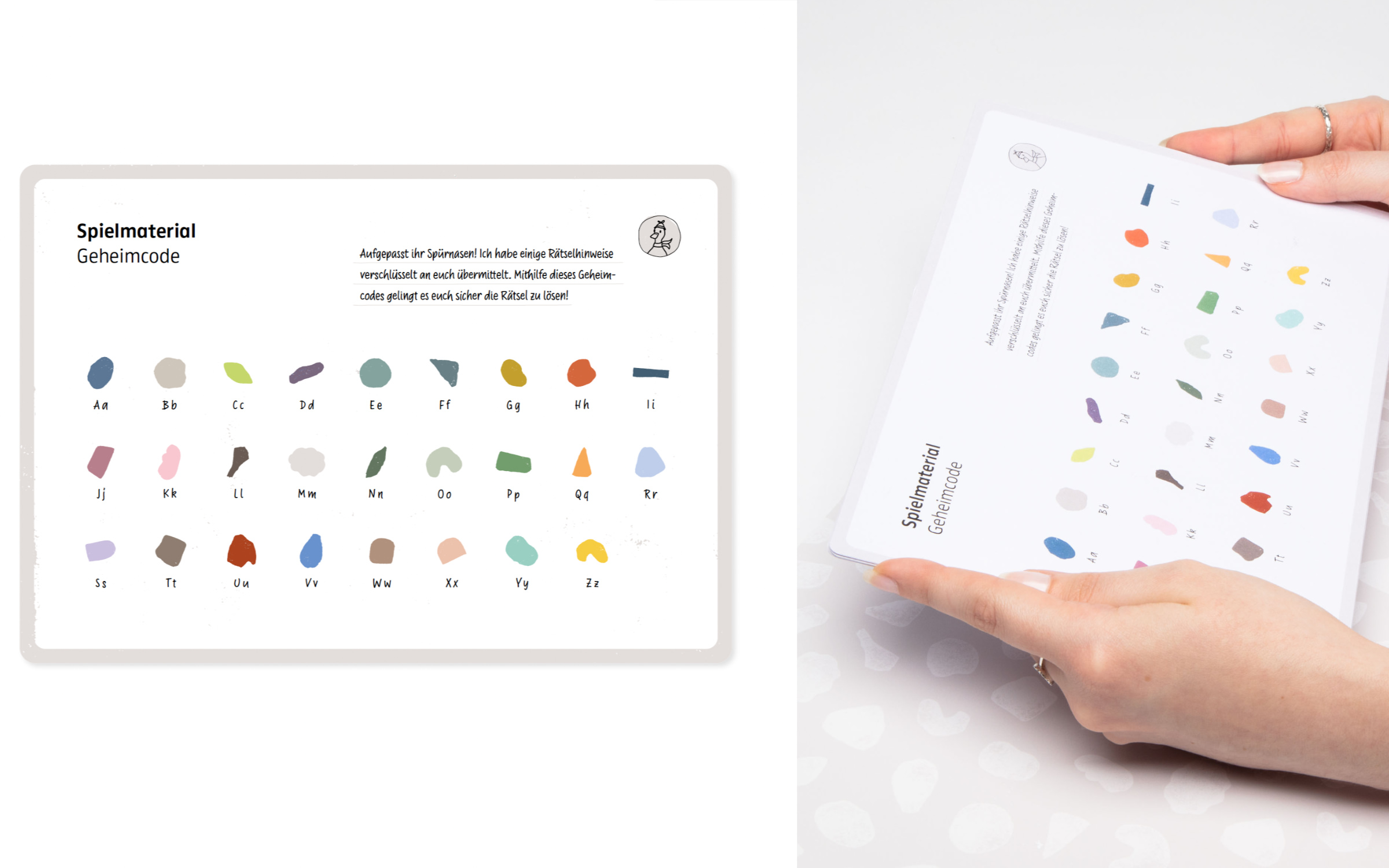
For the puzzles and the illustrations, Jana Heinz chose the script typeface Supermarker which was designed by Ulrike Rausch. With its felt-tip pen look, it was actually intended for use at the point of sale, but what sparks customer interest in busy and distracting shopping situations attracts even more attention in the classroom. The clever programming of Supermarker uses three (consonants) and four (vowel) letter variants to create the impression of authentic handwriting.
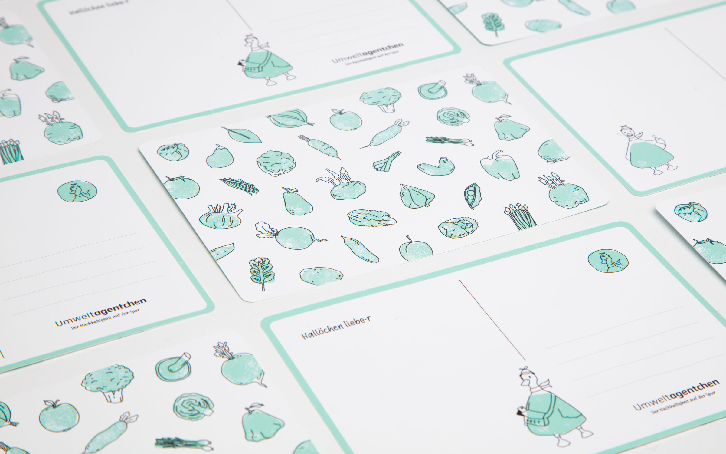
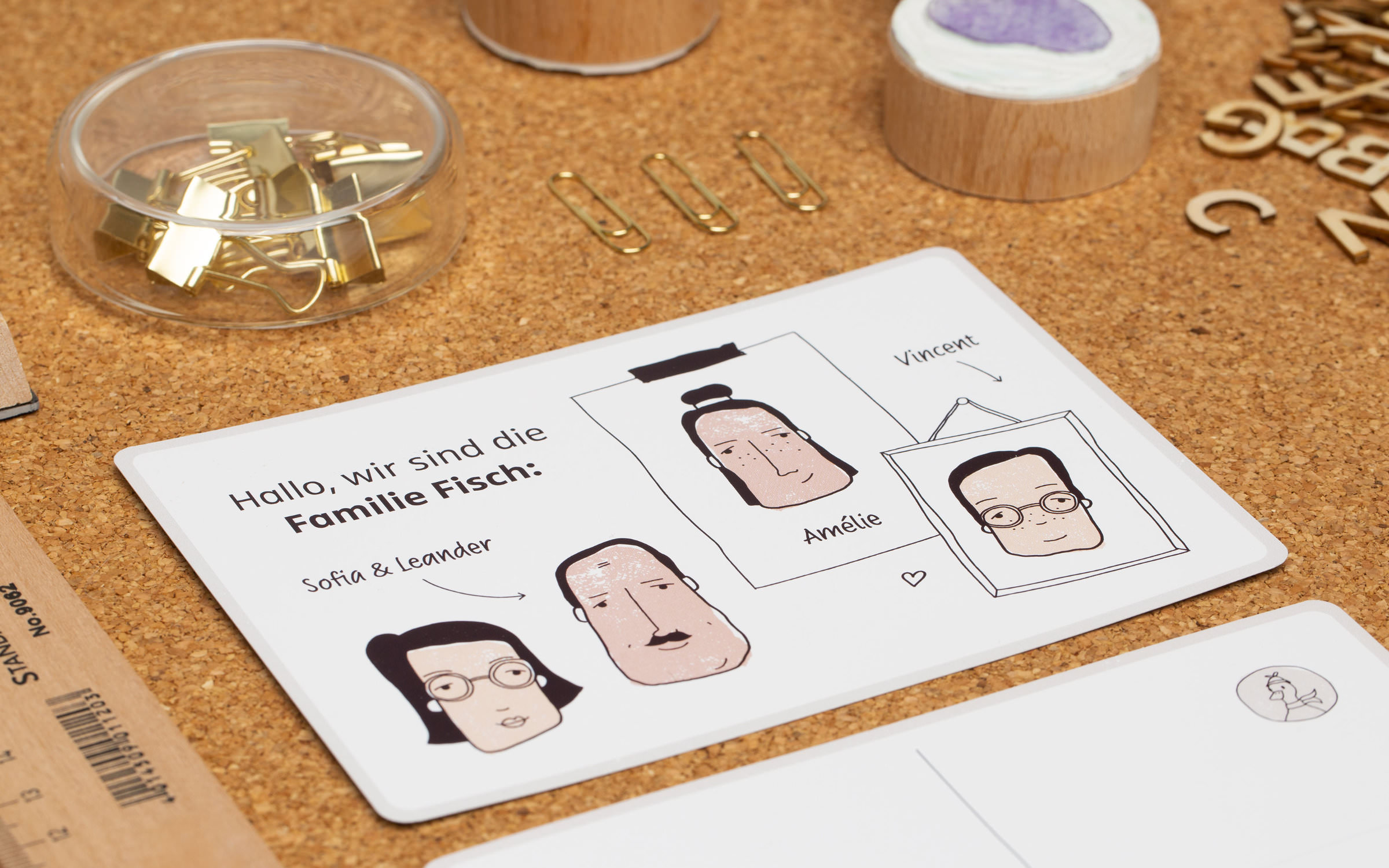
The close link between content and form becomes clear when one looks at the formal language of the illustrations. Twenty six stamp shapes form the basis of all illustrations, whether it is a type of fruit or vegetable, the shape of a person’s face or even the ‘Environment Agent’ mascot itself. The use of the illustrations is based on the principle of reuse. The conception of the game and the conscious use of the working materials ensure that many children can use the same tools. If the project is carried out as planned, there is virtually no waste on the project day.
