Nikolai
Nikolai
“The ancients stole all our great ideas from us.”, Mark Twain complained. “Nonsense!” we respond.


Designer(s)
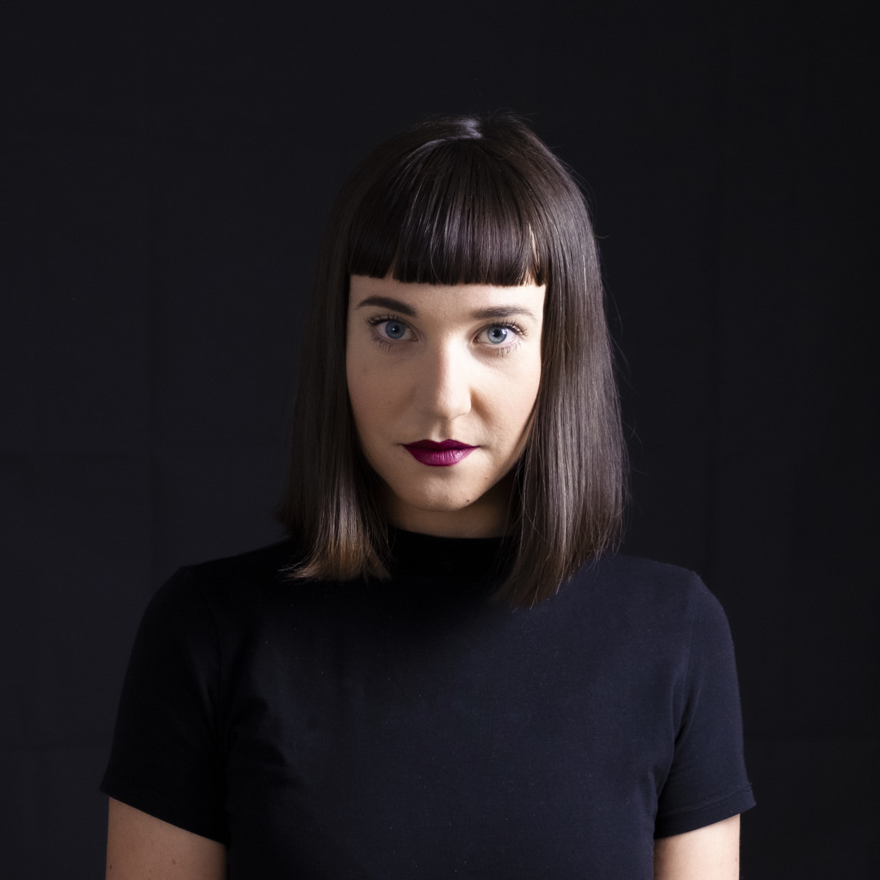
Franziska Weitgruber
Franziska Weitgruber
It is in the middle of two mountain ranges that Franziska Weitgruber designs her typefaces. The letterforms that she designs are just as striking as the South Tyrolean Alps where she lives.
Fascinated by the interaction of analog and digital technologies, she explores the limits of these tools and materials in her work. She works intensively with manual printing techniques and high-quality coatings, such as gold leaf, enamel paint, risography and screen printing.
Franziska received her Bachelor’s Degree in Graphic Design with a focus on type from the New Design University St. Pölten (typography, calligraphy, hand lettering, typeface design). Later she also worked there as a lecturer. The TypeMedia Master at the Royal Academy of Fine Arts in The Hague manifested her way to type design. Franziska is currently working as a freelance type designer and graphic designer. She is also a regular guest mentor at Type Clinic Slovenia.
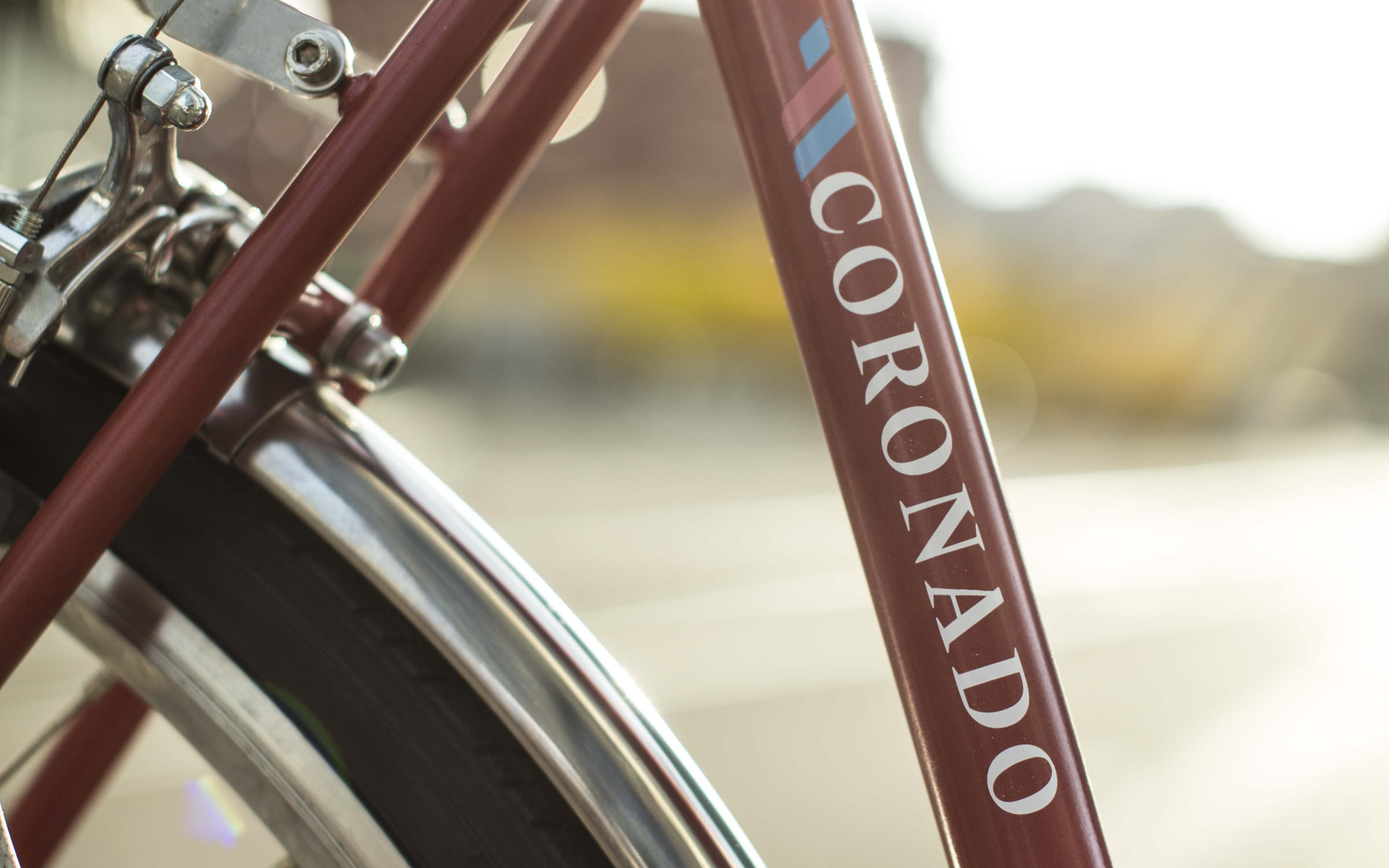
In addition to Nikolai, she also initially published early versions of her fonts Gig and Roba on the Future Fonts platform. Aside from the world of letters, she loves bicycles and the Rietveld Schröder House in Utrecht.
Fonts on Fontwerk
Team & Details
Design Contributions
Mastering, Production
Andreas Frohloff
Christoph Koeberlin
Rosalie Wagner Variable Fonts
Marketing
Franziska Weitgruber Naming
Ivo Gabrowitsch Copywriting, Imagery (© Shutterstock), Specimen
Lucy Beckley English Translation
Anja Knust Graphic Design, Imagery
Design Period
2018–2020
Release History
July 20, 2020; Variable Fonts February 15, 2022
Technology, Licenses & Trademarks
Formats
Static .otf, .woff2
Variable .ttf, .woff2
Additional formats on request
Licenses
Trial Free test license
Base Includes Desktop, Web and Social Media use
Extended Larger volume, App or Audio-Visual
Additional licenses on request
Modifications, Extensions
Available on request
Variable Fonts
Included in the Family package
2 axes: weight, width
Web file sizes .woff2: 97 KB Upright, 102 KB Italic
Trademarks
Nikolai™ is a trademark of Fontwerk GmbH
A
Glyphs
Uppercase
A
B
C
D
E
F
G
H
I
J
K
L
M
N
O
P
Q
R
S
T
U
V
W
X
Y
Z
Lowercase
a
b
c
d
e
f
g
h
i
j
k
l
m
n
o
p
q
r
s
t
u
v
w
x
y
z
Latin Accents
Á
Ă
Â
Ä
À
Ā
Ą
Å
Ã
Æ
Ć
Č
Ç
Ĉ
Ċ
Ð
Ď
Đ
É
Ĕ
Ě
Ê
Ë
Ė
È
Ē
Ę
Ğ
Ĝ
Ģ
Ġ
Ħ
Ĥ
Í
Ĭ
Î
Ï
İ
Ì
Ī
Į
Ĩ
Ĵ
Ķ
Ĺ
Ľ
Ļ
Ŀ
Ł
Ń
Ň
Ņ
Ŋ
Ñ
Ó
Ŏ
Ô
Ö
Ò
Ő
Ō
Ø
Õ
Œ
Þ
Ŕ
Ř
Ŗ
Ś
Š
Ş
Ŝ
Ș
ẞ
Ə
Ŧ
Ť
Ţ
Ț
Ú
Ŭ
Û
Ü
Ù
Ű
Ū
Ų
Ů
Ũ
Ẃ
Ŵ
Ẅ
Ẁ
Ý
Ŷ
Ÿ
Ỳ
Ź
Ž
Ż
á
ă
â
ä
à
ā
ą
å
ã
æ
ć
č
ç
ĉ
ċ
ð
ď
đ
é
ĕ
ě
ê
ë
ė
è
ē
ę
ğ
ĝ
ģ
ġ
ħ
ĥ
í
ĭ
î
ï
̇
ì
ī
į
ĩ
ĵ
ķ
ĺ
ľ
ļ
ŀ
ł
ń
ň
ņ
ŋ
ñ
ó
ŏ
ô
ö
ò
ő
ō
ø
õ
œ
þ
ŕ
ř
ŗ
ś
š
ş
ŝ
ș
ß
ə
ŧ
ť
ţ
ț
ú
ŭ
û
ü
ù
ű
ū
ų
ů
ũ
ẃ
ŵ
ẅ
ẁ
ý
ŷ
ÿ
ỳ
ź
ž
ż
Numerals & Currency Symbols
0
1
2
3
4
5
6
7
8
9
¤
€
$
¢
£
¥
₿
ƒ
₺
0
1
2
3
4
5
6
7
8
9
0
1
2
3
4
5
6
7
8
9
0
1
2
3
4
5
6
7
8
9
Small Caps
!
"
#
$
%
&
'
(
)
*
+
-
/
0
1
2
3
4
5
6
7
8
9
<
=
>
?
@
[
\
]
a
b
c
d
e
f
g
h
i
j
k
l
m
n
o
p
q
r
s
t
u
v
w
x
y
z
{
}
~
¡
¢
£
¥
«
¬
±
»
¿
×
ß
à
á
â
ã
ä
å
æ
ç
è
é
ê
ë
ì
í
î
ï
ð
ñ
ò
ó
ô
õ
ö
÷
ø
ù
ú
û
ü
ý
þ
ÿ
ā
ă
ą
ć
ĉ
ċ
č
ď
đ
ē
ĕ
ė
ę
ě
ĝ
ğ
ġ
ģ
ĥ
ħ
ĩ
ī
ĭ
į
ĵ
ķ
ĺ
ļ
ľ
ŀ
ł
ń
ņ
ň
ŋ
ō
ŏ
ő
œ
ŕ
ŗ
ř
ś
ŝ
ş
š
ţ
ť
ŧ
ũ
ū
ŭ
ů
ű
ų
ŵ
ŷ
ź
ż
ž
ƒ
ș
ț
ȷ
ə
̀
́
̂
̃
̄
̆
̇
̈
̊
̋
̌
̦
̧
̨
ẁ
ẃ
ẅ
ỳ
‐
‑
‒
–
—
‘
’
‚
“
”
„
•
‰
′
″
‴
‹
›
‽
⁒
€
₺
₿
−
∞
≈
≠
≤
≥
⟨
⟩
⸘
Punctuation
.
,
:
;
…
!
¡
?
¿
&
@
·
•
*
‽
⸘
#
/
|
\
(
)
{
}
[
]
-
–
—
‒
‐
‑
_
‚
„
“
”
‘
’
«
»
‹
›
‴
"
'
⟨
⟩
Mathematical Signs & Symbols
∙
≅
≙
+
−
×
÷
=
≠
>
<
≥
≤
±
≈
~
¬
^
∞
∫
Ω
∆
∏
∑
√
µ
∂
%
‰
Arrows & Shapes
↑
↗
→
↘
↓
↙
←
↖
●
○
◊
■
□
▲
▼
△
▽
▴
▸
▾
◂
Ligatures
Tv
Tw
Ty
ffb
ffh
ffi
ffk
ffl
fb
ff
fh
fi
fj
fk
fl
tt
Greek
π
Languages
| A | Afrikaans Albanian Asu |
| B | Basque Bemba Bena Breton |
| C | Catalan Cornish Croatian Czech |
| D | Danish Dutch |
| E | Embu English Esperanto Estonian |
| F | Faroese Filipino Finnish French Friulian |
| G | Galician Ganda German Gusii |
| H | Hungarian |
| I | Icelandic Inari Sami Indonesian Irish Italian |
| J | Jola-Fonyi |
| K | Kabuverdianu Kalenjin Kamba Kikuyu Kinyarwanda |
| L | Latvian Lithuanian Lower Sorbian Luo Luxembourgish Luyia |
| M | Machame Makhuwa-Meetto Makonde Malagasy Maltese Manx Meru Morisyen |
| N | North Ndebele Northern Sami Norwegian Bokmål Norwegian Nynorsk Nyankole |
| O | Oromo |
| P | Polish Portuguese |
| Q | Quechua |
| R | Romanian Romansh Rombo Rundi Rwa |
| S | Samburu Sango Sangu Sena Serbian Shambala Shona Slovak Slovenian Soga Somali Spanish Swahili Swedish Swiss German |
| T | Taita Teso Turkish |
| U | Upper Sorbian Uzbek |
| V | Volapük Vunjo |
| W | Walser Welsh |