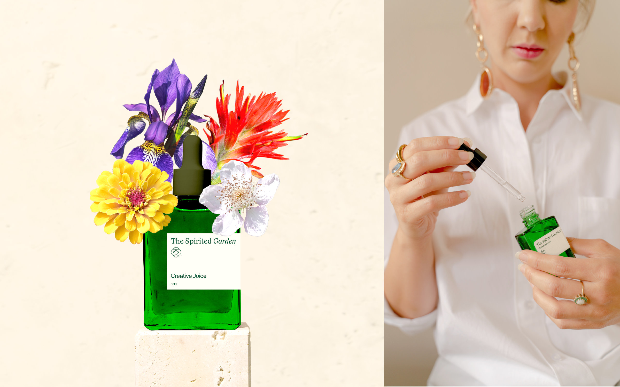
pirited Garden is where Mother Nature and Design meet,” says the founder. “I want to make flower essences more accessible, without hocus-pocus, but presented in a down-to-earth and contemporary way.” Spirited Garden’s essences, sprays and rollers are intended to support people in challenging moments, “from a broken heart to a boost in creativity or self-confidence”. The names of the products range from Creative Juice, Focus Zone, Here I Am! to Flower Power. The odourless essences are for oral consumption, one drop under the tongue four times a day. Rollers and sprays are used externally and release a beautiful flowery fragrance. Emily also creates flower essences that are specifically tailored to the individual needs of her customers.
The Spirited Garden
Mother Nature and her children
© Photo: Sanne Marije Sanders
S

© Photo: Sanne Marije Sanders
The presentation of the products products is both emotional and factual. The animated illustrations are eye-catching: The remedy bottles are arranged like flower vases in which colourful blossoms dance. The typography is informal and clear but without being clinical. Lyrical headlines, set in the extravagant Nikolai, stimulate the imagination. While small print, set in Pangea, provides transparent information. Product-specific quotes (“I’m bringing sexy back…”) are set in Nikolai Italic.
What I like about Pangea is not only its appearance and legibility, but also the story behind the typeface. A quarter of the designer’s royalties go to climate protection, which for me closes the loop to my natural products.
explains Emily on her choice of Pangea. While, “The quirky Nikolai brings an edgy twist to my brand. She’s feisty, bold and quite far from the visual clichés in mental health or holistic medicine marketing.”
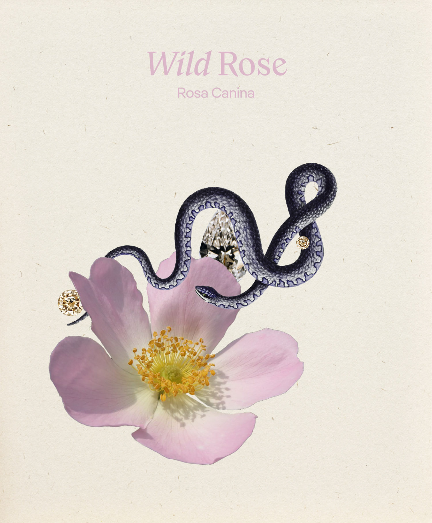
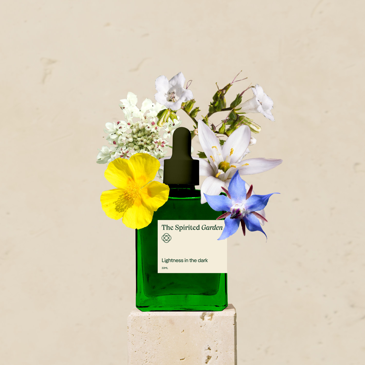
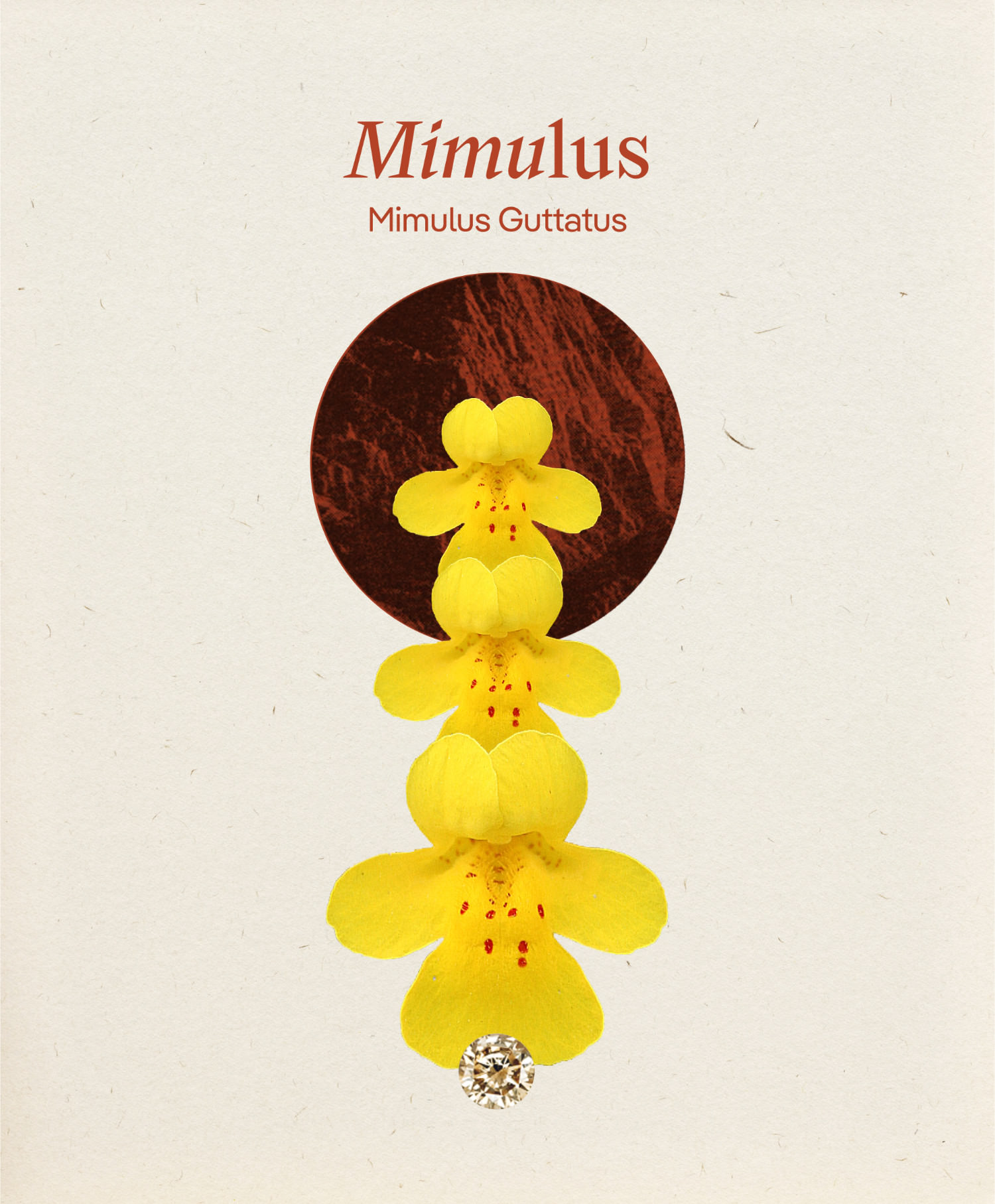
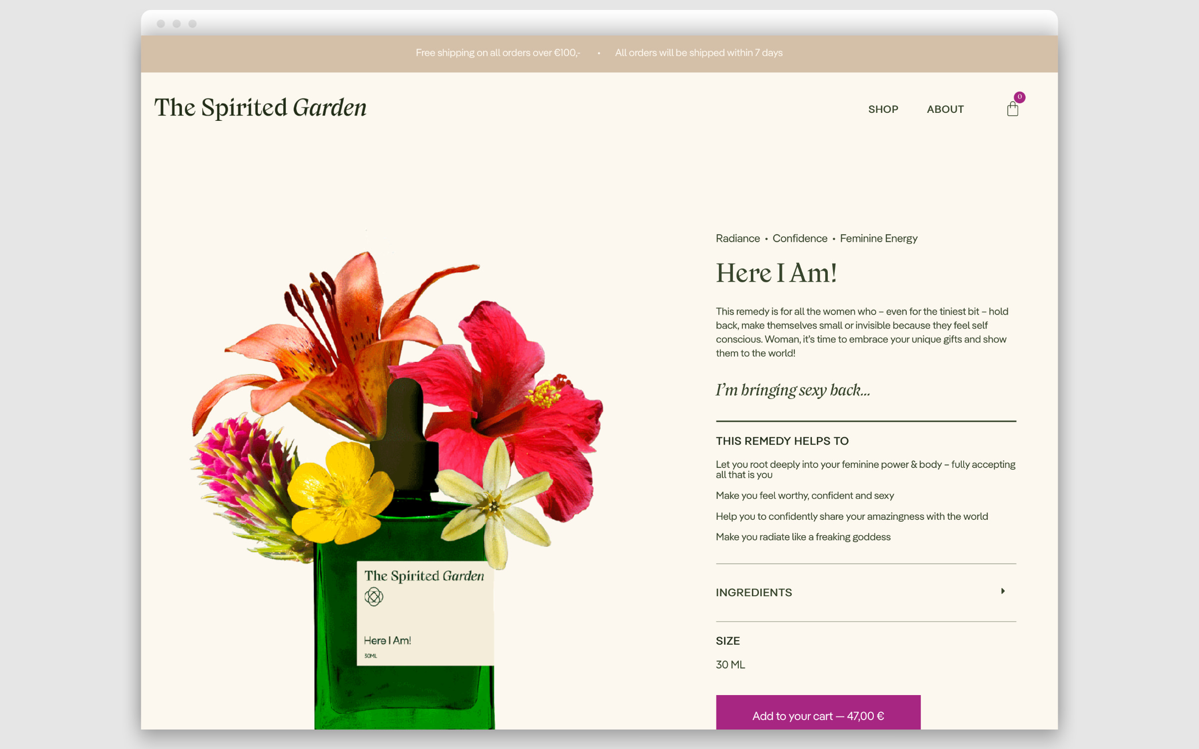
Cheeky language, clean design, subtle typography: that’s what sets the natural remedies apart from the clichés of the industry.
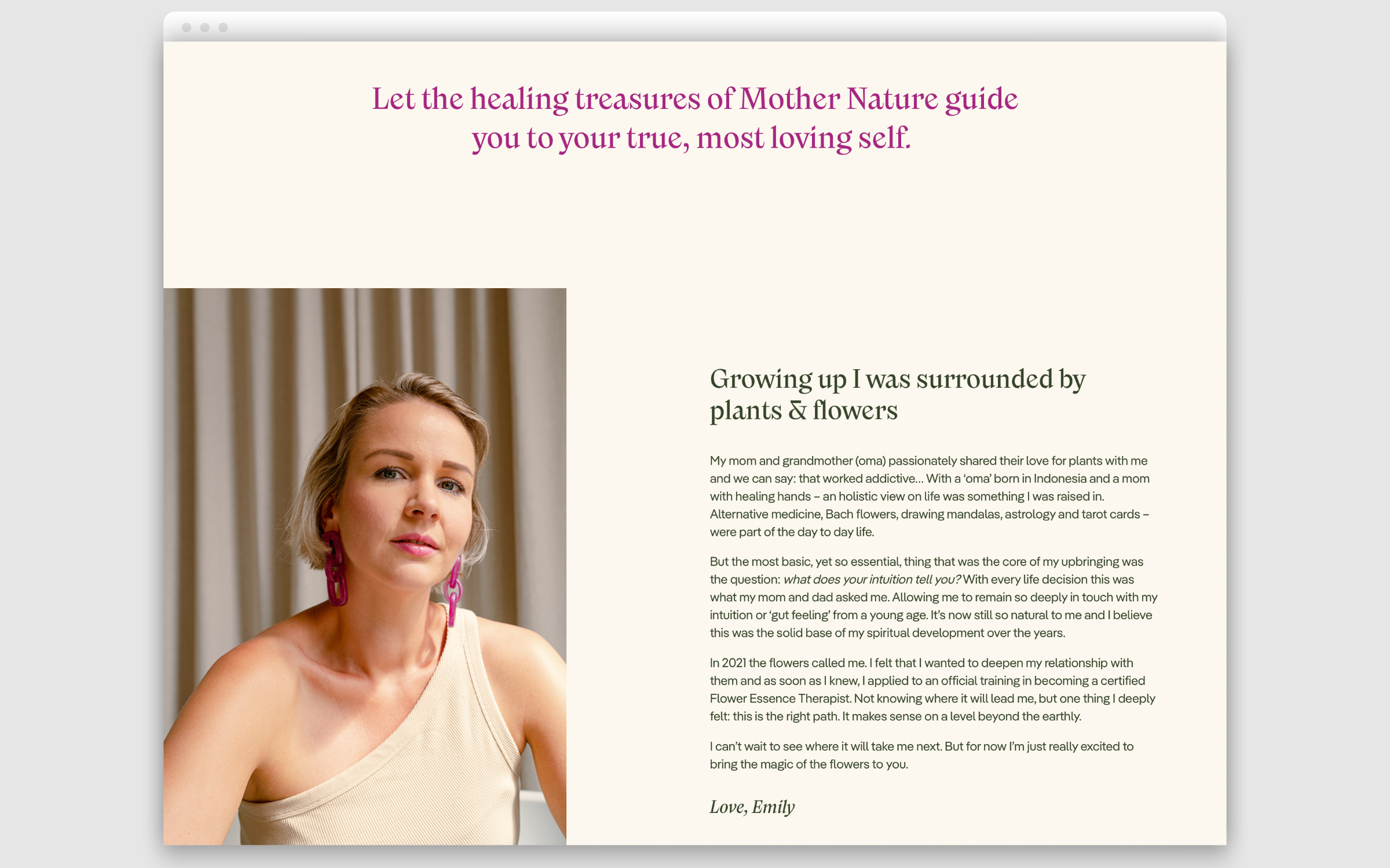
Screenshot thespiritedgarden.com