Nikolai

Font Story: “The ancients stole all our great ideas from us.”, Mark Twain complained. “Nonsense!” we respond.

Perhaps our most striking typeface to date

Nikolai typeface – Specimen

Admittedly at the very beginning of the conception of Nikolai was the attempt to reinterpret an old idea. At the end is something that has rarely been seen before, in terms of character and typographical impact. The best ideas are almost always only the best ideas of their time.

T

he designer, Franziska Weitgruber, was entrusted with the task of designing a revival of the Monotype typeface, Veronese, during her TypeMedia master’s degree at KABK in The Hague. Veronese is a mechanized version of the Golden Type by William Morris from 1925, which in turn was a rough interpretation of Nicolas Jenson’s earlier Print types of the 1470s. However, she was not entirely satisfied with the result and found her interpretation too cool and too rigid.

Driven by her own aspirations and ambition, she later tried to reinterpret another Jenson Model from the Renaissance. She found Nebiolo’s Jenson in an almost 90-year-old specimen from the legendary Turiner Foundry. Beguiled by the wild and liveliness of the typeface, she began to digitize the bold weight.
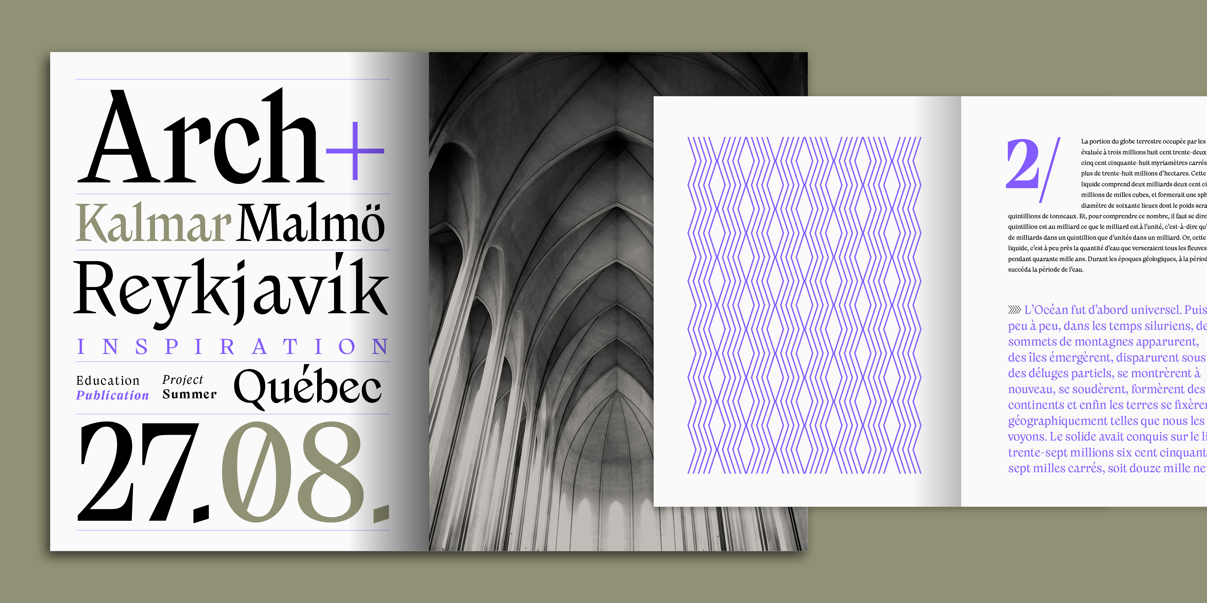
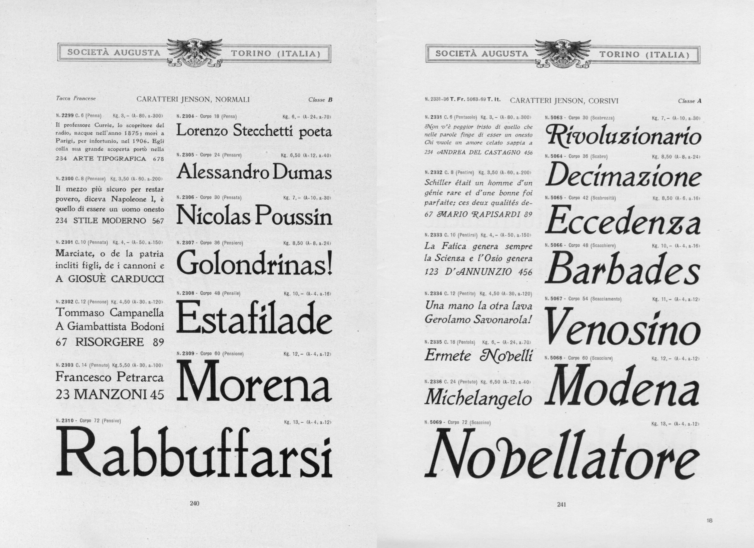
Image of the Nebiolo Specimen from the 1930s. It’s clear to see how far the designer moved away from the original.
Image of the Nebiolo Specimen from the 1930s. It’s clear to see how far the designer moved away from the original. Scans made available by Dr. Thomas Maier.

Very soon, however, she abandoned her revivalist approach and developed the design and forms in a more emancipated and contemporary direction. In doing so, the typeface began to evolve into a display family full of character. And so Nicolas became Nikolai with the crucial letter ‘k’ which is so important in its design. The original Renaissance-DNA is now barely recognizable in the design owing to the clear stroke contrast.

The font was initially published on the Future Fonts platform. Renowned for showcasing refreshing and rebellious designs at an early stage, the young platform offered Franziska the ideal space to develop Nikolai into a modern extended family. The expansion into different widths, as well as the design of the italics, ornaments and alternative forms, such as round instead of square dots, are due in part to direct user feedback on Future Fonts. All these characteristics make the typeface a highly versatile headline, poster and logo font.

Now with its publication on Fontwerk, Nikolai has reached its optimum level of maturity. The angular and pointed shapes are full of character and fully developed. Overall, it exudes a typographic hardness, which when combined with a sans-serif, especially a geometric one, will command your full attention.

When all your best ideas just lay ahead of you, tease them out with a typeface that knows how to do it.

Try Nikolai