Written by Amir Mahdi Moslehi
The Evolution and Adaptation of the Arabic Script
Cultural Diversities and Modern Typography
T
he Arabic script stands as one of the most enduring and influential writing systems in human history. It has served not only as the primary means of recording religious texts but also as a vital cultural and artistic symbol across diverse regions. Its development reflects a complex interplay of regional aesthetics, linguistic structures, and technological innovations. From its earliest Kufic origins to the development of six proportioned calligraphic styles—including Naskh—the script has continuously adapted to meet the needs of its users, resulting in a rich tradition of calligraphy.
This essay explores the evolution of the Arabic script by first examining its origins and the development of various calligraphic styles, with a focus on how regional influences have shaped these forms. It then investigates regional variations across the Islamicate societies—such as North African, Persian, and Ottoman calligraphy—highlighting how linguistic and cultural differences have influenced script forms and reading practices. Special attention is given to the modifications that non-Arabic languages like Persian and Urdu have made to the script to accommodate their unique phonetic and aesthetic requirements, thus contributing to the diverse orthographies and calligraphic conventions within the Eastern narratives of the Arabic script.
Furthermore, the essay analyzes orthographic and formal variations—such as letter proportions, diacritical marks, and layout textures—that define regional distinctions and impact readability and visual identity. An examination of the influence of historical empires, particularly the Safavid and Ottoman, reveals how these political entities shaped distinct calligraphic traditions that continue into modern typography.
In addition, the transition from traditional calligraphy to digital fonts introduces new challenges and opportunities. This study showcases the design process behind the Persian version of Pangea Arabic, a contemporary typeface by Christoph Koeberlin and Azza Alameddine rooted in Western narrative traditions of Arabic script. Modifications to key letters—such as Meem, Seen, Heh, Yā, and Waw—were carefully implemented to better accommodate Persian orthography and aesthetic conventions. This process exemplifies how culturally informed adjustments are essential in creating digital fonts that are both contemporary and respectful of manuscript cultures.
The text highlights the importance of understanding the historical, cultural, and linguistic factors that have shaped Arabic script. Thoughtful typographical adaptations, such as those made in the development of the Persian version of Pangea Arabic, are vital for preserving tradition and reader acceptance while embracing technological progress.
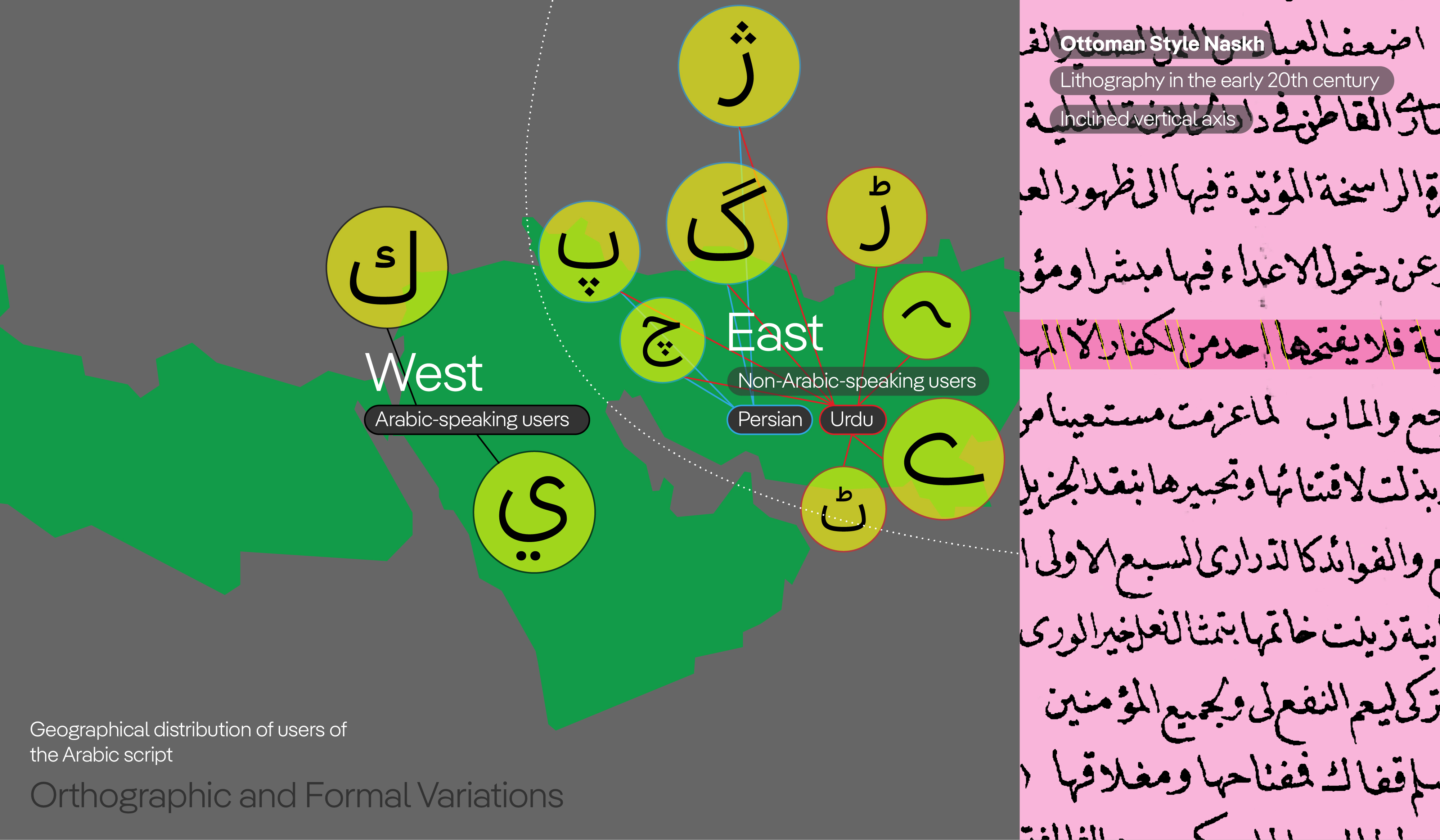
Fig. 01: Stylistic and linguistic diversity among Arabic script users across the SWANA region (South West Asia and North Africa)
Historical Context
Since the advent of Islam and the widespread adoption of the Arabic script across territories under the Islamic Empire, the Arabic script has traveled extensively and evolved according to the cultural and geographical contexts it encountered. Due to the importance of writing and calligraphy in Islamic teachings—e.g. the Quran emphasizes the act of writing and swearing by the pen—the Arabic script has become a primary visual symbol of cultural identity in Islamicate Societies. This emphasis has elevated calligraphy to a major art form during the Islamic period and afterward.
The formal variations in Arabic calligraphy, notably the development of more ornate and sophisticated styles over the centuries, have contributed to the continuous evolution of the script, shaping its aesthetic and functional aspects over a history spanning over a millennium.
Given the vast geographical extent of the Islamic Empire—from western China to Spain—varied scribal traditions emerged, influenced by local linguistic and cultural backgrounds. Consequently, different readings and interpretations of the Arabic script developed based on regional and cultural contexts. Therefore, a uniform way of reading or writing Arabic script does not exist; perspectives on readability and aesthetic considerations vary significantly.
Development of Calligraphic Styles
In the early Islamic centuries, the predominant script style was Kufic, mainly used for Quranic and religious texts under state patronage. During the Abbasid period, a more cursive style known as the round script emerged, laying the foundation for various contemporary calligraphic styles such as Naskh. The round script introduced curved elements into Arabic letterforms, transforming the visual texture from predominantly horizontal and linear to more rounded and open, aligning the letterforms with natural writing movements. This style later became the basis for the development of a proportioned script system known as the standardized six Islamic scripts, which include: Moḥaqqaq, Rayḥān, Thuluth, Naskh, Tōqīʿ, and Riqāʿ. Each was optimized for different purposes—Naskh being the most common for texts due to its readability and versatility, and Thuluth preferred for titles and inscriptions because of its features that facilitate elaborate calligraphic compositions.
Regional Variations and Adaptations
Due to diverse cultural influences across regions, each area adapted the scripts to suit its own aesthetic and functional needs. For example, North African Naskh exhibits differences from Persian or Indo-Pakistani Naskh—not only in form but also in specific letter shapes. For instance, the final form of the letter Yā in Maghrebi Naskh has a tooth-like terminal, reflecting regional calligraphic traditions. Additionally, certain letters, such as the initial and medial forms of Sād, are written without the tooth in Maghrebi Naskh, a feature not present in eastern interpretations of the Arabic script. An example of this regional influence today is the Tahoma Arabic typeface, which was designed with Maghrebi features. However, it is less favoured among Persian users because it does not align well with local writing conventions.
Arabic and Persian/Urdu: Linguistic and Cultural Divergence
Regions influenced by Islamic civilization are not all Arabic-speaking, although Arabic was the official language of science and governance in the early centuries of Islam. Among these, Iran and the Persian language are significant in the development and refinement of the Arabic script; moreover, Persian was one of the first languages into which the Quran was translated. Since pre-Islamic civilization in Iran was rich in historical culture and written tradition, the arrival of Islam and the Arabic language and script into this society occurred through a different cultural and historical lens. The linguistic differences between Persian and Arabic also play a major role in the variations in reading the Arabic script in Iran and eastern lands such as India and later Pakistan, compared to other Arab countries.
Persian, like Urdu, belongs to the Indo-European language family, whereas Arabic is classified within the Semitic languages. In this regard, the syntax of Persian is entirely different from that of Arabic, resulting in distinct structural characteristics in written texts. For example, Persian and Urdu do not use separate definite articles, whereas the definite articles “Alif” (الف) and “Lam” (لام) in Arabic, placed before nouns, create a vertical rhythm within the text. Additionally, words in Arabic tend to be longer than in Persian. The greater length of Arabic words causes Arabic texts to appear more cohesive and aligned along the horizontal baseline. In contrast, words in Persian are often more fragmented, creating more blank spaces within the text compared to Arabic.
Therefore, Iranian scribes, based on these differences—primarily related to the texture of the text—gradually adapted calligraphic interpretations to the Arabic script, such as Naskh, in a way that achieved better compatibility and yielded improved results when used for Persian texts.
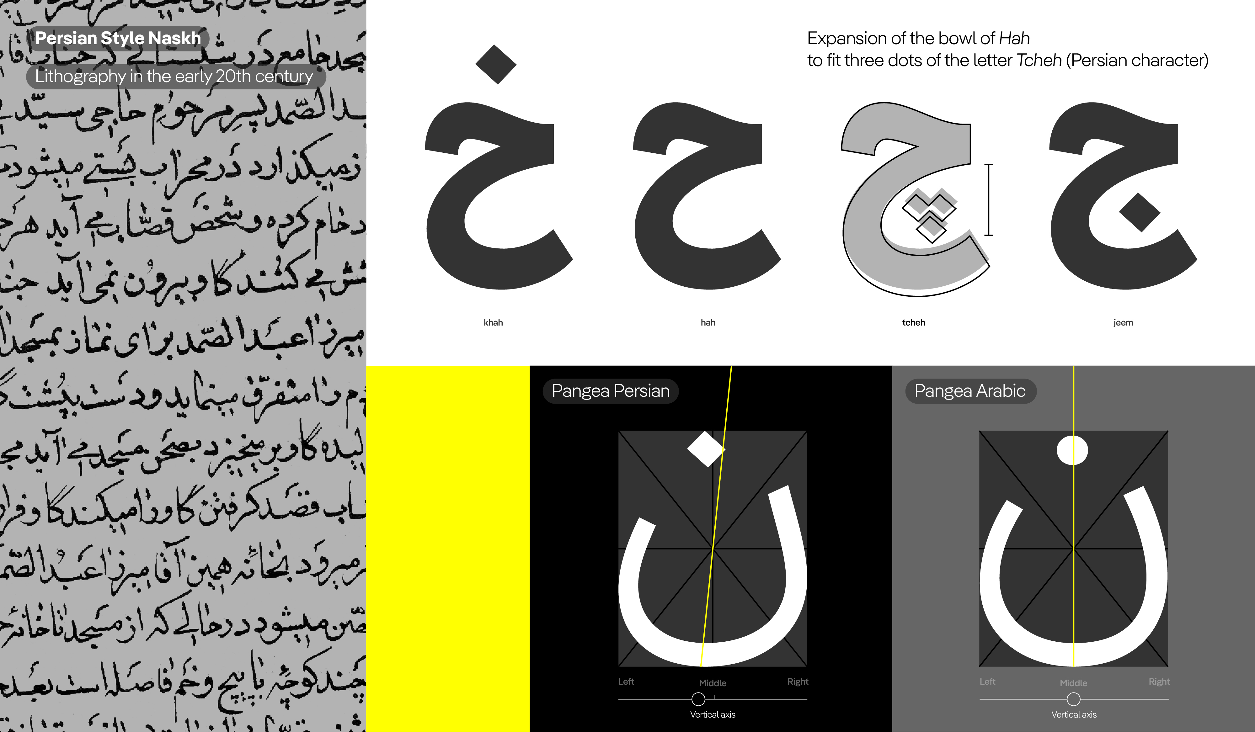
Fig. 02: Persian-style Naskh and its characteristics
Adaptation of Calligraphy for Persian:
The Emergence of Nastaʿlīq
The first attempts to modify Naskh occurred during the Mongol rule over Islamic lands, such as Iran, where a distinctive interpretation of Naskh style developed specifically for writing Persian literary texts, resulting in the establishment of Nastaʿlīq calligraphy style. Over the past 600 years, Nastaʿlīq has become the predominant writing style for Persian texts and later for Urdu.
Features of Nastaʿlīq, such as shifting letters along the horizontal baseline, slanting elongations, and connecting letters from top to bottom along an inclined axis—adapted to the needs of Persian manuscript writing—made it an ideal style for writing in Persian and Urdu. These characteristics allow Persian words to be harmoniously positioned with each other and effectively fill blank spaces, creating a cohesive and uniform texture in the text.
In contrast, the texture of Persian text written in Naskh style tends to be less cohesive. Due to the adherence of Naskh characters to the horizontal baseline, compared to Nastaʿlīq, it results in uneven textures with numerous empty spaces above and below the letters. As a result, some scribes add diacritical marks to fill the empty spaces above the letters, aiming to achieve a more uniform texture.
Regarding the formal features of Nastaʿlīq compared to Naskh, one notable aspect is its curved shape. In Nastaʿlīq, there are no straight lines, which imparts a more flowing and dynamic appearance to the script compared to Naskh. The emergence of Nastaʿlīq in eastern Islamic lands, in addition to linguistic differences, also reflects regional aesthetic preferences in calligraphy. This is evident in the distinctive style of Naskh used in these regions, which differs from that of other areas.
Regional Divergence and Modern Variations
After the formation of the Ottoman Empire in Turkey and the Safavid Empire in Iran as two major powers of the Islamic world in the 16th and 17th centuries CE, two different calligraphic traditions of Arabic script emerged, whose influence is still felt today. For example, the Naskh style and other Islamic pens forms in the Ottoman Empire exhibit different components and proportions compared to the Naskh style in Iran of that period. In Ottoman Naskh, the letters tend to be inclined, whereas in Persian Naskh, the letters are more vertical and upright. Ottoman Naskh features clear skeletal structures in the letters, with noticeable changes in stroke breaks and angularity, while Persian Naskh employs softer, broader strokes that smooth out letter details and create more uniform thickness in the curves.
Overall, Persian Naskh tends to be softer, more rounded, and more spacious within the letters, partly due to larger bowls in the letter shapes that create more white space. The Naskh style in Pakistan is even more spaced out than Persian Naskh, closely aligning with natural hand movements during writing, reflecting less calligraphic complexity and resembling more of a handwritten style. As a result, the range of Naskh style interpretations shifted from the Western Islamic lands— heritage of Ottoman calligraphy school—to the eastern regions, becoming more fluid and smoothly executed.
Style and Aesthetic Preferences
Among the elements that reveal differences in formal preferences and the duality between flattened and fluid letterforms is the contrast between the common handwriting styles in the West and the East of the Islamic lands. The Ruqʿah style is the predominant handwritten style in the western regions. In this style, the letters are set on a slanted baseline, with abstracted strokes and minimal curves, created using a straight pen movement. The strokes in Ruqʿah are simple and straight, resulting in a text with a linear and tightly controlled texture, confined within the upper and lower bounds of the line. The letters and words are enclosed within a rectangular frame and aligned side by side.
However, in the eastern regions of the Arabic script, the Nastaʿlīq style is the dominant handwriting tradition. As previously mentioned, Nastaʿlīq lacks straight lines, and compared to other Islamic calligraphic styles, its letter shapes are more fluid and curved. In Nastaʿlīq, words blend into one another, and to achieve a balanced composition on a single line, the letters and words are shifted relative to the horizontal baseline. Consequently, the texture of text written in Nastaʿlīq appears thinner than in Ruqʿah, with more negative space, and due to the rounded forms and cascading arrangement of the letters, its overall texture is more fluid and free. As noted earlier, these differences in writing culture are influenced both by linguistic distinctions and by aesthetic preferences specific to these two regions of the Arabic script.
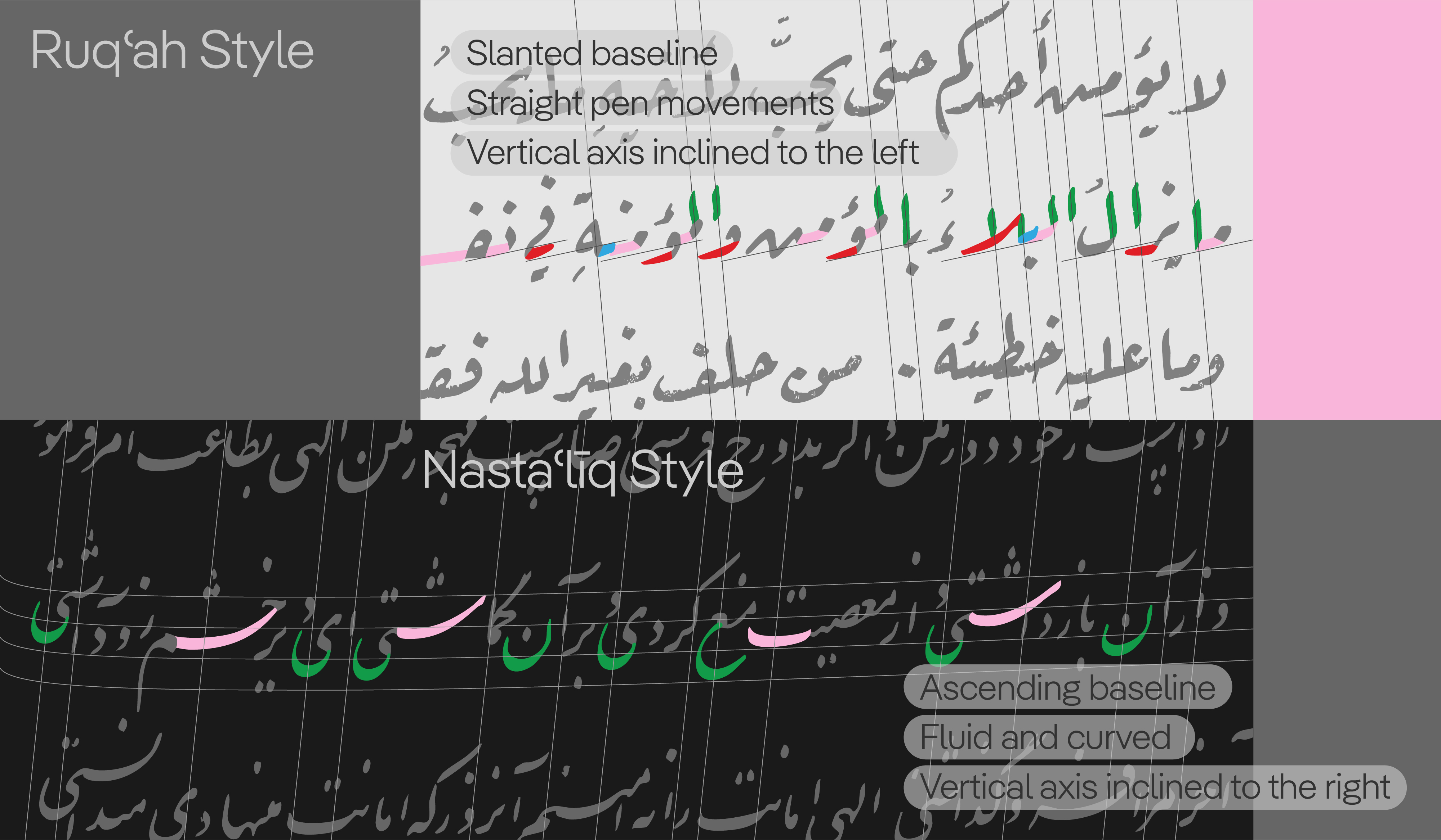
Fig. 03: Ruqʿah vs. Nastaʿlīq: features and specifications
Orthographic and Formal Variations
Another factor influencing the differences in the reading of Arabic script between Arab users and non-Arab users in the eastern regions is orthographic distinction. For example, in New Persian and Urdu orthography, the form of the letter Yā (AlefMaksura/YehFarsi/ی) and its final variation do not include the two below-dots, as in the Arabic orthography. Therefore, in Urdu and Persian, Yā has more space for the descending tail. As a result, the bowl of Yā in Persian and Urdu is rendered larger.
In contrast, in Arabic orthography, to accommodate the below-dots of Yā (Yeh/ي), the bowl of the letter is written more compactly—especially in final Yā, which connects from the right to the preceding letter—and sometimes the initial connection of the final Yā in Arabic typefaces designed for Arab users begins with an upward movement, a feature not seen in Persian and Urdu typographic interpretations.
Due to these formal differences and considering the frequent repetition of the letter Yā in texts written in Arabic script for these languages, a distinct texture emerges that sets Arabic-written texts apart from others.
In Persian and Urdu orthographies, the presence of three-dot letters such as Tchah (چ) and Peh (پ), each with their own unique forms, creates a different texture compared to Arabic text. Additionally, to provide enough space within the inverted curves of the letter Ḥā (ح) for placing the three dots, the bowl of Ḥā in Persian and Urdu manuscripts is rendered larger.
Another characteristic that distinguishes Urdu orthography from Persian and Arabic is the frequent use of the Baree Yā (Baree ye/ے) letter, which features a lying, horizontal form. In Persian Nastaʿlīq, Baree Yā is called the reversed Yā with an elongated lying shape, and because it involves a backward movement, special handling is required to prevent collisions with surrounding letters and dots.
Summary of Formal and Typographic Differences
In summary, these are some of the formal differences that characterize the reading of Arabic script among Western and Eastern users:
- The absence of the definite articles “Alif” and “Lam” in Persian and Urdu reduces the vertical rhythm in texts written in these languages.
- Due to aesthetic preferences and orthographic differences, the bowls of letters such as Nūn (ن), Yā (ي), and Ḥā (ح) are rendered larger and more extended.
- Eastern Naskh has proportionally larger and more flowing forms compared to Western Naskh.
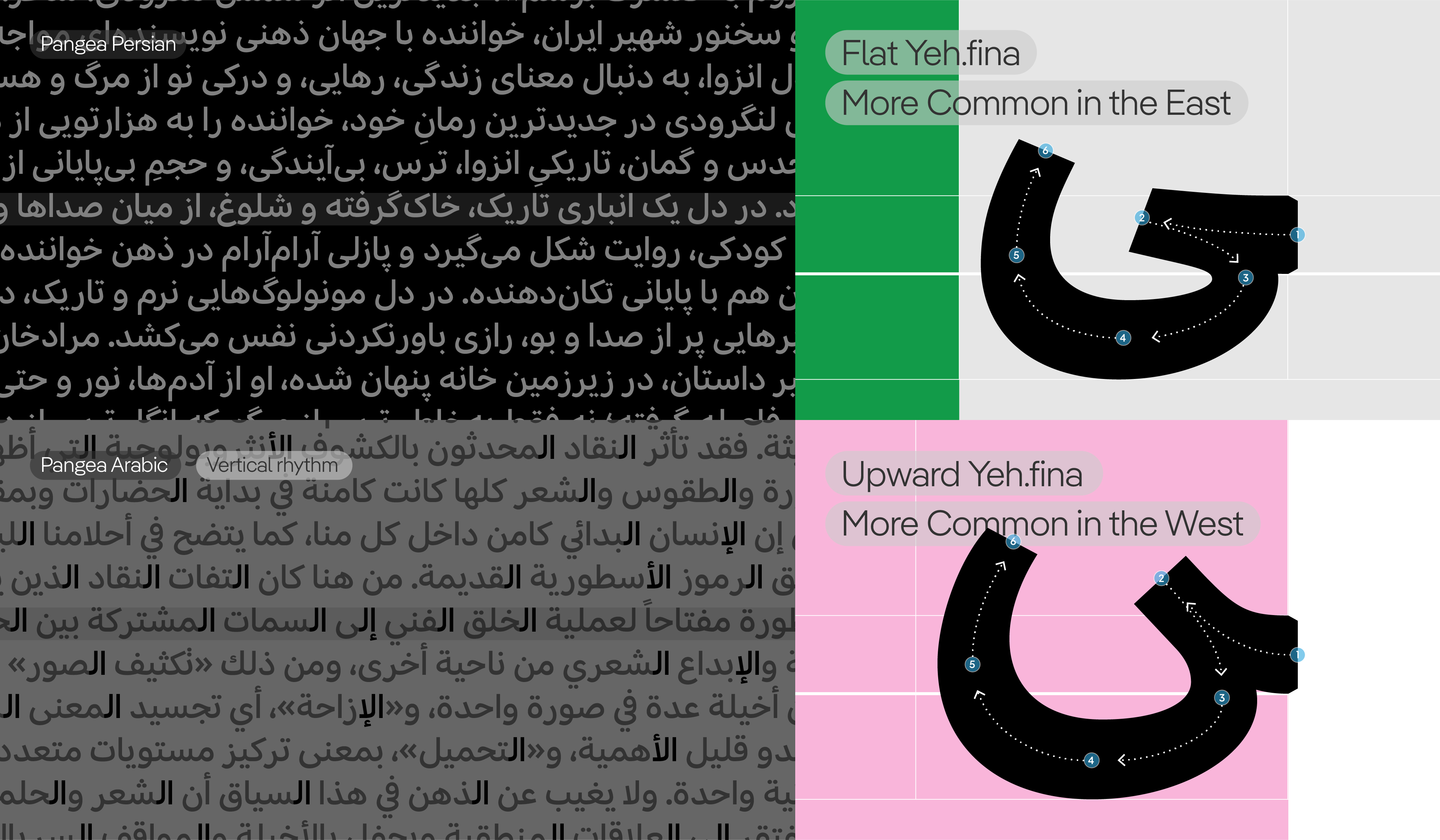
Fig. 04: Pangea Persian (Farsi) vs. Pangea Arabic: How cultural distinctions shape different typographic expressions
Design Adjustments in Pangea Arabic for Persian and Urdu Texts
Considering these observations and features, the Pangea Arabic typeface was gradually adapted for use in Pangea Persian by its original designer Azza Alameddine with consulting help from Amir Mahdi Moslehi, making it suitable for Persian readers. The key letter modifications incorporated into Pangea Arabic were as follows:
- Initial and medial Meem forms (مـ ـمـ): In Persian writings, which is more influenced by calligraphic forms of letters, the top of the Meem’s loop has a triangular shape, and the usual geometric and circular execution is not applied.
- Initial Seen form (سـ): As previously mentioned, in Persian Naskh style, compared to the Arabic Naskh style (which is part of the Ottoman calligraphic heritage), the vertical axes of the letters are more prominent. Therefore, in Persian writing conventions, the second and third teeth of Seen are executed vertically, and the tilted form of Seen’s teeth (as in the Adobe Arabic typefaces), which is common in Arabic, is not used.
- Initial Heh form (هـ): In teaching the letter Heh, it is often depicted as combining the Dal (د) and the middle form of Feh (ـفـ). Since the loop of the middle form of Feh is close to the form of the Waw head (و), and as explained earlier about Meem, where the top of the Meem loop is triangular and pointed, other looped letters follow this formal logic. Therefore, the second Heh loop in Persian writing is executed with a pointed tip and along a tilted axis.
- Centre of gravity of the bowls of Nūn (Noon/ن) and Yā (Yeh/ي): The tilted axis seen in the execution of looped letters in Persian writing can also be tracked in the bowls of Noon and Yeh. Unlike in Arabic writing, where the centre of gravity is aligned at the middle of the bowl, in Persian writing it is slightly shifted to the left. The position of the Noon’s dot is also determined along this centre of gravity axis and is slightly tilted to the right relative to the bowl’s centre.
- Initial movement of the Final Yā (Yeh/ـي): As previously noted, the absence of the dots below Yeh in Persian and Urdu creates more space beneath the letter. Therefore, the Yeh bowl in Persian and Urdu is larger and more extended. In Arabic writing, to accommodate the dots within the Yeh bowl, it is raised higher, which results in an upward initial movement of Yeh—a feature that is not common in Persian and Urdu writing.
- Form of the Waw head (و): The head of Waw is executed as a triangular, pointed loop, like other looped letters, which creates an inclined axis in Persian writing.
- Proportions of Yā (Yeh/ی): The letter Yeh consists of three separate movements: the initial movement (the terminal of Yeh), the middle or transitional movement (a relatively flat curve connecting the terminal to the Yeh bowl), and the final movement, which is the longest and includes the Yeh bowl, ending with a thin pen stroke. In Persian and Urdu writing, the white space above the Yeh bowl (between the terminal and transitional stroke) is more open, while the negative space below the middle movement is slightly reduced.
- Final form of Reh (ر): The ending form of Reh follows that of Waw. As mentioned earlier regarding the Waw in Persian writing, its head is pointed, which creates an inclined axis influencing the shape of the tail or end of Waw. The tail of Waw is also executed with a slight pointed tip, and the curvature in the tail is not flattened. Therefore, the tail of Reh is also slightly pointed.
- Shape and size of dots: In Arabic script, the dots are elements that can significantly influence the texture of the text and the character of the letters. Circular dots often impart a more childish and informal tone compared to the lozenge-shaped dots commonly used in Persian writing. Additionally, the size of dots in Persian is smaller relative to those in Urdu, where dots are larger and more prominent.
The changes made to Pangea Arabic were primarily aimed at bringing the design—based on the most popular fonts in Iran—closer to the common style of contemporary Persian (or Farsi) fonts. Therefore, at the beginning of the project, the most frequently used Persian fonts in online media and influential broadcasts were examined. The characteristics identified in this process were recognized as the obvious and decisive differences in the interpretation of Persian and Arabic within the Arabic script. Taking these differences into account, the font was carefully adapted for the Persian audience by retaining the basic design of Pangea Arabic and making only limited modifications.
Historical and Analytical Resources
- Blair, Sheila ‘Islamic Calligraphy’, Edinburgh, Edinburgh University Press, 2008.
- Elaine Wright ‘The Look of the Book: Manuscript Production in Shiraz, 1303–1452’, University of Washington Press, 2013
- Nemeth, Titus ‘Arabic Type-Making in the Machine Age: The Influence of Technology on the Form of Arabic Type, 1908–1993’, Islamic Manuscripts and Books, volume 14, Leiden; Boston: Brill, 2017.