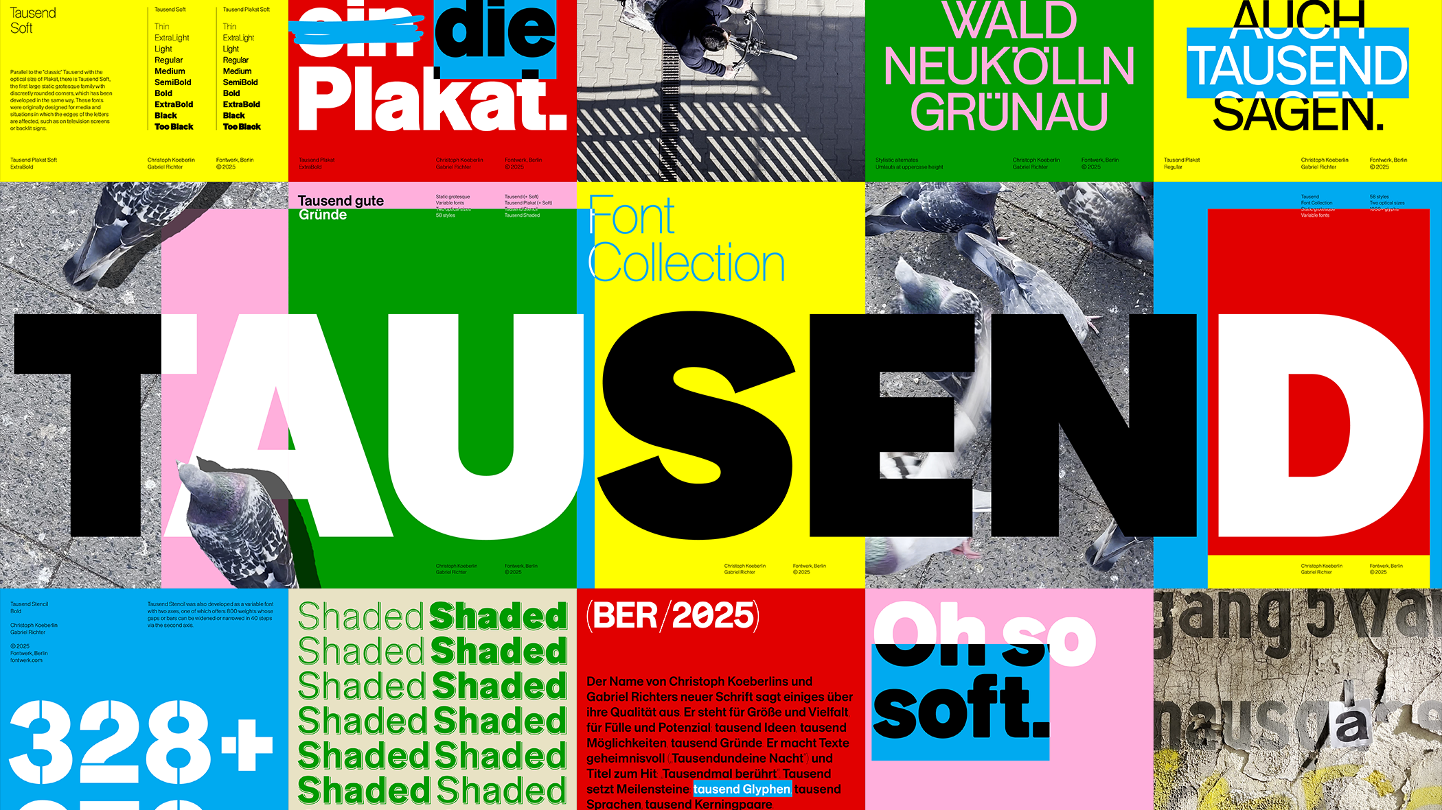
F
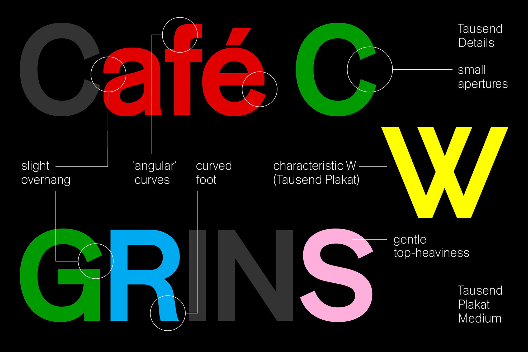
rom the architecture of the two-story a, type designers create the blueprint for a complete alphabet: contrast, arch, angle, stroke, finial and the counters define the DNA of a typeface. No wonder that a very special ‘a’ became the seed for the new Tausend Font Collection.
About three years ago, while designing his typeface Tresor, Christoph Koeberlin sketched a very special and particular a. It took a more straightforward and clean design direction and found itself in the tradition of German grotesque typefaces, but retained an anarchistic core: the slight overhang, the gentle top-heaviness, the minimal contrast, the smile and wink in the curves. It was these promising details that Koeberlin later wanted to explore.