Sukoon

Typography as sensation

Showing a hyperreal world, the film created for Sukoon’s launch serves as a stylistic contrast to the meticulous work of the past ten years.

A single letter, drawn during a moment of inner peace. No concept, no goal, just tranquility. The designer and artist Jan Gerner, known as Yanone, describes the state of deep relaxation and mental clarity he experienced in a remote forest cabin as almost sacred. In that moment, he had not created a form, but found it. It wasn’t a finished idea or full alphabet — just a feeling that would grow into a special typeface over the next ten years.

The name

The name of this sensation is Sukoon. A word that embodies everything this typeface represents: Silence. Clarity. Tranquility. Inner peace.

The word is understood in Arabic, Persian, Turkish and Urdu; it has also been borrowed into Hindi and other Indian languages. In Southeast Asia, the name refers to the breadfruit tree, which in turn is a symbol of frugality, gratitude, deep connection with nature, and community cohesion.

In Arabic, the diacritical mark “sukūn” also describes a state of calm: the absence of a vowel and thus a conscious pause in the voice when it briefly stops after a consonant to create a moment of silence in the flow of speech. The symbol for this is a circle, which plays a central role in the artwork accompanying the release in the form of a spherical object.
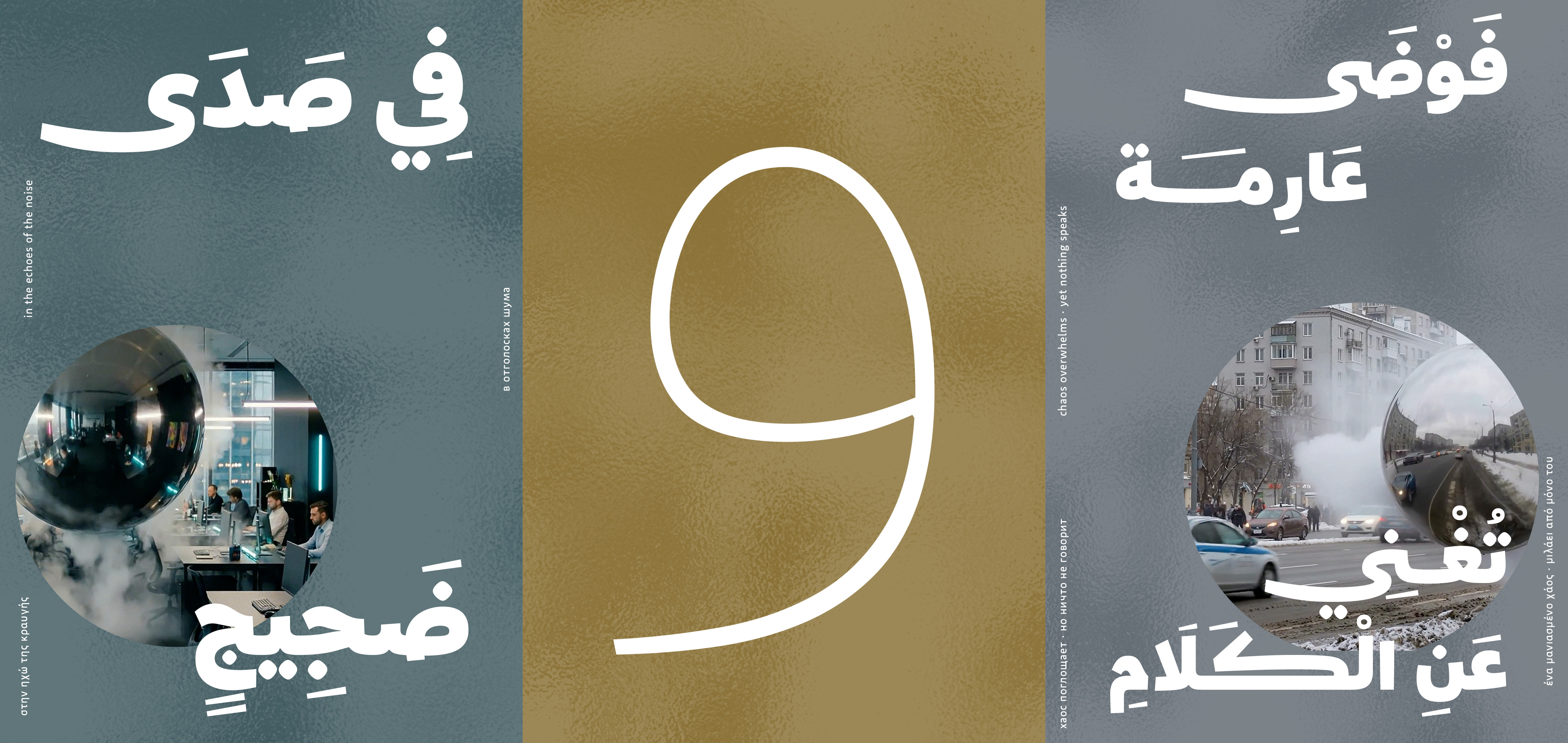
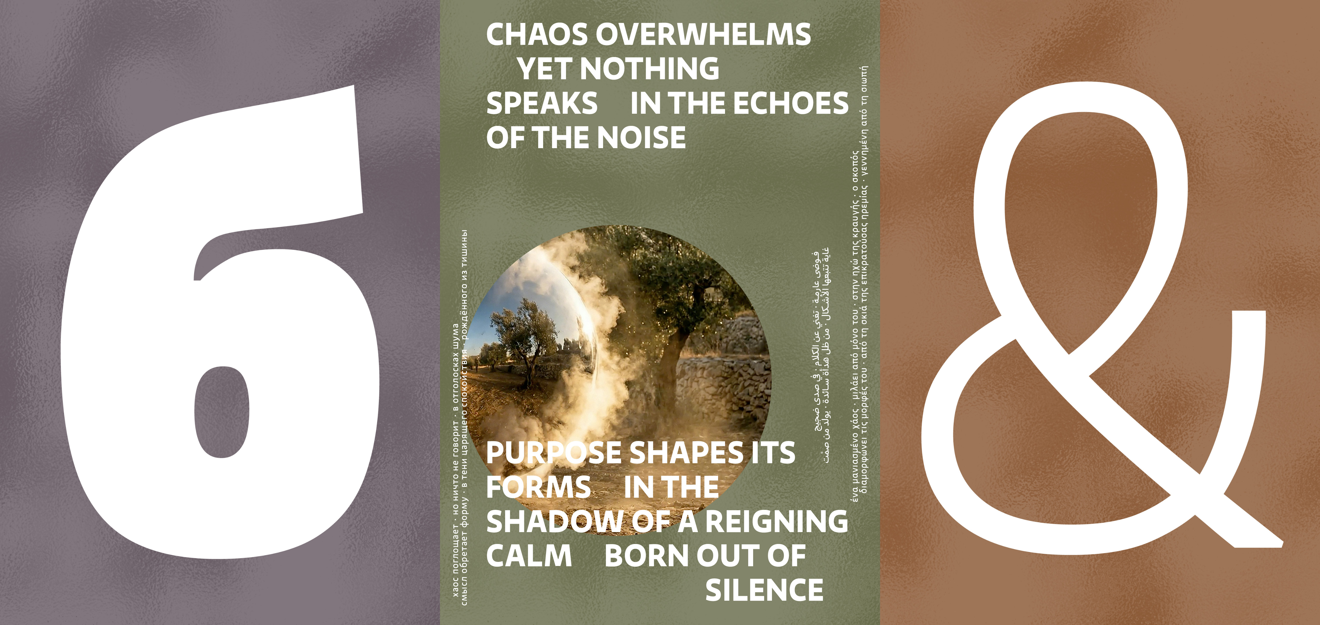
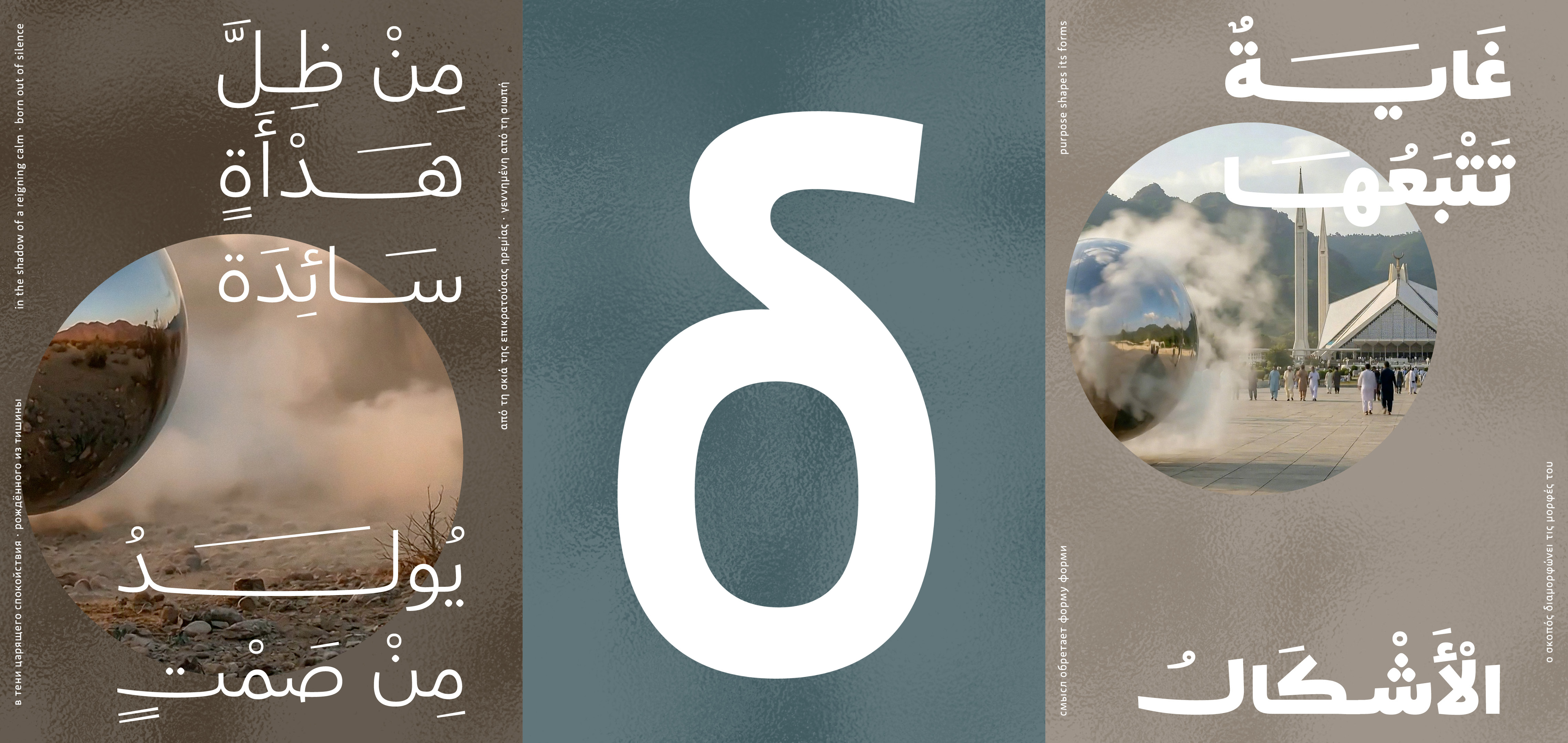
Typography as sensation – Artworks typeface Sukoon (سـكون) by Yanone
Sukoon is Yanone’s third Arabic type design and his most important one personally.
The design

Just as language travels across cultures, this typeface is also influenced by more than one origin. This is hardly surprising given the culturally rich life story of its designer, Yanone. The typeface has a character all of its own that communicates across languages through its form, rhythm and restraint. Sukoon is not loud. It asserts itself not through force, but through balance. It takes up space without filling it. It speaks without pushing.

Sukoon can be characterized as a dynamic or humanistic sans serif font. Thanks to its more open and clearly distinguishable letterforms (e.g., double-story ‘g’) compared to static and geometric sans serif fonts, and its humanistic contrast axis, this style is considered the most legible in the sans serif genre, making it increasingly important in light of growing demands for accessibility.

Nevertheless, Sukoon is not a typical dynamic sans serif typeface. The letters M, g, y and j stand out from the standard set of shapes in this type category. The slightly low-hanging waist and the different ratio of large ascenders to small descenders are also distinctive features. These are elements that Yanone drew from the concept of silence and which are crucial to the calm and clear effect of the design.

Typography as sensation – Artworks typeface Sukoon (سـكون) by Yanone
Sukoon includes over 400 Latin, Arabic, Cyrillic and Greek languages, with the name itself hinting at a focus on Arabic.

However, the secret highlight of the font is its language support. It includes over 400 Latin, Arabic, Cyrillic and Greek languages, with the name itself hinting at a focus on Arabic. After FF DIN Arabic (with Albert-Jan Pool) and FF Amman Sans/Serif, Sukoon is Yanone’s third Arabic type design and his most important one personally.

While the classic Naskh proportions in FF DIN Arabic, with their clear and reduced design language, remain within geometric constraints, in Sukoon they were able to be designed completely freely in a humanistic style, thus remaining largely faithful to calligraphy. This calligraphic consistency is particularly striking in the lowercase letter Meem. Other fonts also feature the correct right-hand curve in the upstroke from below the baseline, but they move back above the baseline to connect with the next letter. This usually results in unnatural stroke movement — Sukoon, on the other hand, resolves this with elegance and visual calm.

Equally unusual for Arabic is the wide range of stroke weights from Thin to ExtraBlack. The bold weights in particular regularly attract astonished interest whenever their designer presents them on social media or in person. Other features such as swashes, curved kashida connections and individually selectable ligatures from traditional Naskh calligraphy gradually reveal their magic the more you engage with the font. They are explained in more detail in the PDF specimen as well as on kashida.fyi.

Typography as sensation – Artworks typeface Sukoon (سـكون) by Yanone
Unusual for Arabic is the wide range of stroke weights from Thin to ExtraBlack.
Conclusion

Sukoon is typography as sensation. It arose from a moment of silence and aims to send this moment to as many corners of the world as possible. Not as ornamentation, but as expression. Not only as craftsmanship, but also as art. If you look closely, you may sense a little of the clarity, beauty and tranquility from which it was born.

Try Sukoon