NeuHarz

A perfect match: NeuHarz meets Neue DIN

Fonts in Use: Neue DIN for the design of the photography book ‘NeuHarz’

People who leave their hometowns often remain connected to them for life. Financial expert Christian Hille, who grew up in the mining and university town of Clausthal-Zellerfeld, is one such person. What fascinated him about the Harz region as a teenager, still moves him today.

T

he people, the nature, the active community groups, and the small-to-medium-sized businesses. When he met the Berlin-based photographer Lars Wiedemann, the pair came up with an idea to portray the region beyond all clichés in a high-quality book. The deeper the two delved into the subject, the more people they met, the clearer it became. This book must be more than that. It should answer the question: How does a region with such deep historical roots manage the transition to modernity without abandoning its established identity?

Fonts in Use: Neue DIN for the design of the photography book ‘NeuHarz’
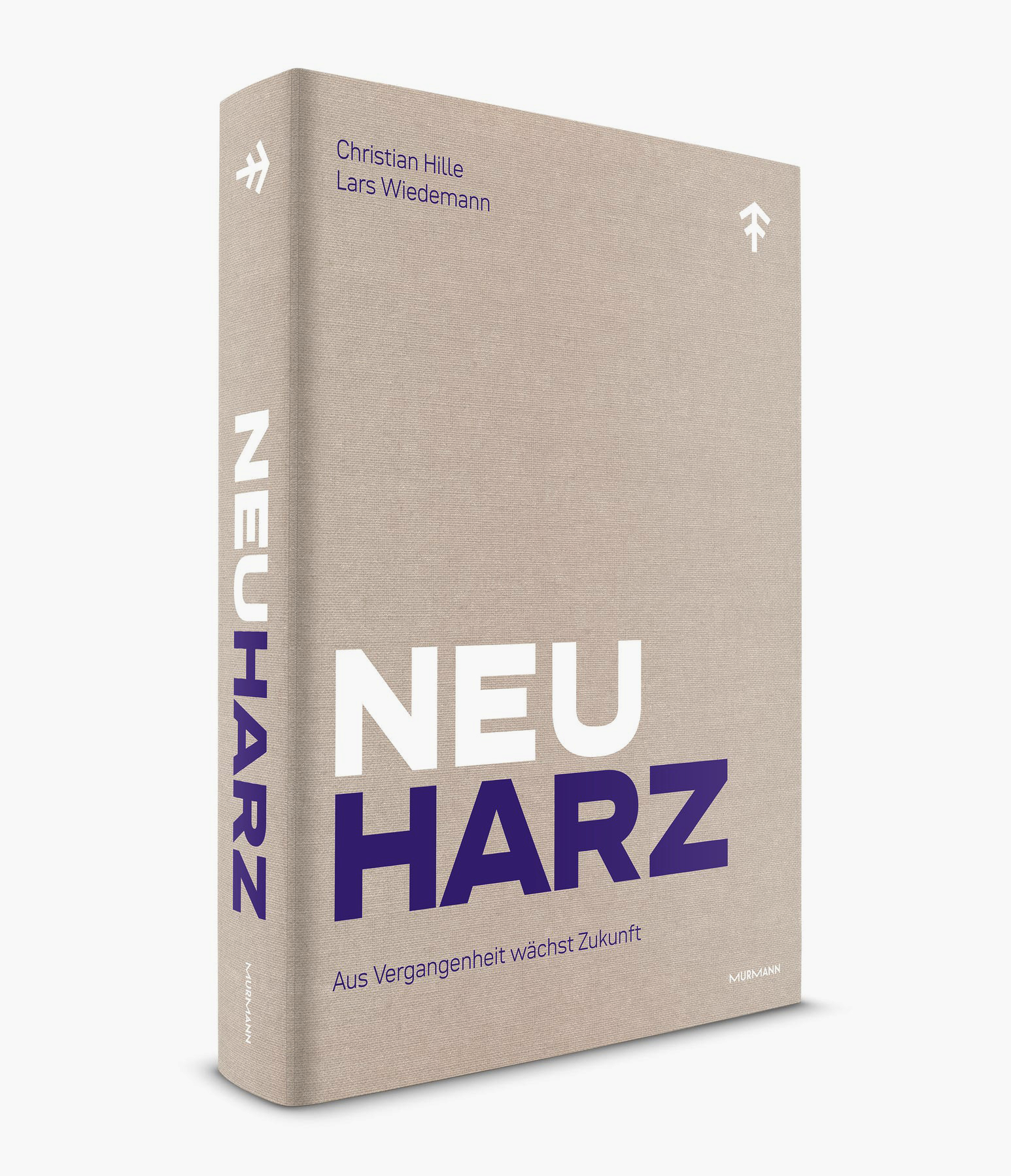
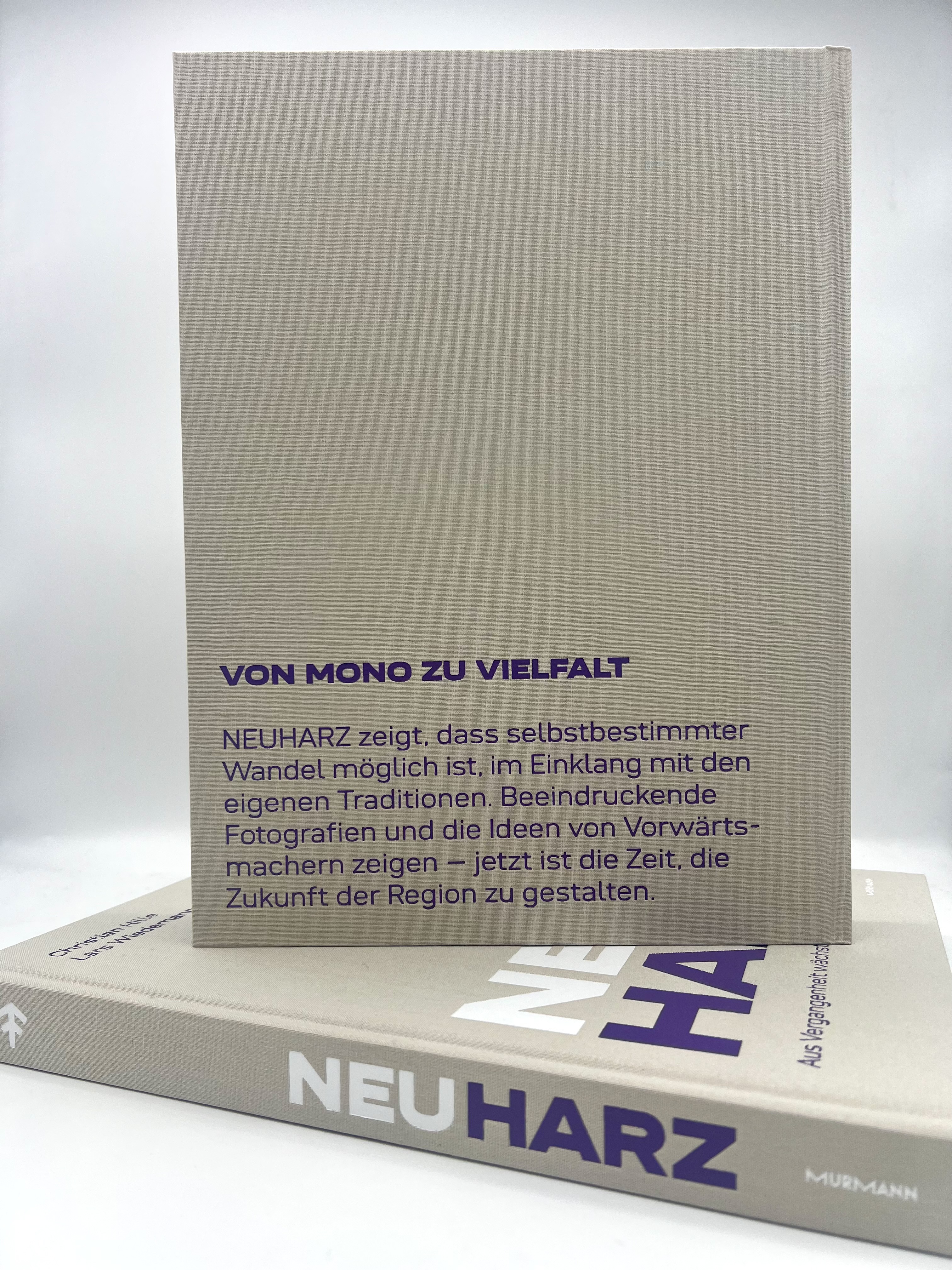
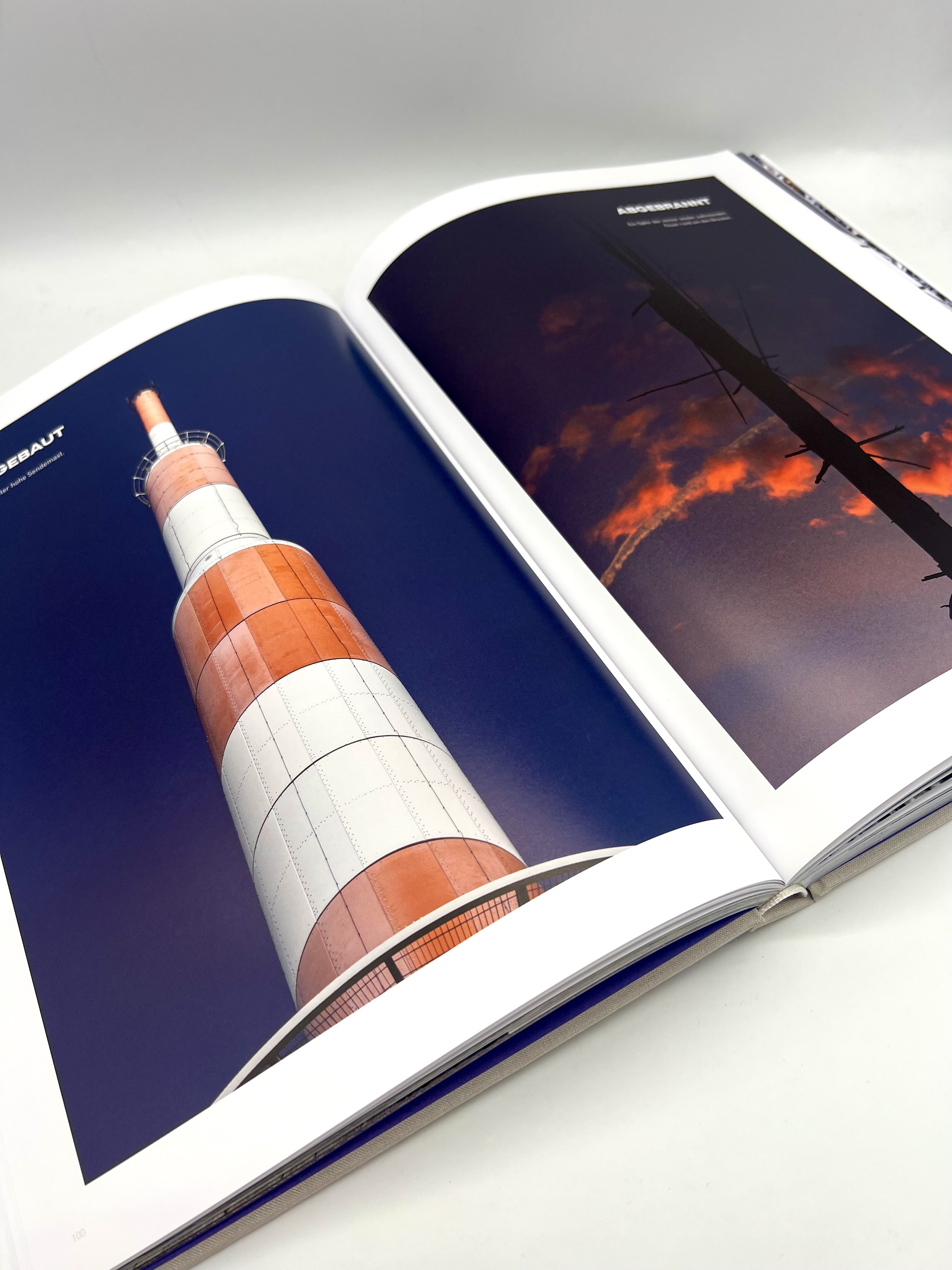
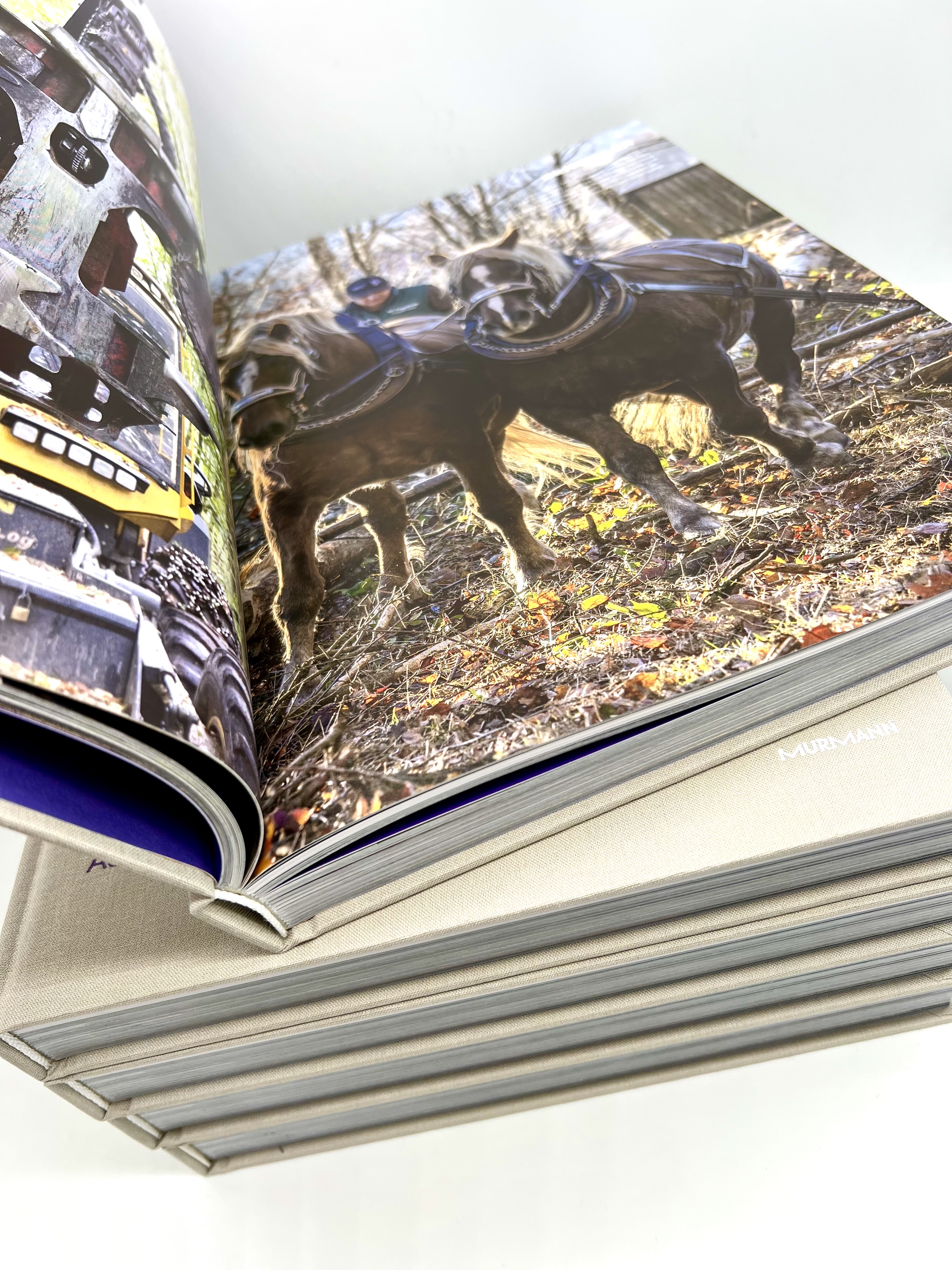
In the Harz Mountains, in the heart of Germany, an entire region is reinventing itself. The book ‘NeuHarz’ uses stunning photographs and compelling prose to show how people and businesses are driving their transformation forward.

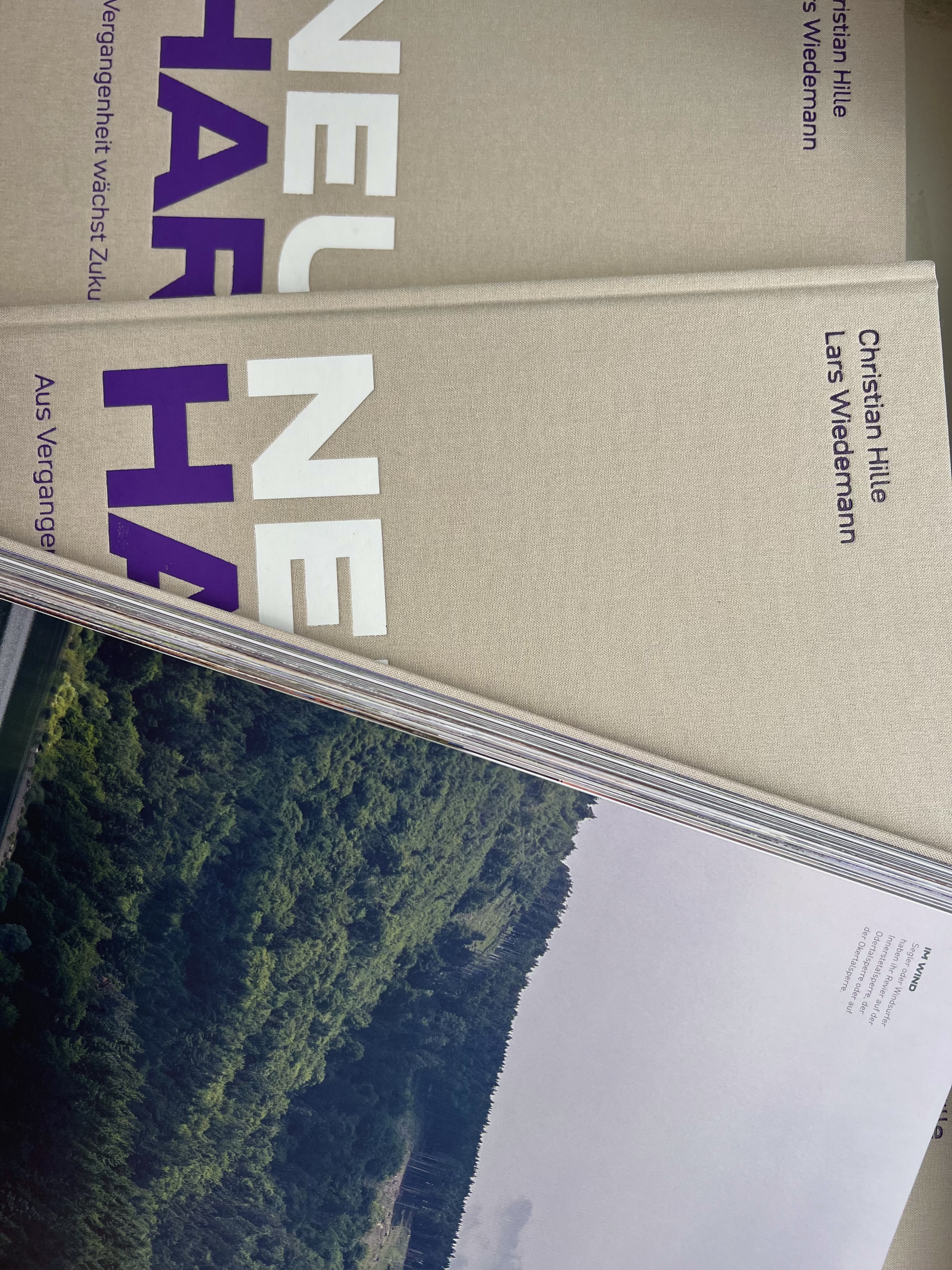
“NeuHarz – The Future Grows from the Past” was published in May 2025 by the Hamburg-based Murmann Verlag. With a cloth bound hardcover, 324 pages, and numerous photographs, the central message of the book is: Only through a forward-looking connection to one’s homeland is a self-determined journey into the future possible. Christian Hille and Lars Wiedemann bring together the region’s trailblazers and use images and text to show what drives them. Their book marks the beginning of a larger movement: exhibitions and events will follow. In this way, NeuHarz could become a blueprint for other regions in transition.

Fonts in Use: Neue DIN for the design of the photography book ‘NeuHarz’
The book is about transformation rooted in tradition and requires a typeface that embodies both. Neue DIN does exactly that.
Fonts in Use: Neue DIN for the design of the photography book ‘NeuHarz’
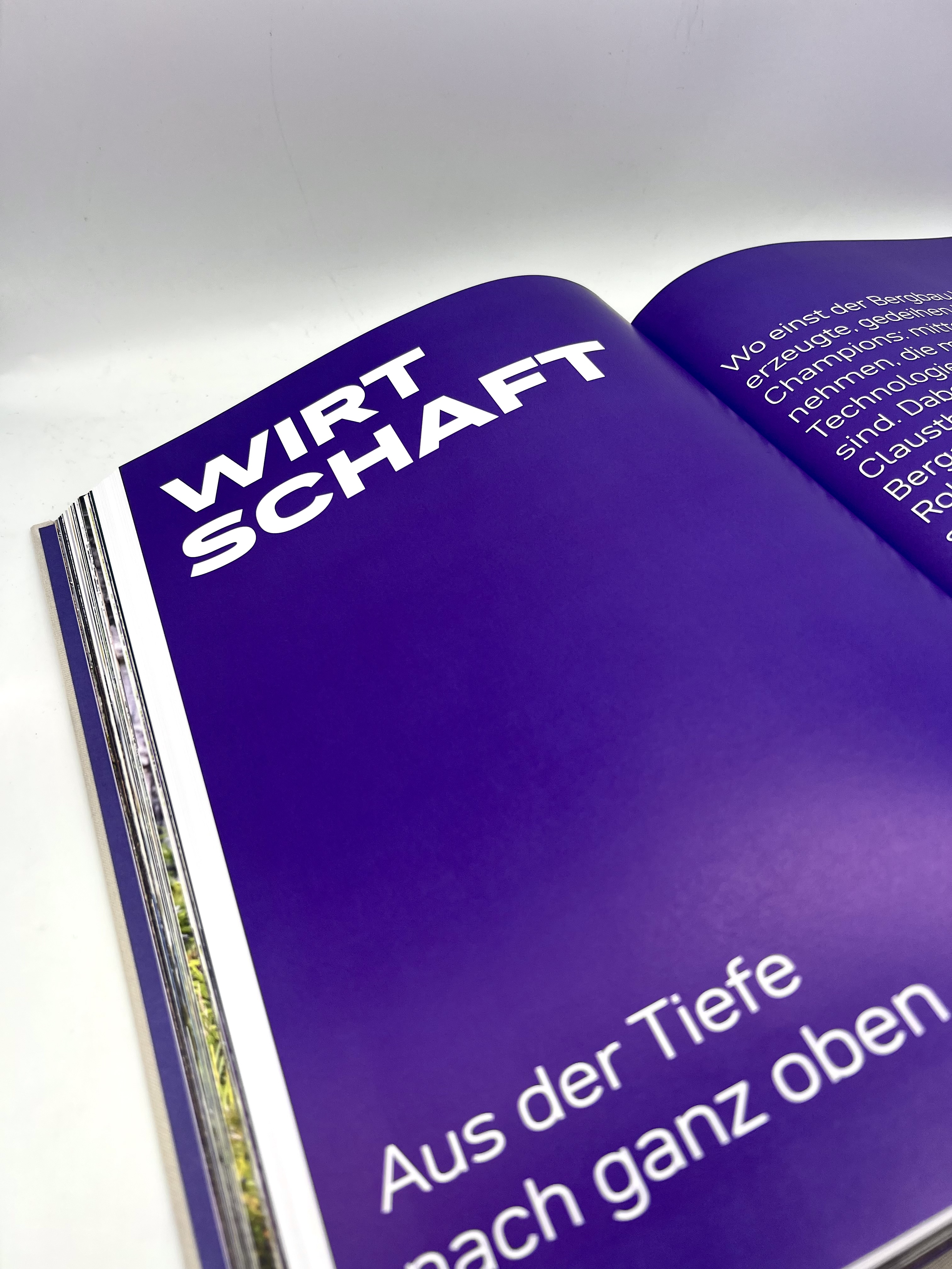
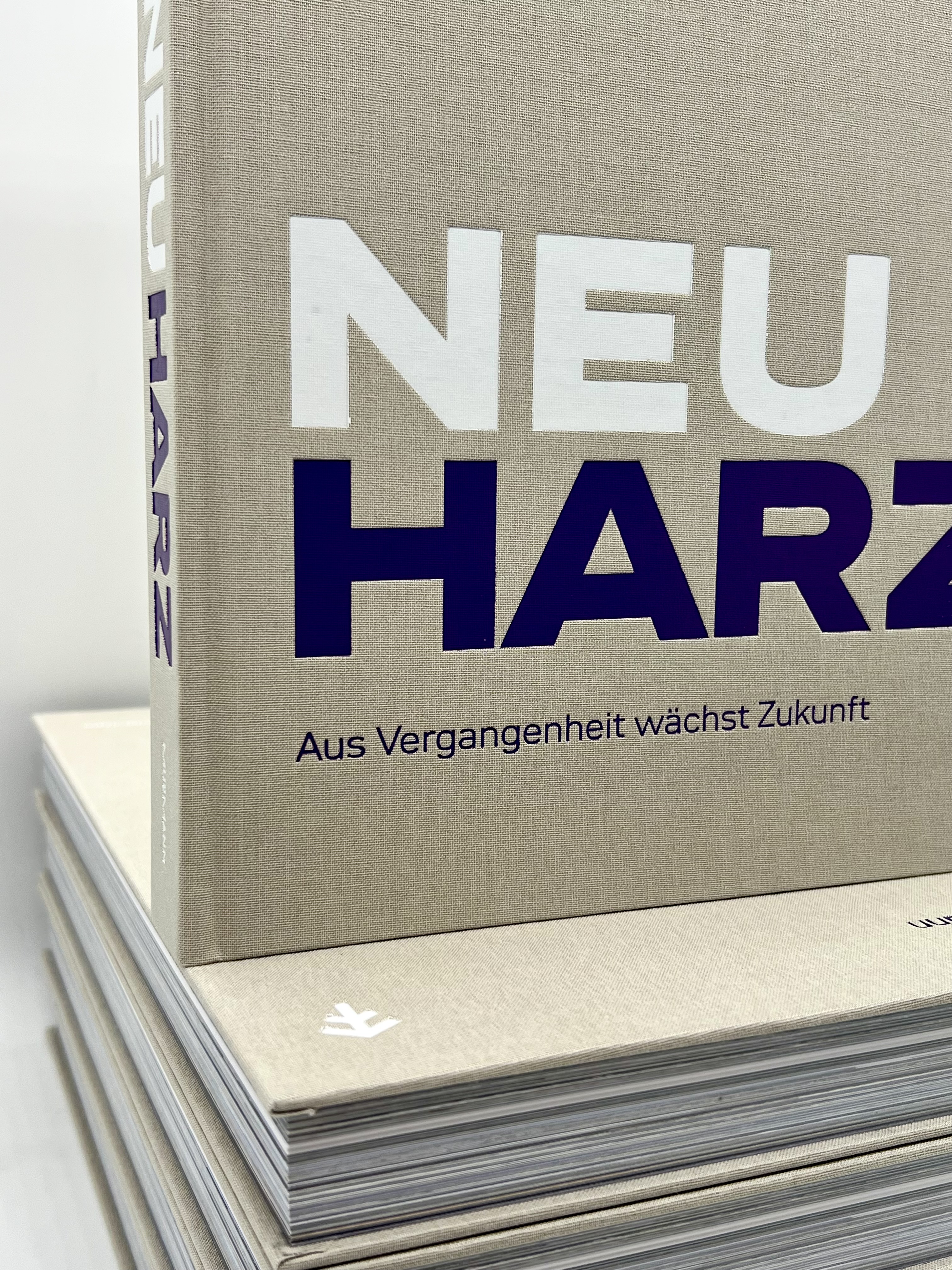
The bold chapter headings in NeuHarz are real eye-catchers, set in Neue DIN Wide Black.

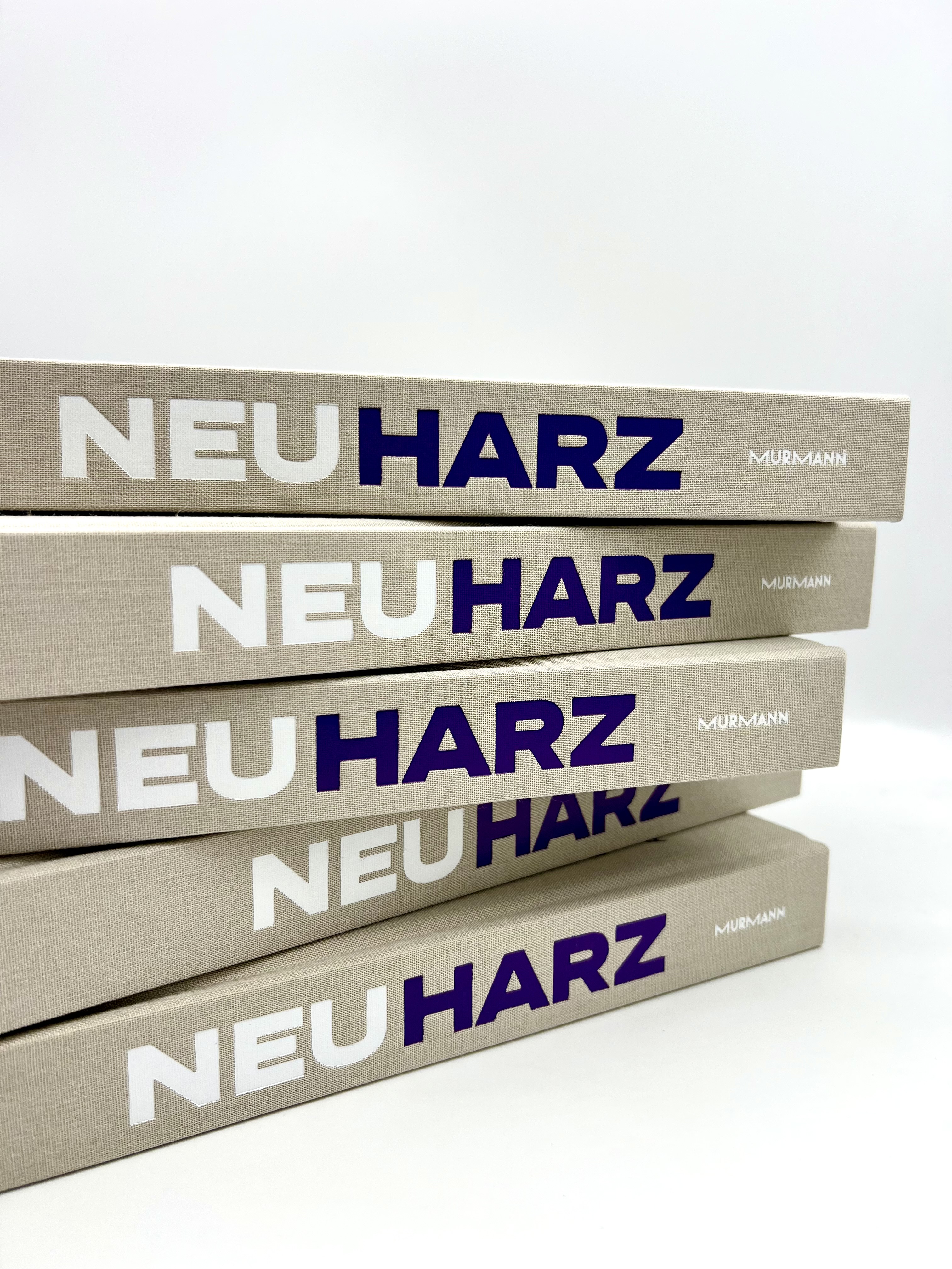
Two styles of Neue DIN were used for the project: SemiWide Light and Wide Black. Two extremes of an exceptionally broad spectrum of type design. Neue DIN was developed by Andreas Frohloff, Hendrik Weber, and Olli Meier for Fontwerk and blends the demands of the digital world with a modern vision of German engineering. It is rooted in DIN 1451, the standard typeface that has helped shape Germany’s graphic identity for nearly a century, from street signs and highways to technical drawings. Neue DIN, however, is not a restoration but a consistent reinterpretation. With a “variable-first” approach that can be summarized in traditional terminology as follows: nine widths, nine stroke weights, and everything in between.

Neue DIN inherently embodies what the project exudes: clarity, reliability, an unmistakably German identity. A typeface that people know and that they get to know anew here. Just like the Harz region.
Fonts in Use: Neue DIN for the design of the photography book ‘NeuHarz’

The team at the Hamburg-based design firm 2erpack Identity are responsible for the book’s design. They develop identities that challenge: not because they reflect the present, but because they anchor the envisioned future as a driver of growth for brands and companies. For NeuHarz, this is exactly the right approach. The book is about transformation rooted in tradition and requires a typeface that embodies both. Neue DIN does just that. Its functional, structured character carries the DNA of German engineering culture, that precision and reliability for which the Harz region, with its mining tradition and small-to-medium-sized businesses, is known for. At the same time, the combination of the sleek SemiWide Light and the bold Wide Black creates a visual dynamism that makes the project’s spirit of renewal palpable: down-to-earth and forward-looking at the same time.

Or, in the words of Behruz Tschaitschian from 2erpack Identity: “NeuHarz is a book about a region that isn’t reinventing itself, but rediscovering itself. We wanted to make this attitude tangible through typography as well. Neue DIN inherently embodies what the project exudes: clarity, reliability, an unmistakably German identity. A typeface that people know and that they get to know anew here. Just like the Harz region.”

The book received a special honor from the German Publishers and Booksellers Association and the Stiftung Buchkunst: it was one of 15 books selected as a nominee for “Germany’s Most Beautiful Regional Book.” With this award, the jury honors books that have a regional connection and stand out in particular for their design, binding, typography (!), and overall concept, thereby promising strong sales figures at local bookstores. We congratulate Lars, Christian, Murmann Publishers and 2erpack Identity and share in their joy at this recognition.

Try Neue DIN