In 2020, he founded his own agency: effektkommunikation, with a down-to-earth approach with the following guiding principles: analysis, evaluation, recommendation.
effektkommunikation
The Power of Good Advertising

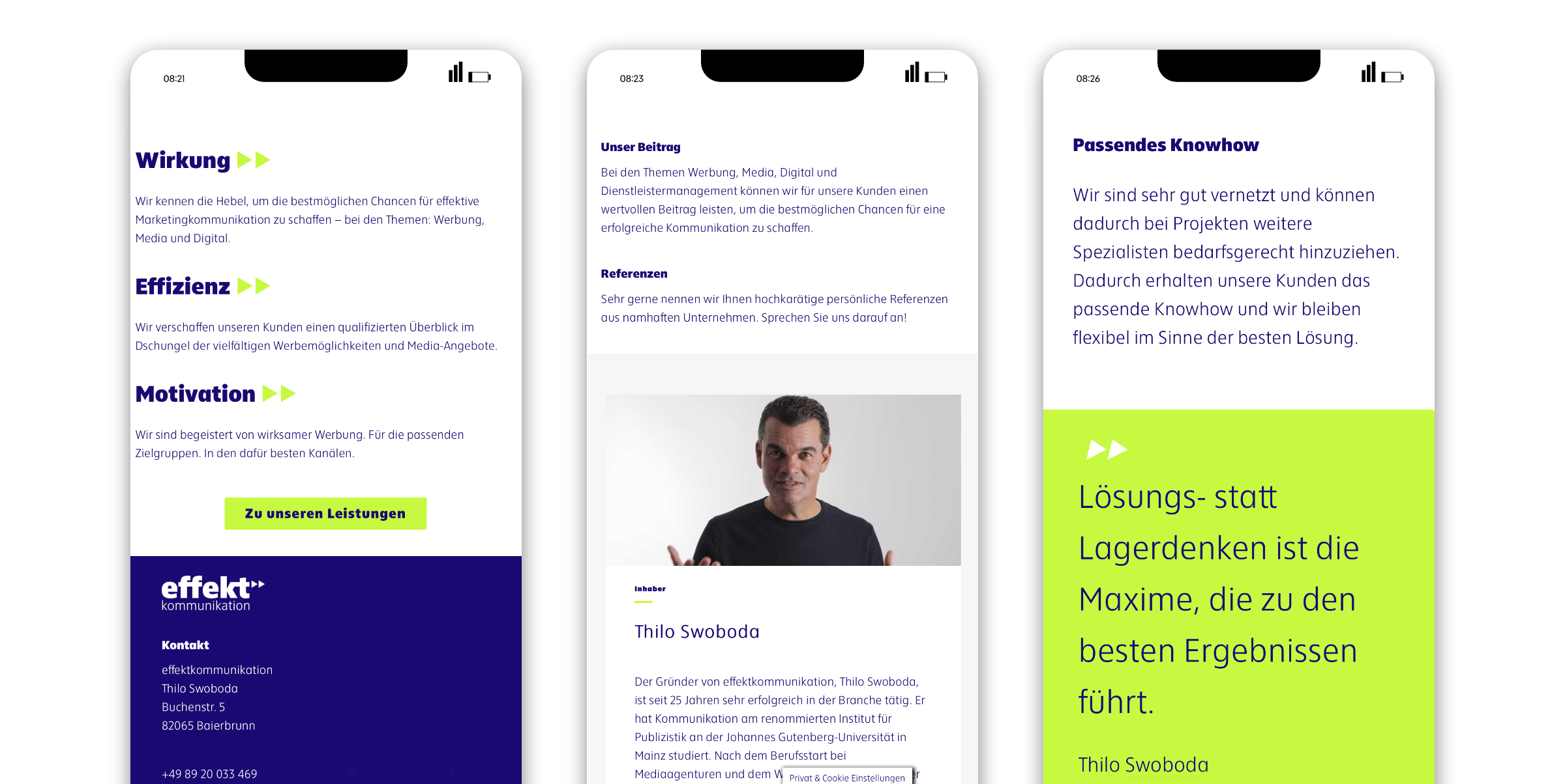
Solution thinking instead of stock thinking is the maxim that leads to the best results.
… is effektkommunikation’s strategic approach. “We are convinced by the power of good advertising” is what their homepage says, and the goal of the consultancy could hardly be summed up more succinctly: “to increase the impact and value of your advertising. We are only satisfied when we have demonstrably achieved this”. To this end, Thilo Swoboda has come up with the Impact Check.

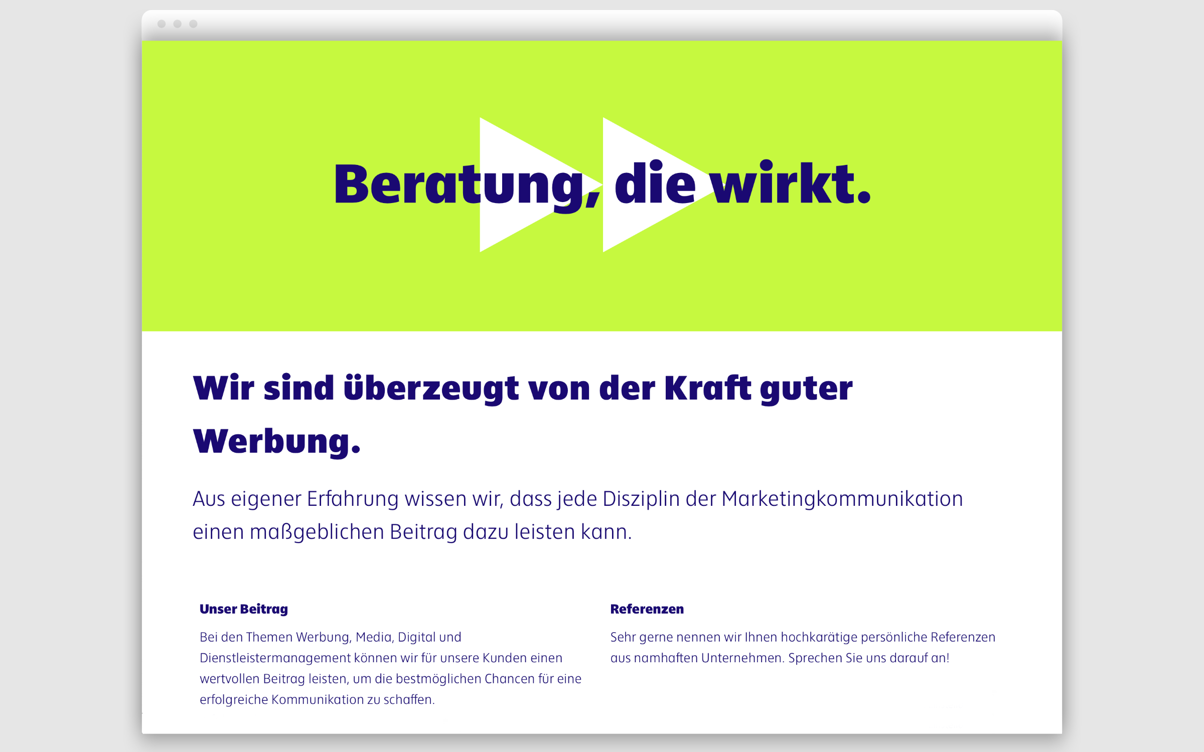
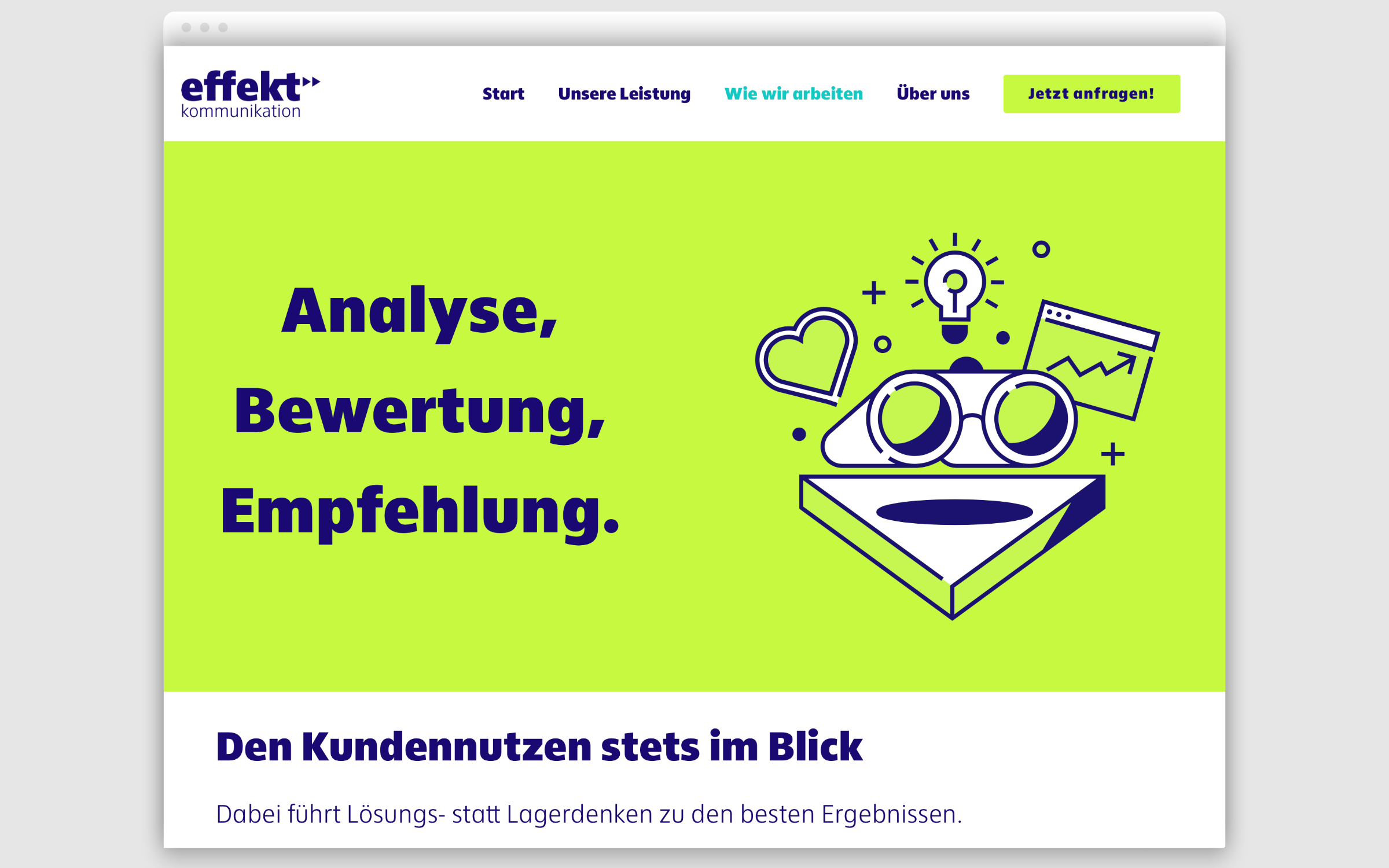
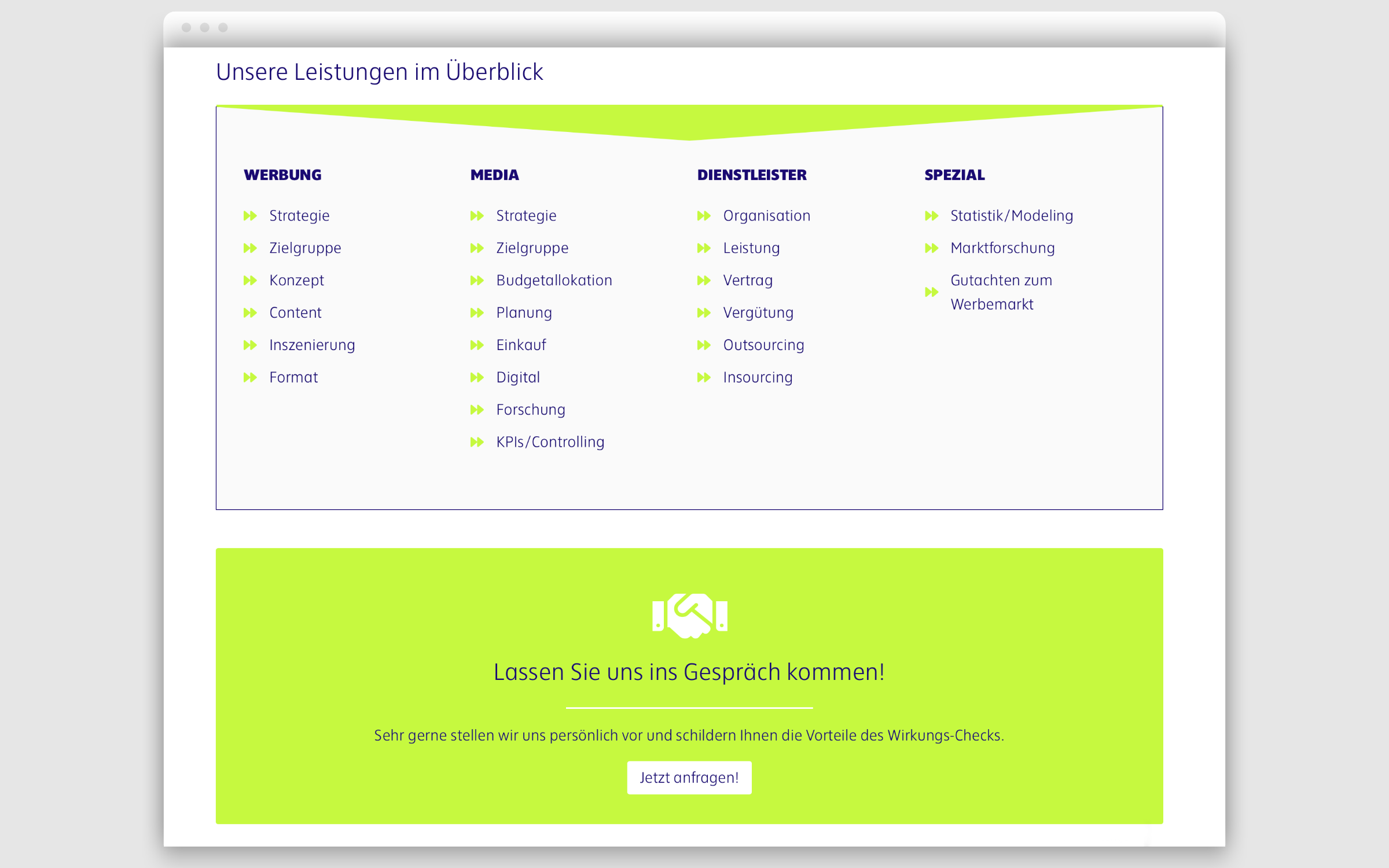
The online presence of effektkommunication was developed by OVAU Agile Design Studio who are based in Düsseldorf and specialize in branding. Sjoerd Verbeek contributed the illustrations. Making a typographic impact in dark blue on a light green background is Ika Black, the second most powerful of the nine weights in the Ika family which was designed by the Hamburg Type Designer Jörg Hemker (he is also the designer of FF Zwo, FF Sero, among others). Ika Light is used for the small text (i.e. intros and body copy).


Ika is the perfect choice for effektkommunikation, as just like the marketing agency itself, the typeface exudes clarity, simplicity and transparency. It draws its matter-of-fact impression in equal parts from humanistic, constructed and geometric influences. With clear, open and balanced forms and a perfectly balanced gray value, Ika proves to be one of the most legible typefaces on the market.
In addition to the main family, Jörg Hemker has created a three weight Compact Version which is perfect for headline use. This offers a little taste of what’s to come, in the form of future planned extensions which include Condensed, Narrow and Compressed designs.