We’re delighted to share our next new typeface: say hello to Push! Also in this newsletter, McQueen Grotesk gives an infusion technology company the edge and Font Lovers … oh you are in for a REAL treat when you buy our fonts this month.
The clocks are changing soon and we couldn’t be more excited to get more light hours in our days! We’re delighted to share our next new typeface: say hello to Push! Also in this newsletter, McQueen Grotesk gives an infusion technology company the edge and Font Lovers … oh you are in for a REAL treat when you buy our fonts this month. |
|
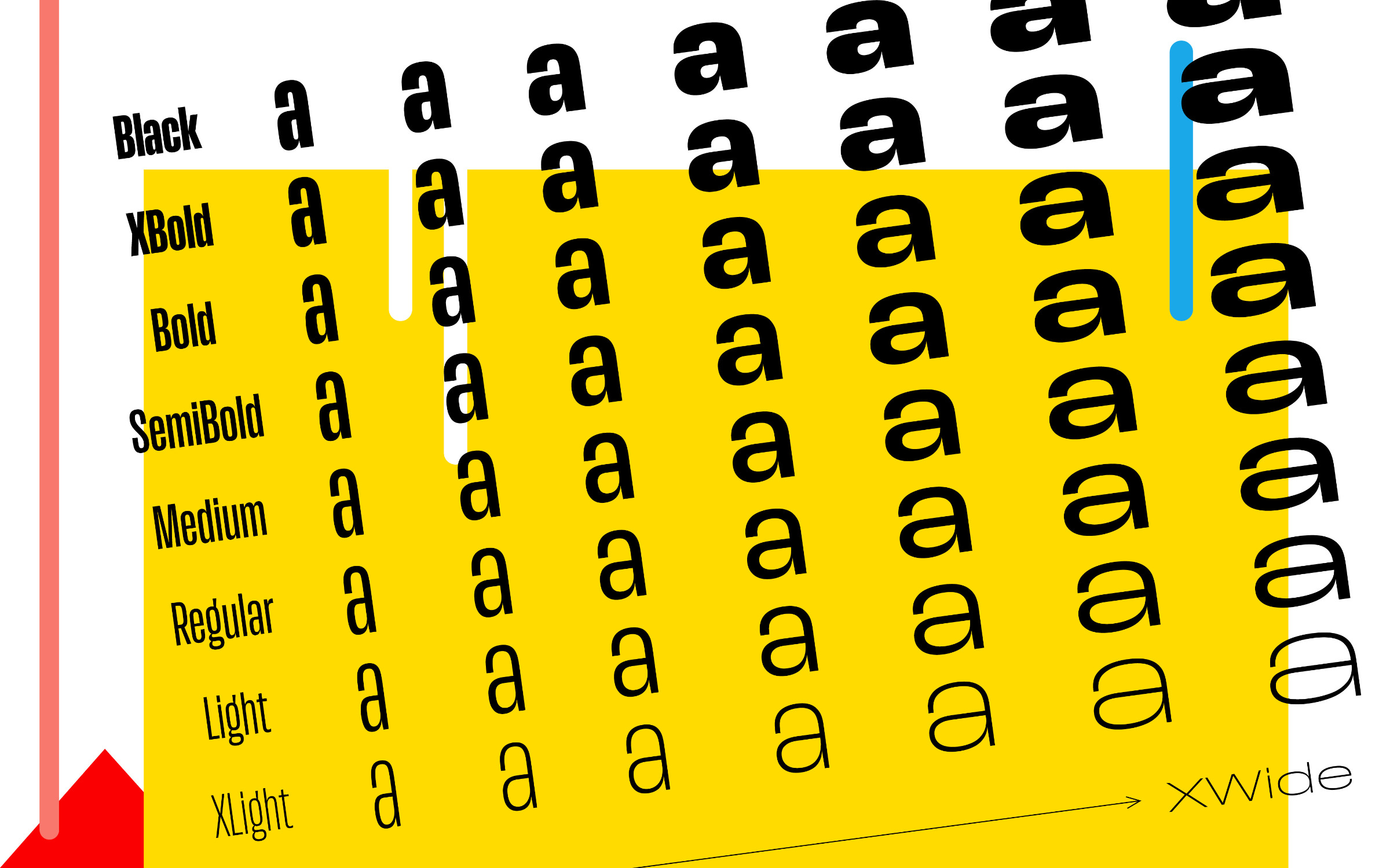 | | Christine Gertsch’s Push is a comprehensive and immensely versatile system of eight weights at seven widths. | |
|
| | Seven widths in eight weights? Challenge accepted!With a nod to early American Gothics and European Grotesques and thanks to a clever curvature transformation across XCondensed and XWide, we’re delighted to introduce Push by Christine Gertsch. Push is a vast and immensely versatile type system of eight weights at seven widths and has an incredible 56 styles. Drawing on Christine Gertsch’s broad experience as a Visual Designer, Type Designer and Head of the CAS Type & Brand faculty at the Zurich University of the Arts (ZHdK), Push assumes a confident presence in any setting. Its design echoes the letterforms of the first one hundred years of sans serifs yet carries its own weight in a very contemporary manner. The bold condensed, crossbar-less capital ‘G’ takes inspiration from Thorowgood’s 1830 Seven-Line Grotesque, while the lowercase ‘a’ follows in the same vein as Plak from 1930. Some standout characteristics include a looped Anglo-American ‘g’, a Grotesk two-storey ‘g’ and an open-sloped ‘Danish g’ which all add to this magical mix of the Old and New world. With an extensive range from extra-condensed to extra-wide and from extra-light to extra-bold, Push equips designers with an unparalleled typographic palette, offering huge versatility and variety ready to tackle any project. | |
|
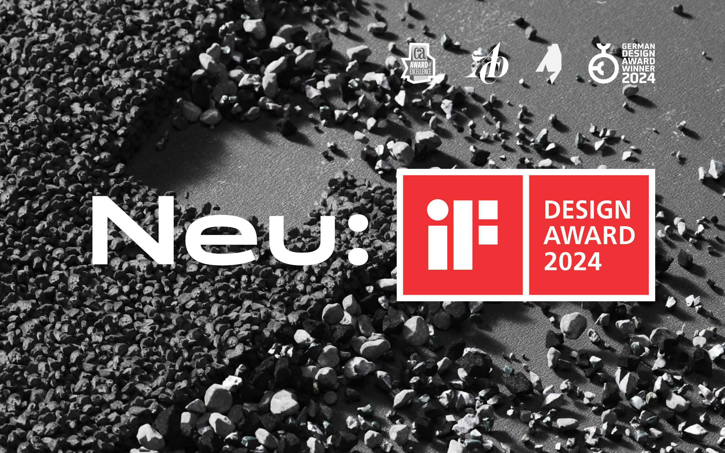 | | Neue DIN has just won the iF DESIGN AWARD 2024 in the category Communication → Typography/Signage | |
|
| | Neue DIN does it again!Hot on the heels of the following awards: • German Design Award 2024 (Winner)
• Communication Arts 2024 (Award of Excellence)
• ADC Award 2023 (Bronze)
• ADC*E Awards 2023 (Finalist) We are delighted to share the news that Neue DIN has also just won the prestigious iF DESIGN AWARD 2024 in the category Communication → Typography/Signage We are so proud that Neue DIN has been recognized by so many different industry experts and has received so many awards and accolades. It keeps us motivated to keep going and keep working on the font. In fact, we have just released the latest version of Neue DIN, 1.2 which includes some minor optimizations as well as refining the all-important regular weights. All customers who’ve previously licensed Neue DIN can download the latest version now for FREE and if you haven’t bought it yet, why not give this brand new version a test drive today by downloading the Trial Fonts. | |
|
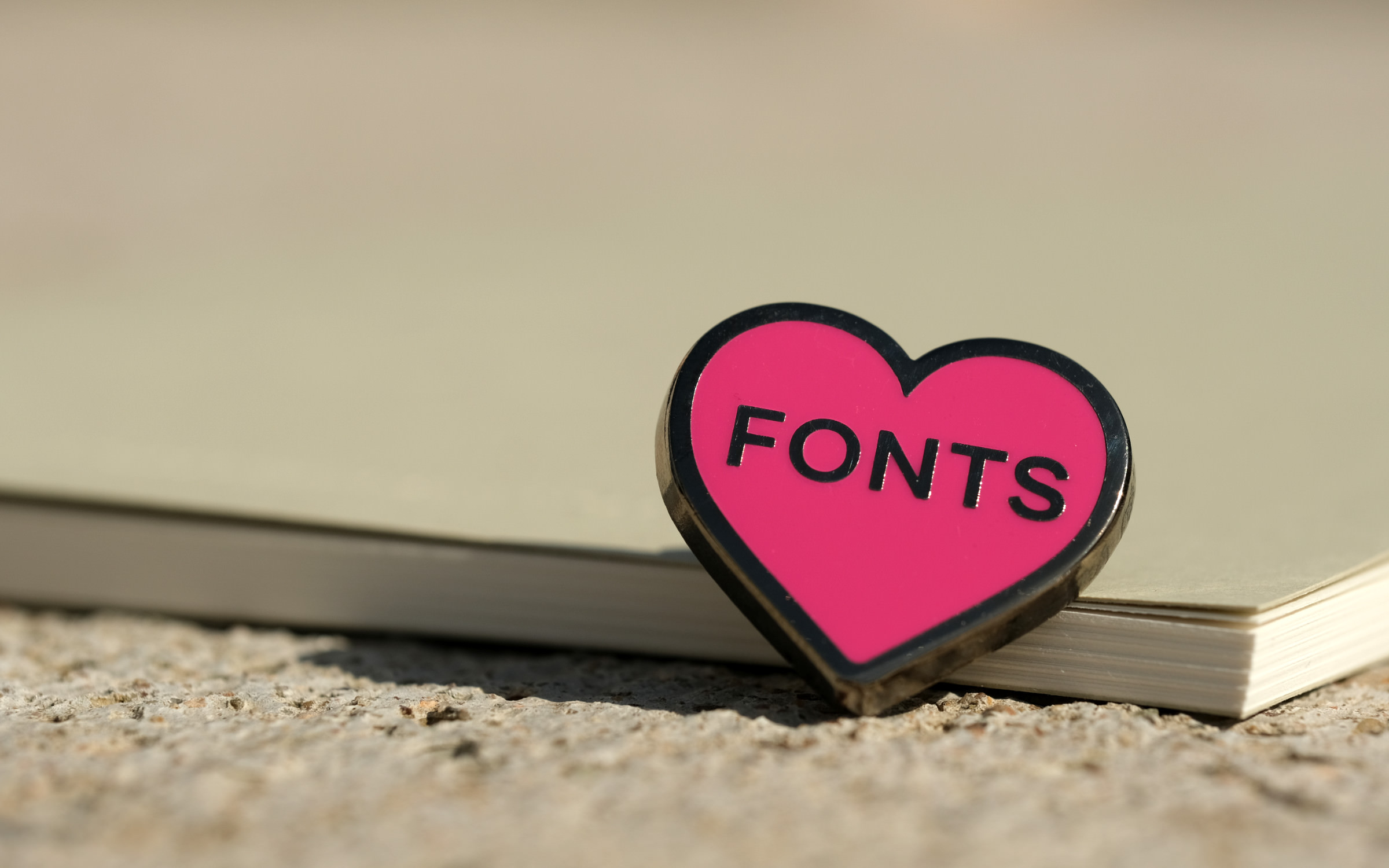 | | You can get your hands on this beautiful pin and one of the limited edition ‘Trust The Process’ notebooks by purchasing a Family or Superfamily. | |
|
| | Font Lovers Pin for the winNot only do we make great typefaces, sometimes we also create some rather nice type tangibles too. Introducing the absolute must-have accessory for font lovers … Our very own Fonts heart pin (which is also packaged with the world’s smallest typeface catalog)! In case you missed it in our last newsletter, you can get your hands on this beautiful pin and one of the limited edition ‘Trust The Process’ notebooks that we created together with Roterfaden and Baumkuchen and which is embossed with our very own McQueen. To receive these two exclusive goodies all you have to do is purchase a Family or Superfamily (regardless of the typeface and also includes our newest addition, Push) by March 31st, 2024 and provide your address when you checkout. | |
|
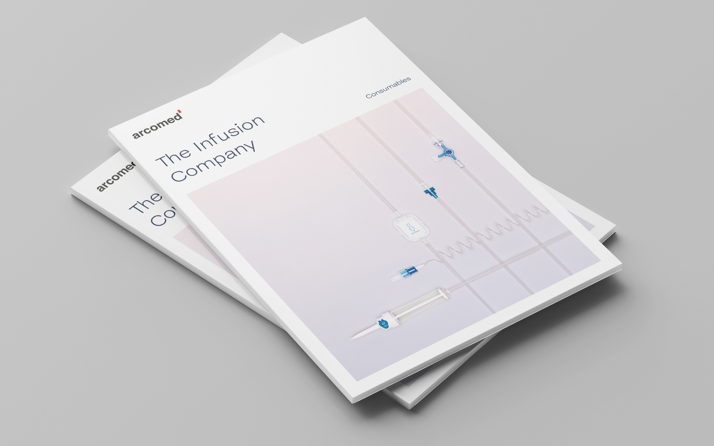 | | The typographic basis of Arcomed’s redesign is formed by the two fonts McQueen Grotesk Light and Medium. | |
|
| | McQueen Grotesk adds an edge to ArcomedBased in Switzerland the infusion technology company Arcomed is a leader in providing continuous dosing systems for the (usually intravenous) administration of medicines and infusions. Having been established for over half a century, they have pioneered numerous innovations in this field, making an important contribution to patient safety and care. In a bid to future proof their brand and translate the complexity of the world in which they operate, Arcomed instructed Konstanz-based art director Florian Rhiemeier and brand strategist Eduard Helmann (Sichtweise) to help reimagine and reinvigorate their visual identity. Drawing on the beauty and precision of McQueen Grotesk Light and Medium, the new Arcomed brand is full of clarity and easily recognizable. As Eduard Helmann says, “When redesigning Arcomed AG, we first sharpened the brand and were then on the lookout for a typeface that had a technical feel, exuded precision and symbolized stability. With McQueen, we found exactly the typeface that expresses this.” | |
|
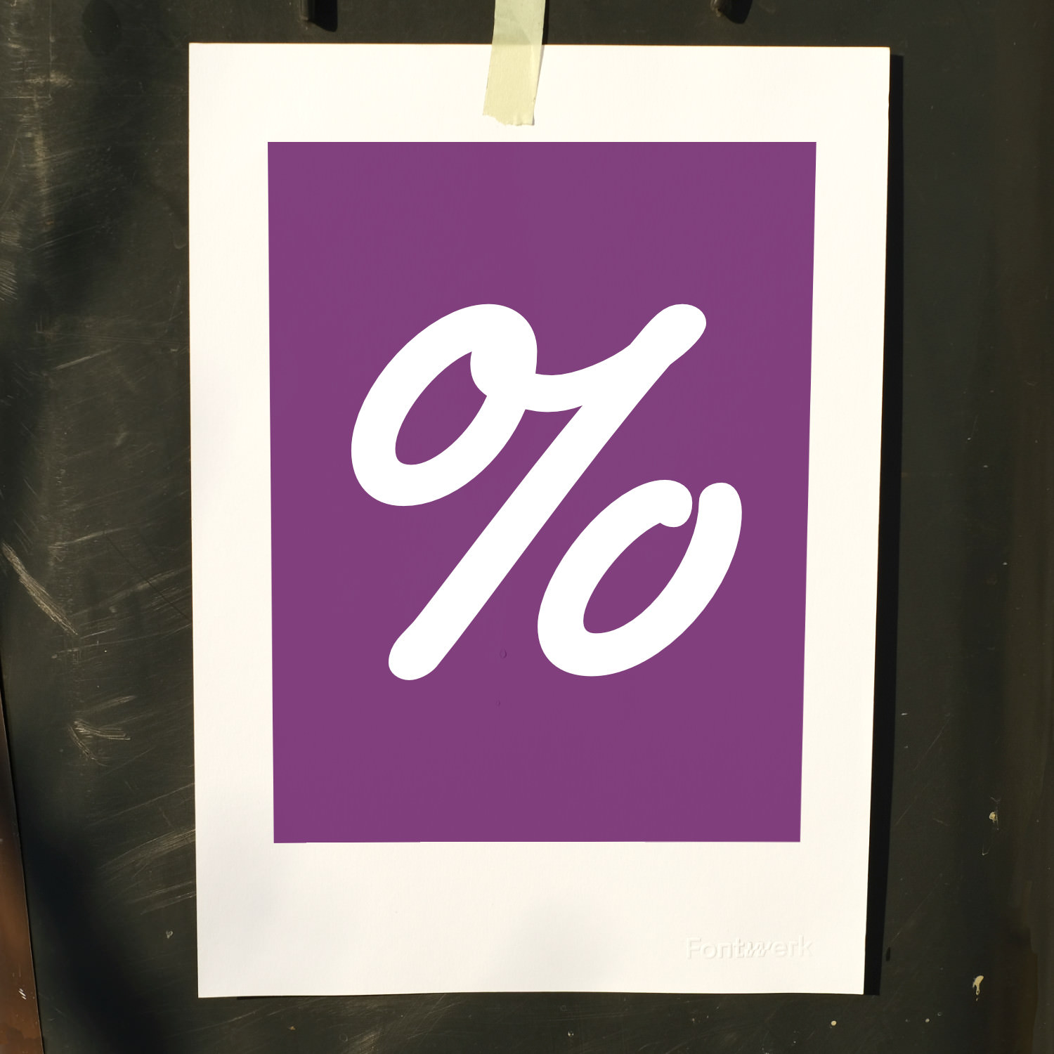 In this month’s big Glyph, Ulrike Rausch’sSupermarker Medium Italic takes center stage with a percent sign. Did you know that ‘percent’ is derived from the Latin ‘per centum’ which means ‘hundred’ or by the hundred? The sign itself originated as a contraction of the italian term ‘per cento’, which was shortened to ‘cento’ and was represented by two circles which were separated by a line. ↗ |
|
Whenever we see our typefaces in the wild, it makes us smile and we love to celebrate your work! Whether you’ve used one of our fonts for a project or maybe even for a university project, we would LOVE to hear from you. Our ever-expanding in-use gallery casts the spotlight on some of the most recent use cases shared by our customers. So, if you’ve got something that you are proud of and have some images to share, please get in touch. |
|
|
|