We’re excited to share news of a beautiful collaboration, a customized and refined Pangea takes center-stage for a sustainable energy company and a double act from West makes its debut in our Big Glyph feature.
We’re super excited to share news of a beautiful collaboration, a customized and refined Pangea takes center stage for a sustainable energy company and a glorious historical alternative from West makes its debut in our Big Glyph feature. And last but by no means least… we promised some new faces and we’re delighted to share the first one join the family this year. So, take a moment to fill your font cup this month and read on to find out more. |
|
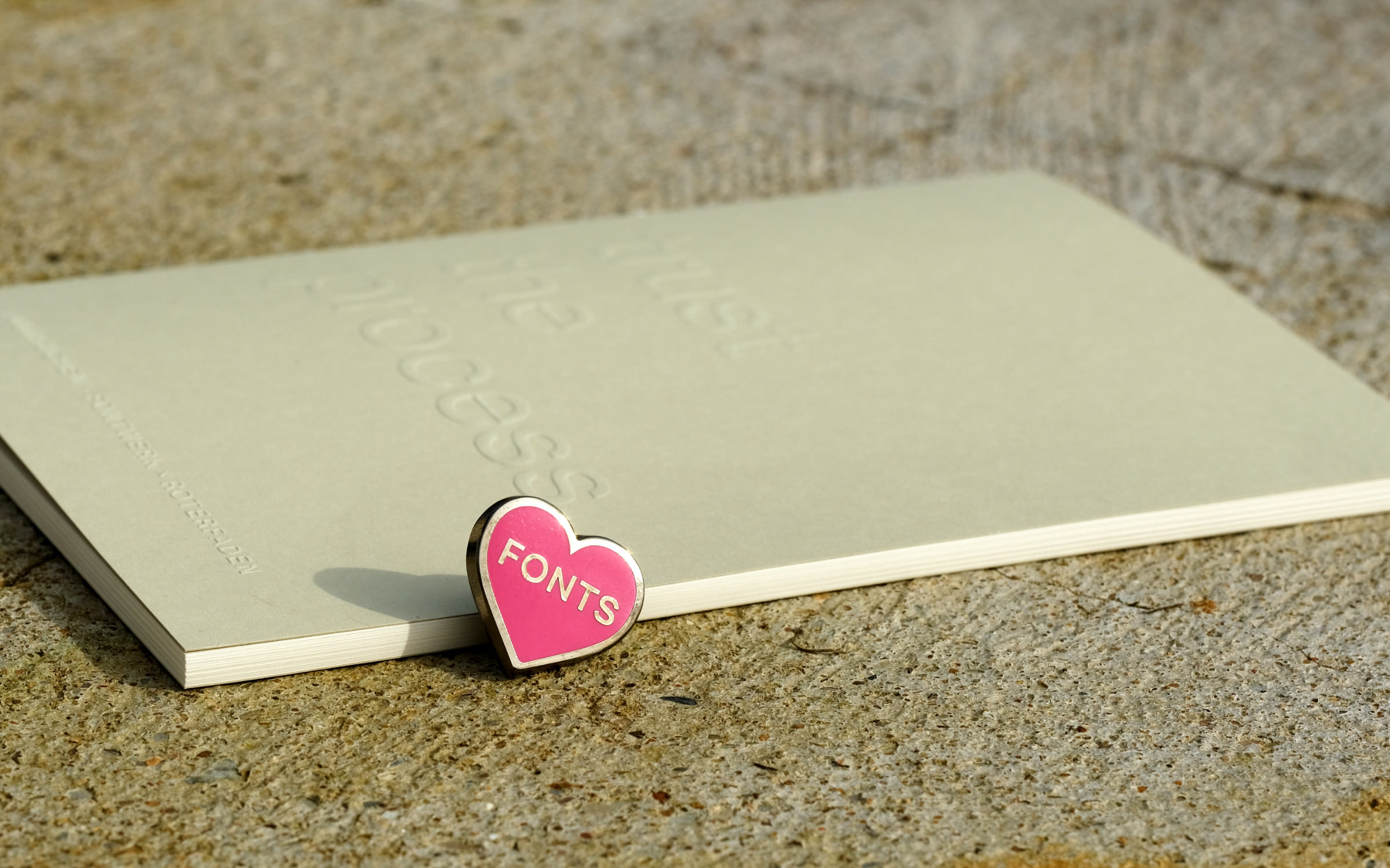
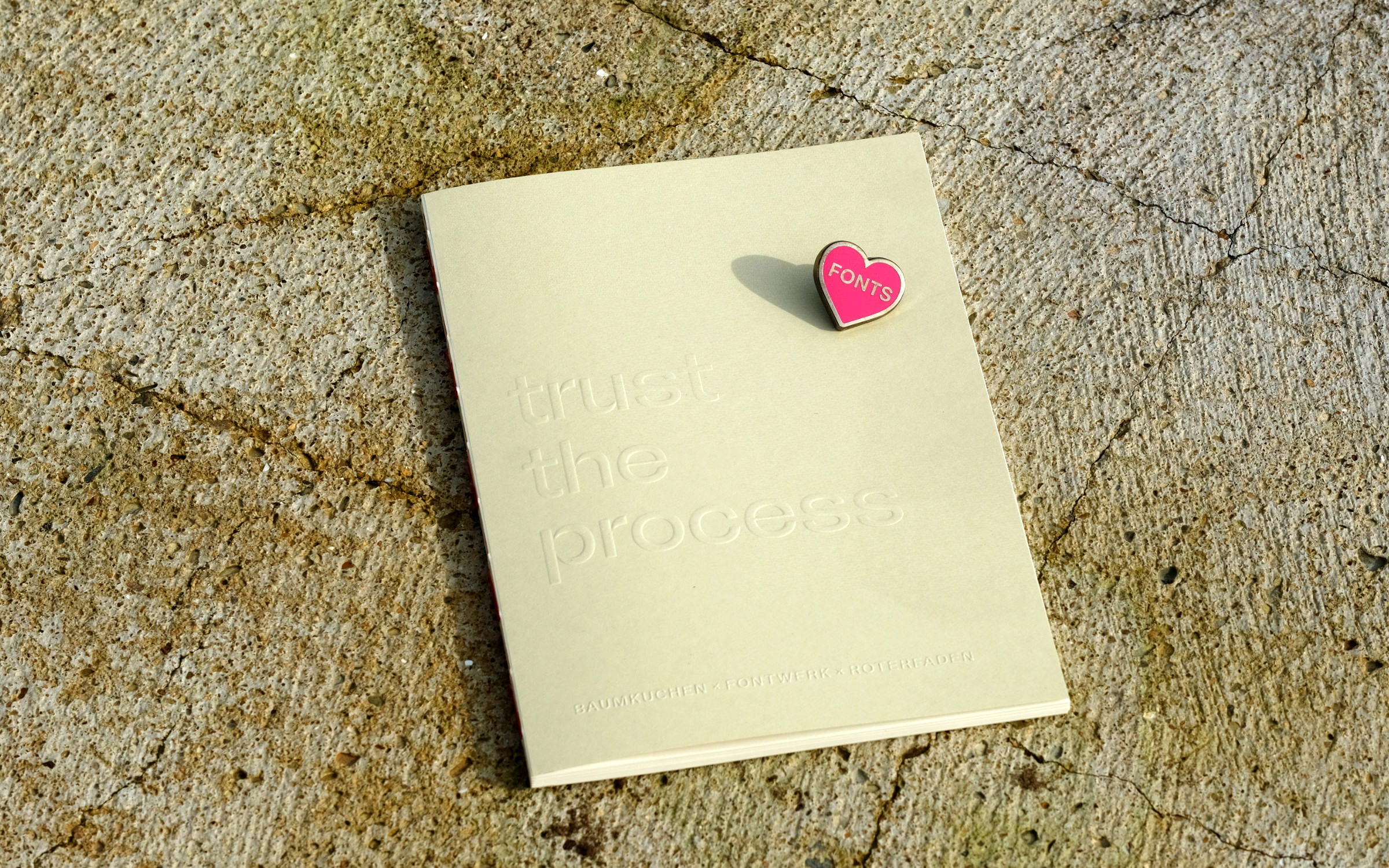 | | Buy any Family or Superfamily by March 31st and get a notebook as well as our exclusive font-lovers pin. | |
|
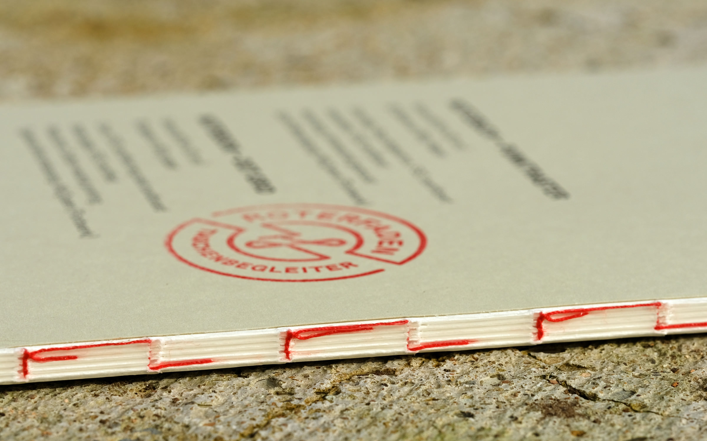
| | Limited edition goodies up for grabs We are huge fans of stationery and of working collaboratively, so when the opportunity arose to work with Roterfaden and Baumkuchen on a beautiful notebook, we leapt at the opportunity. The limited edition ‘Trust The Process’ notebooks are embossed with our very own McQueen and are perfectly formed using recycled paper and bound with the signature red thread. Roterfaden are famed for their Taschenbegleiter (bag companion) which is the perfect planning system that works without any punching holes or special formats and allows you to carry all that you need using the unique clip mechanism. You can either purchase the notebooks directly from Roterfaden and Baumkuchen or you can grab it as a giveaway: In a VERY special offer, all customers who buy a Family or Superfamily (regardless of the typeface) by March 31st, 2024 and provide their address when purchasing will receive a notebook and our exclusive and oh-so-beautiful font-lovers pin as well (more on that gem in our next newsletter). | |
|
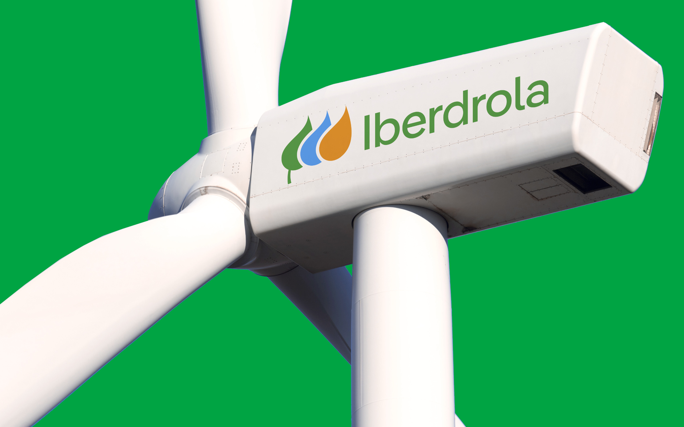 | | Iberdrola’s new corporate font family is a customized Pangea. | |
|
| | Iberdrola: sustainability built-in from the logo upAs an international pioneer in the renewable energy sector, Iberdrola is currently the fifth largest energy company in the world and supplies almost 40 million customers. With an emphasis on renewables, Iberdrola is not only leading the way in generating energy from sustainable sources, they are also taking steps to ensure that their own visual identity has more impact but uses less energy. They recently engaged Design Bridge and Partners to revamp their brand in order to make it more sustainable, accessible and modern. The digital footprint of the new logo is now smaller and has been simplified in terms of color and design. At the same time, a logo font has made it more accessible, secure and user-friendly. Their new corporate font family was derived from Pangea by Christoph Koeberlin and subtly adapted by Fontwerk. The 20 weights of ‘IberPangea’ and ‘IberPangea Text’ were supplied in several individual formats, each with a single-story g as the default. In a clever little font engineering trick, access to the leaf logo is integrated into the fonts and the (individually spaced) logotype is accessed via Unicode. | |
|
 (© Gerhard Kassner) We mentioned at the beginning of the year that we were looking forward to welcoming some new additions to the Fontwerk family! With that, we don’t just mean new typefaces, but also actual faces. So, we are absolutely delighted to share the news that former FontShop Legend, Christian Köhler has started in a brand new role as Sales & Support Manager and is now responsible for the fast, friendly and solutions-oriented support for all our international customers. Christian brings over thirty years experience with him to the role, having worked in various leadership and management positions across the areas of customer support and sales whilst at FontShop Germany and – after its acquisition – at Monotype. The depth and breadth of his knowledge is unparalleled and his telephone voice is truly something else! This is a big step for us as we strive towards creating a more customer-oriented approach to our work and we are so incredibly excited to welcome him into the Fontwerk fold. ↗ |
|
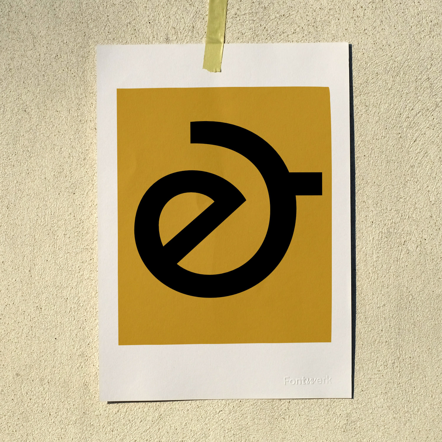 In this month’s Big Glyph, we’re delighted to share the gorgeous ampersand and alternative (historical) ampersand from the West family by Daniel Perraudin. Fun fact, the ampersand was originally derived from a ligature of the letters e and t from the Latin word for “and” which is et. ↗ |
|
We can help! From language extensions to custom typefaces, from extra special font engineering to type direction, from logo design to color fonts, we’ve got you covered. If you’re looking to put your best foot forward with a font that helps your brand stand out from the crowd, please get in touch. |
|
|
|