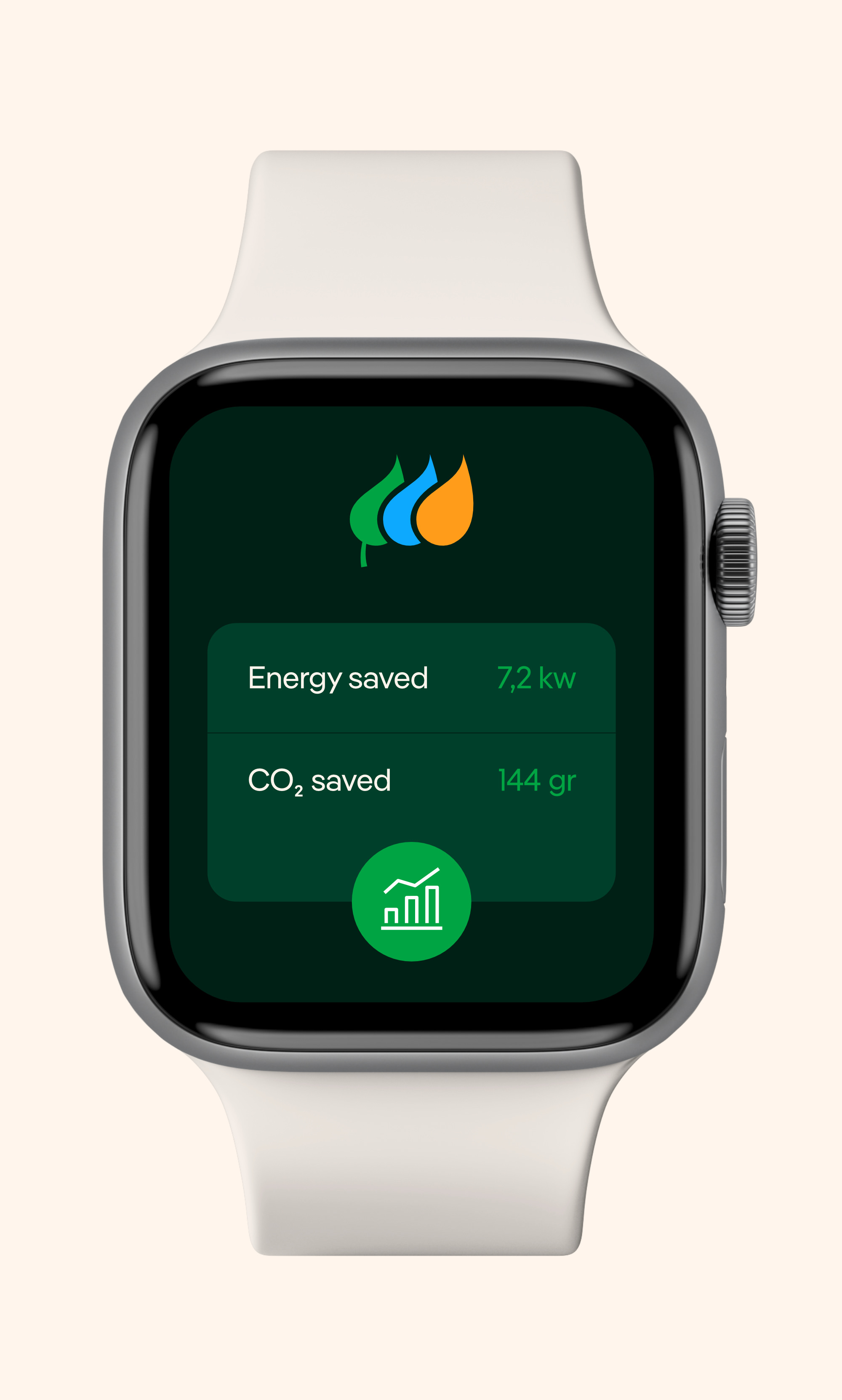
As Iberdrola is already an international pioneer in the renewable energy sector and wants to focus even more on protecting the environment, the company commissioned Design Bridge and Partners (a merger of Superunion and Design Bridge) to revamp its visual identity. In redesigning the brand, care was taken to ensure that every element of its visual identity has more impact and yet uses less energy.
Iberdrola
Leading the clean energy revolution
The new design aims to create a brand that is more sustainable, accessible and modern. The digital footprint of the new logo is now smaller, as it has been simplified in terms of color and design. At the same time, a logo font has made it more accessible, secure and user-friendly.
The Iberdrola Group has been a global and local brand since 2008, when, with the first Iberdrola merger in the UK, the purpose and values of the brand were transmitted to the host companies. All this occurred without changing the name of the merged companies. Typeface and colors form the connecting elements.
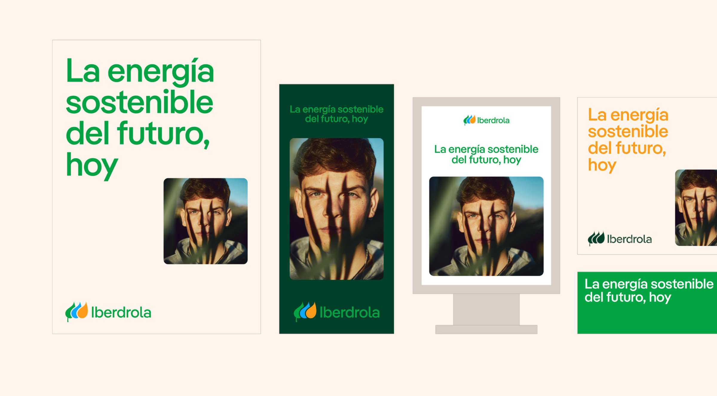
The new corporate font family, which was derived from Pangea and subtly adapted by Fontwerk on behalf of the client also meets the brand’s requirements. For office use, the 20 weights of “IberPangea” and “IberPangea Text” – in addition to OpenType and WOFF2 – were also supplied in TrueType format, each with a single-story g as the default. Access to the leaf logo is integrated into the fonts and the (individually spaced) logotype is accessed via Unicode.
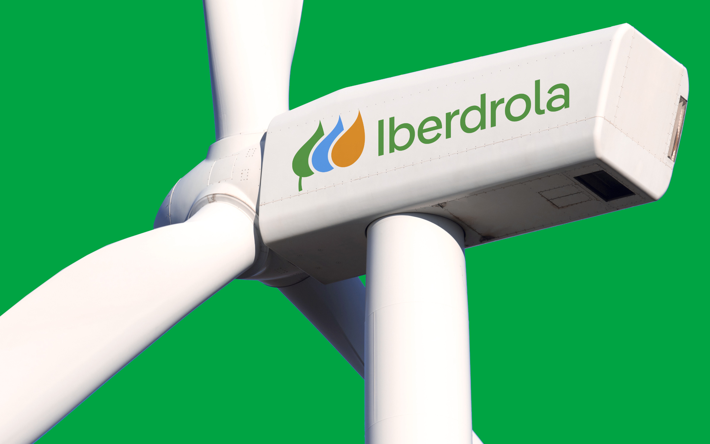
The four pillars of the new Iberdrola brand identity: simplified logo, minimalized color palette, new corporate font, unmistakable visual language
The updated color palette represents three key elements of Iberdrola’s values: green = renewable energy, blue = water and orange = the sun.
“Also significant is the new IberPangea font family, which is more flexible, more efficient and easier to read. It can be used sustainably in both the digital and offline world,” states the press release about the new Iberdrola identity. The fresh typographic appearance conveys the optimism and innovative strength that characterizes the company.
Marco Walker, Designer at Design Bridge and Partners, adds: “It is the ideal typeface for Iberdrola, a globally renowned renewable energy brand.” and furthermore:
Pangea is a versatile, and easily recognizable typeface family, serving as a crucial asset in conveying the sustainable and energy-efficient brand expression crafted for Iberdrola, Avangrid, ScottishPower, Neoenergia, and Iberdrola México.
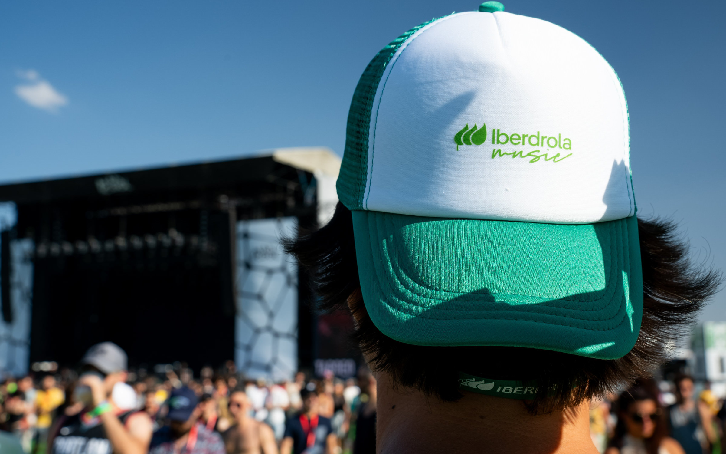
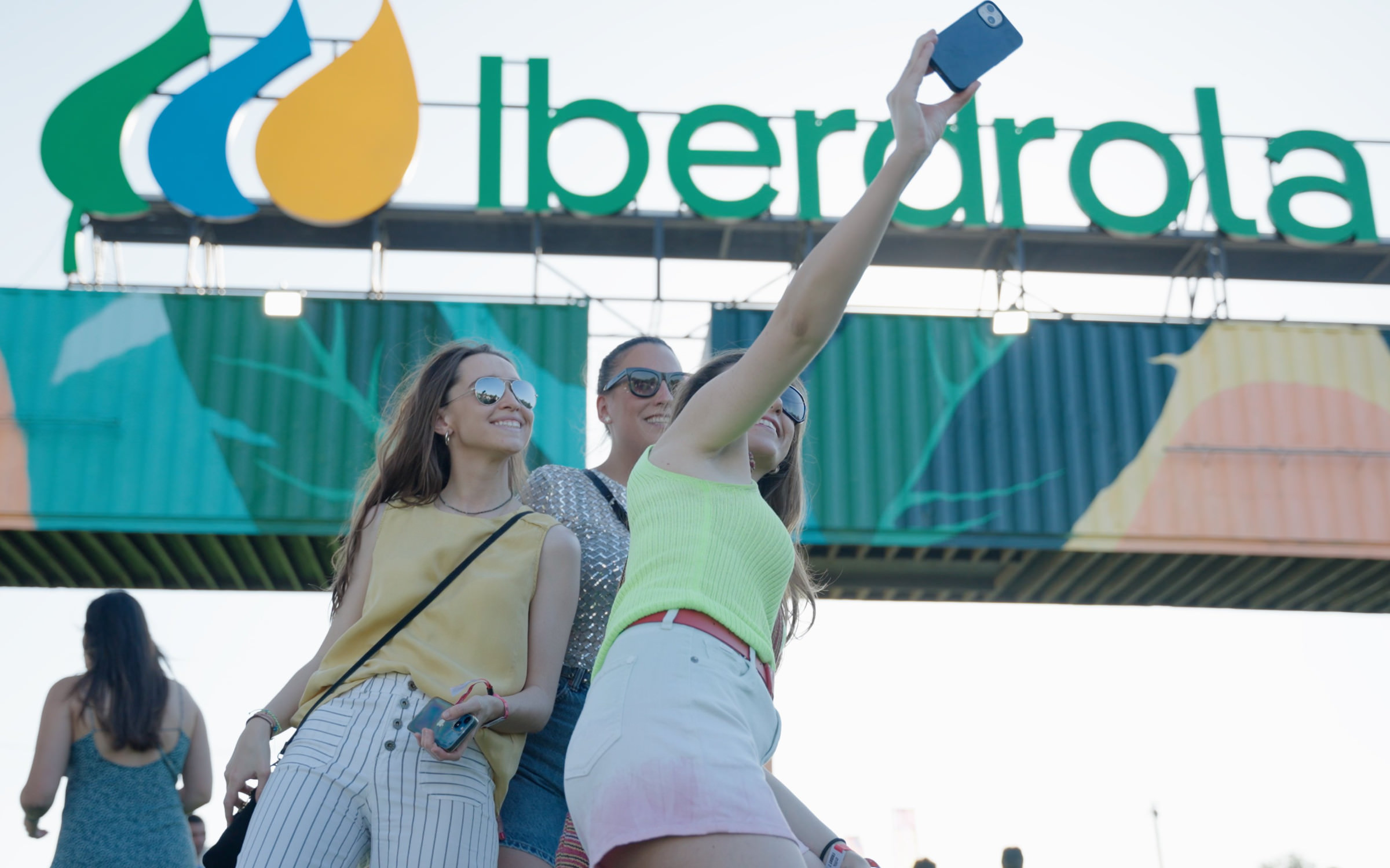
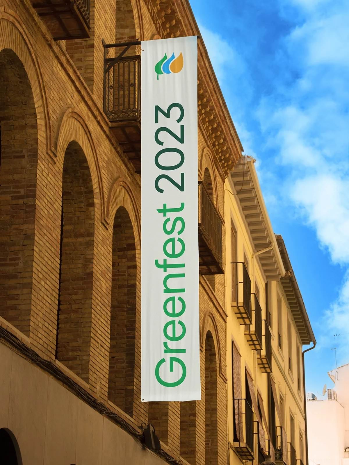
Iberdrola organizes music events for up to 100,000 people, e.g. the Green Vibes Festival in Madrid.
Sustainable right down to the tips of the leaves: the new Iberdrola logo, with 50 percent fewer curve points, less color and no gradients
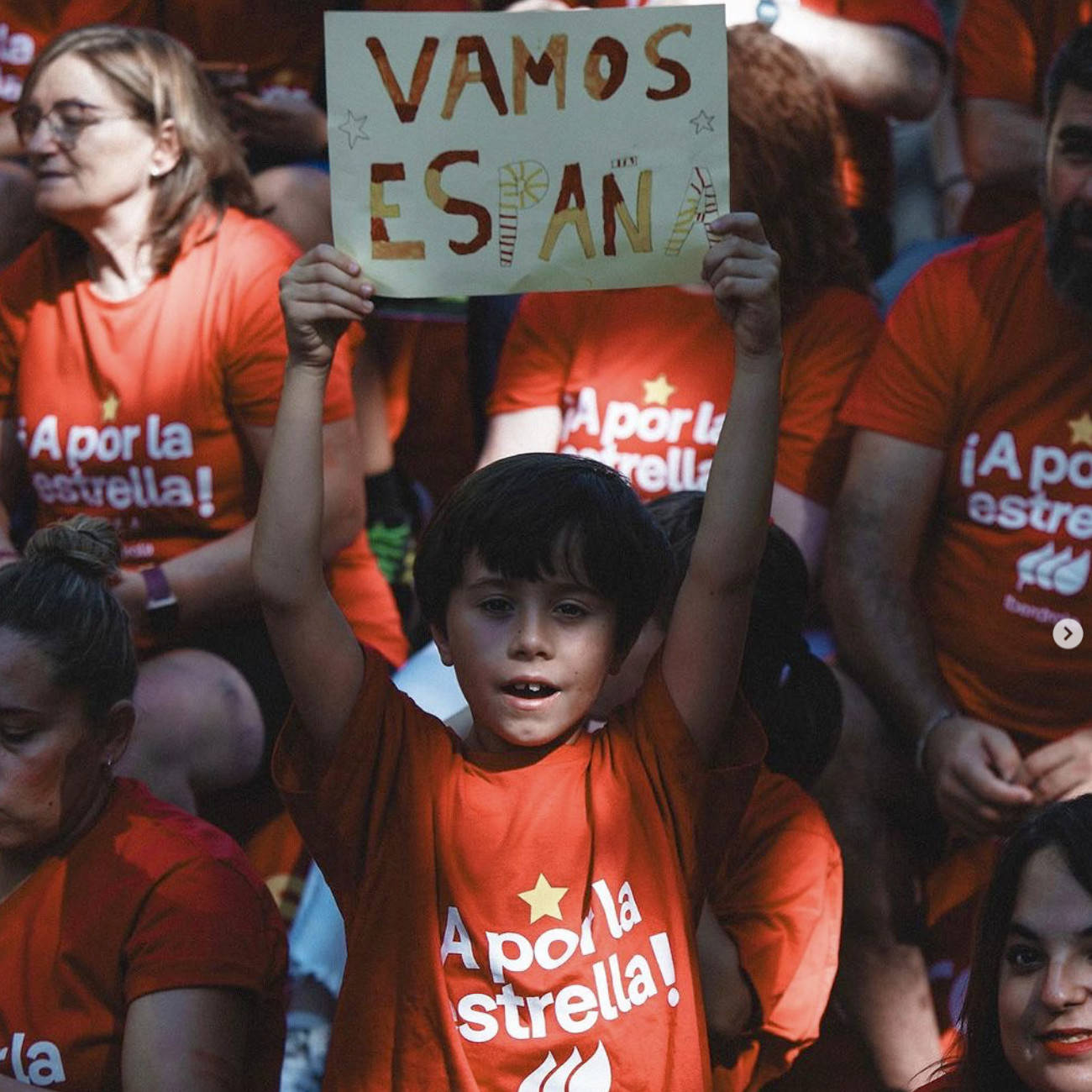
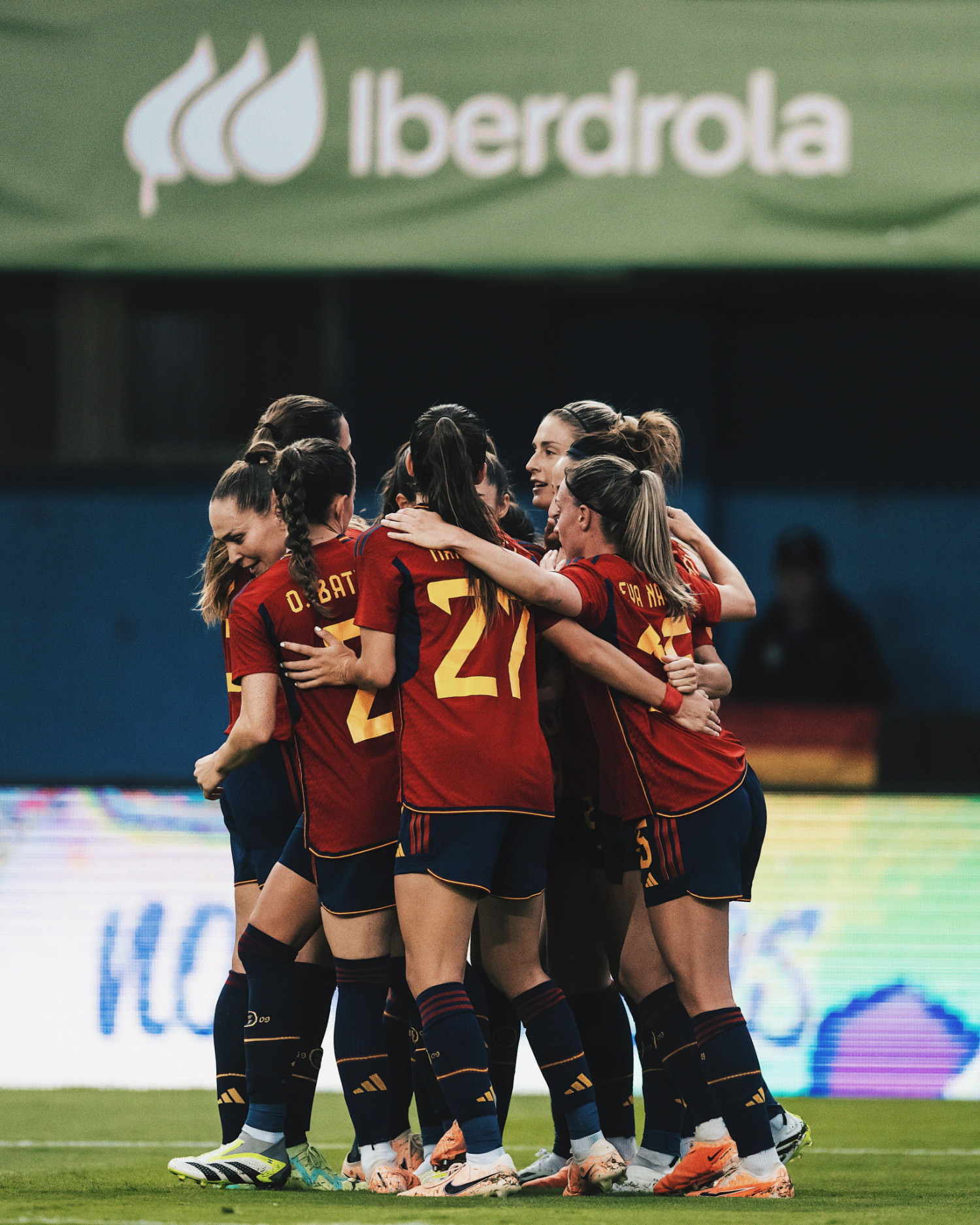
Iberdrola is the main sponsor of the Spanish women’s national football team.