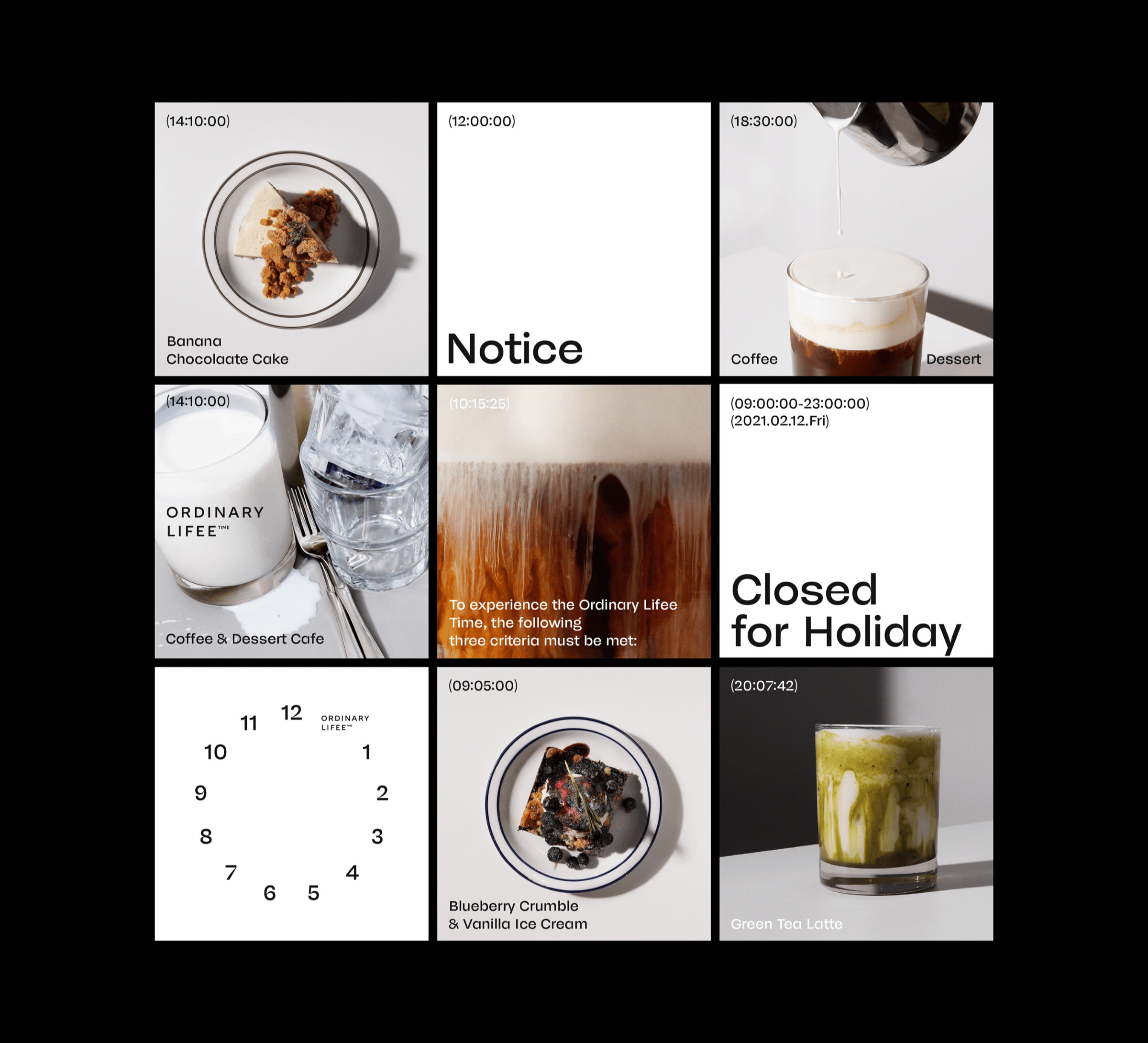
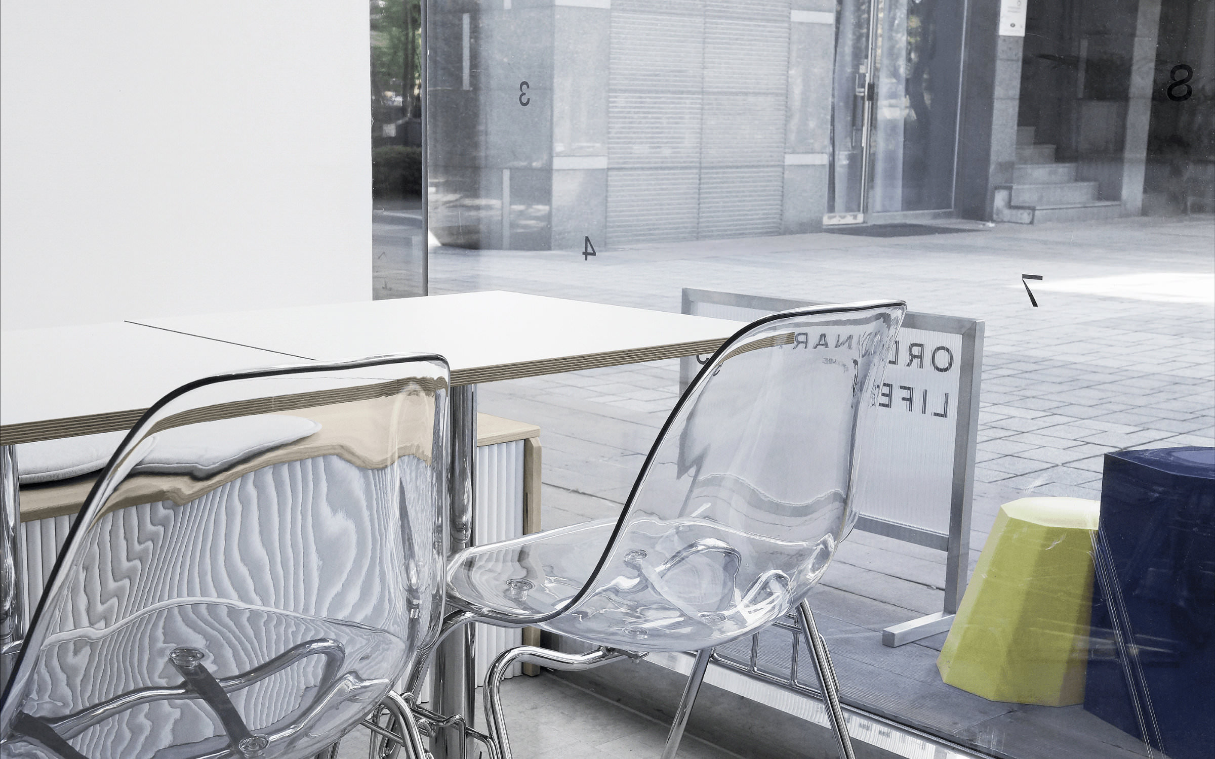
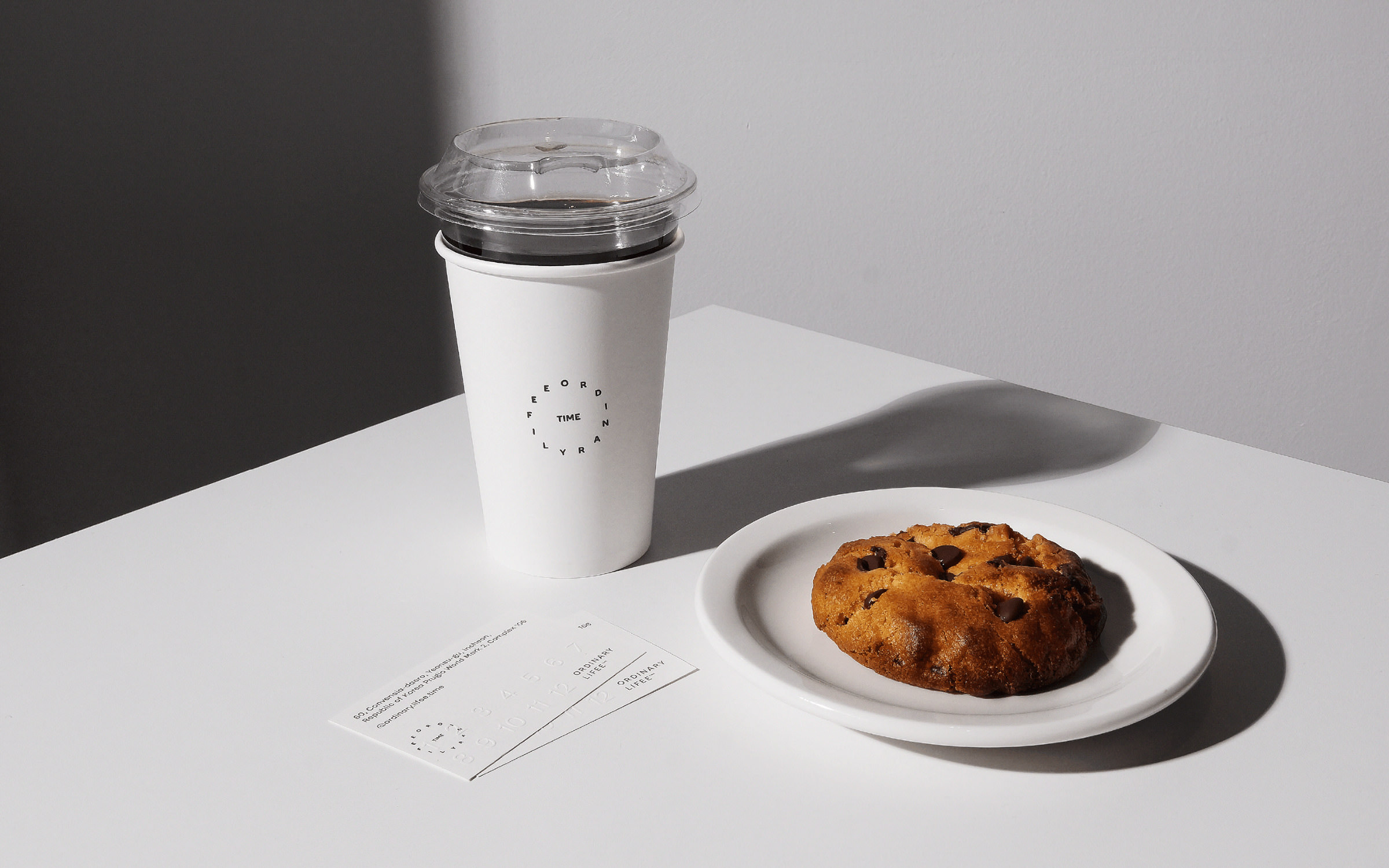
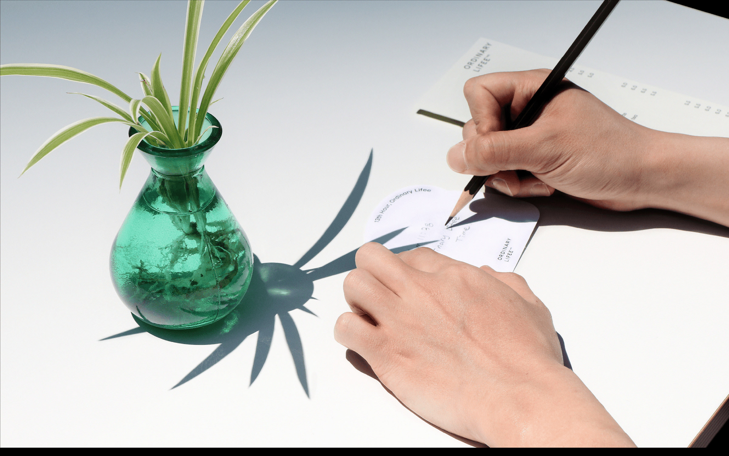
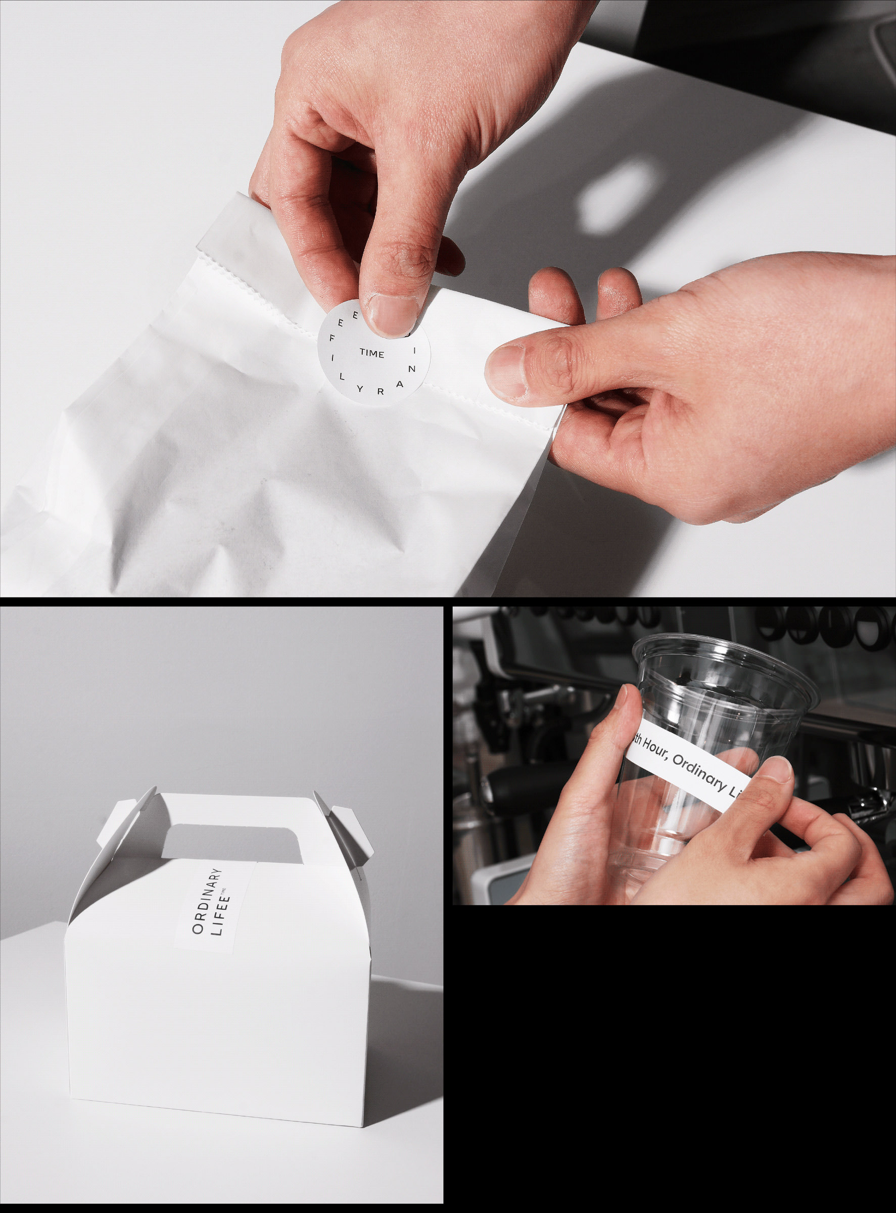
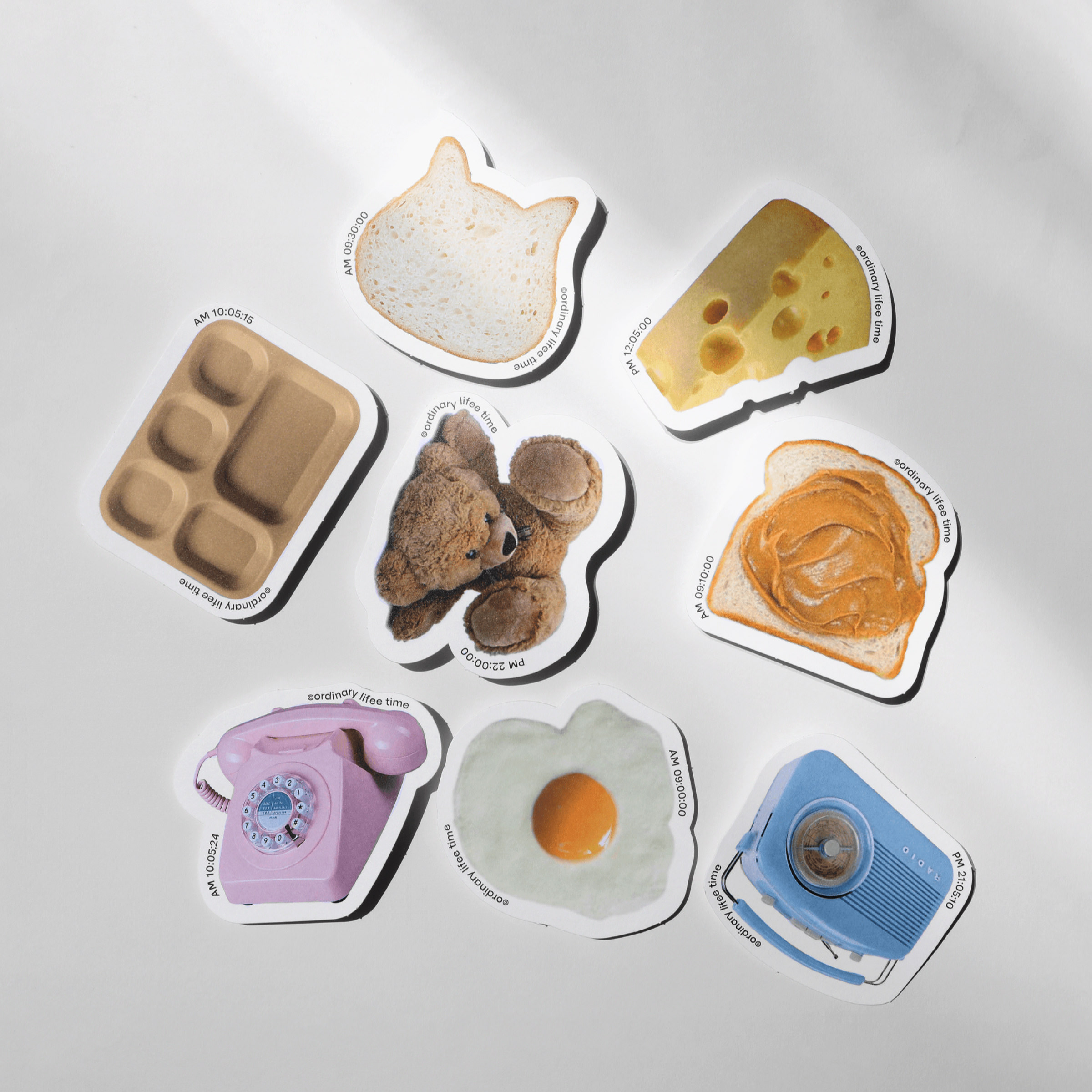
he idea of the café, its name (also consisting of 13 letters) and the corporate design are just as utopian as the location of Ordinary Lifee. The shop is located in Songdo, the “City of the Future”. Songdo is the world’s first completely networked smart city and it was built from scratch in seventeen years. In 2003, as no suitable land could be found in the entire Seoul metropolitan area, the city was built on a 6 km² polder area (a low lying tract of land) reclaimed from the tidal flats in southern Incheon.
Ordinary Lifee
The café where you can gain an extra hour daily
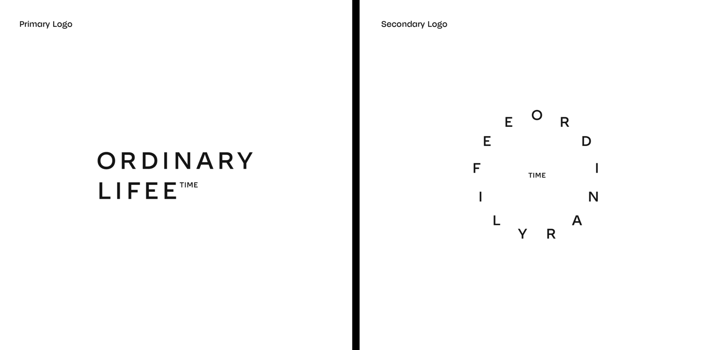
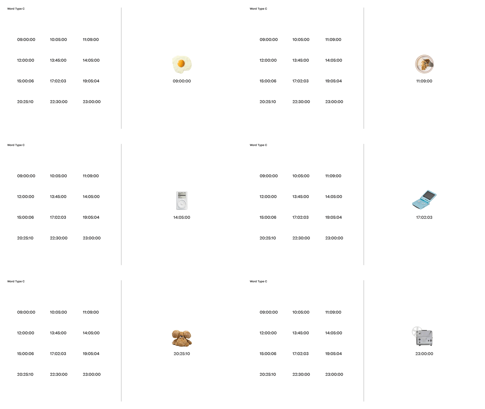
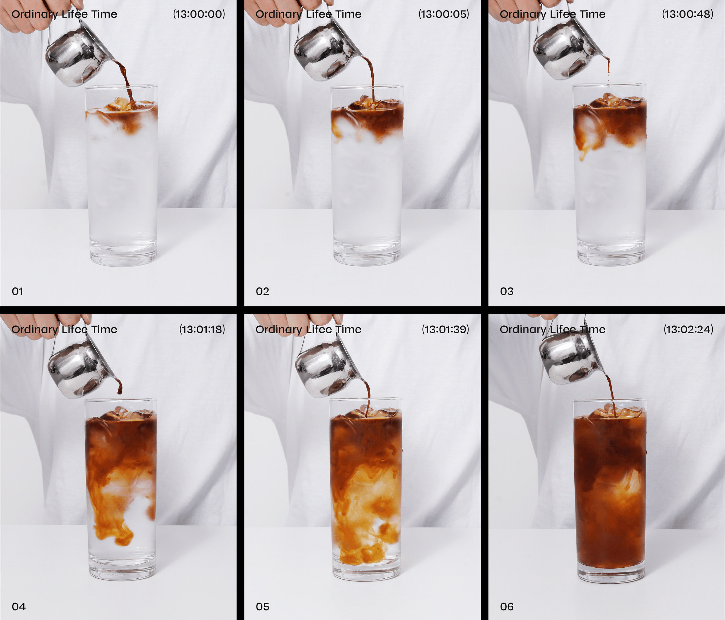
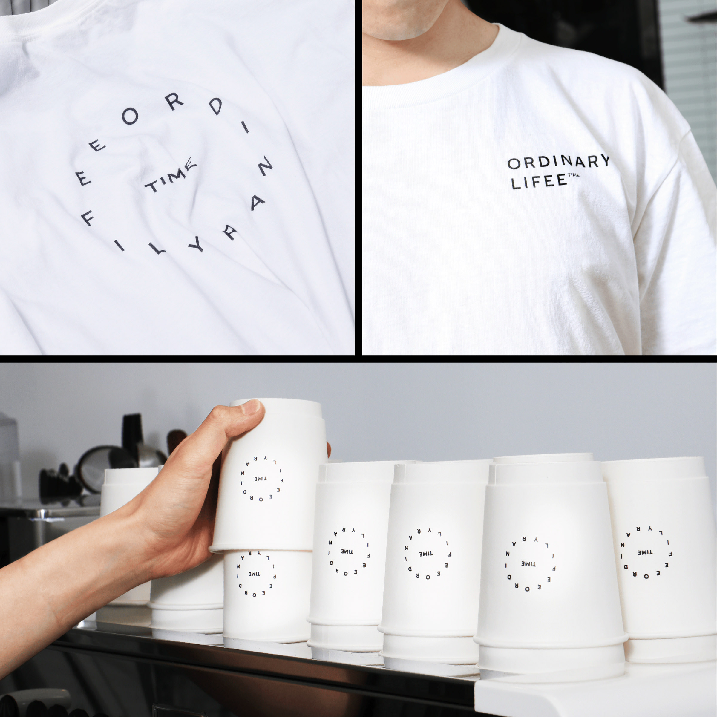
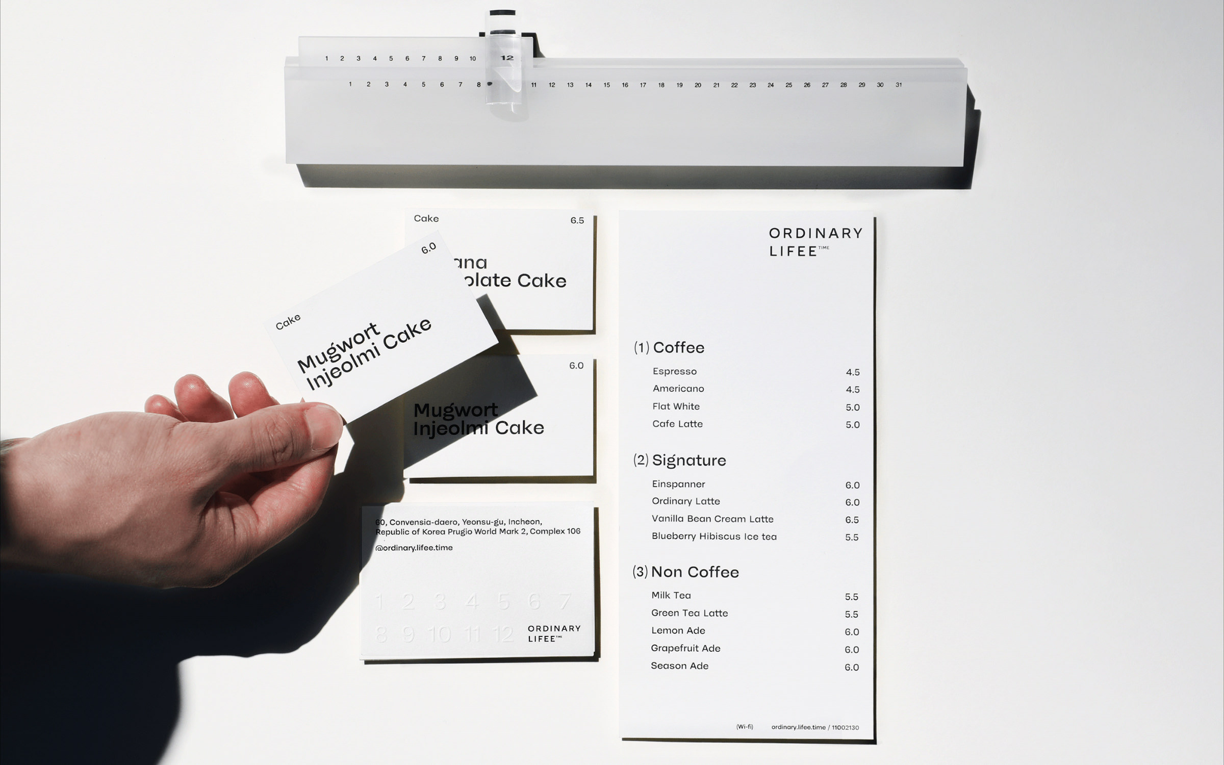
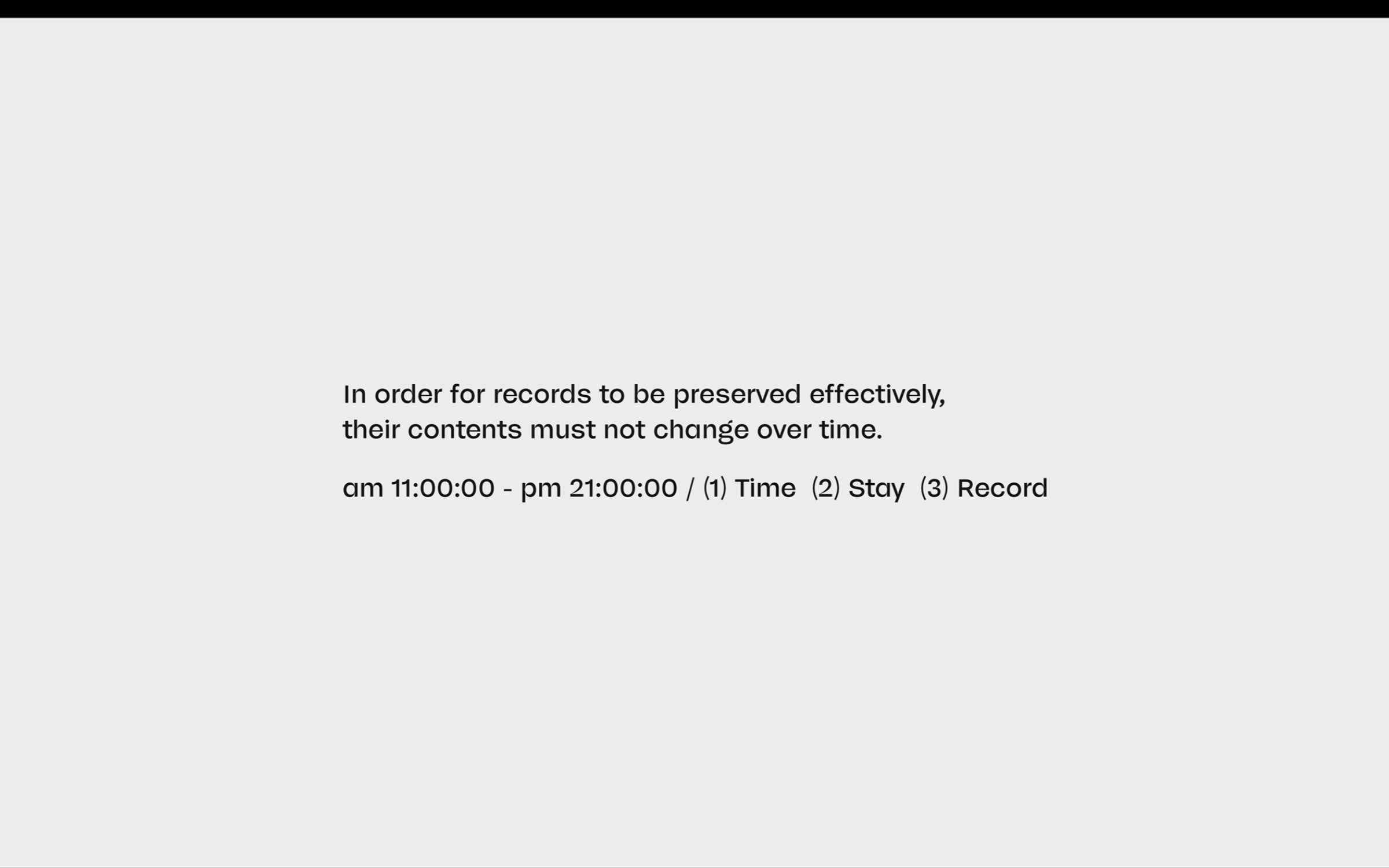
The Art Director Kwangmyung Lim explains the concept of his brand identity as follows: “The idea of the café was to be a space where you can fit cake and coffee into your normal everyday life. So for Ordinary Lifee’s visual identity, we used the themes of time and timekeeping. The idea of time runs across the entire corporate design.”
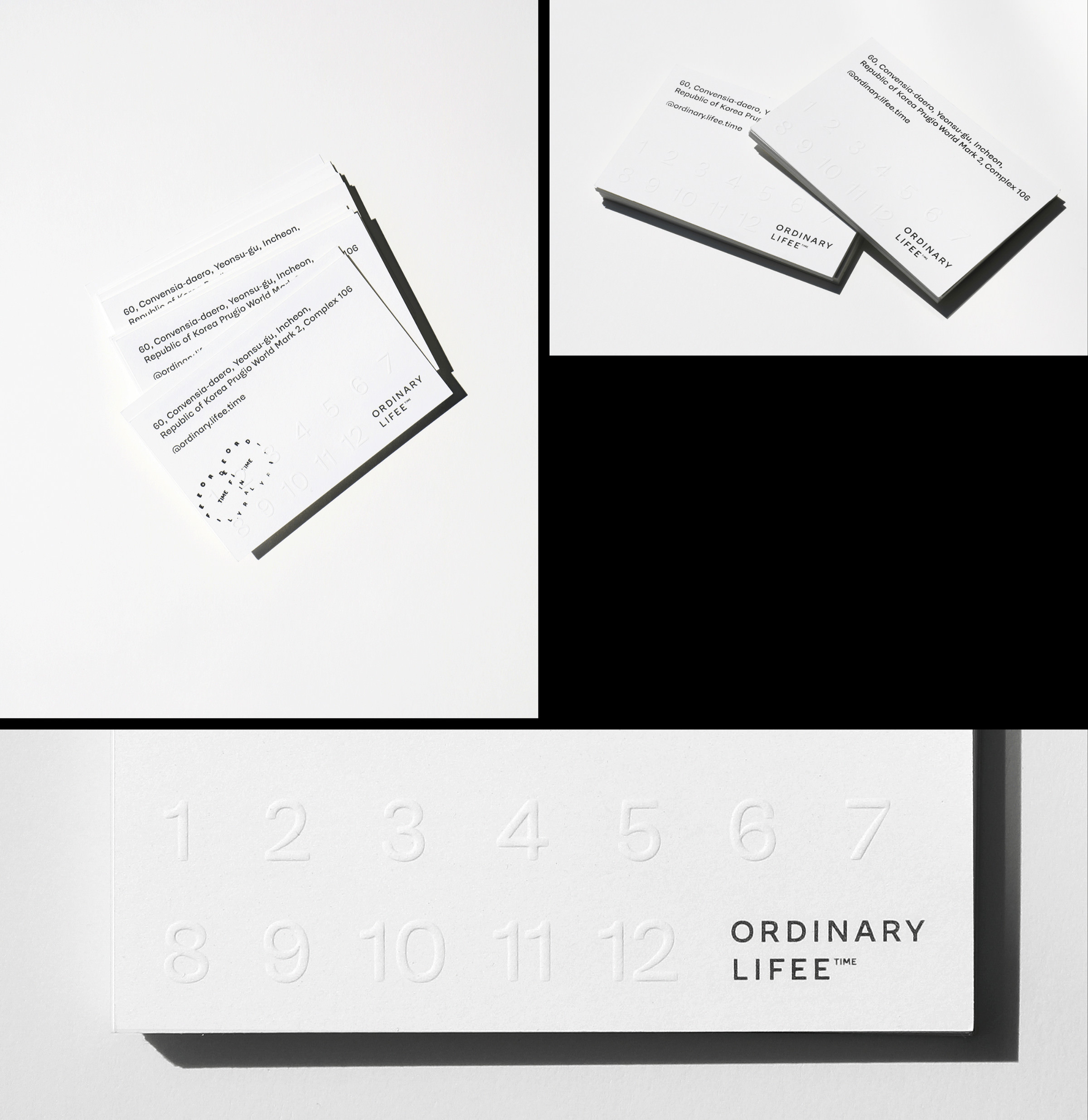
When it comes to time and watches, there is no way of avoiding Swiss design. So it was only natural that Kwangmyung Lim chose McQueen as the house font for Ordinary Lifee. The typeface was developed by the Swiss Type Designer Loris Olivier, his wife Noheul Lee and Katja Schimmel. The most striking feature of the headline version of McQueen (there is also a text variant) is the strong stroke width contrasts and the deep cuts in selected curve transitions, which are comparable to ink-traps. This feature ensures that the characters give the visual identity of Ordinary Lifee a distinctive profile and that the display typeface is also easy to use for small print – such as Business Cards and Drinks Menus.
