Yamakasa

A font ‘spectacle’ that carries the story

Fonts in use: The typefaces Tausend Plakat and Tausend in combination with Hiragino Sans for the photo book ‘Yamakasa 2025 Nishinagare’ that documents the Hakata Gion Yamakasa Festival in Fukuoka, Japan
Klaus Richter’s 300-page photographic documentary “Yamakasa” takes a look behind the scenes of the spectacular Hakata Gion Yamakasa Festival in the Japanese city of Fukuoka.

“Yamakasa” is not a classic photo book, but a tapestry of culture, closeness, and movement. The book was photographed by a renowned rock and metal scene photographer and designed by his son, and is all about a 785-year-old Japanese ritual. A German-Japanese font ‘spectacle’ carries and supports the book.

Y

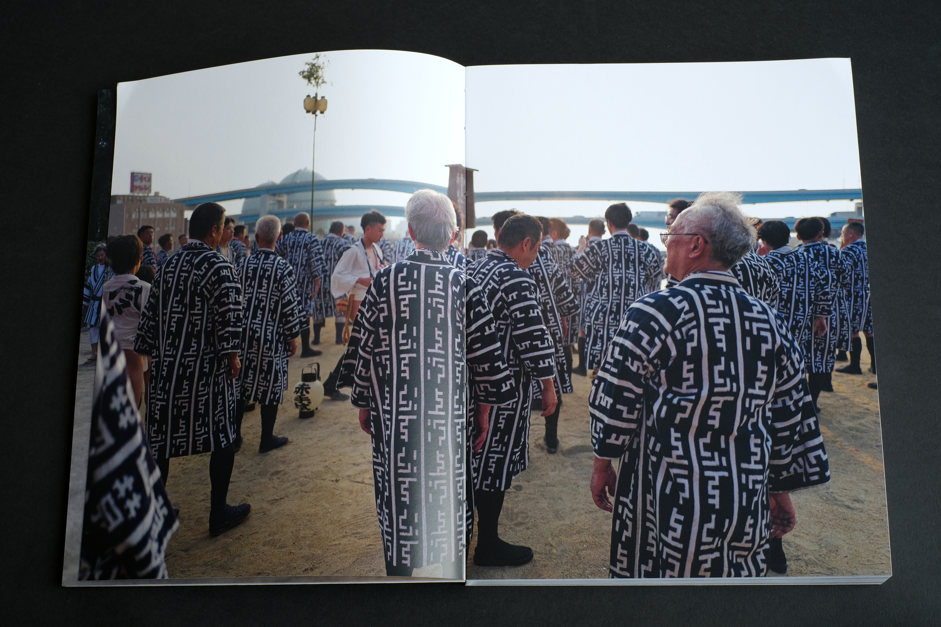
amakasa documents the Hakata Gion Yamakasa Festival 2025 and translates its energy into a visual language that goes far beyond mere documentation.

The origins of the festival date back to 1241, when the Buddhist monk Enni was carried through the city on a festival float by the population in order to drive away the plague with prayers. Over the centuries, the ritual ceremony developed into a spiritual festival that is unique in the world. Every year from July 1 to 15, seven groups of men parade through the old town with their magnificent Yamakasas: richly decorated wooden frames weighing over a ton.

Fonts in use: The typefaces Tausend Plakat and Tausend in combination with Hiragino Sans for the photo book ‘Yamakasa 2025 Nishinagare’ that documents the Hakata Gion Yamakasa Festival in Fukuoka, Japan

German photographer Klaus Richter, who has been a constant companion to the rock and metal scene with his camera since the 1960s, received rare permission in 2025 to accompany one of the teams during the festivities. His photographs document not only the procession itself, but also the preparations, the breaks, the sweat, and the audience. They show the pulse of a community celebrating its tradition.

The impetus for the book came from the photo platform LFI Gallery (Leica Fotografie International). LFI Gallery awarded five photographs by Klaus Richter as Mastershot, five additional images as Selection, and one photo as Picture of the Week in 2025.

Fonts in use: The typefaces Tausend Plakat and Tausend in combination with Hiragino Sans for the photo book ‘Yamakasa 2025 Nishinagare’ that documents the Hakata Gion Yamakasa Festival in Fukuoka, Japan
LFI mastershot by Klaus Richter
Fonts in use: The typefaces Tausend Plakat and Tausend in combination with Hiragino Sans for the photo book ‘Yamakasa 2025 Nishinagare’ that documents the Hakata Gion Yamakasa Festival in Fukuoka, Japan
Just as the stretcher is carried through the old town of Hakata, the explanatory texts take up different positions on the double pages.

Yamakasa was designed by Klaus Richter and his son Gabriel. They conceptualized the book as a spatial and movable object. The headlines and texts move across the pages like the Yamakasa carriers through the city. The open thread stitching is not only an aesthetic detail, but a deliberate reference to the ropes and cords that hold the Yamakasas together. With around 300 pages, the book has a physical presence that conveys the weight and power of the festival.

During the preparations for the festival, the men wear stylish Toban Happi coats. There are over 50 different types. The Nishinagare group, accompanied by Klaus Richter, wear dark blue toban happi coats with white characters. Gabriel Richter initially sketched a headline font based on this, but did not pursue it further: “It seemed too contrived to me.” (Richter)

Fonts in use: The typefaces Tausend Plakat and Tausend in combination with Hiragino Sans for the photo book ‘Yamakasa 2025 Nishinagare’ that documents the Hakata Gion Yamakasa Festival in Fukuoka, Japan
LFI mastershot by Klaus Richter
One of the five master shots awarded by LFI: At 38 degrees Celsius, the air shimmers, and water from the buckets of spectators provides cooling relief.
LFI mastershot by Klaus Richter
On the morning of July 15, just before sunrise, the highlight begins: the Oiyama run. With rhythmic drums behind them, the runners storm through the alleys – a mixture of ecstasy, ritual, and pure devotion. After the run, the group ceremonially tears the stretcher apart in a kind of battle. If the participants manage to grab something, they can take it home as a trophy. Since this ritual is too dangerous, it is now only performed by the group that Klaus Richter accompanied.

In the German-Japanese typographic design, the typeface Tausend plays a central role and Gabriel Richter was also involved in its development. Its compactness and slightly slanted ends correspond strongly with the structure of Japanese Kanji and their dynamic strokes. Tightly spaced letters create a feeling of density and cohesion, as exemplified by the groups of men carrying their palanquin. In combination with the Japanese typeface Hiragino Sans from SCREEN Graphic Solutions, whose subtle weight gradations could be precisely matched to Tausend, a captivating typographic dialogue was created – without striking effects or cultural simplifications.

Yamakasa is a book about community, trust, and movement. Tausend is not a neutral carrier of information, but part of the narrative: powerful, compact, rhythmic. The project exemplifies how type not only accompanies, but also carries meaning. And how typography can bridge the gap between form and content.

Try Tausend

Fonts in use: The typefaces Tausend Plakat and Tausend in combination with Hiragino Sans for the photo book ‘Yamakasa 2025 Nishinagare’ that documents the Hakata Gion Yamakasa Festival in Fukuoka, Japan
The fonts Tausend and Hiragino Sans engage in a typographic dialogue, either in positive or negative space.
Photo by Klaus Richter
Fonts in use: The typefaces Tausend Plakat and Tausend in combination with Hiragino Sans for the photo book ‘Yamakasa 2025 Nishinagare’ that documents the Hakata Gion Yamakasa Festival in Fukuoka, Japan